Redesign for Online Store
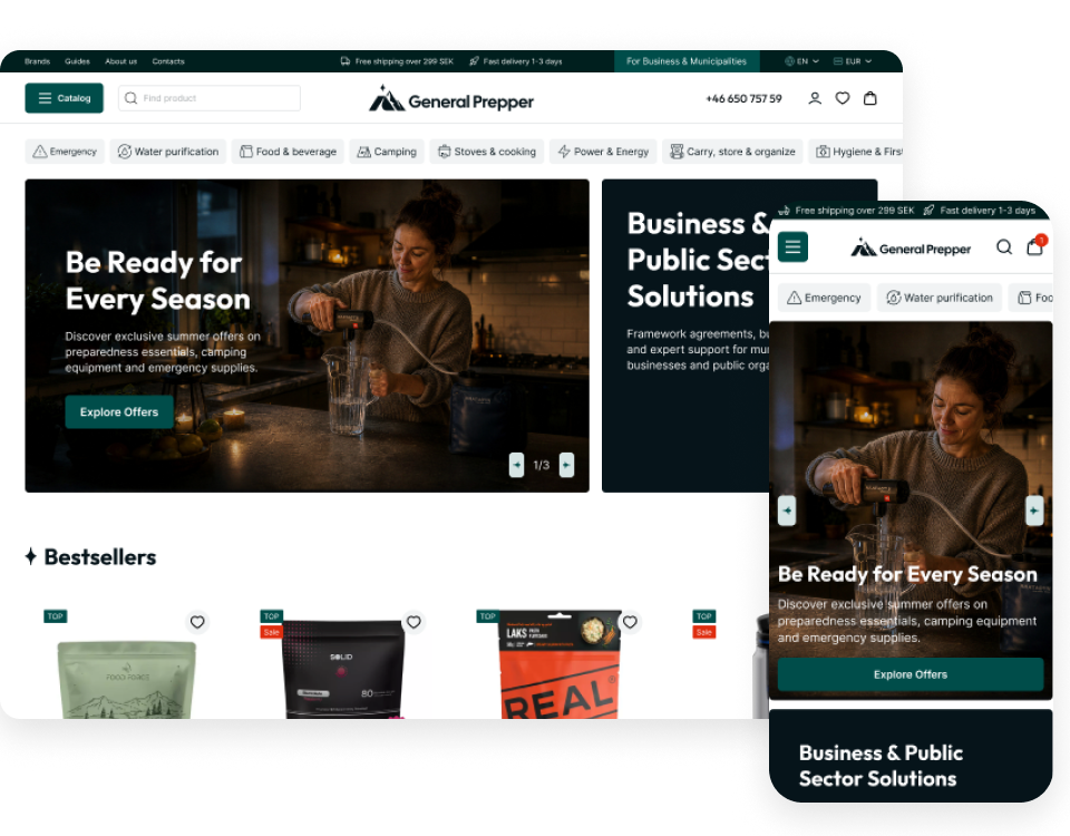
General Prepper is a Swedish online store for emergency preparedness and outdoor gear. It serves private customers as well as municipalities, companies, and public organizations.
The project started with one urgent problem: too many abandoned carts. At the same time, the company was preparing to move to Wikinggruppen, a new e-commerce platform. Thus, we used the migration to rethink the entire shopping experience before launch.

Tasks
- Identify the UX issues behind cart abandonment using GA4 and Microsoft Clarity.
- Refresh the logo and visual identity.
- Redesign the key shopping journey across desktop and mobile.
- Adapt the design to Wikinggruppen’s technical capabilities.
- Create a scalable design system for development and future growth.
.png)
Visual Identity & UI Kit to Built a Scalable Brand System
Before: the badge-style logo had many small details and was hard to use in digital interfaces, especially in a mobile header.

After: we refreshed the logo while keeping the original mountain motif. The new sign combines a tent for shelter, mountains, and the Polaris star for guidance. The star became a recognizable element across the site and marks every section title.
.png)
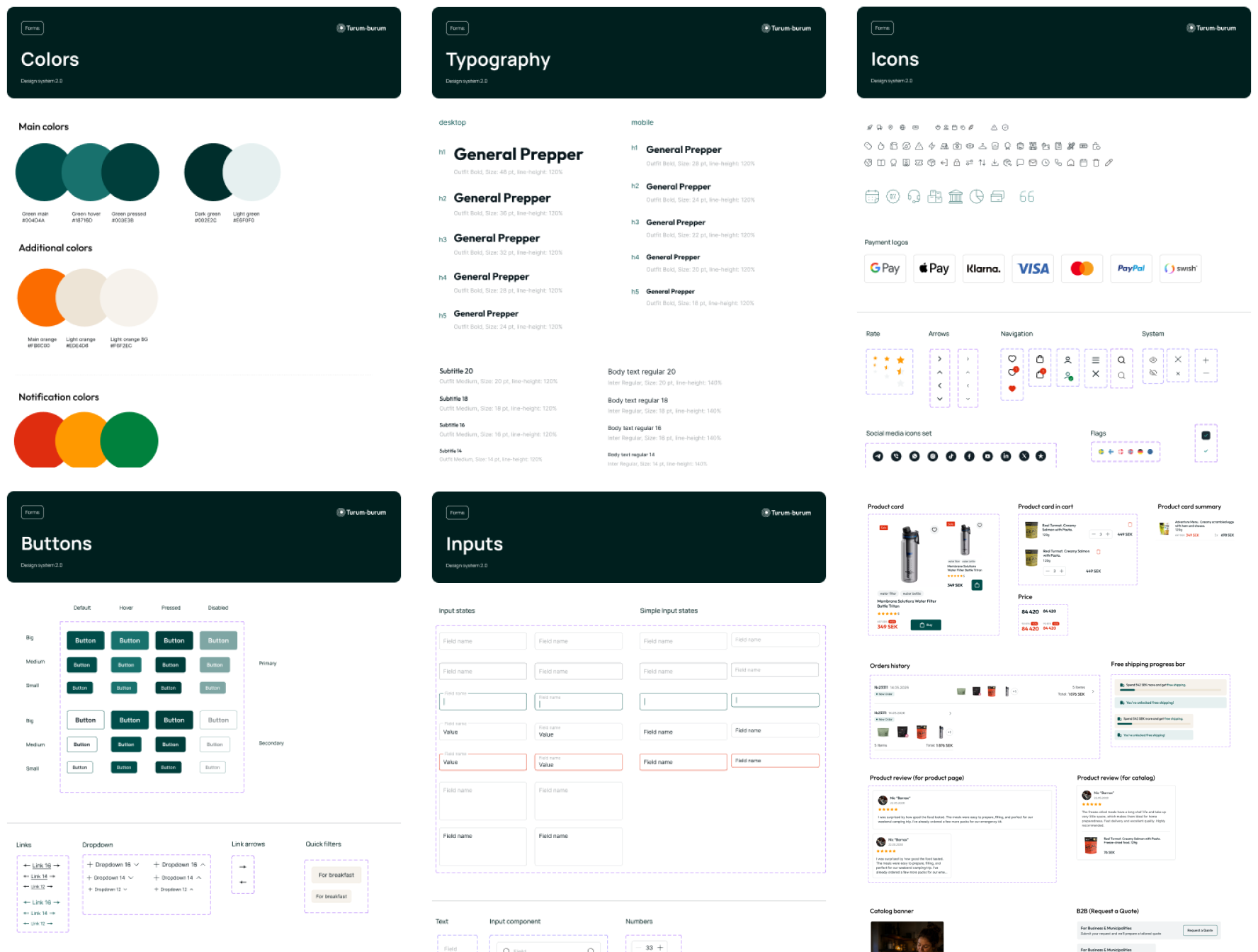
On this base, we created a detailed design system with reusable components and all their states. It gives Wikinggruppen clear guidelines for implementation and allows General Prepper to scale the website without losing visual consistency or brand identity.
Homepage Redesign: One Clear Start for B2C and B2B Buyers
Before: the homepage opened with two large banners, which on mobile took up the first two screens, followed by product rows without section titles. It offered no way to explore the assortment beyond the menu, and business customers could find their offer only through a small link in the top bar.
.png)
After: we rebuilt the homepage around the company’s two audiences. The hero gives B2C and B2B customers separate entry points from the first screen, while Shop by Scenario and a short questionnaire help customers who don’t yet know what they need.
Bestsellers, seasonal categories, brands, reviews, and preparedness guides create more ways to explore the assortment and discover relevant products.
.png)
Navigation & Catalog Design: A Large Assortment, Easy to Explore
Before: the menu ran across three rows of text links with more than 20 items and no icons, and on mobile it pushed the page content below the whole list. On category pages, a banner, a long description, and up to 20 subcategory buttons came before the first product, and some categories offered only Brand and Price filters.
.png)
.png)
After: we reorganized the catalog into 17 categories with line icons and simplified access to subcategories on desktop and mobile.
Category pages bring products higher on the page, and filters follow how customers choose preparedness products: allergens, meal type, shelf life, format, and number of servings. Search shows matching categories and products while users type.
.png)
.png)
Product Page Optimization To Help Customers Buy
Before: next to the Buy button, the page showed three generic lines about secure payments, email support and fast delivery. Nutrition, shelf life and ingredients sat in one long text block below, and the page had no reviews or related products.
.png)
After: we moved key information into the purchase area: stock status, rating, shelf life, servings, size options, allergens, delivery and payment details.
A sticky Buy bar keeps the main action in view. Product documentation helps municipalities with procurement, while related products and bundles support further shopping.
.png)
Checkout Redesign: Less Friction Where Carts Were Lost
The checkout was the starting point of the project. GA4 and Microsoft Clarity showed where users dropped off: a large share of visitors never scrolled down to the order button, and about two in three users who began checkout didn’t complete it.

Before: the cart and checkout were one long page. Quantities required a separate refresh, payment stayed blocked until users selected delivery, and on mobile the order flow took extensive scrolling.
.png)
.png)
Our hypothesis: if users can focus on one task at a time and nothing blocks or distracts them on the way to the order button, fewer of them will leave at checkout.
After: we separated the cart and checkout into two focused stages. The cart became a side panel with instant quantity controls and a free shipping progress bar.
.png)
Checkout became a dedicated page without the main navigation or footer, in three clear blocks: Contact, Delivery, and Payment.
.png)
Results
What started as a checkout optimization request grew into a full redesign for General Prepper’s new e-commerce platform:
- 23 page templates across desktop and mobile, including the customer account, B2B, and content pages.
- A refreshed logo and visual identity built on the original mountain motif.
- Separate paths for private and business customers from the first screen.
- A checkout split into clear steps, with no blocked forms.
- A scalable design system prepared for implementation and future growth.