About the project
ORNER — is a Ukrainian manufacturer of office supplies and products for home and soul. The brand has been on the market since 2013. Their products are popular both in Ukraine and abroad. The company creates unique concepts, designs, and illustrations through its own design department.
Since 2021, it has been in partnership with Turum-burum on the ESR approach and the principle of “Service by Subscription” — that is, we have been constantly supporting the existing interface, improving it according to market changes and business objectives (finalizing labels, catalogs, menus, service pages, etc.).

Business scaling and interface changes
- 2021: A complete UX audit of the website and more than 50 hypotheses for interface optimization. We chose the ESR approach — step-by-step changes that did not require significant investment, resulting in a 1.5x increase in mobile transactions.
- 2023: As the business grew rapidly, the company's goals and target audience behaviors changed, and the product line expanded, it became necessary to optimize the interface design strategy. A second usability analysis was conducted, and more than 40 new hypotheses and growth points were identified.

Design evolution: 6 key interface changes
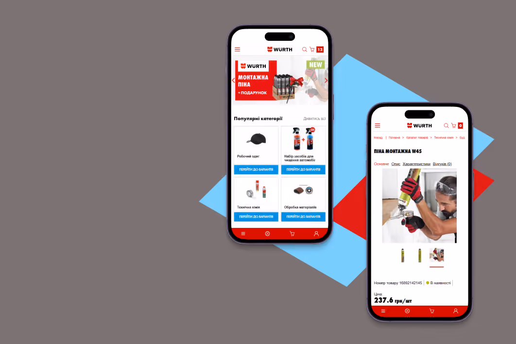
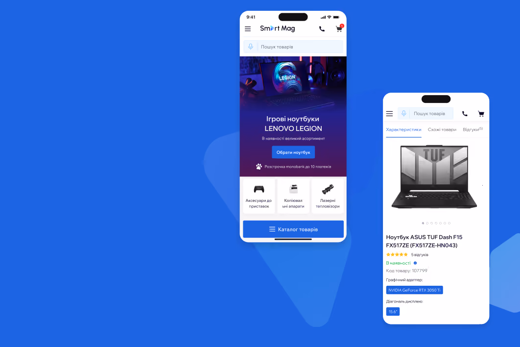
1. An engaging homepage is the face of the brand
In 2021, we added accent blocks that emphasized the uniqueness of the brand and served as additional entry points for users. In 2023, we integrated an abandoned cart reminder block and updated the UI kit for design elements.

2. Well-thought-out catalog and structured menu
Due to the widening of the product range, we added a “Catalog” button with a structured list of categories and subcategories with images, while keeping the most relevant offers, such as promotions and best sellers, in the horizontal menu.

3. The category listing page: all the details for user convenience
In 2023, we fixed the buttons for filters, sorting, and catalog when scrolling, added a price selection interval for convenient filtering according to the budget, and embedded advertising banners with relevant products.


In 2021, based on analytics data, we chose a pop-up shopping cart with key order details displayed and a simple and clear call to action added.

In 2023, we made the “Checkout” button more visible, simplified product browsing with clickable photos, and shifted the focus to completed orders.

5. Checkout and delivery: simple, concise, clear
In 2021, we introduced a simple checkout with several stages and a progress bar. In 2023, we redesigned the delivery block with collapsed details, added the ability to edit the cart via pop-up, and fixed the “Checkout” button at the bottom of the screen on mobile.

Special attention was paid to the mobile version, developing it on the mobile-first principle to ensure maximum usability for mobile users at all stages of the funnel, no matter what gadget they use.

We adapted banners and product photos to different screen sizes, fixed call-to-action and navigation buttons on key pages to make it easy for users to select products and place orders on the go.


Results achieved
Due to the ESR approach, we managed to create an interface that meets user needs and business goals, as well as increase the key KPIs of the project:
- After the first website redesign in 2022, the number of mobile transactions increased by 1.5 times, and another 10 thousand users reached checkout, i.e., completed the order, which positively affected the conversion rate.
- The 2024 redesign resulted in a 30% decrease in bounce rate and a 16% increase in the Add-to-Cart micro-conversion rate.