About the project
Lumier is a Norwegian company offering quality electrical equipment at affordable prices to B2B and B2C customers. Its founder, Per Norman Nielsen, has over 40 years of experience in entrepreneurship and owns several well-known electronics brands.
Tasks:
- Improve the website interface;
- Attract new users and increase the number of regular customers;
- Increase brand awareness;
- Increase the conversion rate of the online store.
UX audit and ESR approach
We studied Lumier's website for desktop and mobile. After the UX audit, the Turum-burum team provided almost 60 recommendations to improve Lumier's conversion rate.
We continued to work on the ESR (Evolutionary Site Redesign) approach to gradually improve the interface to enhance user experience and competitiveness.

1. Personalized blocks on the homepage
Problem: 40% of users who viewed the homepage were repeat customers. However, there was a lack of personalized blocks for this category of customers.

Solution: We suggested adding several customer-oriented blocks to the main page of the site:
- for regular visitors — “recent orders” or “recently viewed products”
- for new users — blocks with different products grouped by popularity, application, or rating.

2. Intuitive navigation and user-friendly menu
Problem: The desktop menu was too complex and some categories were spread over three lines. On mobile, clicking "Back" took users to the burger menu or another category, not the previous page.

Solution: We recommended making the 2nd and 3rd level categories open by default and organizing them within the screen. For the mobile version, we suggested adding a “Back” button and moving the burger menu to the left to simplify navigation.

Problem:
- Too long a list of filters, with some of them being used rarely;
- No list of applied filters;
- No button to clear the selected filters.

Solution: Keep the 5-7 most popular filters and show the rest in a burger menu. Add a block with applied filters and a button to clear them.

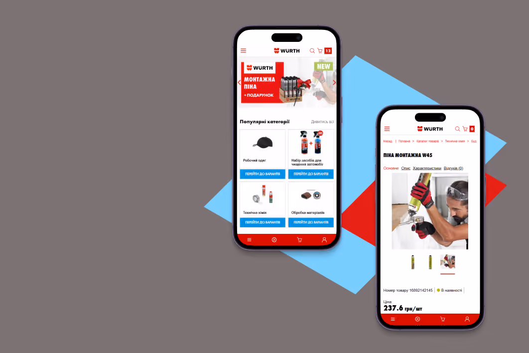
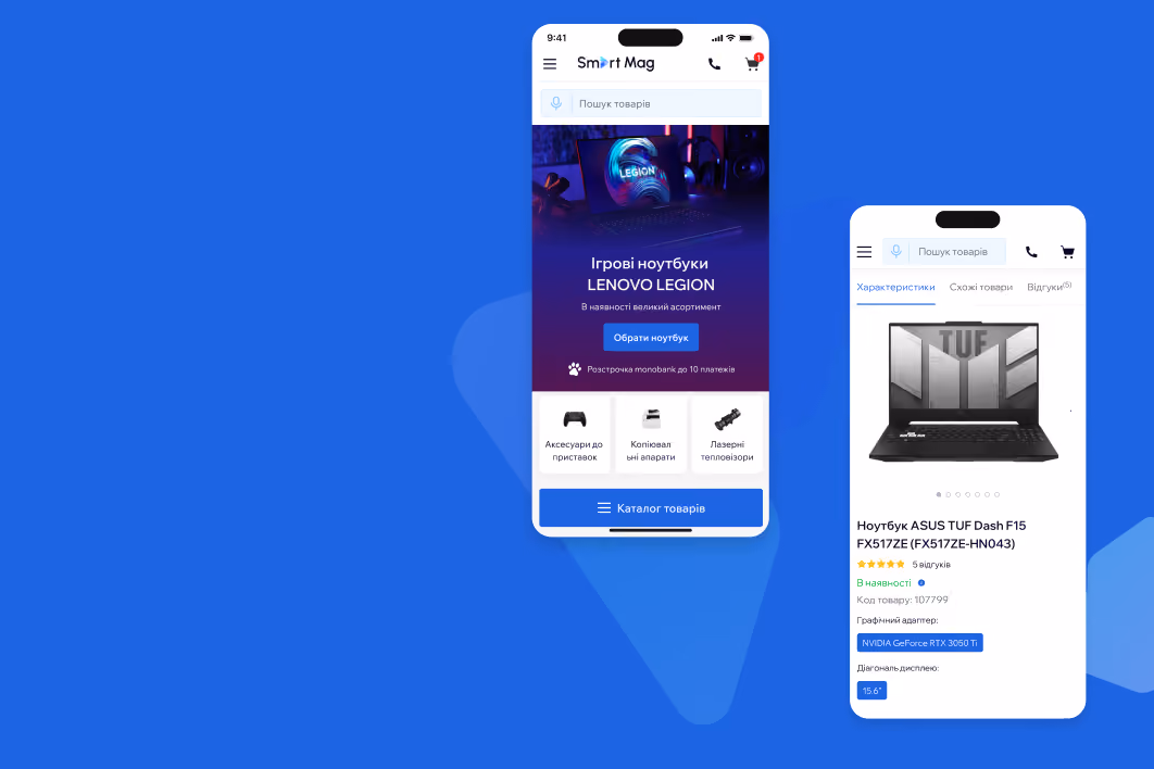
4. Product list that encourages purchase
Problem: Lumier's product cards lacked information that would emphasize the value proposition and lacked key features of each product.

Solution: Display the overall rating of products, information about promotions and sales on product cards in the product catalog, add key product features, and the “Add to cart” button.

Problem: The quantity buttons were too small, and the "Remove" icon was the main focus, causing users to exit the page.
%25201.png)
Solution: Make the quantity selection buttons bigger, change the focus from the remove icon, make the price and quantity block the same size, and move the product name closer to the price/quantity in desktop and mobile
%25202.png)
Website redesign results
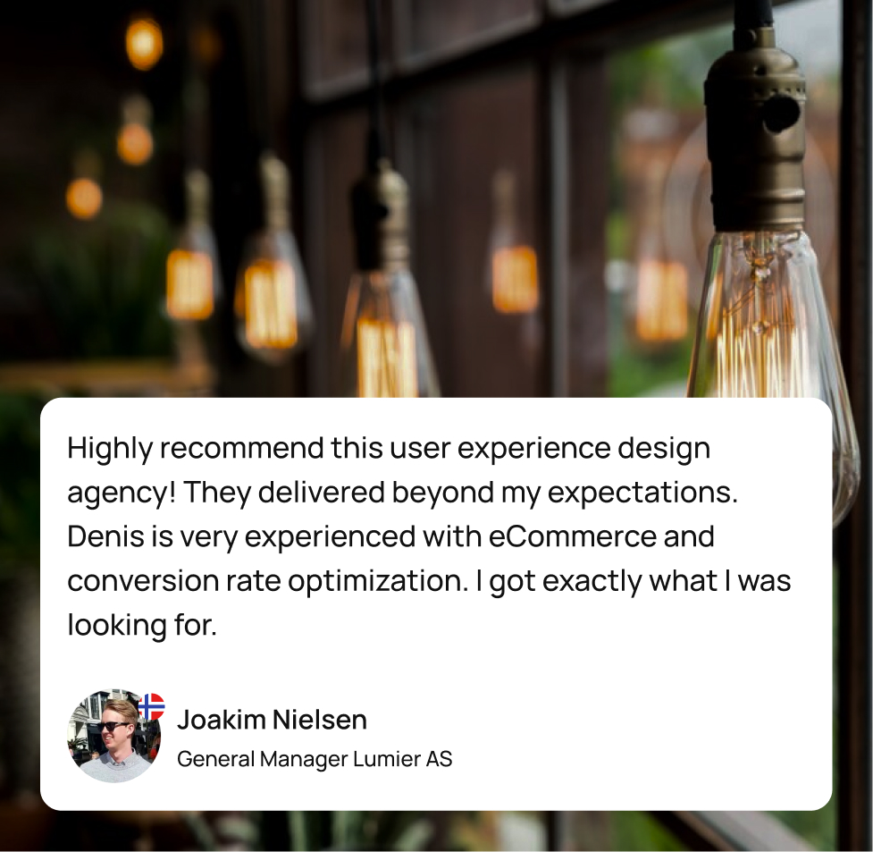
In this case study, we have covered only a small part of the work we have done. Thanks to a high-quality UX audit and effective cooperation with the client, we:
- Identified the most critical usability issues;
- Chose the best redesign strategy for the case;
- Created a user-friendly interface with easy navigation;
- Highlighted the benefits of the products;
- Accented correctly;
- Provided users with the info they needed to make a purchase decision.