About the project
CBD100 is a multi-brand online store in Ukraine that offers popular products with cannabidiol of its own production.
The main tasks of the project:
- Preparing the website for traffic growth;
- Broadcasting brand prestige through the interface;
- Increase in trust and loyalty, audience awareness;
- Optimization of the user journey.
.png)
Key usability issues and growth points
A UX audit and heatmap analysis revealed the main problems to be addressed:
- 97% of users were new, but 48% left the homepage without understanding what CBD is;
- 76% of users leave the funnel on the product page without finding enough information to make a purchase decision;
- Only 1.5% of users passed through the funnel to the end and completed the purchase;
- 75% of traffic is from mobile devices, but the time spent on the site is half that of the desktop, indicating problems with interface adaptation.
We then moved on to optimizing the interface to eliminate these problems and improve the user experience.

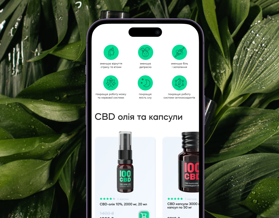
Homepage: engage & drive purchase
Problem: About 30% of users immediately left the homepage because, from the first screen, they did not understand what kind of product was offered, what its advantages were, and how it could help them.
.png)
Solution: Add key information about the product, its value and benefits to the first screens. Add blocks with key brand advantages, product description, benefits, reviews, FAQs, and recommendations, and integrate a block with a map to find offline stores and pharmacies where products can be purchased.
.png)
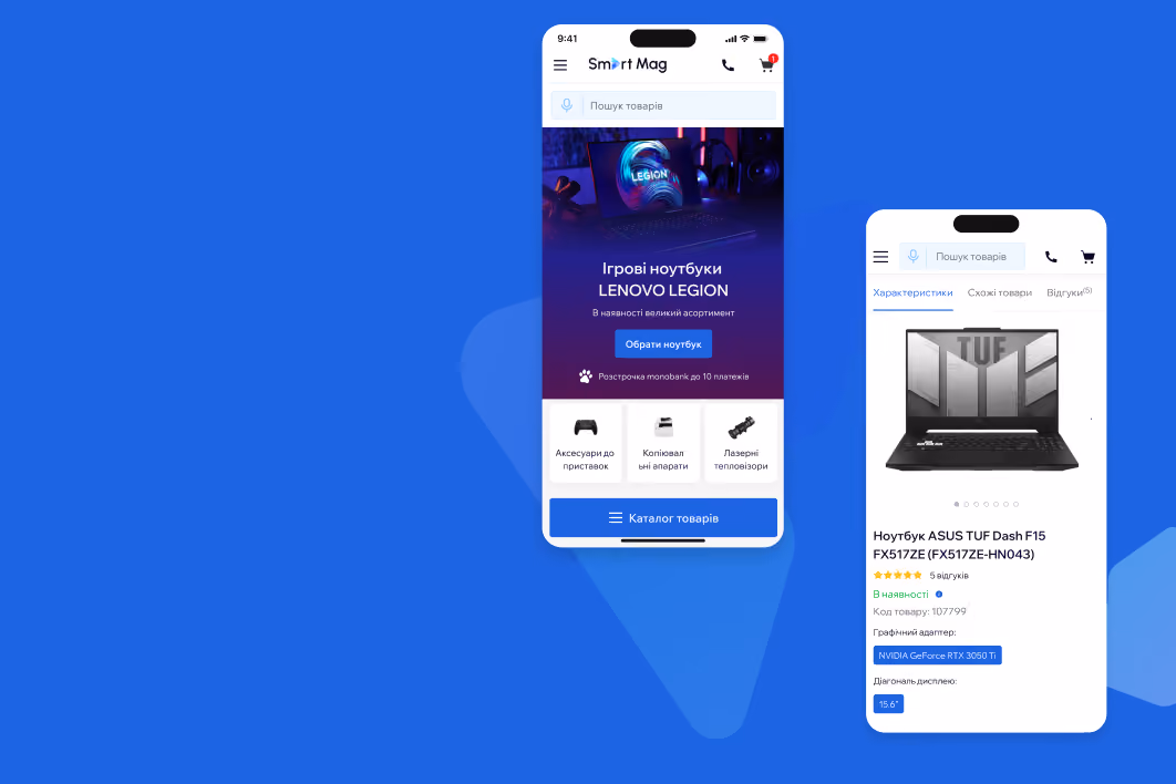
Product page: making clear and easy
Problem: 50% of users reached the bottom of the page but did not proceed to purchase and left without finding the necessary details.
.png)
Solution: Redesign the page structure and add a short block with information on delivery, payment, and returns; links to product certification; reviews with ratings; and interactive blocks with recommendations of similar products, and FAQ.
As a result, the number of exits from the product page decreased by 45%.
.png)
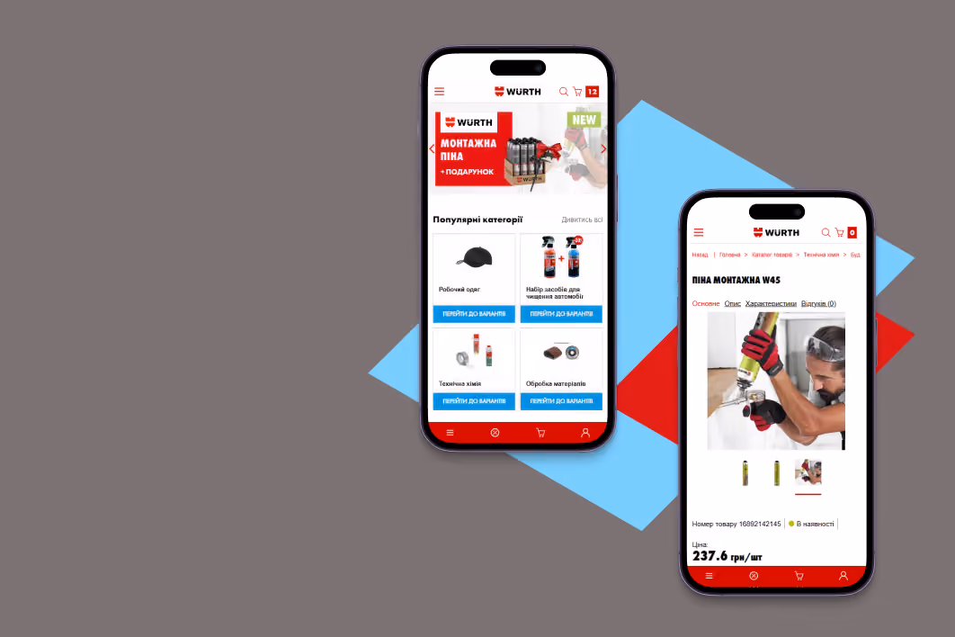
The problem: Mobile device product listings had product photos that took up almost the entire screen, covering important information such as name, price, and rating.
.png)
Solution: Reduce the size of images in the mobile version so that key product information is visible on one screen.
.png)
Checkout: streamlining the process
The problem: About 50% of users left the checkout page due to the unclear form structure, the complexity of fields for various delivery types, and confusion with the page title.

Solution: Simplify the form structure, make it more compact (2/3 of the screen), adapt the fields to different delivery types, and change the page name to “Checkout.”


Results of the redesign
Conducted usability audit, created prototypes and delivered them to the client team. Provided supervision to ensure that UX/UI solutions were implemented correctly to improve site usability and increase conversions. As a result of the changes made, the brand noted that:
- The number of users increased 6 times;
- Bounce rate decreased by 17%;
- Session duration on mobile increased by 32%;
- Exit rate from product pages decreased by 45%;
- Session duration on product pages increased by 198%.