About the project
glo™ – is a BAT brand, which produces devices for heating tobacco sticks. British American Tobacco Plc is one of the world's leading international companies, with products sold in more than 200 markets.
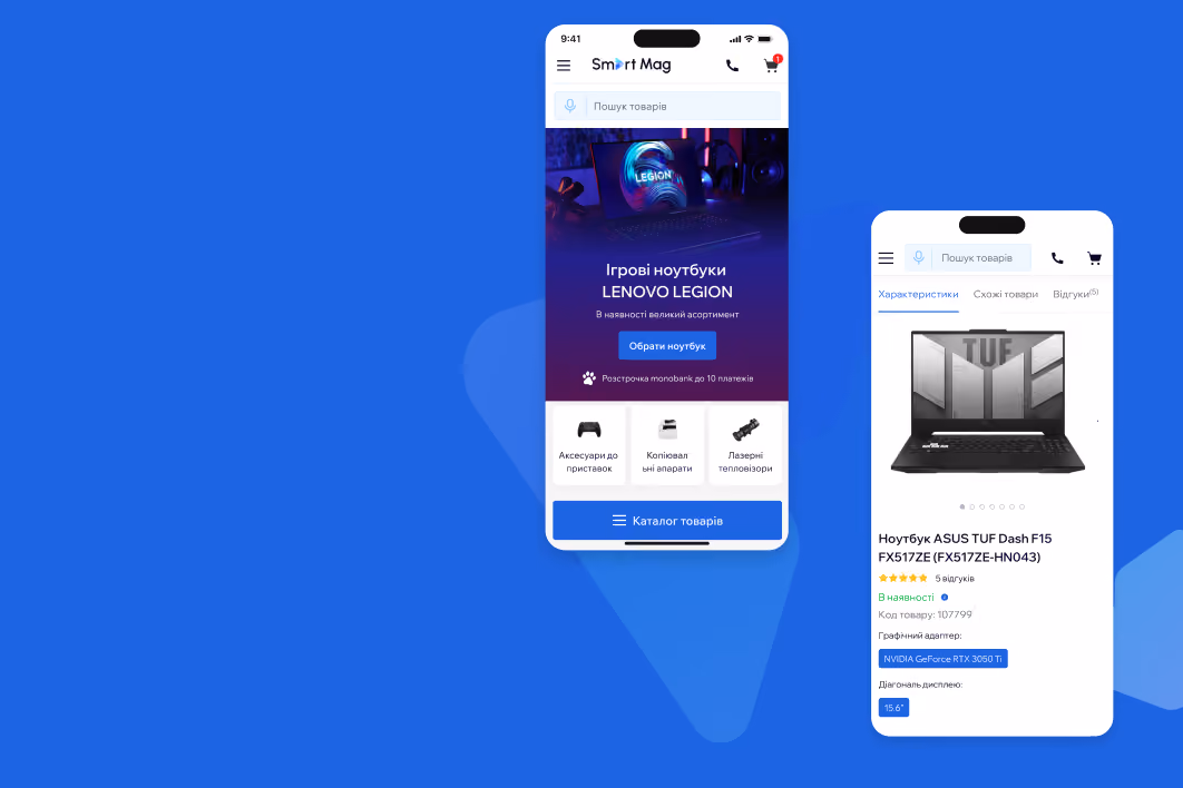
Disclaimer: We are not advertising glo™ products or the glo™ brand, but we are using examples of the website's interface to showcase the work done by Turum-burum studio.
The issues we faced:
- Not correctly configured data collection tools that prevent correct analysis of user interaction with the website and the adoption of relevant decisions on further interface changes and tracking their impact on KPIs.
- The website had numerous usability issues that had a negative impact on key website metrics.
Task:
Improve UX/UI design and adjust GA4 settings for the glo™ website
ESR approach
Since the glo™ website has a recognizable style among users and functions as an established mechanism, we decided to optimize it using the ESR (Evolutionary Site Redesign) approach.
It involves implementing step-by-step changes to the interface to improve the website’s usability and increase the company’s conversion.
Thus, instead of creating a new site from scratch, we use analytics to identify the shortcomings of the current website interface and fix them by applying CRO tactics to increase e-commerce conversion.

Fixing Google Analytics 4 setup issues
We developed a user journey map to determine which flows users can take on the website to manage their objectives.

Then, we devised a scheme of events and parameters that we overlaid on user journey maps to track the behavioral patterns of website visitors at each stage of their interaction with the platform.

Recommendations for fixing usability issues
- identified more than 80 website growth points
- worked out hypotheses for improving the identified usability issues
- developed prototypes of the future glo™ website

1. Poor engagement of regular customers
Problemr: The home page has low scrolling and interaction rates with the website’s elements, which means that it does not fulfil its main task of encouraging users to interact with the website.
Recommendation: Adapt the home page to the interests of regular customers: displaying a list of different product models instead of showcasing 6 identical ones.
Before redesign

The main page after redesign
The home page after redesign: blocks that demonstrate new device models, related products and accessories for encouraging users to move further the website
After redesign

2. Inconvenient option to choose the color of the product
Problem: 40% of users do not view the selected product in other colors and leave the page.
Recommendation: Simplify the color selection option, raise the color indicators higher and place them next to the product photo.
Before redesign

Product card before the redesign: no quick color switcher and a heatmap showing that only 60% of users scrolled to the end of the page.
Product card after redesign:
Convenient color switcher, additional photos in the gallery, reduced page loading time (mobile version)
After redesign

3. Impossible to purchase the selected product quickly
Problem: The page with the product comparison table didn’t have a button for adding the selected product to the cart.
Before redesign

Recommendation: Add a “Buy” button or make product comparison cards clickable so that users can go to the page.
After redesign

4. Wrong accents that resulted in a high bounce rate
Problem: The cart page showed the total price of the order, but there was no fixed button leading to a checkout.
Before redesign

Recommendation: Fix the checkout button on a scroll and shift the emphasis to it to encourage users to complete the purchase.
After redesign


ESR glo™ website redesign: main achievements
When working on the glo™ website optimization, our team focused on two major tasks:
- Setting up data collection tools to get more precise analytics;
- Detecting website’s usability mistakes based on improved analytics and providing recommendations for their elimination.
As a result, within two months after the launch of the new website’s version, we got the following results:
+87% СR
Conversion rates for landing on product cards
+22,31% СR
Conversion for new users
+131% СR
Conversion of users who viewed the glo™hyper x2 desktop device pages