About the project:
SmartMag is an online store of technology and gadgets that started as a startup in 2014. Today, it is a well-known company with thousands of customers across Ukraine, its own pickup points and courier delivery in most regional centers.
Task: To create a modern, customer-oriented online store design, lay the foundation for its scaling, increase conversion and revenue, and strengthen the brand's position among the top players in the home appliances and electronics market in Ukraine.

Migration from the Horoshop platform
As the business grows, the functionality of Horoshop may not be enough. That's why we developed a turnkey UX/UI for SmartMag and implemented it on a more flexible platform together with Linecore.
The main stages of the redesign:
- Detailed UX analysis of competitors
- Audit of the old site and collection of analytics data
- Work on stylistics — creating a high-quality UI design
- Development of UX design based on all collected insights

UX analysis of competitors: insights
Insight #1. A two-level structure of thewebsite menu is optimal: information about the company is at the top, and functional elements are below. The product catalog should be categorized by brand.

Insight #2. It is better to use from 5 to 16 screens on the main page — this allows you to keep the user's focus and not overload the interface.

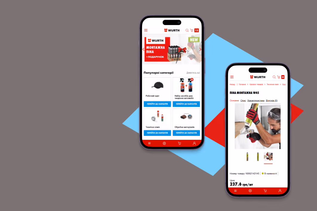
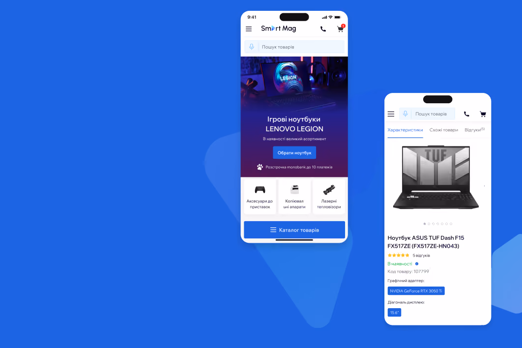
Insight #3. In the mobile version, it is advisable to present the catalog in the form of a burger menu.

And also add a separate button “Catalog” on the main page for quick access.

Insight #4. On the product page, in addition to categories, implement sorting by brand and add blocks such as “See also”, “Top products”, and “Viewed” — this will help create more entry points and improve navigation.

Insight #5. On the product page, navigation through the main sections (“All about the product,” “Features,” “Reviews”) should be fixed when scrolling. All loan offers from banks should be placed in a general pop-up.

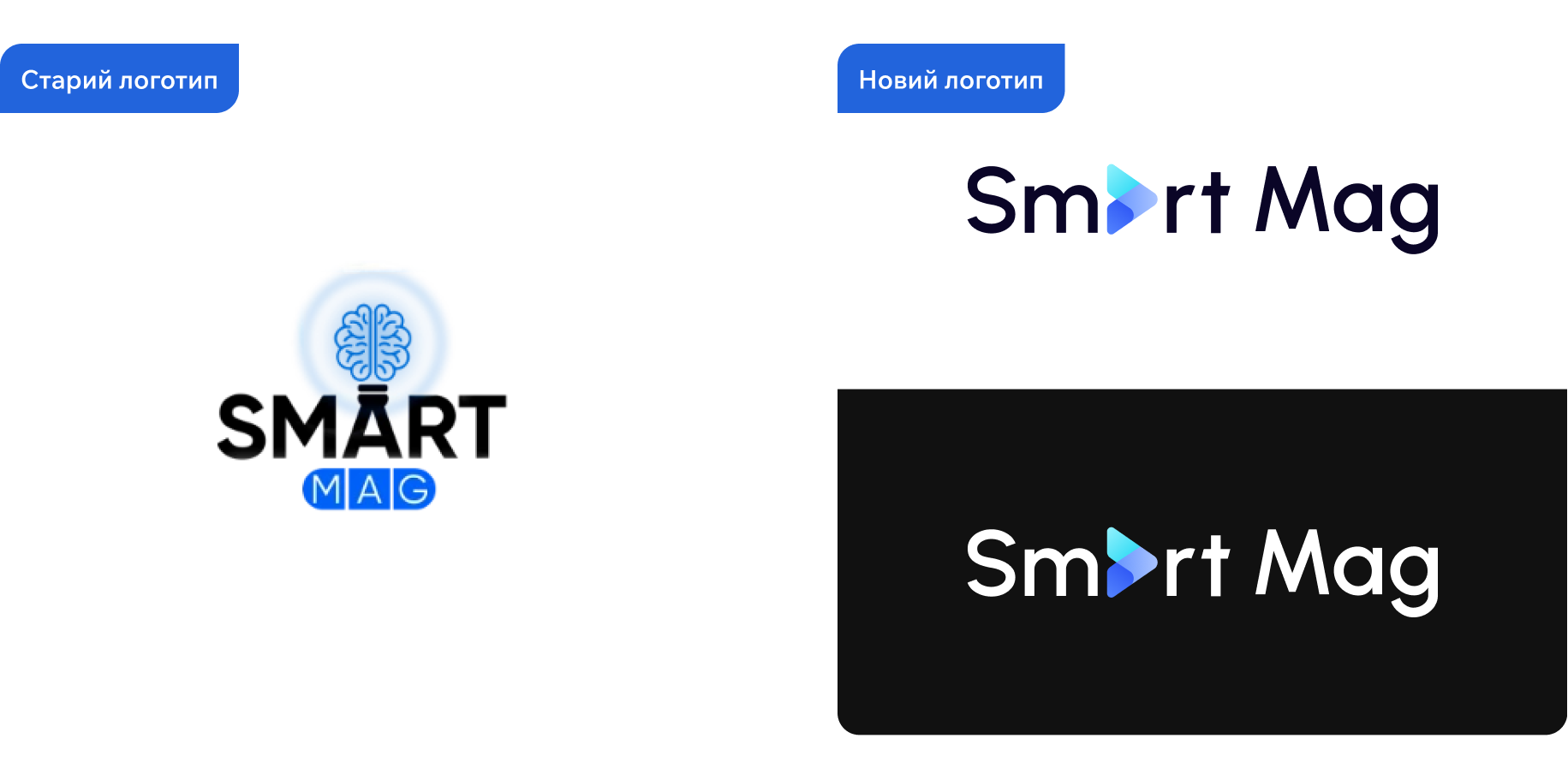
Working on stylistics
We redesigned the logo and created a UI kit for a holistic design and further independent support of the site by the client without losing the identity

We wanted to create a website that would be convenient to use in any place and situation — from a store line to the bathtub. The interface had to be adaptive, intuitive and easy to read on any screen.

To do that, we made the buttons visible and accessible, used contrasting colors and clear icons, provided instant feedback, and optimized the space between elements to avoid accidental taps.

Results
Within a month of launching the site on the new platform, the following results were achieved:
- mobile traffic increased by 42%, mobile conversion by 69%, and page views per session by 96%.
- overall conversion increased by 26%, revenue by 81%, and bounce rate by 69%, which is evidence of improved UX and effective traffic acquisition.