About the project:
Infoshina is an industry leader in the sale of tires and wheels.
- On the market since 2013.
- Over 600,000 online visitors per month.
- An official dealer of Michelin, Goodyear, Premiorri, Bridgestone and Rosava tires in the city of Kharkiv and the Kharkiv region.
ESR approach implies step-by-step point changes in the site design, thanks to which you can quickly improve KPIs.
infoshina.com.ua
Example of an ESR approach in action

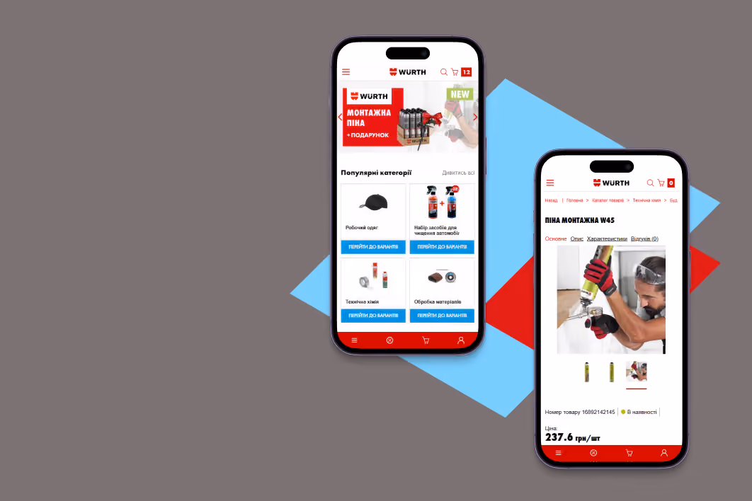
Product card optimization
Hypothesis №1
If you place the panel with the Buy Button all the way to the bottom of the page, the add-to-cart conversion rate from the panel will increase.

Result:
The micro conversion rate for the transition from the Product Item Card
to the cart increased by 85.57% after moving the Buy Button
to the bottom of the screen..
to the cart increased by 85.57% after moving the Buy Button
to the bottom of the screen..

Hypothesis №2:
If you fix the indentation between the elements and remove the extra "Articles" blocks, the banner without a clear benefit and raise the cross-sale blocks higher, you can increase the number of product additions to the cart.


Result:
The micro conversion of the transition from the Product Item Card to the cart increased by 13,26%, according to the A/B testing results.

Pop-up cart optimization
Hypothesis №3:
If you remove the "Continue shopping" button and change the color of the "Checkout" button to a more noticeable color, you can increase the number of transitions to the checkout page after adding an item to the cart.


Result:
The micro-conversion of the transition from the cart to the checkout increased by 14,8% after we left one priority button "Checkout" and changed its color to a more noticeable one in relation to the other interface elements.