About the project
Unilamp is a global brand in architectural lighting, shaping urban and business spaces since 1993. Their focus is on reliability, high-end design, and constant innovation in outdoor lighting.
The old website, built on a WordPress template, looked more like a basic B2C shop than a professional B2B platform. It didn’t meet the expectations of corporate clients and wasn’t ready for scaling.
Task
- Conduct a full usability audit and test over 50 UX hypotheses.
- Perform a step-by-step redesign: don't completely revamp everything, but gradually improve key points of interaction.
- Strengthen trust and make the site more functional for the B2B audience.
- Increase conversion and usability while keeping WordPress + e-commerce.

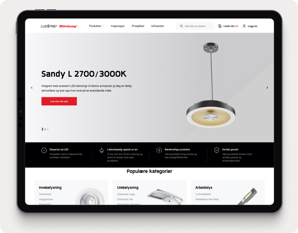
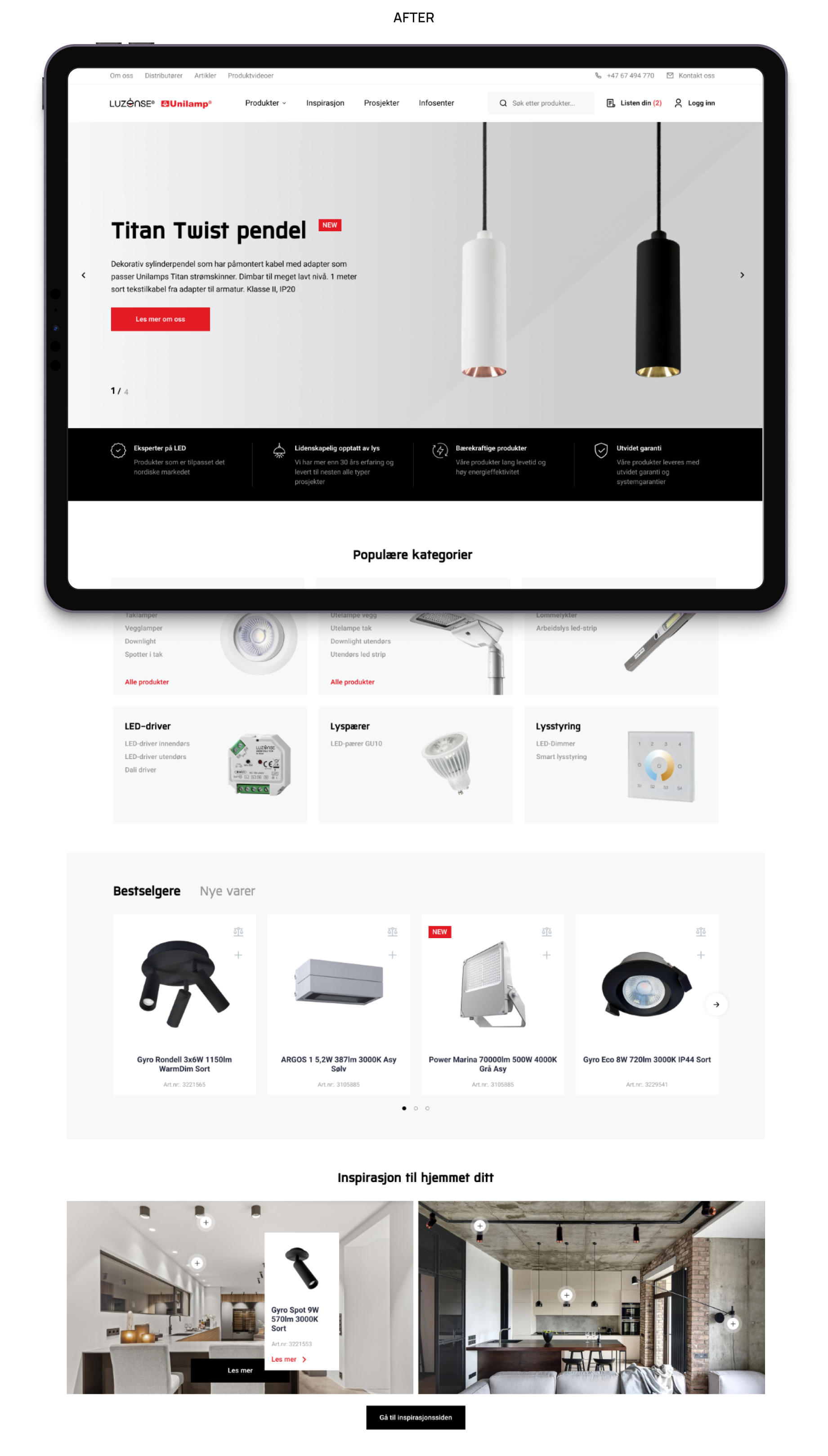
Homepage: informing and selling
Before:
- No visual hierarchy: headlines, subheadings, and the “Read more” button blended into the banner and went unnoticed.
- 41% of new visitors missed key company information (story, benefits, achievements).
- Product previews and categories were limited to images and basic details, while CTAs were almost invisible.
.png)
After:
- Clear visual hierarchy with contrasting headlines, subheadings, and noticeable CTAs.
- Added an “About the Company” block with key information for new visitors.
- Optimized navigation: categories and important blocks are now displayed on the first screen.
- Product previews became more informative with specifics, benefits, visible CTAs, etc.
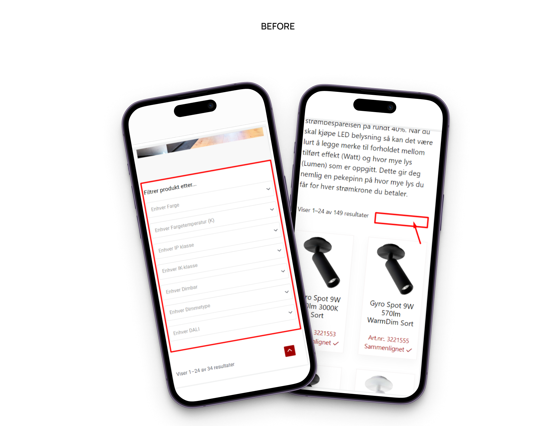
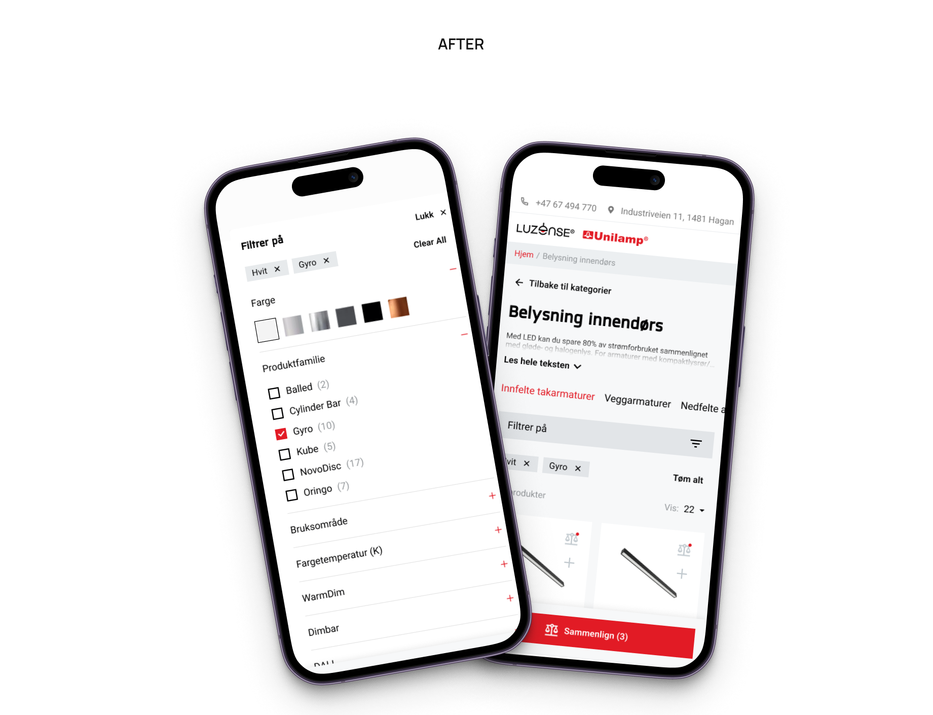
Category page: helping to choose
Before:
- On mobile, filters stacked in a single column with page reloads after each change.
- Product cards lacked a “Buy in Shop / Buying Options” button, making it harder to purchase.
- No comparison feature plus the test icon looked like “copy,” confusing users.
After:
- Added a Filters button leading to a dedicated page with grouped parameters (price, size, color).
- Introduced a clear “Buy in Shop / Buying Options” button to every product card.
- Implemented a product comparison feature with a familiar icon placed in the upper right corner.
No items found.
Product page: maximum information
Before:
- No clear CTAs, warranty info, reviews, or product color variations.
- Long, unstructured pages: one-column photos, hidden specs and documents on mobile.
- No cross-sell or upsell blocks (“Related products,” “You may also like”).
- Lacked extra triggers to purchase (video reviews, detailed specifics).
After:
- Added strong CTAs (“Buy in Shop / Buying Options”), warranty details, color variations, and customer reviews.
- Structured pages with a fixed navigation (Overview, Specs, Docs, Reviews), photo carousel, and mobile-friendly specs/documents.
- Added cross-sell and up-sell blocks plus videos, animations, and first-time buyer promos (e.g., –10% off your first order).

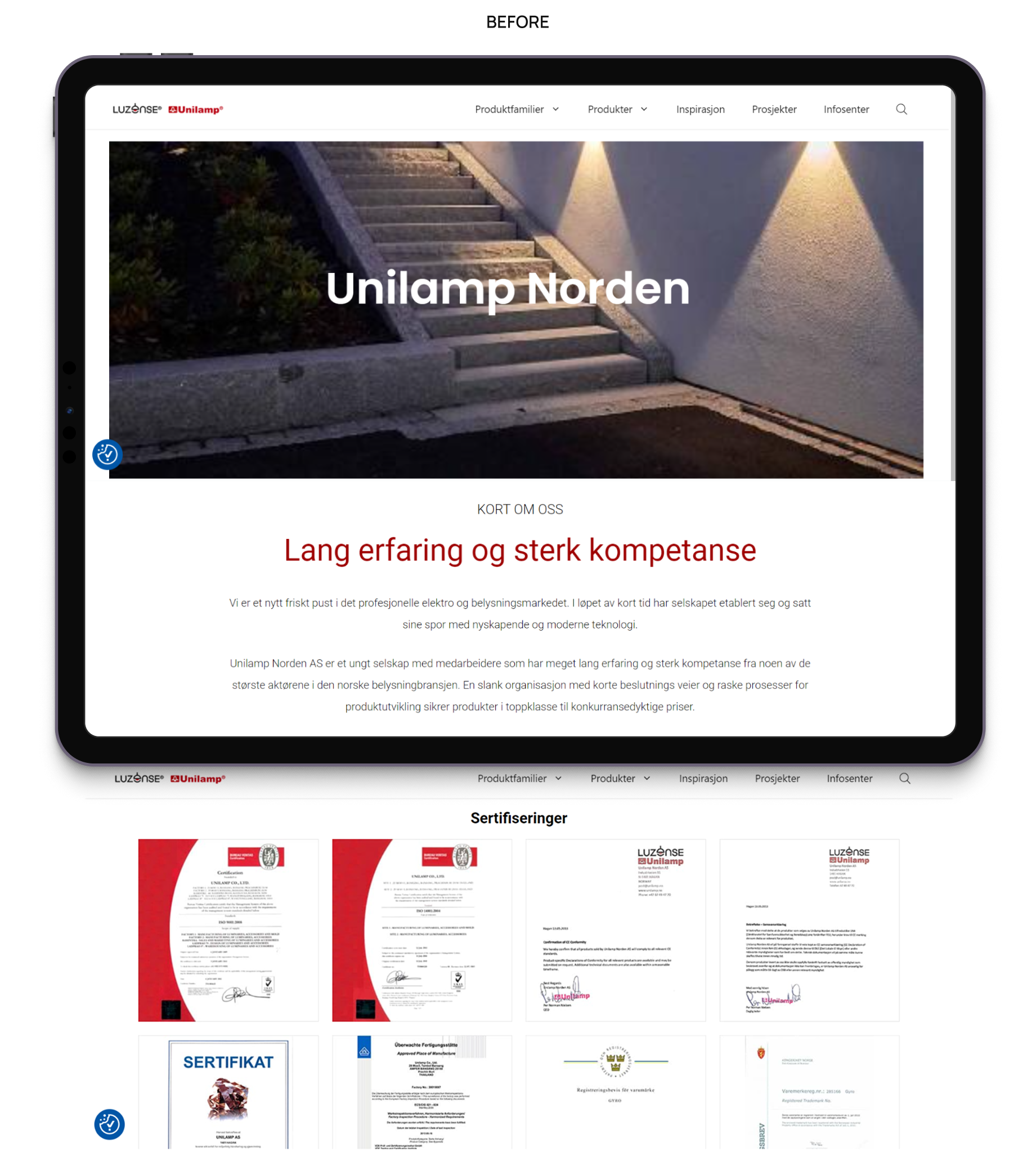
About the company: crucial page for B2B
Before:
- Oversized images pushed important content below the fold.
- Text was hard to read (center-aligned, long lines).
- Certificates and distributors sections took up too much space.
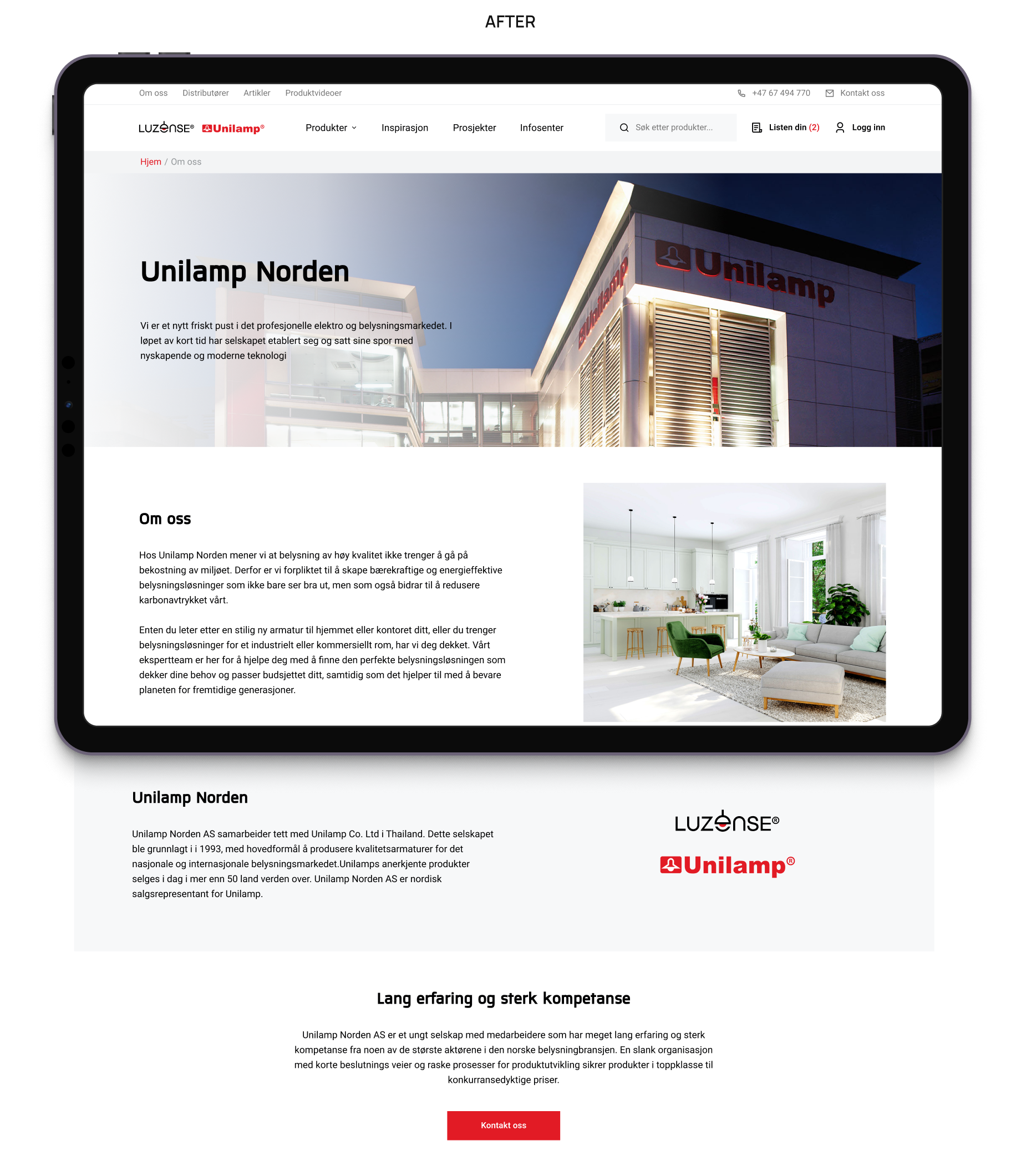
After:
- Replaced static visuals with informative blocks, text aligned left for readability.
- Sections are simplified and unified, with icons/sliders instead of pictures.
- Added horizontal scroll for certificates and distributors.
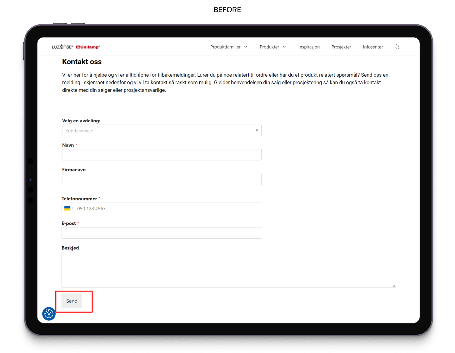
Contact us: so that people actually can get in touch
Before:
- Wide text, oversized form, and invisible “Send” button. No phone number or FAQ.
- Form didn’t explain errors when entering email/phone.
- Team section was too long: each member in a separate row → endless scrolling.
After:
- Combined text and form, added phone number, FAQ, and highlighted “Send” button.
- Added field hints with correct input examples.
- Optimized the “Team” page for easy browsing on both desktop and mobile devices.

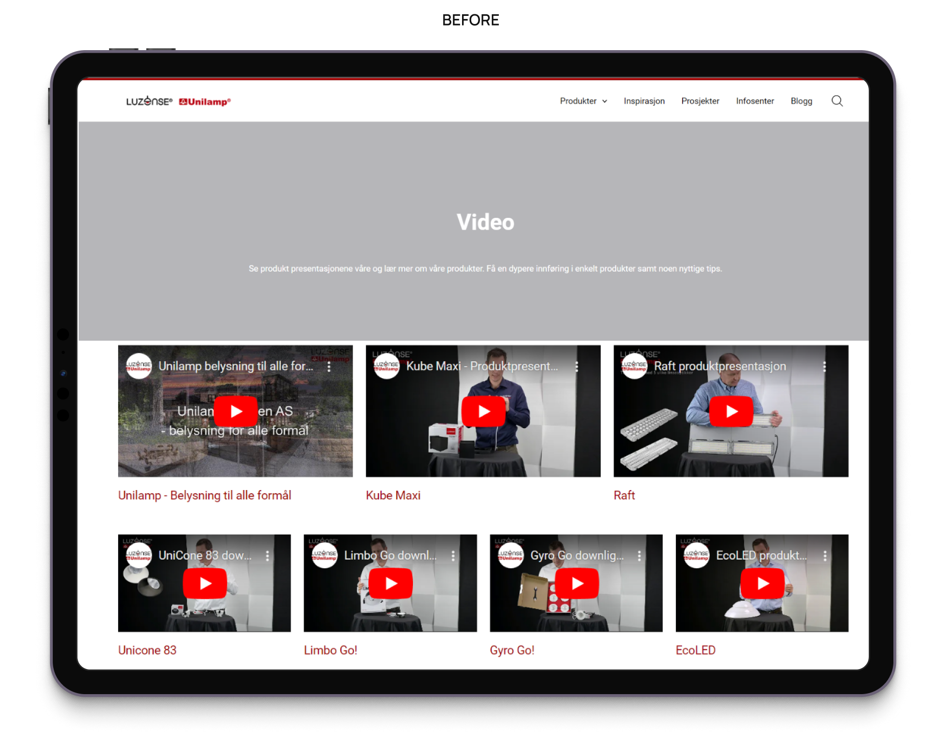
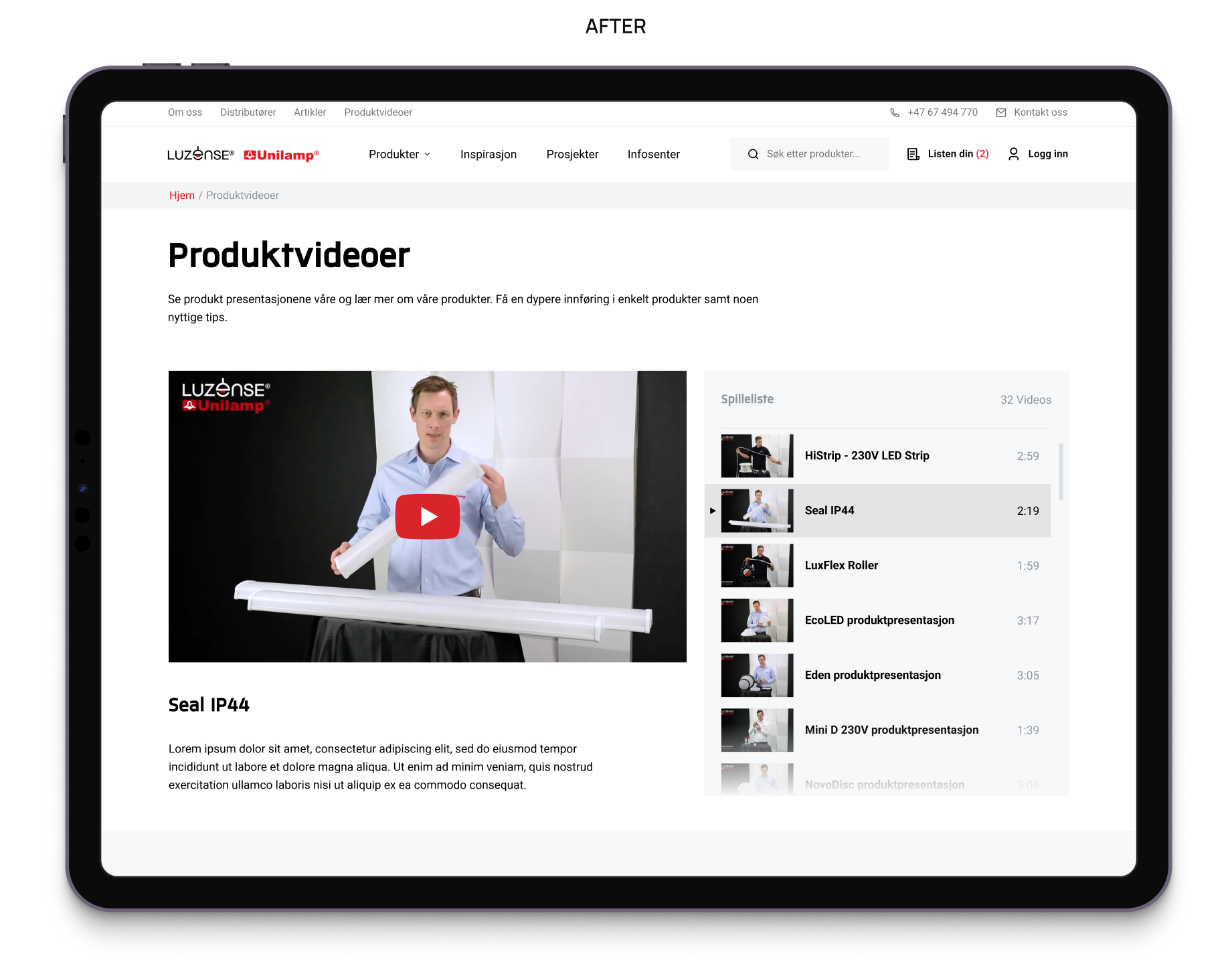
Video: presenting products and increasing loyalty
Before:
- Gray banner looked dull and failed to attract attention.
- Videos had no short descriptions, leaving users unsure what each one was about.
- If a video wasn’t relevant, users simply left instead of exploring other sections.
After:
- Redesigned banner with bright, contrasting visuals.
- Added short, informative descriptions for each video.
- Linked to other sections like Inspiration and Featured Products to encourage browsing.
Results
Through a gradual redesign, Unilamp transformed its website into a trustworthy B2B platform and an effective business tool.
As a result, the website's KPIs increased:
- +30% user engagement.
- +41% conversion (requests left on the website).
- +16% average session duration.