About the project
Lullaby is a multi-brand beauty store offering premium original cosmetics, perfumes, and accessories, operating since 2019.
Challenge: Analytics showed that most of the audience was mobile, but they spent 4 times less time on the site than desktop users. Most of the traffic came from new users who bought less than returning users did. The bounce rate was high, reaching critical levels on product pages.
The site needed deep mobile optimization to convert the audience attracted from social networks into buyers.
Tasks and objectives
Lullaby needed not an aesthetic redesign, but UX/UI solutions to improve efficiency:
- Conduct a UX audit to identify and eliminate barriers in the sales funnel for mobile users;
- Increase brand trust by emphasizing product originality;
- Simplify navigation and shorten the path from login to product page;
- Speed up product selection (brands, filters, variations, card readability);
- Optimize the shopping cart and checkout so that more users complete their purchases.
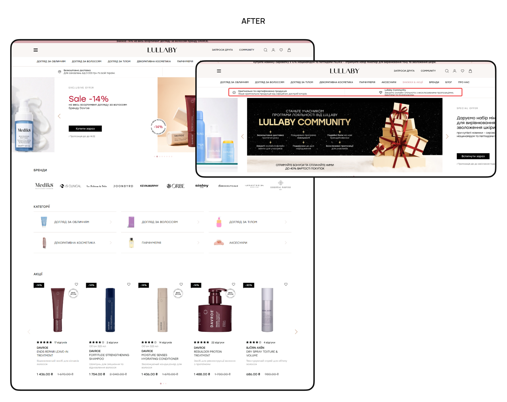
Navigation and homepage
Before: Complex navigation: the menu wasn't fixed on scrolling, there were extra elements (open search, duplicate icons in the burger menu) that forced users to keep scrolling, and there were no breadcrumbs to return to categories. Information about product originality (key USP) and the “Promotions” section were located too low, so almost all visitors did not notice them.
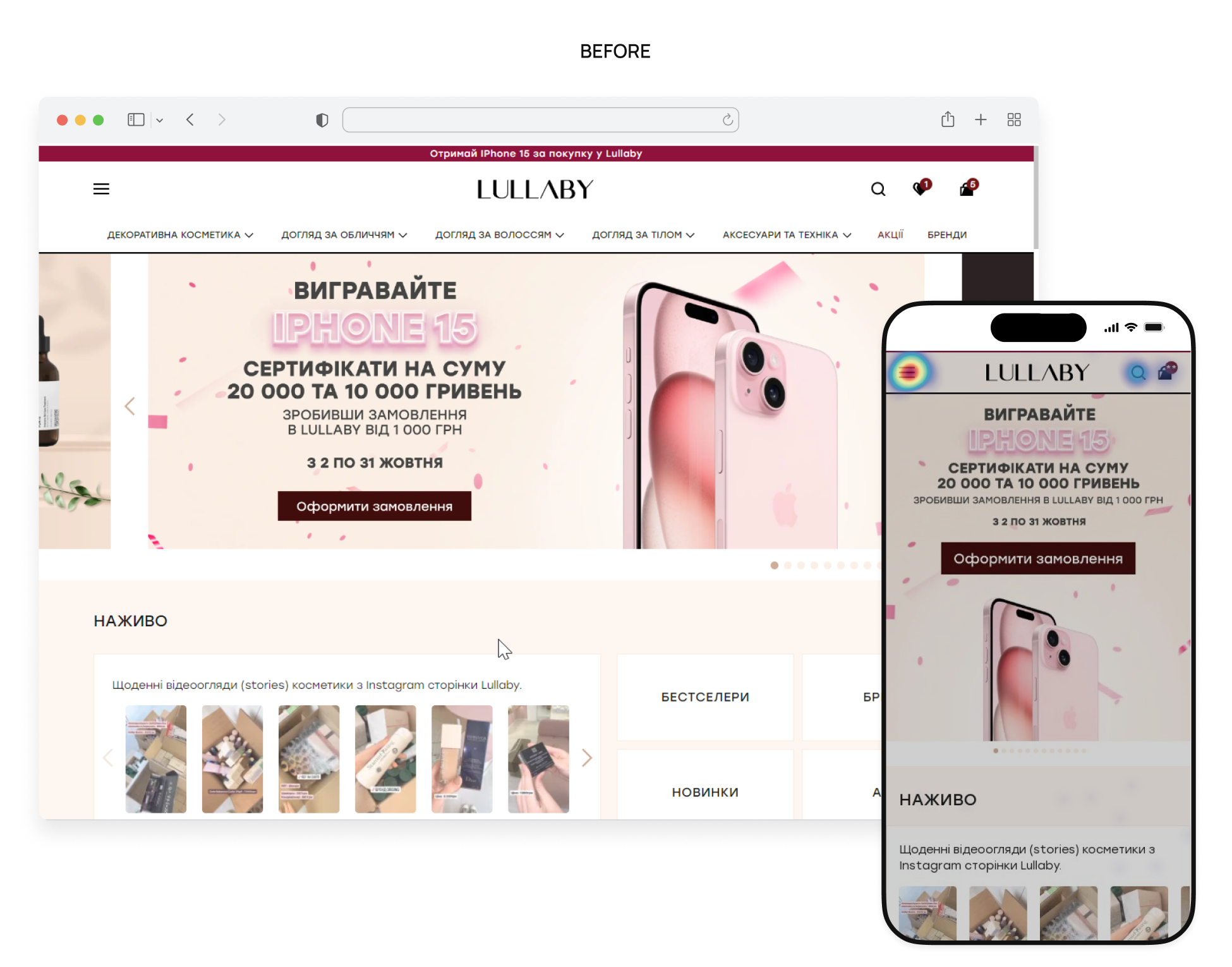
After: Suggested to implement Sticky Header, fix navigation, remove unnecessary items from the burger menu, move the catalog higher, and bring “Promotions” and “Brands” to the top for quick access, and move the USP about product originality and fast delivery to the second screen to build trust at once. Also, add breadcrumbs and fixed menu closure so that users can navigate the site faster without repeating actions.
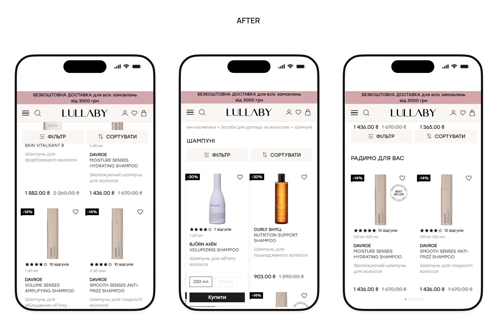
Category listing page
Before: Filters weren't fixed on the scroll, forcing the user to go back to the top all the time. Product pages weren't informative: small photos, big white spaces, and no color/volume indicators made you go to the product page for details. At the end of the search results, there was nothing to lead the user further — if they didn't find what they were looking for, the session would end.
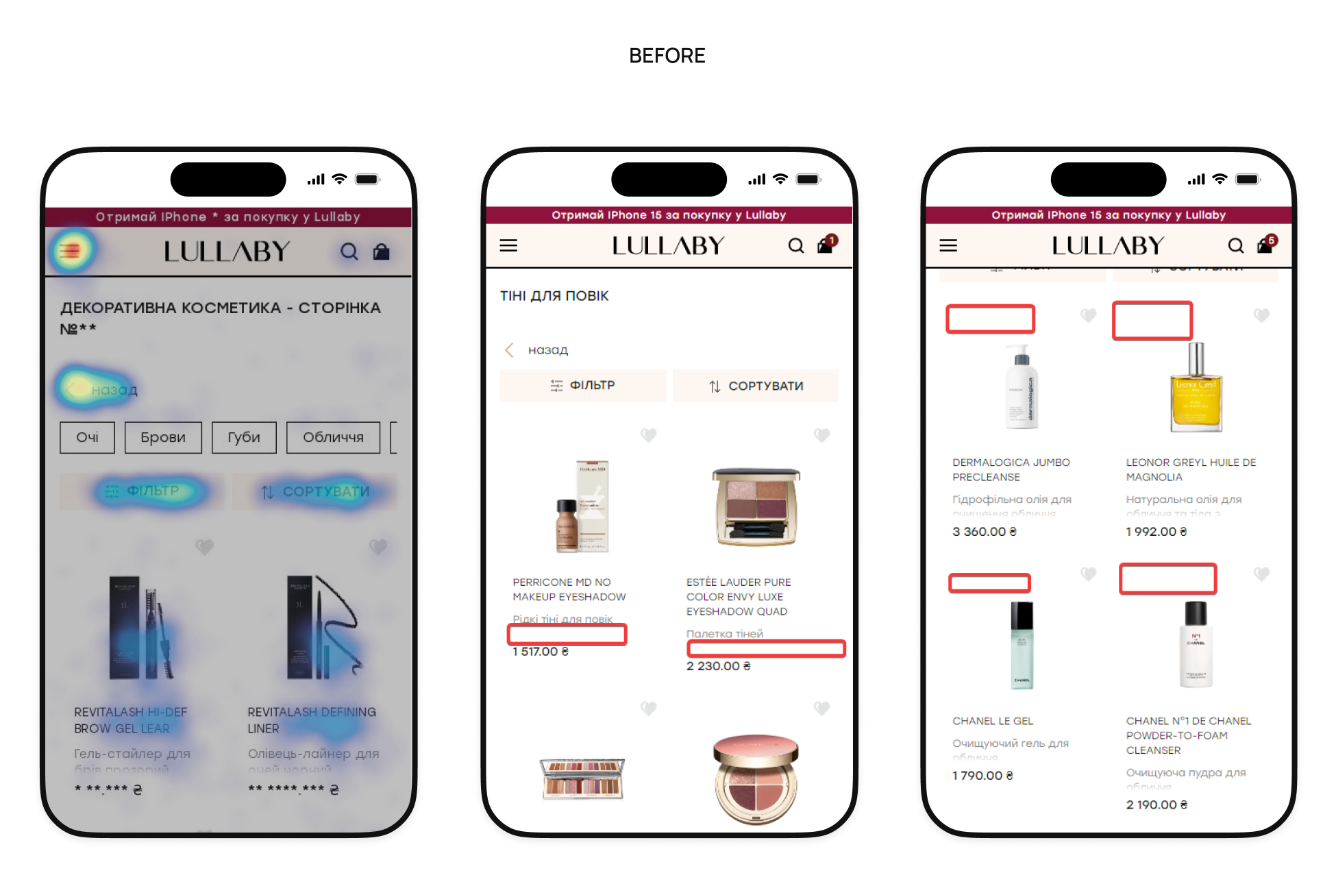
After: Fixed filters were implemented for instant access to settings. Product pages were optimized by enlarging photos and adding variations (color, volume) directly to the list. Sorting by “Popularity” was also added to highlight trending products. A block with Viewed/Recommended products was placed at the end of the list to reduce exits and increase depth.
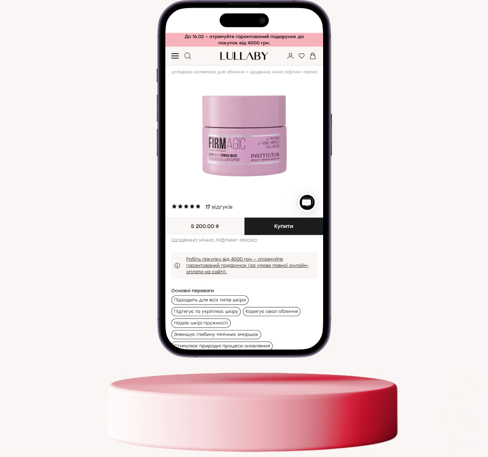
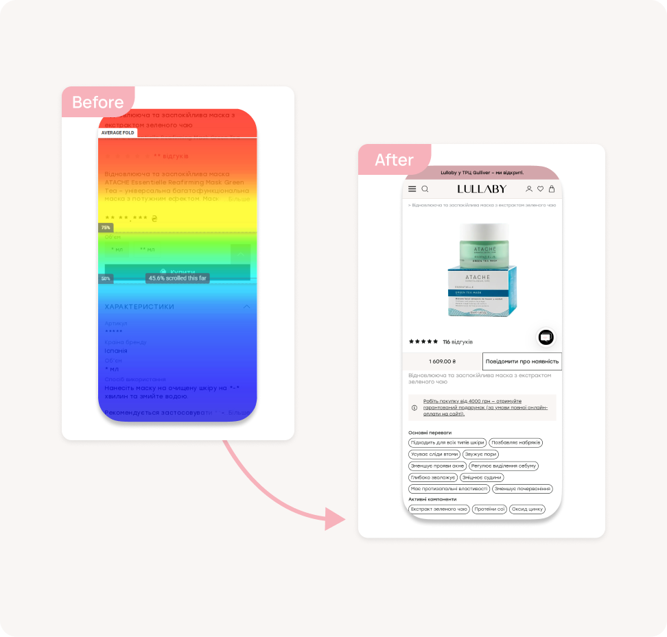
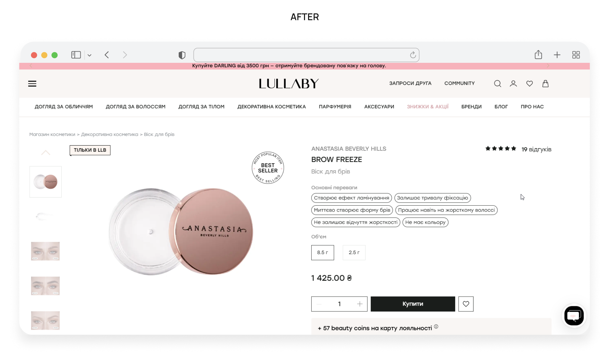
Product details page
Before: Price and the “Buy” button weren’t on the first screen and got hidden on scrolling. The description, specifications, and usage instructions were merged into a single block, and product variations (size/color) were far from the photo, causing users to scroll constantly and potentially make mistakes. The “Similar Products” block displayed irrelevant items, and users had to search the site separately for payment and delivery information.
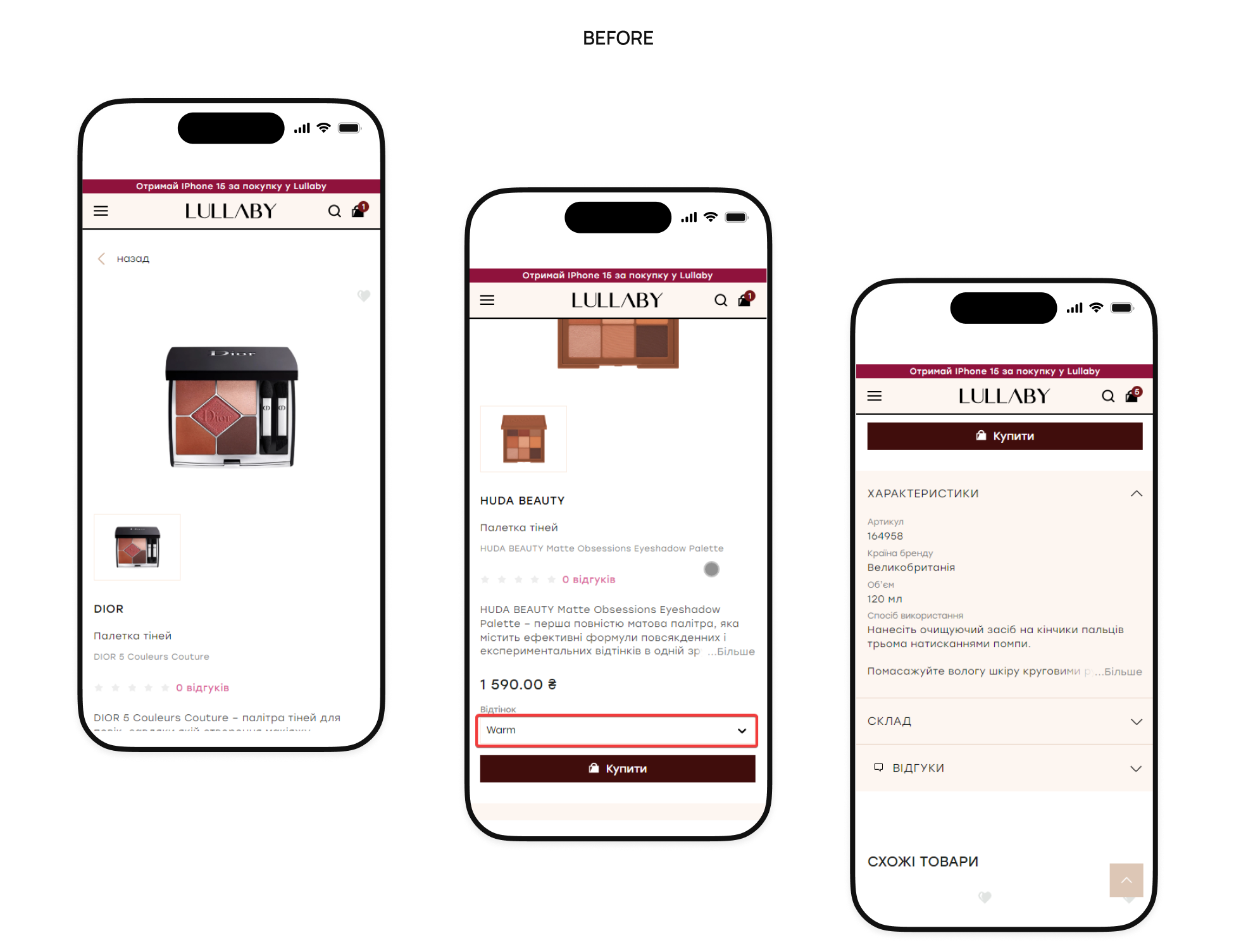
After: Fixed the price and “Buy” button during scrolling for instant ordering. Divided the description, characteristics, how to use, ingredients, and certification into convenient tabs and set up relevant complementary products. Also added brief information about delivery and availability in offline stores directly to the page.
Shopping cart
Before: Promotional banners visually blended in with the products. It was not possible to enter a promo code at checkout or save a product to “Favorites” when deleting it, which led to a loss of interest.

After: Products were clearly separated from promotional blocks, and a promo code field was added. We recommended implementing a “Save to favorites” feature when removing a product and added cross-sell blocks directly to the shopping cart to increase the average order value.

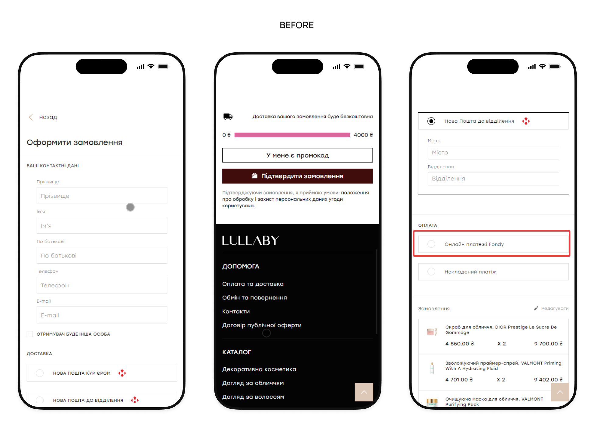
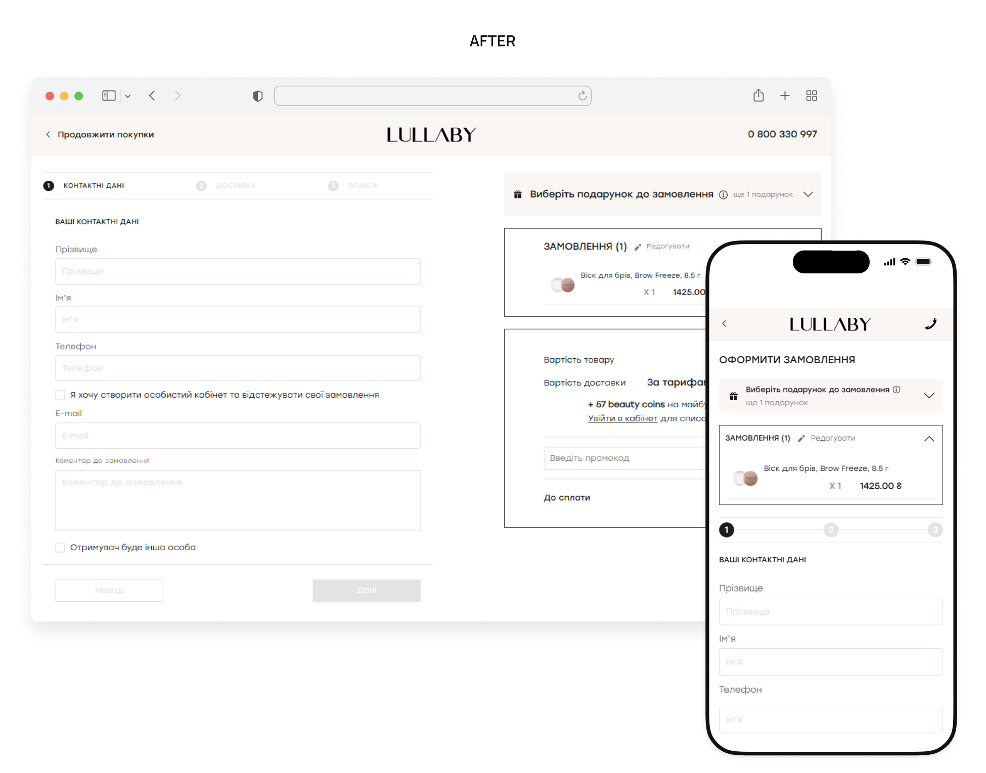
Checkout page
Before: There was no logo or support phone number, but there was a distracting footer. If the user returned, the data was not saved and had to be re-entered. The delivery city had to be entered each time manually, the free delivery message could be distracting and cause users to return to previous steps, and the names of payment methods (such as Fondy) were unclear.
After: A simplified header with a support phone number and logo was added, and auto-saving of entered data and editing of the shopping cart via pop-up were implemented. To speed things up, we added a list of frequently visited cities and clearer payment names (e.g., “Pay by card”). The free delivery message was moved to the shopping cart, and the checkout process was simplified by dividing it into clear and understandable steps.

Results
As a result, Lullaby received not just a list of recommendations, but a comprehensive system of changes for stable KPI growth:
- Mobile-first CRO roadmap: a prioritized plan of action focused on mobile traffic and new user conversion.
- Shortened path to purchase: optimized navigation, refined filters, and relevant recommendations that simplify selection and build trust.
- Clear purchasing process: transparent shopping cart structure, auto-save data, and distraction-free checkout to minimize doubts.
- Retention strategy: tools for customer return (selection, personalization) and strengthening the potential of the Lullaby Community.