About the Project
Wixez is an international fashion accessories retailer with over 10 years of experience and customers in more than 70 countries worldwide.
Despite having a strong brand and a broad product catalog, the store struggled to convert first-time users. Most users left after viewing only a few pages or without exploring, lacking the information, trust signals, and confidence needed to continue their journey and make a purchase.

Goals and Objectives
- Increase engagement and trust among new customers;
- Simplify product discovery, navigation, and search;
- Optimize the user journey from product browsing to purchase;
- Improve the mobile shopping experience;
- Create a UX roadmap for further conversion optimization.

Homepage & Navigation for Better Engagement
Before:
- A single accent color made CTAs blend into the interface;
- The banner had no obvious controls or indication of additional slides;
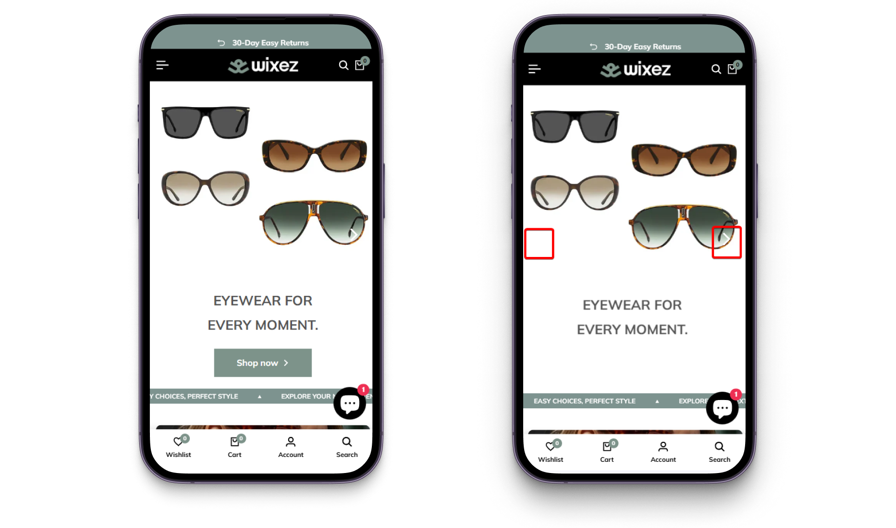
- Mobile users had to navigate between two separate navigation systems (top bar + tab bar with no catalog acces);
- Homepage categories too broad with product blocks limited to discounts and bestsellers;
- In the side menu, product categories are visually similar to informational pages.

After:
- Introduced a stronger visual hierarchy with more prominent CTA colors and separate contrast colors for product card tags;
- Added visible slider controls and pagination indicators;

- Simplified mobile navigation by removing duplicate mobile tab bar;
- Product and informational sections visually separated in the menu;
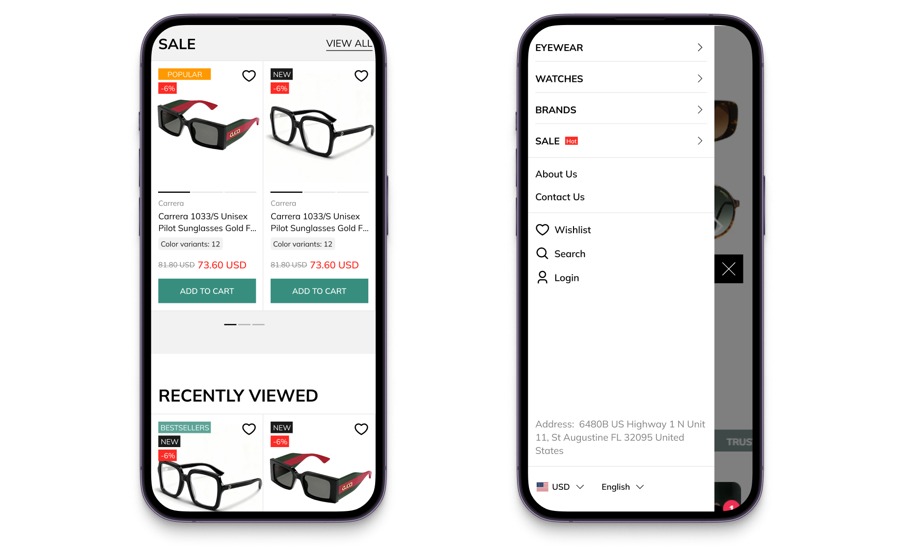
- Expanded category navigation, introduced a Popular Brands section, and added diverse product collections for better user engagement.

Catalog & Search for Easier Product Discovery
Before:
- Navigation elements such as breadcrumbs and category shortcuts were placed in the unusual for customers place, which didn't follow familiar behaviour patterns;
- No subcategories before the listing (e.g. by frame shape, mechanism type, style) to help narrow down the selection;
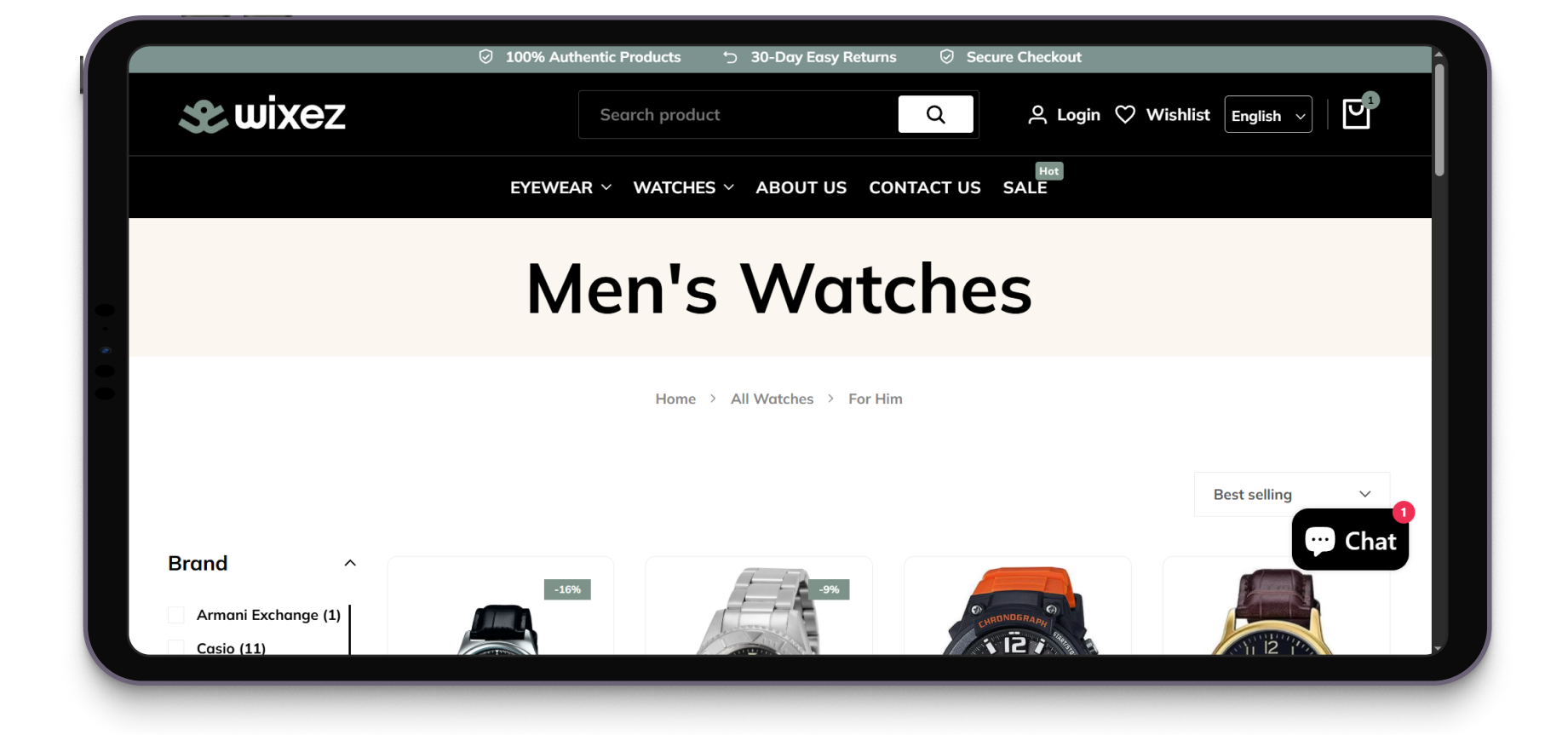
- The filter button was non-fixed, poorly placed, and without a text label, while the panel closed after each parameter selection;
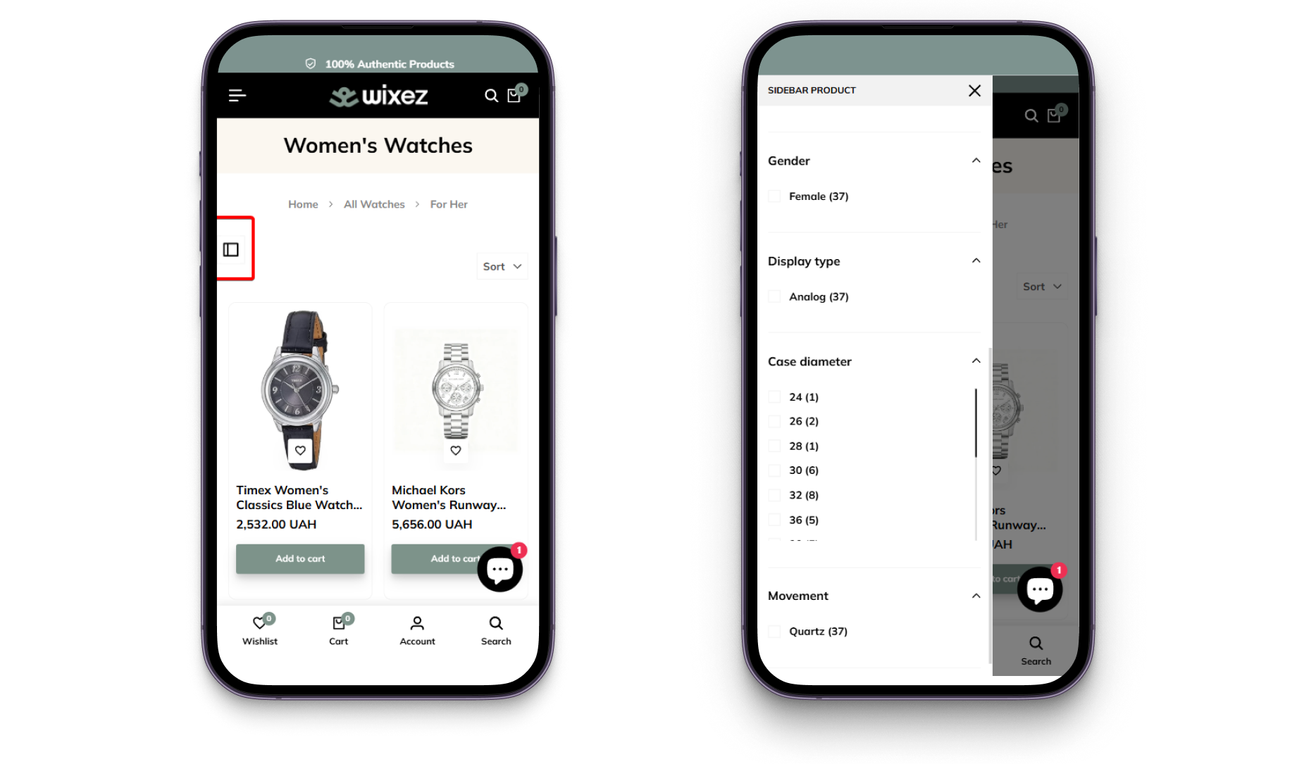
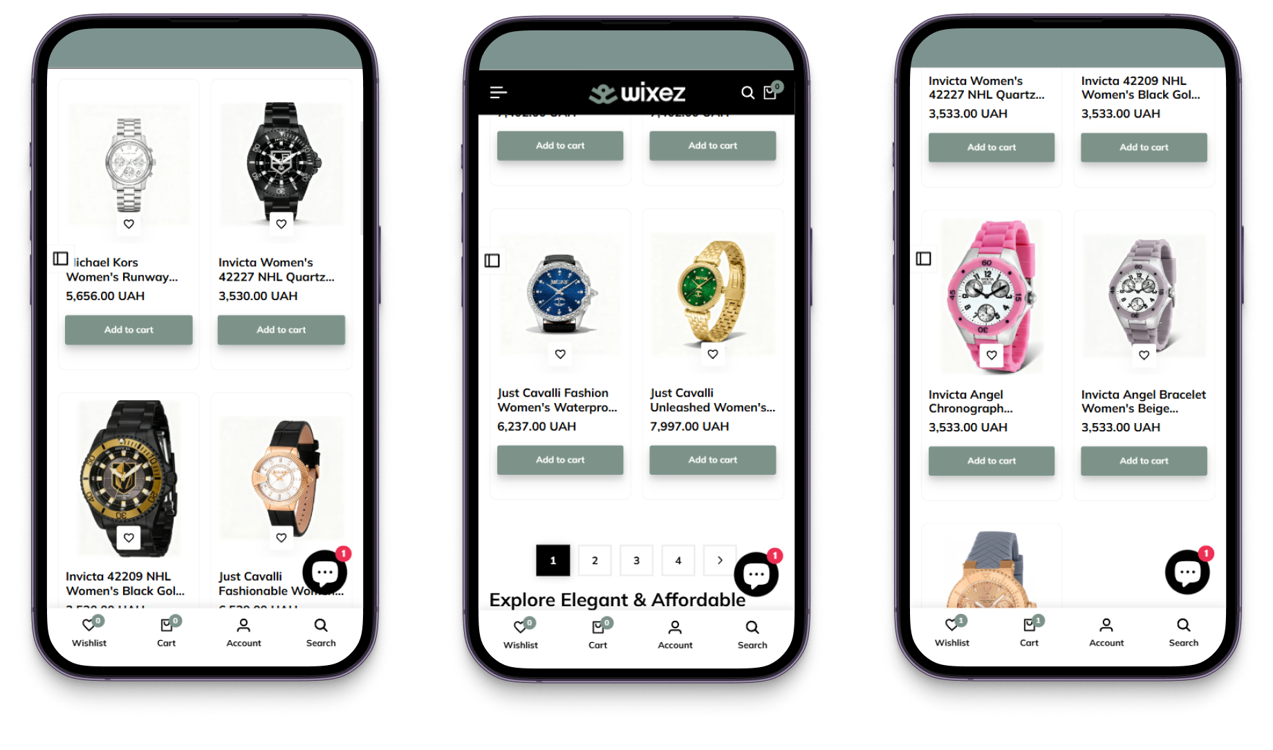
- Long category pages featured too few products shown;
- Wishlist icon overlapping product images in cards;
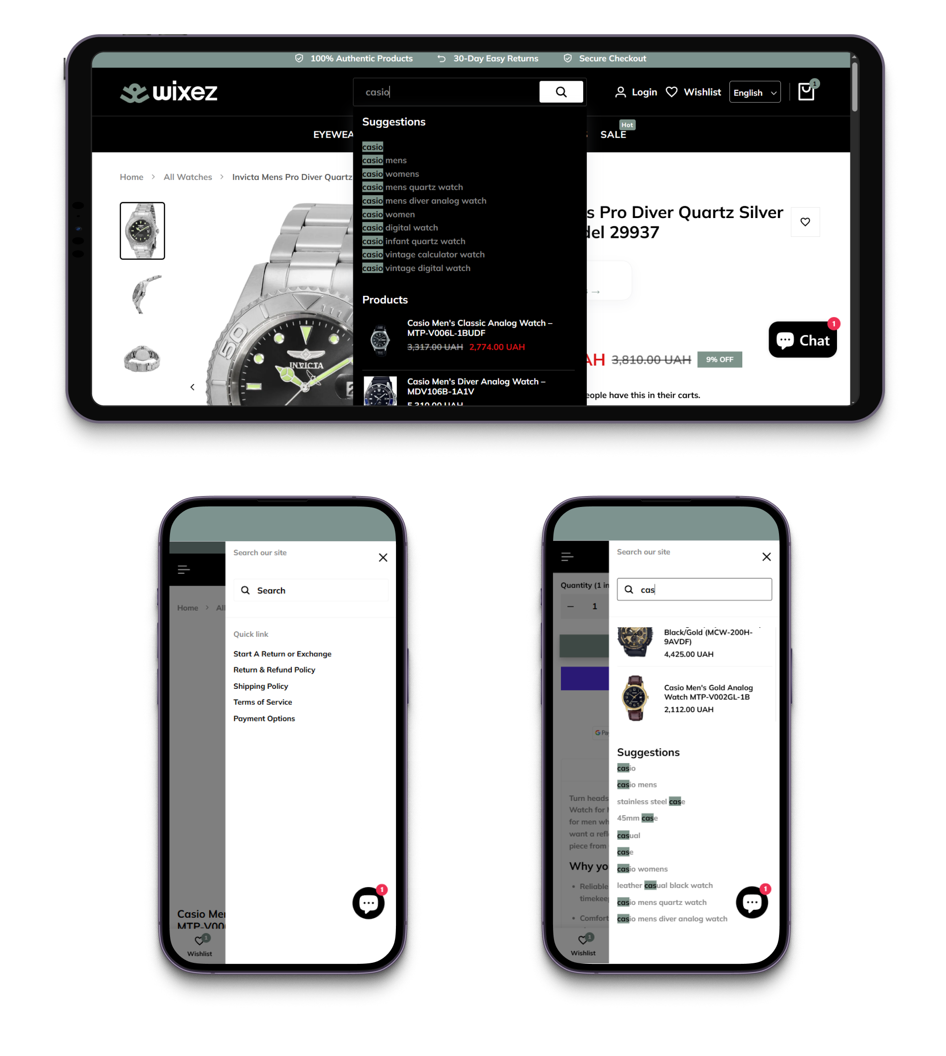
- Search occupied only part of the screen and was ineffective as long as its empty state showed only informational pages.
After:
- Moved navigation elements to more familiar and expected places;
- Added a subcategory shortcuts above product listings to speed up product discovery;
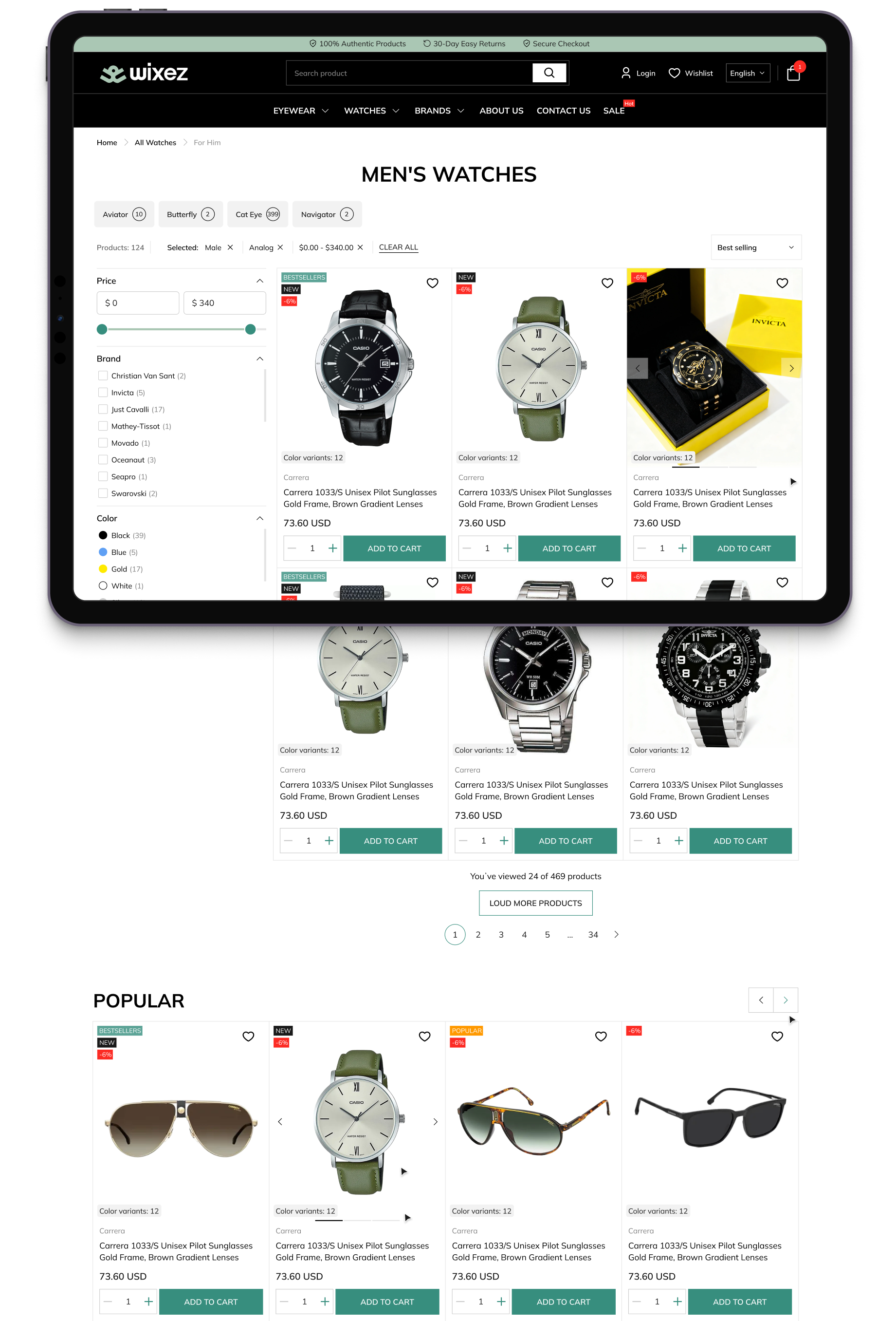
- Replaced filter button with a text label and sticky scroll behavior, and multi-selection support;
- Wishlist icon moved to the top right corner of the card so it no longer overlaps the image;
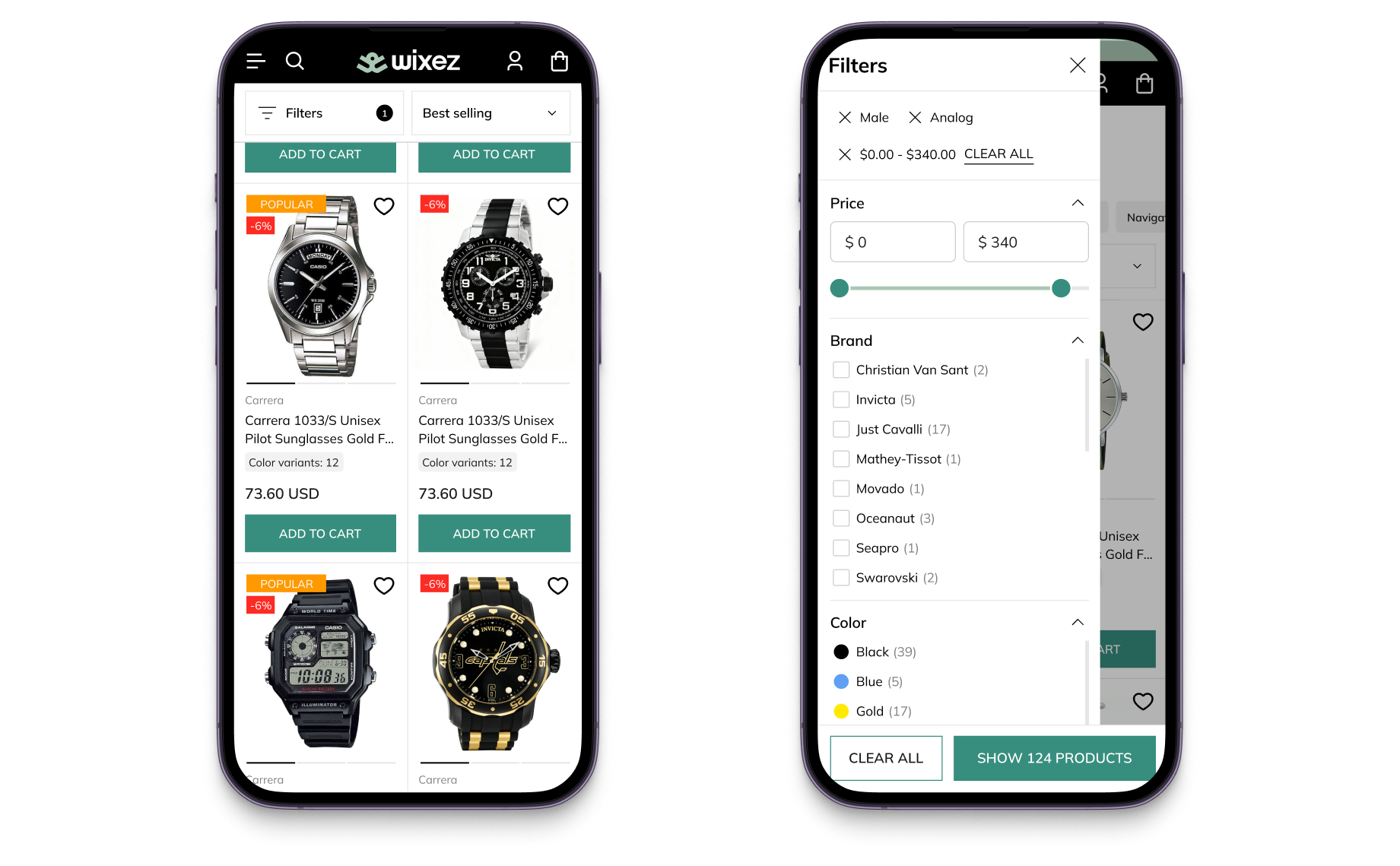
- Added more products per page with a "Load more" button;

- Made search full-screen, with the empty state now showing subcategories, popular queries, and recently viewed items.

Category page exits decreased significantly, while exits from watch category pages dropped by 3x.
Product Page Redesigned for Decision-Making
Before:
- The product image doesn't stay fixed while scrolling;
- Shipping and return conditions were absent from the product page;

- Technical specifications were buried inside long product descriptions;
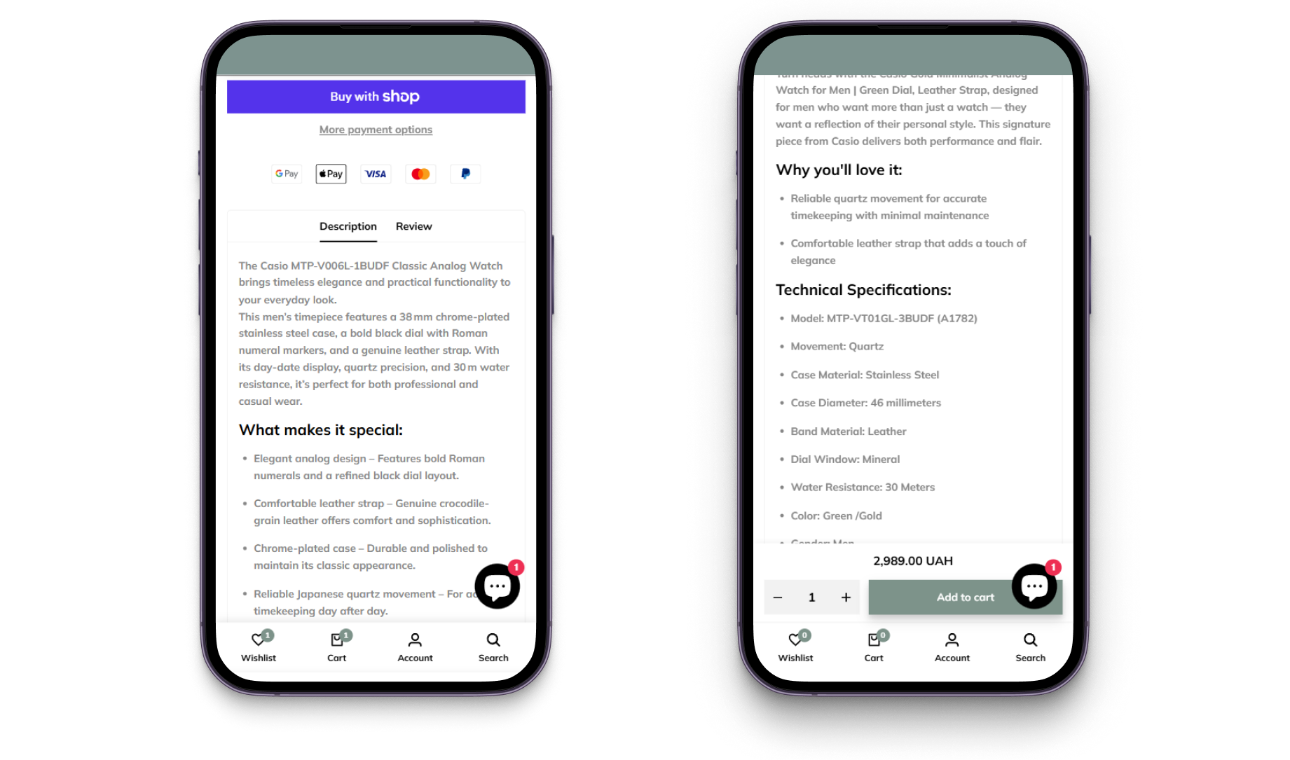
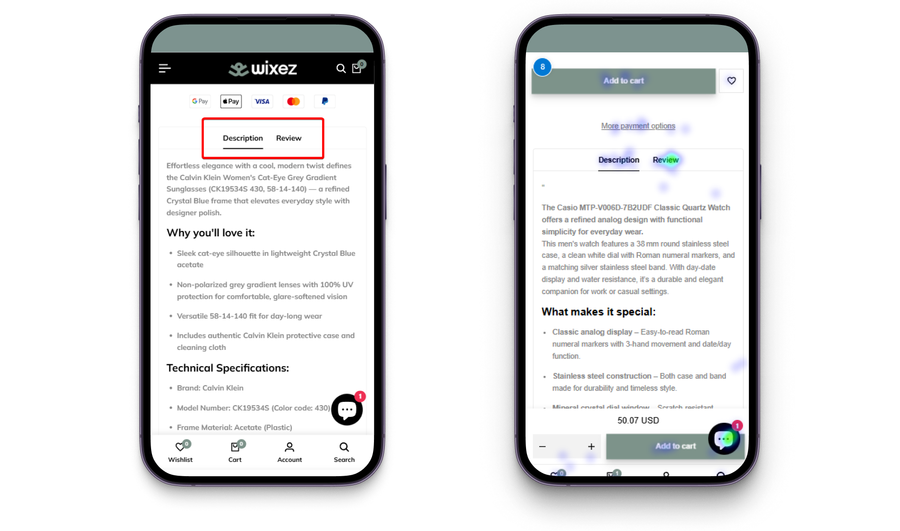
- Reviews were hidden inside tabs despite being one of the most interacted-with elements;
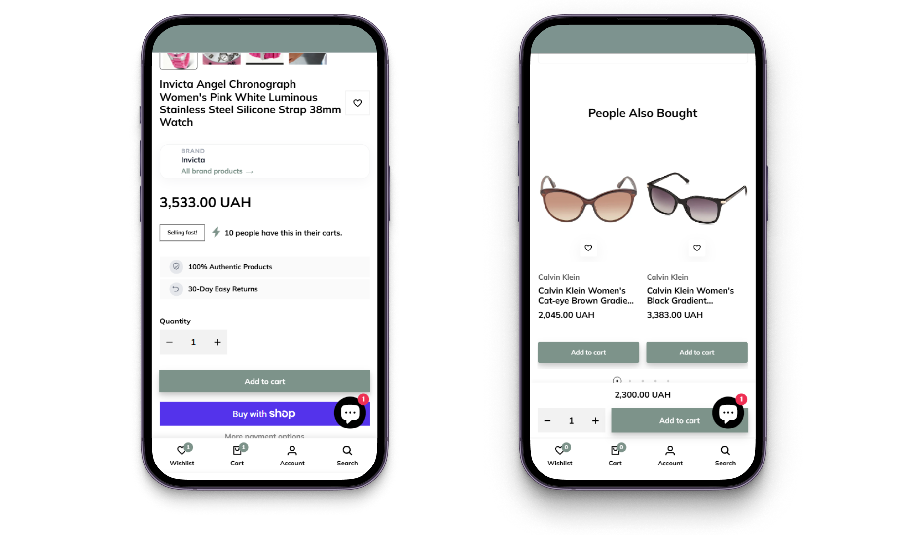
- The purchase area contained unnecessary distractions around the primary CTA;
- Recommendations block shows only very similar products from the same category, leaving users without alternatives.
After:
- Added prominent shipping, payment, and return information;
- Replaced tabs with sequential content sections for reviews and product details;

- Fixed the product images during the scroll;
- Structured specifications into dedicated information blocks (watches: strap, dial, features; eyewear: frame, lenses, fit);

- Simplified the purchase block with unnecessary links and quantity counter removed, and fixed "Buy" button on mobile;
- Introduced cross-category recommendations between watches and eyewear.

Drop-off from the product page improved by 23%; add-to-cart conversion increased by 62%.
Wishlist for Sharing and Gift Purchases
Before: Users couldn't share their wishlist, despite accessories often being purchased as gifts.

After: Added wishlist sharing via direct links and messaging apps, making it easier for users to share gift ideas and return to saved products later, increasing reach and boosting conversion from saved items.

Registration in a Few Clicks
Before: Account creation required manual form completion, creating additional friction, especially for mobile users.
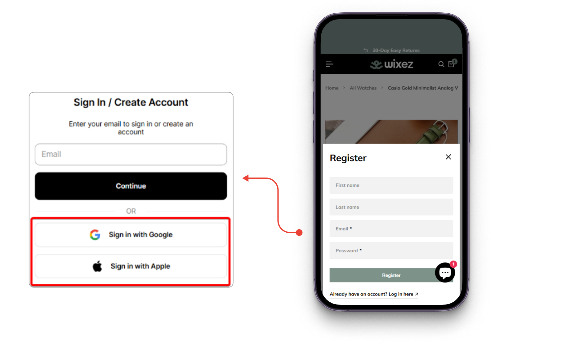
After: One-click sign-up and login via Google, Apple, and Facebook added.


Results
As a result, Wixez received a comprehensive UX/UI development and conversion optimization roadmap for the store's key pages.
After implementation:
- Overall conversion rate increased by 114%;
- Mobile conversion rate tripled;
- Bounce rate among new users decreased by 41%;
- New users purchased three times more often;
- Add-to-cart micro-conversion increased by 62%;
- Checkout transition rate doubled.