About the project
Belok is one of the largest sports nutrition store chains in Ukraine. The company has been operating on the market for over 10 years, has 40 offline stores, and serves hundreds of thousands of customers every month.
Challenge: The project hit a growth ceiling due to outdated design and complex interface, resulting in lower conversion rates and making scaling difficult, especially for new and mobile users. A UX/UI revamp was needed for further development.
Tasks
- Conduct a UX analysis of the current website and analyze competitors.
- Study the behavior of the target audience and build a Customer Journey Map.
- Make the website more modern, convenient, and visually appealing.
- Rethink and rebuild the navigation, catalog, and filter system.
- Present products and brand advantages in a clear and profitable way.
- Shorten the user's journey to purchase, especially from mobile devices.
- Lay the foundation for scaling the business and increasing competitiveness
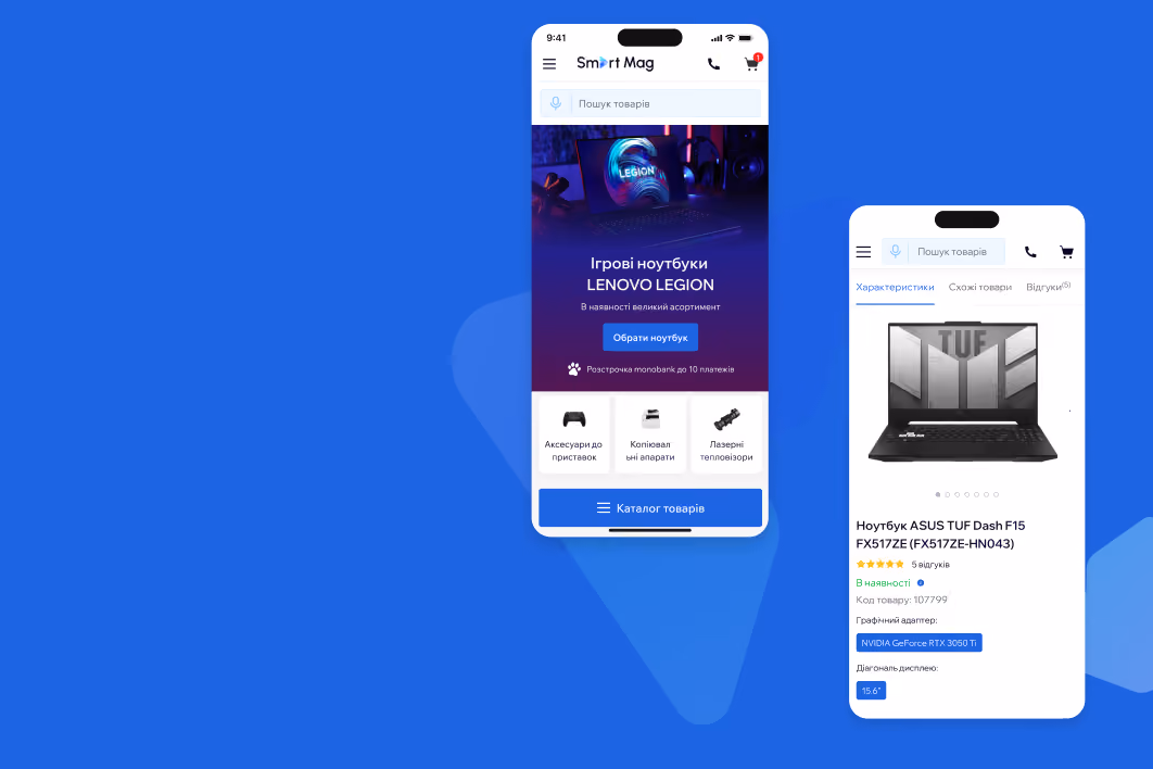
Homepage and navigation
Before: 93% of traffic consisted of new users, but they spent half as much time on the site and made purchases less often than regular users. Mobile users (84% of the audience) had the worst engagement rates. Navigation was difficult, key blocks were inconspicuous, and the homepage did not clearly convey the brand's advantages and next steps.
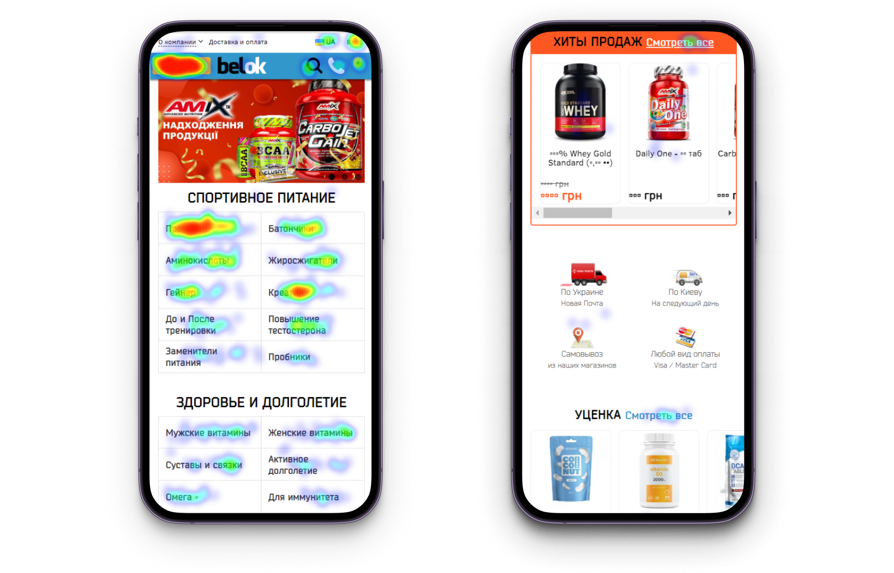
After: Entirely redesigned the structure of the main page, emphasizing Belok's products and advantages. Simplified navigation and adapted it using a mobile-first approach: added icons to the catalog and optimized elements such as the Account, Cart, etc., for convenient clicking on all devices. Quick entry points to key catalog categories were added.
.png)

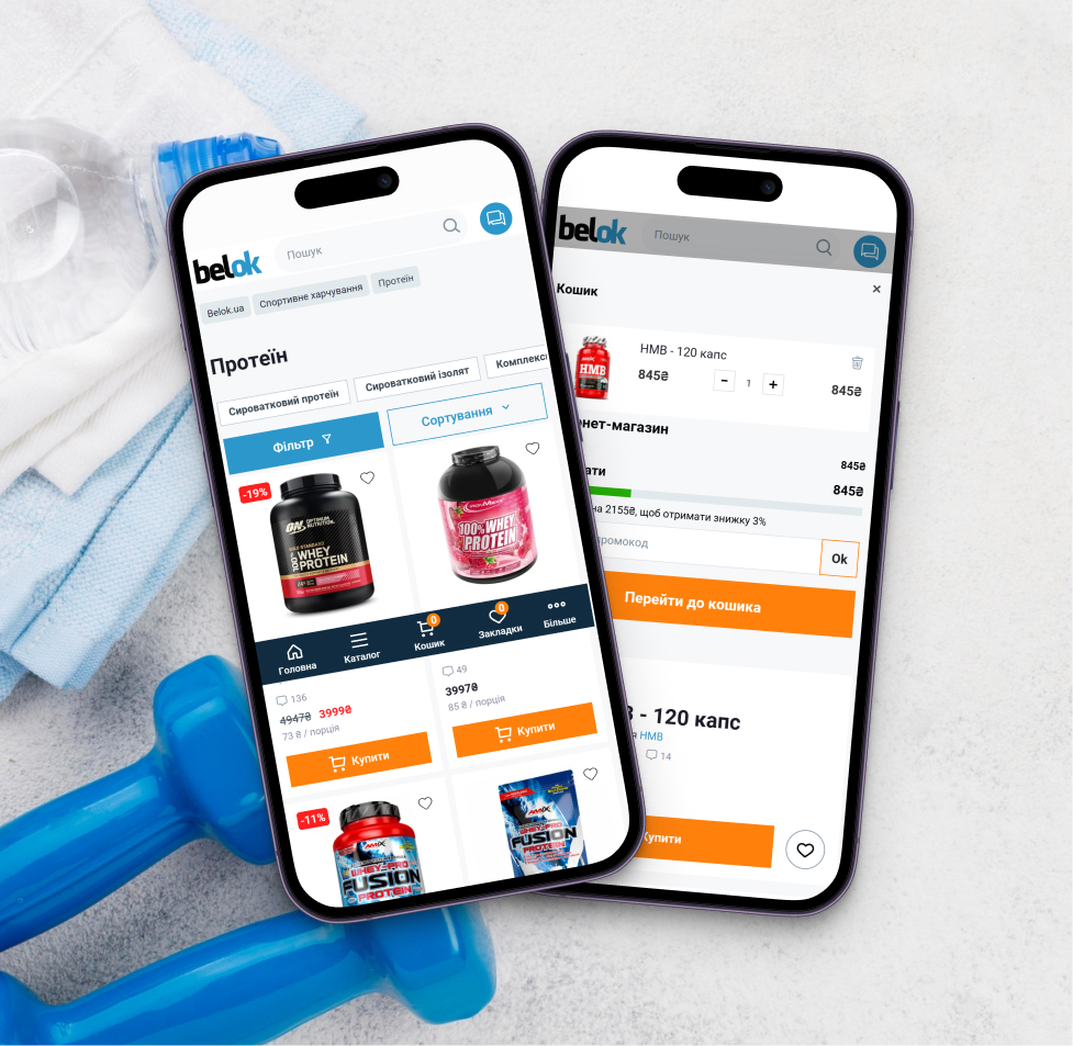
Category listing page
Before: The category listing pages were among the main landing pages (particularly Protein and Creatine), but users often left the site from there. Filtering was inconvenient and unavailable on mobile devices, adding items to the cart required extra steps, and product previews did not provide enough information for quick selection.
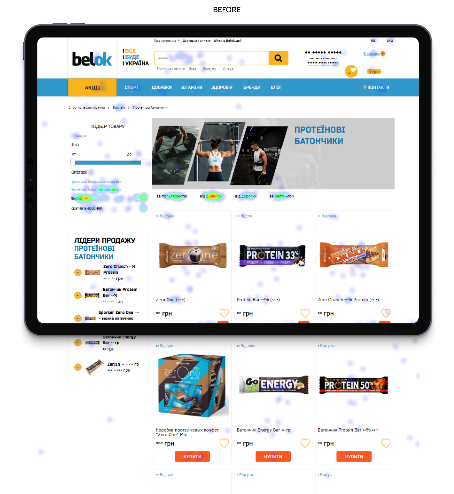
After: Product previews are now more informative, featuring prices, flavors as tags, labels (sale, discount, hit), a quick Add to Cart button, and variation previews. Filtering was added with a fixed button for mobile and a sidebar for desktop, and a “Load more” button was implemented for convenient scrolling. This simplified the selection process and shortened the path to purchase.
.png)
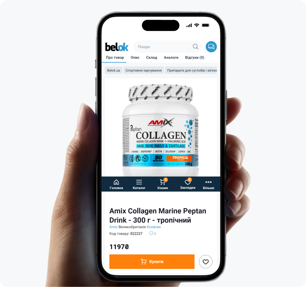
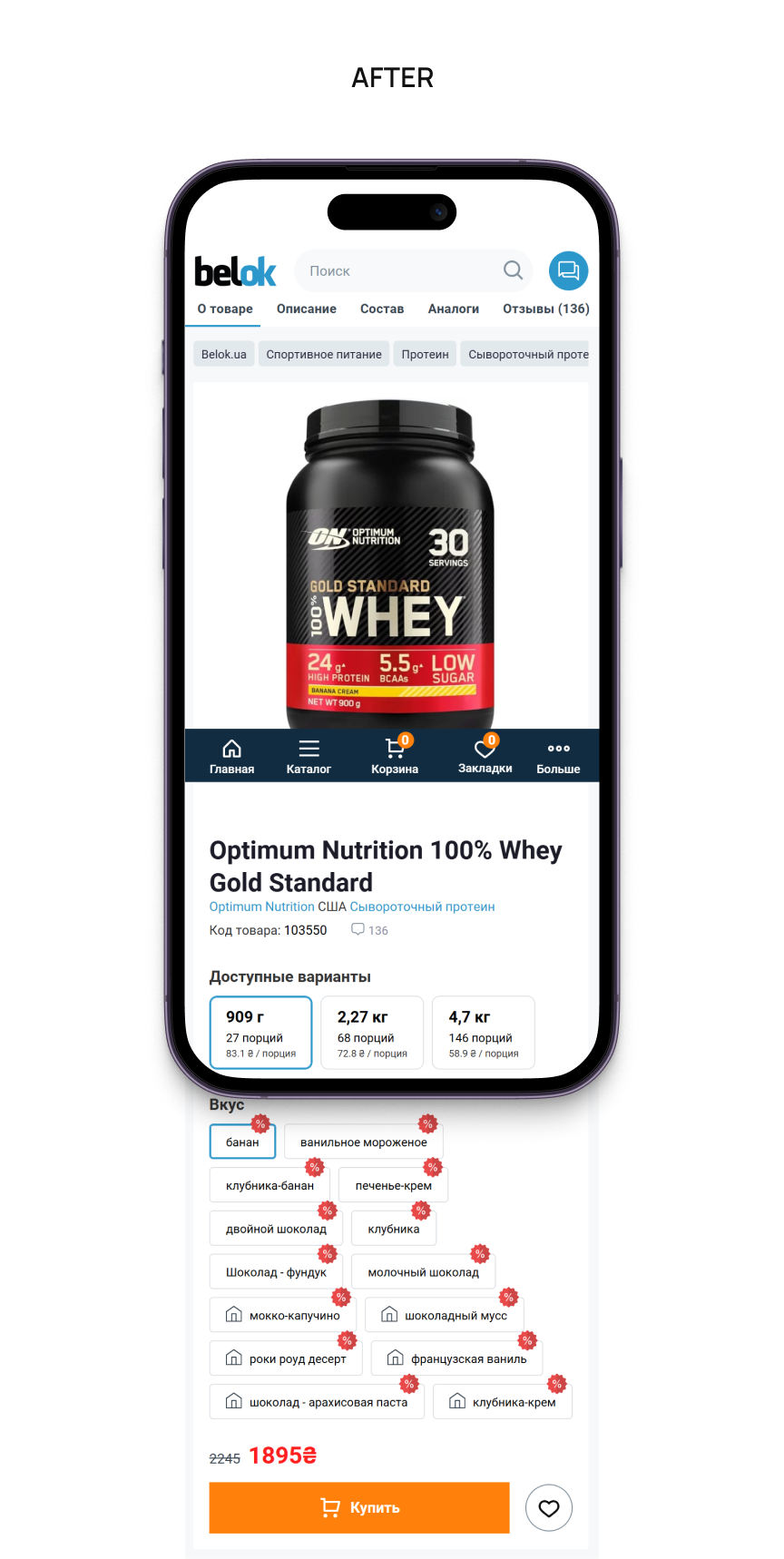
Before: It was the key entry point, but it was here that users most often left the site: 70% did not proceed to add items to their cart. Important information was hidden, social proof was ineffective, and users had to return to the catalog in search of alternatives.
.png)
After: All key elements for decision-making on one screen: large product photos, price, availability, packaging options, flavors, etc.
Added upsell and cross-sell blocks with relevant offers, social proof, and a transition to the blog.
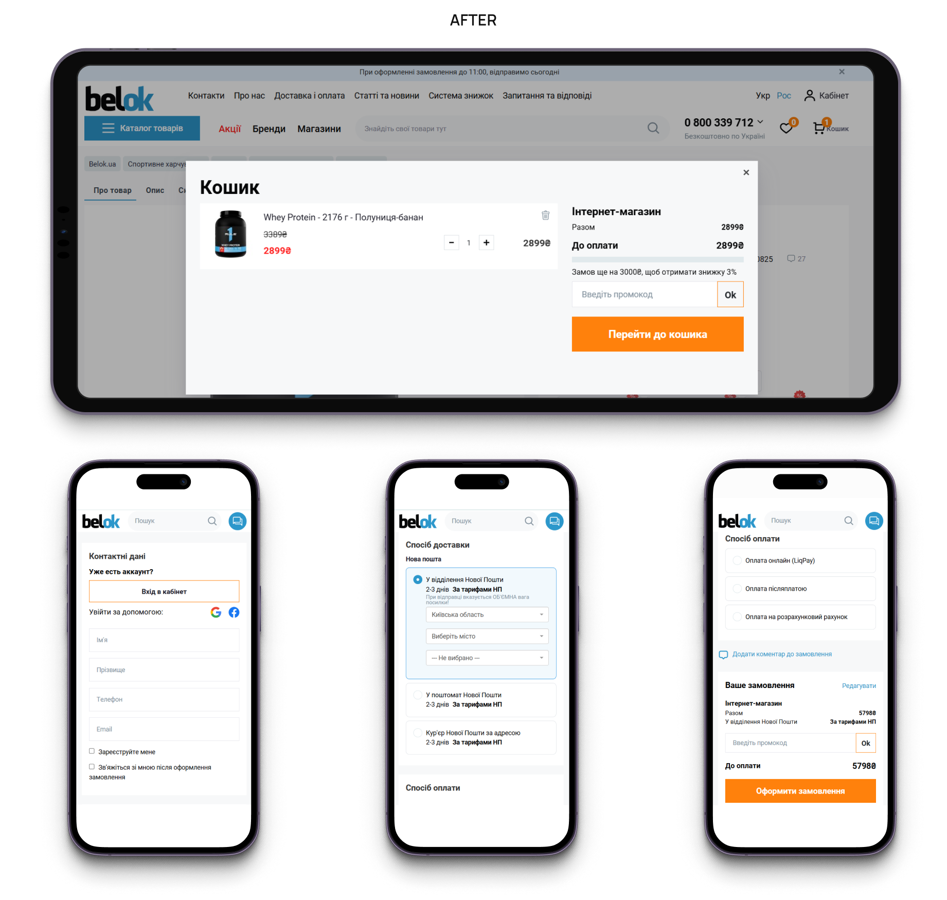
Shopping cart and Checkout
Before: 70% of users left the site after adding a product to their cart, and only 4% reached the final step. The checkout process was too long and confusing, and the interface was cluttered with unnecessary elements, especially on mobile.
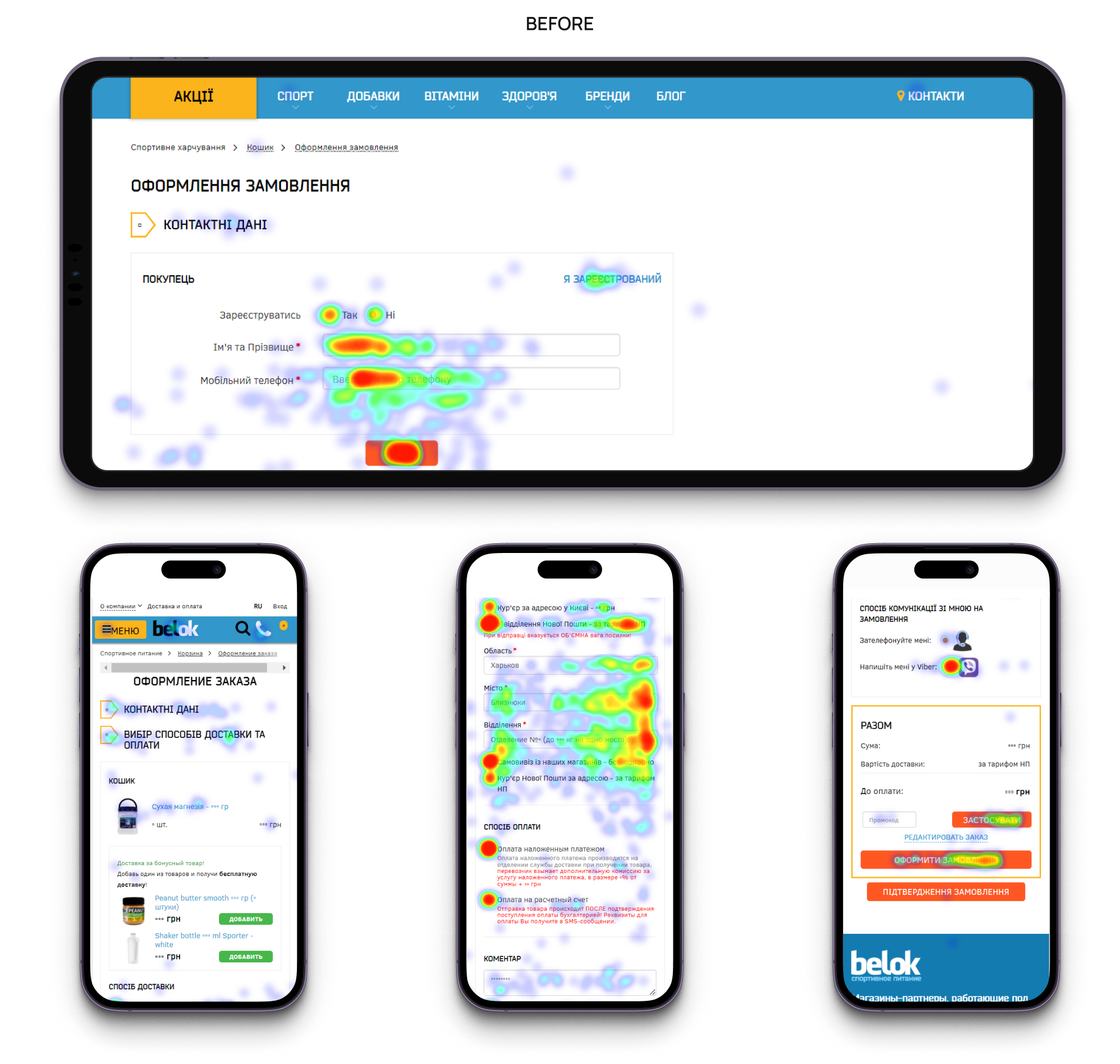
After: Optimized the shopping cart with a clear focus on products, benefits, and additional services. Optimized checkout by reducing the number of steps, removing unnecessary elements, and adapting the process for mobile use.
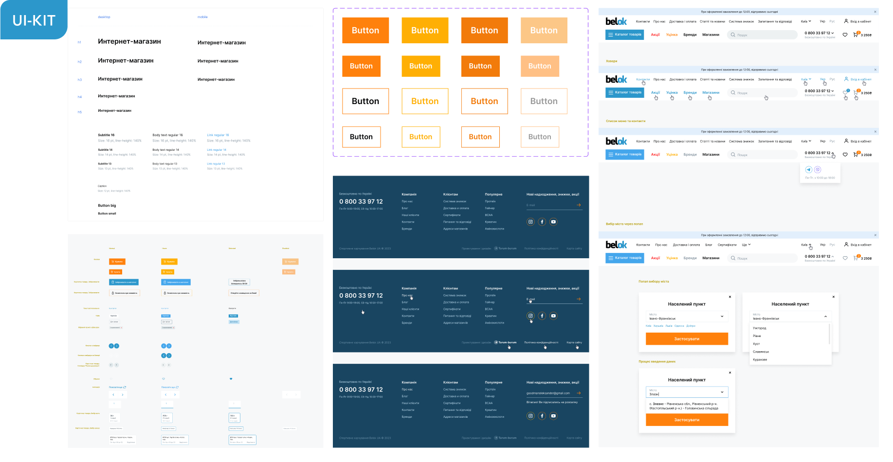
Visual identity and design system
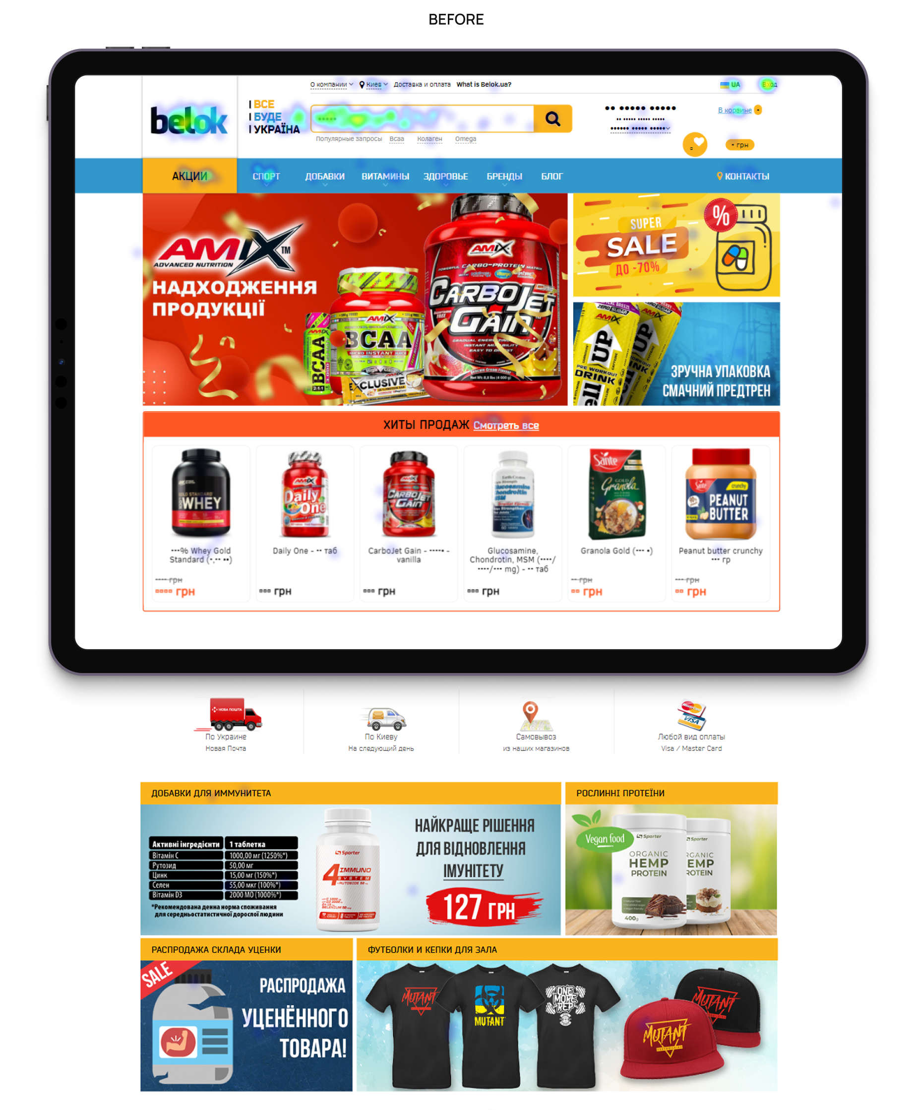
Before: The website had an outdated and fragmented look: there was no consistent style, components behaved differently on different pages, and adding new sections complicated product maintenance and development.
After: We created a cohesive visual style and a detailed UI guide, containing all components in all states. This gave the Belok team a tool for scaling the website and launching new pages and features without compromising the quality, recognizability, and consistency of the interface.
Results
As a result of a complete redesign, Belok received:
- A modern, mobile-first online store with a focus on the prevailing mobile audience;
- Intuitive navigation and updated information architecture that simplifies the buying process;
- Category and product pages that better explain the value of the product and support the purchase decision;
- Cross-sell and up-sell tools to increase the average check;
- A unified design system (UI kit) that allows the company to scale the product without losing UX/UI quality.
The redesign became the foundation for further growth, business scaling, and maintaining Belok's leadership position in the sports nutrition market.