About the project
Domino’s Pizza is a global fast-food chain operating in over 90 countries. In Ukraine, the brand is the market leader in delivery, with 65+ stores across major cities like Kyiv, Lviv, and Odesa.
The mobile app is a critical sales channel. Since its Play Market launch in 2014, it has amassed over 500,000 downloads. Besides, the audience is uniquely premium, dominated by iOS users compared to Android.
Challenge: While the brand is tech-forward, the mobile app performance lagged behind its potential. Almost a quarter of users uninstalled the app shortly after the first open. A redesign was needed to reduce friction for new users and speed up the flow for loyal customers.
Tasks and Goals
- Conduct a UX audit of the Domino’s Pizza mobile app (iOS & Android)
- Identify growth points in navigation, product selection, and ordering
- Improve speed and clarity of building an order on mobile
- Reduce drop-offs at the add-to-cart and checkout stages
- Strengthen retention of customers by improving repeat orders for loyal users and complete orders for returning ones.
- Create UX recommendations scalable for further app growth
Main Screen & Navigation
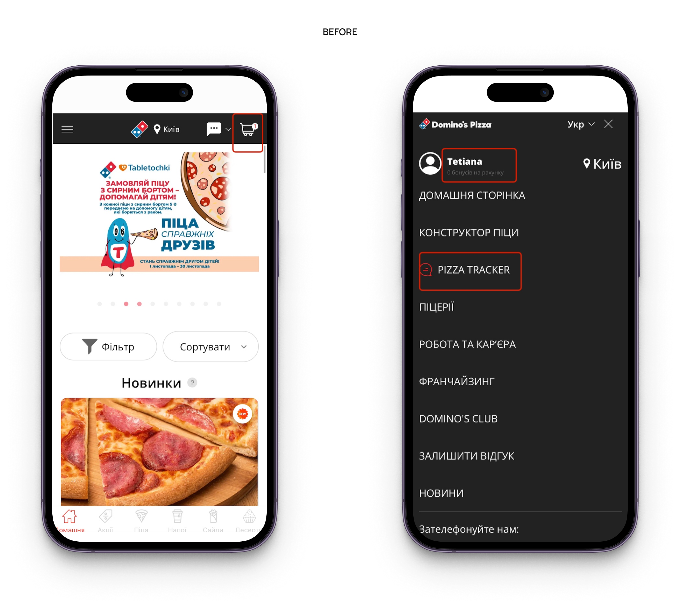
Before: The cart icon was placed in the top corner, hard to reach with one hand and easy to miss. Returning users had no way to quickly repeat previous orders or resume abandoned ones, forcing them to rebuild orders manually. The Burger Menu was cluttered, hiding key tools like "Bonuses" and "Tracker."
After: Moved the cart into the bottom navigation for easy thumb access. Added blocks for abandoned carts and repeat orders to the main screen, allowing loyal users to continue or reorder in just a few taps. The burger menu was restructured to prioritize high-frequency actions.
.png)
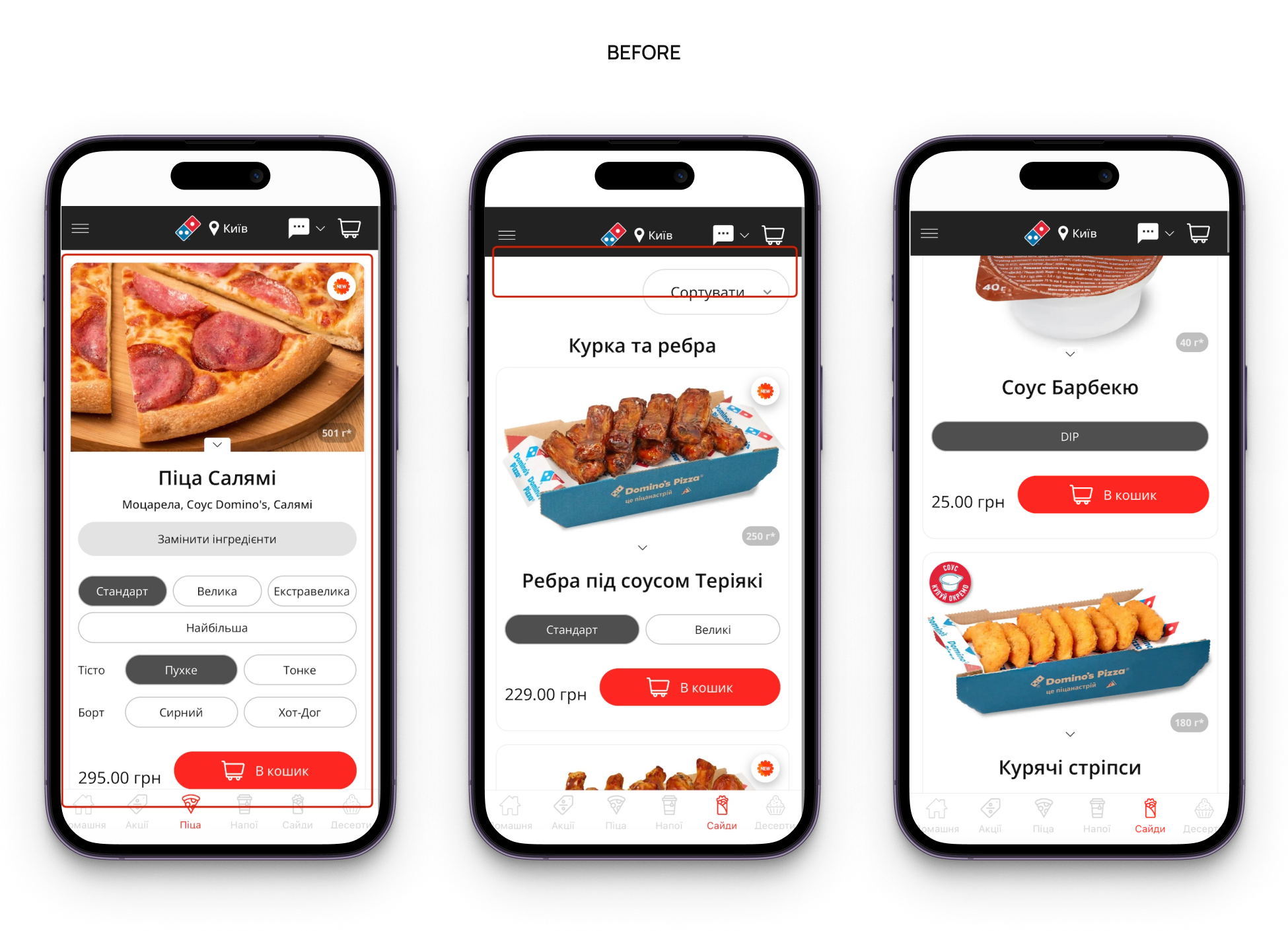
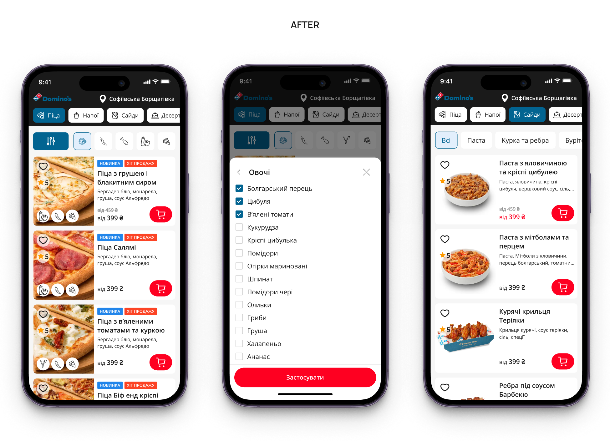
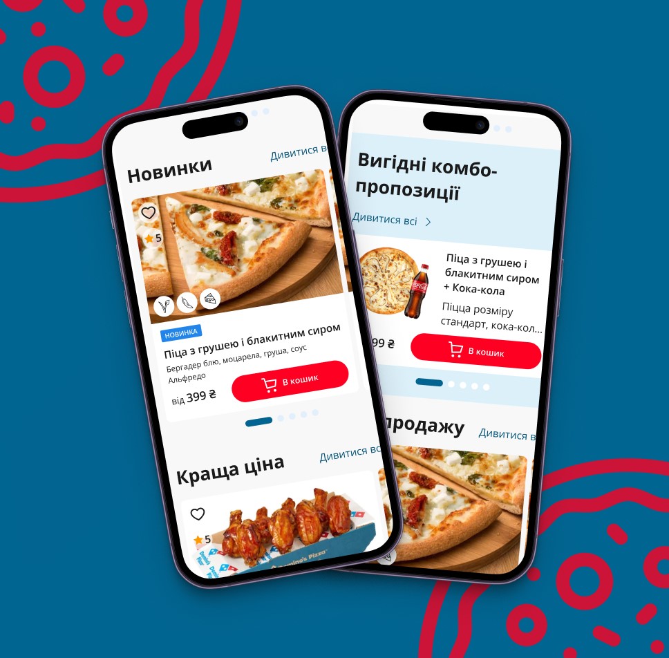
Category Listing Screen
Before: Product selection required excessive scrolling. Long product cards made comparison difficult, while filters were rarely used due to poor visibility and lack of fixation during scroll. In categories like sides, products were mixed without clear structure, increasing the risk of missed items.
After: Made product cards more compacted to highlight essentials, while fixed filters and sorting controls. Added subcategory tags (e.g., meat, cheese, sauces, chicken) for faster navigation, and explicit diameter info (e.g., "30 cm") to size selectors to aid decision-making.
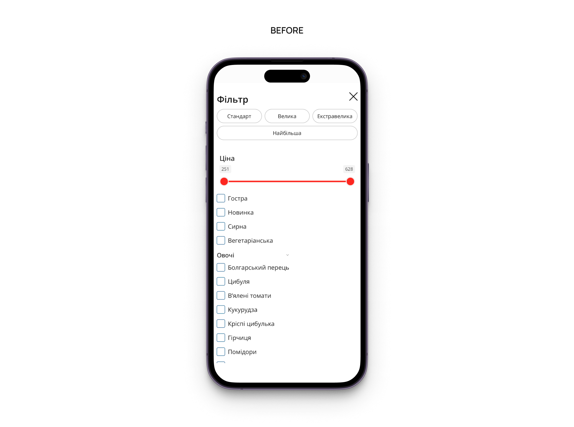
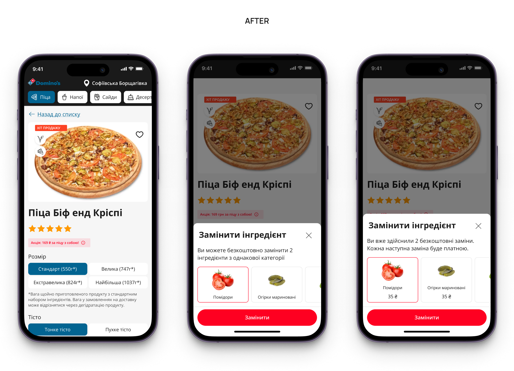
Product Details Screen
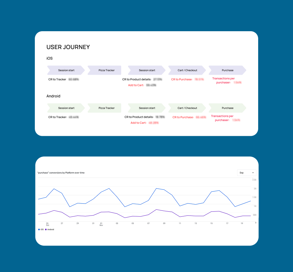
Before: Only one third of users added items to the cart from product pages, probably because of key actions and info (price, quantity, “Add to cart”) were not fixed during scroll. Besides that, returning from a product page reseted the list filters, interrupting exploration. And thelogic for "free ingredient swaps" was unclear.
After: Paid toppings and add-ons visually were prioritized, with clear pricing logic for free vs. paid replacements. Price, quantity, and “Add to cart” were fixed during scroll, enabling instant purchase decisions. Cross-sell blocks for drinks and sides were added. Selected filters and scroll position were preserved when returning to the list.
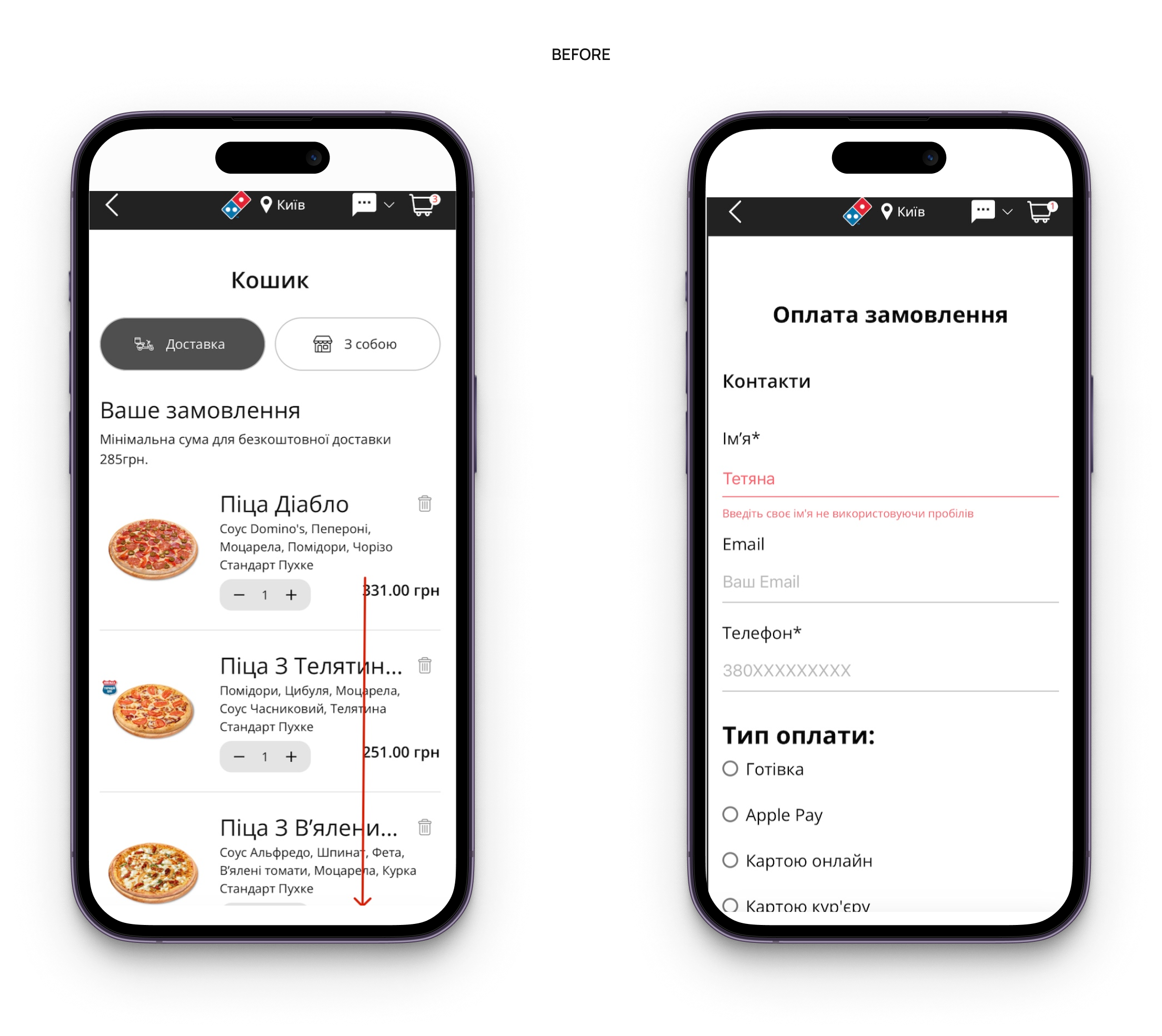
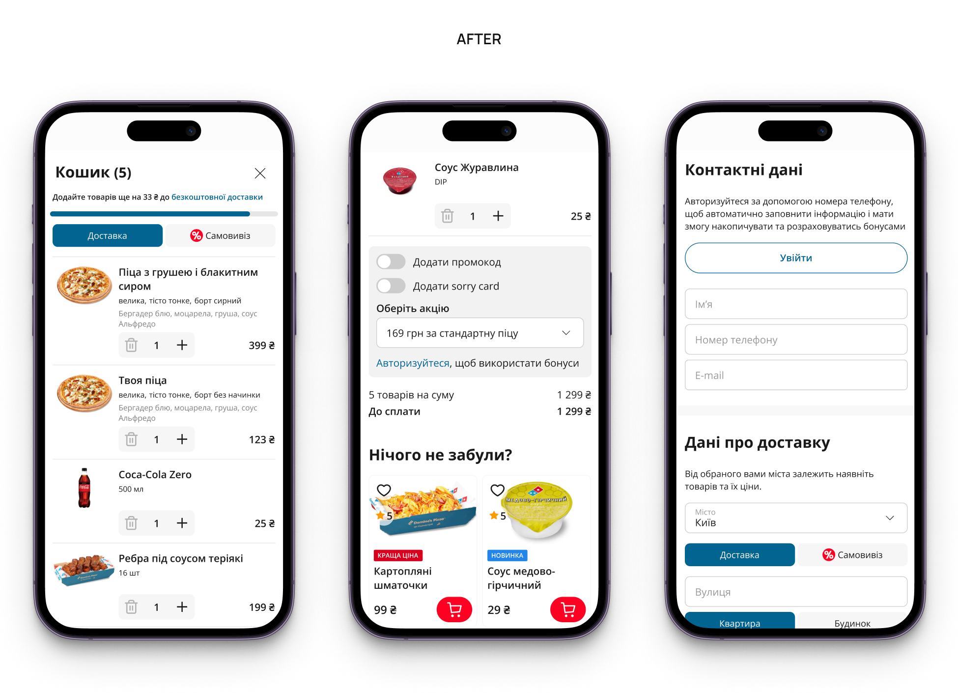
Shopping Cart & Checkout
Before: Users had to scroll to the bottom to see the total price. There were no cross-sell suggestions for drinks or sauces. Discounted items weren't highlighted, making users question if their promo code worked. Checkout errors caused by autofill issues were hard to detect, blocking order completion.
After: The order total and checkout CTA were fixed during scroll, promotions became visually explicit, and cross-sell blocks for drinks and sauces added. Input validation was improved by automatically handling hidden errors and guiding users directly to problematic fields.
Results
As a result of this collaboration, Domino’s Pizza received a prioritized CRO roadmap and ready-to-implement design solutions and hypotheses, grounded in real user behavior and adapted for both iOS and Android, and the direction for further UX optimization:
- Faster access to the cart and checkout through improved navigation logic
- Reduced effort for repeat users via “Repeat Order” and abandoned cart scenarios
- Clearer product selection with compact cards, visible sizes, and sticky filters
- Higher average check potential through structured cross-sell and toppings logic
- More transparent pricing and fewer checkout errors through UX and form improvements