About the project
Zensum, founded in 2013, is one of the top three loan brokers in the Nordics. The company quickly became a leader in helping people refinance loans, secure mortgages, and compare credit offers.
But while the business grew, the website didn’t reflect its credibility. It converted but looked more like an affiliate landing page than the platform of a trusted financial institution. To compete with banks, Zensum needed a redesign that built trust, scaled fast, and worked equally well for users and Google.
Tasks
- Build a design that reflects Zensum’s credibility and leadership.
- Create a scalable design system powering 100+ landing pages.
- Align SEO with usability to compete with banks in search results.
- Improve navigation and key service flows for clarity and trust.
That’s when Zensum partnered with TopDog for SEO expertise and Turum-burum for a full-cycle UX/UI redesign.
Visual Identity & Design System
Before: the logo and visuals felt generic and didn’t reflect Zensum’s credibility.
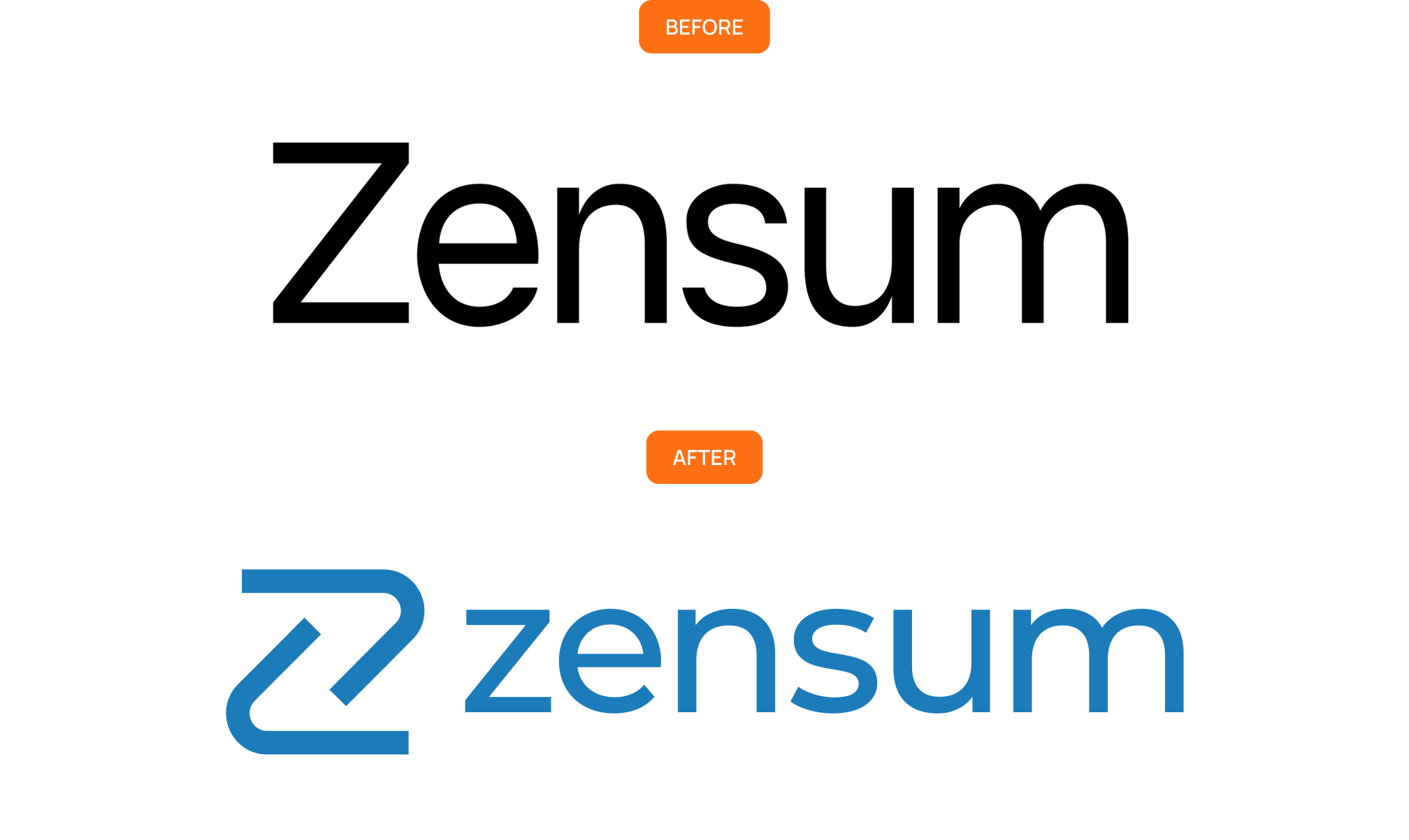
After: the new logo unites “Zen,” calm and clarity, with “Sum,” total overview, inspired by Zen gardens, yin-yang harmony, and rippling water and sand waves.

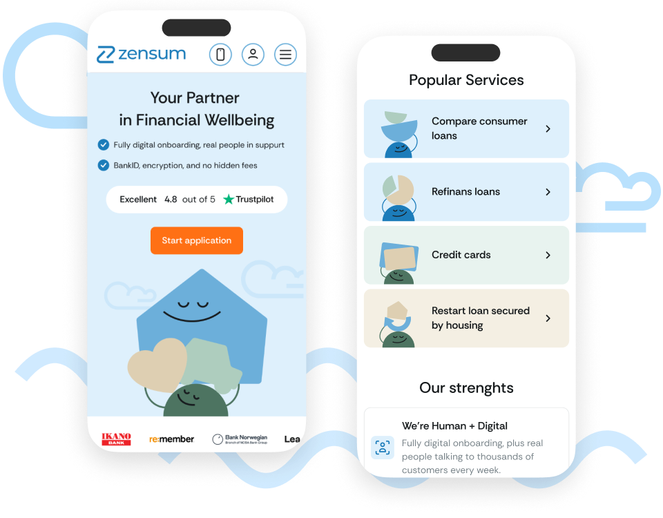
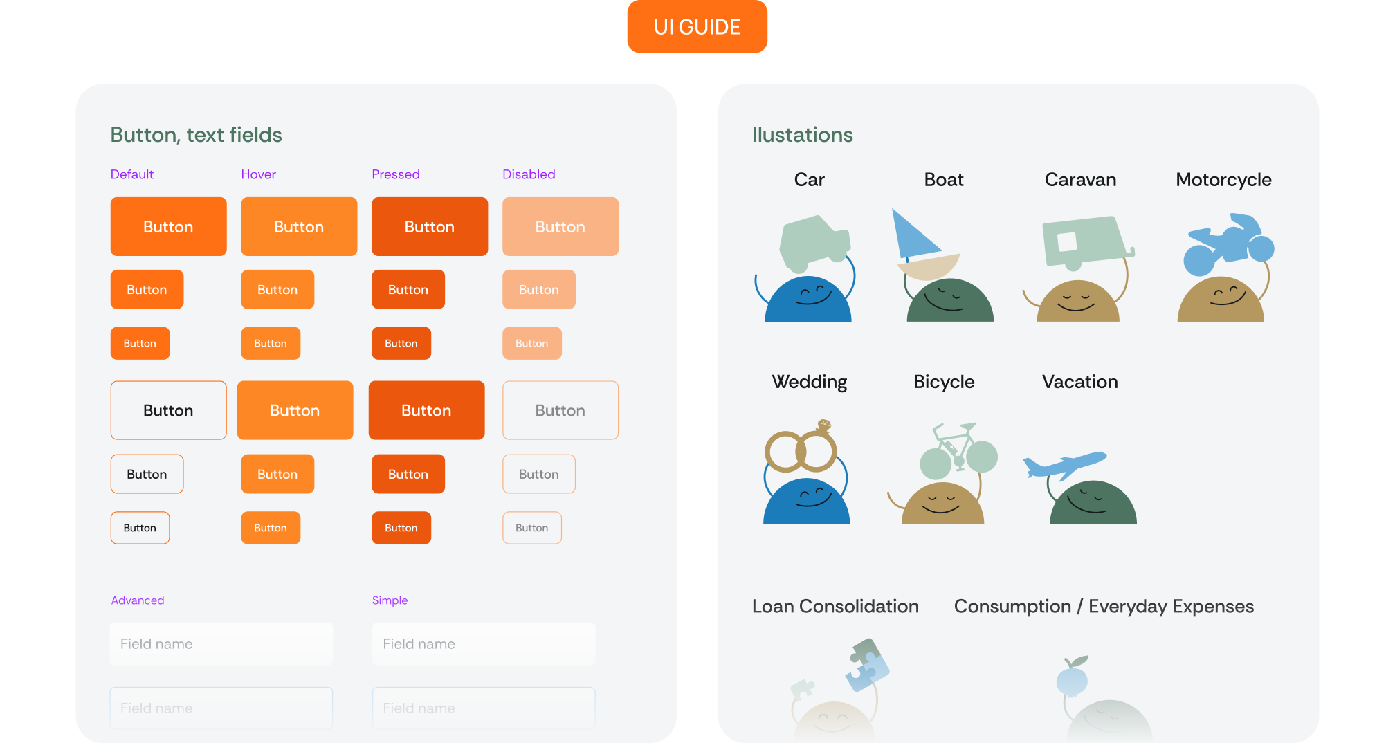
Custom illustrations replaced stock photos: characters carefully balancing objects symbolize Zensum’s promise of financial wellbeing and control.

A complete UI kit: typography, colors, buttons, and icons, presented in all states and variations, now ensures accessibility, consistency, and effortless scaling across all pages.
Homepage & Navigation: A Strong First Impression
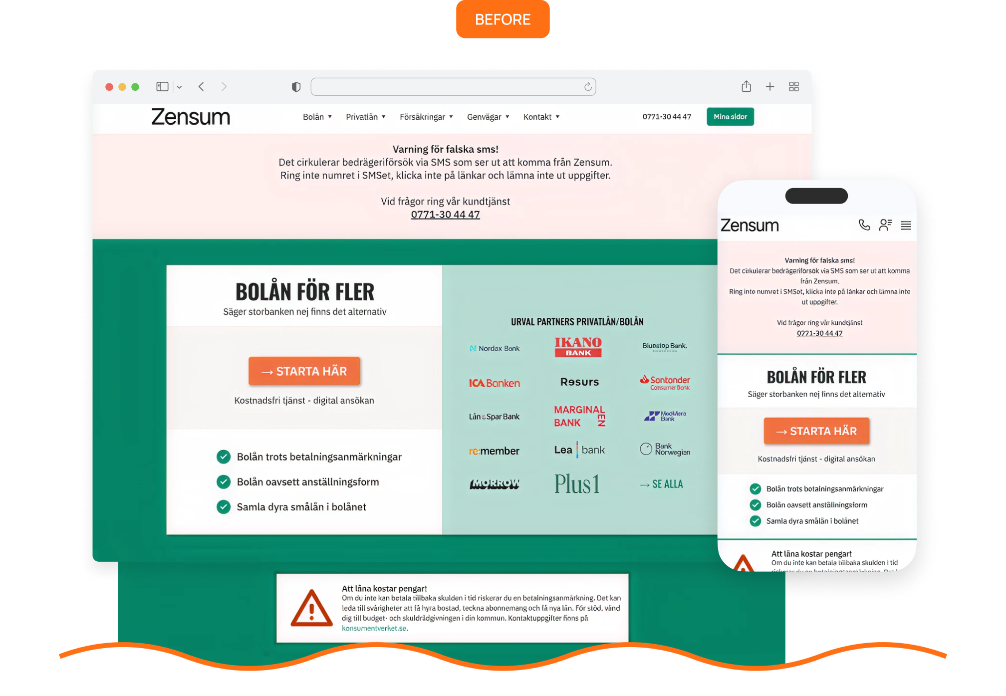
Before: the homepage was overloaded with text, trust signals were hidden, and navigation wasn’t built around how users actually searched.
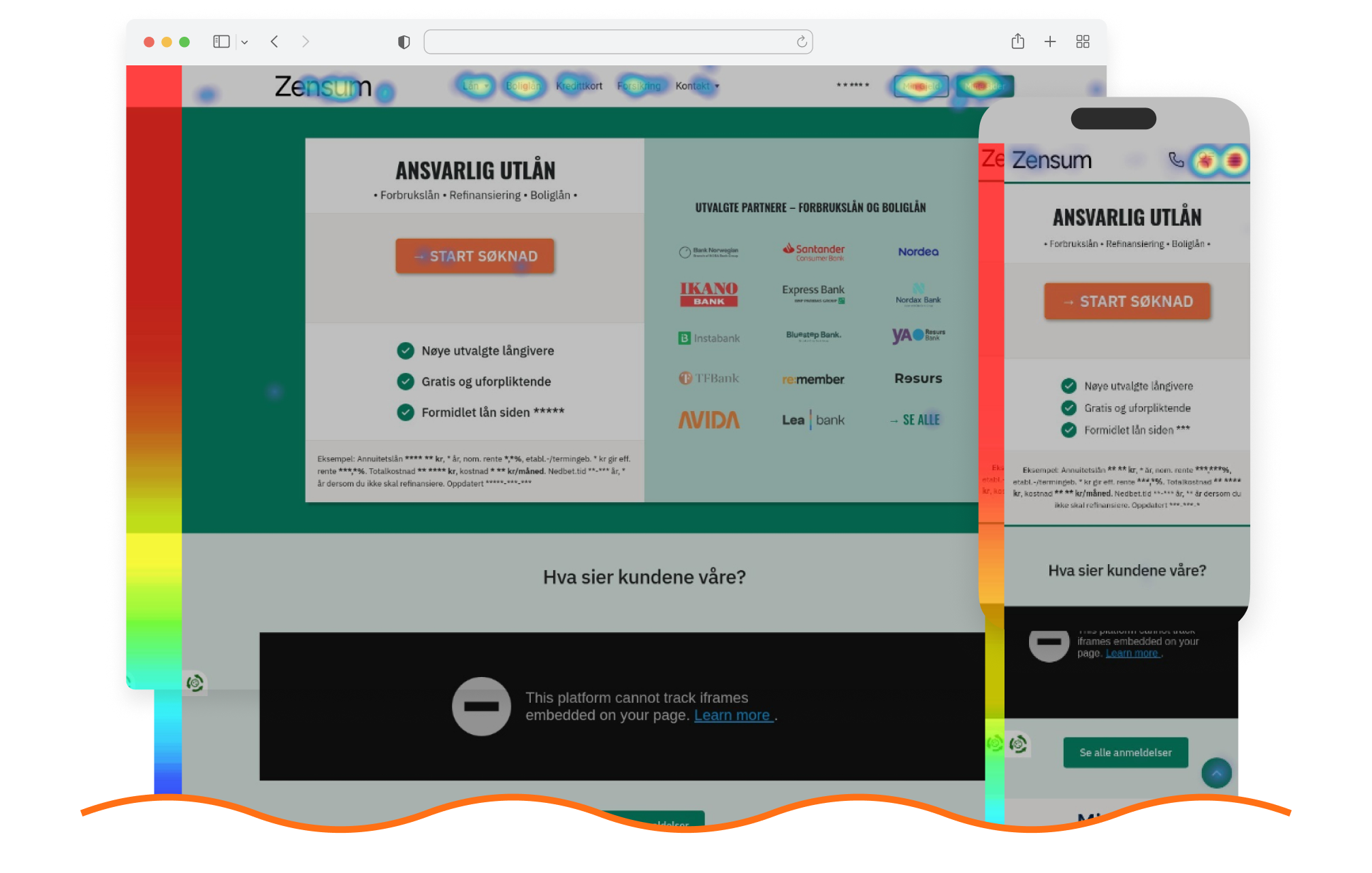
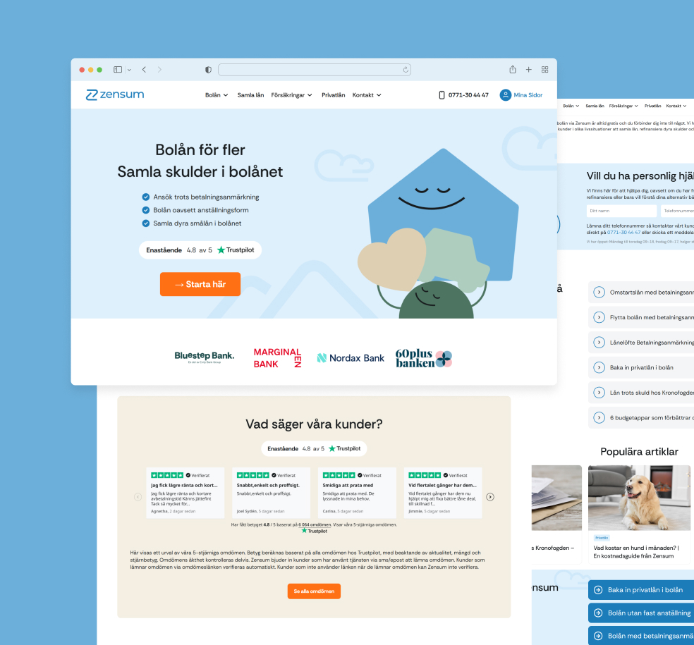
After: guided by heatmaps and analytics, we restructured the homepage around clarity and confidence: a clear value promise, one CTA, and visible partner logos and reviews. Friendly illustrations replaced text blocks for lighter, more readable content.
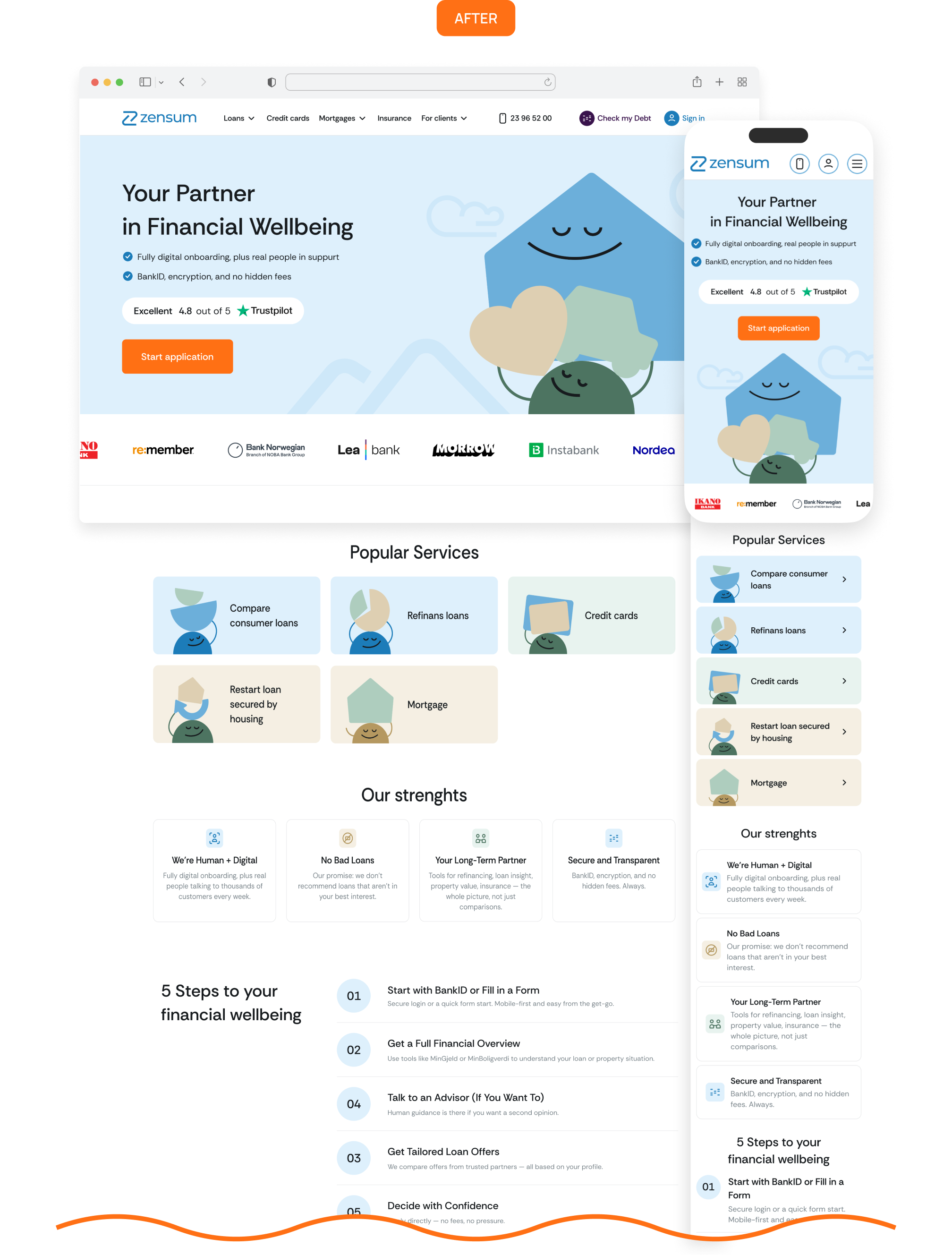
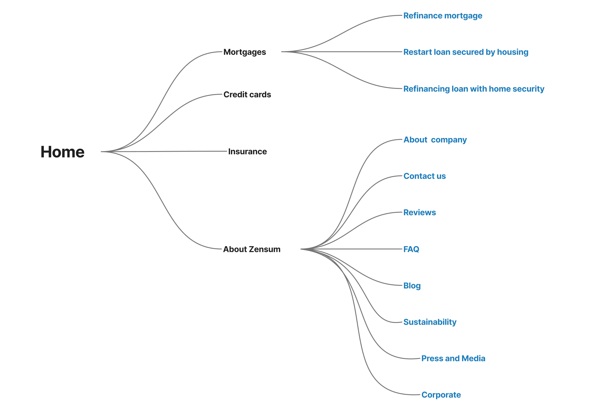
We also built a new information architecture reflecting real user behavior: simpler flows, intuitive categories, and smooth navigation across devices.
Online Service Pages: Complexity → Simple Steps
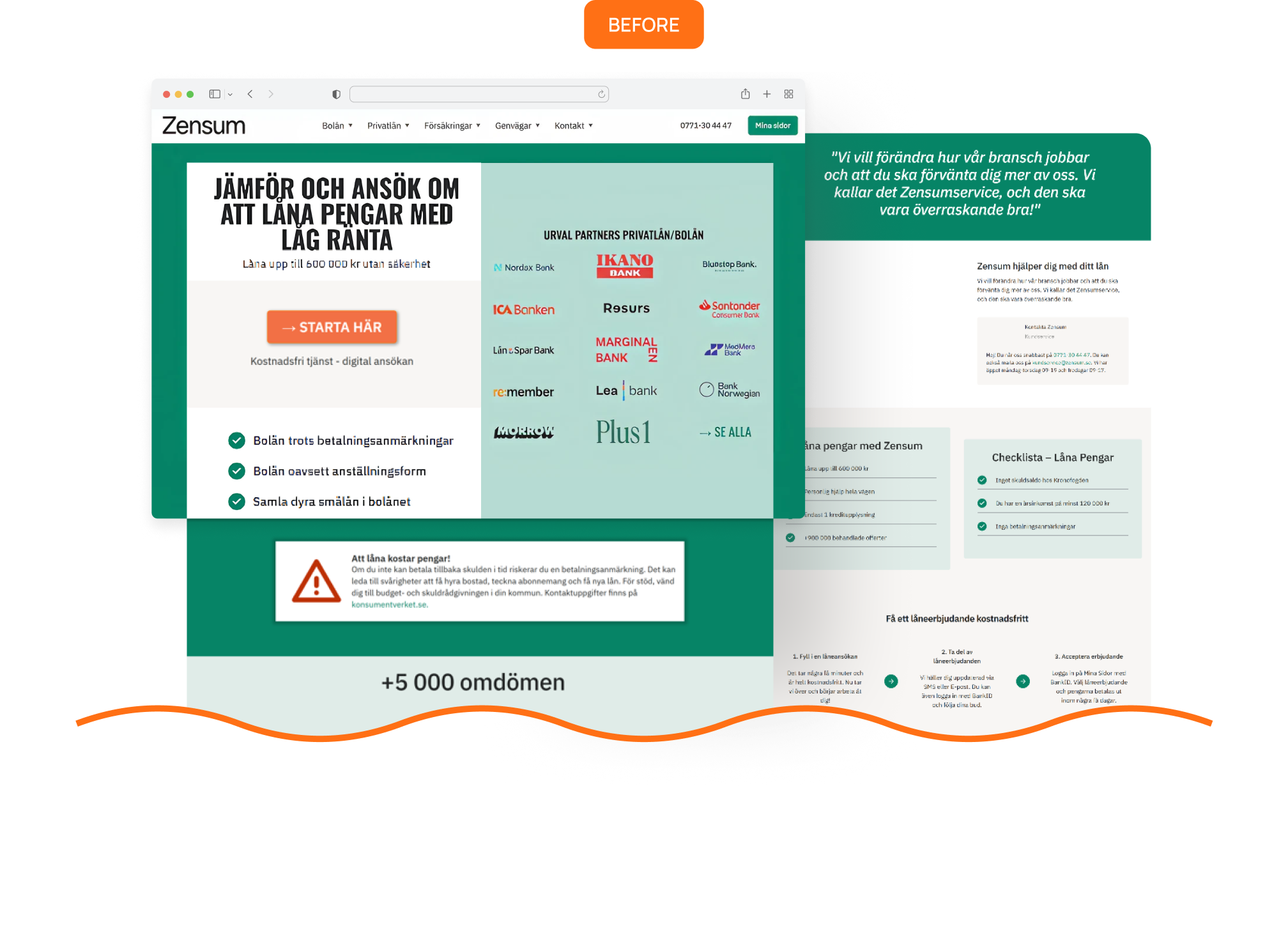
Before: The pages had all the facts but were text-heavy, unstructured, and missing clear trust cues, making decisions feel complicated.
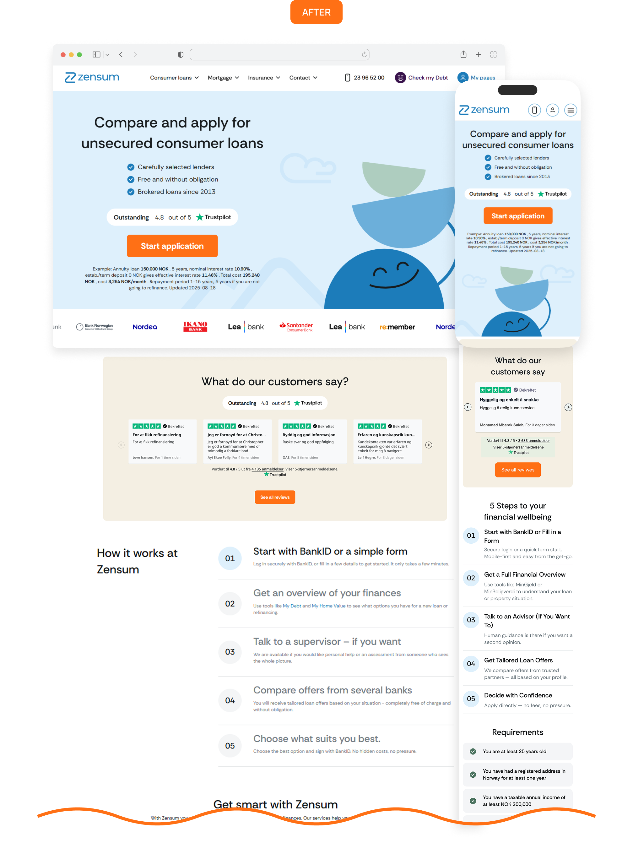
After: Each service page now opens with a clear value promise, one CTA, and trust signals upfront. Complex processes are simplified into 3–5 clear steps with supportive icons and illustrations, while expandable sections keep details and stay informative without overwhelming.
Content Pages: Trust and Visibility
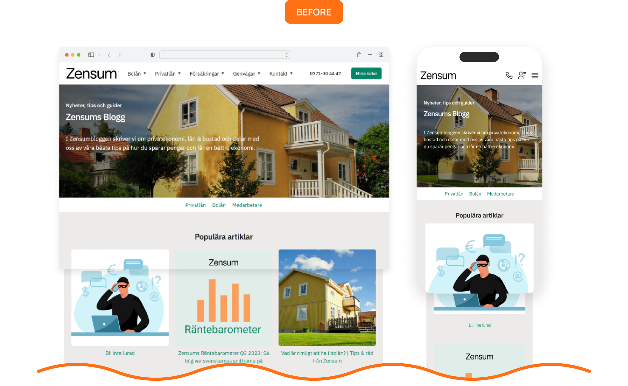
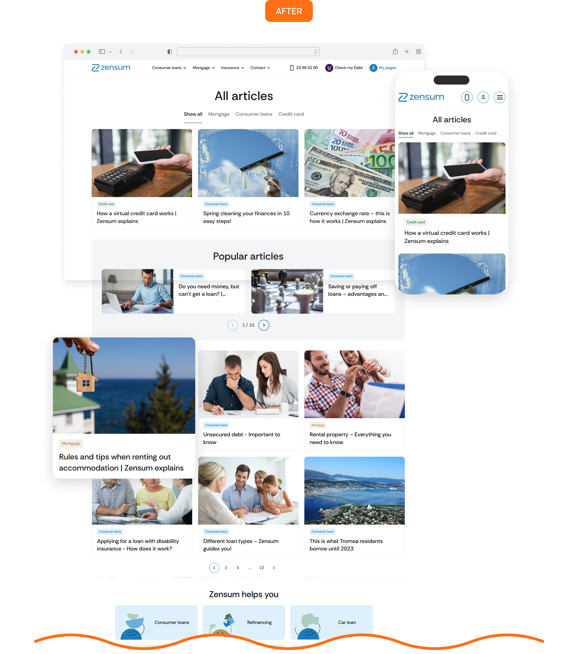
Before: Pages like About, Blog, and FAQ focused on SEO more than people. Layouts were unstructured, and key information was easy to miss.
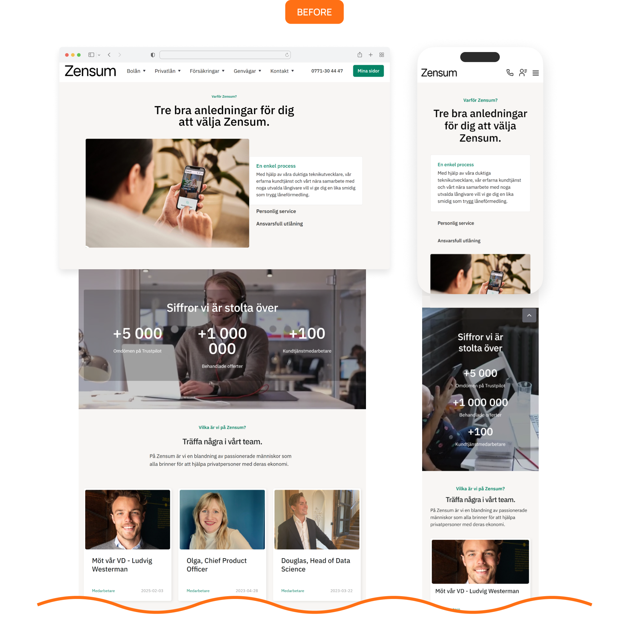
After: Content was reorganized with clear hierarchy, helpful visuals, and concise, scannable copy. Pages that still drive traffic, but now also build trust, showing Zensum’s story, people, and values in a clear and engaging way.
.png)
Full-Cycle: Tech & Implementation
We built a clean, scalable Webflow architecture to replace the old, cluttered setup, introducing structured classes, reusable components, and a documented style guide to ensure consistency and smooth performance across all devices and browsers, making it easy for Zensum’s team to expand the site effortlessly.
Results: A Platform Built to Lead
The redesign focused on building trust, improving usability, and preparing Zensum for growth.
- Rebuilt the website into a modern, credible platform that strengthens user trust.
- Created clearer user journeys and stronger CTAs for smoother conversions.
- Developed a scalable Webflow system and UI kit for fast campaign and page launches.
- Unified SEO, design, and tech through close collaboration with TopDog and Zensum.
A complete transformation: from a functional site to a fintech platform built to lead.