Fotoklok is a Swedish company that has been turning memories into photobooks, calendars, and student signs since 2010. Their products are all about family, tradition, and special moments. But their website wasn’t reflecting this.
The design felt outdated, navigation was clumsy, and SEO rankings for “fotobok” and “fotokalender” were unstable, while the user journey felt disconnected. So we joined forces with SEO agency TopDog and Fotoklok to make the site welcoming, trustworthy, and ready to grow.
.png)
Tasks on the table
- Stabilize rankings for key pages like “fotobok” and “fotokalender.”
- Improve navigation and UX to connect Google visitors smoothly with products.
- Redesign key pages (navigation, categories, product page) to improve usability and KPIs.
- Build a scalable design system for future growth without losing brand consistency.
- Align SEO, usability, and branding in one consistent experience.
.png)
SEO solutions
TopDog identified key issues: outdated design, fragmented user journeys, and technical problems affecting rankings and conversions.

With this in mind, TopDog:
- Built a clear SEO roadmap that guided the redesign.
- Aligned messaging between Google results and onsite pages.
- Created SEO-friendly UX requirements and content to boost trust and relevance.
- Fixed technical issues to stabilize rankings and performance.
.png)
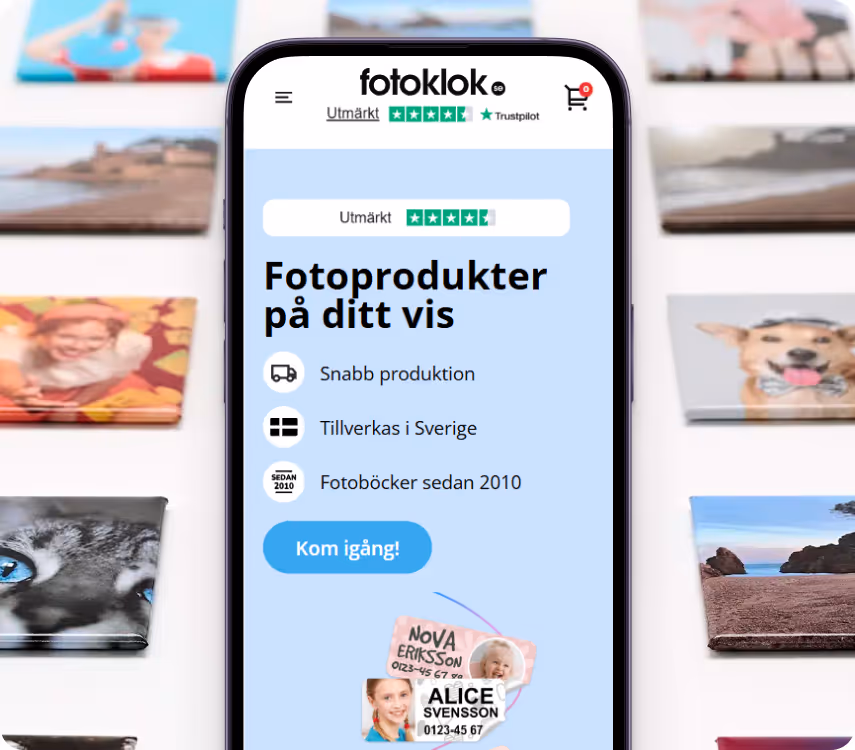
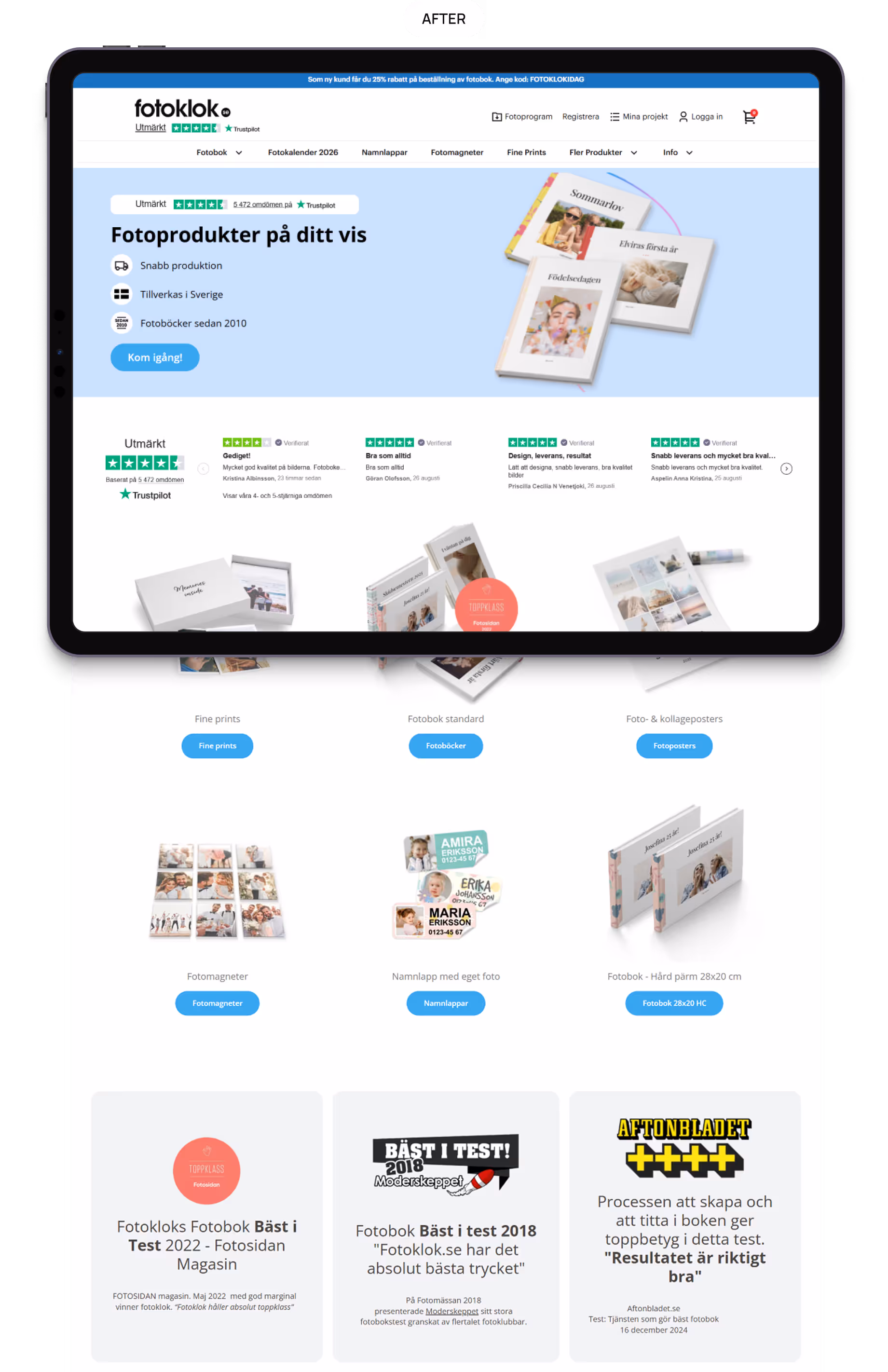
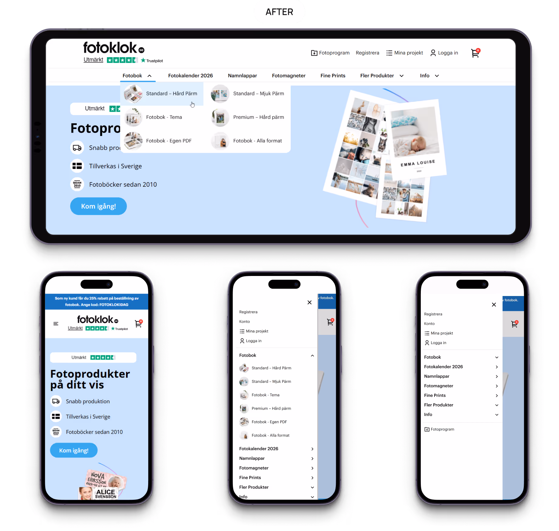
Navigation: clarity and trust
Before: the header felt cluttered and menus were hard to use, especially on mobile, where submenus were clumsy, and trust signals were missing.
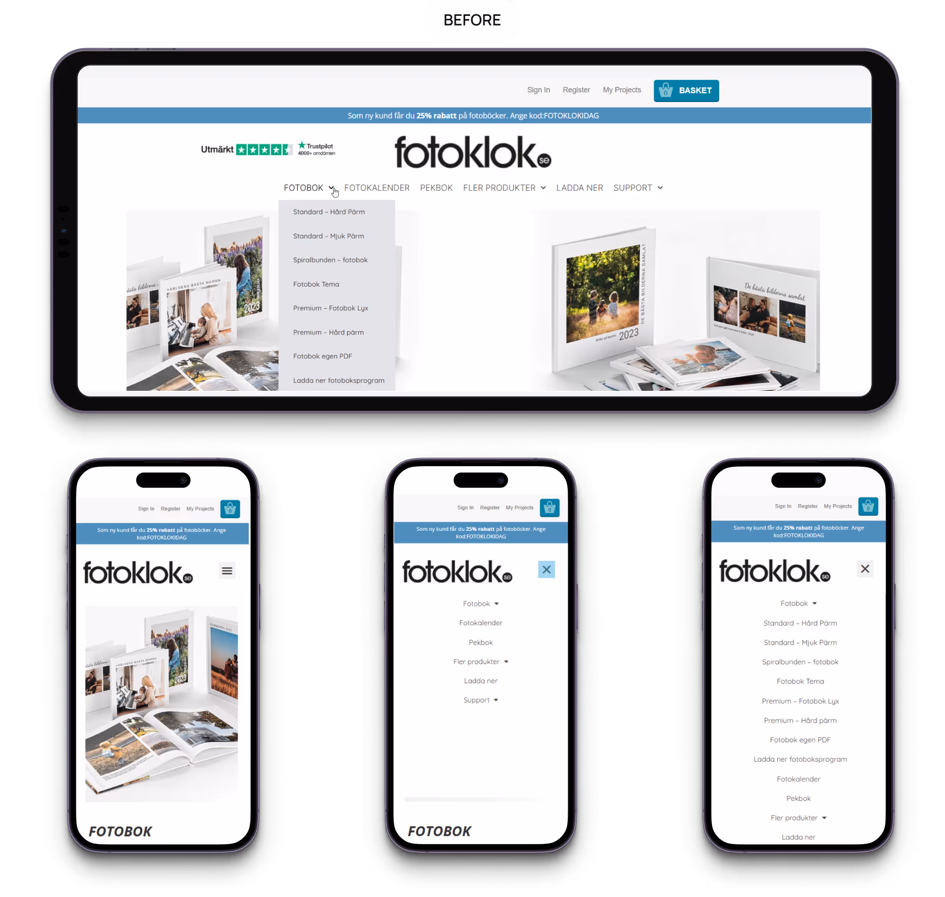
After: the header is clean and transparent, with key actions just a tap away. Menus open smoothly, thumbnails guide choices, and mobile navigation feels natural. The site became lighter, friendlier, and quicker, helping users start projects without hesitation.
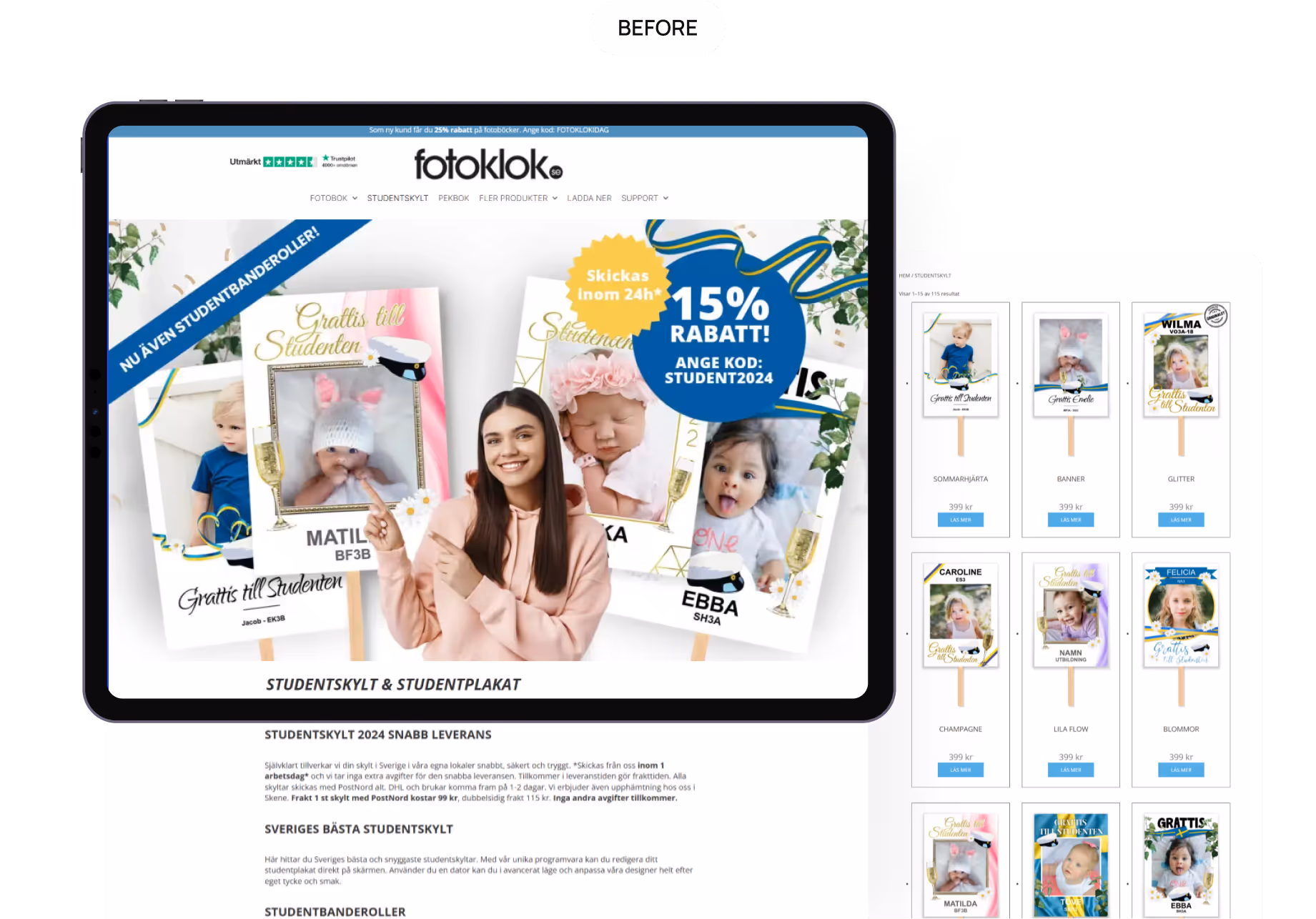
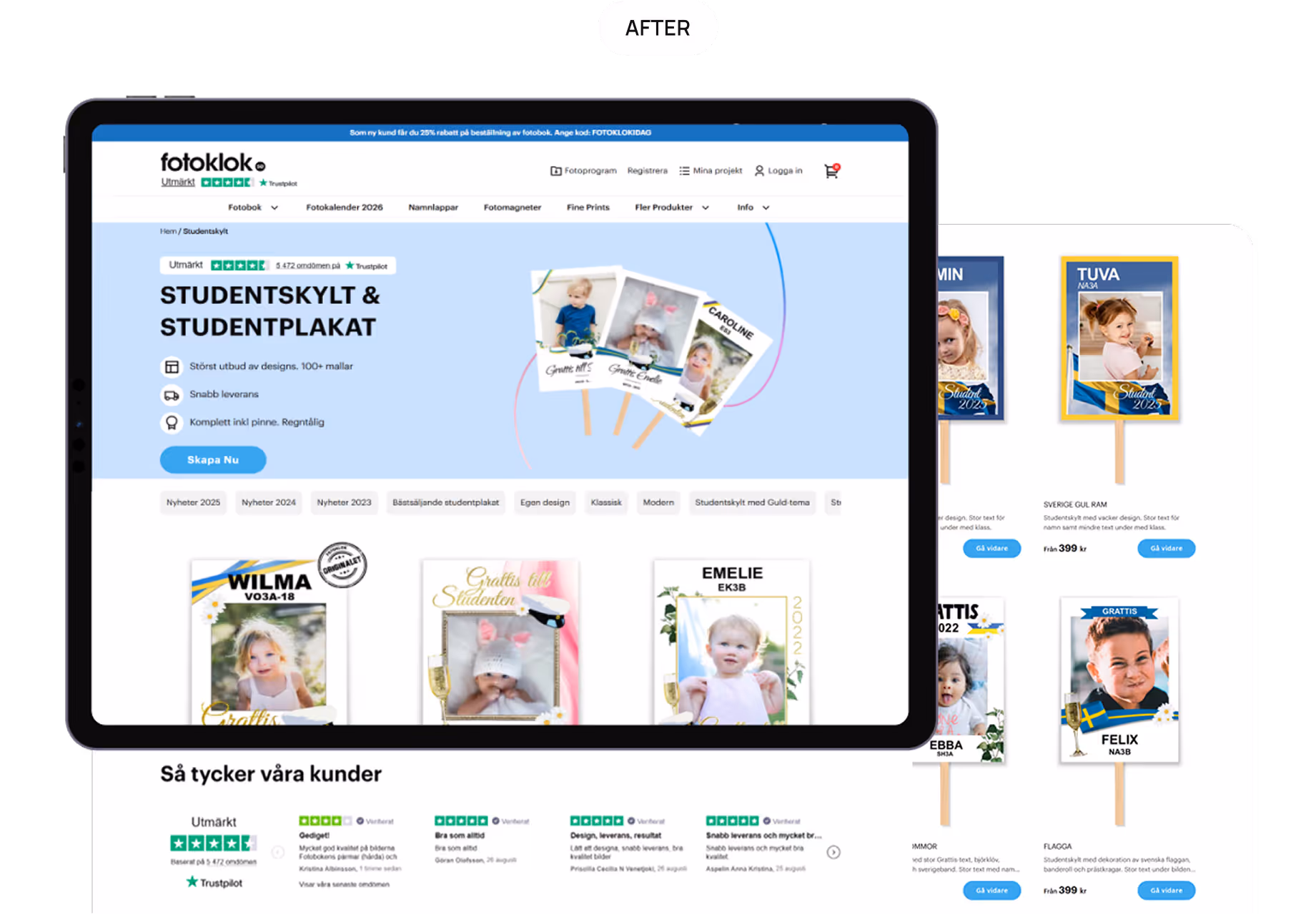
Category pages: Swedish traditions + usability
Before: category pages felt flat — products lacked detail, trust signals were missing, and long texts pushed important info out of view.
After: the alpha categories like Studentskylt, Fotobok, and Fotokalender now highlight clear benefits, reviews, photo/video galleries, and product cards with carousels, prices, and a bold “Design” button, with SEO texts folded under “Read more”. Regular categories follow a simpler version of the same structure.
The result is pages that feel both practical and warm, honoring Swedish traditions.
Product page: clarity and care
Before: the product page lacked guidance, details, and trust signals, leaving users unsure how to order.
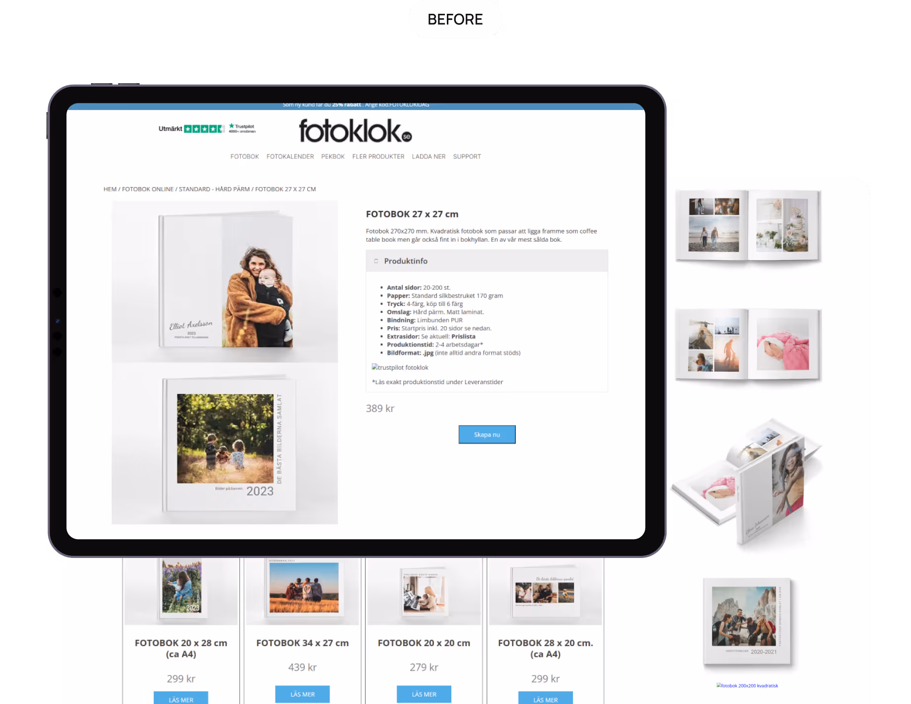
After, it was redesigned around three principles:
- Clarity of choice: big images, visual format cards, video option, and a “Related Products” block.
- Simple process: explained with three clear steps — upload photos, customize, receive in 48h.
- Trust cues: reviews, customer photos, badges, secure payment icons, and bold CTAs.
The result: a product details page that feels light yet complete, guiding users smoothly from idea to order.

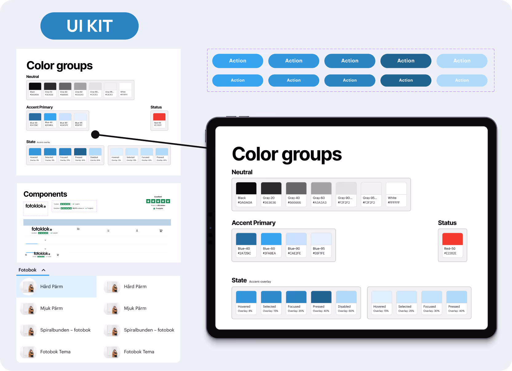
Design system: scaling with consistency
To ensure Fotoklok could grow without losing its identity, we created a UI kit with all the essentials — typography, buttons, icons, color palettes, and reusable components in every state.

Results
Redesigning Fotoklok was about aligning their heartfelt mission with a smoother, more trustworthy user journey.
Together with TopDog, we optimized design, content, and structure so the site works equally well for users and for Google.
The impact speaks for itself:
- +30% traffic from Google
- +25% boost in conversions
- Stable rankings for key categories like Studentskylt, Fotobok, and Fotokalender
- Most successful revenue season in company history