


Fotoklok’s Success Story: How Usability and SEO Drove +30% Traffic & +25% Conversions
What does a website for creating memories need most? Clever SEO, usability that showcases the brand's reliability, effective Google Ads, and a big heart.
Here’s the website growth story… or even the story of strong collaboration between Fotoklok, a Swedish company; TopDog, SEO-agency; and Turum-burum, UX/UI company.
Spoiler: as any good story, this one aligned the client’s wishes, business needs, SEO requirements, and usability, and had the happy ending of +30% traffic and +25% conversions, with the next chapters still being written together.
Want more details on how SEO and usability impact KPIs? Here we are to tell it in full!
Fotoklok: story behind and tasks on the table
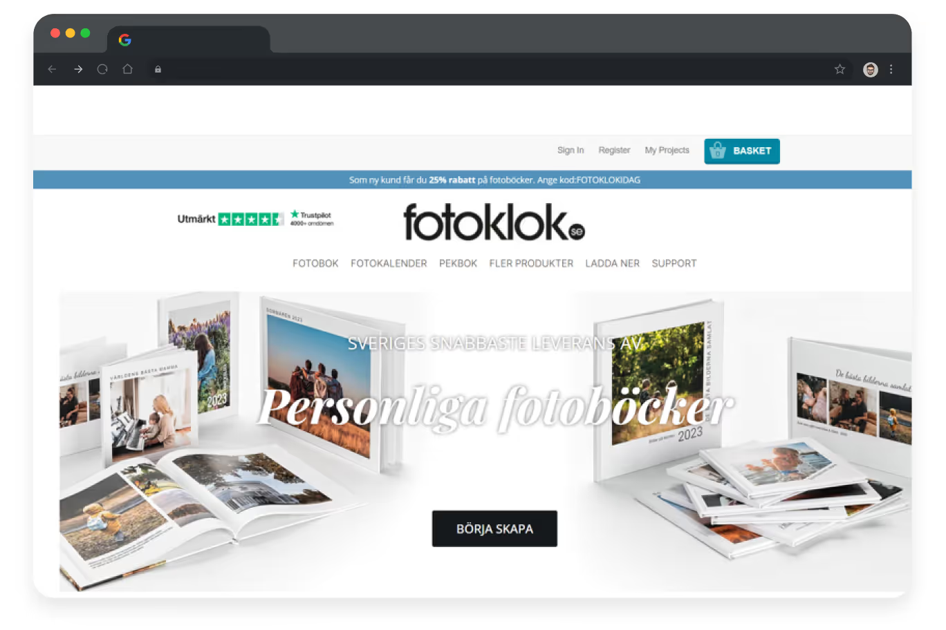
Fotoklok has been helping people preserve their memories since 2010. Based in Skene, Sweden, they produce photobooks, calendars, student signs, and other products cherished as gifts and timeless keepsakes.

But even the most heartfelt companies face digital challenges. Fotoklok is no different.
Their website, while functional, had several SEO and UX growth points.
- The design was outdated and no longer fully reflected the brand’s strengths.
- The user journey felt disconnected, one message was communicated on-site, another off-site. Overall navigation was fragmented, broken into parts that weren’t well connected, especially for visitors coming from Google.
- Content wasn’t yet integrated into the UX in a useful and pleasant way.
- Small but critical tech issues held back performance.
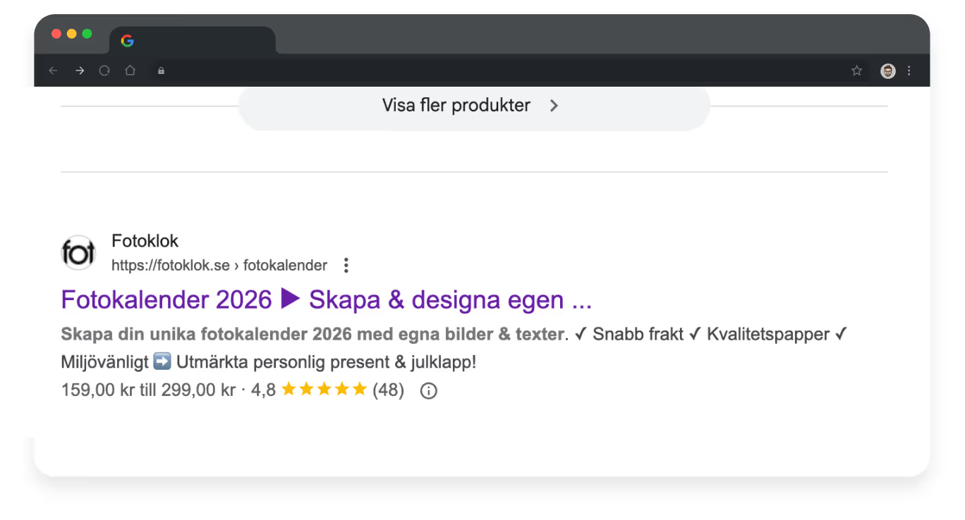
- Most importantly, rankings for key topics like 'fotobok' and 'fotokalender' were unstable, hurting both visibility and conversions.
That’s when three parties came together:
- Mats, Fotoklok’s product owner and serial entrepreneur with over 15 startups under his belt, set the direction and defined the business needs. His focus: stable traffic, smoother sales, and a site that truly reflected Fotoklok’s reliability and benefits.
- Christian, CEO of TopDog, brought in SEO expertise. Running a boutique agency across Sweden, his team’s mission was to stabilize rankings, fix technical bottlenecks, and align Google’s view of Fotoklok with its real-world trust. A key role in this process was SEO specialist Vova, who handled the SEO work and implementation.
- And our team at Turum-burum took on the UX/UI side, aligning the client’s wishes, TopDog’s requirements, and best practices and creating a unified design system for stressless scaling.
That was the starting point of the collaboration to realign Fotoklok’s digital journey with the company’s mission and ensure that Google and customers alike could see it.
SEO solutions that helped increase traffic by 30%
It was TopDog who got to work with Fotoklok. Here is a brief summary of what they found:
- Design limitations: while functional, the site no longer fully reflected modern usability or SEO best practices.
- Fragmented user journeys: visitors coming from Google weren’t always guided smoothly to the right product or action.
- Technical issues: small but critical ones that affected both rankings and conversions.
With this in mind, TopDog:
- Created a clear roadmap of requirements for the website that became the foundation for the redesign (became a part of Turum-burum work);
- Aligned messaging and benefits across Google search results and onsite pages;
- Created SEO-friendly UX requirements and content, making pages more relevant, trustworthy, and conversion-driven while keeping Google satisfied;
- Fixed technical issues to ensure stable rankings and reliable performance even during peak loads.
Design solutions that helped increase conversion by 25%
To move forward, we started with the analysis of the materials provided by TopDog, along with Fotoklok’s requirements and wishes, and researching user journeys.
Having a roadmap for the redesign, we got to work with key templates like navigation, category pages, and product pages and build the design system.
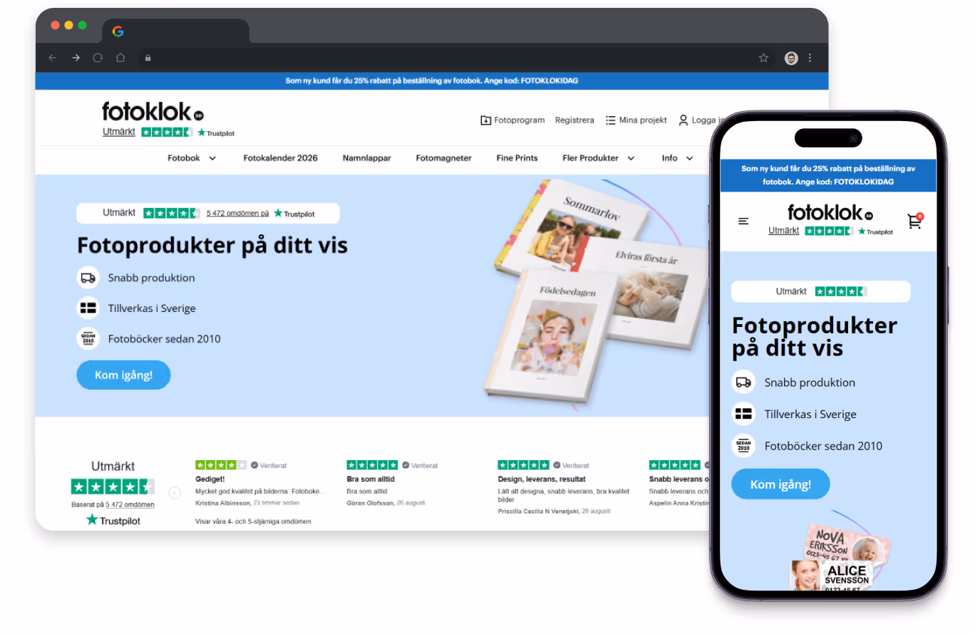
Navigation: quick paths, visible trust, happy customers
Navigation sets the tone, so it was made thoughtfully, with all the client’s and TopDog’s team requirements considered and the best practices in mind. With a focus on trust.
The header was cleaned up for clarity: the logo now sits beside trust signals, while essential actions (projects, login/registration, cart, and the desktop app) are just one tap away with clear and familiar icons.
The main menu is centered for easy scanning with subcategories open on hover with thumbnails, giving users quick visual cues.
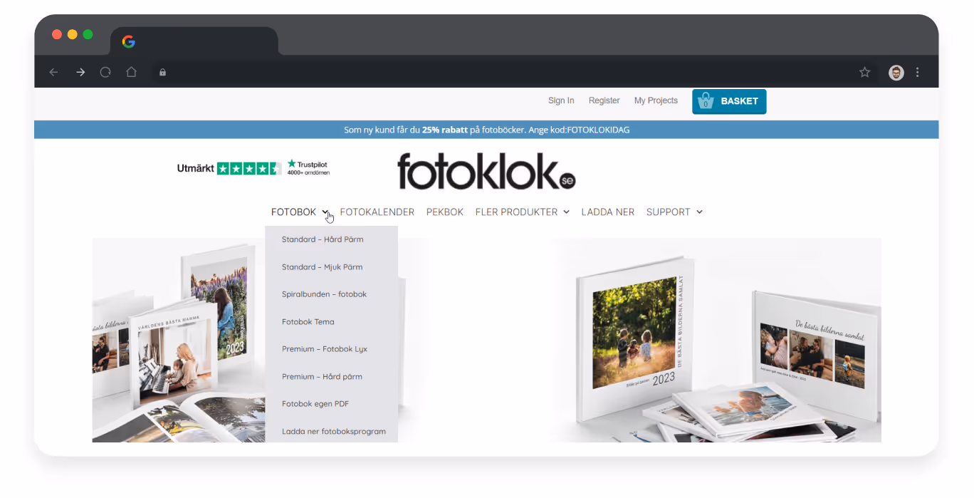

On mobile, the structure and layout are made according to the mobile user's behavior patterns, with improved spacing and interaction. Expanding submenus is now smoother, and thumbnails make even small-screen browsing easier.
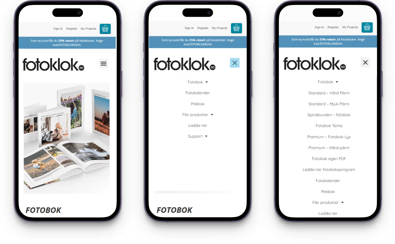
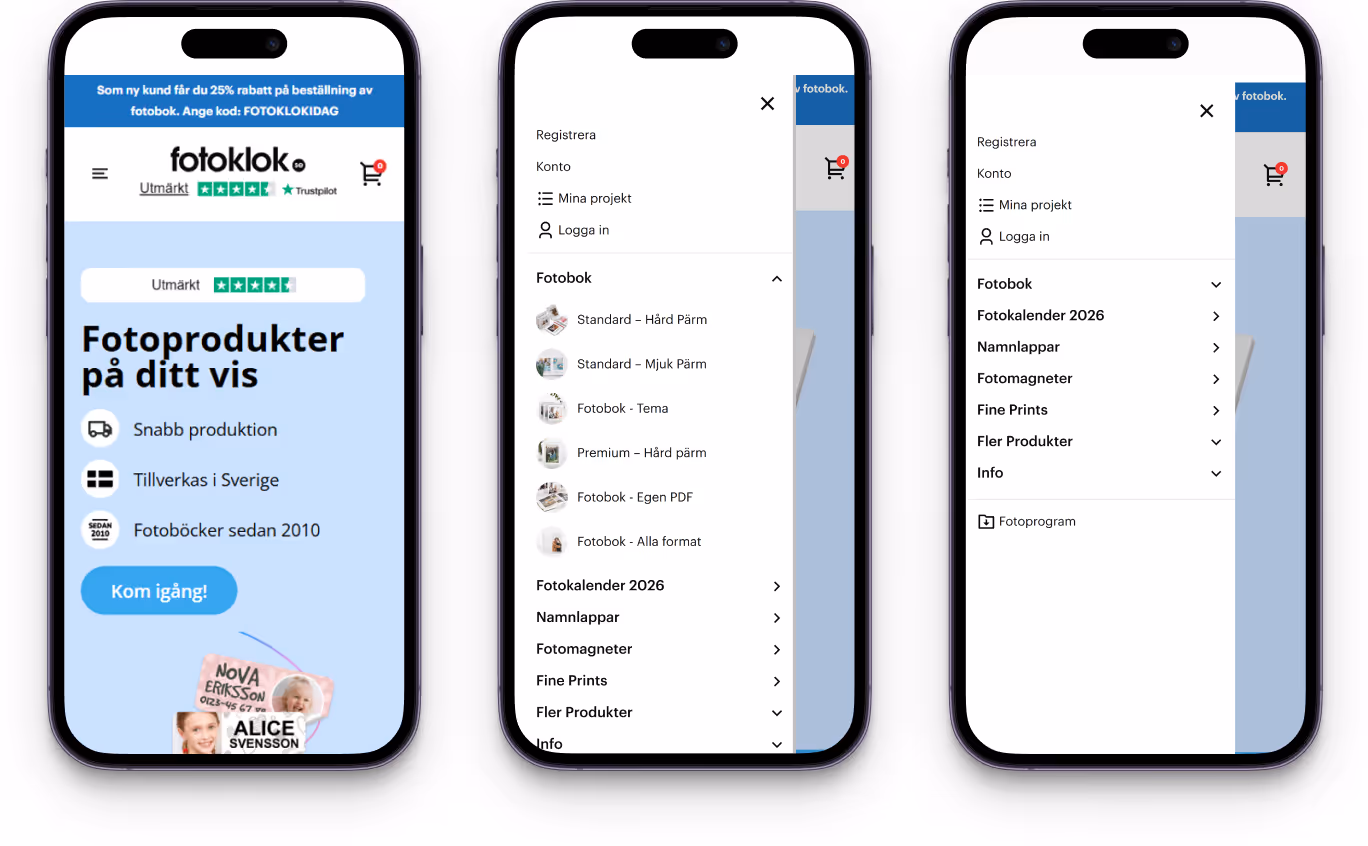
The result: navigation that feels light, trustworthy, and effortless, helping customers start their projects in seconds instead of searching. Whenever the device is used.
{{block}}
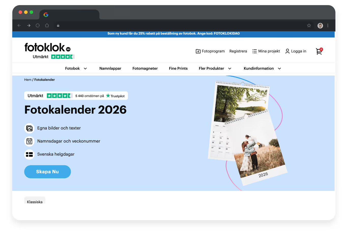
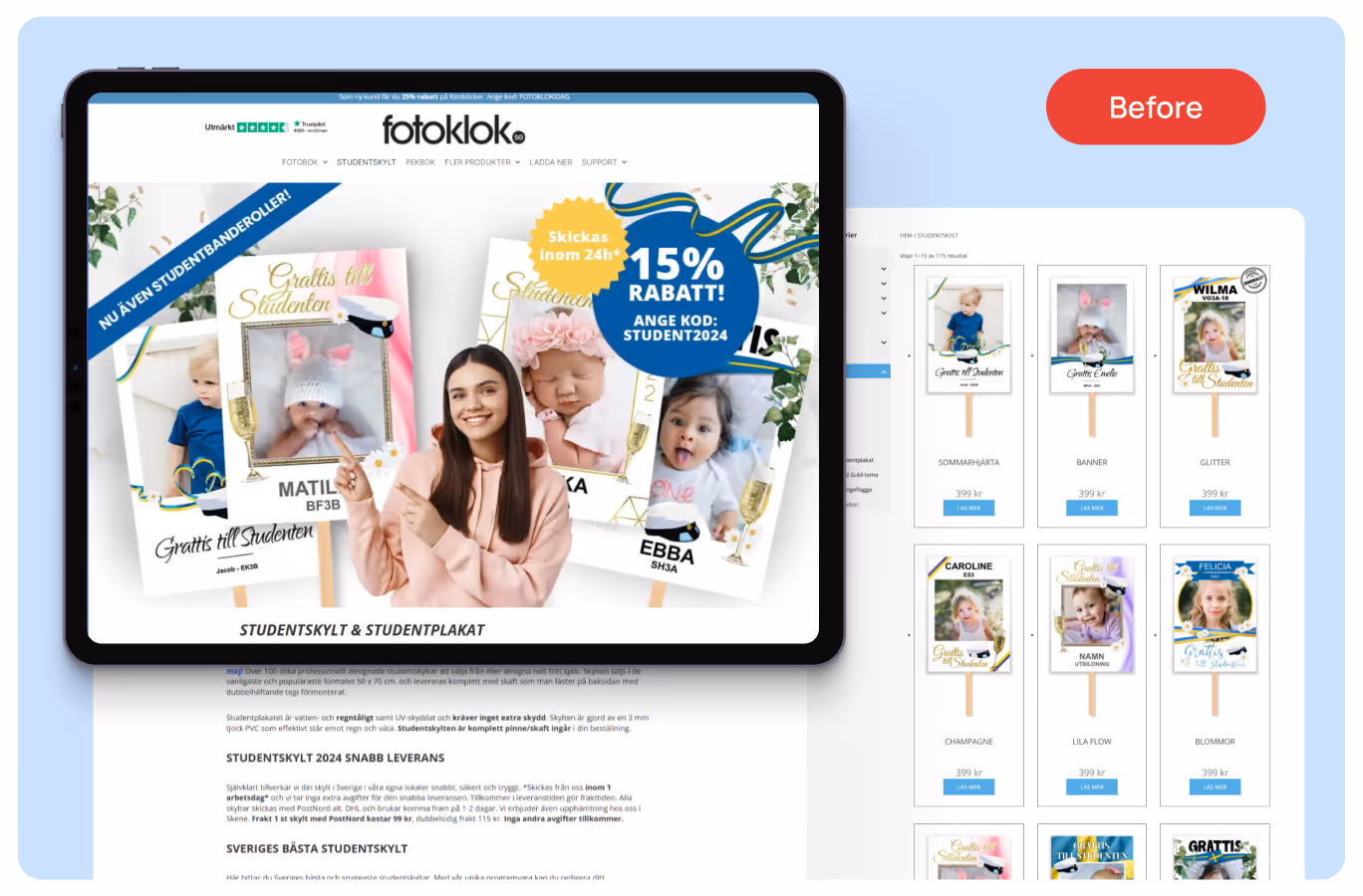
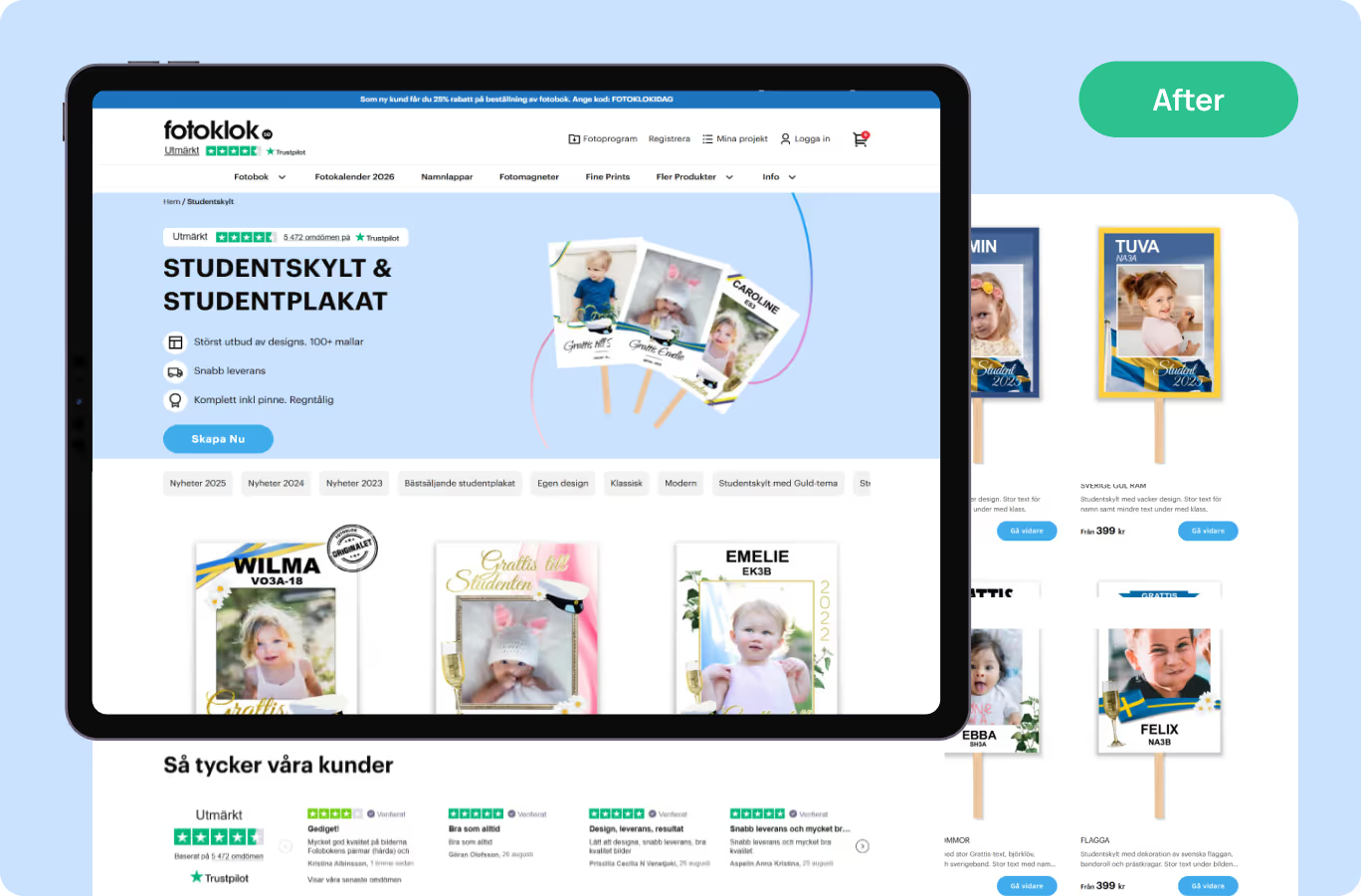
Category pages: honoring Swedish traditions with practical design
We redesigned all category pages, but gave extra attention to Studentskylt, Fotobok, and Fotokalender — the alpha categories most closely tied to Swedish traditions and seasonal demand.
Take Studentskylt. In Sweden, graduation signs with childhood photos are a beloved tradition and a symbol of growing up. The task was to redesign the page so it reflects this warmth but also stays practical for customers ordering at scale.
Thus, the most crucial information is kept front and center:
- Quick benefit highlights with icons;
- Trustpilot widget for reassurance;
- Product cards with image carousel, price, short description, sale labels, and a bright “Design” button;
- Pagination made browsing simple and stress-free.
For Fotobok and Fotokalender, we used the same structure but adjusted layouts to fit the product specifics:
- The blocks showcasing quality and materials;
- Customer reviews to provide a social proof;
- Photo/video gallery to give the categories a more human, lived-in feel.
The regular categories followed the same structure in a leaner way: clean informative product cards, light pagination, promotional labels where relevant, etc.


To balance rankings with usability, SEO texts and FAQs remained on all the category pages but were folded under “Read more” links, so users see the crucial information first while Google still gets the content it needs.
The result: alpha categories that honor tradition and seasonal products, and regular ones that stay clear and efficient — all aligned with requirements and brought to life through clean, user-friendly design.
Product page: guiding users with clarity and care
The product page is where browsing turns into creating, so it had to feel simple, trustworthy, and inspiring. The old version not only didn’t guide users through the process but also didn't provide them with product details.
The PDP (product details page) was redesigned around three core principles:
- Clarity of choice: large images in the carousel, formats shown as visual cards instead of text, and a thumbnail slider with a video option, so users can see the product in action. A “Related Products” block keeps customers engaged and helps them discover the right fit.
- Process explained. The ordering process is illustrated by icons in three easy steps: upload photos, customize, and receive in 48h.
- Trust and conversion cues: customer photos and reviews for social proof, quality/award badges that emphasize reliability, benefit highlights, secure payment icons, and bold CTAs were placed at key points to reassure users and remove hesitation.


The outcome: a product details page that feels light yet complete, replacing dry product info with a guided experience and making it effortless for users to go from idea to order.
Helping to keep going or creating a design for further success
Designing key pages was only part of the story. To make sure Fotoklok could continue evolving without losing consistency and brand identity, we also prepared a UI kit. It included the essential building blocks like typography, buttons, icons, color palettes, and reusable components, — and all that in all the possible states.
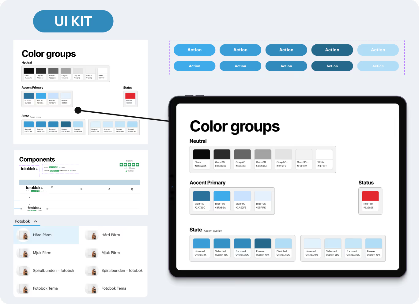
So, the dev team can work faster, with fewer ambiguities, because every element is documented and ready to implement.
{{block}}
SEO and usability improvements results: traffic up, conversions higher, clients happier
Redesigning Fotoklok wasn’t just about fresh visuals, but also it was about aligning the company’s heartfelt mission with a smoother, more trustworthy user journey. Together with TopDog, we optimized design, content, and structure to make the site both welcoming for users and stable for Google.
The impact was clear and impressive:
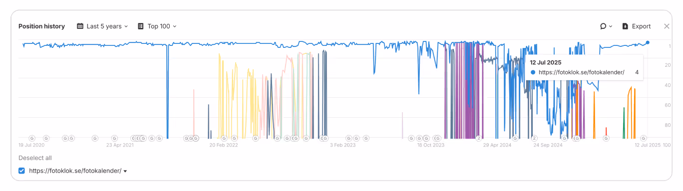
- +30% increase in traffic from Google
“The chart below shows Fotoklok rankings on the word 'fotokalender' in the Swedish index. The graph clearly shows they have a Google problem. Rankings fluctuate a lot. As you can see, the rankings are stable post-project. The right content is in the right place. The graph also shows a stable but slow uptrend in rankings for the word.”
— Christian Rudolf, CEO, Topdog

- +25% boost in conversion rate
These results didn’t come from the design alone. They were the outcome of a close collaboration: Fotoklok defining their wishes, TopDog guiding SEO and new design implementation, and our team turning requirements into a user experience that truly works.
Testimonial Highlight:
“We took a comprehensive approach to SEO together with TopDog & Turum-burum, with a particular focus on UX SEO and mapping user journeys. By analyzing how visitors navigated the site, rebuilding the information architecture, and optimizing both design and content, we increased traffic from Google by 30% and boosted our conversion rate by 25%. This resulted in our most successful season in terms of revenue ever.”
— Mats Ohlsson, PO, Fotoklok
FAQ
Question reference
Answer reference


More real-world Turum-burum cases?
Review our vast portfolio of cases in a variety of business fields to make sure of our expertise.
Go to Portfolio
