


Telegram Mini App: Beyond the Standard UI. Designing a Truly Native Experience
A Mini App is Not Just a Website in a Frame
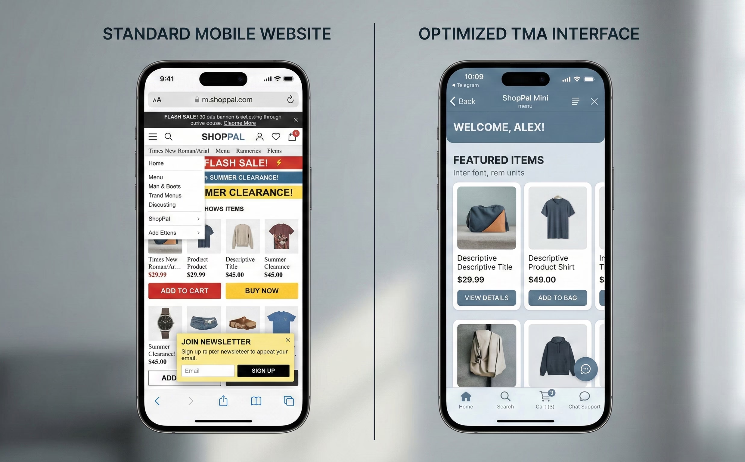
The era of simple chatbots is long gone. Telegram Mini Apps (TMA) have introduced a new paradigm of user interaction within the messenger. However, the most common pitfall for developers is treating a TMA as nothing more than a mobile version of a website wrapped in a WebView.
For a user, the transition from a chat to a Mini App must be seamless. If this journey is interrupted by visual or logical dissonance, conversion rates drop before the first script even loads.
Why Copy-Pasting Kills Conversion
Most e-commerce or SaaS platforms are designed for a standard browser experience. When such an interface is forced into the Telegram environment, it creates what we call a "foreign interface" effect.
1. Cognitive Load and Trust: Users subconsciously expect specific behavioral patterns within Telegram. If an app looks like a random website, it triggers a "phishing effect." This is particularly critical for Web3 projects where connecting a wallet or entering sensitive data is required. Trust is the baseline for conversion, and a non-native look shatters it instantly.
2. The "White Screen" Perception: In a web environment, users are accustomed to loading bars. In a messenger, any delay is perceived as a technical failure. Technical hygiene—such as the immediate execution of the ready() method to prevent UI flickering—is mandatory. Research suggests that usability activities should account for at least 10% of the project budget, and in TMA, this starts with ensuring the app doesn't "blink" upon launch.
3. Environmental Conflict: Browsers have their own controls (address bars, back buttons). TMA has its own set of system-level components, like the MainButton or the BackButton. Simply mirroring a mobile site often leads to duplicated navigation, creating visual noise that confuses the user and leads to high bounce rates.
The "App-in-App" Concept: Designing for the Ecosystem
A successful Mini App is built on the "App-in-App" principle. This means designing an application that doesn't feel like an isolated island but rather a natural, functional extension of the Telegram ecosystem.
Designing for this ecosystem requires a shift in focus: instead of trying to fit a website into a frame, specialized telegram mini app development services focus on utilizing Telegram's native affordances—such as themeParams for color synchronization and haptic feedback—to ensure the user feels they are still within their trusted messenger environment.
The Psychology of a Seamless Entry (Entry Point UX)
The first few seconds of interaction determine whether a user stays or leaves. In a Mini App, the entry point is not just a URL; it is a transition point between social interaction and utility.
Entry Point Design: Inline Buttons vs. Menu Button
The choice of entry point dictates the user's intent. Inline buttons within a chat are contextual and drive higher immediate engagement for specific tasks (e.g., "Join Game" or "View Invoice"). Conversely, the Menu Button serves as a permanent shortcut for utility-heavy apps. A native experience starts with choosing the right trigger that aligns with the user's current flow within the chat.
Skeleton Screens: Fighting the Load Time Perception
Waiting for JavaScript to initialize can feel like an eternity in a messenger. Instead of showing a generic spinner or a blank page, high-quality TMAs implement Skeleton Screens. By rendering a visual outline of the interface immediately, we reduce the "perceived" loading time. This signals to the user that the app is responsive, even if the data is still being fetched.
Theming & Color Schemes: The Power of themeParams
Nothing breaks immersion faster than a bright white app opening while the user is in a dark-themed Telegram interface. Utilizing the themeParams object is non-negotiable. An app must automatically sync its background, text, and accent colors with the user's Telegram theme. This level of technical adaptation proves that the product is a "first-class citizen" of the ecosystem.
Personalization from the Start
Telegram allows Mini Apps to access basic profile information, such as the user’s first name and avatar, instantly. Displaying a "Welcome, [Name]" message or a personalized dashboard right after the launch creates an immediate sense of belonging. This bypasses the friction of traditional sign-up flows and reinforces the feeling that the app is part of the user's personal messenger space.
Navigation Pitfalls and Solutions
Navigation in a Mini App is where the distinction between a "mobile site" and a "native-like application" becomes most apparent. Because the Telegram container has its own set of global gestures and system buttons, developers must account for physical interactions that don't exist in a standard browser.
Swipe Conflicts: The iOS "Accidental Closure" Problem
One of the most frustrating UX failures in TMA occurs on iOS. By default, a horizontal swipe from the edge of the screen is the system-wide gesture for "back" or "close."
If a Mini App includes horizontal elements—such as product carousels, image sliders, or kanban boards—users often trigger the container’s closure instead of scrolling through the content. To solve this:
- Safe Margins: Avoid placing interactive horizontal elements too close to the screen edges.
- Visual Cues: Use clear pagination indicators (dots or arrows) that signal the element is a slider, helping users adjust their touch targets away from the "trigger zones" of the iOS edge-swipe.
- Locking Gestures: Use the Telegram API to manage viewport behavior, ensuring that horizontal navigation within the app doesn't conflict with the parent container’s vertical "swipe-to-close" logic.
MainButton vs. Custom UI Buttons
Telegram provides a native MainButton—a high-contrast, persistent button fixed at the bottom of the interface. This is a powerful affordance that users recognize as the primary Call to Action (CTA), such as "Pay," "Submit," or "Next."
A strategic approach to navigation means:
- The Power of Familiarity: Using the native MainButton instead of custom floating web buttons increases trust and conversion. It feels more secure, especially for transactions.
- Adaptive States: The MainButton supports loading states and disabling, which prevents double-tapping and provides instant feedback during API calls.
- Strategic Placement: Reserve the MainButton for the most critical action on the screen. For secondary actions, use standard UI buttons within the layout to maintain a clear hierarchy.
Haptic Feedback: The Tactile Dimension
Haptic feedback is often overlooked, yet it is essential for creating a "premium" feel. Telegram’s HapticFeedback API allows developers to trigger subtle vibrations for different user actions.
- Impact Levels: Use "light" or "medium" impacts for button presses or toggles to simulate a physical click.
- Success and Error Alerts: A distinct vibration pattern for a successful payment or an input error provides confirmation without requiring the user to look for a text message.
- The "Premium" Factor: Small tactile details significantly improve the perceived quality of the app. It transforms the interface from a flat, static webpage into a responsive, physical tool that "reacts" to the user’s touch.
Retention & Engagement UX (Keeping the User Hooked)
In the hyper-competitive environment of a messenger, where a user is always one "back" gesture away from a hundred other chats, retention isn't just a marketing metric—it’s a core design challenge. Engagement in a Mini App must be high-frequency and low-friction.
Closing Confirmation: Protecting User Effort
One of the most common "rage-quit" scenarios in TMA is the accidental closure of an app during a complex task. Because the "swipe-to-close" gesture is so easy to trigger, users can lose minutes of progress in a heartbeat.
Implementing the ClosingConfirmation API is a simple but vital UX safety net. When enabled, the app prompts the user with a system-level dialog before closing. This should not be used everywhere (to avoid "dialog fatigue"), but it is mandatory for:
- Checkout processes and payment flows.
- Long form-filling or data entry.
- Active gameplay sessions where progress hasn't been auto-saved.
Push Notifications: The Delicate Balance
Telegram has significantly expanded notification capabilities for Mini Apps, allowing for more granular re-engagement. However, the UX challenge is to provide value without being perceived as spam, which leads to the user muting the entire bot.
- Contextual Opt-in: Instead of asking for notification permissions on the first launch, wait for a meaningful event (e.g., "Notify me when my order is ready" or "Alert me when my energy refills").
- Service Messages: Use notifications to bridge the gap between the app and the chat. A notification that leads directly to a specific state within the TMA creates a "loop" that keeps the user coming back.
Share Mechanics: Social Proof and Virality
Telegram is, first and foremost, a social platform. A native-like TMA should leverage this by making sharing a core part of the UI.
- Story Integration: Designing specific "shareable" layouts for Telegram Stories (with vertical aspect ratios and space for UI overlays) allows users to show off achievements or products with one tap.
- Direct Forwarding: Use the share API to allow users to send specific deep-linked content to friends or groups. The UX should focus on creating "cards" or "achievements" that look visually appealing within the chat preview.
Gamifying Micro-interactions: Delighting the User
To make an app feel organic to Telegram, it should mirror the messenger’s own playfulness. Telegram's UI is famous for its smooth, animated stickers and reactive emojis.
- Lottie Animations: Use lightweight Lottie files for state transitions, success messages, or loading states. They provide high-fidelity motion without the performance tax of heavy video files.
- Confetti and Visual Feedback: Triggering a "confetti" effect via the API upon a successful purchase or a level-up provides a hit of dopamine that reinforces positive user behavior. These micro-interactions transform a functional tool into an enjoyable experience
Technical UX: Speed and Accessibility
In the world of Telegram Mini Apps, technical performance is not just a backend concern—it is a fundamental part of the user experience. Because TMAs run within a web container, they are often judged against the speed and reliability of native mobile applications. Any technical friction, such as a slow load or a broken offline state, immediately breaks the "native" illusion.
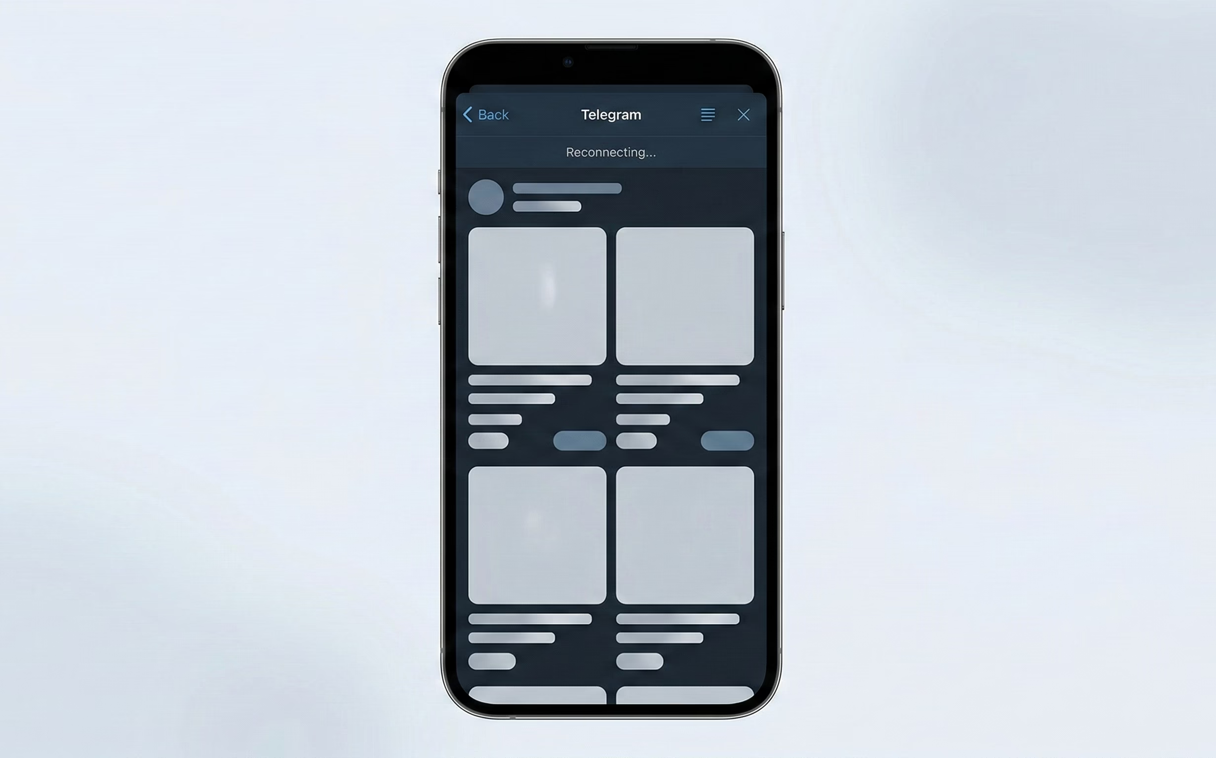
Offline Experience: Mastering "Metro Mode"
Users often interact with Telegram in environments with unstable connectivity—subways, elevators, or crowded areas. A robust TMA must handle these transitions gracefully rather than displaying a generic browser "No Internet" error.
- Caching Strategy: Implementing Service Workers allows the app to cache static assets (HTML, CSS, JS) and core UI components. This ensures that even without a connection, the shell of the app loads instantly, providing a sense of stability.
- Designing for "No Connection": When the network fails, the app should display a dedicated "Offline State" that mirrors Telegram’s own aesthetic. Instead of an empty screen, show cached data with a clear "Reconnecting..." status bar. This manages user expectations and prevents them from closing the app in frustration.
- Performance Benchmarks: To maintain a "snappy" feel, developers should aim for strict Core Web Vitals: a Largest Contentful Paint (LCP) of ≤ 2.5 seconds and an Interaction to Next Paint (INP) of ≤ 200ms. Speed is the most direct way to build user trust.
Accessibility: Inclusive Design within the Messenger
Telegram is a highly accessible platform used by a diverse global audience. A professional Mini App must adhere to these same standards of inclusivity, ensuring the interface is usable for everyone.
- Adapting to Dynamic Type: Telegram allows users to adjust their system-wide font sizes. A well-designed TMA must respect these settings. Using relative units (like rem or em) instead of fixed pixels ensures that text scales correctly without breaking the layout or causing element overlap.
- Contrast and Legibility: Following WCAG 2.2 standards is essential. Maintaining a minimum contrast ratio of 4.5:1 for text against its background ensures readability in various lighting conditions—from bright sunlight to low-light "Night Mode."
- Semantic HTML and Screen Readers: Using proper ARIA labels and semantic tags allows screen readers to navigate the app effectively. Since a TMA is technically a website, these "invisible" UX elements are what make the application truly accessible to users with visual impairments.
Error Handling as a Design Tool
Errors are inevitable, but how they are communicated defines the quality of the UX. In a TMA, error messages should never feel like "system failures."
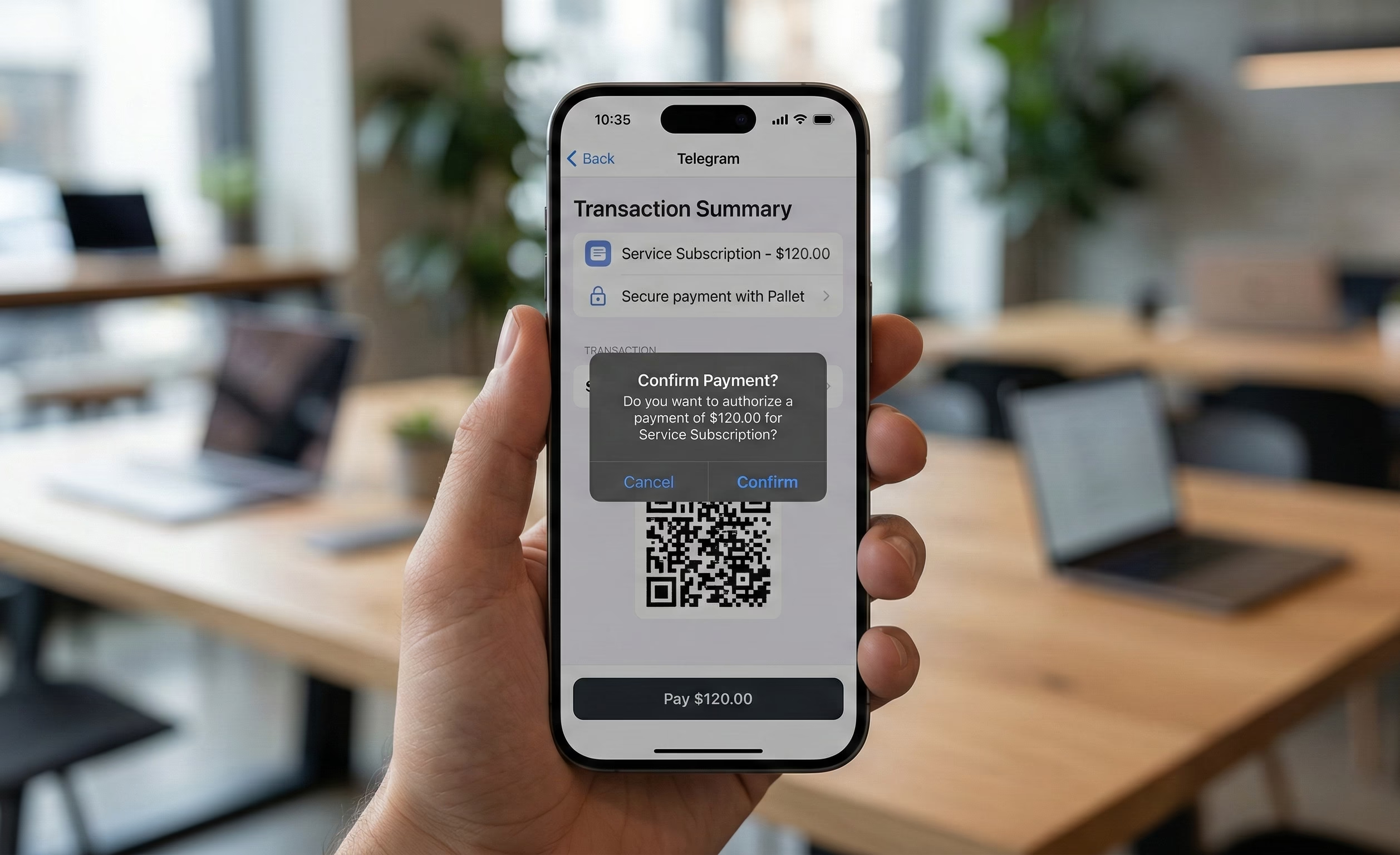
- Telegram-Style Popups: Use the native showPopup or showAlert methods for critical errors. These UI elements are familiar to Telegram users and carry more "authority" than custom web modals.
- Constructive Feedback: Instead of saying "Action Failed," use human-centric language like "Something went wrong. Please check your balance and try again." This guides the user toward a solution rather than a dead end.
Security and Trust (Web3 & Data)
In an ecosystem where "viral" apps can gain millions of users overnight, security is not just a technical requirement—it is a cornerstone of the user experience. For Telegram Mini Apps, especially those involving Web3 or personal data, the "trust barrier" is the highest hurdle to conversion. If a user feels even a slight hint of risk, they will close the app and return to the safety of their chat list.
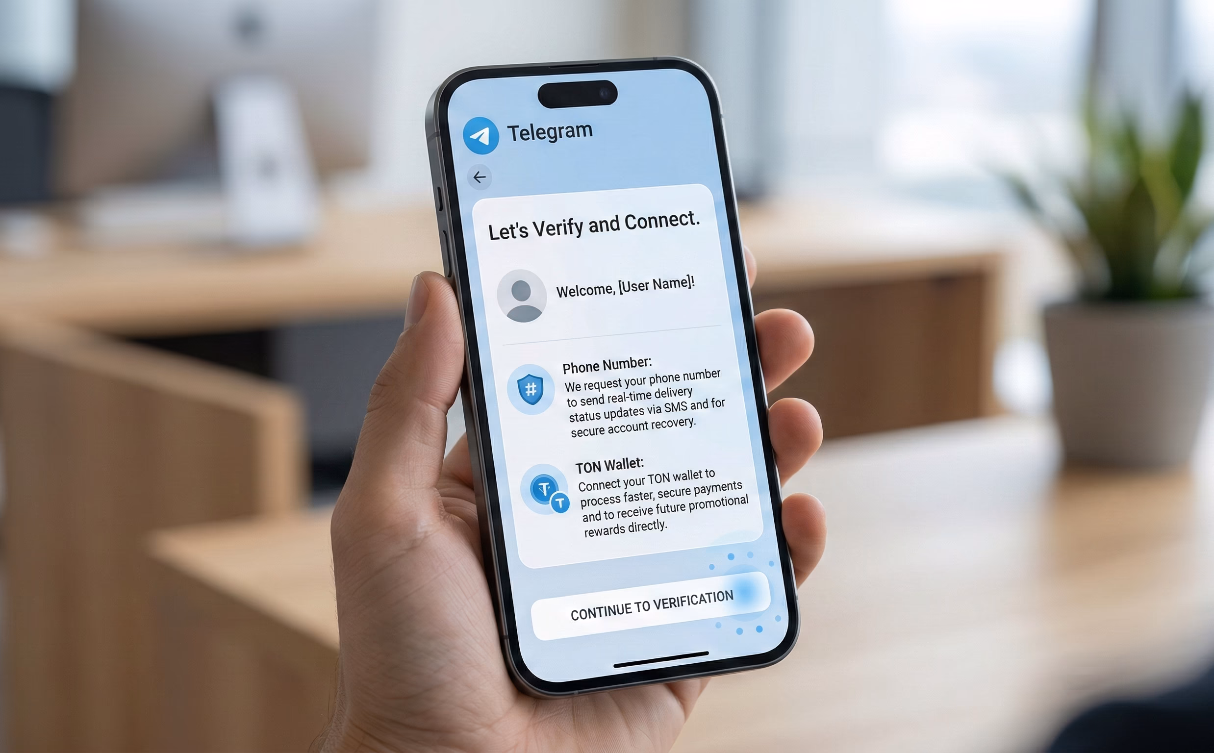
Data Request UX: Transparency Over Friction
The moment an app requests access to a phone number or a TON wallet is the moment most users drop off. To mitigate this, the request must be contextual and transparent.
- The "Just-in-Time" Strategy: Never ask for sensitive permissions on the first launch. A request for a phone number should only appear when the user is about to perform an action that requires it (e.g., "Verify your number to track your delivery").
- The Explanatory Lead-in: Before triggering the system-level permission dialog, use a custom UI element to explain why the data is needed and how it will be protected. This "pre-request" screen reduces the shock of the system popup and allows the user to make an informed decision.
- Native Dialogs: Always use Telegram’s native showPopup or showAlert for security-related messaging. These components carry the aesthetic authority of the platform, signaling to the user that the request is being handled through official channels rather than a malicious script.
Ecosystem Trust: Leveraging Familiar Patterns
Users have already built a mental model of how "safe" interactions look in Telegram, largely influenced by the official Telegram Wallet and standard authentication flows.
- Mirroring the Wallet Experience: When integrating Web3 features, the UI should mirror the patterns used by the official Wallet app. This includes using similar terminology, icon sets, and transaction confirmation layouts. When a user sees a familiar interface, their "anti-phishing" guard lowers because the experience feels regulated and standard.
- Security Validation as UX: Trust is also built through technical transparency. Behind the scenes, the application must strictly validate initData on the backend. While this is a technical step, it manifests in the UX as a stable, secure session where users don't face unexpected logouts or data inconsistencies.
- Anti-Phishing Patterns: In a landscape of clones, visual consistency is a security feature. Maintaining a unique but ecosystem-aligned design helps users recognize the "official" version of an app. Avoiding external redirects for payments or authentication keeps the user within the "walled garden" of Telegram, which is inherently perceived as more secure than the open web.
Conclusion: The Invisible Standard
True "Native" UX in a Telegram Mini App is invisible. It’s the absence of flickering, the lack of gesture conflicts, and the presence of familiar buttons and tactile responses. By moving beyond the "website in a frame" mindset and embracing the specific technical and psychological constraints of the Telegram ecosystem—a practice followed by industry experts like OmiSoft—developers can build products that are not just functional, but essential parts of the user's daily digital life.
FAQ
Question reference
Answer reference


.png)


%20(1).png)


More real-world Turum-burum cases?
Review our vast portfolio of cases in a variety of business fields to make sure of our expertise.
Go to Portfolio
