Best Web3 website design examples to learn from
We continue our series of articles highlighting the best UX/UI solutions for various niches and products like fintech, SaaS, CRM, etc. And today we will talk about rocket science in the online world – Web3 websites.
How to make an innovative digital product accessible to customers without specific knowledge while displaying all the strong sides of it? In this article, we share the best Web3 design solutions from real cases for your inspiration.
Web3 design peculiarities, or what is under the hood
Web3 websites are the ‘gateway’ to a decentralized internet, where users own their data, assets, and digital identity via blockchain and crypto wallets. Unlike traditional Web2 platforms, which act as mediators, Web3 products directly connect people with decentralized applications (dApps), cryptocurrencies, NFTs, and DeFi tools.
What are the objectives of UX/UI design in this niche?
- Make complex processes understandable and straightforward;
- Build trust through transparency and security;
- Guide users towards targeted actions that are often associated with real money.
However, Web3 design comes with its own challenges. Most users still don't completely understand the concepts of blockchain, cryptocurrencies, or NFTs. At the same time, designers need to balance a user-friendly interface with clear explanations of complex and challenging processes, like making transactions or activating a wallet.
Therefore, we have collected the best examples of Web3 website design solutions that prove that even complex technologies can be presented in an accessible, intuitive, and understandable way.
Best Web3 website design: UX/UI solutions that work
1. RPC Fast: UI/UX design for a WEB3 startup
RCP Fast is a ready-to-use product for blockchain node deployment made by Dysnix, a well-known company experienced in DevOps, Kubernetes, and blockchain.
What UX/UI solutions make this website so special?
- Deep symbolism
The homepage of the RPC Fast website contains a few distinctive and metaphoric symbols that subconsciously bring about building customer trust and loyalty:
- Vault emphasizes the security of the technology and demonstrates that the company cares about data safety

- Rabbit that seems as if flying out of the portal, followed by nodes — speed of service

- Lock — high security level to protect clients’ data

- Convenient price calculator
The moment people have to say goodbye to their money is usually painful, especially when they don’t know for sure how much they will be charged. Therefore, a price calculator with a user-friendly interface, accented buttons, and clear descriptions is a very client-oriented decision.
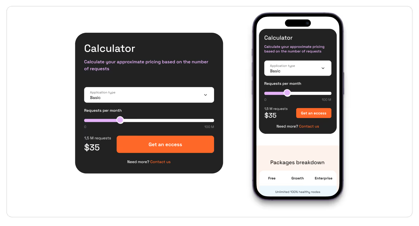
- Eloquent plans comparison
A comparative table of all available plans allows users to easily compare the advantages of different packages and choose the most relevant option for their project.

{{block}}
2. MetaMask: UX/UI for a Web3 Wallet
MetaMask is a popular crypto wallet and browser plugin for interacting with Ethereum and other blockchain networks. MetaMask provides a user-friendly experience for blockchain users while ensuring security.
Some of the key UX/UI solutions that enhance its convenience and reliability include:
- Intuitive onboarding with tips on creating a wallet
Managing crypto can feel intimidating, especially for first-time users. MetaMask simplifies this with a clean, guided interface, clear labels, and step-by-step prompts, making transactions and dApp interactions straightforward and secure.

- Dark mode for easier navigation
Web3 platforms display lots of data and tokens, which can be confusing. A dark theme makes colorful crypto icons stand out, creating a clear and modern interface.

- Absence of distracting elements
For web products like this, the page for buying and selling coins is the most converting. It is essential to make it simple, with just a few fields and no element that can draw users' attention away from the target action.

3. Zapper: web design for managing crypto assets and portfolios
Zapper is a Web3 platform for managing crypto assets and DeFi portfolios: investment tracking, making stakes, and cryptocurrency tracking.
Despite the vast amount of data presented, the interface is easy to use thanks to the following UX/UI solutions:
- Multi-functional dashboard
All the data on the website is collected and presented on one screen via an all-in-one dashboard.
This creates a sense of control and convenience — the user doesn’t get lost between tabs, which is essential for complex digital products

- Icons and visual markers
Instead of dry text, the website contains many token icons, service logos, and simple graphic elements in lists. This helps users quickly read information, even if there is a large amount of data.
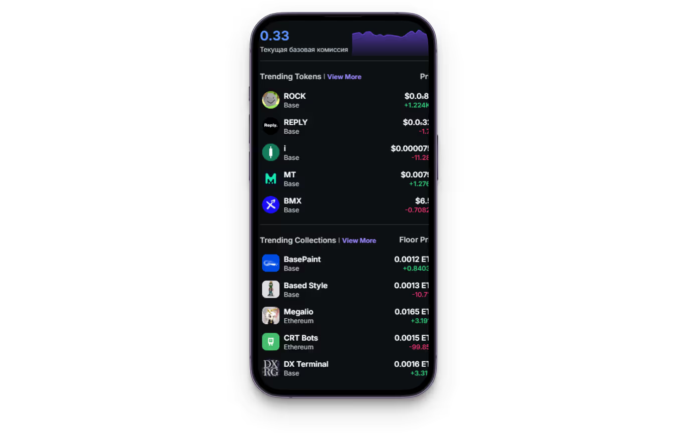
- Informative hover
When users put the mouse on certain blocks, Zapper displays additional information about cryptocurrencies: charts, rates, or transaction details. Thanks to this, users don’t have to navigate to other pages and can quickly find relevant information.

4. OpenSea: interface for an NFT platform
OpenSea is a high-tech company based on blockchain technologies that creates a bridge between art and technology.
The OpenSea interface is marked by a good deal of powerful UX/UI solutions, including:
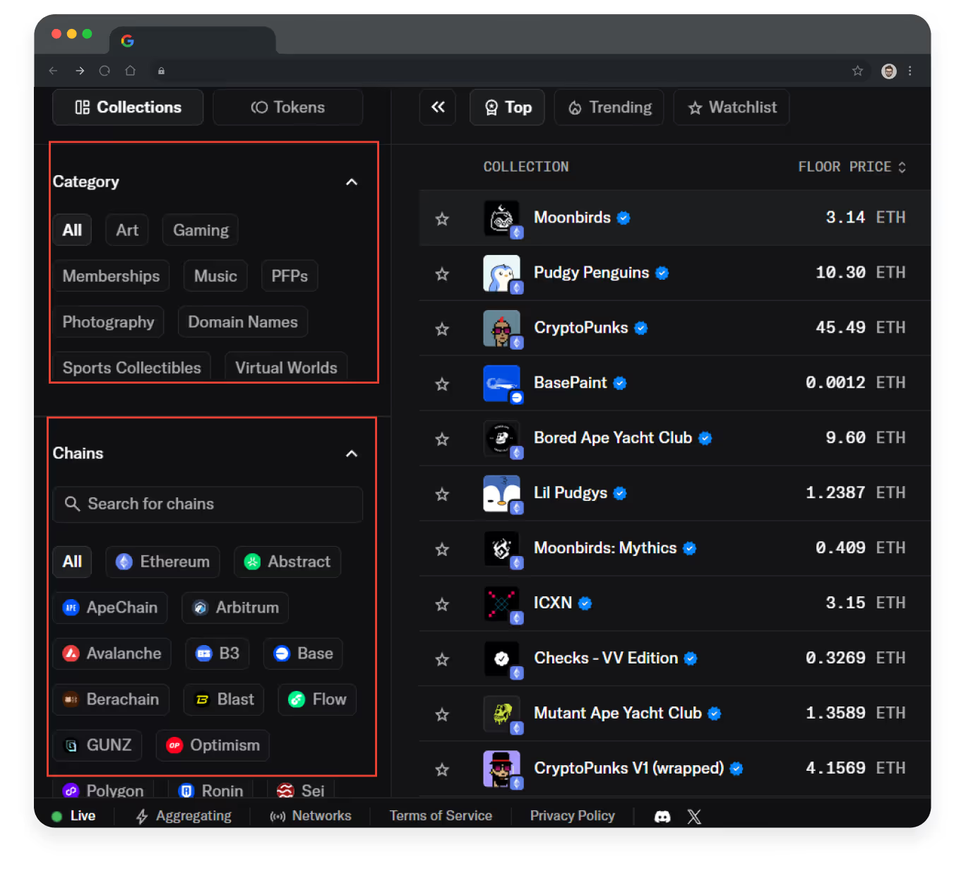
- Convenient filtering options
Users can quickly sort NFTs by category, chain, popularity, or even specific token properties. This approach saves time and allows customers to focus on relevant information without getting lost in thousands of options.
- Product as the highest value
The NFTs take up the majority of the product card, immediately grasping users’ attention and allowing them to assess the token's visual value.

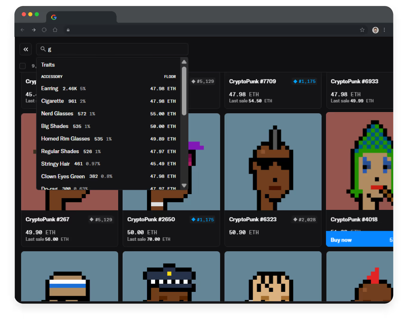
- Advanced search capabilities
The system automatically suggests relevant options as users type their queries. This allows them to quickly find relevant collections or tokens, even if they don't remember the exact name, by offering items that can also be liked, the same author, etc. This approach reduces the customer journey and makes the search process more intuitive.
{{block}}
5. Decentraland: UX/UI solutions for the platform to buy NFTs
Decentraland is a social digital world where users can buy virtual lands or clothes in the form of NFTs via the MANA cryptocurrency based on the Ethereum blockchain.
This Web3 platform feels special and even unique thanks to the following web design solutions:
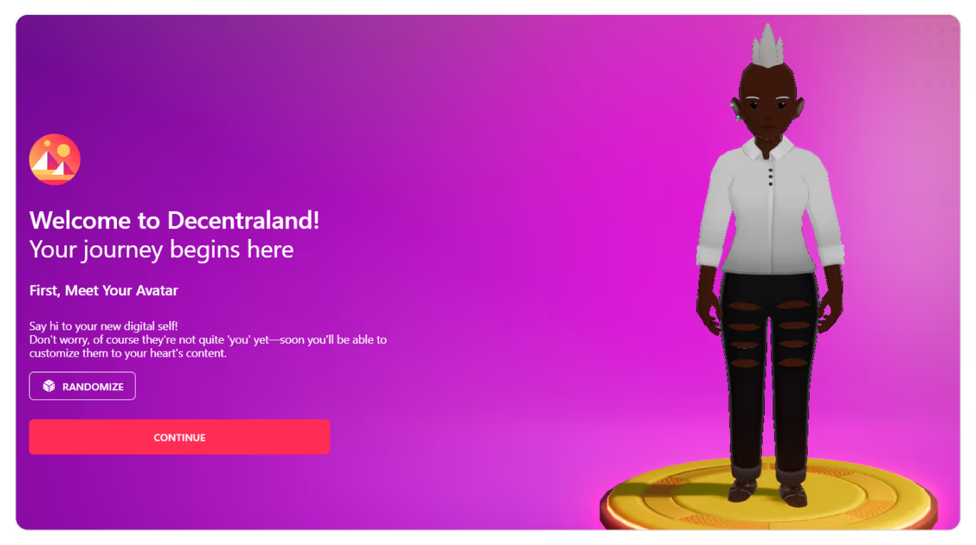
- Avatar customization as an onboarding step
Instead of simple registration, Decentraland offers to create an avatar: choose appearance, clothing, and accessories. It turns ‘registration’ into a game, which significantly increases user engagement.
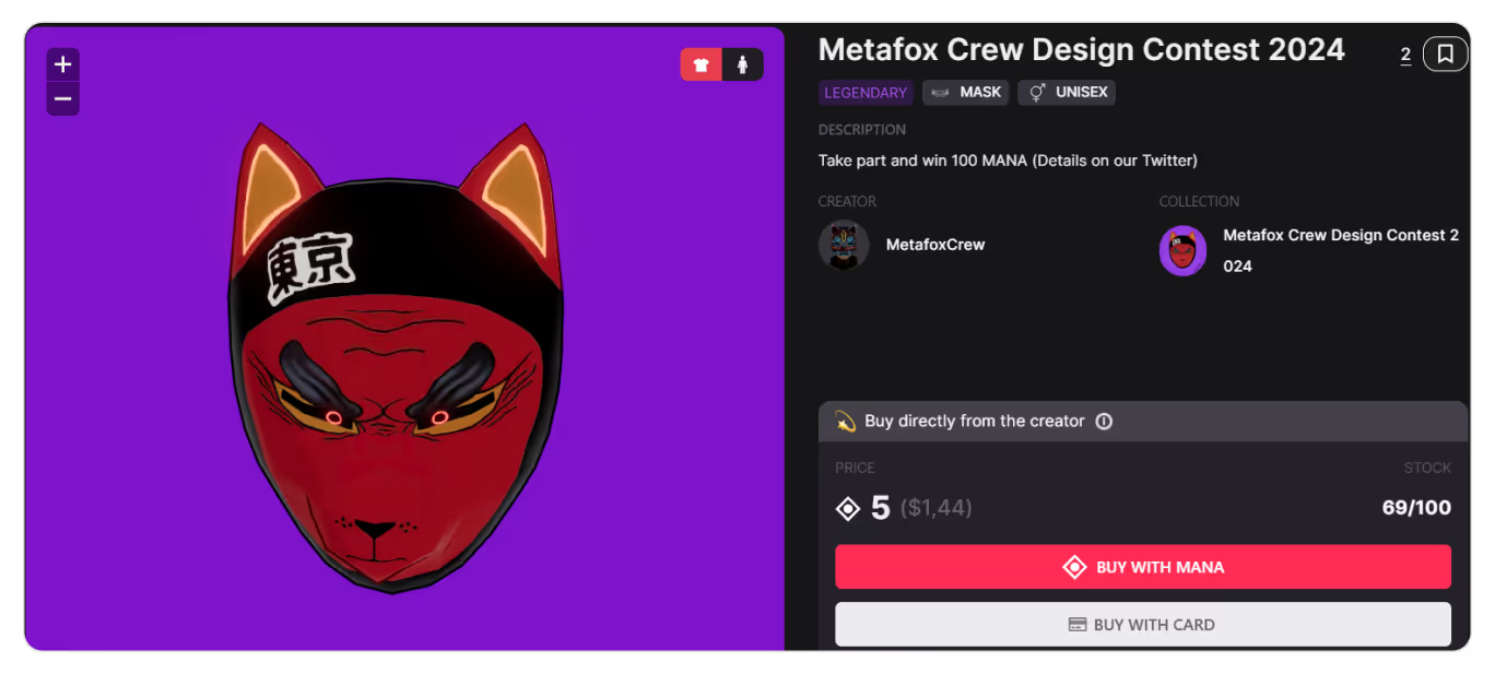
- Marketplace with virtual goods previews
In the marketplace, you can not only view NFT items, but also immediately see how they will look on your avatar by clicking ‘Try on.’

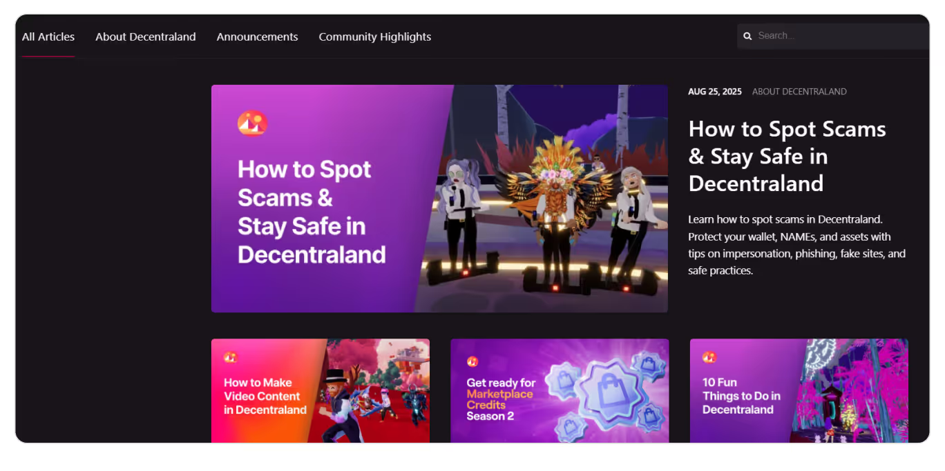
- A blog with entertaining articles
60% of consumers are more loyal to a brand after reading customized content via blogs.
Decentraland has a blog page with bright photo backgrounds that immediately attract attention and make the content visually appealing. Articles can be sorted by topic, which allows for quick navigation and improves user experience.
What can we now say about the best Web3 design ideas?
The above-mentioned projects prove that even technologically advanced Web3 products can be accessible and available even to people without specific knowledge.
Despite their uniqueness, the presented web designs have some common features:
- Intuitive but appealing user interface;
- Combination of no more than 2-3 colors;
- Clear titles and block descriptions;
- Structured and optimized layout and content to present bulk data hastily: dashboards, tables, charts;
- Accented icons and product photos for attracting users’ attention;
- Gamification of the process for better engagement.
In the new digital reality, UX/UI determines who will become the leader and who will get lost among competitors. This means that your Web3 website must be intuitive, visually appealing, and offer a unique experience.
Want your website to take pride of place in such a chart? We do know how to manage it and make your project a leader in its niche. Just fill out the form and get a free consultation.
FAQ
Question reference
Answer reference

More real-world Turum-burum cases?
Review our vast portfolio of cases in a variety of business fields to make sure of our expertise.
Go to Portfolio




.png)


.png)

