

Best financial web design to win customer trust
Financial services work with the most sensitive customer assets — their money and personal data. That's why a website needs to build trust from the very first seconds of interaction: it must be secure, intuitive, and simple to use.
But how can you create a web design that combines simplicity, trust, and advanced usability in such a complex field as finance?
Let’s figure it out by analyzing successful financial web design cases and UX/UI solutions behind them!
Financial web design: challenges to consider
What is the main difference between web design for e-commerce and the financial sector? When users visit a website to buy a party dress, towels for the bathroom, or choose a new phone, they are usually in a positive or neutral mood. The task of the interface is to simply give users what they have come for.
In the financial industry, the situation is completely different. When users visit an unfamiliar online platform in the finance field, they feel apprehensive and somewhat mistrustful. In this case, the interface must not only be convenient but also find a way to transform this initial skepticism into trust: calm users down, make them feel safe, and demonstrate the reliability of the platform from the very first seconds of interaction.

As you understand, there are some specific challenges that UX/UI designers and business owners must take into account to build a successful financial web product that constantly generates profit:
- Complexity of the processes — verification procedures, contract drafting, loan or investment management — you need to find a way to make these steps intuitive and quick;
- Obligatory security measures — multi-factor authentication and transaction confirmation — are critical for winning customers’ trust, but they might make the interface look more complicated;
- Wide target audience — your financial web design must meet the expectations of young users who value speed and mobility and older customers who appreciate simplicity and stability;
- Regulatory requirements and policy compliance — a financial website must comply with legal requirements, KYC/AML standards and data protection regulations, which is difficult to combine with simplicity;
- Mobile adaptation — financial services are actively used on smartphones, so the interface must remain convenient and understandable on small screens.
The challenges may seem overwhelming, but the best financial products prove that even in such a sensitive area, design can be simple, clear, and trustworthy. Let's look at a few examples below.
Best financial web design solutions: based on real cases
1. Parasol.ua: UX/UI design for online insurance website
Parasol.ua is an online platform for comparing insurance services (car, health, travel) and purchasing policies with minimal effort.
Best financial web design solutions that created an advanced customer experience:
- Fixed header with key functions
Users always see the menu and the ‘up’ button. This helps them quickly navigate the page, reduces cognitive load, and keeps them focused on the main tasks — selecting and purchasing a policy.
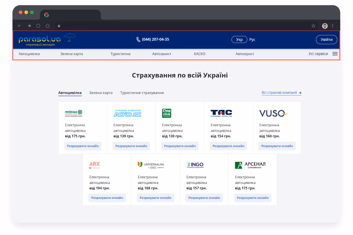
- Well-structured home page
Insurance product blocks are presented in a single logical row with clear headings, prices, and key parameters. Users can quickly compare products, which increases clicks on products and makes the selection process easier.
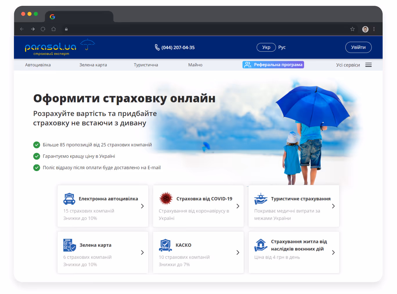

- Consistent checkout information architecture
Clear headings for every step of the process ensure users don’t get lost and feel they are on the right track. Additionally, an option to authorize via “Diia” (Ukrainian e-service with digital documents) that allows for the automatic filling in of some forms makes the workflow faster and more intuitive.

{{block}}
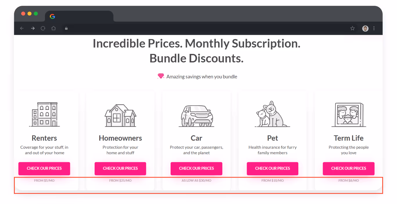
2. Lemonade: user-focused UX/UI for modern online insurance
Lemonade is an online insurance company that has simplified the process of purchasing policies to a few steps and minutes, thanks to advanced usability and a minimalistic interface.
Among the UX/UI lessons learned from this case should be mentioned:
- Step-by-step forms
Each stage of policy registration is displayed on a separate screen with a clear heading and progress bar.

- Impersonated interface
Lemonade actively uses photos of real people in its design, which adds humanity to the interface, increases user trust, and makes interaction with the platform more intimate and comfortable.

- Monthly pricing displayed
Service cards show the cost calculated not only per year but also per month. This reduces psychological pressure on users, makes pricing feel more approachable, and increases customer trust in the platform.
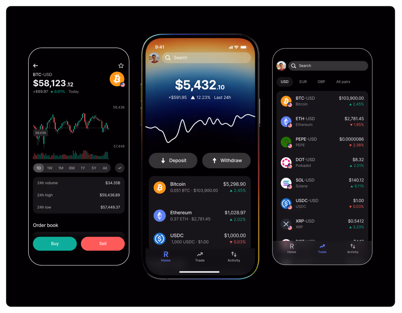
3. Revolut: UX/UI solutions for easy money management
Revolut is an international fintech service and mobile bank that allows its clients to manage accounts, make payments, exchange currencies, and buy cryptocurrencies directly from the app or web platform.
Why is this platform so successful?
- Visually displayed product advantages
The homepage presents the product’s key benefits in a clear, structured, and visually engaging way. Users can instantly grasp the company’s value and reasons to opt for its services.

- Clear typography and colors
The balance between contrasting numbers and a neutral background allows information to be quickly perceived and avoids visual overload.
{{block}}
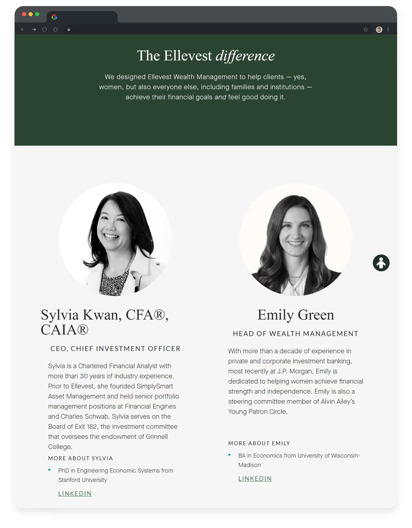
4. Ellevest: intuitive interface for women-focused finance
Ellevest is an online investment and financial planning platform for women. The platform combines personalized investment plans with a simple and intuitive UX/UI to make finance understandable and accessible to everyone.
In this financial website design, we should underline:
- Aesthetics and color palette
Ellevest uses warm, subtle shades of green and beige to create a sense of calm and professionalism. These colors emphasize the brand's inclusive approach and focus on women while maintaining the seriousness of the financial platform.

- The way information about the team is presented
Using real photos of the team on the ‘Our Team’ page significantly increases user trust in the brand, improves interaction on the website, and can increase conversion rates by 35–65% compared to stock images.
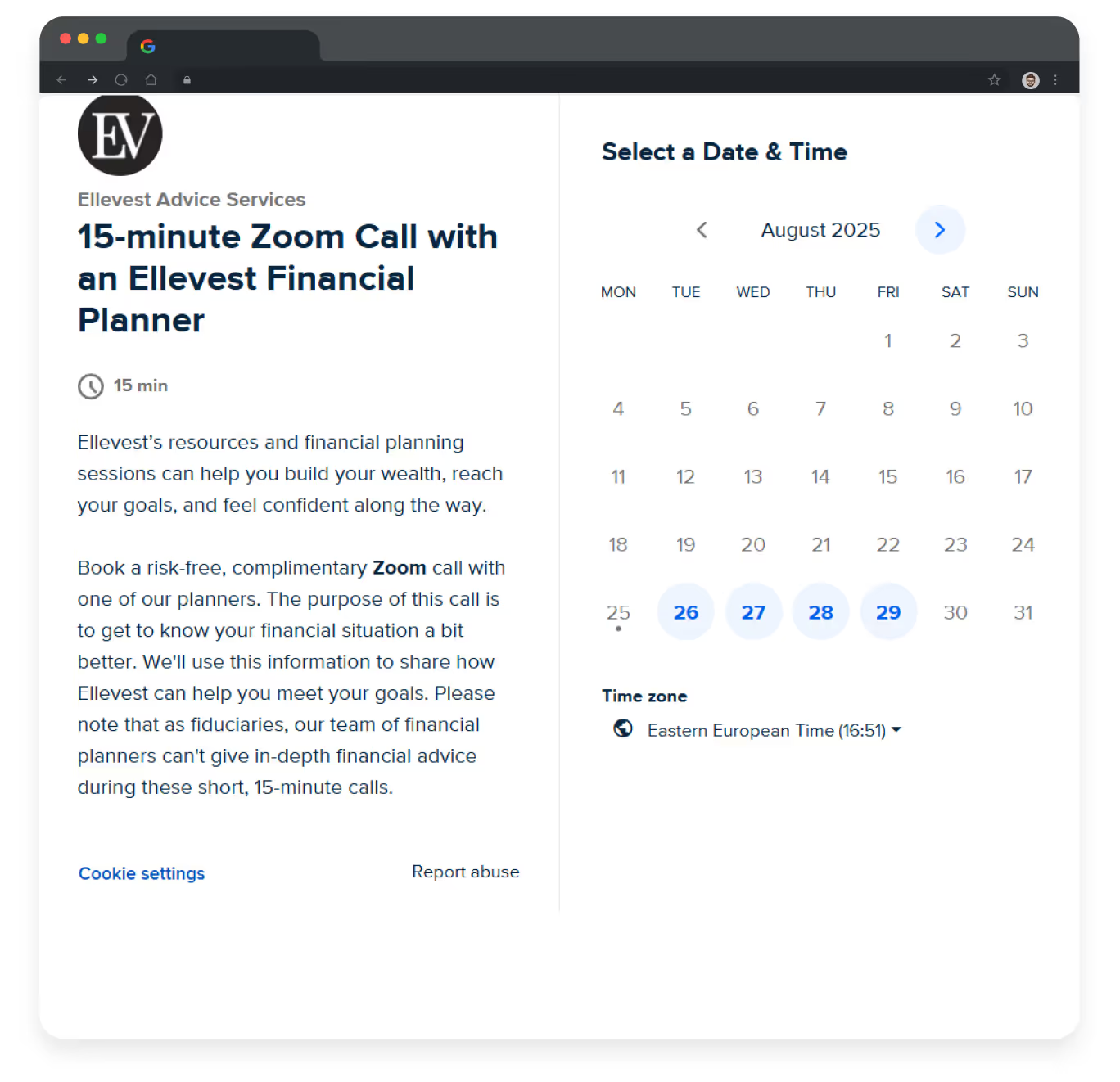
- Well-thought-out UX/UI of the page for call booking
This web design puts customers first: it clearly displays the call’s duration, time zone, available slots, and purpose of the meeting. The interface avoids unnecessary colors or elements, keeping the user focused on the main action — buying the company’s services.
Best financial web design practices: lessons learned
If your financial website were a bank vault, UX/UI design would be the key to open it. In this niche, web design is much more than making a good impression; it is about forming long-term and stable relations with your customers.
The above-mentioned examples show that if you want to get a profitable financial website, show users they can trust you:
- Highlight the company’s advantages;
- Use clear titles and descriptions;
- Work out a consistent information structure;
- Impersonate your interface;
- Ensure intuitive navigation.
By following these and other expert recommendations, you increase your chances of building a financial website that delivers high-quality services to your clients and rewards you with a stable income.
FAQ
Question reference
Answer reference


.png)


.png)

More real-world Turum-burum cases?
Review our vast portfolio of cases in a variety of business fields to make sure of our expertise.
Go to Portfolio
