


How to increase conversion in retail: from clicks to customers
How often do you assess your webstore from the client’s perspective? Do you truly understand the strengths and weaknesses of your online business?
In this article, we will explore how to increase conversion in retail and build an e-commerce platform with great scalability potential, which will yield stable financial returns.
Increase conversion in retail: three reasons why?
Our experience shows that an advanced user interface can increase conversion by up to 160% and more. At the same time, many business owners don’t fully understand that even minor UX/UI issues, such as button color or size, can lead to significant client and financial losses.
And that leads us to at least three reasons why businesses should keep optimizing their websites:
- To convert more users into buyers while maintaining the same level of traffic.
- To improve your website's ranking in search engines and increase traffic effectiveness.
- Provide clients with a caring customer experience, thereby increasing brand loyalty.
But most importantly, interface optimization allows for increasing website conversion, which directly affects business revenues. Sometimes, even a 5% conversion increase can make a great difference! If you want to assess your business potential, you can use our automated CRO calculator developed for your convenience.
How to increase conversion rate in retail through UX/UI optimization
Can your customers quickly find a relevant product? Are there enough photos and information for comparing and choosing the right item? How long does it take to fill in the checkout form?
All these factors determine the quality and success of your web product. So, if you are looking for ways to increase conversion in retail, make sure your website has the following criteria:
1. Sticky navigation elements and structured menu:
94% of online users say easy navigation is one of the key factors defining their satisfaction with shopping
Here’s a quick example: which menu do you find easier to use?

In all likelihood, you will find the second option easier to read and navigate, since the categories of the 2nd and 3rd levels are opened by default and placed within the available width of the screen.
In terms of navigation, we also recommend you:
- place navigation elements in predictable places and use familiar labels – users will know what to expect when they click on the website element;
- consider user search queries — process queries in different languages, provide suggestions for incorrectly entered names;
- implement drop-down or burger menus in mobile versions — take minimal screen space while providing access to all sections of the site;
Real-life example:
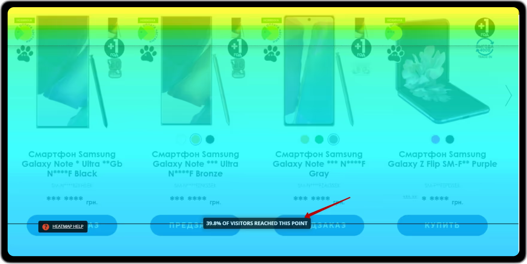
While working on the Infoshina case, we conducted detailed product analysis and identified that the website’s product card — the major decision-making spot — was poorly structured:
- Sticky product info, price, and “Buy” button at the top of the screen;
- Extra blocks distract the user from the target action;
- Unstructured information.
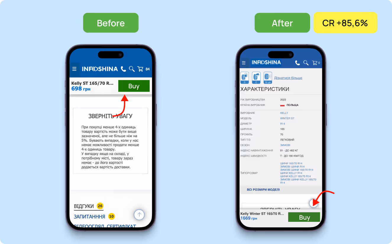
Therefore, we moved the “Buy” button to the bottom of the screen on mobile, and the add-to-cart micro-conversion from the product page increased by 85.57%.
Thereafter, we eliminated extra blocks, leveled the indentations between the elements, increased product photos, and placed cross-sell blocks higher. As a result, the add-to-cart micro-conversion from the product card increased by 13.26% more, according to A/B testing results.
.avif)
2. High-speed web page loading
From our experience, even a one-second delay can reduce conversion by 7%.
Imagine: a potential client is ready to make a purchase, but the website pages load too slowly. Instead of a quick and convenient process, the users have to wait at every step of their customer journey. For a business, this means more than just an irritated user; it also means missed sales and revenues.
Therefore, we recommend you to:
- implement image compression – use modern formats (WebP, AVIF) and tools to reduce file sizes
- minimize CSS, JS, and HTML – removal of extra spaces, comments, and unnecessary code.
- conduct regular loading speed checks – via Google PageSpeed Insights, GTmetrix, or Lighthouse
3. Smooth mobile experience
According to Statista, 61% of Google searches are made from mobile devices.
For boosting sales, you need:
- Adopt mobile-first design – start by designing for the smallest screen, then scale up.
- Ensure tap-friendly elements – buttons at least 44×44px and with enough spacing.
- Prioritize vertical scrolling – avoid complex layouts and side scrolling.
- Readable text without zooming – choose responsive typography that adapts to screen size, so users don’t need to pinch and zoom.
Real-life example:
CBD100 website before redesign (mobile version) — product photos on the listing page took nearly the entire screen, overlapping key product characteristics like its name, price, and rating. This made it harder for users to browse, compare, and choose relevant products.
We took a simple step — reduced the size of images in the mobile version so that key product information is visible on one screen.

At the end of the day, we got significant results — the exit rate from the product listing page decreased by 8% and the session duration increased by 32%.
4. High-quality images and videos
Products with high-quality photos convert 94% better than those with low-quality ones
Just compare:
.avif)

The first example demonstrates the importance of high-resolution photos, while the second shows that users gain a better sense of the product’s actual size when it’s shown alongside other objects.
So, to ensure a pleasant customer experience:
- add high-quality photos of great resolution and large sizes — make it the main accent of the product page;
- implement zooming and 360-degree views — allow users to examine products in detail and from every angle;
- ensure consistency in product imagery across all platforms – create a cohesive brand experience.
5. Simple checkout form
18% of customers abandon their checkout because it is too long or complicated
Here we go with another comparison and the same question: which checkout design would you prefer?
.avif)
So, if you want to ensure CRO in retail and boost your revenues, you should:
- reduce the number of form fields to the bare minimum — users don’t like to waste their time;
- introduce auto-save function — don’t ask people to fill in the same information twice;
- show a progress bar – so buyers can see the number of steps left.
Real-life example:
The checkout page on Zlato.ua website before the redesign was really lengthy and complicated, which often scared away the users.
In the new design, we simplified checkout page, restructured the order form and split it into semantic blocks by means of visual accents:
- registration/signing in;
- delivery;
- payment;
- comments to the order.
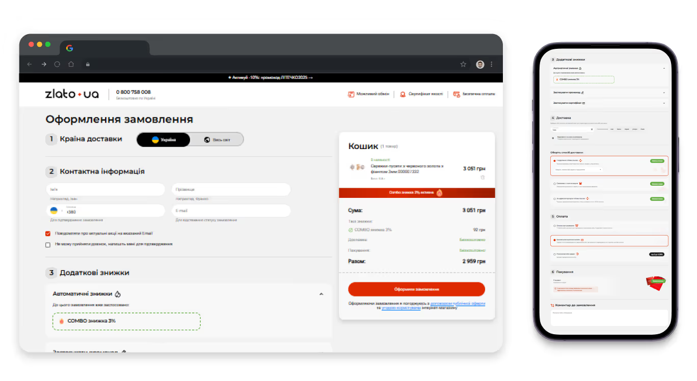
As a result, the number of users who moved to the Checkout page and completed the checkout increased by 83.69%.
{{block}}
Two main ways to increase conversion in retail through redesign
Now you know that interface optimization can boost retail conversions, but the key question is, how do you make it happen?
Everything starts with the UX audit — an expert assessment of how your potential customers interact with the website, what problems they face, and what prevents them from performing the targeted action.
Based on analytics and user behavior analysis, the expert identifies critical interface issues that may influence business conversion and works out a number of hypotheses on how to tackle them.

Then, depending on the results of the UX audit and the number of issues found, you may need:
- Complete website redesign — development of the new design based on data and analytics;
OR
- CRO in retail — step-by-step interface improvement from the most crucial issues to the minor ones, without changing the website’s structure at once.
Since customer expectations evolve and become more sophisticated every year, it’s crucial to stay ahead and adapt to their needs. If you don’t make changes to your website regularly, you will end up having to completely redesign it every 5 years. Alternatively, you can continually improve your website to extend its lifespan for many years and keep it relevant to users.
{{block}}
Existing business models for CRO in retail: smart investment that pays off
So, CRO in retail. How can it all be done? There are 3 business models available for website owners:
- One-time fixed-priced CRO work. This format works well for small companies or specific CRO projects. After the UX audit, you consult with UX/UI specialists and define the scope of tasks to be performed and agree on a fixed price for the needed services.
- Step-by-step improvements according to the time-materials approach (agile). The agile system is all about flexibility and delivering measurable results at every stage. The work is divided into sprints (from several weeks to several months): the first one is usually a UX audit, after which we prioritize the hypothesis and define the next sprints. This approach is a perfect option if your business is growing fast and your priorities are changing frequently — the business owner controls the work speed and volume.
- Subscription-based model and long-term CRO partnership. You have a reliable CRO partner and receive a certain amount of services (UX research, UX/UI design, analytics, AB testing, etc.) every month for a fixed monthly payment. Your CRO partner constantly monitors website metrics and user behavior patterns, offers new conversion growth ideas, and warns about market and audience changes. So you can always react quickly and adjust your business strategy instead of waiting for your contractor to become available.
How interface optimization helps increase conversion in retail: actually how?
Nowadays, web design is not just decoration, but a strategic tool that allows for increasing conversion rate in retail. From navigation to visual presentation — every detail is pivotal for shaping customer opinion from the very first seconds.
Users always return to web sources where they feel comfortable and can quickly find relevant product or information.That's why successful brands don't just sell products or services — they sell experiences. And if that experience is smooth, they lead the market.
Curious about how you can boost your revenues by increasing conversion? Make use of the CRO calculator to assess your website’s or book a consultation with our CRO specialist.
FAQ
Question reference
Answer reference


More real-world Turum-burum cases?
Review our vast portfolio of cases in a variety of business fields to make sure of our expertise.
Go to Portfolio
