

Usability research for beauty websites: key insights to boost business efficiency
The beauty niche has always been the industry of first impressions, and your website is not an exception. If users struggle to find the right products or interact with an inconvenient interface, they’ll quickly turn to competitors. But how can you understand your strengths and identify the areas that need improvement?
In this article, we present the results of our comprehensive research on beauty industry websites. You’ll learn practical tips on how to boost your website’s usability and conversion by making it more client-oriented. As a bonus, at the end of the article, you will find a checklist to help you evaluate the usability of your website.
This material is part of our retail research series, in which we have already analyzed the electronics and fashion niches. If you haven't read them yet, we recommend you do it:
- Usability research of websites in the electronics niche
- Research: What is trending on fashion websites nowadays? Part 1
- Research: What is trending on fashion websites nowadays? Part 2
- Survey: interface strategies for retail businesses in 2024
Research basics: from numbers to practical solutions
Our research is based on 572 hours of websites and apps UX audits in the beauty niche. During our work, we identified the most common issues users face and worked out effective UX/UI solutions to fix them. In this section, we’ll consider the research methods used and highlight the key insights gained.
Beauty niche research process
For our research, we combined different methods that allowed us to identify interface issues and growth points:
- Open research and experience: we considered market trends, customer insights, and our own experience.
- Qualitative analysis: heatmaps, session records, and click maps allowed us to see how users interact with the website.
- Quantitative analysis: Google Analytics and end-to-end analytics helped us find out when users most frequently leave the website.
- Market leader references: we researched mono- and multi-brand store solutions to implement best practices.
Average website’s KPI in the beauty niche


Key user needs to be addressed by beauty niche websites
Research shows that users usually visit beauty websites with the following goals:
- Finding a store with a large product range: Users want to find an online store that offers a wide variety of original products. The ability to get professional advice and convenient service is crucial.
- Looking for specific products: When users know exactly what they are looking for, it is important to provide quick access to relevant options via a convenient search tool and clear product descriptions.
- Selecting products by brand and parameters: Customers often search for products of specific brands or characteristics. Effective filters help to reduce the search time and increase the customer satisfaction rate.
- Finding a gift: For customers looking for a gift, recommendations, top lists, and tips will help make the right choice.
- Getting acquainted with new products and trends: Users often visit to catch up on new products or current trends. They look for reviews, ratings, and the latest products.
- Getting personalized recommendations: Websites with individual recommendations based on previous purchases or preferences will help customers find relevant products faster, increasing their loyalty and satisfaction.
Where interaction begins: key entry points on beauty websites
By understanding the main entry points on a website, you can effectively optimize the user experience. In the beauty niche, there are three key landing pages where users most often start their interaction with any website:
1. Product page (for specific requests)
Customers with specific queries usually navigate to product pages through ads or search queries. It is important to provide detailed information about the product on these pages: high-quality photos, key characteristics, product reviews, and delivery terms. It will speed up product search and encourage users to purchase from the website.


2. Product listing page (for category or brand queries)
Queries like “moisturizing cream” or “mascara by brand X” usually navigate users to category or brand listing pages. Providing easy navigation, functional filters, and convenient sorting options is critical. This allows users to quickly narrow down their choices and find a relevant product among various options.


3. Homepage (for loyal, regular customers and those who came by recommendation):
Regular customers and those who come by recommendations usually start their interaction with the website from the homepage, either through direct links or by browsing the store name. The homepage should display current promotions, new arrivals, and recommendations to grab attention and encourage customers to explore the website further.

User flows: how to convert visitors into customers on beauty websites
Let’s explore three key scenarios of user interaction with the websites of the beauty niche. We’ll analyze critical interface issues to understand why users may abandon the site. Then, Turum-burum will share recommendations on how to help you retain users by fixing identified UX/UI issues.
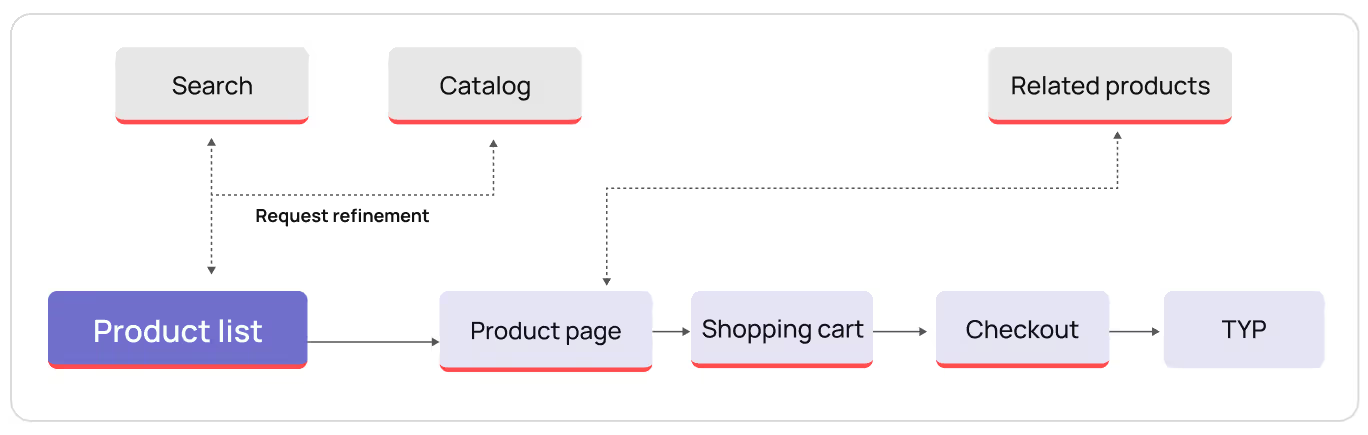
First user flow scenario: new user
Product page — Related product page — Category listing page — Shopping cart — Checkout

Product page: how to retain loyal users and prevent drop-offs
The product page is one of the key landing pages for beauty niche websites. Users usually navigate to it through search queries or advertising with a clear idea of what they are looking for. However, even if the user is interested in the product, the final purchasing decision depends on whether the benefits of the product are displayed in an eye-catching and clear way.
If key information about the product’s benefits is placed too low on the page or presented in the form of a lengthy text, in all likelihood, users won’t read it. As a result, 47% of users leave the page, and those who stay often browse 2-4 additional pages to find the details they need.


Ways to improve:
- Display key product characteristics on the first screen in the form of infographics or short summaries.
- Make the product description brief but complete with a focus on the product's main benefits.
These solutions will help users feel confident in their purchase decision, even if it’s on a whim, leading to conversion increase and enhanced overall user experience.

Category listing: how to encourage users to click “Add to cart” button?
The category listing page is the next step in the user's journey to purchase, but customers often face different obstacles here. Because of the large product range and lack of key product information like size, volume, or available colors, product selection becomes difficult and time-consuming. For that reason, users need to navigate to each product page to find out needed information, which can cause confusion and fatigue.
As a result, users may lose interest or even abandon the purchase at all. According to our research, around 50% of websites in the beauty niche face this problem.

Ways to improve:
- Add key characteristics (size, color, volume) directly to product cards on the product listing page.
- Ensure that this information is displayed clearly so that users can compare products without navigating to other pages.
Clear and easy-to-use product listings facilitate purchase decisions, reduce bounce rates and increase business conversion.

Cart without cross-sell is like Thanksgiving without turkey: satisfying the user and increasing the average check
Once users add products to their cart, they rarely return to browse other website categories or pages. And since the average check usually consists of 3.79 products, we can assume that customers are ready to buy more but don’t do it because searches take too long. And, unfortunately, 50% of websites we analyzed didn’t have cross-sale blocks which limits the potential for additional sales.

Ways to improve:
- Add to the shopping cart cross-sell blocks with products that supplement the chosen one (for example, offer a night cream additionally to a day cream, or a toner from the same product line).
- Place relevant offers based on their popularity or personalized data.
It will encourage users to add more products to their carts, which, in turn, can increase an average check and boost website conversion.

Checkout: shorten and simplify the form to retain customers
At the final stage of the purchase, it's critical to ensure that the customer can easily and quickly specify their delivery details, especially on mobile devices. However, many websites in the beauty industry make this process too complicated. Lack of auto-suggestions or lists of popular cities makes users enter data manually, provoking a kind of irritation.

Ways to improve:
- Implement auto-suggestions that offer popular or recently used cities as the user fills in the form.
- Add a ready-to-use list of popular cities to reduce the number of required steps.
By offering an optimized form with delivery details, you will make the checkout process intuitive and fast, resulting in reduced bounce rate and increased business conversion.

Second user flow scenario: new user
Category listing — Request specification — Product page — Shopping cart — Checkout
Category listing: shorten the user's path and help customers find relevant products
The category listing page is essential for users searching for products by specific categories or brands. People who type in queries like ‘facial cosmetics' or 'shampoo for dry hair' usually navigate exactly to category listing pages.
At this stage, customers usually don’t know what they are looking for, so they browse different products, compare options, and need to browse several sessions to decide. Therefore, users need convenient filters and sorting options to simplify the search and quickly find relevant products.

Ways to improve:
- Ensure intuitive navigation and clear product descriptions.
- Fix filters and sorting options in desktop and mobile versions, enabling users to adjust settings without scrolling up the page.
Optimized filters and sorting tools enhance page usability, helping users find relevant products quickly and reducing overall bounce rate. It also encourages users to finish the purchase, since they can easily find a product that meets their requirements.

Product page: things to consider for customer retention
On the product page users make their purchase decisions by exploring product details, reviews, and characteristics. The scroll maps show that 45% of mobile and 35% of desktop users scroll to the end of the page. However, since users have to scroll to the top of the page to add a product to the cart, only 9.55% manage to do it. This creates extra difficulties for users and negatively affects the business conversion rate.

Ways to improve:
- Add a fixed ‘Buy’ button and product price at the bottom of the screen.
After implementing this, users will be able to add a product to the cart any time they want to without scrolling up the page.

Shopping cart: why over half of users abandon the carts and how to prevent it?
On average, users add 3.55 products to their shopping carts. However, when the number of items in the cart increases, it becomes difficult to view the cart — users have to scroll to the bottom of the page to find the total order price or the ‘Checkout’ button. This introduces additional barriers to placing an order, resulting in a cart abandonment rate of 55.66% in this niche.

Ways to improve:
- Add a fixed 'Checkout' button and final order cost at the bottom of the screen to make them always visible, no matter how many items are in the cart.
This approach will reduce the checkout steps and create a more convenient and intuitive shopping experience for customers, boosting website conversion and reducing the bounce rate.

Checkout process: transparency as the key to the customer’s heart
Lack of information about the delivery cost and terms at the checkout is often a barrier to completing a purchase. If customers can’t find the final price or the delivery terms, they become unsure of their choice and are likely to leave the website. It is especially relevant for users who want to get the order within a specific timeframe.

Ways to improve:
- Display shipping costs and delivery terms right at the checkout.
- Provide clear delivery options with transparent terms and conditions.
By providing complete information, you can reduce the bounce rate and abandoned carts by increasing user confidence in their choice. This solution can increase checkout conversion by 5-10%.

Third user flow scenario: regular customer, a new user who came on a recommendation
Homepage — Search/Catalog — Category listing/Product page — Shopping cart — Checkout

Homepage as a pleasant starting point of a user journey
The Homepage is the first place where new users get acquainted with the website, find the categories they are looking for, or learn more about the brand. Loyal customers also use it to quickly access promotions, new arrivals, or continue shopping.
However, if the catalog on the homepage is poorly structured and overwhelmed with information, users can't see all the available options. This makes it difficult to navigate and find relevant products, which may lead to loss of potential customers.

Ways to improve:
- Make your catalog more convenient: divide categories into subcategories.
- Place categories horizontally in the desktop version by grouping them logically.
- Simplify access to key page sections by minimizing the number of required clicks.
A convenient and well-thought-out catalog structure will not only improve the user experience, but also increase the product browsing conversion by 20-25%.

From the category listing to the cart or how not to lose a customer in this way
A flow from the homepage to category listing and product pages is a typical user journey: they move from the category listing to product pages and back. However, on this way they often notice that the website lacks the ‘Previously viewed’ or ‘Related products’ blocks.
This creates obstacles for users trying to find the products they liked and often discourages users from continuing shopping. As a result, the bounce rate for pages with categories sometimes reaches 80%, a critical sign that you need to enhance the user experience of your website.

Ways to improve:
- Add a block with 'Recently viewed products' so that the users can easily return to their favorite items and quickly add them to the cart.
- Add a 'Related products' block after the category listing to extend the product choice for users.
Our experience shows that such changes can reduce bounce/exit rates by up to 15% and increase micro-conversion of products added to cart, retaining users on the website much longer.

Checkout: guiding customers through the final steps of purchase
50% of beauty websites have a full header and footer on the checkout page, which can distract users and tempt them to return to previous pages, explore other products, or even leave the website. Analytics reveal that 51% of users abandon the checkout process after reaching the checkout page.

Ways to improve:
- Remove the full header and footer — leave only the logo and the button for contacting store employees.
Minimalism in checkout can increase the overall conversion rate by 10-15% by not distracting users with other elements of the site.

UX design in the beauty industry: usability checklist for your website
Evaluate the usability of your beauty website's interface by conducting a self-assessment. Below you will find a short checklist – tick in the box if your website meets the specified criterion.
The clear boxes will indicate areas that need improvement to make your web product more user-friendly and drive its conversion:
- Homepage
- Displays current promotions, new arrivals, and personalized recommendations.
- The catalog structure is logically divided into categories and subcategories.
- In the desktop version, categories are displayed horizontally, ensuring easy and intuitive navigation.
- Customers can easily access the main sections of the website through clearly displayed buttons or banners.
- Category listing
- Product cards contain key product characteristics: size, volume, colors, and prices.
- The filter and sorting buttons remain fixed and easily accessible on both mobile and desktop versions.
- The page contains a block with recommendations (e.g., popular or associated products)
- The user can compare items directly on the product listing page without navigating to the product details page.
- Product page
- Key product characteristics (main advantages, price, delivery terms) are displayed on the first screen.
- 'Buy' button and the product's price are fixed at the bottom of the screen as you scroll through the page.
- Delivery terms, payment and return methods are displayed.
- The blocks with recommendations based on similar or associated products are added.
- Shopping cart
- The final cost, discounts, and shipping charges are displayed directly in the shopping cart.
- A fixed 'Checkout' button is always visible, no matter how many items are in the cart.
- Your shopping cart contains cross-sale blocks offering additional products that supplement the main customer's choice (for example, accessories or care products from the same product line).
- Checkout
- The delivery cost and terms are clearly specified right in the checkout.
- There are auto-suggestions or a list of popular cities so that users can quickly fill in their delivery address.
- The form is short and asks only for necessary information for order placement.
- The checkout interface is minimalistic, featuring only a logo, a contact button, and data entry fields, without a full header or footer.
Your website's interface serves as a bridge between customers and your business, determining whether users stay or switch to the competitors. If the website fails to meet their expectations or address their needs, conversion rate will remain low. By conducting a thorough analysis of user flows and implementing a well-thought-out UX strategy, you can create an intuitive, user-friendly interface that will not only attract but also retain customers.
By investing time and resources in UX research and optimization, you can increase business conversion and create a competitive advantage in any niche: beauty, electronics, fashion, etc.
FAQ
Question reference
Answer reference

.png)


.png)
More real-world Turum-burum cases?
Review our vast portfolio of cases in a variety of business fields to make sure of our expertise.
Go to Portfolio
