

Must-follow UI design principles for your online business
The online business world offers great opportunities, but at the same time, it is also severely competitive. To attract and retain customers, you must deliver a smooth and engaging user experience. But what criteria should a high-converting website meet, and how can you determine that your product needs improvements? In this article, you will find information about key UI design principles and best practices for developing client-oriented web products.
What are UI design principles?
Before defining the top 10 UI design principles, let’s ensure you understand what we mean by this.
- UI design principle — the UI aspect of a web product focuses on the visual side of interface elements, including color schemes, fonts, word indentations, etc. A high-quality UI creates an intuitive, aesthetically pleasing, and efficient user experience.
It might seem simple, but you must consider numerous aspects to develop an advanced user experience. In most cases, UI drawbacks are so difficult to detect that they can’t be noticed without a comprehensive UI audit.
Why are UI design principles important?
Since UI design defines the visual side of your website, it also forms the first impression about your business, adds to the brand recognition, and creates the overall mood of your website. What’s more, according to Stanford University research, 75% of users judge a company's credibility based on its website design.
That’s why, it is essential to offer exceptional UI to attract new customers and retain existing clients. And the easiest way to manage it is to follow basic UI design principles. Otherwise, you may lose potential orders and revenue.
Top 10 principles of UI design: best practices and real-world examples
Here are our modern UI design principles guide with real-life examples from Turum-burum practice to boost your web product.
1. Simplicity: the more, not always, the better
The popularity of stylistically complex websites with many interactive elements, colorful blocks, animations, and videos has dropped significantly. The reason is entirely predictable: users prefer interfaces that take care of their time = have a simple, clear structure and style.
By ensuring service design, you allow customers to focus on their tasks and complete them quickly and smoothly. Among other things, a clean interface design reduces page loading time and allows placing the page accents appropriately.

2. Soulfulness: convey business values through the interface
Statistics say that 89% of B2С consumers are more loyal to brands that share their values. Therefore, even when choosing a service design, you should implement attractive visual accents and trends: custom images or icons, bright call-to-action blocks, or large product images to emphasize the business's strengths. This allows you to convey the company's general mood and values, and choose a beneficial tone of voice, thereby increasing user loyalty and business conversion. At the same time, the website stylistics should be consistent with the brand identity to increase the company's recognition rate.

3. Predictability: place interface elements where users expect them
The interface elements must help website visitors navigate the pages and help them place orders quickly and without obstacles. For that reason, it is better to use standard icons and place them exactly where customers are likely to search for them.
While working on the project Lamour, during the UX audit Turum-burum revealed that in the adaptive design of the site, the burger menu icon was unusual and not accentuated, so users ignored it, which affected exit and bounce rates.

Since a common menu icon in a familiar place makes it easier and faster for users to find the product they need, we made the burger menu icon familiar to users, consisting of three lines, that improved customer satisfaction.

If you do not use standard icons and blocks, add explanations for them. For instance, a generic ‘Back’ button may not clearly indicate whether it will take the user to the previous page or return them to the catalog. Renaming the button to “Back to the Catalog” can make navigation more intuitive and help users understand exactly where they will be directed.
Creativity is also welcome and can even be useful. When using non-standard icons, it's crucial to make sure that they are clear and easy to understand. For example, Turum-burum created custom icons for Juliette Lingerie that not only look good, but also help customers to find the item they need faster.

4. Visual hierarchy: important things first
Visual hierarchy defines the sequence in which users see the page elements and blocks. Sometimes, business owners underestimate the importance of this UI design principle, which results in a high bounce rate.
For example, during UX/UI audit for Allmart we revealed that details about the website’s services on the main page were hidden below the fold, making it hard for users to quickly understand what the website offers. This led to potential buyers leaving the site.

Turum-burum recommended replacing the block with available products with the marketplace header. This way, users quickly see the platform's services when they visit the site.

5. Accessibility: cover wide target audience
Among the most pivotal web UI design principles is ensuring a high-quality user experience for all representatives of your target audience, including people with disabilities. As an example, we can consider pharmaceutical web products.
Since such sites are often used by the elderly and individuals with visual impairments, it is essential to provide:
- contrasting website blocks;
- convenient button size;
- clear font;
- sufficient indents.
To enhance web accessibility, the World Wide Web Consortium (W3C) started the Web Accessibility Initiative (WAI) in 1997. This initiative provides important guidelines to make websites accessible to everyone. The WCAG framework includes four main categories that outline standards to help people with disabilities use online services efficiently and smoothly. By following these guidelines, business owners can reach a wider audience, create a more inclusive online space, and boost the quality of delivered services.

6. Adaptability: different appliances — same quality
As of 2023, mobile devices accounted for 73% of global e-commerce sales, highlighting the critical role of mobile optimization for online businesses. Therefore, to boost your online business, you must follow mobile UI design principles to develop a client-oriented adaptive design that allows shopping on the go.
When developing such a design, it is essential to provide a smooth user experience on different screens and appliances. The average person's fingertip is about 1.6-2 cm wide, and the thumb has a pressure area of about 2.5 cm. Therefore, research shows that the minimum physical size of a touch target should be 1 cm × 1 cm.
That's why, for touch screens, provide sufficient spacing between interactive elements and make sure that all buttons and links are large enough to prevent accidental taps.

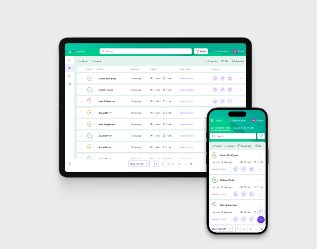
7. Interactive blocks: creating additional entry points
Website visitors do not always know what they want to buy from the beginning. In most cases, they open e-commerce to view the brand’s assortment, compare goods or services, and browse the pages. It means that customers frequently abandon the main catalog and go to other pages after opening it.
But how can you kindly remind your clients to continue their product search? By implementing non-standard menus in the form of customized images or icons that lead users to different product listing pages. The best idea is to place such blocks on the main page where users usually scroll a lot to get acquainted with your brand. This way, you will create additional entry points, make the user experience more engaging, and add to the visual appeal of your website.
.avif)
8. Personalization: treat your customer as a close friend
Since 91% of customers are more likely to buy from brands that offer a personalized user experience by providing relevant offers and recommendations due to the customer preferences, we recommend adding personalized blocks: ‘Viewed products’, ‘Similar products’, ‘Popular’, etc.;

9. Typography: small things matter
When using service design it is also important to choose a font that matches the business peculiarities and overall stylistics. The text should be visually readable, consistent, and not irritate your customers. Otherwise, you will have poor user engagement and a high bounce rate. The best way to avoid such an unpleasant situation is to apply for a detailed UI kit.

10. Transparency: keeping users in the loop
A key principle in UI design is ensuring system status visibility. Simply put, it’s about showing users what’s happening in real-time. For example, progress bars during a file download keep you updated on every process step. By incorporating such features into your UI, you keep users informed and enhance their experience, making them more likely to stick around and explore further.
One of the ways to help users better understand the interface is to implement breadcrumbs. This element shows users where they are in the app or website and allows them to quickly backtrack to previous sections. Moreover, our UX audits, especially heatmap results, always prove that breadcrumbs are very popular among the website users.

UI design principles and best practices: drawing the line
By following these web UI design principles, you can enhance the aesthetic side of your interface and create a smooth and engaging user experience for a broad target audience. In other words, you can develop a powerful tool for converting website visitors into regular customers and increasing business conversion.
However, as customer expectations and requirements become more sophisticated, the digital landscape and UI design principles continuously evolve to meet these rising standards. So, keep up with current trends and stay tuned!
FAQ
Question reference
Answer reference

.png)


.png)


More real-world Turum-burum cases?
Review our vast portfolio of cases in a variety of business fields to make sure of our expertise.
Go to Portfolio
