


Best SaaS dashboard designs: where transparency meets efficiency
As of 2025, there are over 30,000 SaaS companies globally, and this figure is expected to double by 2029.
But how does it happen that from such a wild choice of options, we usually know and use just a few web products when it comes to bulk data? What does a successful and viral SaaS dashboard design look like, and what should companies consider to beat the competitors?
In this article, we present the best SaaS dashboard designs that deserve 10 out of 10 points in terms of usability, accessibility, and ability to solve business tasks.
SaaS dashboard design: challenges to consider
SaaS dashboards serve as working environments where users spend hours. Consequently, they must balance aesthetics, clarity, and usability. And that’s a difficult task considering that dashboards usually display complex, multi-level information like metrics, graphs, and tables.
Development of advanced SaaS dashboard UX/UI design is like working on a piece of art since you need to:
- Prevent interface information overload, displaying too much data at once can confuse users;
- Tailor dashboards to different user types, when dashboards don’t match the needs of different users, it creates confusion and frustration;
- Ensure clear visualizations be mens of charts or metrics that are hard to read reduce usability.
Sounds like something unattainable? Luckily, we know some SaaS products that nailed it!
4 SaaS dashboard designs for your inspiration
Looking for SaaS dashboard ideas? These 4 examples reveal the UX/UI tricks that make data easy and enjoyable to use.
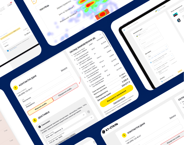
1. SaaS web design for Logistic company
When it comes to UX/UI solutions for the logistics niche, it is always a tough nut.
Cargo tracking, delivery schedules, warehouse and customer management, documents, tracking, maps, statuses — SaaS dashboard has to display all this information in a well-structured way. Otherwise, users can get lost in the data and mess up business processes.
So what exactly did Turum-burum do to turn complex logistics into a smooth digital experience for Logistic?
- Worked out information architecture: how sections, functions, and data are organized, grouped, and presented to the user.
Simple structure = convenient product, even if the service itself is complex.
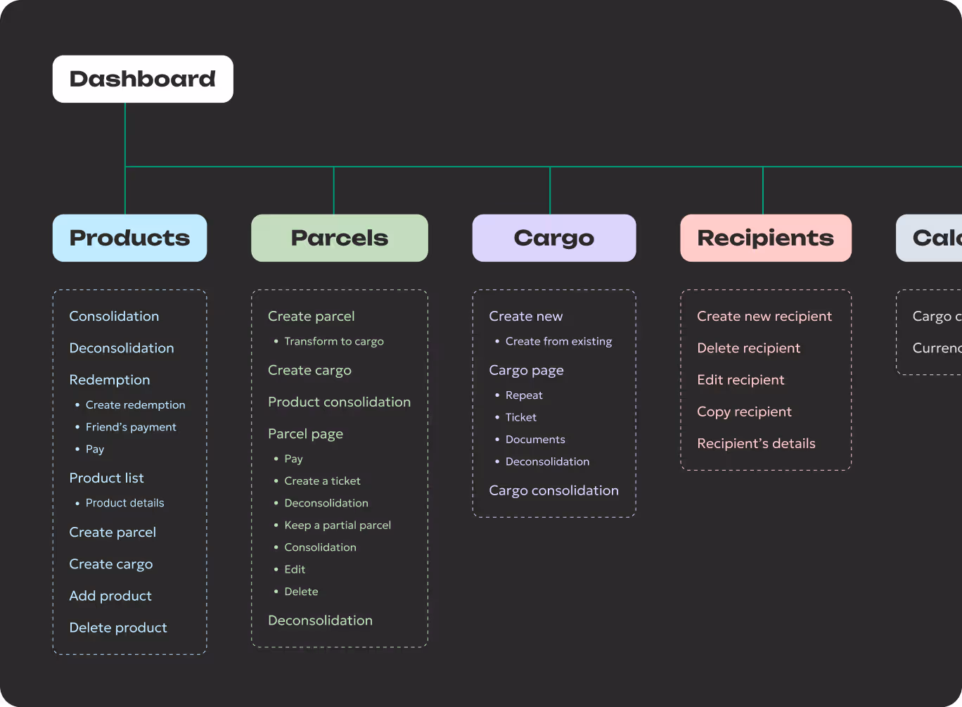
- SaaS design was developed by following the mobile-first principle, so the dashboard is featured by high adaptability and is designed to work with different devices and different screen sizes.
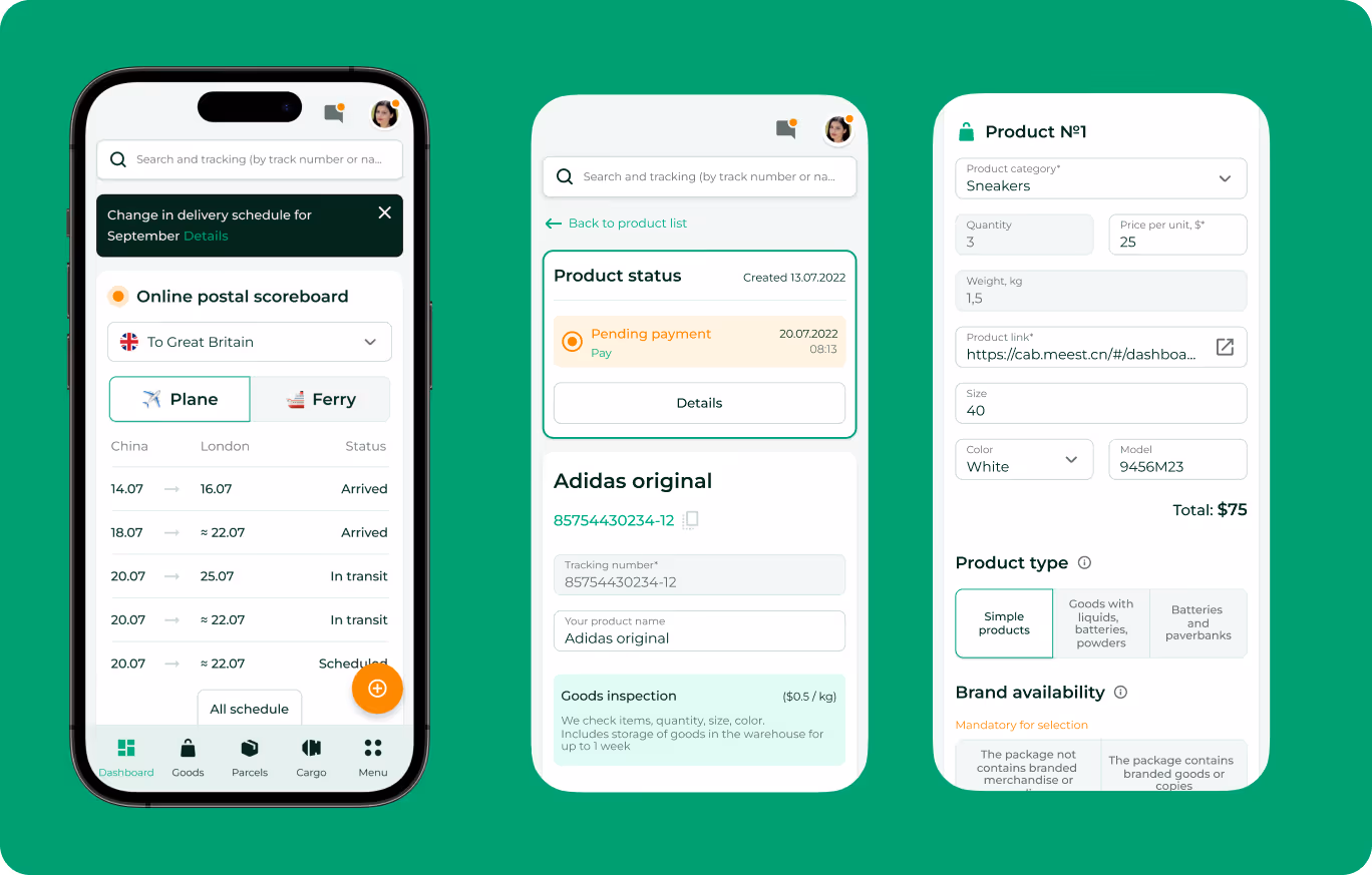
- Designed a consistent UI with appropriate accents by using icons and different font colors for displaying order status so that users can quickly find relevant information.

- Offered secure payment methods, simple parcel management, real-time tracking and convenient pick-up and delivery scheduling, which significantly increased customer satisfaction rate.
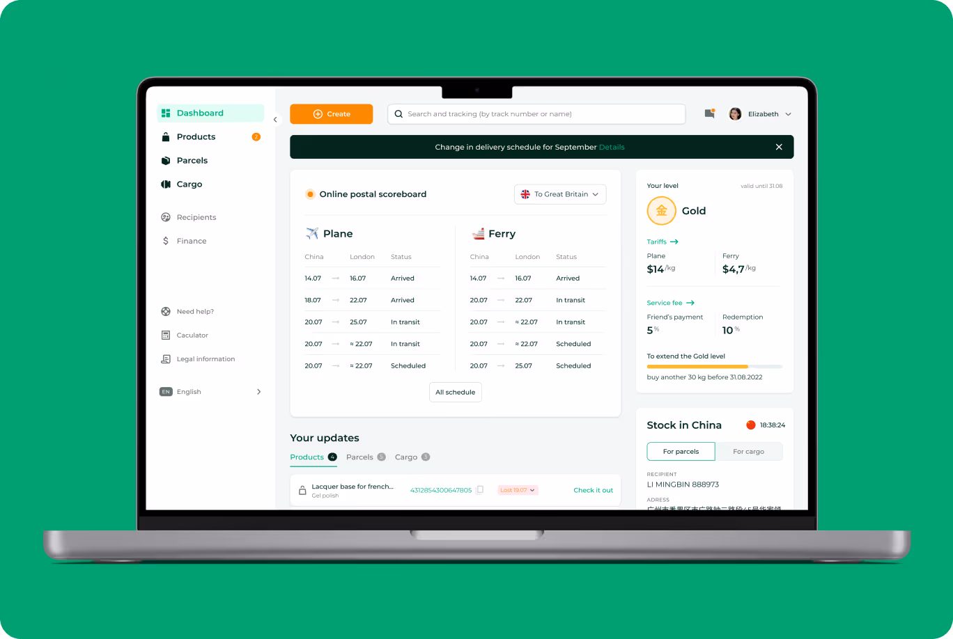
Thanks to these and other UX/UI steps, even a complex logistics platform turned into a simple and intuitive tool for both businesses and their clients.
{{block}}
2. Databox: web design for analytical dashboard
Databox is an online platform for tracking business analytics that helps to measure business success by collecting all KPIs in one place and presenting them using dashboards. Despite a wide variety of integrated tools and available data sets, this dashboard is very intuitive and easy to use thanks to:
- When new users navigate the dashboard and get acquainted with it, they see written tips in the blocks on how to fill in different forms for quick and easy onboarding.
- On the project page, some elements contain “i” icon which shows clear descriptions of advanced dashboard capabilities once the user moves the cursor over it.
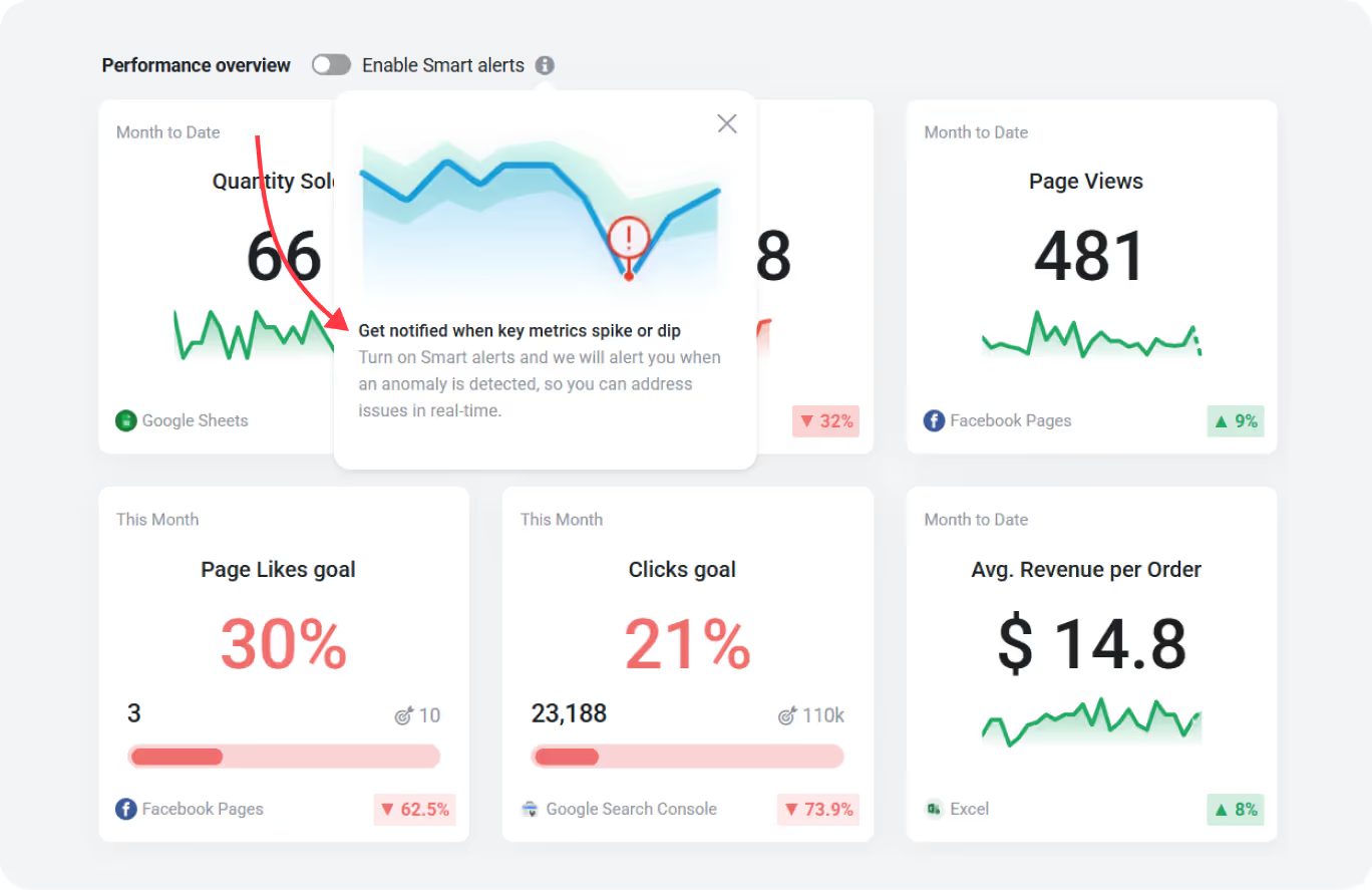
- Drag-and-drop editor for dashboard customization so users can set additional parameters for each metric, such as changing time intervals, currencies, and chart formats.
- Displaying all crucial business KPIs on one screen in a visually attractive way, with further ability to investigate each of the metrics separately by clicking on them
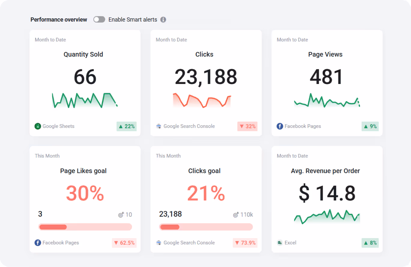
- Report templates and examples to make users’ lives easier, which increases their trust and loyalty. Users can simply edit information in the templates changing it with their project data, no need to play with fonts, layouts, etc.
This way, Databox proves that even advanced analytics can be easy to understand and pleasant to use if you take great UX/UI decisions.
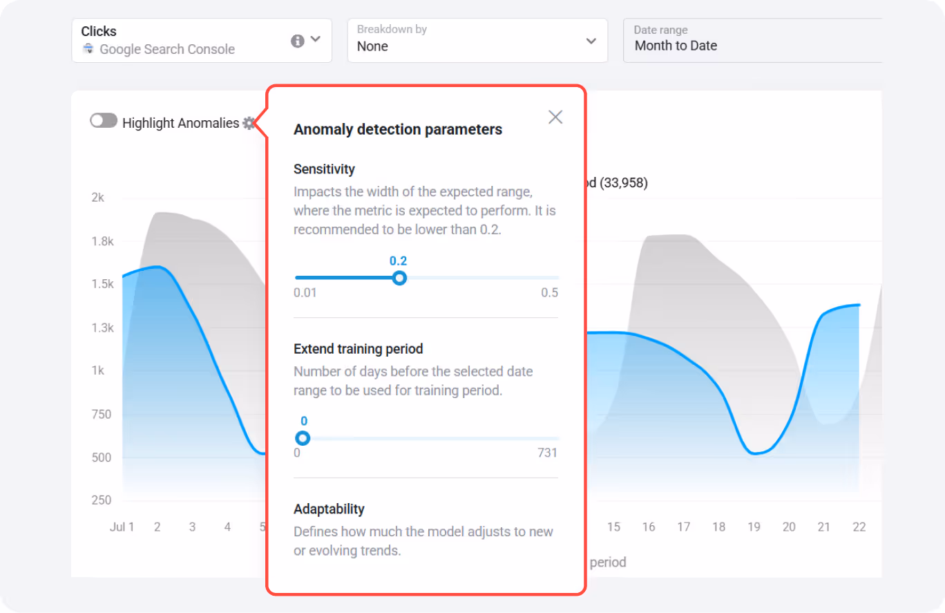
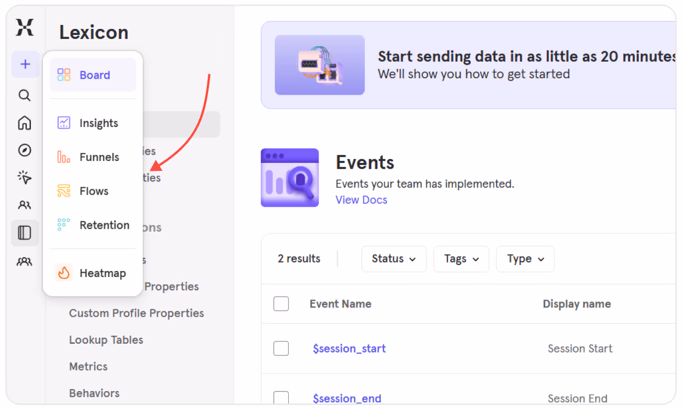
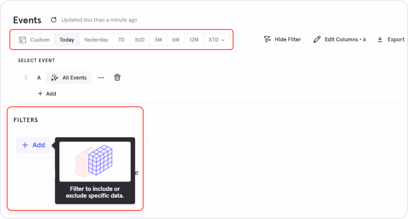
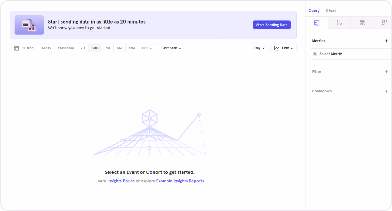
3. Mixpanel: UX/UI for product analytics platform
Mixpanel is a SaaS platform for tracking product analytics, user behavior patterns, and generating data-based reports.
Here are some UX/UI solutions that set this SaaS dashboard apart from the competitors and are worth considering when designing a dashboard of that kind:
- Excellent onboarding with hints appeared at the right moment, which helps new users.
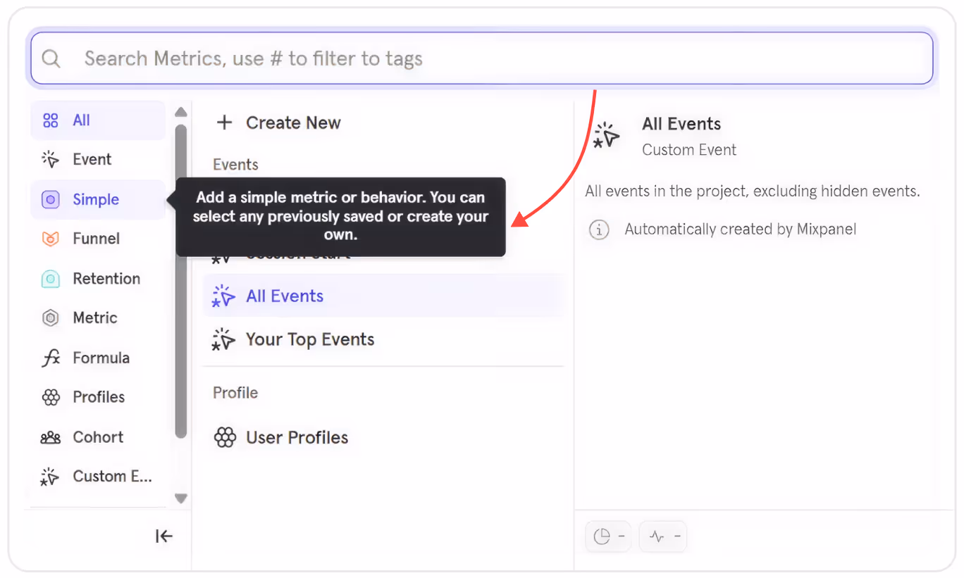
- Burger submenu — since the platform offers a wide range of functions, this UX/UI solution prevents the interface and users from overloading with information, thereby improving navigation.
- Convenient filters that can be customized — users can navigate through the existing dashboards and data sets in just 2-3 clicks and adjust filters to their needs.
- Convenient dashboard segmentation — the page is divided into two parts: visual and informational. In that way, users can easily examine the graphs and anayze data more easily
This approach helps Mixpanel transform raw product data into clear, actionable insights for users.
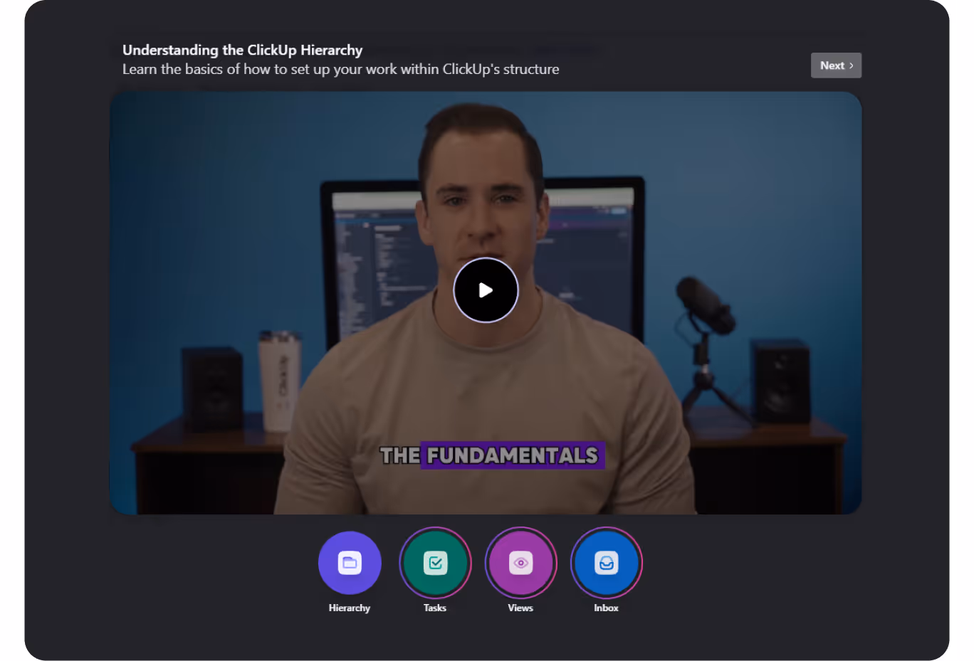
4. Click up: SaaS dashboard for project management with advanced usability
ClickUp is another advanced SaaS platform for project and task management that combines the functions of a task manager, time tracker, and team analytics within one interface.
So, when it comes to web design, the main challenge is to display tasks, deadlines, statuses, team metrics, and schedules without overloading the interface.
Many ClickUp dashboard design solutions are worth our attention, in particular:
- Welcome screen and the first thing users see after creating an account is a video onboarding. This logical step takes care of users who don’t have to look for the guidelines manually.
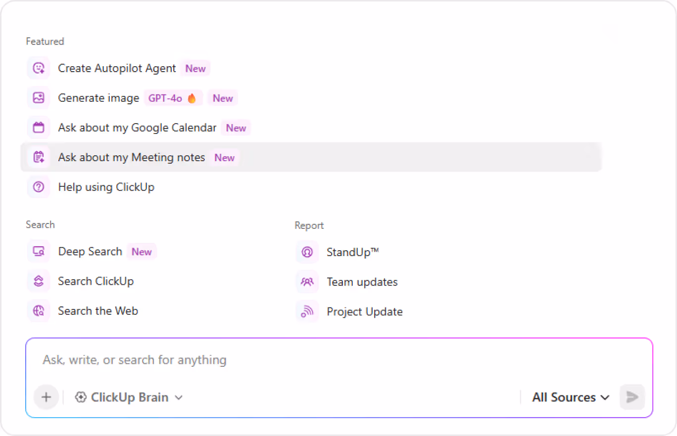
- The dashboard menu contains a ‘Brain’ tab, which displays all the platform’s functions and options so that users can utilize the full potential of the platform.
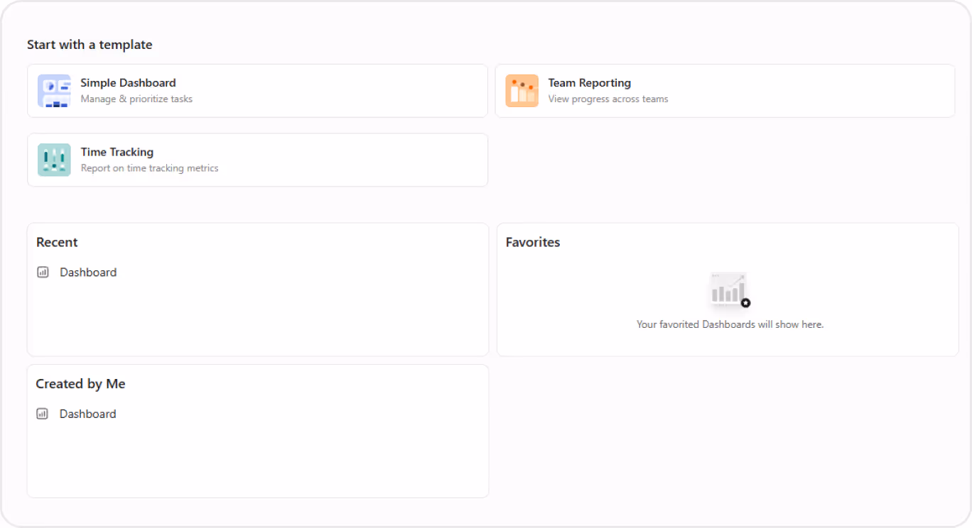
- Splitting of dashboards into categories for convenient workflow management
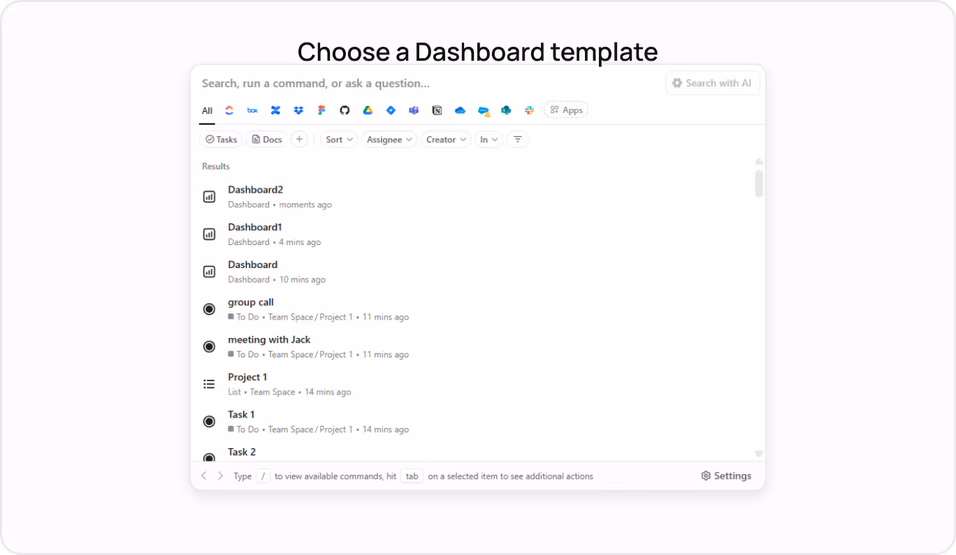
- Advanced search with tips and various filters so that users don’t get lost in large data sets.
ClickUp demonstrates that powerful tools don’t have to be overwhelming – they can be simple and structured.
Final thoughts on SaaS dashboard design
Over 55% of users spend less than 15 seconds on a SaaS website, meaning you don’t have much time to impress potential clients. You need to balance between aesthetics, clarity and functionality to design a product that leads the market.
The best SaaS dashboard designs, presented in this article, teach us:
- Ensure a quick and easy-to-grasp onboarding process for new users: effective onboarding can increase customer retention by 50%;
- Allow for personalization: the ability to customize widgets, filters, and the appearance of the dashboard to suit users’ specific tasks;
- Offer intuitive navigation and quick interaction: drag-and-drop, tips, auto-save, simple editing, etc.
- Work out an efficient information architecture: a logical data structure that supports different user roles;
- Design server interface: nothing should distract users from their target action. So use consistent typography and 2-3 basic colors, and be careful with interactive elements.
If you follow these simple tips, you will be able to build a SaaS dashboard that enables users to achieve their goals faster and businesses to gain greater engagement and loyalty.
FAQ
Question reference
Answer reference


.png)


.png)
.png)


More real-world Turum-burum cases?
Review our vast portfolio of cases in a variety of business fields to make sure of our expertise.
Go to Portfolio
