


Looker Studio Dashboard: How Businesses Can Track Down The Conversion Killer
Every one of our clients wants to know: What’s killing our conversion?
Traffic is growing, campaigns are running, and budgets are spent, but revenue stagnates or slips. Users disappear somewhere between landing and buying… The website is a crime scene.
Businesses become detectives, reconstructing the story to find the conversion “killer.” The Looker Studio Dashboard is the forensic lab, collecting evidence to reveal the culprit.
Want the truth? We'll show you how this investigation works and what Looker Studio changes for your business.
The Forensics Lab: Looker Studio Features That Help Crack the Case
Looker Studio (formerly Google Data Studio) turns analytics about interfaces into interactive visual dashboards with a structured, easy-to-read version of what’s happening on your website or app.
Here’s what makes Looker Studio the perfect partner for UX detectives:
- Connect multiple data sources (up to five for a blend, maximum). Google Analytics 4, Google Tag Manager, Google Ads, Search Console, BigQuery, spreadsheets, CRM exports, and others can be pulled into one place.
- Build dashboards that update automatically. Once the dashboard is set up, it refreshes with live data almost in real time (mind the 48-hour delay).
- Visualize exactly what matters to you. Tables, charts, funnels, scorecards, and comparisons vs. previous periods — all customized to your business model and goals.
- Filter and drill down on the fly. You can switch periods, compare time ranges, filter by device, channel, country, and page type, and see how metrics change in a couple of clicks.
- Share insights with your team easily. Dashboards are available by link, just like Google Docs. Product owners, marketers, designers, and C-level all see the same picture, not different screenshots.
At Turum-burum, we use Looker Studio as a live control panel: a place to spot friction points, find hidden drop-offs, track how redesigns change KPIs, and make decisions based on evidence, not assumptions. So can you do.
But seeing is believing.
So let’s examine a few real patterns from our dashboards to understand what is hidden behind the numbers.
How To Gather Clues in Looker Studio to See the Context and Motive
Once the dashboard is ready, the true investigation begins.
Looker Studio serves as the central hub where all the evidence about interface (data, user behavior patterns, inconsistencies, anomalies, and more) converges. It gathers and visualizes various metrics like traffic, session duration, error events, device performance, and landing pages, and also flags anomalies such as unexpected spikes or dips.
However, the dashboard itself merely presents the facts; it is up to the detectives (marketers, product owners, UX designers, etc.) to analyze and interpret the true significance of these clues.
Let's walk you through each stage, explaining its meaning.
Users and Devices: The Case File Cover
Every investigation starts with the scene overview.
In Looker Studio, the Users and Devices blocks work like the front page, where we understand who came and how they arrived.
At Turum-burum, we typically analyze a three-month period to see the full business cycle and capture stable patterns, seasonal shifts, and any anomalies that might distort the story. So, make sure you have the needed volume of data as well.
First, look at the Users metrics — the baseline health check of the entire product:
- Total users show how many people entered the website. Spikes or sudden drops often signal a major event: a campaign launch, a release, a season, etc.
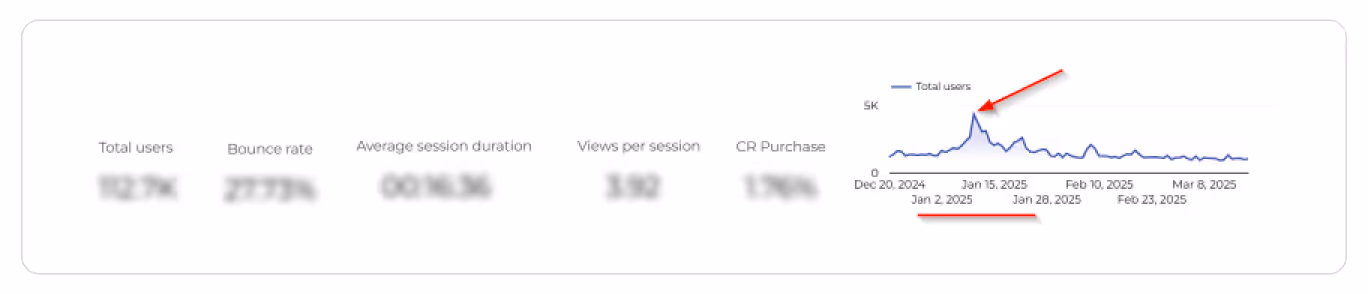
- Bounce rate reveals how many visitors took one step inside and immediately walked out. A high bounce rate hints at relevance, speed, or usability problems, while a suspiciously low bounce rate indicates analytics issues, since Looker Studio only visualizes the data you provide without validating it.

- Average session duration and views per session show how long users stay and how much they explore before giving up. A too-long session combined with low conversion typically means confusion, poor content, or a broken path forward.
- Conversion rate marks how many users completed the goal (purchase, booking, registration, etc.). The “victim” that suffers from interface issues hidden in the funnel.
Then examine the Devices block, because the device often acts like a recurring witness (one that won’t hesitate to expose usability flaws):
- Mobile vs. desktop performance shows where users struggle the most. When mobile traffic dominates, but mobile conversion is much lower than on the desktop, the pattern is clear: mobile UX is the primary suspect.

- Differences in bounce rate, session duration, or page depth across devices expose friction points that only appear on specific screens, like layout issues, interaction challenges, or missing elements on mobile/desktop.
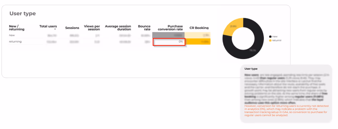
And then there’s User Type — returning vs. new visitors, highlighting the story from quite different sides:
- Returning users behave confidently: they know the site, bypass early confusion, and usually convert better. If their metrics suddenly drop, something in the familiar flow and/or in the analytics settings has broken.
- New users reveal onboarding and clarity issues. If they bounce quickly or barely engage, the value proposition or first-screen experience is failing them. When new users explore a lot but fail to convert, the culprit may be unclear pricing, trust issues, or overly complex journeys.
Depending on the project, we also add a Demography to this “cover” block that gives the business more information about where the main audience is from so they can optimize the message and marketing efforts to target it better.

Our UX experts review all these dimensions together and write the first conclusions right under the block in the dashboard: what looks healthy, what looks suspicious, and which segment deserves deeper investigation next.
This section doesn’t identify the conversion killer.
But in one brief screen, it sets the context for the case and tells us where to look further.
{{block}}
Traffic, Landing Pages, and Page Groups: Who Brought Them In and Where They Got Lost
Once we understand who visits the website and from where, the next question is: Who brought them here, where did they land, and how far did they go?
Traffic sources give you the context of where users come from, whether it’s organic search, direct, paid, social, or any other channel.
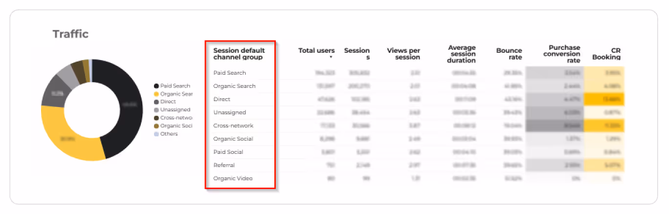
Useful for marketing decisions, but for UX, this is just the entry log. What matters is where they landed and what happens right after.
Landing pages are the front doors. This part shows which pages users arrive on, how many continue deeper, where exits concentrate, and whether the landing experience matches what they expected from the ad, search snippet, or link.
For some projects, PLPs (category listing pages) carry most of the load; for others, blog posts or service pages act as the main entry points. When a landing page has high traffic but a high exit rate, we know the first impression is failing. Wrong expectations, unclear value, and no visible next step are common reasons why many potential conversions disappear before the journey even starts.
Page groups/page views reveal what happens next. We see which sections users explore (homepage, category, product, blog, support, account), how deep they go, and where attention abruptly drops.
These patterns show which sections guide users forward, which ones stall them, and which ones act as dead ends. When a category page gets attention but doesn’t lead to product views, or a PDP gets views but not “Add to Cart,” the trail becomes obvious — this is where the most attention is needed.

This part of the dashboard definitely narrows down the suspect list.
In short, this block shows not just from where users came, but whether they ever had a real chance to convert and what pages are supposed to be redesigned first.
Funnel: Get the Broad Picture to Put the Puzzle Together
The funnel shows where the plot breaks. It’s a straight, visual timeline of the user journey that reveals the moment where users exit most. That is where the conversion killers leave their biggest fingerprints.
In Looker Studio, you can read the funnel in two dimensions: by device and by user type. It's because the same journey can play out very differently depending on who takes it. Plus, it helps to find all CR murder accomplices.
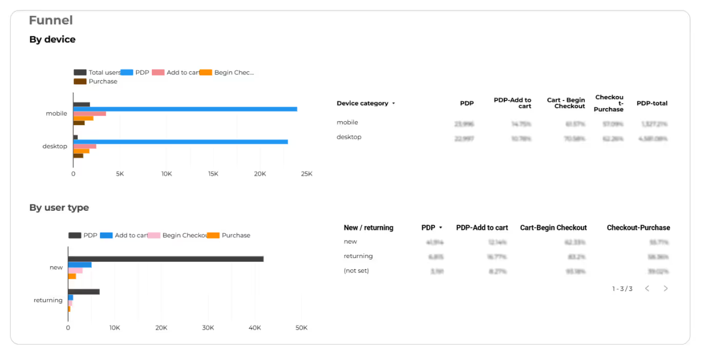
The funnel exposes these patterns instantly. A sudden fall between “Add to Cart” and “Begin Checkout,” an unexpected pause in a long form, an unexplained gap between viewing a product and adding it to cart — this is where assumptions crumble, and the real story comes out.
So, this is where the scattered clues finally align. As soon as the funnel doesn’t just show what happened, but it shows where it happened, giving the broad picture you need to put the entire puzzle together.
E-Commerce and Conversion Events: Following the Money Trail
If the funnel shows where users disappear, the e-commerce and conversion-events block reveals what that costs your business.
Here’s what Looker Studio visualizes in simple, practical terms:
- Revenue & transactions — how much money the site actually made and how many purchases were completed;
- AOV (Average Order Value) — the typical “size” of each order and whether users feel confident buying more;
- ARPU (Average Revenue Per User) — how much revenue each user brings on average;
- Conversion events (add_to_cart, begin_checkout, form_submit, purchase) — the key actions where users either move forward or drop off;
- Top-selling categories/products — what people really buy and which items drive most of your revenue.
Segmentation makes the picture even clearer:
- Mobile vs. desktop revenue uncovers device-specific leaks.
- New vs. returning users exposes onboarding gaps, trust issues, or loyalty drops.
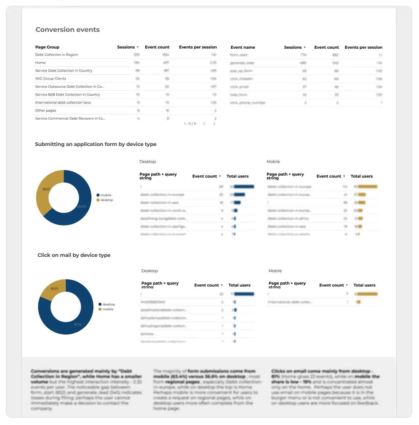
What can it mean to you as a business?
- If a category attracts views but no purchases — that’s a commercial red flag.
- If checkout is busy but not completed — that’s money lost to usability issues.
- If returning users suddenly stop buying — something familiar has broken.
This is where we see the real impact of UX problems, not just in clicks, but in revenue.
Process and Reports Written By UX Designers: Roadmap Leading to Interface Criminals
And a few words on how all that actually works with Turum-burum. Our collaboration follows a simple, swift, and practical flow focused on facts (and our experience):
- Preparation: We start with a brief and access check, fix or align your existing analytics, if necessary, and normalize key events into a clear funnel to ensure data clarity.
- Dashboard Creation: We build a customized Looker Studio dashboard using our proprietary template, adapting it precisely to your business model and specific goals. Not just a pile of GA4 charts, but a tool designed to answer real questions.
- Investigation & Insights: Once the dashboard is ready, our UX designers review the quantitative data. They validate these numbers with qualitative data (using heatmaps, scroll maps, and session recordings) and then embed short, evidence-based conclusions directly into the Looker Studio report.
- Roadmap (under the UX audit): These insights then turn into prioritized hypotheses and UX recommendations.
Looker Studio provides the visualized data clues.
These clues help us understand what happened.
The UX designers uncover why it happened.
All of this aids in reconstructing the crime story: how the conversion was murdered, what left the fingerprints, and which critical UX issues (suspects) need to be fixed first for recovery.
{{block}}
The Closing Report: What Business Actually Get With Looker Studio
Looker Studio isn’t a miracle tool. It won’t redesign your interface or magically raise conversions.
What it does exceptionally well is turn scattered analytics about interface into one clear, structured dashboard — the full picture on a single page.
For businesses, the tool becomes a practical control panel: simple to read, easy to share, and reliable for decision-making.
Looker Studio gives clarity. Experts turn clarity into effective decisions. And together, they help the business act early, long before conversion “dies” again.
FAQ
Question reference
Answer reference


.png)
More real-world Turum-burum cases?
Review our vast portfolio of cases in a variety of business fields to make sure of our expertise.
Go to Portfolio
