


Corporate website redesign: interface that builds brand reputation
Image. Reputation. Brand. Trust.
A corporate website is not just a business face. It is a place where an investor, partner or client gets to know your product. And if the website does not adequately represent the company's expertise, it harms the brand from the very first seconds.
In this article, we won't discuss the concepts of UX/UI or corporate websites. Instead, we will demonstrate how to address real business requests through a well-thought-out corporate website redesign strategy.
Corporate website redesign: 4 challenges and how we solved them
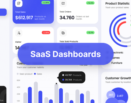
Corporate website redesign is not about changing colors. It's about strategic improvements to ensure the website fulfils business goals. But, as people say, а picture is worth a thousand words.
1. A site that doesn’t match your brand kills trust
Challenge: Your audience trusts you offline and sees you as a credible expert, but your website tells another story. A poorly designed corporate website can damage your brand’s image and reputation, turning away potential clients before you even get a chance to speak. As the saying goes, “You’re judged by your appearance”
For example, Shabo — luxurious brand with a history. However, the old website version failed to convey the store's sense of quality, heritage, and scale. It looked like a regular online store with no character, not like a corporate website for brand presentation.

So, we conducted in-depth UX research, and together with the client, focused on the primary goal: the website should evoke the same emotion as the product itself. The structure, colors, typography, tone of voice — everything should taste like Shabo wine.
To achieve this, we:
- Designed a new website architecture that highlights both the product and the brand;
- Developed a visual style, using a luxurious color palette and premium typography;
- Turned sections on wine tastings, brand history, and tourism into engaging entry points to boost user interest and retention rate.

Thanks to this corporate website redesign strategy, we achieved our key objective: the website now not only drives sales but also strengthens the brand. New design reflects Shabo’s positioning, conveys a sense of quality even before a purchase is made, and helps to acquire a loyal audience.
2. Diverse audience, same experience = missed opportunities
Challenge: one product, a diverse target audience, and a website that meets the needs of only a certain number of your customers — in this scenario, you lose opportunities and profits.
Let's consider the Dysnix case — a tech company specialising in DevOps, Blockchain, AI/ML. This web product is complex, and its customers range from CTOs to business founders. Despite this, the website met only the expectations of developers. This created a barrier for the commercial audience: the interface was inconsistent, complicated, and “not for us.”

Our key question was: who exactly visits the website, and what should they see first? We analyzed user behavior, segmented visitors into groups with different expectations, and developed customized interaction scenarios for each.

Based on the collected data and analytics, we:
- Rebuilt the website's information architecture, ensuring it works equally well for technical and business audiences;
- Developed customized illustrations simply explaining the complex things;
- Choose font and colors that emphasize the technological nature of the brand, but do not overwhelm visitors visually;
- Paid special attention to blog: divided it into categories, added filters and tags — everything is designed so that the user can quickly find needed information even in a large amount of content.

What's the result? The website became well-structured and clear. Different users received personalized content, resulting in an increased number and quality of requests. The business segment that used to “fall off” began to stay, read, contact, and most importantly, buy from the website.
3. Blindly following best practices don’t work without context
Challenge: simply copying best practices and solutions because “it works for other companies” or because “you just like it,” without taking into account the specifics of the product and target audience. This leads to nowhere.
But what if we’re dealing with an innovative product? Just like NFTrends — a Web3 product with no analogs on the market. It offers digital passports for physical luxury goods and works on blockchain technology. The challenge — the audience is not technically advanced. So, the website has to explain complex, cutting-edge concepts in a clear and accessible way, without overwhelming the user.

No one knew what it should look like — there was nothing to compare it with. With no templates to rely on, we built the user experience from scratch. We focused on simplicity: making the complex things feel intuitive. The website had to display innovation, communicate value, build the brand, and resonate with the luxury market.


Our steps:
- Built a UX architecture for 4 types of users (owners, managers, stakeholders, customers): individual flows, tasks, goals;
- Developed a visual style: deep shades, textures, elements of luxury aesthetics;
- Applied simple typography, soft tone of voice, customized icons, etc.
Result: With more than 15 years of experience and close cooperation with stakeholders and developers, Turum-burum has created a unique UX/UI design that effectively presents the company's services and emphasizes its value. As part of the project, we created a comprehensive dashboard for different user types and a website that serves as the company's business card.
4. Mobile design done just to tick the box
Challenge: Most corporate websites still rely on simple “adaptation” rather than true mobile UX. The result? Buttons are hard to tap, text is too small, and key features don’t function as users expect.
The key is understanding that the mobile version isn’t just a website’s copy — it’s a separate interface with its own user experience. That’s why we usually start our work with the development of mobile interfaces as an independent product with a unique experience:
- Develop mobile-first layouts;
- Adapt filters, CTAs, and micro-interactions for mobile use flows;
- Prioritize content based on how users interact on mobile devices.
For example, for the Shabo project, we developed a dedicated mobile UX logic, including thumb-friendly CTAs, intuitive filters, and simplified navigation, all of which were adapted for mobile users.

In Dysnix, we made technically complex things easily readable and accessible for mobile users.

The result: we addressed the needs of mobile users, resulting in increased conversion in this segment.
Effective corporate website redesign strategy: 5 examples for inspiration
When redesigning a corporate website, the key question is: what should it look like to build trust and spark interest? And since every solution should be tailored to the brand's specifics, some businesses prove that UX/UI can effectively support the brand’s image and reputation.
We’ve selected five websites that stand out for their thoughtful approach and can serve as valuable references for your inspiration.
{{block}}
1. Metinvest: navigation for complex structures
Metinvest is an international mining and metals company with numerous divisions and markets.
Despite the complexity of the niche, the website is well organized: user segmentation, minimalist style, and intuitive navigation. It's a good example of how to make complicated things understandable.

2. Volvo Group: communicate complexity with clarity
Volvo Group is one of the best examples of how to present a complex product in a simple way via UX design. The web pages have a clear structure, plenty of space, and simple typography. Volvo maintains a balance between technical precision, accessibility, and consistency.

3. CarTrawler: user-oriented B2B platform
CarTrawler — a leading B2B technology platform that serves as a mediator between customers and travel companies, providing car rental and mobility solutions. The website has a clear structure and intuitive navigation and provides a simple and easy-to-understand presentation of complex services.

4. LS Group (LS.ua): Nothing but reputation
Legal company LS Group teaches how to build a sense of expertise and trust using a website. The successful combination of modern minimalism with emphasis on credibility and experience says, “We are serious and open.”

5. Noughts & Ones: a corporate website that reflects the company's philosophy
Noughts & Ones — an agency that creates environmentally conscious Shopify stores. The website not only presents the services, but also reflects the company's philosophy: simplicity, conciseness, rhythm, and visual harmony. It is vital for B2B products that want to present themselves as much as possible while looking modern and simple.

These examples can serve as a source of inspiration and ideas for your corporate website redesign.
When corporate website redesign objectives go beyond looks, it’s about rethinking the experience
Corporate websites are neither e-commerce nor landing pages. Among website redesign objectives are:
- To form a brand's image and strengthen its reputation;
- Present a product or service to broad target audience;
- Confirm the company's expertise, experience, and scale;
- Serve as a “center” of business communications.
This means that the strategic website design of a corporate product should be different.
Redesign is not about “freshening up.” It's about changing the UX/UI strategy. Every interface solution should be based on analytics, user behavior scenarios, and clear business goals. The structure, content, and tone of voice — everything should work not just for the sake of visual appeal, but for results.
Therefore, when you follow a website redesign marketing strategy, you should not ask “what to change” but “what do we want to achieve” and “for whom are we doing it.” Only in this case will your website become not an 'anchor' but a business growth point.
FAQ
Question reference
Answer reference


.png)

.png)


More real-world Turum-burum cases?
Review our vast portfolio of cases in a variety of business fields to make sure of our expertise.
Go to Portfolio
