


E-commerce A/B testing in action: +58% CR in mobile version or VSV-Group redesign story
Since childhood, we have known: “rearranging the terms doesn't change the sum”. But why doesn't it work so in web design? How does the arrangement of elements on a webpage affect user behavior and business profits? Is it possible to determine the website elements that will contribute to conversion and the ones that, on the contrary, lead to lost revenue?
In this article, we'll look at how VSV-Group's A/B design testing helped us prove the effectiveness of the Turum-burum UX/UI hypothesis and unlock business potential by increasing the conversion rate of key pages from 30% to 58%.
About VSV-Group
VSV-Group is a company that specializes in the manufacturing and installation of gates, sun protection systems, mobile ramps, warehouse equipment, and many other things. Such a variety of services is the company's main advantage. The brand allows you to order full-service solutions tailored to your most creative and individual requirements.
However, in the context of UX/UI design, this creates a challenge: how to present all the company's services in detail without overloading the interface? After all, without convenient and intuitive navigation, users simply won't be able to find the information they need and won’t understand the value of the business's services.
Therefore, VSV-Group representatives applied to Turum-burum studio with a clear goal: optimize the website interface to increase KPIs and improve user experience.
How did we manage to increase the conversion of key website pages from 30% to 58%, and what was the role of A/B testing in this? You'll find the answer in the next section.
UX audit, or what preceded e-commerce A/B testing?
Confidence is good, overconfidence is dangerous. This is true for everything: from deciding on a working weight in the gym to choosing a UX/UI design for a project. And in each case, overconfidence has its own cost: in the first case, it's undermined health, and in the second – it's a waste of time and money.
That's why the Turum-burum team considers e-commerce A/B testing to be one of the most effective methods for proving the efficiency of UX/UI hypotheses and making data-driven business decisions. And since we favor actions over words, we'll share the details of the VSV-Group case and the results achieved below.
VSV-Group website optimization or everything starts with UX audit
We conducted a UX audit and found around 30 usability issues, which is good news. Why? Firstly, the identified UX/UI issues explain why some of the website's performance indicators are not as high as desired. And secondly, they demonstrate the huge business potential if these issues are eliminated.
What's next? Identifying issues is not enough — we need to find ways to fix them. Therefore, based on analytical insights and our vast experience, Turum-burum specialists have worked out a number of hypotheses to fix the interface's issues, increase the website's KPIs, and find a further development vector.
However, how to ensure that the hypotheses will work 100%? This is where e-commerce A/B testing comes into play, which aims to check how users will react to the proposed UX/UI changes.
A/B product testing for e-commerce: VSV-Group's experience
So, we decided to test how our hypotheses would work in practice using e-commerce A/B testing. To do this, we chose two key website pages with the highest growth potential — the search results page and the product page in desktop and mobile versions. We developed a new design for these two pages based on our hypotheses, recommendations, and references.
We randomly assigned some users to the old version of the site and others to the new one. Then we compared user behavior patterns and pages KPIs before and after the redesign and observed impressive results.
Gate systems category listing page
Issue:
During the usability audit, we noticed that the page was too lengthy, overloaded with text, and the block with the company's benefits was so low that 80% of users did not even scroll to it. The product photos were also small, and the buttons visually merged with other website elements. The descriptions were displayed in a zigzag pattern, which made it difficult to find the necessary information on the page.


Hypothesis:
Users could not find information about the company and its benefits, product examples, reviews from other customers, and other elements that could increase their brand loyalty on the search results page. And since the product photos weren't eye-catching enough to grab their attention, they left the website.
Recommendations:
- Arrange product previews in a row of two;
- Make SEO texts smaller;
- Briefly display the main advantages of the company;
- Increase the size of photos with work examples and place them before the FAQ block;
- Add information about the main features of different gate types.
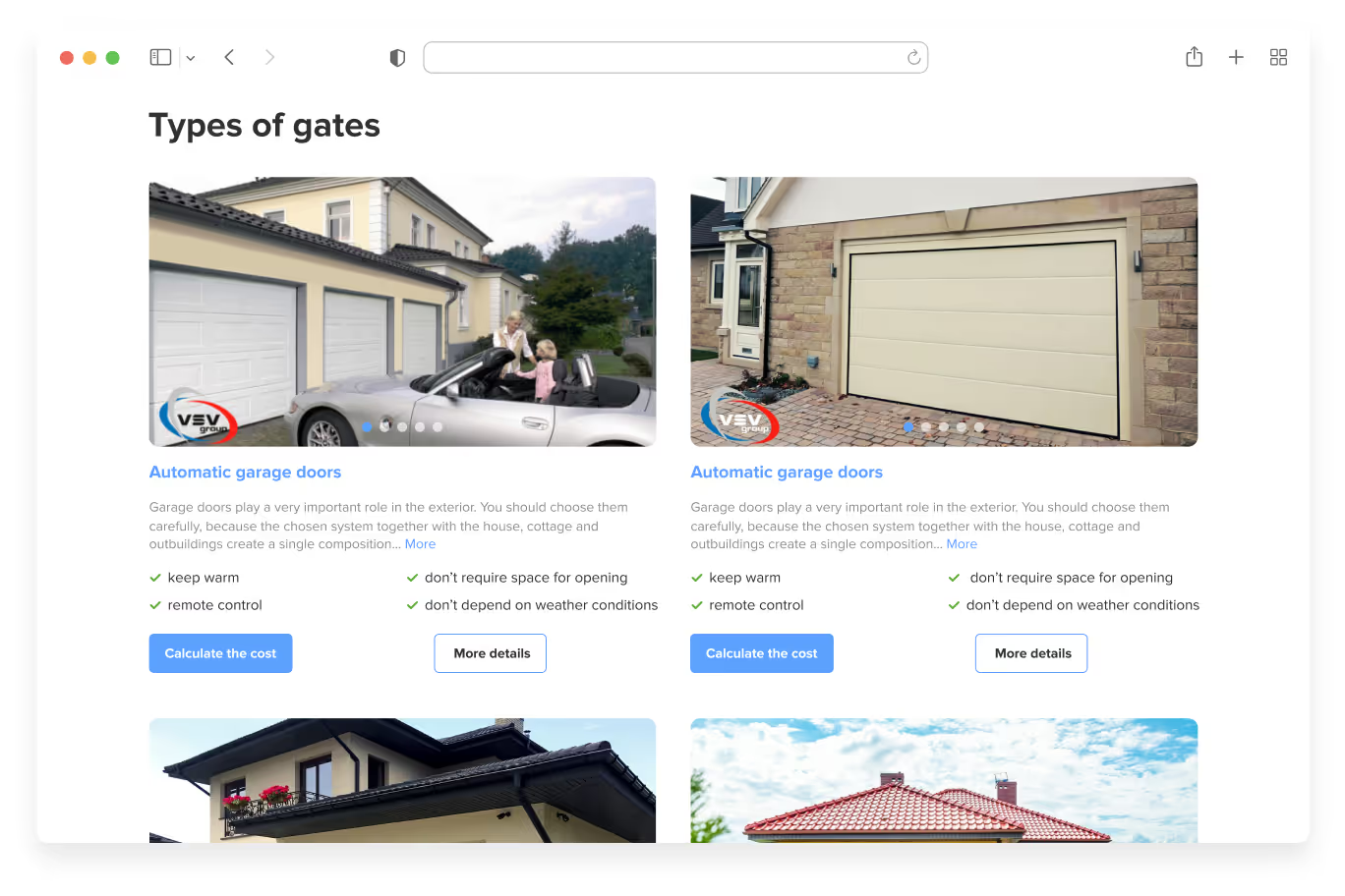

A/B testing results:
We checked how the suggested interface changes would potentially affect user behavior and received positive results. For example, users spent more time on the website, demonstrated a higher engagement rate, and navigated to the product page more frequently. As a result, the product page conversion rate on desktop increased by 32%, and on mobile devices — by 58%.
Product page (garage door)
Issue:
We identified the same usability issues: lack of visual content, small and low-quality photos of gate materials, lengthy descriptions, lack of a product benefits list, and a block with products’ technical characteristics and their application. These issues were especially critical for mobile devices, where some blocks were not displayed at all.
Hypothesis:
Due to a large amount of unstructured content, users struggled to find key information needed to make a purchase decision — clear descriptions of gate types, their purposes, high-quality photos of the products’ texture and color, customer reviews, or a quick way to contact a company manager for advice. Anyway, it's not something people buy every day.
Imagine you want to install a gate system for your country house but lack experience in this area. You expect the website to guide you, but instead, you're faced with a dense wall of text and no clear answers. Frustrated and confused, you’re likely to leave the site without making a purchase decision. This was exactly why potential VSV-Group clients abandoned the website without choosing a product.


Recommendations:
- Add macro photos of materials and examples of color schemes;
- Visually isolate page options and blocks from each other;
- Implement social proof blocks: “Examples of work”, “Reviews”, “Expert advice,” and figures emphasizing the company's expertise;
- Add a block with technical specifications, recommended solution options, and add a pop-up with specific characteristics indicating the best solution for specific situations;
- Simplify the calculator form for estimating the cost of goods;
- Enlarge the product card and photos in the mobile version of the website.


One block and different approaches: which one attracts your attention more? And which one is more user-friendly and clearly demonstrates the work done?


А/B testing results:
The results of the new product page design testing proved the effectiveness of our hypothesis. After the redesign, the page became more intuitive and convenient for users. As a result, we saw a rapid increase in the micro-conversion rate — +30% for desktop and +48% for mobile.
In this way, we proved the effectiveness of our hypotheses and the need to implement the proposed UX/UI changes with real facts!
Results of A/B testing for e-commerce or why do you need it?
Thanks to e-commerce A/B testing, we evaluated hypotheses to optimize both the search results and product pages across VSV-Group desktop and mobile platforms. The test results showed that by implementing new designs, we can achieve significant improvements, including:
- +32% micro-conversion for the product page on desktop and +58% for mobile devices;
- +30% micro-conversion for the product page on desktop and +48% for mobile devices.
All in all, we managed to confirm the effectiveness of all the suggested hypotheses, although sometimes it takes several iterations to achieve the final goal. In the VSV-Group case, A/B testing allowed us to identify the areas that need to be improved and thus save the customer's budget and time and minimize business risks. Want to know more about our work on such cases? Then check out the details of the Crystal Clear Memories project.
FAQ
Question reference
Answer reference


.png)


.png)


More real-world Turum-burum cases?
Review our vast portfolio of cases in a variety of business fields to make sure of our expertise.
Go to Portfolio
