


How to Evaluate Website Usability: A Practical Guide Without Boring You to Death
You're not Amazon or eBay.
But maybe you dream of becoming the next one.
You've got traffic… but conversions? Let’s just say they're shy.
Or maybe you're about to launch your new online project, and it’s shiny, modern, and has those cool animated buttons everyone loves... But do you hesitate if it appeals to your future customers?
Welcome to the world of usability evaluation. A world that sounds scary and technical but is actually about one simple thing: “Can a real human being use the website/app without crying?”
In this article, we’ll walk through practical, business-friendly, effective methods to evaluate usability, from professional UX audits to free DIY tools you can try today. And yes, we’ll keep it fun.
Let’s go.
Why Should You Care About Usability, Anyway?
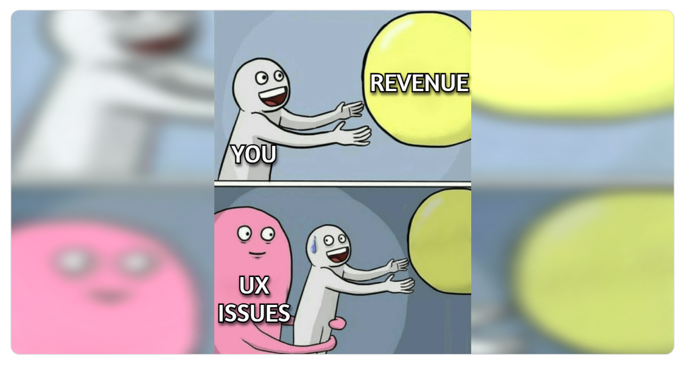
Because you're not Amazon.
You can’t afford losing users because:
- They couldn’t find the “Buy” button;
- The form was confusing;
- Your homepage felt like a puzzle;
- The checkout looked suspicious, etc.
Every bounce costs you money.
Every confusing flow kills trust.
Every tiny UX issue is a tiny leak, and leaks add up.
So instead of asking, “Do we need a usability check?”
Ask, “Can we afford NOT to?”
Two Big Ways to Evaluate Website Usability
There are two paths.
The first one is a professional, expert-led evaluation. Precise, data-backed, strategic.
The second one is a DIY evaluation (online tools anyone can use). Fast, simple, and great for early insights.
Let’s break them down.
Way #1 Professional Services (a.k.a. Cost Money, Save Your Sanity)
This is where companies like Turum-burum come in. The pros who spend their days analyzing user flows while you sleep and fighting conversion-killing demons so you don’t have to, becoming an amateur psychologist at 2 a.m.
Here are the three main approaches worth considering.
1. UX Audit (The Full MRI Scan of Your Website)
A full usability audit examines how people actually move through your site, what confuses them, where they drop off, and why your conversions aren’t where they should be.
But this isn’t guesswork. It’s a deep, data-driven investigation: analytics, funnels, heatmaps, session recordings, interface logic, and UX patterns.
Think of a UX audit like taking your website to a doctor, but instead of “drink more water and take paracetamol,” you get:
- Deep analysis of user behavior;
- Hypothesis based solely on data from analytics tools;
- Insights into what’s confusing your users and where they drop-off;
- A clear roadmap of what to fix and what impact it will have;
- Examples, references, and prioritized recommendations.
A complete UX audit usually takes about two weeks, and the outcome is a professional strategy document. Not just “your button is weird,” but detailed recommendations a la:
“By adding a second and third level of subcategories to the catalog for more detailed structuring, users can immediately access the list of products without needing to go to the product listing page. Additionally, the catalog page should include a “View all products” button to provide quick access to the entire range of the category. This solution can reduce the bounce rate in the catalog by 20-25%, increase the depth of viewing by 15-20%, and increase the number of transitions to product cards by 12-15%.”
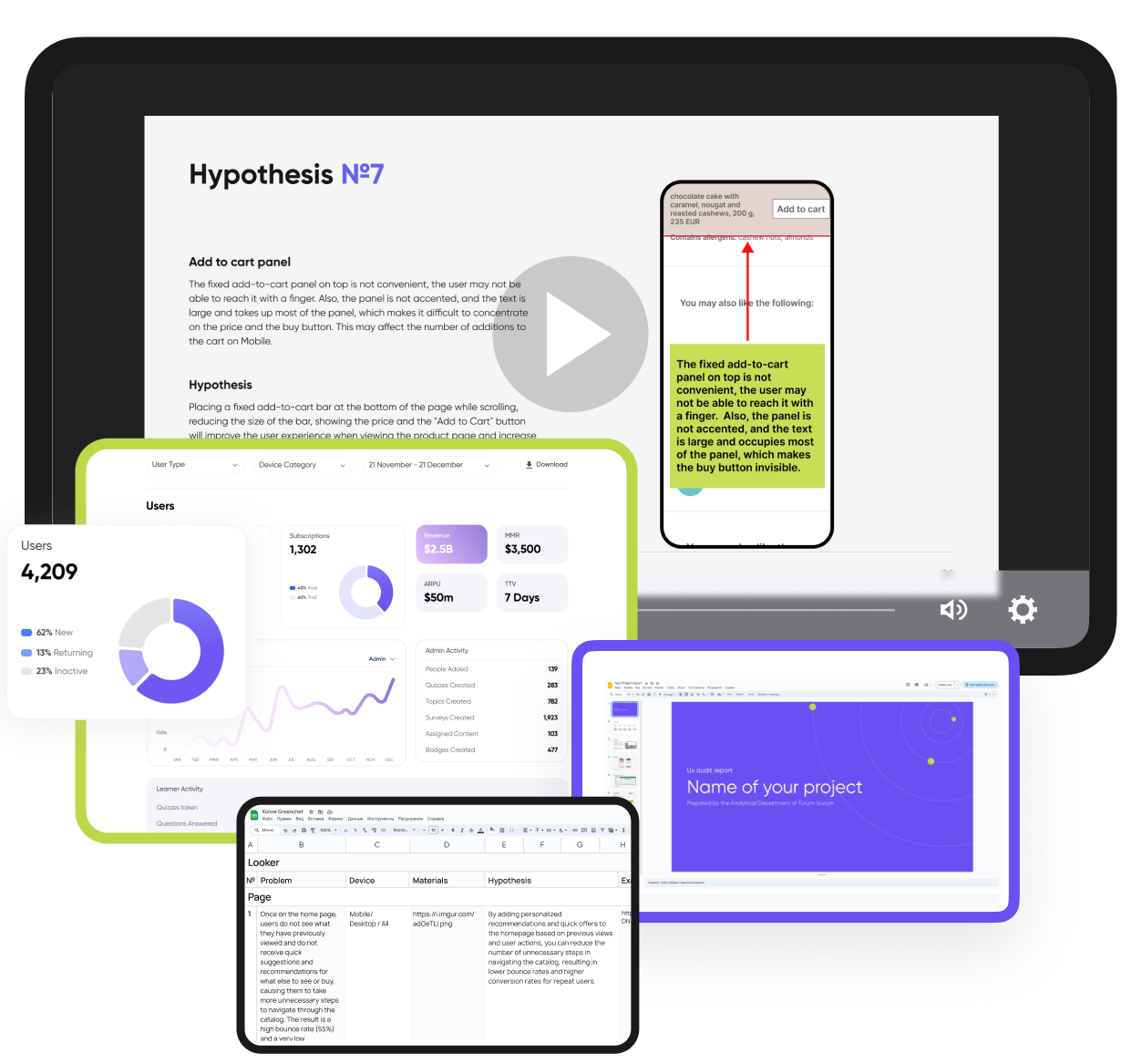
It’s structured. It’s actionable. It’s created by specialists who’ve run hundreds of audits.
Use this if you want to increase conversion, improve user flow, and make decisions based on real data, not your gut feeling or your cousin’s opinion.
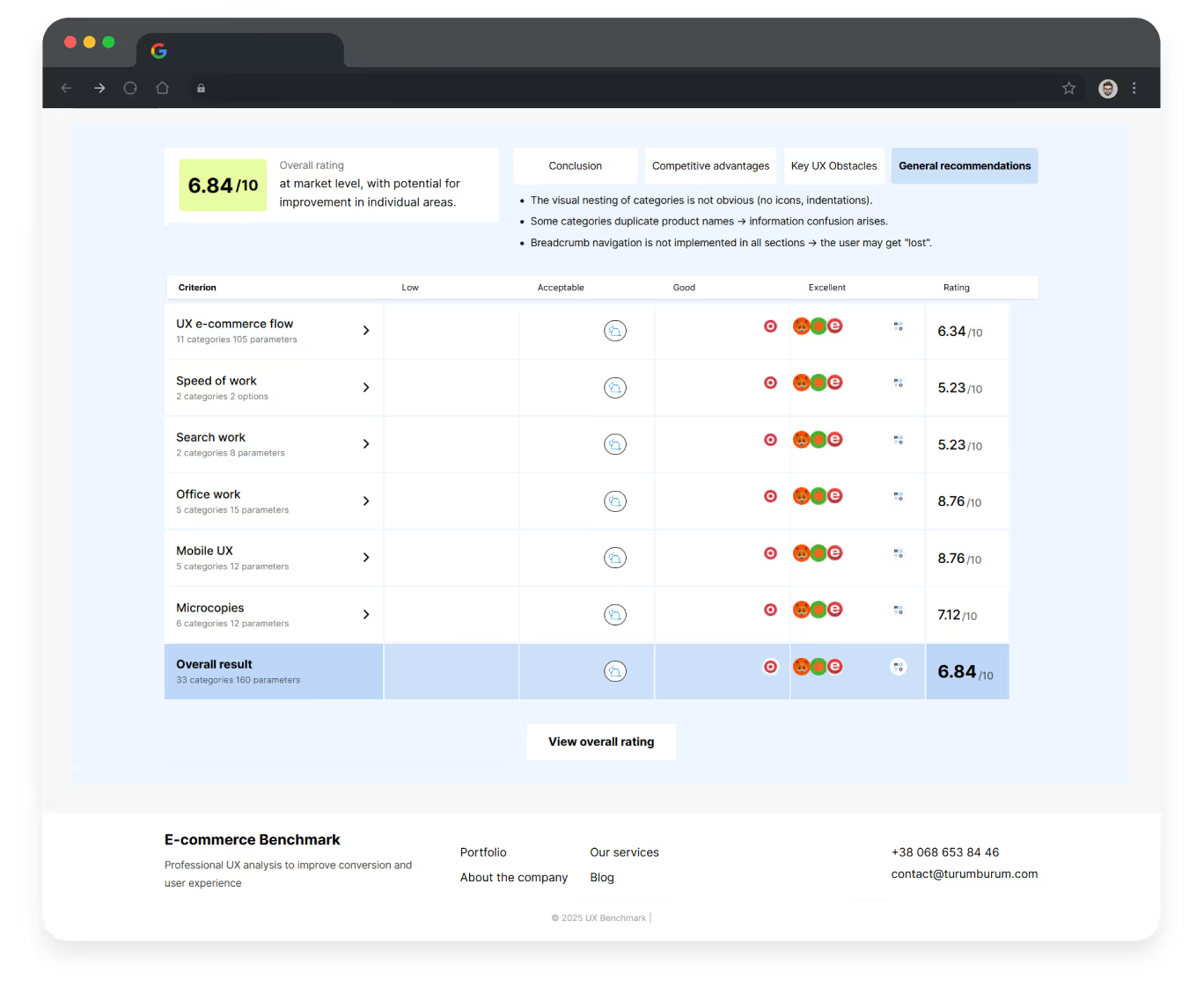
2. UX Benchmarking: Your Website vs. The Competition (The X-Ray With Context)
While a UX audit dives into your analytics and users, UX benchmarking flips the perspective and shifts the spotlight outward, examining how your website performs in the real marketplace, not in isolation.
Here the main question is, “How does your product compare to competitors?”

What UX benchmarking includes:
- Side-by-side comparison of your usability against industry leaders or direct competitors (just like your users are comparing you every day);
- Identifying where competitors outperform you;
- Spotting opportunities: missing features, better flows, more intuitive patterns;
- Discovering your unique strengths.
Think of it as competitive intelligence dressed as UX research that, very often, leads to businesses having their first “Oh… that’s why” moment.
Benchmarking is like peeking over the fence (legally) and learning what works out there. It’s especially useful when:
- You feel your product is “good” or “nay” (and want to understand where it’s so);
- You want to differentiate your user experience;
- You’re searching for new features or improvements;
- You want to stay ahead of top market players or at least outperform your rivals.
Use this if you want to understand your competitive position, discover hidden opportunities, or refine your product with strategies proven to work in your industry — not with guesswork or internal debates.
3. Express UX Audit (When You Need Insights Fast)
An Express UX Audit is the quick, focused check-up for situations when you have:
- Very little traffic or no analytics access;
- A project still in Figma or early development;
- Tight deadlines before launch;
- A need to quickly validate whether your interface has chances to convert.
This is the “quick diagnostic” option, something like the UX equivalent of checking blood pressure instead of doing a full body scan.
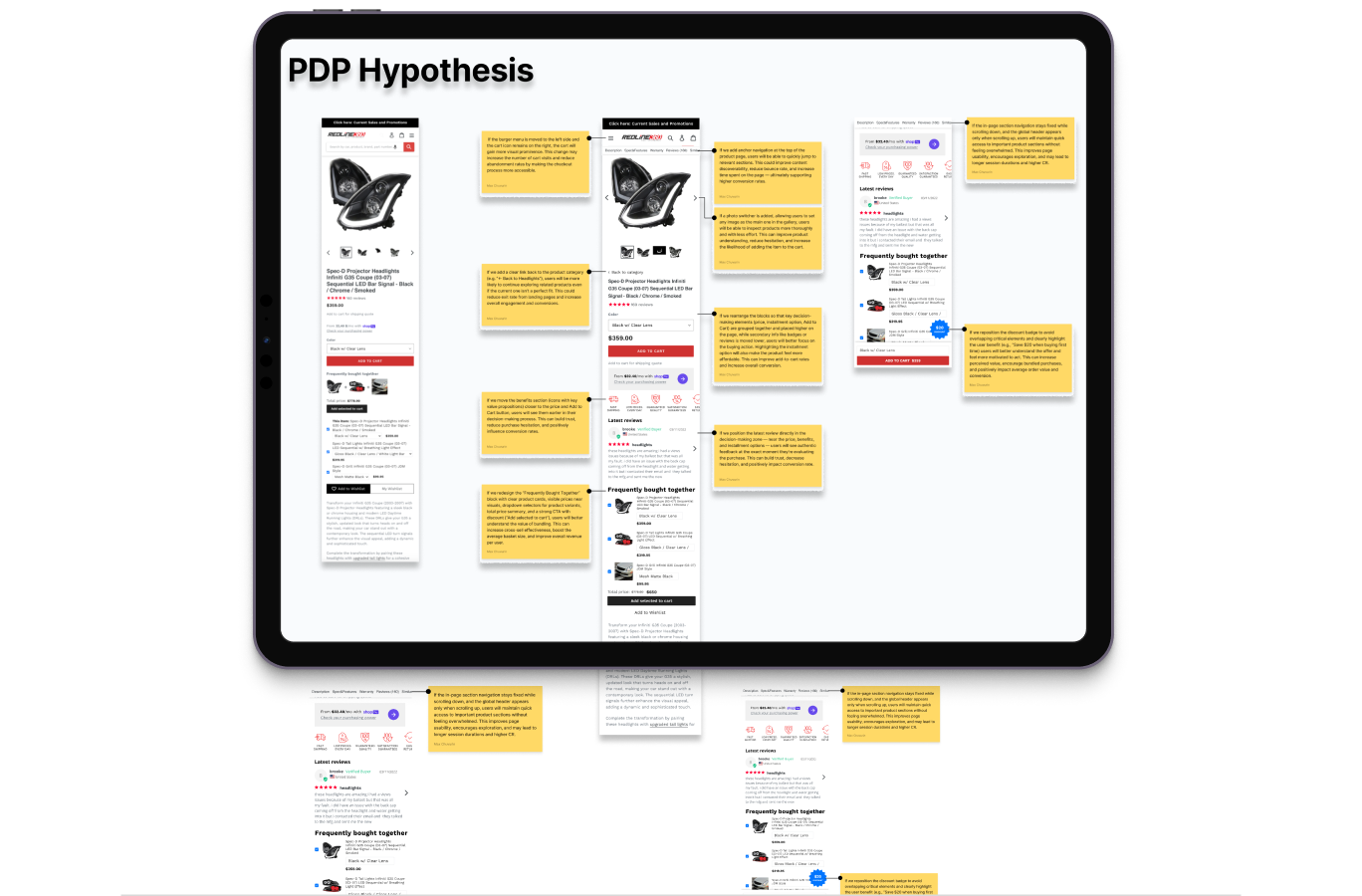
Instead of digging through data, the expert evaluates your interface (key pages like the homepage, category listings, product details page, shopping cart, and checkout) directly, screen by screen, flow by flow, and reviews:
- Your layouts and page logic;
- The clarity and hierarchy of information;
- The intuitiveness of user flows;
- Potential friction points and red flags that will confuse people.
It’s based on experience, best practices, and conversion principles, not analytics.
Fast, clear, practical.
Use this if you need immediate clarity, early validation, or expert confirmation that you’re not launching (or redesigning) something users will struggle with. Fast, accurate, and surprisingly impactful, especially when you need answers… yesterday.
Other Professional Methods (That Exist, But You Don’t Necessarily Need… Yet)
If you’re curious (or just want to sound smart in meetings), you can explore more advanced techniques beyond audits and benchmarking, such as eye-tracking, user testing, JTBD interviews, journey mapping, accessibility audits, and others. But we won’t go into details here, because you came for a practical guide, not a UX PhD.
So, if you ever need deeper insights or want to validate big product decisions, these methods are there. Otherwise, the three approaches above will already cover 90% of what most businesses struggle with.
{{block}}
Way #2 DIY: How to Check Usability Yourself Using Online Tools
Not ready for a professional audit?
No problem. You can start optimizing usability today with free (or just online) tools and self-check methods.
Let’s explore the easiest ones.
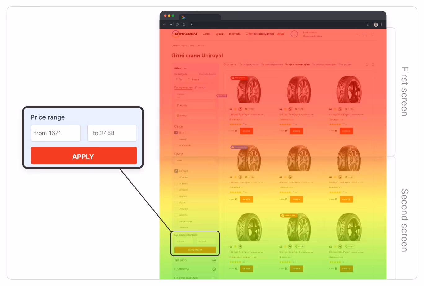
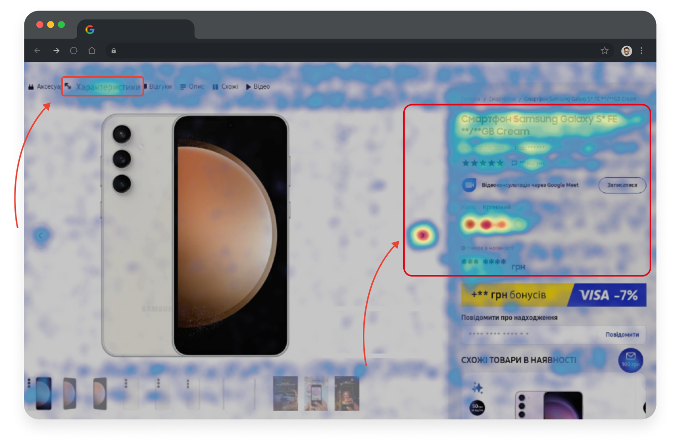
1. Heatmaps & Click Maps (Your Users’ “Secret Diary”)
Tools like Hotjar (a paid one) and Microsoft Clarity (a free tool) are incredibly simple to connect through Google Tag Manager, so you won’t need a developer.
Once you get data, you can see:
- Where users click;
- What they try to click (even if it’s not clickable, ouch);
- How far they scroll;
- Where they get stuck;
- What frustrates them, etc.
Bonus: Both tools now have AI summaries.
Are these insights as good as a real UX expert? No.
But are they helpful? Surprisingly, yes.
Think of it like asking a trainee for advice. Not as deep as an experienced specialist, but a good start.
2. AI UX Assistants (Your New Digital Intern)
There are now a bunch of tools, including UX-focused AI-based chats (like those created by specialists at ChatGPT), that can:
- Analyze screenshots of your site;
- Propose improvements;
- Highlight issues;
- Suggest best practices, and so on.
They’re not perfect (AI still doesn’t understand human emotions, memes, or why people rage when a form resets). But for first steps it can be very helpful.
3. UX Checklists and The “No Experience Needed” Methods
Want to evaluate your site with zero tools and zero budget?
It’s also possible, though.
A simple heuristic evaluation based on Nielsen’s 10 usability rules can uncover 40-60% of common UX issues, just by checking whether your website is clear, consistent, predictable, visible, and easy to navigate (or recover from when things go wrong).
Here’s the full list of Nielsen’s heuristics (you’re welcome):
- Visibility of system status: the interface shows what’s happening.
- Match with the real world: written in familiar, human language.
- User control and freedom: easy to undo, redo, or escape from mistakes.
- Consistency and standards: patterns behave the same across pages.
- Error prevention: the design helps users avoid problems.
- Recognition over recall: users shouldn’t need to memorize anything.
- Aesthetic and minimalist design: clean, uncluttered, and to the point.
- Flexibility and efficiency of use: works for beginners and experts alike.
- Help users recover from errors: error messages that actually help.
- Help and documentation: simple guidance when users need it.
“As developers, we know that a UX design only delivers when it’s faithfully implemented. Real user experience depends on how flows behave under real conditions, how interactions respond within tight performance budgets, and how design systems are accurately translated to code while handling edge cases across devices. That’s where UX converts into measurable value.” — Alex Lozytskyi, CEO at Che IT Group.
You can also use comprehensive UX checklists, like this 170-point usability checklist from Turum-burum, to spot interface gaps you’d never notice on your own.
And then there are the surprisingly effective “human tests”:
- Ask three friends to complete key tasks (without helping them), and watch what happened;
- Time how long it takes to find important pages;
- Try your own checkout on mobile;
- Or simply ask customers what confused them.
No tools. No expertise. Just honest feedback. That can also be eye-opening and shockingly effective.
A Good Website Is One That Is Effective: Evaluate Usability So Your Website Isn’t a Puzzle
At the end of the day, usability evaluation is not about “rules” or “best practices.” It’s about making sure your website (or mobile app) solves customers’ tasks and helps your business grow (not silently kills conversions).
So, if your customers can understand your offer, find what they need, take action easily, and feel good while doing it… Then congratulations, your website is (more likely) usable.
And if not? You now know exactly how to evaluate it and which tools or services can help.
FAQ
Question reference
Answer reference


More real-world Turum-burum cases?
Review our vast portfolio of cases in a variety of business fields to make sure of our expertise.
Go to Portfolio
