


E-commerce Homepage Design: 5 Practical UX/UI Tips to Boost Revenue
A visitor lands on your homepage. A clock starts.
In a few seconds, they decide whether you're worth their time. And here's the uncomfortable part — most of them will never scroll far enough to give you a second chance.
According to our experience, only about 2% of visitors reach the bottom of a homepage. The other 98% make up their mind near the top, or they're already gone. So what should homepage design actually look like in 2026?
This article covers 5 practical UX/UI moves that turn a homepage from a storefront into a hub that cuts time-to-value. They come from Denys Studennikov, COO at Turum-burum, backed by thousands of hours of experience and real redesigns from our portfolio.
We updated the article to reflect the realities of the modern market. We've tried to be honest about what's genuinely still a differentiator versus what's now table stakes.
If you're short on time, here's the gist:
- Decide what your homepage is for before you design a pixel.
- Guide the visitor; don't just showcase your catalog at them.
- "Everyone" is not your audience. Know your buyers. Segment them on the first visit.
- Design for a thumb, not a mouse.
- Remember the people who came back.
- And stop making the mistakes that are somehow still everywhere (described in Tip 5).
What Should Be On The Homepage Of An Online Store (And What Shouldn’t)
So what actually belongs on a homepage now and what quietly needs to go? The bones are the same as ever: a header, a hero, a way in. What's changed is where each of those now sits, what's been added beside them, and how many of yesterday's bold moves, like a mobile-first layout, personalization, a segmented catalog, a page that remembers you, and others are simply the baseline today.
Plenty of big brands still haven't caught up. Here's what our own redesigns taught us.
Tip 1. First, decide what the homepage is for
A homepage does one unglamorous job well: it points. It distributes traffic across sections and offers clear entry points so that within a second of landing, a visitor knows exactly where to go next. And the less time they spend on the homepage itself, the better it's working.
How it points depends on your business model, and that choice dictates the entire layout. There are two modes, and trying to be both (without deciding) is how you get a page that does neither.
Big catalog, broad audience? Maximize the entry points. For large stores with broad assortments like electronics, DIY, B2B supplies, general merchandise, etc., the homepage should show range: hot deals, new arrivals, top categories, popular products at accessible prices, and so on.
The goal is to funnel users toward products as fast as possible, because for this kind of store, requiring users to hunt for entry points is the same as sending them to a competitor.
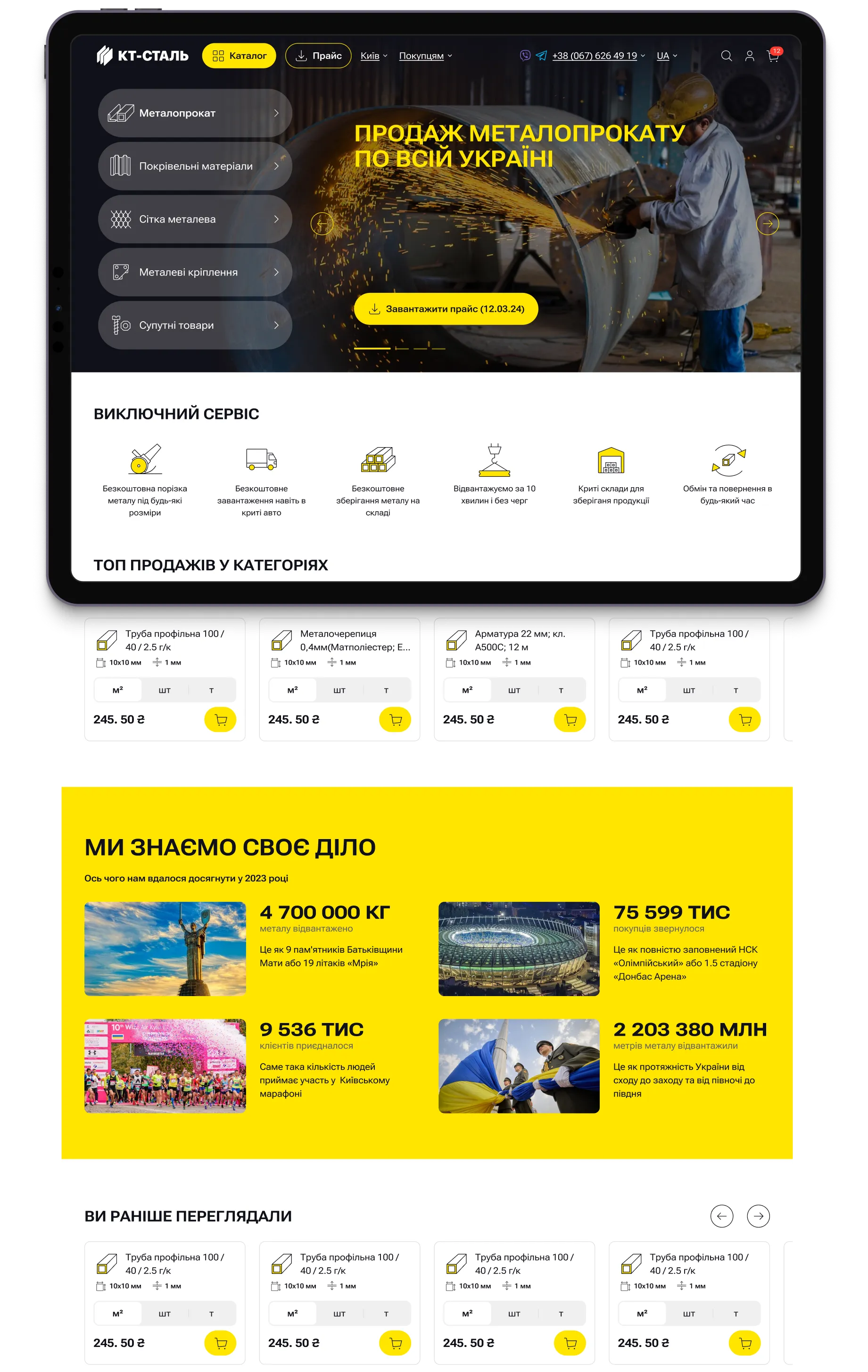
Selling the brand, not just products? Let the design carry the trust. When the goal is brand building or when users arrive through branded search, the homepage plays a representational role first and a sales role second. Visual identity, editorial tone, and brand personality do the work here.
Let’s take Shabo, a Ukrainian wine brand with a long heritage. Before the redesign, the website looked like a generic online store. It didn't convey the brand's scale, history, or quality.
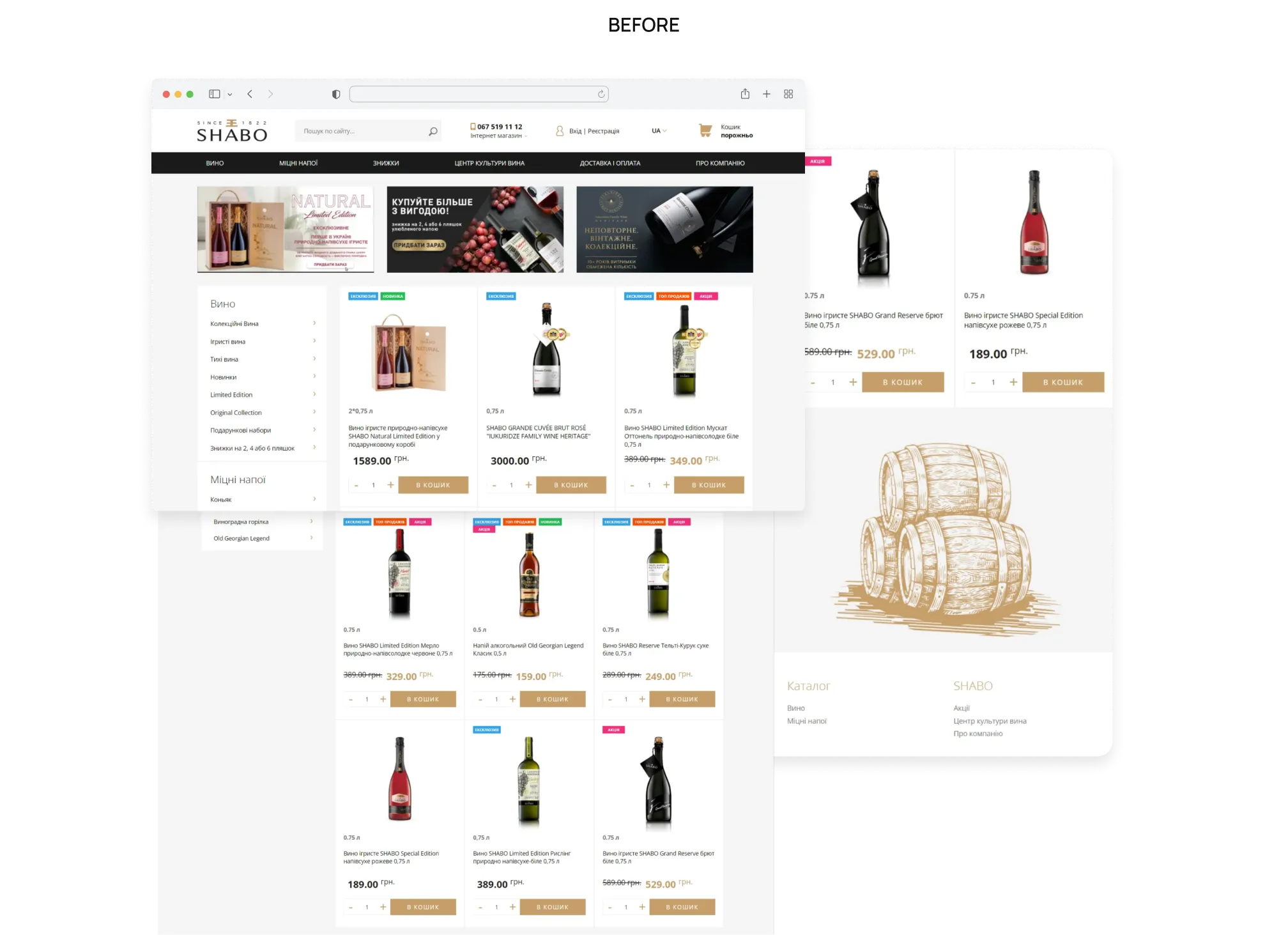
After the redesign, every element from structure, palette, typography, and tone of voice was oriented toward one objective: make the visitor feel the brand before they read a single product description.
.webp)
The same logic drives any corporate website redesign: if the website doesn't match how the company presents itself offline, it damages trust from the very first second.
{{block}}
Tip 2. "Everyone" is not your audience: segment users on the first visit
Showing the same homepage to every visitor is a missed opportunity. For stores with diverse audiences, it can actively hurt conversion.
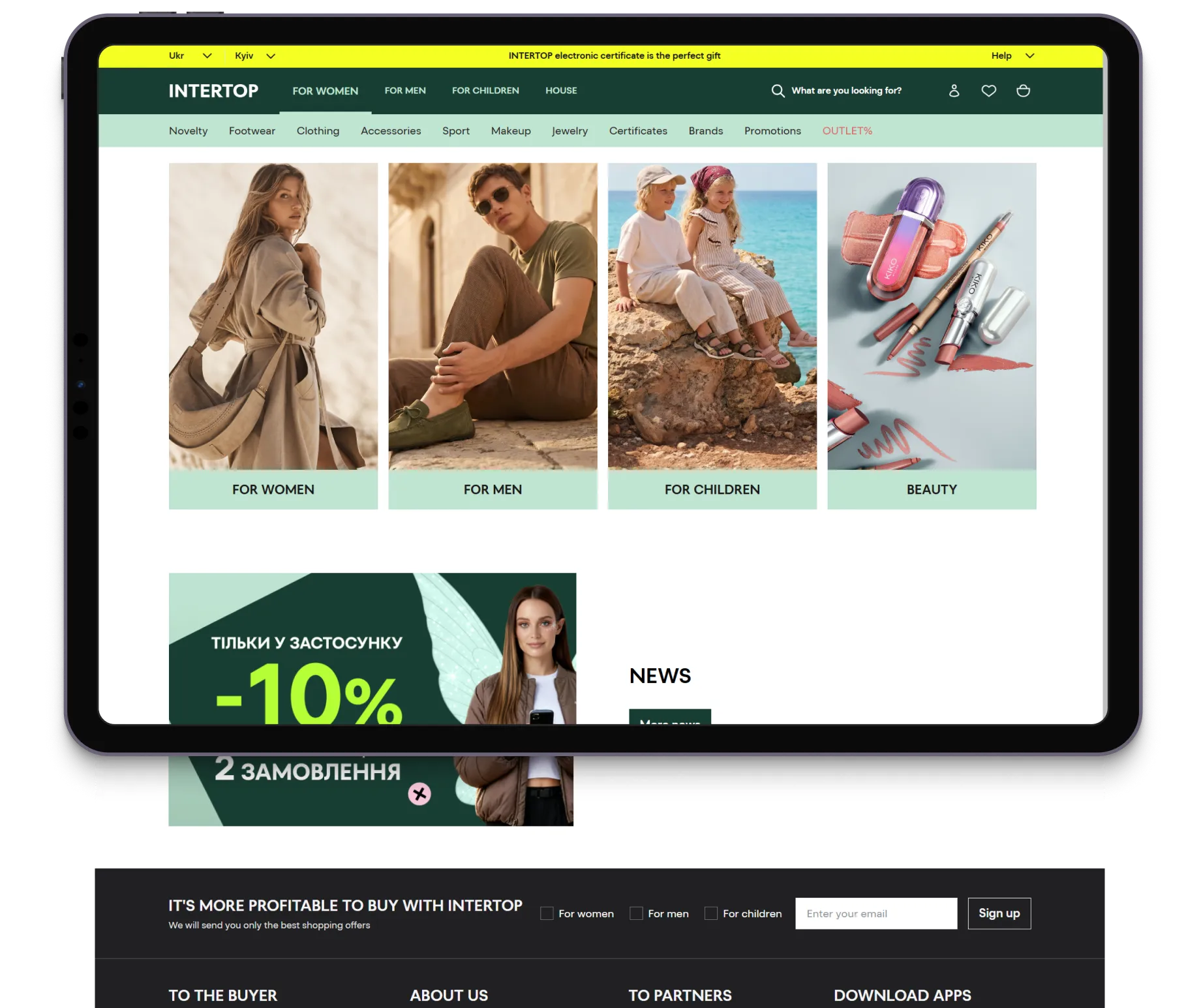
The most common version: a gender or age split like for fashion stores. On the first visit, users are offered a choice: Women / Men / Kids, and the experience adapts accordingly. Intertop, Zara, and dozens of others have been doing this for years.
It works: the homepage personalizes itself, relevant products appear first, and mental filtering time drops.
But segmentation doesn't have to be demographic. The more interesting version is behavioral. So, segment by intent and context:
- First-time visitor vs. returning customer;
- Where a visitor came from (a branded search vs. a paid campaign vs. a social link);
- The category they browsed before;
- Device (mobile vs. desktop) and region, etc.
Each is a first-visit signal you can use to lead with what they most likely want instead of a one-size-fits-none homepage.
The lesson is simple: if your homepage doesn't immediately say this is for you, the visitor assumes it isn't, and that's a qualified lead walking out.
This is where AI is starting to earn its place on the homepage. Today there are many platforms that can serve dynamically personalized content based on behavioral signals, with no manual setup per segment. For a UX designer, this changes the challenge: you're no longer designing one layout. You're designing a system of states. Components stay the same; content inside them adapts.
Tip 3. Mobile-first design: build for a thumb, not a mouse
"Design for mobile" stopped being advice years ago. In 2026, it's a baseline requirement, and it's simply where the revenue happens.
Based on our practice and niche research, in fashion, 73-86% of traffic comes from mobile. Electronics and beauty look much the same, by the way.
So the interesting question isn't whether, it's how well. And it’s about the design implication: mobile isn't a smaller version of the desktop site. It's a different world: touch targets, not hover states; portrait, not landscape, one-handed use; interrupted sessions; and many more.
Adapting desktop design by resizing and rearranging is not enough. Some things need to be completely rethought. This sounds obvious. It isn't, in practice. According to research, 67% of mobile sites scored "mediocre" or worse on homepage and category navigation.
And "within a thumb's reach" is more literal than it sounds. The average fingertip is 1.6-2 cm wide, with a thumb's pad closer to 2.5 cm, and a tap target should be at least 1 × 1 cm (0.4 in), with real space around it. Anything smaller, or crammed up against its neighbors, is a mis-tap waiting to happen.
And spacing is only the very beginning. So, the structure, hierarchy, and color scheme are the next things, which everyone knows but a few who do.
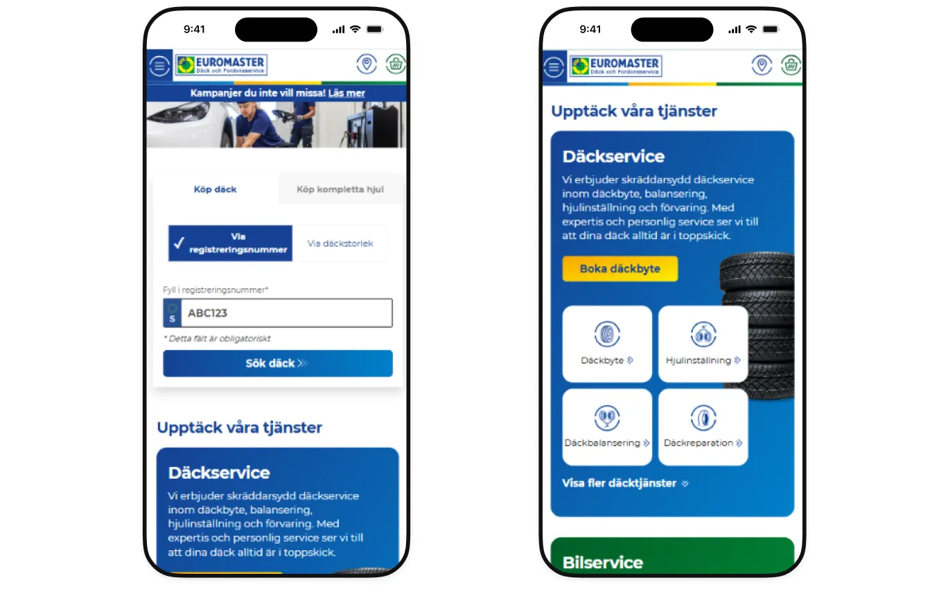
Seeing is believing. So just compare two websites from a single niche and say which one you choose to buy.
.webp)
Let me guess, you chose the second one, didn’t you? Yep.
So, what is wrong with the EuroMaster.se e-commerce homepage design? The search box that people came for is competing with a promo banner, the header icons are crammed together, and the main CTA blends into the layout. On a phone, the experience is a maze.
Shiny&Diski offers the same kinds of products, arranged for a thumb: a size selector up top, categories as tappable tags, cards that show the price and add to cart in one tap, and a fixed bottom bar keeping Menu, Search, Shopping Cart, and Contacts always in reach.
One homepage change tells the story best: just adding direct links to popular categories on the home screen sent 40% of mobile users straight into the catalog and lifted conversion for homepage visitors by 8%, with overall conversion rising 12.5%.
Tip 4. Retention matters: show returning customers that you remember them
A few years ago, a homepage that remembered you was a pleasant surprise. In 2026, it's closer to being an expectation. And from our experience, most stores still do precisely nothing about it.
The gap is measurable.
The key idea is clear: stop treating a regular like a first-timer.
Three blocks do most of the remembering.
1. Previously viewed products block. Due to our experience, over 54% of websites have no "recently viewed" block on the homepage or listing page. Users who viewed a product but didn't buy often return to reconsider, and if there's no easy way back to that product, they navigate by memory (and usually fail). Adding this block reduces decision friction and cuts time-to-purchase.
2. Personalized sections based on history. A homepage that shows a returning user "New arrivals in running shoes" (because they browsed running shoes last week) converts better than one showing the same generic banner to everyone. Yep, 72% of consumers say they only engage with personalized messaging.
3. Cart reminder block. Users often add items to their cart to calculate the total, then leave to think about it. If they return and the cart is empty, the store has lost them. A homepage "You left 2 items behind" block gives a clear, low-friction re-entry point. The cart should persist for at least a week for high-ticket categories.
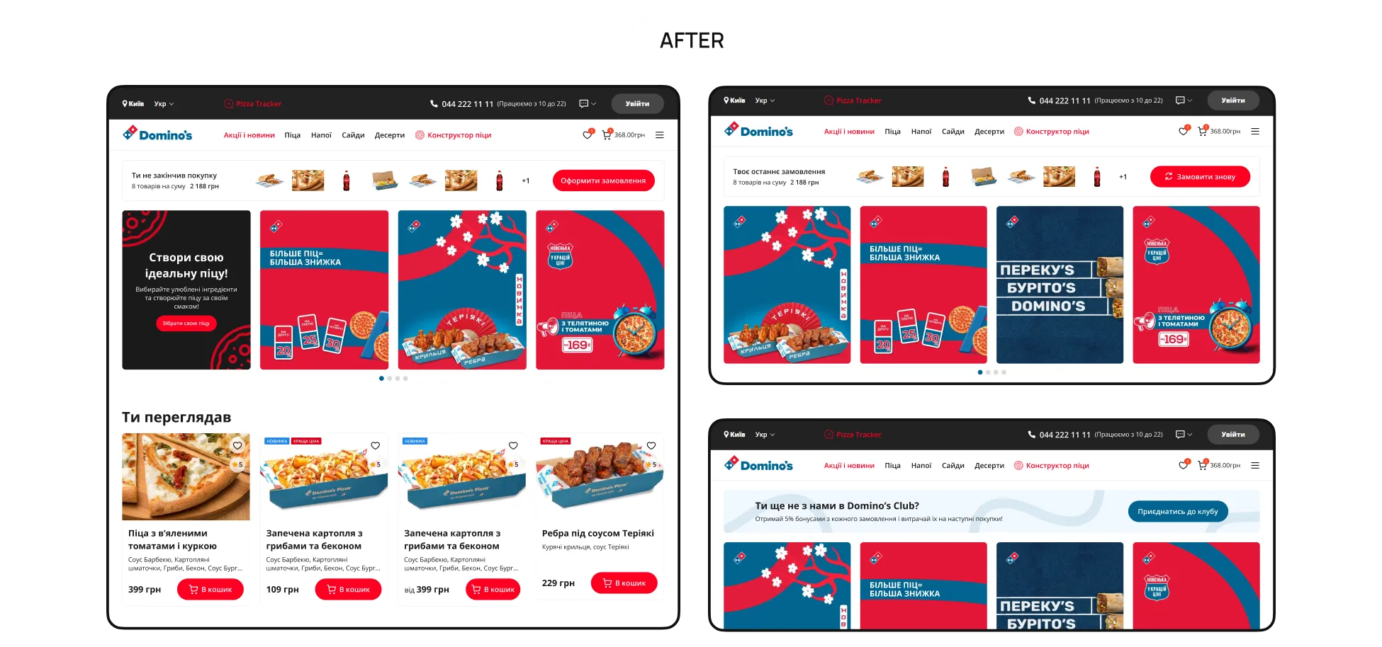
And here is the example from our practice. Working under the Domino’s Pizza case, we found that about a third of returning users landed with a craving and no way to act on it: no fast way to repeat a favorite order or resume an abandoned cart.
.webp)
So, we offered to add a "Repeat Order" and abandoned-cart block for logged-in users to shorten the user journey and increase the number of finished orders, and add a CTA block to nudge them to register.
By the way, AI here is more than just helpful. Beyond rule-based personalization ("you viewed X, see more like X"), AI recommendation engines can predict what a user wants next based on their current session, not just history. Modern AI tools offer this as a plug-in layer that doesn't require rebuilding the homepage from scratch.
Tip 5. The essentials everyone knows and the mistakes half of stores still make
A clear header. A meaningful hero section. Visible search. A strong value proposition.
None of these ideas is groundbreaking. Most e-commerce teams already know them.
And here's the ironic part: after 17+ years of UX audits and e-commerce projects, we keep finding these "obvious" things missing from homepage after homepage.
Take the header, for example. It should immediately communicate who you are through a visible logo while giving users constant access to navigation, search, and their account. Sounds obvious, right? Yet one in three websites still had a non-sticky header, forcing visitors to scroll back to the top every time they wanted to switch categories or search for another product. Simply making the header persistent reduced exit rates by up to 15%.
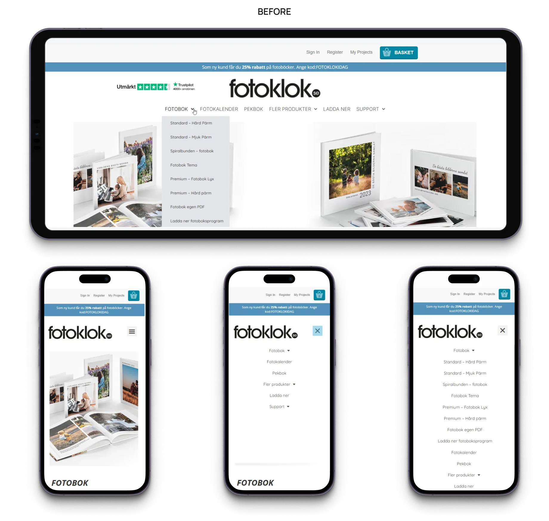
Navigation follows the same principle. The problem gets harder to ignore as a catalog grows. A narrow assortment can survive a loose menu; a wide one can't. Add category after category without rethinking the structure, and the navigation that once helped people find things starts working against them instead.
Whether you use a mega menu, a catalog button, or another pattern matters less than whether the structure reflects how customers actually shop. Structure is king here (or queen). Judge for yourself by the Fotoklok case example.
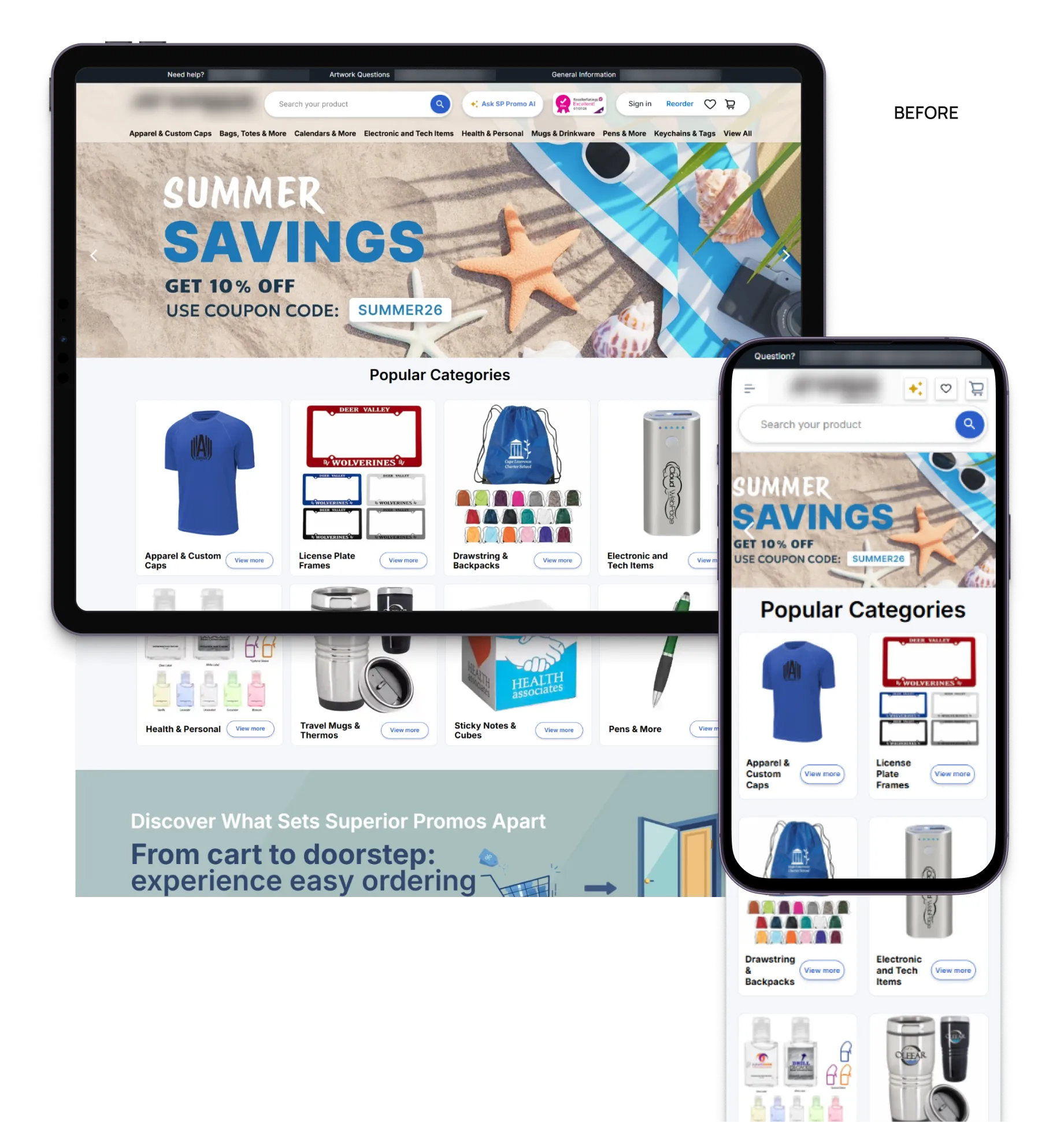
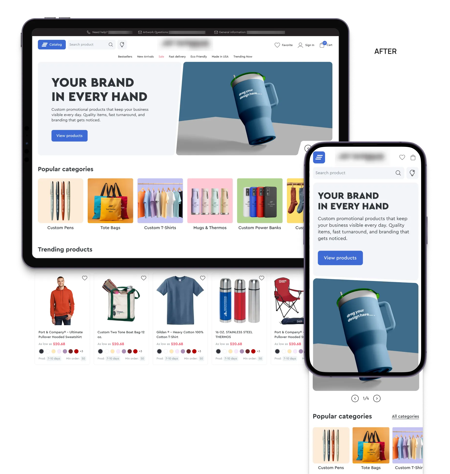
Or take the hero section. Beautiful imagery alone won't do the job because visitors need to understand, immediately, what you sell and what to do next. A gorgeous banner that's too abstract to say anything ("A New Era of Style" on a store that sells curtains, for example) helps nobody. Splitting the hero into a content area and a visual area fixes that: the message and the product each get their own space, and a new campaign becomes a swap, not a redesign.
One more subtle mistake we see surprisingly often is visual monotony.
Visitors don't read homepages. They scan them. When every content block has the same layout, size, and visual weight, promotions, featured categories, and bestselling products begin to blend together. We call this the "tunnel effect": users lock onto one visual pattern and unconsciously ignore everything around it.
Alternating layouts, introducing stronger visual contrast, and creating a clear hierarchy keep the page engaging and make product discovery feel effortless rather than overwhelming.
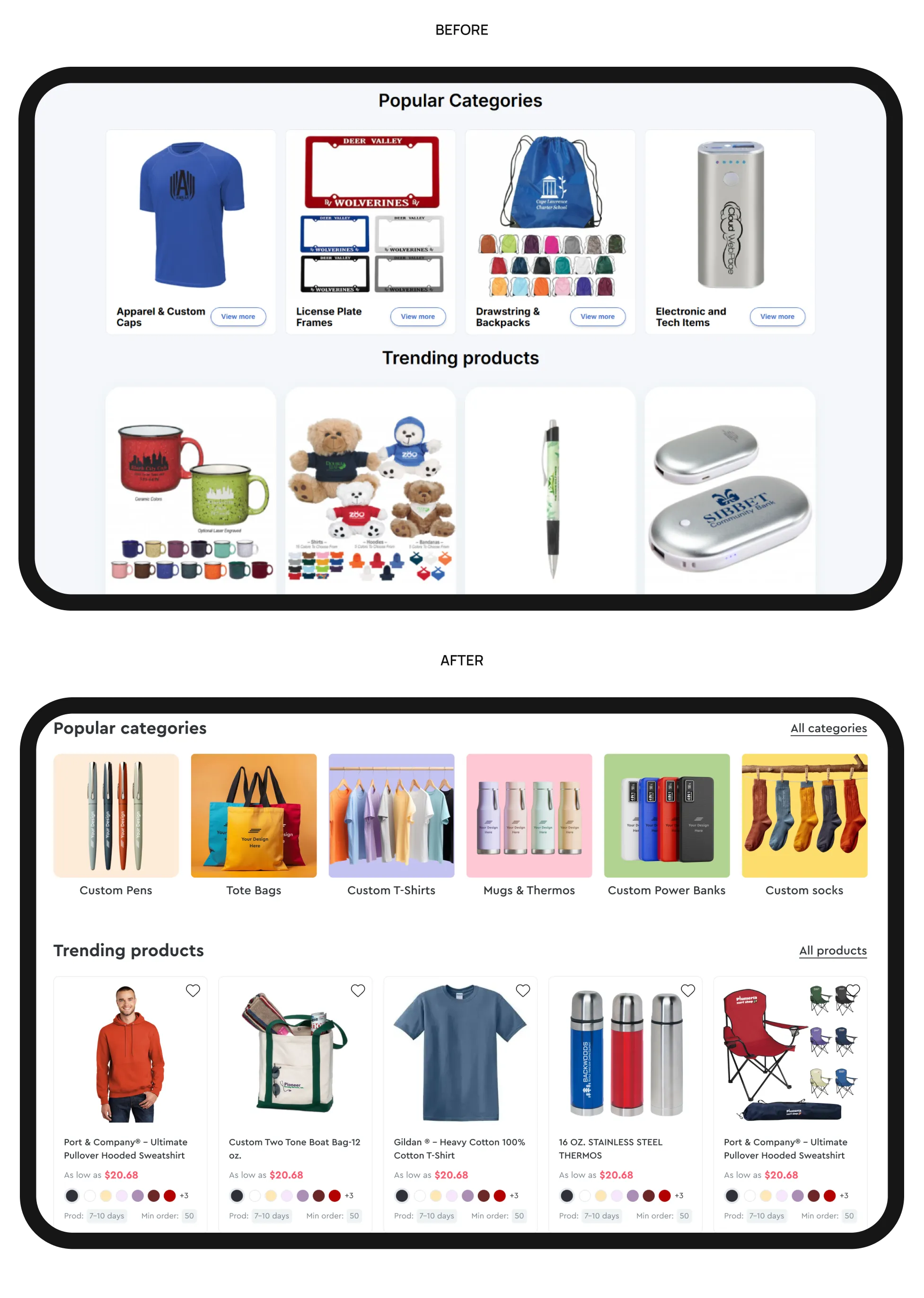
Finally, don't hide what makes your business different.
One of the biggest missed opportunities we see during UX audits is a strong value proposition buried on the About Us page instead of appearing on the homepage. Visitors shouldn't have to search for reasons to trust your business or guess why they should choose you over dozens of competitors.
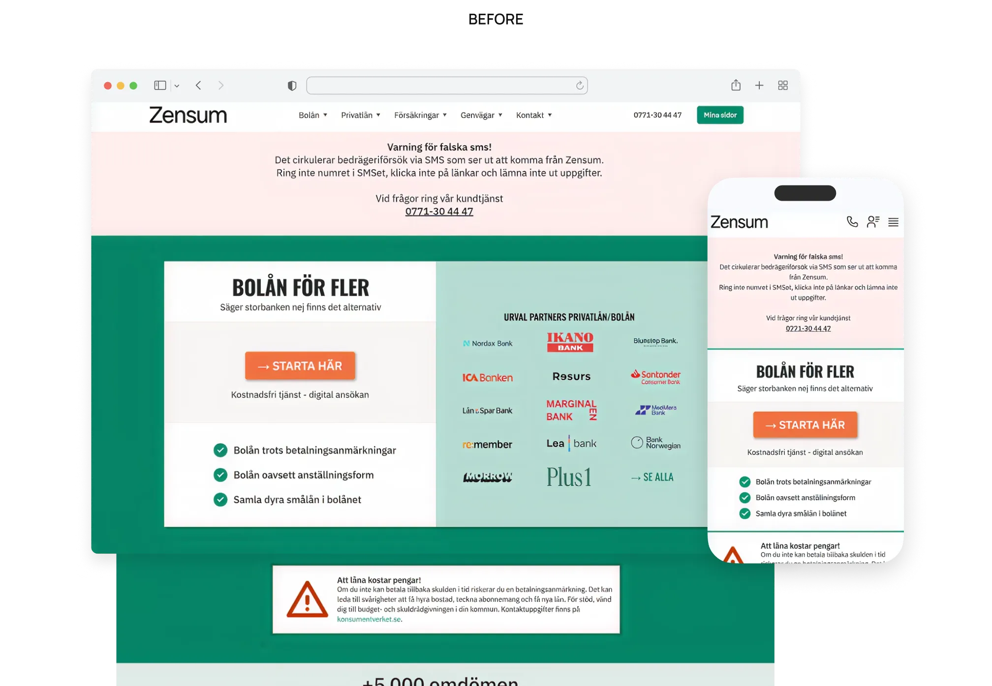
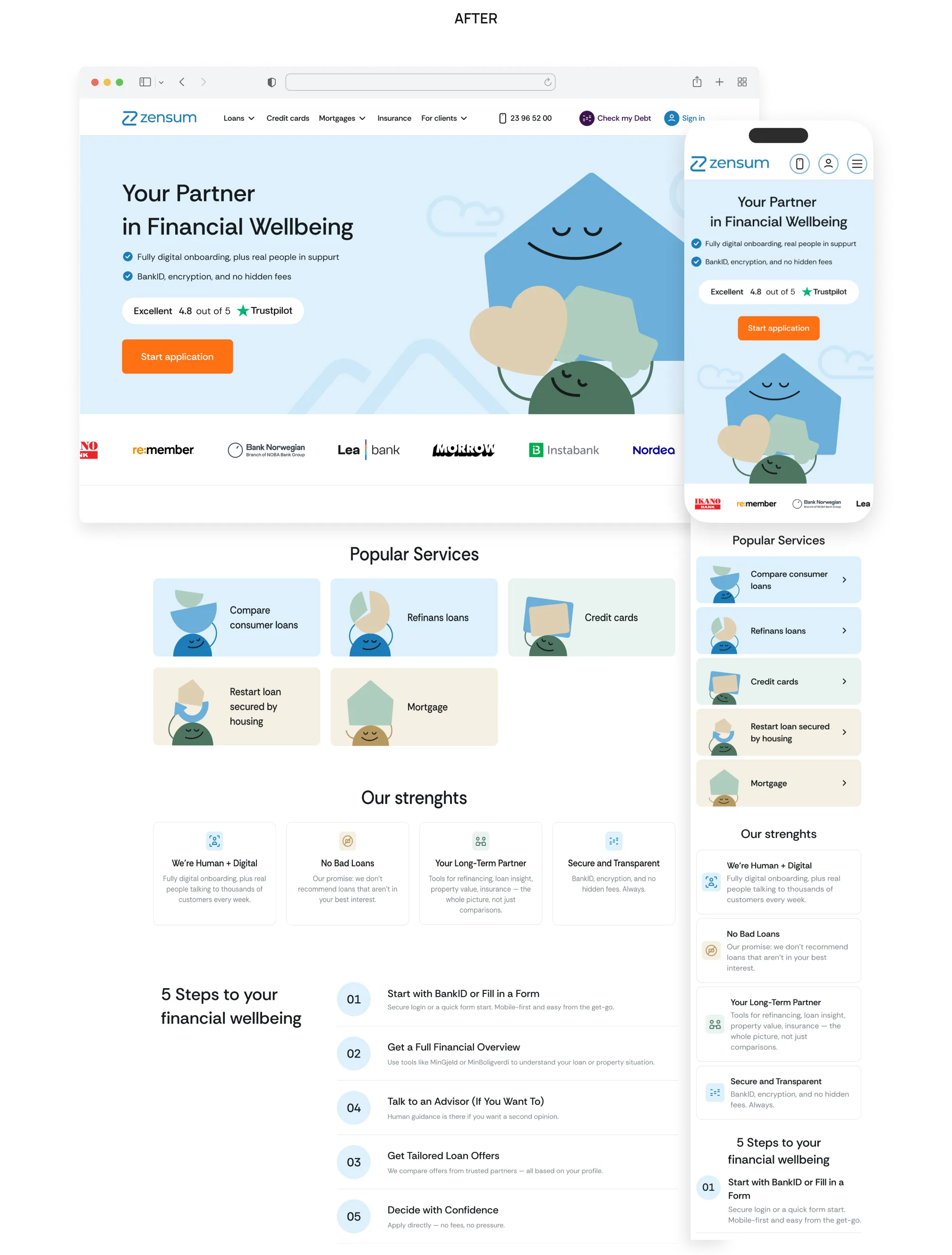
Instead of relying on marketing claims alone, just use the interface itself to reinforce the brand promise. The Zensum redesign illustrates this well, with the design communicating confidence and financial well-being before users even begin reading the copy.
None of these improvements is revolutionary. That's exactly the point.
The biggest homepage problems rarely come from missing cutting-edge features. More often, they come from fundamentals that everyone knows, but surprisingly few e-commerce stores execute consistently well.
Knowing what belongs on a homepage design and implementing it in a way that genuinely helps users are two very different things.
{{block}}
What to keep in mind about homepage design
A few years ago, the homepage used to be like a storefront window. Yet today that instinct is exactly backwards. The homepage isn't a window to linger at. It's a dynamic hub designed to minimize time-to-value. Its entire job is to get the visitor off it and into the product, fast.
In practice, that means:
- Help users reach the right category faster.
- Show returning customers that you remember them.
- Design for mobile interactions first, not desktop layouts scaled down.
- And keep questioning whether every section on your homepage still earns its place.
The five tips in this article aren't a checklist to complete once and forget. They're a framework for continuously evaluating whether your homepage still reflects how your customers browse, compare, and buy.
One final thing is worth remembering: the homepage isn't equally important for every visitor. It's primarily a destination for returning customers and people who already know your brand. New visitors are far more likely to arrive through Google, ads, marketplaces, or directly on product and category pages.
That's why homepage design isn't about trying to tell your entire story.
It's about helping every user continue theirs.
FAQ
Question reference
Answer reference

.png)




.png)


More real-world Turum-burum cases?
Review our vast portfolio of cases in a variety of business fields to make sure of our expertise.
Go to Portfolio
