

UX/UI solutions that make subscription work: guide for e-commerce owners
The subscription model may become a game-changer for e-commerce selling goods that are always in demand: from pet food to toilet paper. However, this can’t be effectively achieved solely by implementing the ‘Subscribe’ button — you need a powerful UX/UI strategy!
Below, we share practical tips, real-life examples, and data-driven insights on how to implement the subscription model wisely, thereby increasing website KPIs.
Hope you see it earlier than your competitors!
How can subscriptions open new horizons for e-commerce?
The subscription model is no longer limited to platforms like Netflix or Spotify. Many e-commerce companies in various niches, such as skincare, dietary supplements, and products for pets or children, are already leveraging it.
The reason to implement a subscription
Nowadays, customers appreciate not the products but the experience the business offers.
It means that if your brand can make their lives easier, you win.
And that’s exactly what you can do by implementing a subscription model and allowing customers to complete routine tasks without their intervention.
Advantages for business
If traditional shopping is a sprint, then subscription-based purchasing is a marathon, where each customer is not a one-time conversion but a source of long-term value. For business owners, it means:
- higher and more predictable MRR (monthly recurring revenue);
- increased retention rate and LTV;
- better understanding of the target audience and deeper analytics.
But how to implement subscription into your e-commerce to make it work? Let’s figure it out below.
5 proven UX/UI tips on how to make your subscription work
Want people to actually want to subscribe? It shouldn't feel like you're pressuring them; it should feel like you're making their lives easier and saving them time.
You might be surprised, but it is UX/UI design that makes that switch happen.
Below, we'll show you how putting UX first can make subscriptions super attractive with smart design, using the real-world examples.
1. Transparency means trust
Don’t force users to search for subscription details — it irritates, discourages, and makes them feel as if you have something to hide.
Recommended UX solutions:
- Display subscription terms immediately on the product page to make them noticeable.
- Provide detailed information on price, cancellation period, and terms right at the selection phase.
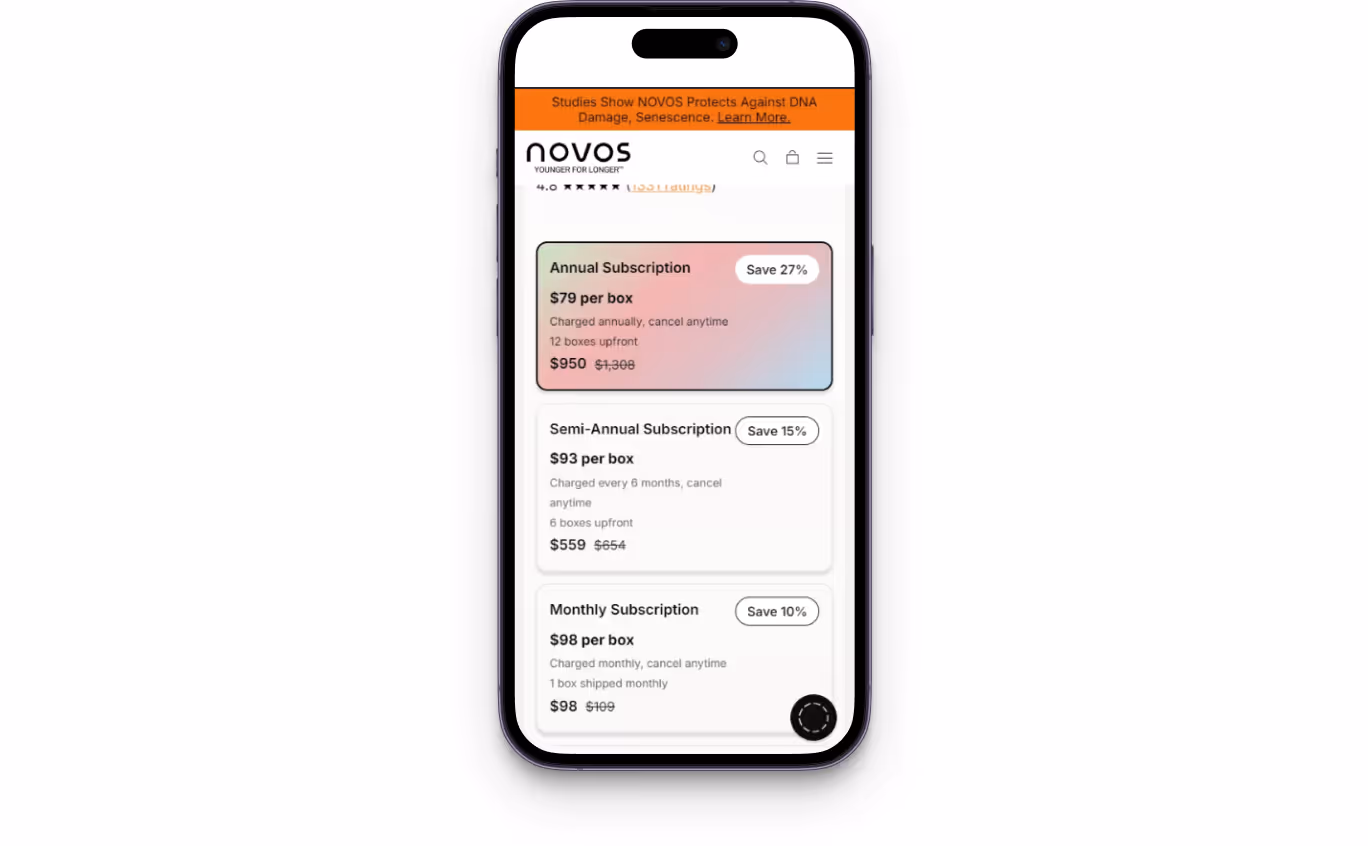
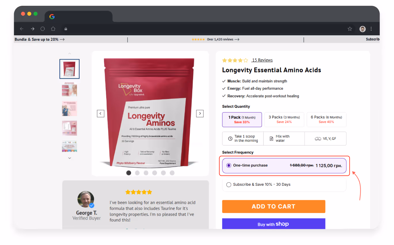
For example, for the Longevity Box project, we recommended adding information on why the user needs to choose a subscription and how it affects their health. As a result, the number of subscriptions and purchased products increased.
- Add tooltips recommendations (‘You'll be charged every 30 days — no hidden fees’);
- Implement a small icon indicating the benefit for the customer: ‘Save 10%’ or ‘No need to worry about it anymore’;

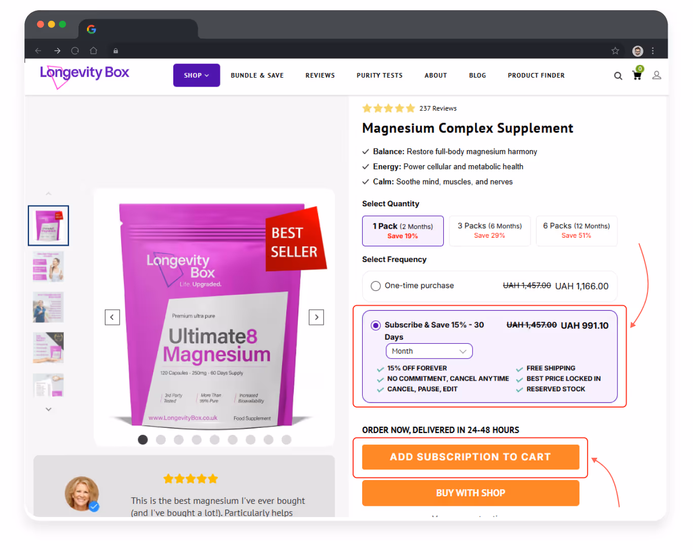
- Ensure smooth mobile shopping experience — 91% of consumers are buying through their smartphones.
For example, while conducting UX audit for Longevity Box website we revealed that the discount label overlapped some important elements in the mobile version, making key product information and actions difficult to see and interact with.
All these details might seem small, but together they build the most valuable thing — a sense of control and security for customers, which lowers the barrier to purchase.
2. Let customers make the final decision
Instead of tension, apply motivation. You need to visually and textually show that subscription is not a trick but the most convenient and beneficial solution for the customer.
Recommended UX solutions:
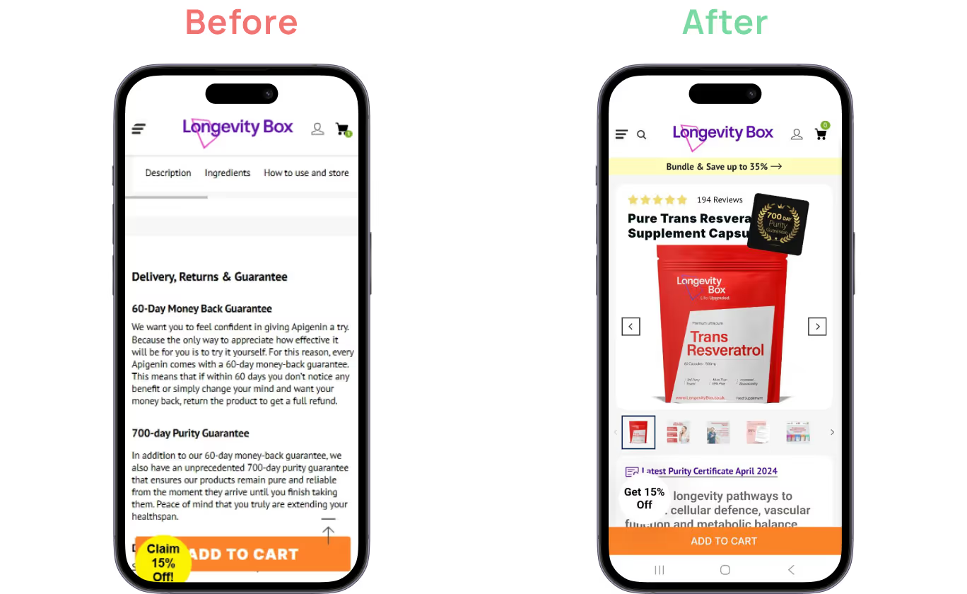
- Don’t automatically enable ‘Subscribe’ button. It can be a reason for the users to leave the product page. Thus, during the product page redesign of Longevity Box, we highlighted product characteristics and advantages but left the ‘subscribe’ button unselected. That led to loyalty and a microconversion increase.
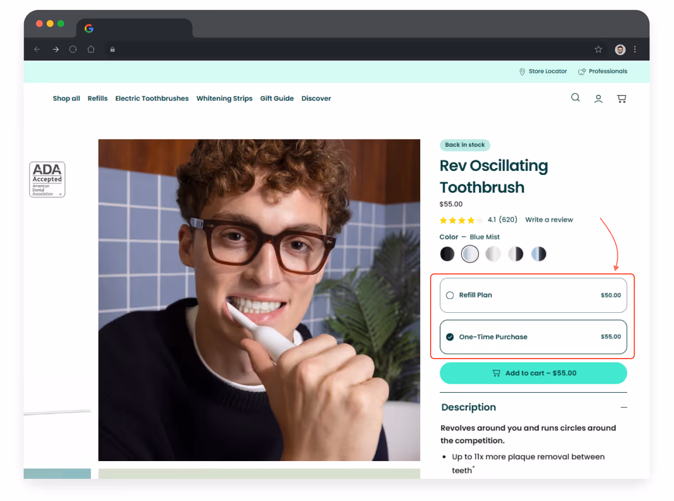
- Apply equal visual weight for ‘One-time purchase’ and ‘Subscribe & Save’ buttons — do not make the subscription dominant in color or size;
- Ensure consistent UI throughout the website: the same colors, buttons, visual logic throughout all stages of subscription;
- Replace any harsh phrasing with motivational ones: instead of ‘Don’t miss your chance’ use “Subscribe once — and never run out of it again.”
All these solutions will create a consistent website experience with a clear path for users to follow.
3. Subscription management to acquire customer loyalty
“What if I decide not to buy this in the future? What if it obliges me to pay for this for years, even if I don’t want to?” — that’s are possible users’ fears when it comes to subscription.
Therefore, your UX should demonstrate that the user can easily manage this process.
Recommended UX/UI solutions:
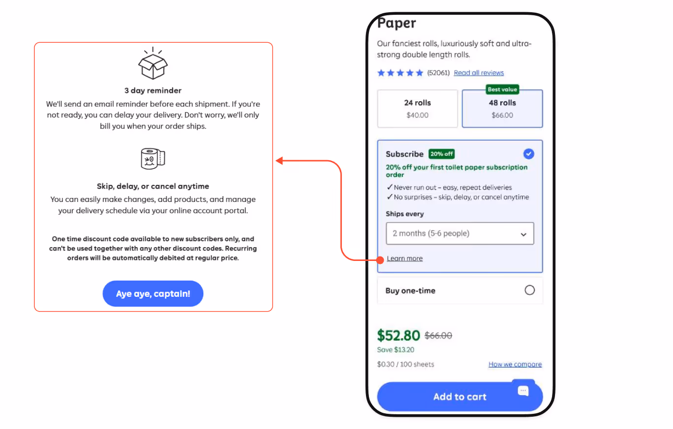
- Add ‘Pause subscription’/‘Skip next delivery’ options and inform users about them via eye-catching blocks;
- Implement clearly visible ‘Change frequency’ or ‘Edit plan’ buttons on the subscription arrangement page;
- Short explanations without small print — people find it suspicious — ‘No extra fees. You can edit your subscription anytime’.
By doing this, you will turn an ‘obligation’ into a convenient habit.
4. Optimize shopping cart to reduce barriers to purchase
Even if customers have added a product or service to the shopping cart, it doesn’t mean they can’t change their mind.
‘Did I get everything correctly?’ — the most common thought they may have. And your task is not to freak out your clients at this phase.
Recommended UX solutions:
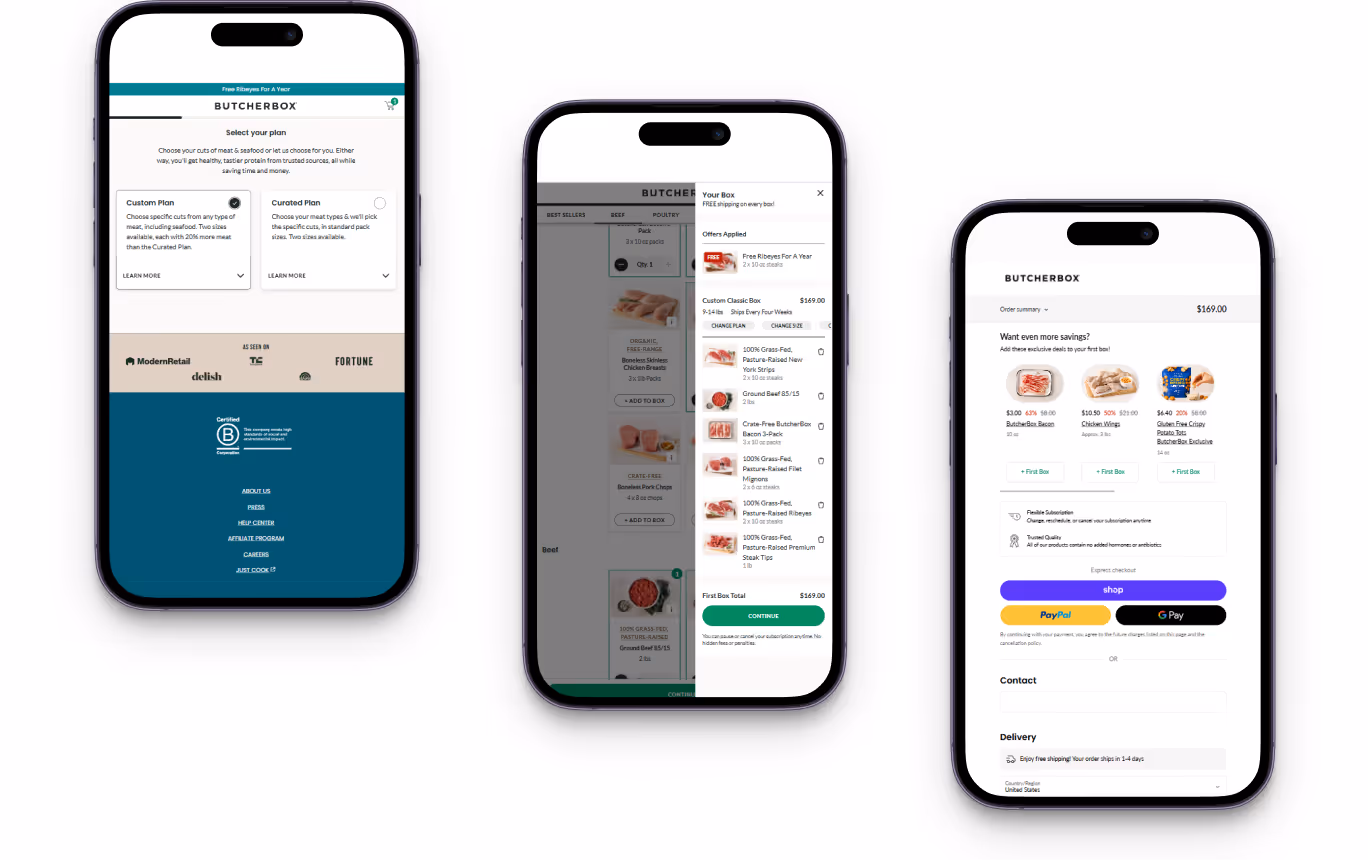
- Display full subscription details directly in the cart — the frequency of payments, the next payment date, and the future price should be visible immediately;
- Allow users to switch between one-time purchase and subscription inside the cart — without returning to the product page and unnecessary steps;
- add a “subscription summary” box before the final button: discount, terms, flexibility, option to pause/cancel;
Such UX/UI solutions will make customers feel calm and encourage them to proceed to checkout.

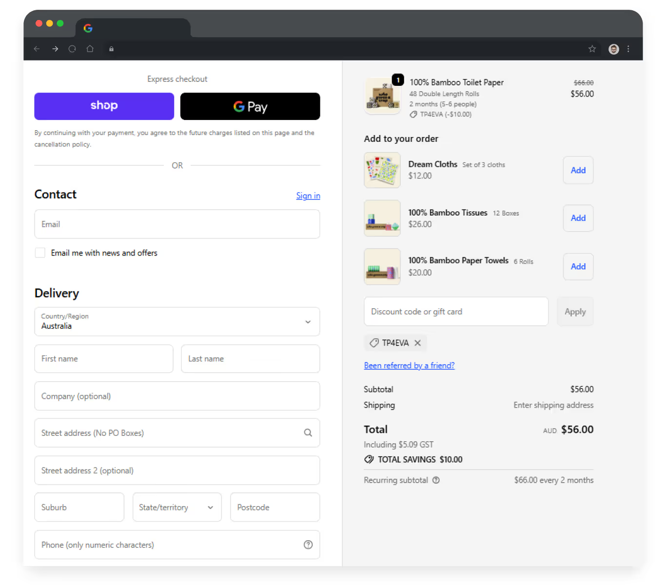
5. Checkout: last but not least
Checkout is the final step of the funnel, where the user decides whether to proceed with signing up or leave. Therefore, the UX at this stage must remove all possible obstacles.
Recommended UX solutions:
- Implement automatic field filling (for registered users);
- Add a block with a short summary on subscription details: Product — Frequency — Next pay date — Total;
- Allow editing settings without navigating to the previous screen.
As a result, the checkout process becomes so easy and smooth that the decision is made ‘automatically’, increasing website conversion.
Final thoughts on e-commerce subscription: do or not to do
Subscription may not be the right model for every business. However, it becomes a powerful tool if your product is in regular demand (baby or pet nutrition, cosmetics, toilet paper, supplements, etc.) or when you can create ongoing value through early access, limited drops, or service-based benefits.
What matters most is not the subscription itself, but how trustworthy this experience feels for the customer. Every improvement you make — from clear term descriptions to intuitive UI — will pay off with customer trust, engagement, and repeat purchases.
If you’re ready to give your e-commerce a new life by integrating a subscription model, Turum-burum can help you design an efficient UX/UI to turn occasional buyers into loyal subscribers — and make this experience as smooth and intuitive as it should be.
FAQ
Question reference
Answer reference


More real-world Turum-burum cases?
Review our vast portfolio of cases in a variety of business fields to make sure of our expertise.
Go to Portfolio
