

Best AI dashboard design solutions: 3 case examples
AI services are currently one of the most promising niches for developing a profitable and sustainable business. However, the success of a website depends directly on the quality of its interface.
What are the AI web design challenges and how to tackle them via UX/UI solutions? Find the answers below.
Challenges in creating the best AI dashboard design
AI products are no longer just a trend — they are becoming everyday tools for solving routine tasks: generating content, analyzing bulk data, solving corporate tasks, etc. And the key aspect defining the success of the AI dashboard is whether it can convert complex algorithms into simple and clear interfaces.
As a business owner, you might face the following challenges:
- Data visualization — AI algorithms operate using massive data sets and complex models, which should be presented in a convenient and simple manner;
- Transparency and customer trust — users often do not understand how AI makes decisions, so it is important to incorporate elements with explanatory comments;
- Equal accessibility for different users — AI dashboards are used by a broad target audience, from data scientists to marketers. To succeed, you need to provide equally accessible and intuitive services for people with various backgrounds;
- Automation vs. control — users should feel they are in control of the process, even if most of the work is done by an algorithm;
- Real-time performance: AI services usually work in real time, so dashboards need to update data instantly without lags or delays.
How can it all be done in practice?
By ensuring high-quality web design with structured information architecture, clear visual accents, CTAs, and advanced usability.
That’s high-quality UX/UI for AI dashboards that helps users understand the service's capabilities and rely on AI technologies.
Best AI dashboard design examples: 4 cases turning complexity into clarity
Still doubt whether it is possible to turn complex data into simple, understandable, and emotionally engaging interfaces that attract users and support business goals?
Let's check out 3 real-world cases of the best AI dashboard designs that have already nailed it!
1. Gemini — web design for multifunctional AI platform
Gemini is a popular AI platform for analytics and forecasting with various services.
Hardly anyone who hasn't heard of this AI platform can be found, which is primarily due to the high-quality customer experience and UX/UI solutions it offers:
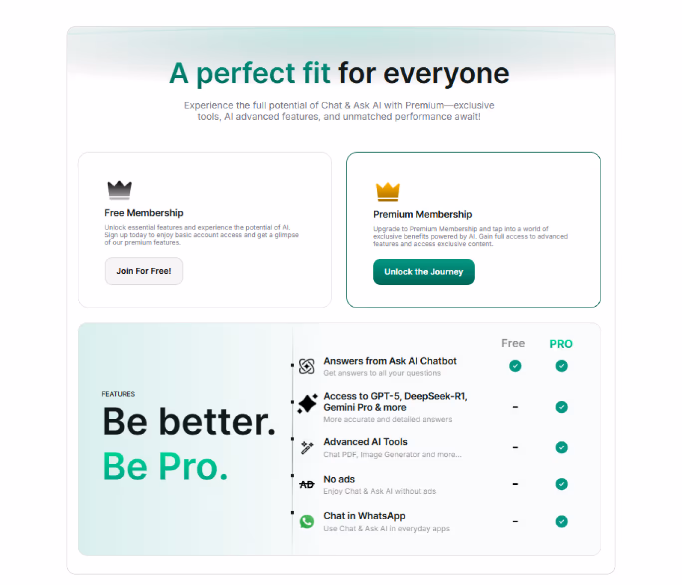
- Clear plan descriptions
The most efficient way to convert free website visitors into paid subscribers is to highlight the pros of a paid subscription. Gemini shows an excellent solution: a comparison table, advanced features descriptions, and eye-catching CTAs — everything is presented within 1 page — users can quickly look through the data and see the benefits they can get.
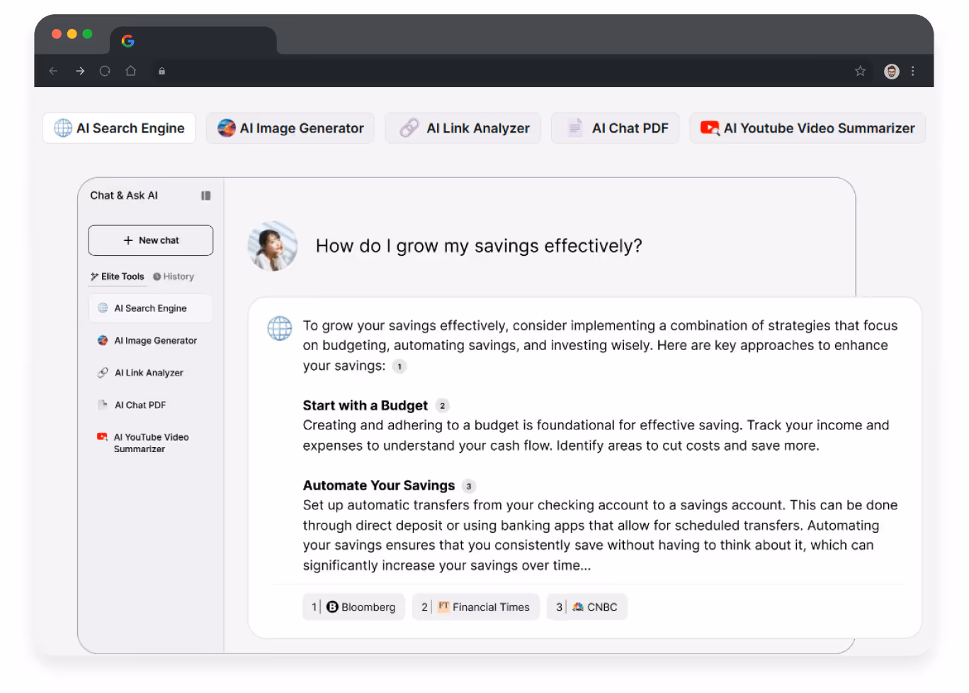
- Queries relevant to a broad audience
The Gemini homepage features a block demonstrating how to use the platform. As a query example, it exploits a financial efficiency issue, which is relevant to the majority of users. By using such examples, the platform increases customer loyalty and engagement.
- Platform as a friend, not a competitor
The platform acts as a personal mentor, inspiring users and offering tips and different styles for creating photos. It communicates with users on an equal footing, making the creative process simple and exciting.
{{block}}
2. Runway: intuitive web design for AI-driven photos and videos
Runway is a popular platform for producing AI-generated videos and images. It offers an intuitive, user-friendly interface that simplifies the content creation process and inspires users to experiment.
Among the key UX/UI solutions that improve platform usability and efficiency, the following should be mentioned:
- Step-by-step guidance for all features
Each tool's page contains step-by-step usage instructions, allowing beginners to quickly master the tool and not get lost in the menu, making the interface understandable and effective for users with different backgrounds.

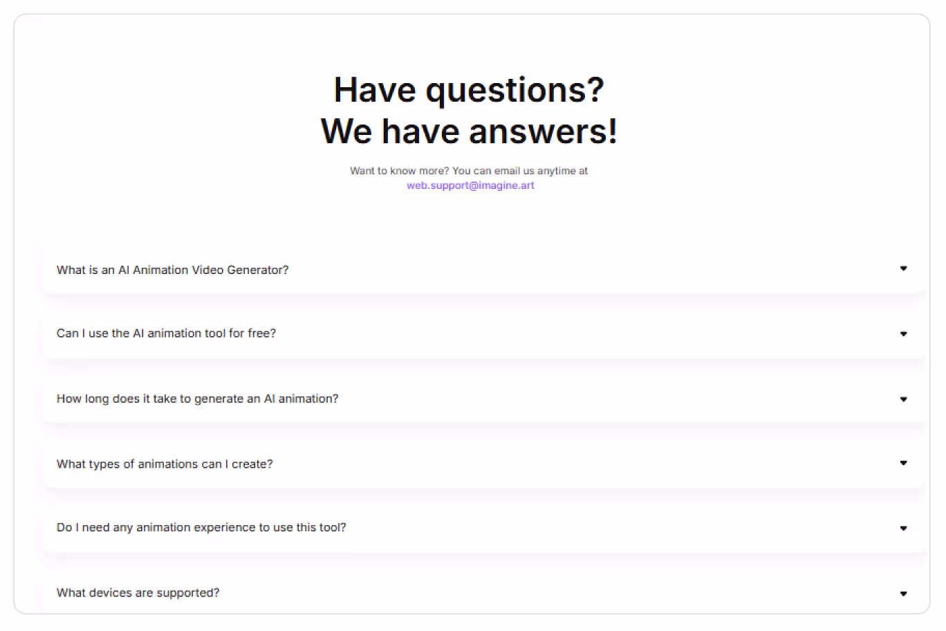
- FAQ block at each page presenting the tool на
All tool pages end up with an FAQ section, where users can find answers to the most common questions. This simple UX/UI decision reduces the need for external support and makes the platform client-oriented.
- Blog with the latest topic-related news
Runway has a blog with the latest articles on AI, design, and the creative process, helping users keep abreast of new developments and trends. Regular content updates increase user engagement: according to research, blogs with useful articles can increase the average time users spend on the site by 30–50% and improve audience loyalty.

3. Jasper AI: UX/UI solutions that take care of new users
Jasper AI is an AI platform designed to help businesses and content creators quickly generate text, from articles and product descriptions to advertising slogans.
Jasper addresses users in their language: the platform's design and tone of voice create the feeling that you are among colleagues and marketers, where creativity is more important than technical knowledge. It became possible thanks to:
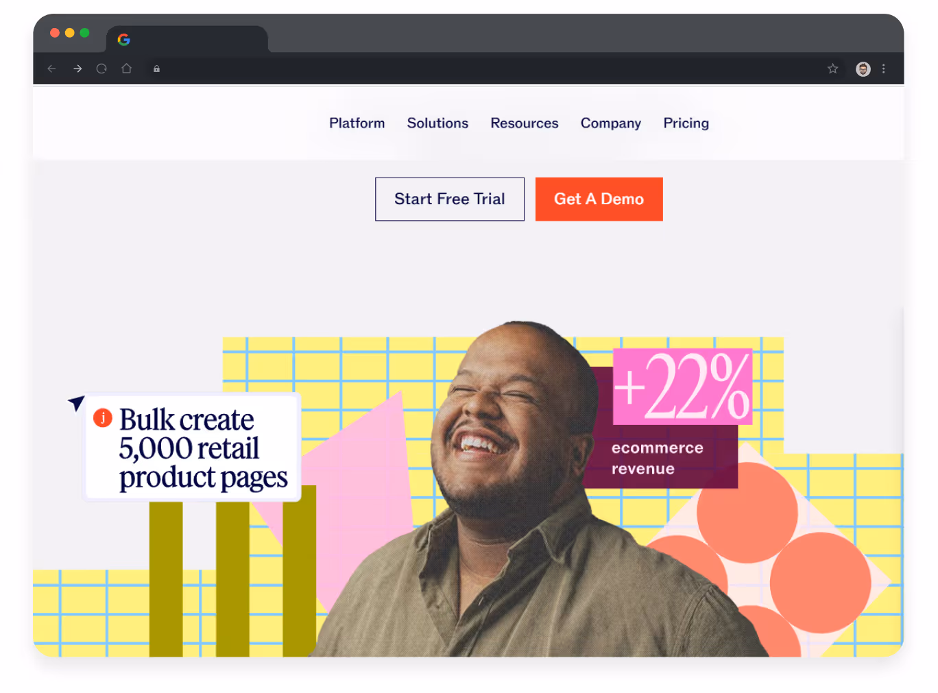
- Bright banners on the homepage
Jasper's homepage immediately greets visitors with a dynamic banner displaying a powerful message about the results most marketers strive for: more conversions, faster content, and improved KPIs. Visually, it is enhanced by images of happy people, which immediately creates an emotional connection and motivates the user to navigate the website further.
- Blocks with real-life application examples
The platform eloquently answers the users’ question, ‘What do you offer, and why do I need it?’ by implementing bright blocks displaying available tools that also serve as additional entry points.

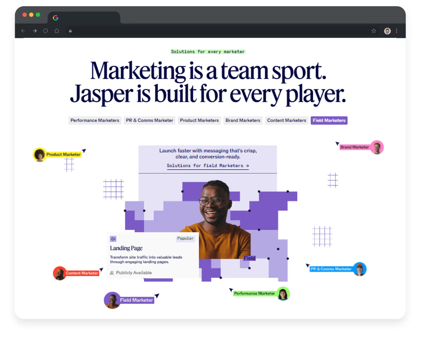
Among other effective UX/UI solutions, Jasper has a block showing how users can benefit from the platform’s services depending on their speciality. It is brightly colored and contains images of real people, which increases customer trust and loyalty.
- Powerful social proof elements
72% of online users assume customer reviews to be ‘extremely’ or ‘very’ important for making a purchasing decision, and Jasper is taking advantage of that:
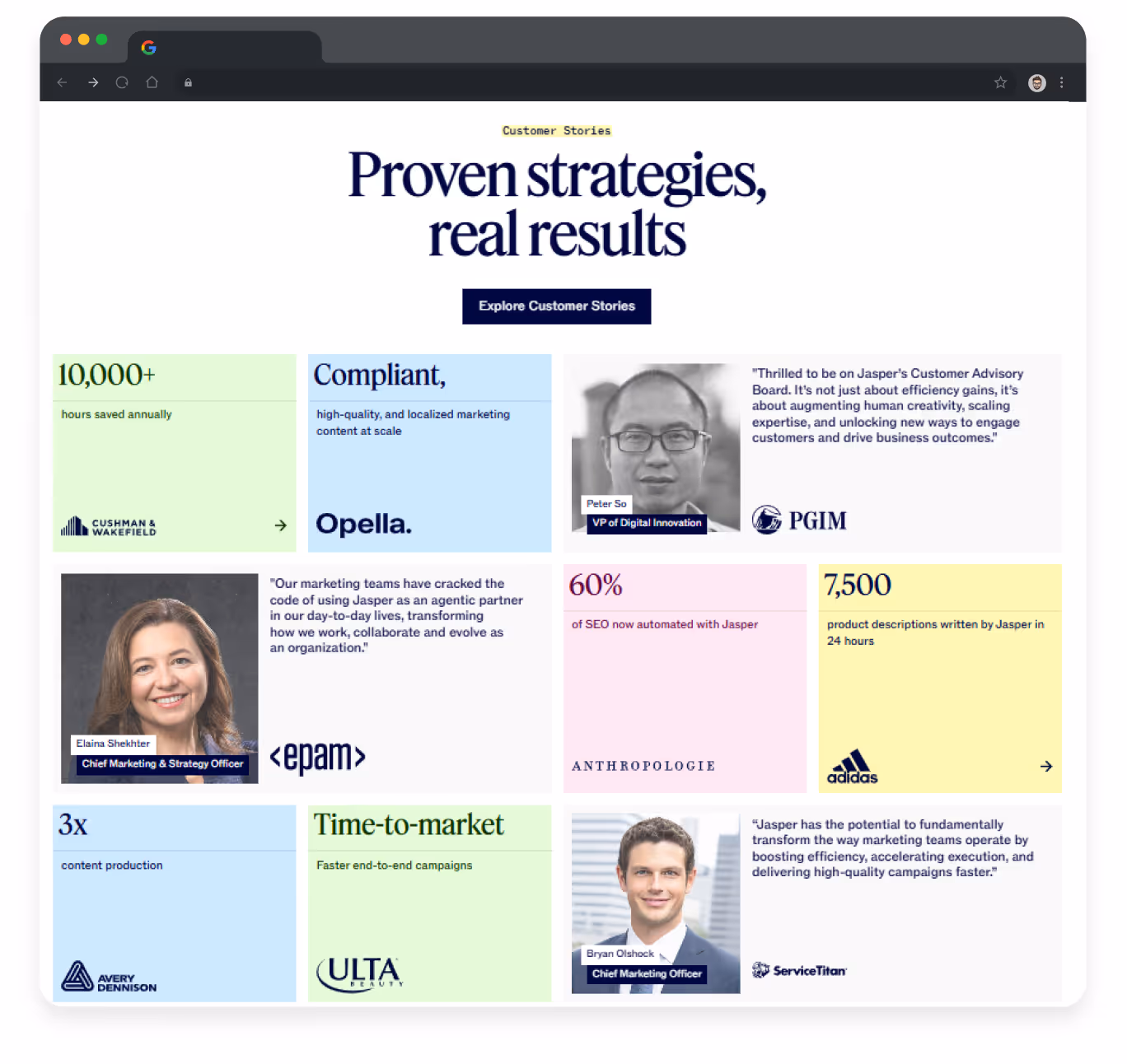
Such blocks increase customer loyalty to the brand and encourage them to buy offered services, ensuring stable profit for business owners.
{{block}}
Best AI dashboard design secrets and takeaways
By ensuring smooth and efficient UX/UI for your AI website, you can pave the way to profitable business with thousands of satisfied customers. As you might notice, the mentioned interface examples have:
- simple structure;
- service UI design;
- burger menus to win the space;
- blocks highlighting the platform’s benefits;
- interactive elements that serve as entry points.
At the same time, each website has its own style and features that make it stand out from the crowd: an exclusive tone of voice, a color palette, and different hooks for different target audiences.
Overall, it proves that a thoughtful UX/UI design can transform an AI platform into a unique and user-friendly digital experience and reward its owner with a profitable and scalable business.
FAQ
Question reference
Answer reference


.png)


.png)


More real-world Turum-burum cases?
Review our vast portfolio of cases in a variety of business fields to make sure of our expertise.
Go to Portfolio
