


Best SaaS web design: UX/UI solution examples
SaaS (Software as a Service) website should not only present available services but also smoothly guide users through different stages of the customer journey, such as registration, onboarding, subscription form, etc.
But how can UX/UI design ensure a seamless user experience and help businesses stand out in a competitive market? Let’s explore the best SaaS web design practices and real cases that prove it works.
Things to consider when developing the best SaaS web design
SaaS products are extremely popular among users today since they offer subscription-based services for a range of purposes.
But making a SaaS website is not the same as making a website for online shop, and it comes with its own set of challenges:
- Complex product requires simple interface
SaaS usually has a set of advanced features (CRM, AI platform, analytics, etc.). The task of UX/UI here is to ‘sort things out’ and explain complex features as clearly and simply as possible.
- Structure and navigation consistency
Just like a tour guide, your SaaS product should smoothly guide users from one step to another: from the sign-in form → to a free trial and paid subscription. That’s why a well-thought-out information architecture and the absence of UX/UI barriers are of paramount importance for SaaS websites.
- Onboarding and demo
Educational blocks, such as onboarding elements, interactive videos, or guides, are specific to SaaS websites. While onboarding blocks may appear easy, to attract and retain new customers, they need smart, data-driven UX/UI solutions.
- Social proof
Reviews, case studies, and logos from well-known customers are a must-have for SaaS conversions. However, unlike e-commerce in this niche, it’s more challenging to encourage subscribers to share their feedback.
- Flexibility and scalability
Since SaaS platforms are constantly updating with new features, the website needs to be flexible so that its blocks can be easily updated and expanded with minimal time investments.
Best SaaS web design practices: 4 inspiring cases
If not considered at the design stage, the above-mentioned challenges can hinder product development. At the same time, the right UX/UI can turn weaknesses into competitive advantages. Let's explore how well-known SaaS platforms have coped with this task.
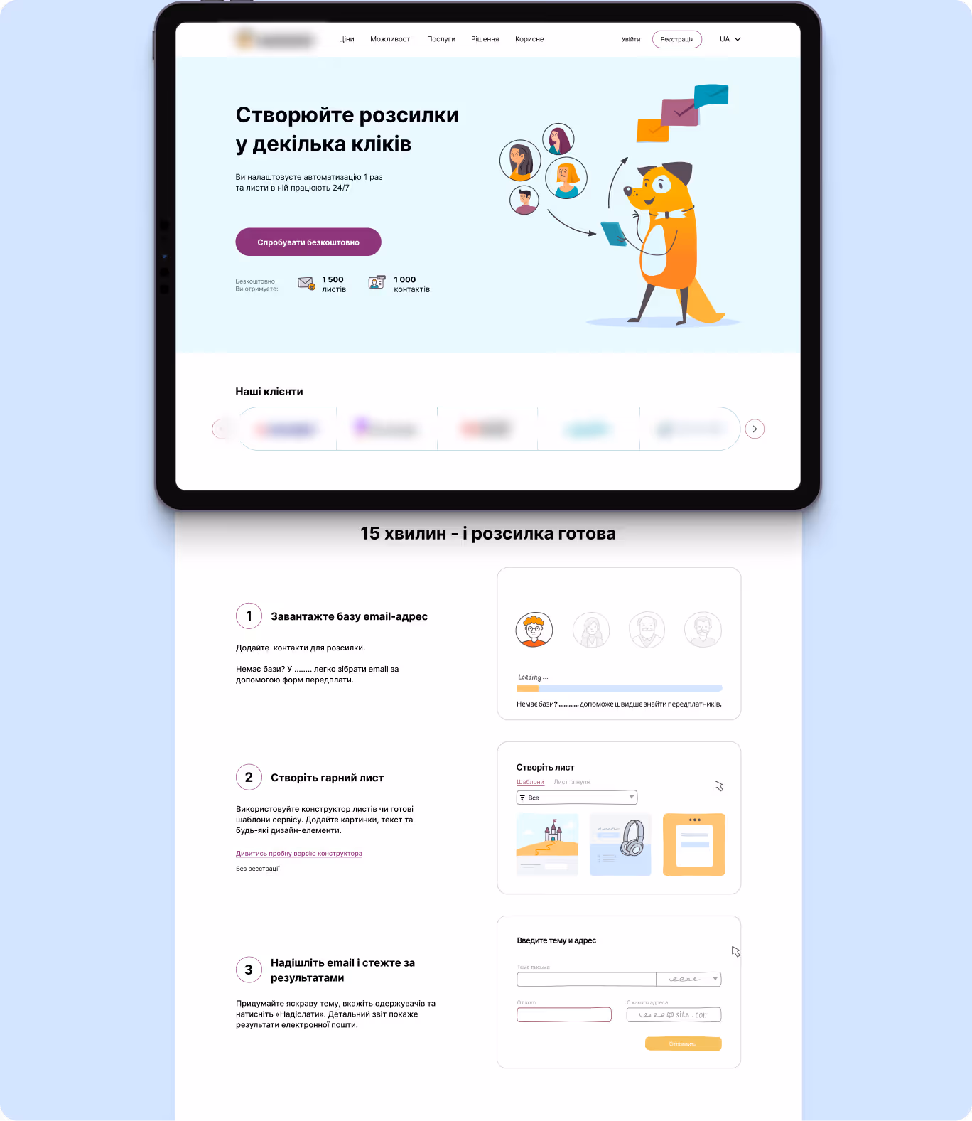
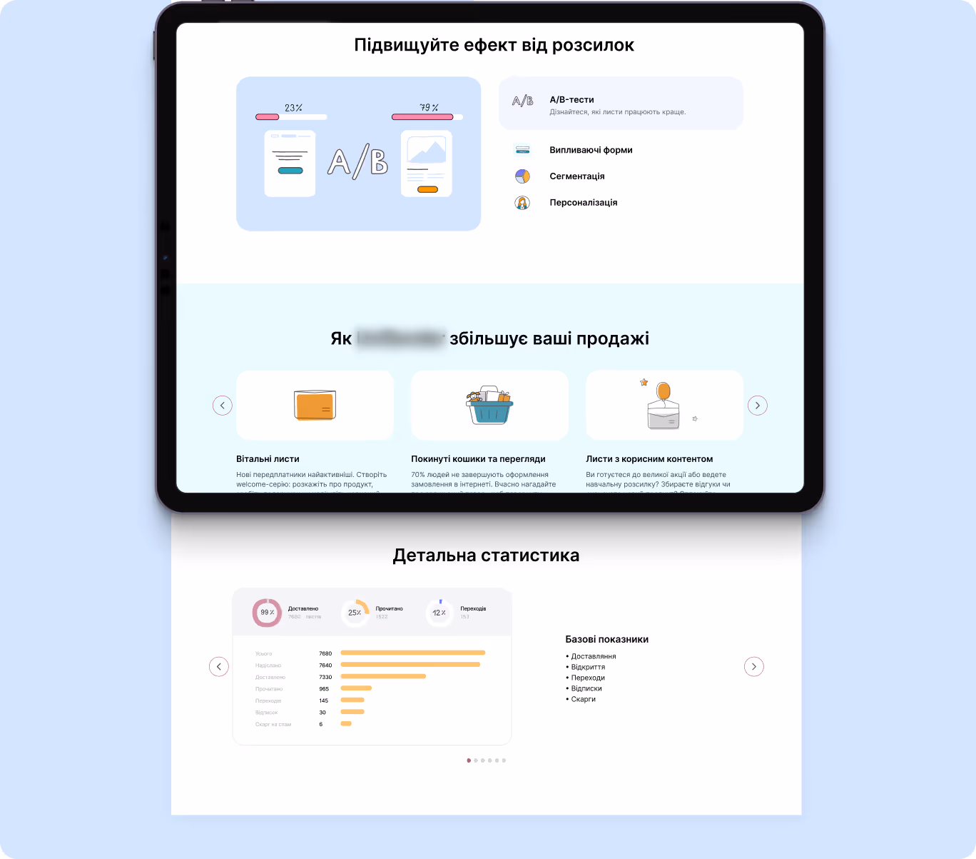
1. Email Marketing Tool: UX/UI for email marketing service
SaaS platform for email marketing and newsletter automation not only provides convenient tools for creating campaigns and analytics but also boasts of an efficient and well-structured website that engages and retains customers thanks to:
- Service UI with clear accents
Their homepage stands out with a clean, service-oriented design and well-placed accents: key benefits, clear CTAs, and concise blocks are immediately visible, making the platform intuitive and accessible even for new users.
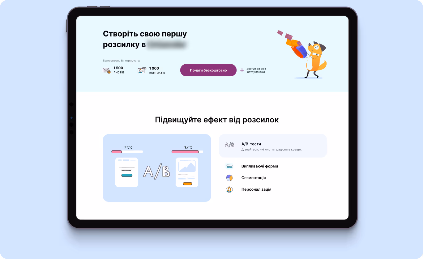
- Simple usage instructions
This email marketing tool doesn’t make users endlessly browse the website searching for a user manual — the step-by-step instructions are displayed right on the home page. This increases customer satisfaction and serves as a hook for potential clients.
- Trust-building blocks highlighting the product’s advantages
The block with product advantages on the homepage features a clear structure with icons and short texts, visual accents, and clear explanations of how the service helps businesses. This allows users to immediately grasp the product's value without being overwhelmed with information.
{{block}}
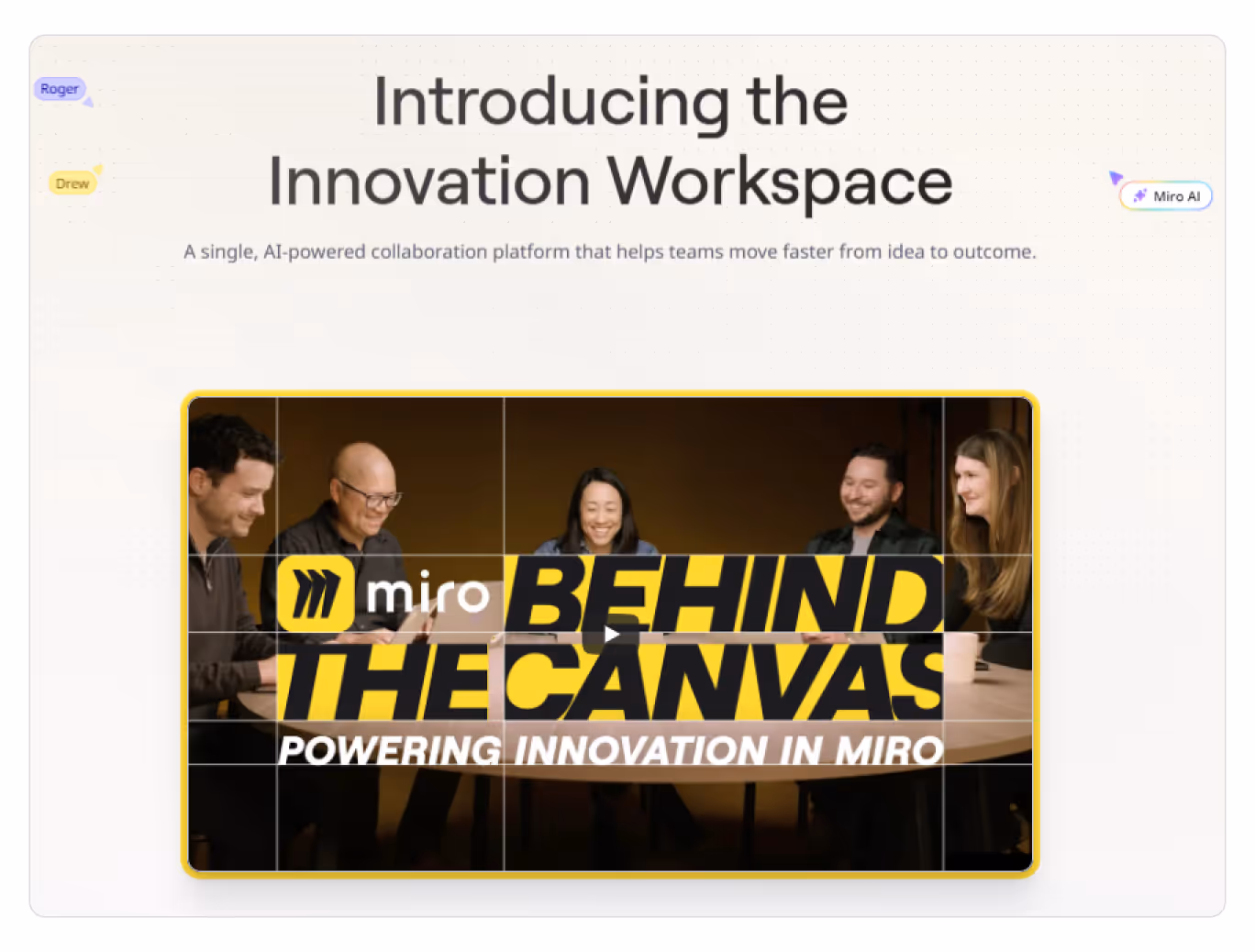
2. Miro: advanced web design for a technically complicated platform
Miro is an innovative SaaS workspace for teams to manage projects, develop products, and work together. Since platforms allowing for simultaneous work of several persons might seem complex and suspicious to customers, Miro focuses on clear onboarding and trust-building blocks:
- Personalized onboarding
As users sign in, they see an onboarding block that addresses them by name, uses a friendly tone of voice, and offers a short video demo displaying the platform’s features. Such UX/UI solutions make users feel that they are taken care of, which increases their loyalty and trust.
- Creative social proof blocks
Since Miro is a digital board, the idea of displaying reviews in the form of stickers on the homepage is excellent. It makes it easy to find and grasp customer reviews, which can significantly boost the number of paid subscriptions.

- Timely client support
The user may scroll the homepage till the end, but still doesn’t understand how to use the product. To retain the potential client, the platform features a block with additional links to product manuals at the end of the home page

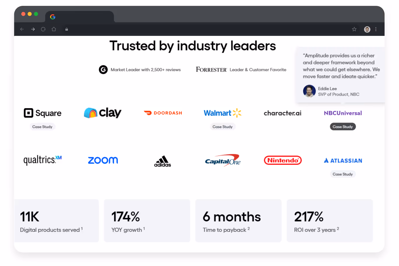
3. Amplitude: example of simple but powerful interface
Amplitude is a SaaS platform for monitoring user behavior and product analytics to help companies make data-driven decisions.
Among its most effective UX/UI solutions are:
- Focus on famous clients and average results
Even if clients haven’t heard of Amplitude before, in all likelihood, they know at least one company on the client list, and it automatically increases brand loyalty.
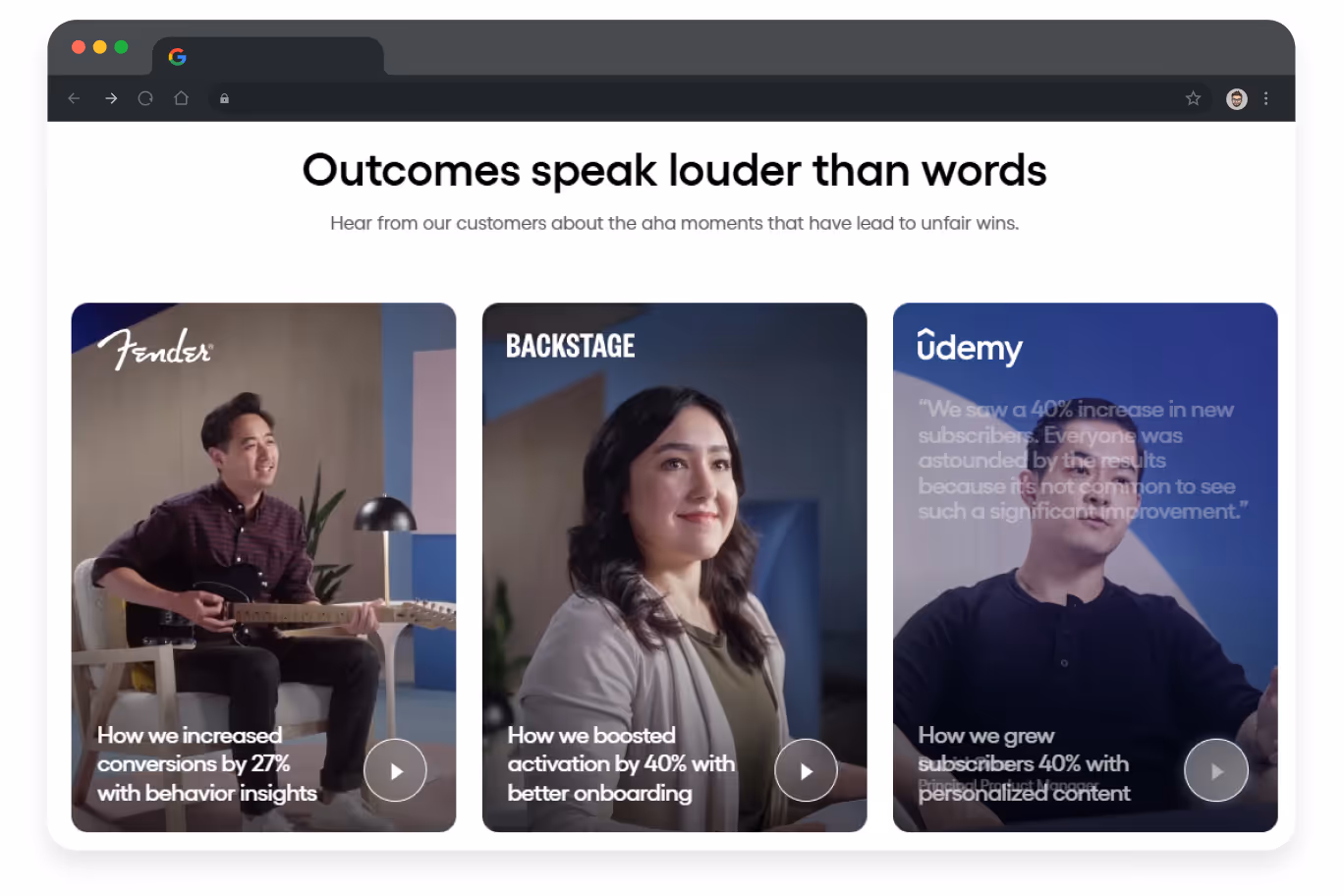
- Real clients sharing their success stories
Reviews are important, but sometimes users may doubt their credibility. Therefore, videos with real customers telling how the platform helped them reach their business goals are a more powerful tool for user retention
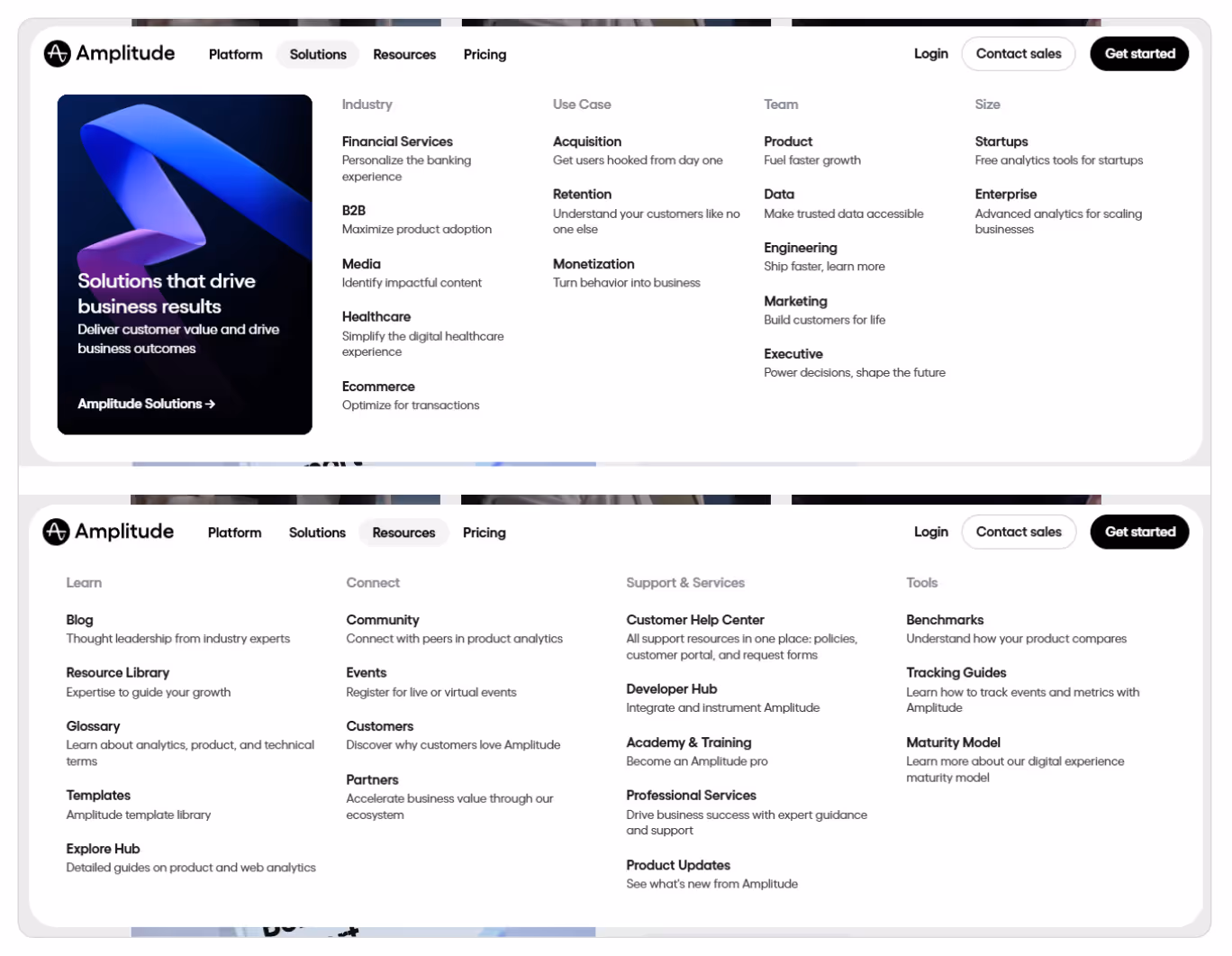
- Intuitive website navigation
Amplitude has a clearly structured menu divided into categories — from core products to resources and analytical tools. Thanks to clear groupings and a logical hierarchy, even new users can easily navigate the website and find relevant information
4. Evernote: UX/UI that converts free users into paying customers
Evernote is a SaaS platform for note-taking, task management, and workflow organization for high digital productivity.
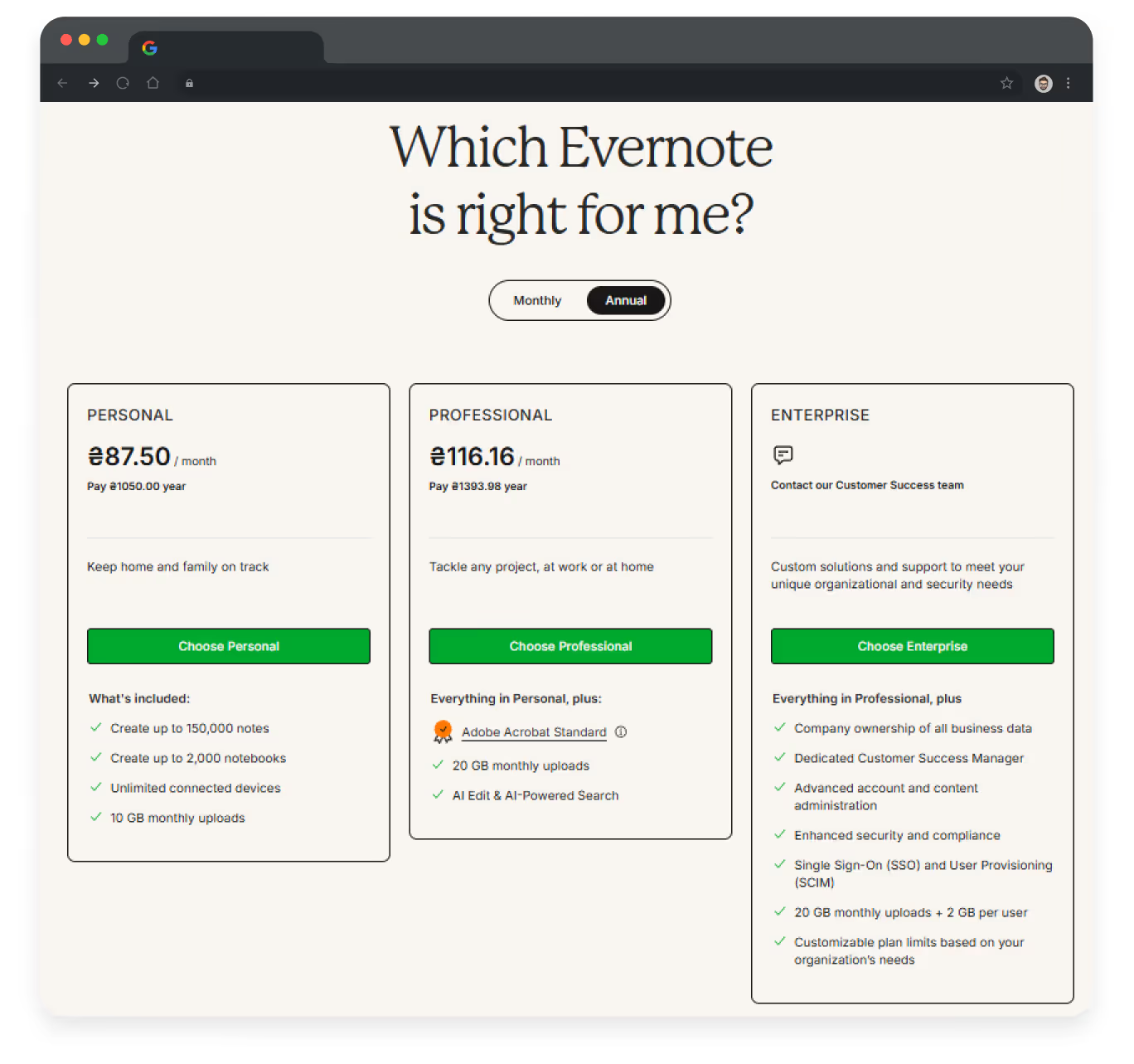
The platform has a simple and easy-to-work-with UX/UI design, but what is worth special attention is the “Plans” page showcasing available subscription options:
- Block with offered plans
This block is done due to the best UX/UI practices: short and clear information, minimum text, eye-catching CTAs, highlighted advantages of annual subscriptions and plans’ benefits.
Consequently, users can quickly find relevant information, which positively influences their purchasing decisions.
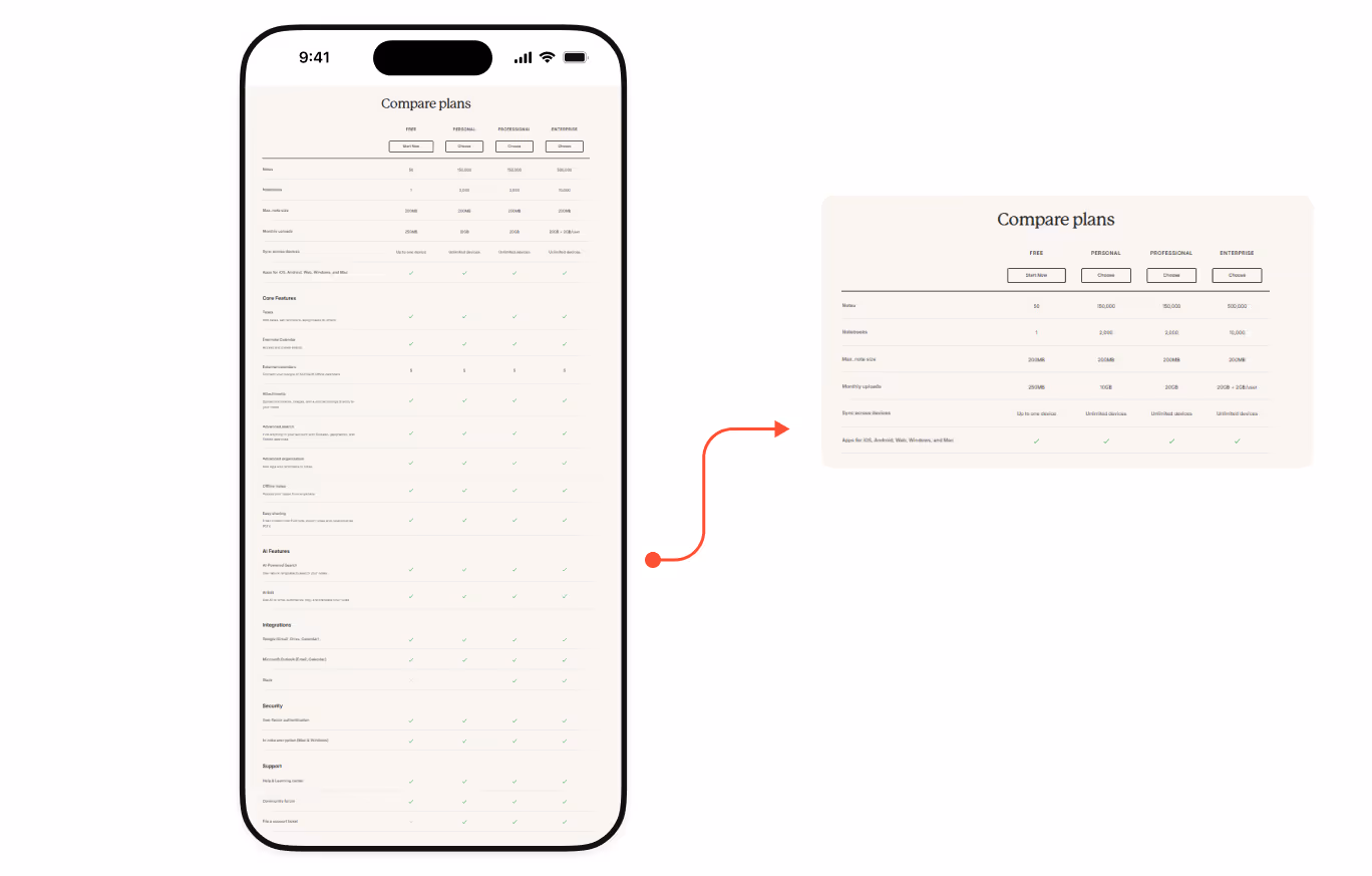
- Plan comparison table
In case users learn about available options but don’t subscribe, the platform presents another persuading block: a table that compares the features of different plan options. Its efficiency lies in its simplicity, since the table is easy to navigate and understand.
- FAQ section
When the difference between plans is clear, there still might be some technical questions left. To reduce possible anxiety, the page features an FAQ block answering the most common questions. This way, the platform takes care of customers’ time and nerves, therefore increasing their brand loyalty.

{{block}}
Lessons learned from the cases
SaaS web products differ from other digital platforms and require a specific approach. As a business owner, you have to convince users that your product can make their lives better. As seen from the cases, the best way to do this is to focus on:
- customer reviews;
- blocks with your reputable clients;
- use cases;
- photos/videos of real people and real-life success stories;
- creative and eye-catching blocks with entry points to service descriptions.
If done correctly from the UX/UI perspective, you will easily convert website visitors into paid clients. But will you lose them or retain them? It depends on your product's accessibility, intuitiveness, and usability.
If your friend from a totally different sphere and with no technical background is able to master your platform within 5 minutes, our congratulations! If not, you should consider a UX/UI audit to find weak points to transform them into competitive benefits!
FAQ
Question reference
Answer reference


.png)


.png)


.png)


More real-world Turum-burum cases?
Review our vast portfolio of cases in a variety of business fields to make sure of our expertise.
Go to Portfolio
