


Dysnix Website Redesign: How UX/UI Design Helped to Stand Out Among Competitors
How to simplify the complex? How to structure large amounts of information? How to keep users' attention on long pages?
In this article, we'll look at how the Dysnix website redesign improved the product's accessibility by making it more clear thanks to non-standard UX/UI design solutions.
About Dysnix: Innovative Solutions to Complex Tasks
Dysnix is a Ukrainian IT company with over 8 years of international market experience that provides DevOps and DevSecOps services. Engineers at Dysnix have completed over 60 projects in Fintech, Web3, Medtech, advertising, and other industries. Dysnix has worked with Visa clients and contributed to Google product development.
One of their primary goals is to provide customers with innovative and flexible solutions that help to solve complex business tasks effectively. Because the Dysnix website is the primary means of communication with potential and existing customers, it must be visually appealing, informative, and well-structured.
Dysnix: Challenges and Objectives of the Project
Since Dysnix is a progressive company that is developing rapidly, constantly updating and expanding its services, the previous website simply did not cover all the necessary tasks. That's why Dysnix asked us to create a new website with the following objectives:
- Demonstrate all their existing Web 3 products and services;
- Underline their expertise in the field;
- Stand out from the competition.
The challenges: The unique aspect of the project was that there was an abundance of textual information on the site that needed to be properly structured and presented in different ways, as well as ensuring the possibility of further scaling.

Stages of the Dysnix Website Redesign
The process of the project work consisted of the following stages:
- Research: At this stage, we conducted market research and main competitors and discussed with the client their wishes and requirements for the new design.
- Concept: We developed several visual design versions and prototypes.
- Design: After the prototype was approved, we started working on the design, including choosing the color schemes, fonts, styles, etc.
- Development: After the concept was approved, we started working on the site redesign and creating custom illustrations.
UX/UI Design Elements Of Key Websites To Convey The Company's Mission And Vision
We started working on the project with the main page and other key pages, as well as the blog (Products, Solutions, and Blog) because they:
- Cover the core needs of the client;
- Serve as templates for the rest of the site's pages, as they contain most of the UX/UI elements used on other pages;
- Set the overall style of the website.
Below is a detailed description of the UX/UI solutions implemented to cover all the requirements and peculiarities of the project and achieve the set objectives.
Website Stylistics: Custom-designed Illustrations, UX/UI Elements, and Color Scheme
One of the designer's tasks was to systematize and compile the website's style. In order to convey the content of the services and the identity of the company, we worked out the following:
- The color scheme and palette.
The color scheme was unified throughout the site to ensure the integrity of the look and feel. We chose a cleaner and deeper primary color and added accents and block color separations.

- Illustrations.
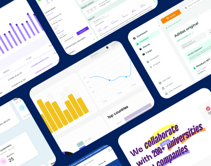
We refused to use stock images and created visuals that fully reflect the product itself and its features. Laconic geometric shapes were used to emphasize the main idea: to simplify the complex while avoiding banal metaphors.

Our brains process images 60,000 times faster than text, so we added a block of specially designed UX/UI design elements to make information more perceptible and to add entry points to the main page.

- Fonts.
We chose a font that better fits the company's theme and niche, as well as the product itself because it is associated with programming and blockchain. That's how we reemphasized the business niche.
- Visually separated and structured blocks of information.
Because the pages are long enough with a lot of text material, the user becomes accustomed to the scrolling monotony and loses attention over time. So we divided the page into dark and light sections to keep his/her focus and concentration.

UX/UI Design of the Blog: Structuring a Vast Amount of Information to Make It More Accessible
Dysnix's blog design was a critical task because this website section has significant potential for user engagement and SEO. The challenge was in structuring and presenting the content, as the blog's content was extremely rich and diverse.
The design team focused on developing a functional structure that allows users to quickly find the information they require, making it more clear and more accessible. At the same time, it was crucial to consider further scaling and updating the blog so that the company's employees could add new articles without losing the brand stylistics.
Because the content is so varied, we worked with a Dysnix content writer to properly structure the page. To accomplish this objective, we:
- On the first screen, we added a panel with the latest posts and most popular articles by the editor;

- Added a quick search by articles and tags. We have placed the main categories and collections of articles in a separate block to optimize navigation and speed up the search for the necessary information;


- Created post previews, making sure that a non-designer employee could also add the necessary elements when uploading new content without losing the style;

- Placed a separate block with the most popular article collections with custom illustrations to add bright accents and keep the user's attention;

- Cases were placed into the standalone block to separate them from other content on the blog.

Results of the Dysnix website redesign
We worked out the core pages of the site and thought up the accent elements of the UX/UI design. The main features of the website design include:
- A structured and intuitive interface that allows users to easily find the necessary information about the company and its services.
- The choice of colors and fonts match the company's vision and convey its technological nature.
- Customized illustrations that help visually convey the importance of the products and services offered.
Special attention was paid to the blog page. The product is complex and for such products, a blog is an integral part. Thanks to effective cooperation with the client's team, the blog site looks informative and appealing. The blog has several main sections and collections of articles by topic, and there is a search function that allows users to quickly find specific topics and articles.
We achieved the goals set and created a design that not only helped Dysnix stand out from the competition, but also demonstrated new products and services in Web 3 in a clearer and more accessible format.
FAQ
Question reference
Answer reference


.png)

.png)

%20(1).png)
.png)
More real-world Turum-burum cases?
Review our vast portfolio of cases in a variety of business fields to make sure of our expertise.
Go to Portfolio
