

Step-by-step instructions for optimizing the checkout for website
According to our experience, the average cart abandonment rate is 69.57%. How to optimize the checkout process so that visitors do not leave? In this article, you will find ecommerce checkout best practices, real-life examples, and practical tips on designing a checkout page from Denis Studennikov, Head of the UX/UI department at Turum-burum studio. These recommendations will help reduce the bounce rate and increase the conversion of an online store.
Checkout process UX: definition
The checkout process in UX (User Experience) refers to the way a customer goes through to complete a purchase on a website or mobile app. A well-designed checkout process should be simple, intuitive, and minimize any obstacles that might cause the user to abandon their purchase.
While some might say that developing a client-oriented checkout is not difficult, almost 70% of shoppers abandon their carts, meaning that only three out of ten customers who fill their shopping carts actually complete their purchase. This means that there are some common mistakes that online businesses usually make that lead to financial losses. Luckily, most of these UX issues can be easily solved, and you will learn how below.
Checkout UX best practices: boost your CR
So, to turn website visitors into customers, you need an easy checkout process. Below, Turum-burum will share ecommerce checkout best practices based on 14+ years of experience.
Step 1. Analyze each step of sales funnel
Sales funnel analysis is a good way to identify the drawbacks of the order placement stages where users leave most often. And website checkout is the best place to start, because if people leave at this point, your online store loses the most interested customers. Thus, it is important to find what exactly prevented them from completing the purchase.
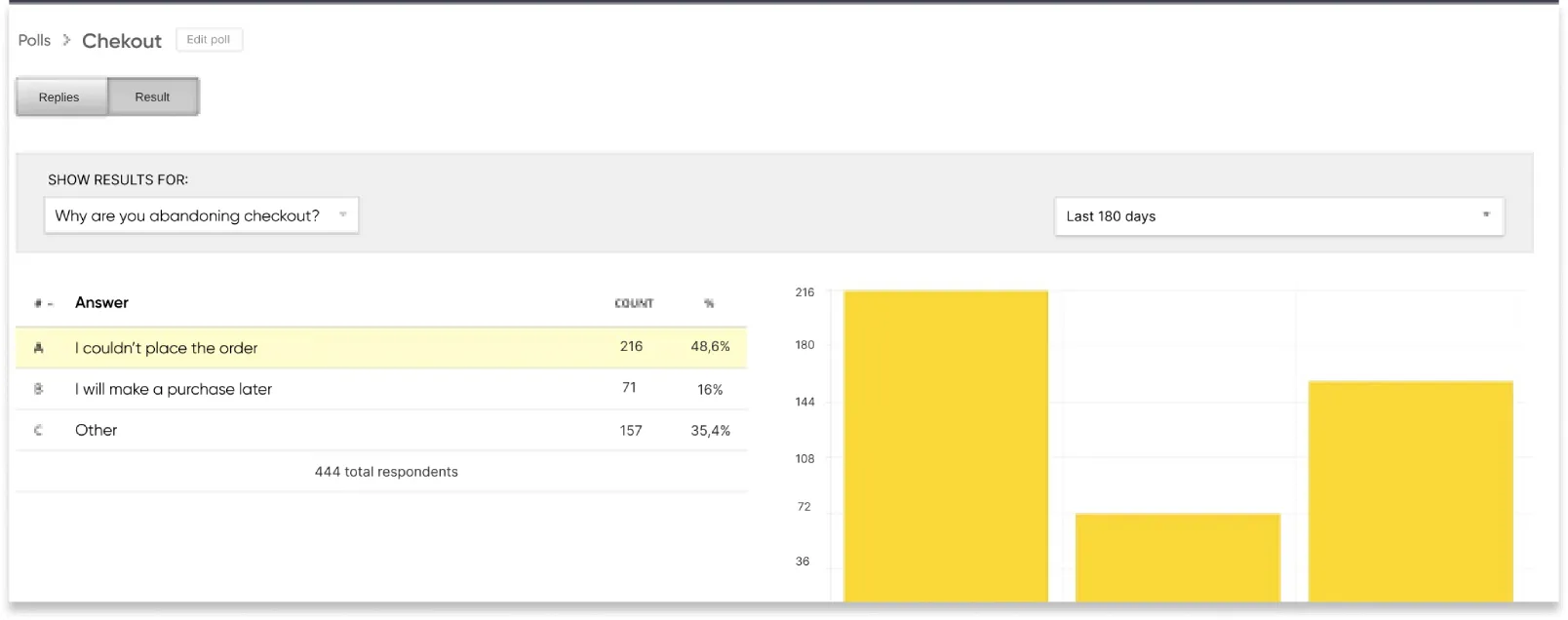
This can be done with analytics tools and questionnaires. For example, when working on the Intertop project, we did a checkout UX survey and found that 48.6% of visitors left the checkout form simply because they were unable to complete their order.
To identify the bottlenecks, we analyzed the 5-stage funnel.
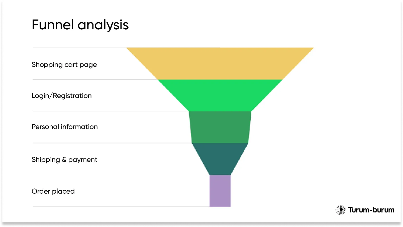
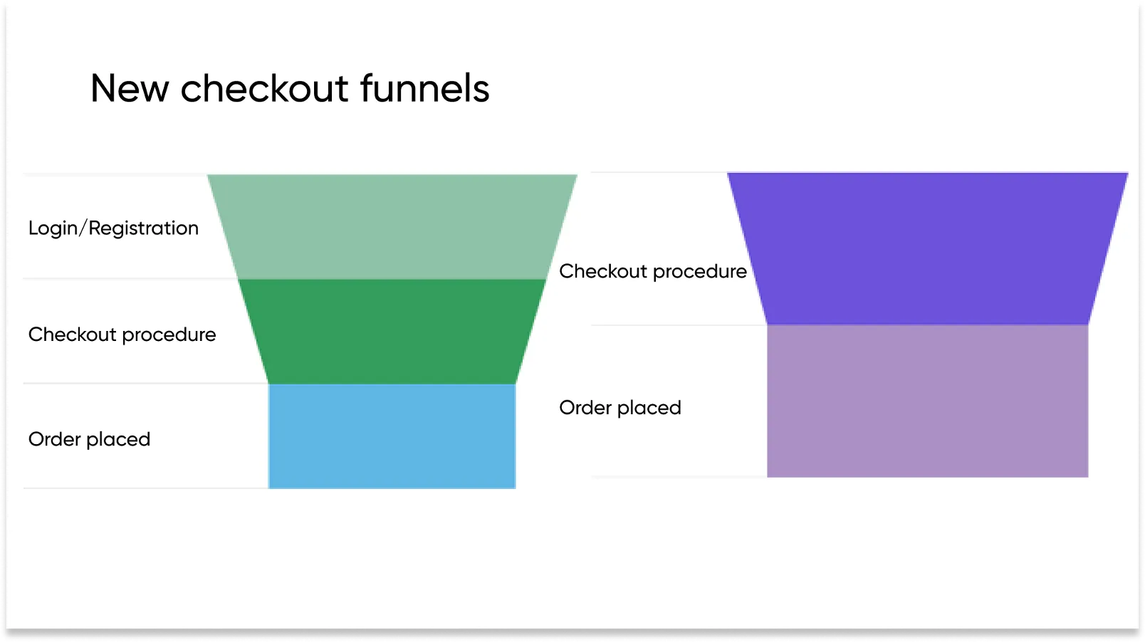
After detailed work on each stage of the funnel during the checkout UX audit, we decided to simplify this stage for customers. So we decided to reduce checkout to three steps for new users and to two steps for registered ones, which helped us increase the conversion rate by 55%.
Step 2: Break the order placement process into several simple steps
Follow the user path yourself to understand how easy the checkout UX is. For example, while working on the Dobovo.com project, we discovered that the booking procedure was so complicated and time-consuming that by the moment the users reached the final step they were forgetting the key points.
By splitting the process into three consecutive steps and adding reminders of all the key parameters, we managed to decrease the bounce rate by 11.73% with mobile users and increase the micro conversion rate by 35%.
You can also add a progress bar to let the user know where he/she is at the moment, and how many steps there are left. Provide your customers with an opportunity to edit the order at any point, with all the entered data being saved.
Step 3: Add a one-click “Buy” button
Not all visitors want to go through the checkout process, filling in all the necessary forms. Take care of those customers and give them an opportunity to place an order with one click.
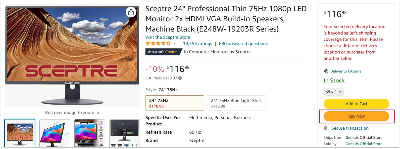
This approach's definite plus is the speed of order placement, but it can also have drawbacks — for example, if it is impossible to pay for the order online.
Market changes and new trends should be taken into account — e.g., online or web acquiring (increase in digital payments during the COVID-19 pandemic). Thus, you can let the customer pay for the order online and complete all the other stages of the order placement with the operator. This way you will take care of the user and make the service more customer-oriented. As an alternative, see the method specified in Step 14.
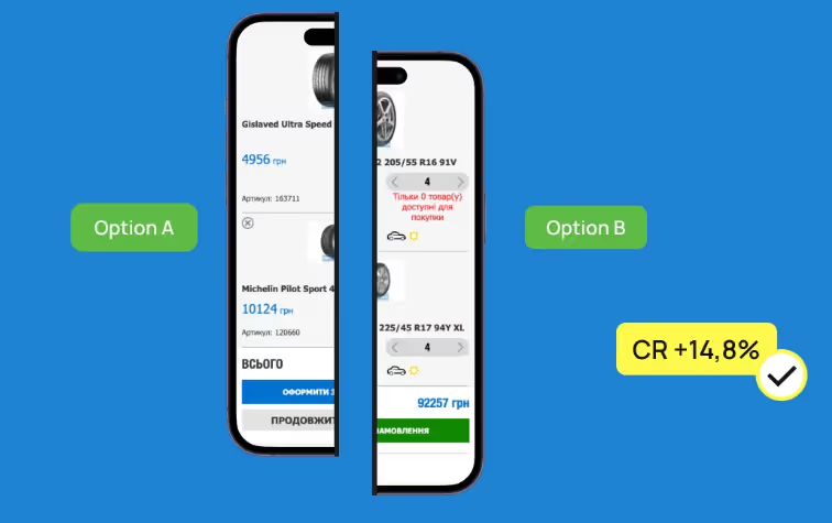
Step 4: Make an accent on the main CTA in website design
There can be several buttons and links on the checkout page for a website, for example, “Back”, “Edit”, etc. However, define one main CTA, not to confuse the user. For example, while redesigning the Infoshina website, we left one priority button “Checkout” and changed its color to a more noticeable one in relation to the other interface elements. By this relatively simple step, we increased the micro-conversion of the transition from the cart to the checkout increased by 14.8%.
Step 5: Motivate your customers instead of limiting them
If you have a minimum order value, be sure to inform the user about it and show the benefit of buying products for a bigger amount:
- motivate the customer using cross-sell and upsell tools;
- offer to order additional items to get free shipping or a gift;
- give a discount when a purchase for a certain amount is made.
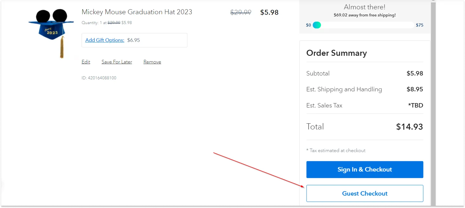
Step 6: Offer only products in stock
Show the quantity of goods in stock in the product card, in the cart and on the checkout page. Make it impossible to add and buy products if they are not in stock. If the customer added the goods to the cart, left, came back to complete the order later, and during that time the products had already been purchased, make sure to inform the customer about it. Specify which item is no longer available.
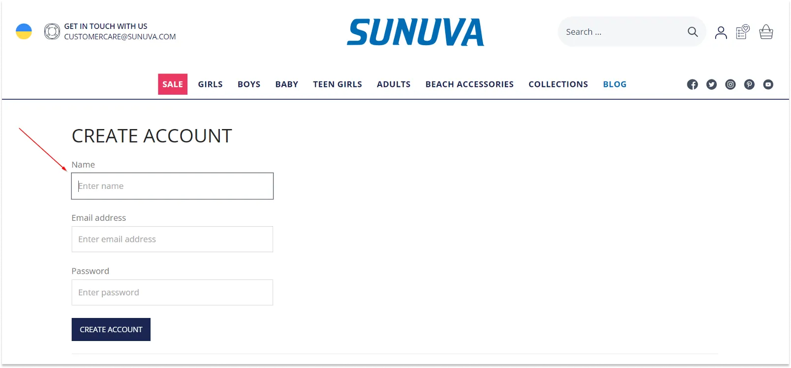
Step 7: Don’t require registration before order placement
Do not make the user register to place an order. Give options: Guest Checkout or Sign In/Register & Checkout.
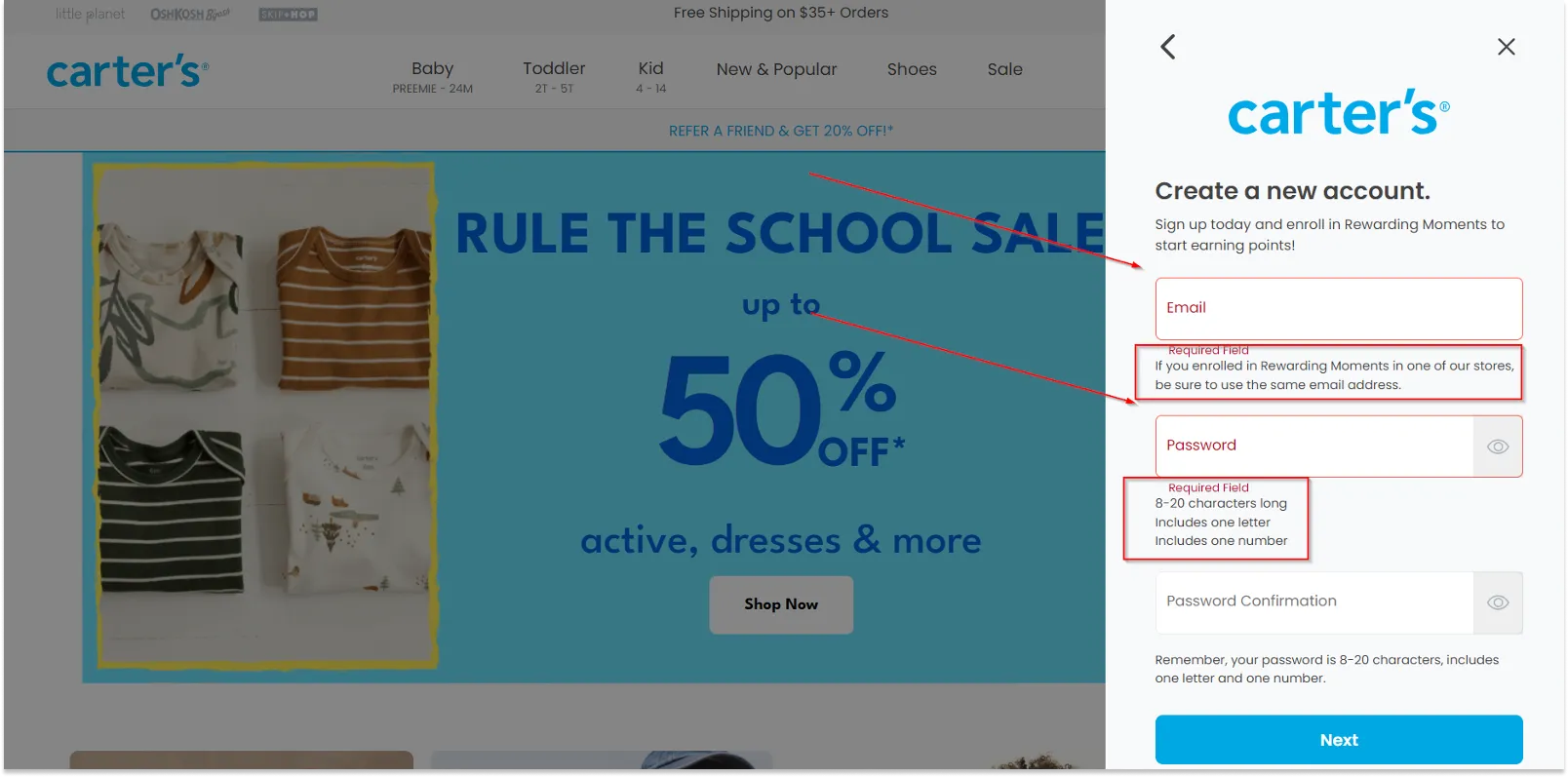
If the user opted for Registration before checkout, follow the next checkout UX best practices:
- Try to simplify and speed up the checkout process as much as possible. For example, generate a password automatically and send it to the email previously provided by the user.
- Do not focus on the fields to fill in and minimize their number.
- Use placeholders and various prompts to make the user understand what information should be provided and, ideally, why it is needed. Auto-fill would also be a good idea, as it makes the user path to checkout shorter.
- Visually highlight the required fields, and if the user has not filled them in or entered incorrect data, report an error. Add explanations to the form fields using an icon with the question mark to make it more clear for the user what information should be entered and what it is needed for.
Step 8: Provide customers with help by offering consultations
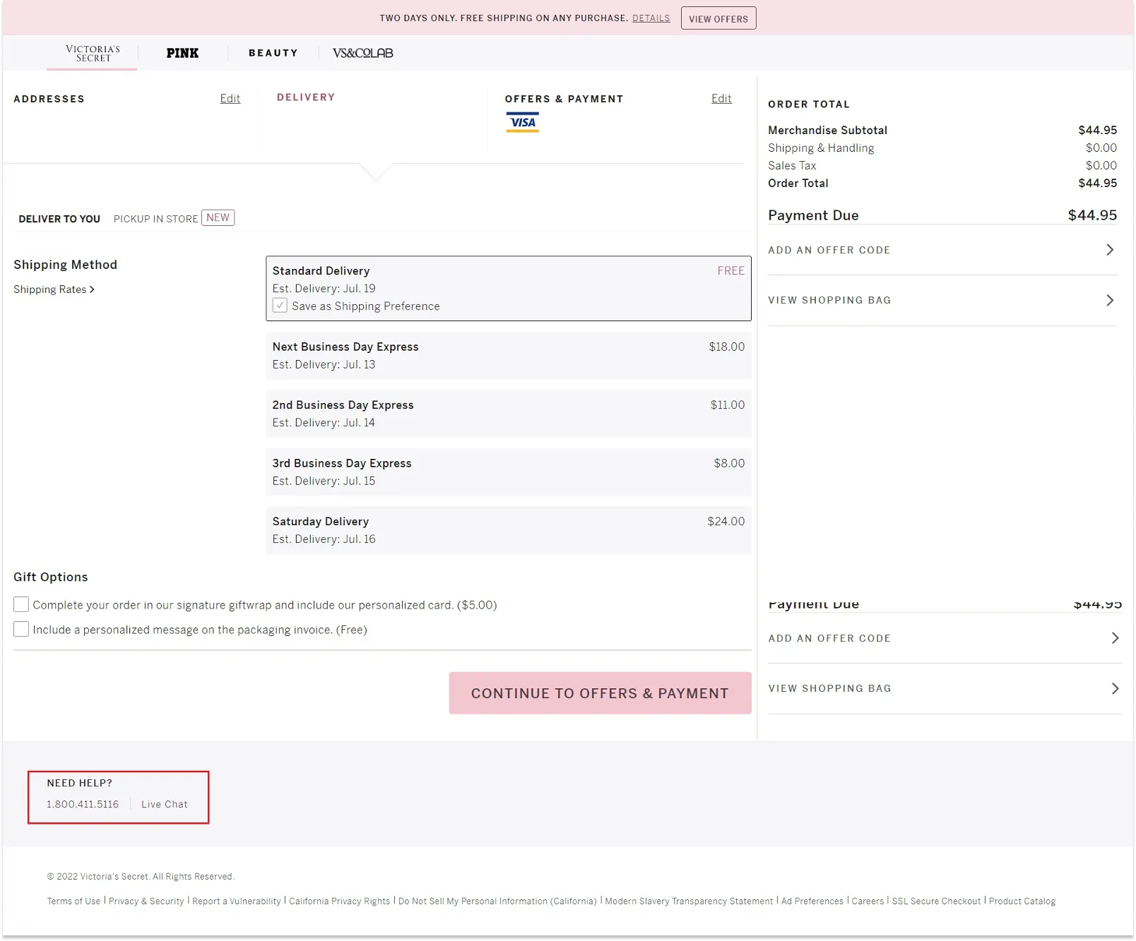
Add an online chat button or customer service contact details on the website checkout page so that users can get professional help or advice from the store employee at any time.
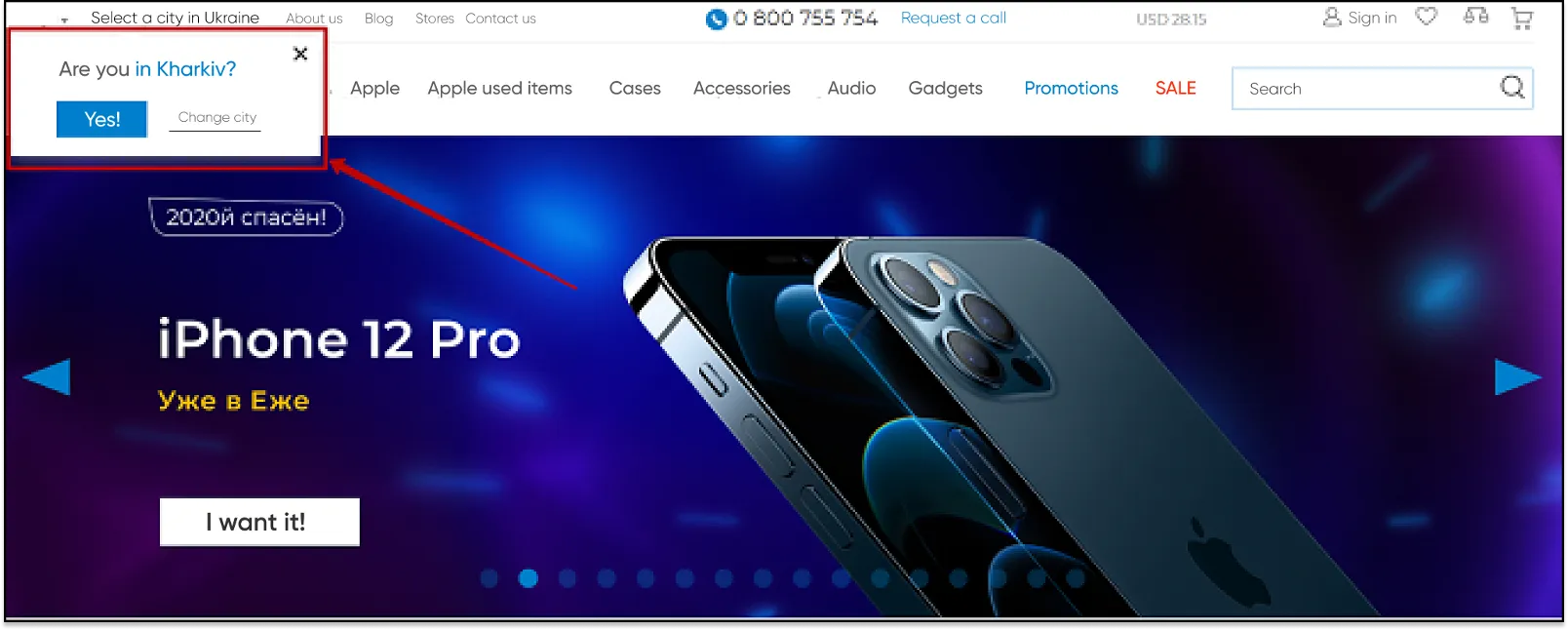
Step 9: Set up geolocation
If the visitor has already specified his/her city, do not ask him/her to do it again on the checkout page. At the same time give the opportunity to change the city, in case the customer wants to make delivery to another location.
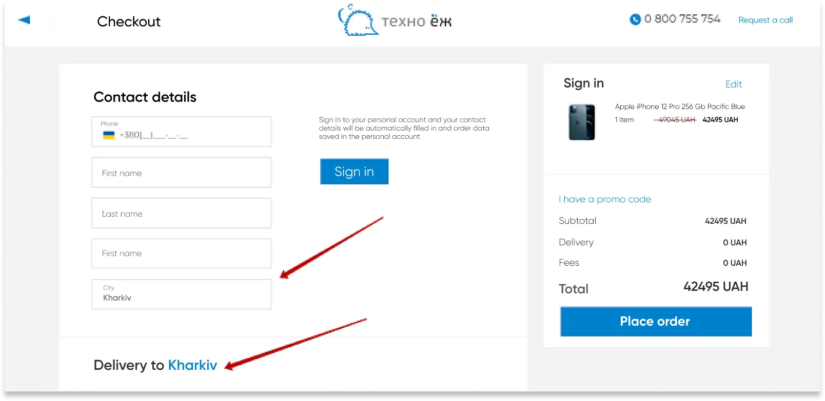
Besides, show the list of the available shipping options for the city selected by the user.
Step 10: Provide checkout UX with the most popular shipping and payment options
Make life easier for your users: analyze all the possible payment and delivery options and offer the most popular ones (sort them by showing the most popular ones first).
Inform the customer about his/her options depending on the selected payment method. For example, in the case of click & collect, the customer can pay for the order both online and in cash on the spot.
Depending on the selected option, ask for more information. For example, if the customer chooses delivery by DHL, ask for the recipient’s name — thus the user will understand the value and feasibility of providing such information.
Step 11: Specify further actions at each checkout stage and after it
It is a good idea to inform the customer about what will happen after this or that button is pressed, option is selected, or stage is completed. Thus, instead of the “Next” button, better use “Choose the delivery method”, “Go to payment”, etc. If you use third-party services for payment, for example PayPal, you should inform the user that after selecting the option “Pay by card” he/she will be redirected to another site to complete the purchase.
Also, after the order completion, not only inform the user that the order has been successfully placed, but also provide a clear action plan. For example, if it is a food delivery, instead of “Thank you for your order!” or “Order successfully placed!”, display one of the following messages: “Thank you for your order! Our operator will contact you shortly for details” or “Thank you for your order! Our courier will deliver it to you within two hours”.
Step 12: Find out why the user interrupted the payment process
There can be several reasons why the user interrupted payment:
- Disrupting interface elements;
- Payment failed — not enough money on the user account;
- The payment form stopped responding during filling in;
- Incorrect data entered (the user made a mistake);
- Internet connection dropped;
- The user didn’t receive the confirmation code, etc.
For example, during the checkout UX audit for Samsung Experience Store click maps revealed exit points on the checkout page that distracted customers and caused them to abandon or edit their carts.
To reduce the bounce rate and optimize the purchasing process, Turum-burum minimized the checkout page’s header. Doing so removed unnecessary information and places users could click to leave the page.

To minimize bounce rate, you can set up the checkout so that after the form is filled in, the order is automatically formed.
If technical errors occur during payment,
- Provide an option of changing the payment method;
- Send such contacts to the manager so that he/she could call the customers back and clarify the reasons;
- You can also send an email or SMS to the user asking to try and pay once more.
Step 13: Work with uncompleted orders
Track uncompleted orders and abandoned carts and work with them. The user may have simply been distracted and forgot to complete the order. By reminding him/her about the abandoned products, you can get the customer back and thus increase the conversion of your online store. In case a new user closes the window or browser tab, use a lead capture form.

Step 14: Take care of mobile users
Track and analyze how comfortable it is for visitors to interact with the site on various mobile devices, and optimize the pages your customers usually leave. Provide a quick pay option. Add Apple Pay, GPay, etc. buttons to the website checkout design. This is becoming a new trend and a modern alternative to the “Buy in 1 click” feature.
In the event that all the necessary data is entered in the phone, when the customer selects one of the payment methods, he/she sees the payment process in the interface of the operating system. In this way you increase the brand credibility and the chance of online payment.
Step 15: Take care of security issues
When placing an order, the user shares personal information, so it is essential to ensure the security of all data and transactions. Not only should you use SSL and other security protocols, but you should also tell your customers about them. Post information and logos of the companies, services, and tools you use to protect user data. In this way, you increase loyalty and trust in the brand.
As practice shows, errors in the website checkout design can lead to loss of customers and profit. Using this guide, you can make the order placement process clear and easy for the user, and thus increase the conversion of your online store and retain customers.
Final thoughts on checkout UX audit
Conducting a checkout UX audit is not a suggestion to implement but is a must-do if you want your business to make a change for the better when it comes to its ecommerce site. Don’t underestimate the importance of the last website pages: the users themselves have completed a lot of steps and even the slightest flaw in the interface can annoy or interrupt them. Thus, by investing in improving your checkout process, you will achieve continuous development and success for your brand in the extensive digital environment.

.png)


More real-world Turum-burum cases?
Review our vast portfolio of cases in a variety of business fields to make sure of our expertise.
Go to Portfolio
