


Zensum Loan Broker Redesign: Building Trust and Scalability
In finance, trust matters as much as clicks.
Zensum’s previous site was functional, but it didn’t fully reflect the company’s scale, credibility, or ambitions. To meet user expectations shaped by leading financial institutions, both in search results and customer perception, a redesign was needed. One that could strengthen trust, improve clarity, and support long-term growth.
Together with TopDog and Turum-burum, Zensum transformed its digital experience into a scalable platform designed for stronger performance, better user journeys, and future expansion.
Starting Point. Challenges. Tasks.
Zensum is an established loan broker in the Nordics, helping customers refinance loans, compare credit options, and make more informed financial decisions.
As the business grew, the website became a limiting factor. While it supported core functionality, it didn’t align with user expectations shaped by banks and modern fintech platforms. This created a gap in perceived trust and clarity.
The project focused on three key challenges:
- Trust: Create a design that clearly communicates credibility and professionalism
- Scalability: Build a flexible system capable of supporting a large and growing number of landing pages
- SEO alignment: Ensure structure and content support long-term search visibility and performance
To solve this, Zensum partnered with TopDog for SEO strategy and Turum-burum for UX/UI and design system development.
SEO by TopDog as the Foundation
A redesign and branding is never just about visuals. It’s always about the strategy and SEO. For Zensum, search visibility was as important as design. Competing with banks and large brokers meant that every change to the website had to respect how Google sees and ranks content. That’s where TopDog came in.
TopDog's advice affected everything from how headings and content blocks were set up to how SERP messages and internal links were made. This framework gave a solid foundation for our UX/UI work.
Every page template and navigation change was reviewed with SEO in mind, ensuring the new design not only improved usability but also preserved (and prepared to grow) Zensum’s visibility in search.
UX/UI & Design System: User-Centric With Business Impact
Zensum already had strong products and a solid reputation. The goal was to ensure the digital experience reflected that strength.
The redesign focused on translating credibility into a clear and accessible interface. The result is a mobile-first UX/UI foundation combined with a scalable design system that supports both user needs and business goals.
Visual Identity & Design System for Consistency
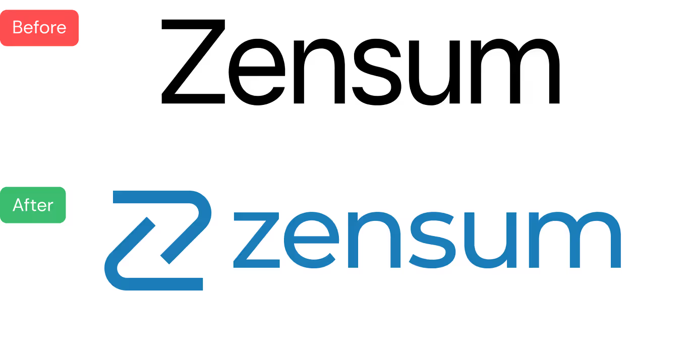
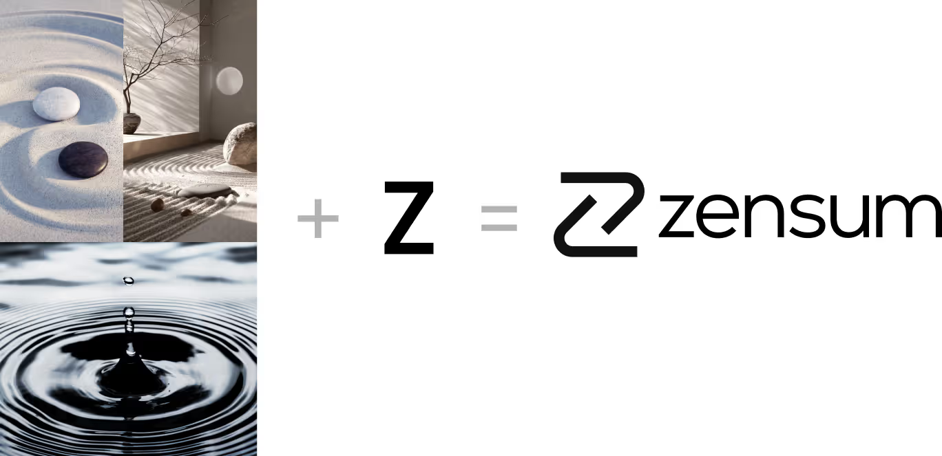
The visual direction focuses on clarity, balance, and simplicity. The goal was to make complex financial decisions feel easier to understand and less intimidating.
Custom illustrations and UI elements were introduced to replace generic stock imagery.
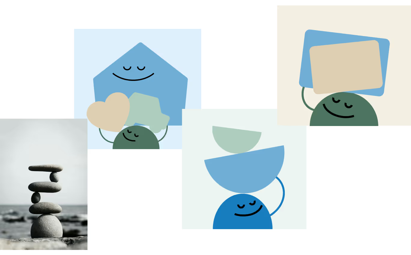
As shown in the illustration examples above, this adds warmth and creates a more human experience while supporting the overall brand tone.
A complete UI kit was developed, including typography, color system, components, and interaction states across both light and dark modes (see UI guide above).

Accessibility was a key priority, with clear hierarchy, readable typography, and consistent patterns across the interface.
Delivered together with core templates, this system provides Zensum with a scalable foundation for future development. New pages can be created faster, maintained more easily, and remain consistent across the platform.
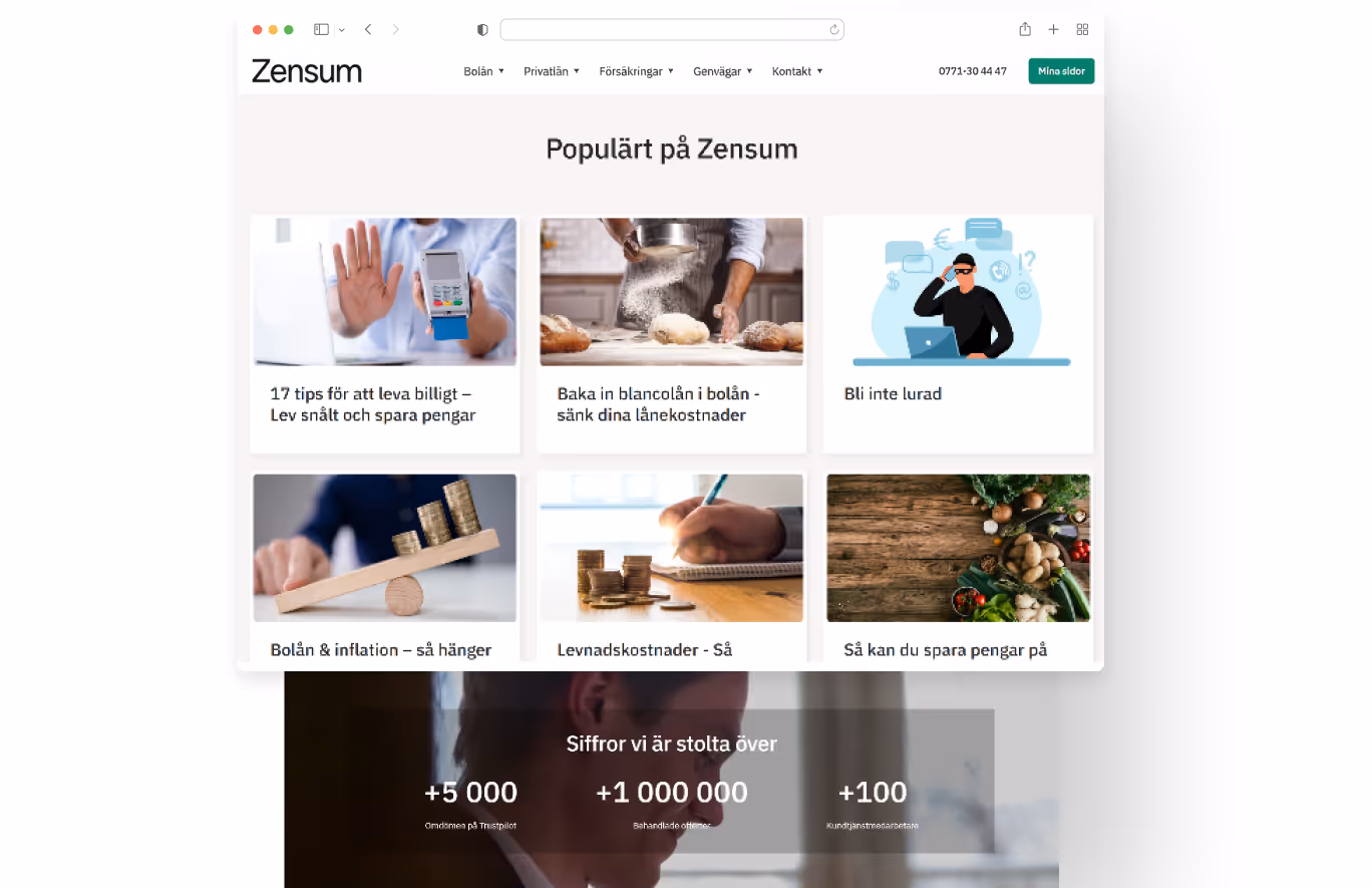
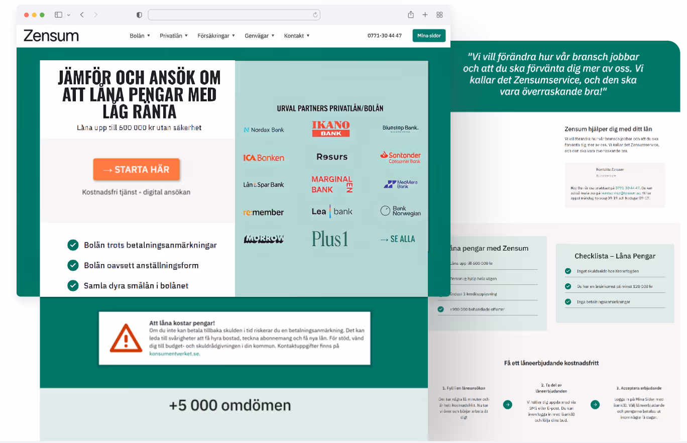
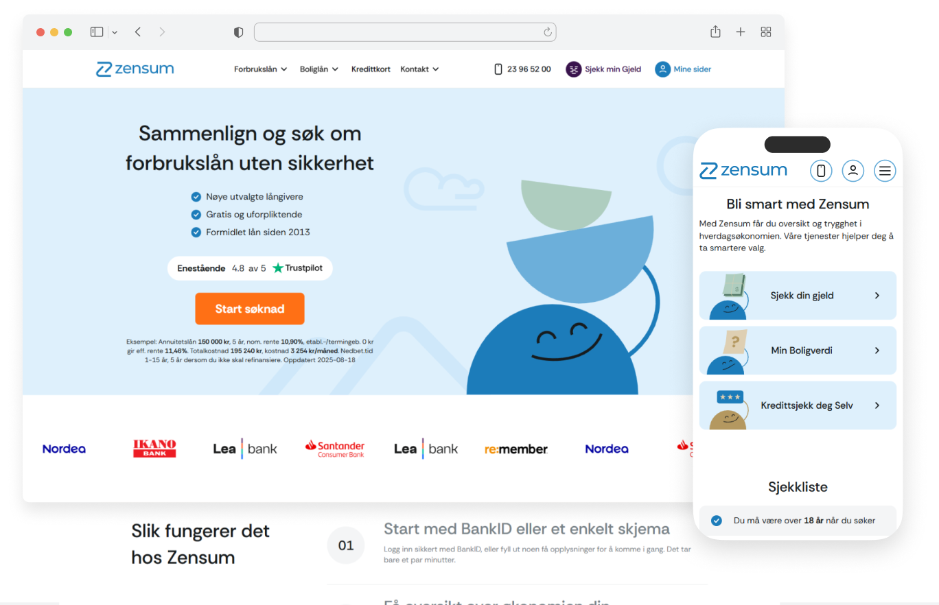
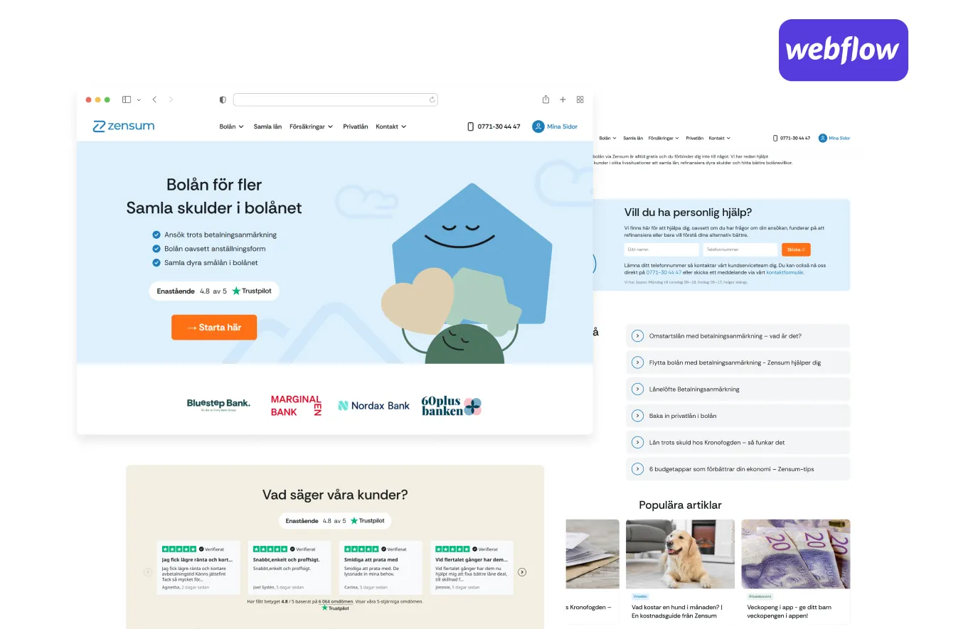
Homepage & Navigation: A Strong First Impression
The homepage plays a critical role in shaping first impressions and guiding users toward action.
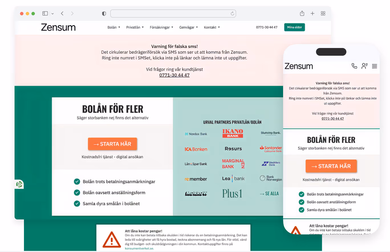
As shown in the “before” screenshot above, the previous version contained relevant information but lacked clear prioritization, making it harder for users to quickly understand where to go next.
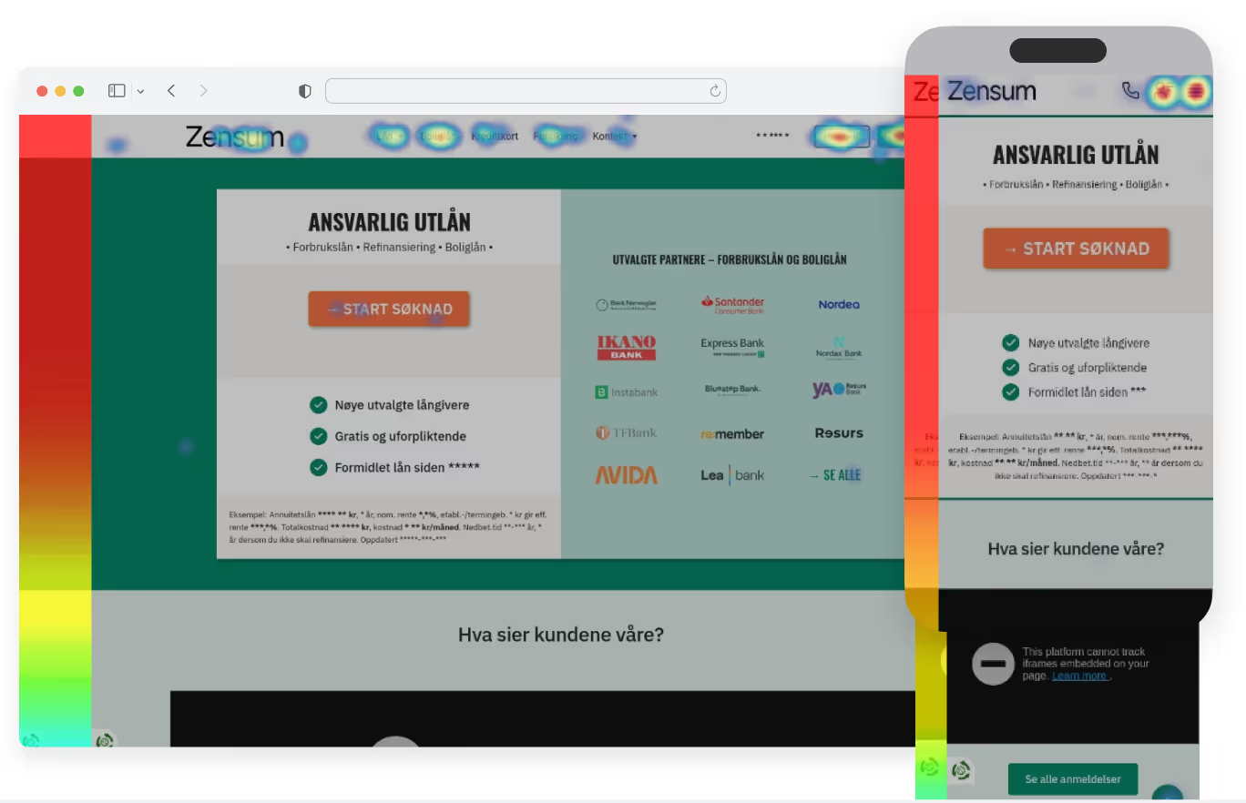
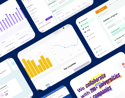
Using behavioral data such as heatmaps, click patterns, and analytics (illustrated above), the team identified friction points and areas of confusion.
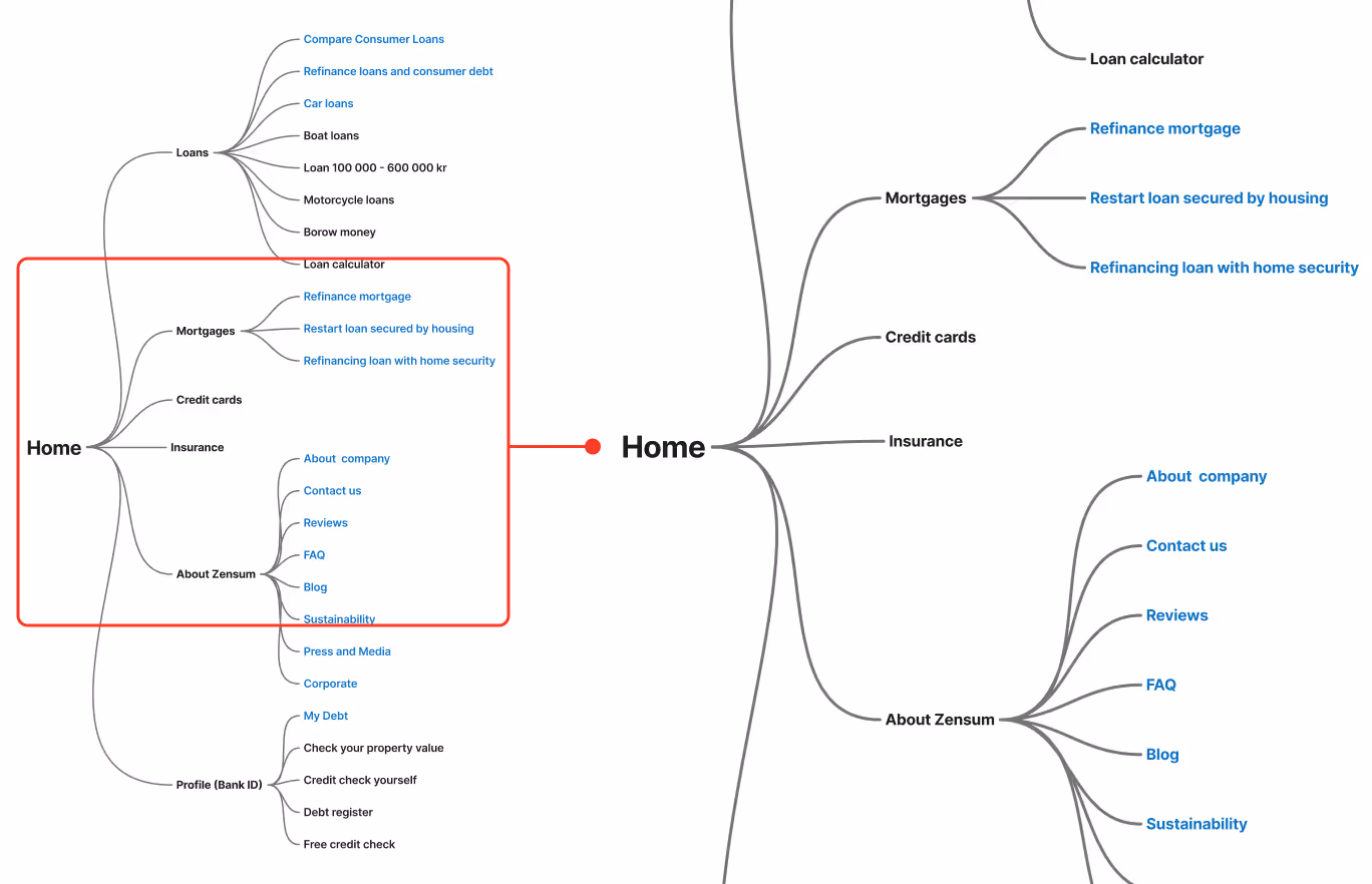
This led to a new information architecture (see diagram above) with clearer structure, improved navigation logic, and better prioritization of key services.
As shown in the “after” example above, the redesigned homepage introduces a clear value proposition, a focused primary call-to-action, and visible trust signals such as partner banks and customer reviews.
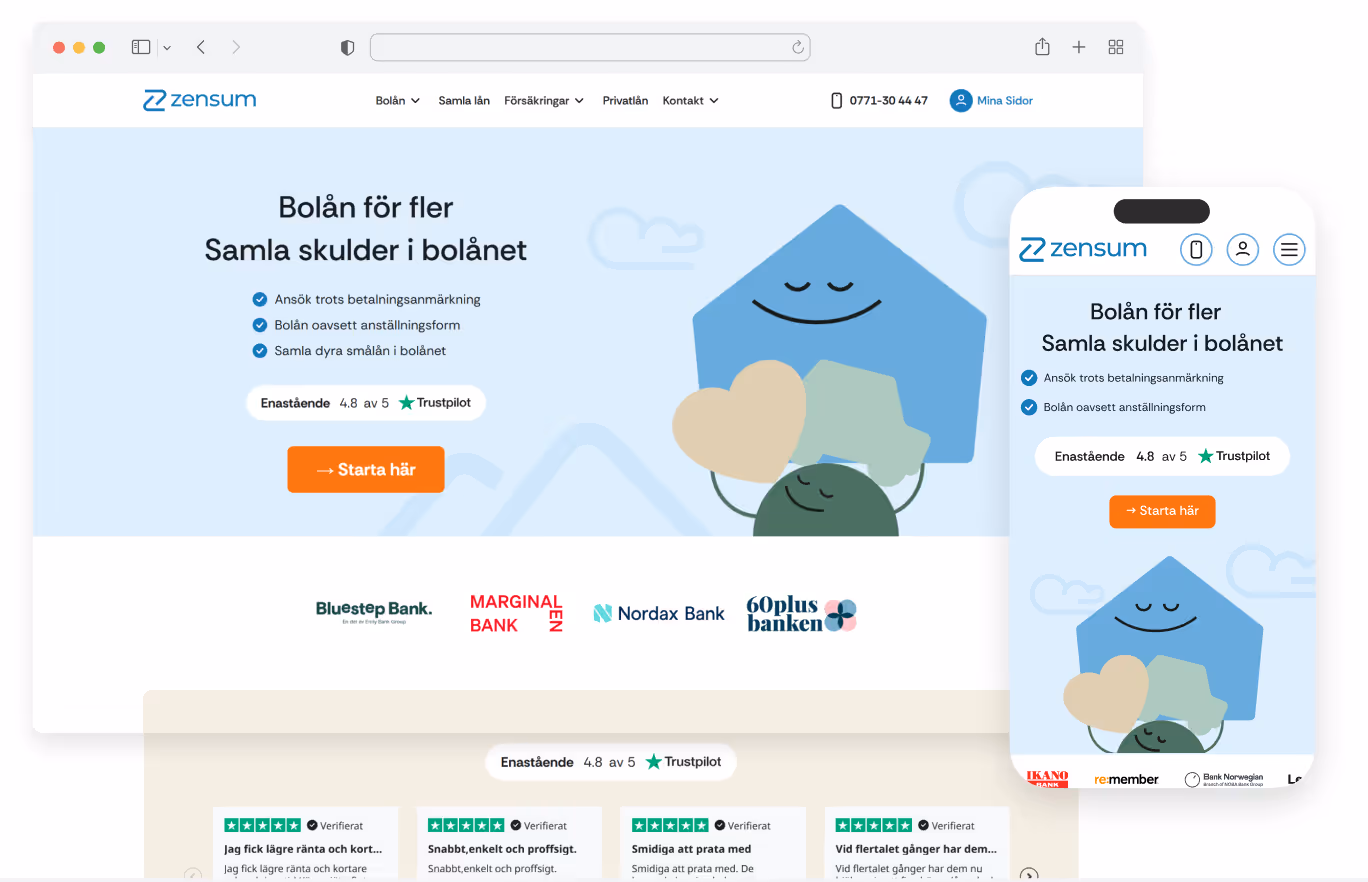
Content is easier to scan, and users can quickly find relevant entry points based on their needs.
Service Pages: Turning Complexity Into Clear Steps
Service pages are where users evaluate options and make decisions.
As shown in the “before” service page example above, these pages contained the necessary information but lacked structure and clarity, which made the journey feel heavier than needed.
As shown in the “after” service page example above, the redesign introduces a more guided experience:
- Clear value proposition and CTA at the top
- Structured steps that break down complex processes
- Expandable sections to manage information density
- Supporting visuals that improve comprehension
A standardized template system ensures consistency across all services. This improves usability while allowing Zensum to scale new offerings efficiently.
Content Pages: Supporting Trust and Visibility
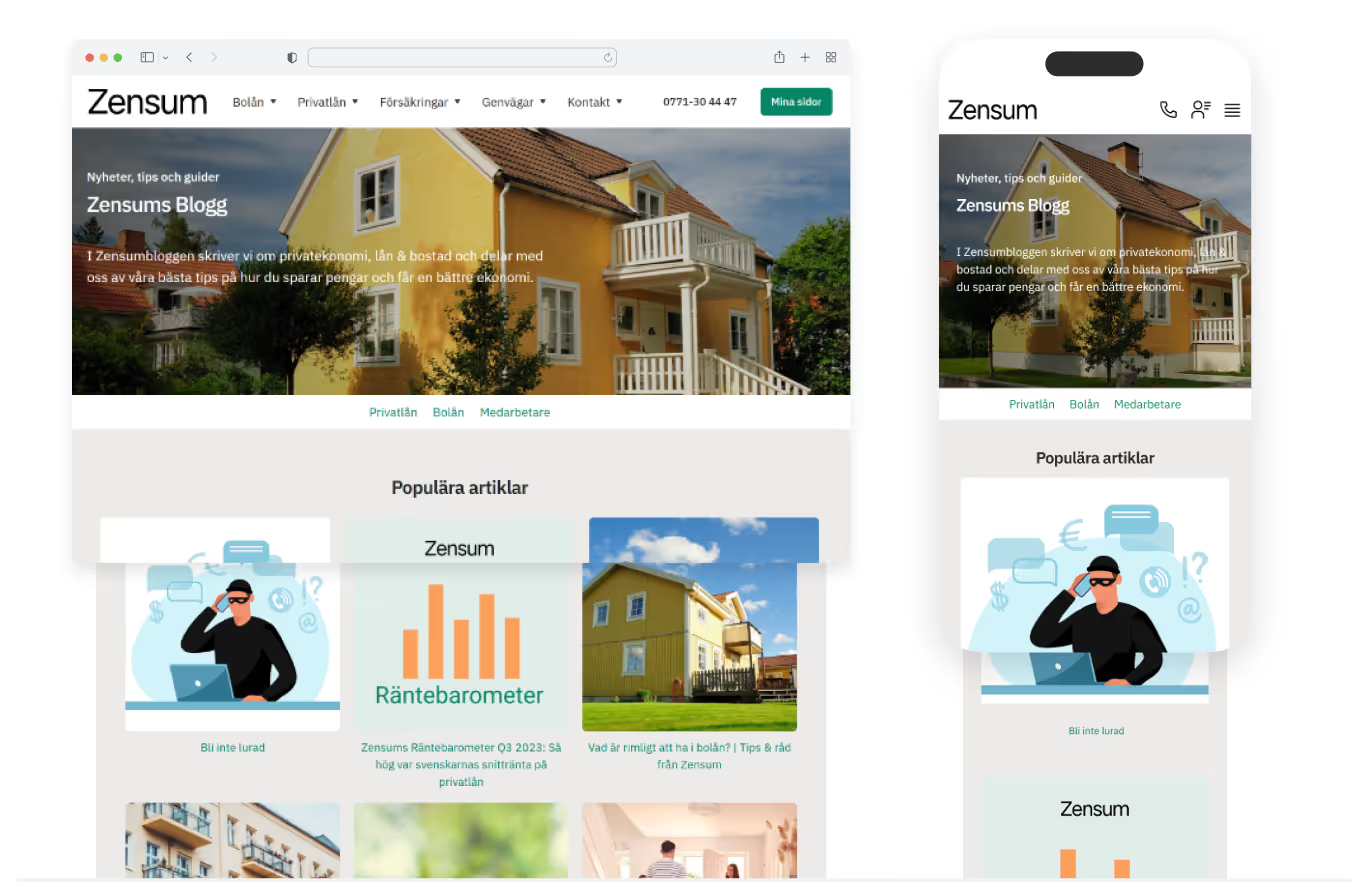
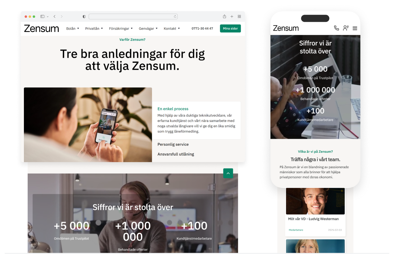
Content pages such as About, FAQ, and blog play an important role in both SEO and user trust.
The previous versions were optimized primarily for search visibility but lacked structure for easy consumption.
As shown in the before and after examples above, the updated approach balances both needs. Content is now structured with clear hierarchy, improved readability, and supporting visuals.
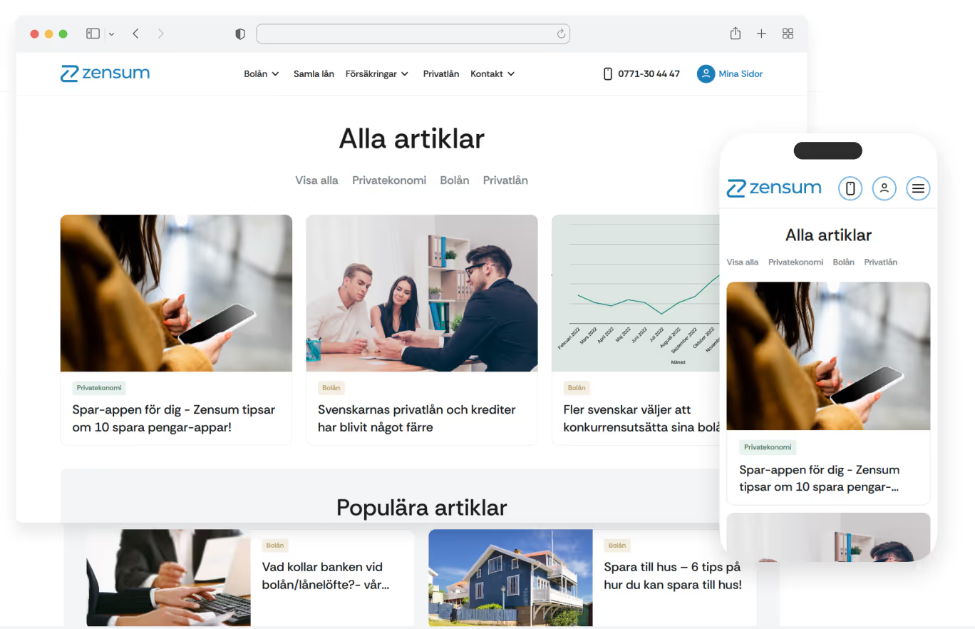
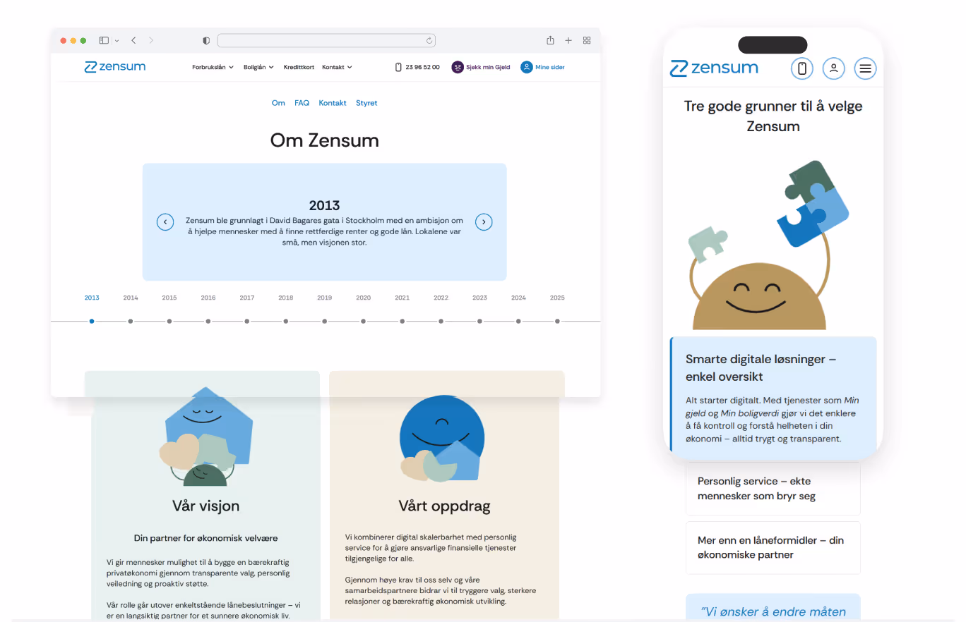
This makes it easier for users to find answers while strengthening Zensum’s credibility.
Full-Cycle Delivery: Webflow Implementation

To support long-term scalability, the project included a structured Webflow implementation.
A clean and reusable class system was introduced, along with clear naming conventions and documentation (as reflected in the structured UI and page examples above). This enables Zensum’s team to extend and maintain the site efficiently without introducing inconsistencies.
The platform is optimized for performance and works seamlessly across major browsers and devices, ensuring a consistent experience for all users.
A library of modular components and templates was delivered, supporting everything from core pages to scalable landing page production for SEO and paid acquisition.
From Redesign to Results: A Platform Built for Growth
The redesign provides Zensum with a stronger foundation for both user experience and business performance.
The new platform improves clarity in user journeys, strengthens trust signals across key pages, and enables more efficient scaling of content and campaigns.
With a flexible design system and structured implementation in place, Zensum is now better equipped to evolve its offering, support marketing initiatives, and continue improving conversion flows over time.

FAQ
Question reference
Answer reference


More real-world Turum-burum cases?
Review our vast portfolio of cases in a variety of business fields to make sure of our expertise.
Go to Portfolio
