


Web design for grocery stores: what works, what doesn’t, and why UX/UI matters?
Grocery might seem like an easy niche to work with until you actually do this.
In fact, this type of shopping rarely happens in perfect conditions. Users open websites on the go with one free hand and very little patience, which forms sophisticated requirements.
That’s why the difference between a grocery website that converts and one that drives users away is not visual — it’s UX.
In this article, we highlight UX/UI solutions that work and demonstrate those that don’t, using real-life examples.
Grocery web design myths that hurt conversion
Here are tired grocery UX/UI myths that Turum-burum constantly runs into. Let’s check what’s crippling grocery stores' potential and absolutely tanking their conversion rates.
Myth №1: Everything starts with the desktop
Reality: more than 64% of the internet traffic comes from mobile phones, with 70% of online shoppers using their smartphones for initial product research.
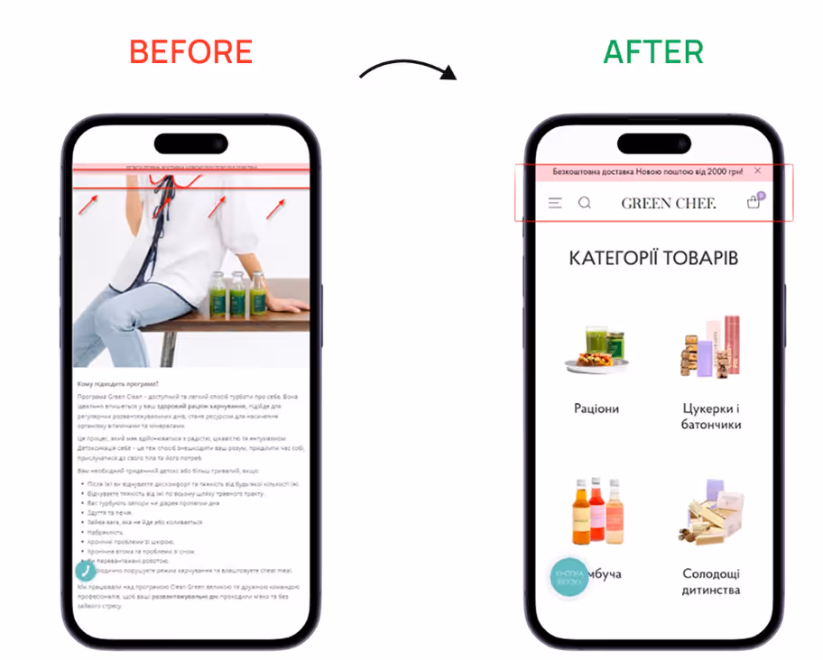
What often goes wrong: desktop-first homepages, insufficient spacing between elements, large banners, and campaign-driven layouts that dominate the first screen.
Mobile-first UX/UI design is a must-have for any online business aiming to be on the same wavelength with their clients. This approach involves developing website design with a primary focus on the mobile shopping experience, rather than adapting the desktop to mobile.
We've seen this approach consistently drive customer engagement and solid sales for online grocery projects.
Mobile ≠ simplified desktop version: ensure advanced UX/UI
- Intuitive navigation: develop a clear information hierarchy, implement burger menu and fixed navigation, place clear visual accents;
- Page loading time no longer than 3 seconds: use WebP / AVIF instead of JPG/PNG, reduce the number of fonts and animations, prioritize the loading of blocks immediately seen by customers;
- One-thumb interaction: minimize the number of fields, place elements in predictable places, and make all interactive buttons no smaller than 1 cm × 1 cm.
Myth №2: The more and brighter, the better
Reality: efficient grocery website web design is the one that allows users to quickly find and recognize their food favorites. If your website is visually overwhelmed, this mission is impossible.
What often goes wrong: numerous interactive elements, a bright website background, lengthy customer journeys, or overly detailed product descriptions.
Since grocery online stores usually display a large number of products, it’s vital to avoid distracting users from their main objective — placing the order.
Therefore, at Turum-burum, we recommend opting for minimalistic interfaces and service designs with interesting custom elements to convey the company's core messages and values.
Here's what effective service design for grocery e-commerce looks like in practice:
- minimal visual noise, banners, and competing CTAs;
- hints, notifications, and recommendations are only displayed when they are truly relevant;
- chosen typography and built visual hierarchy should guide users through the website.
Such UX/UI solutions will help users complete repetitive actions faster, which is exactly what grocery shopping requires.
Myth №3: Checkout is just a technical step
Reality: it’s the leave-or-buy moment and the most sensitive stage of the customer journey.
What often goes wrong: Long forms, unnecessary steps, and desktop-first flows that are not adapted to mobile can lead to frustration and a high exit rate.
18% of customers abandon their checkout because it is too long or complicated, which is really critical for businesses. If the user leaves at this stage, the business loses potential orders and its revenues.
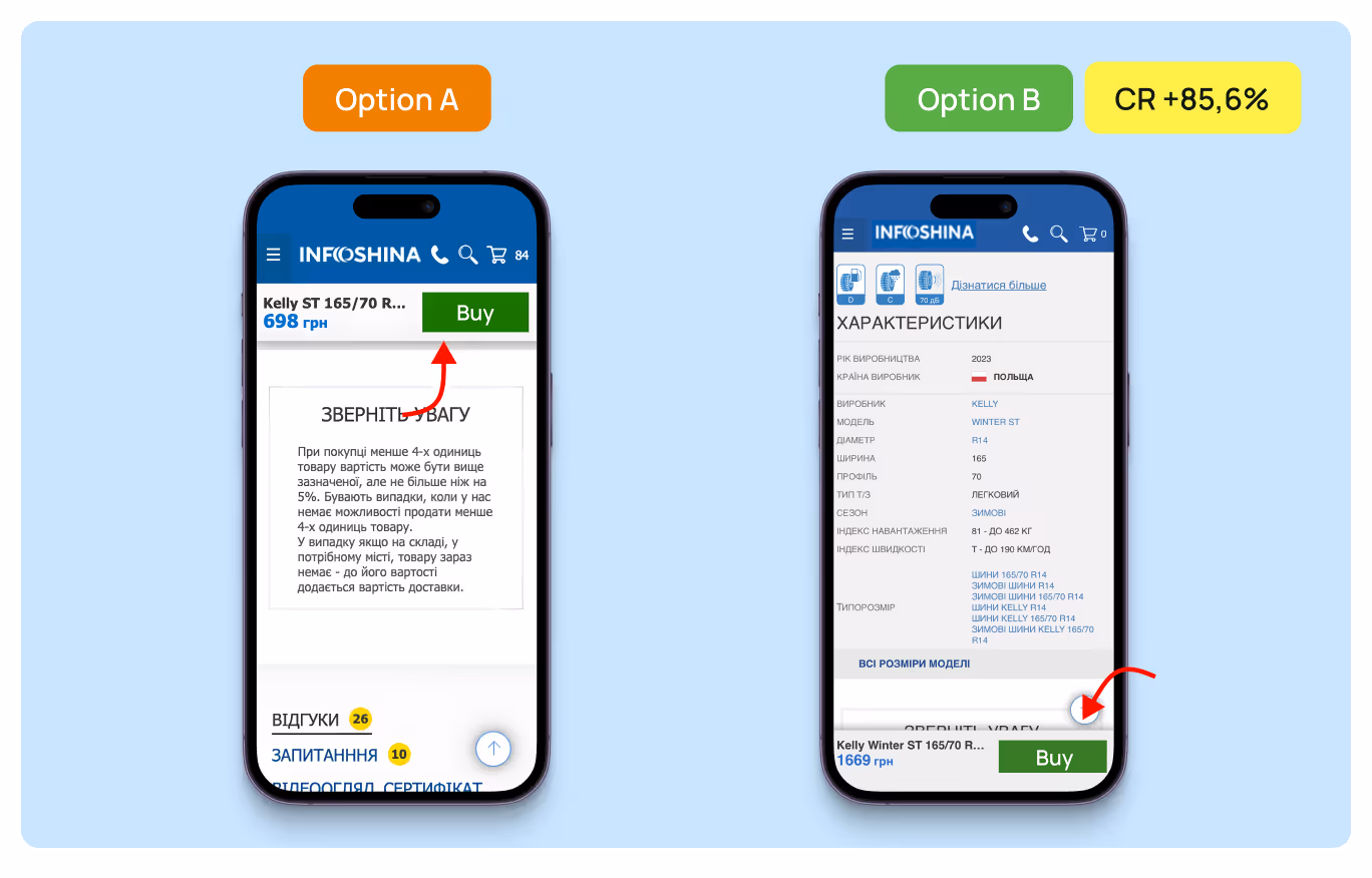
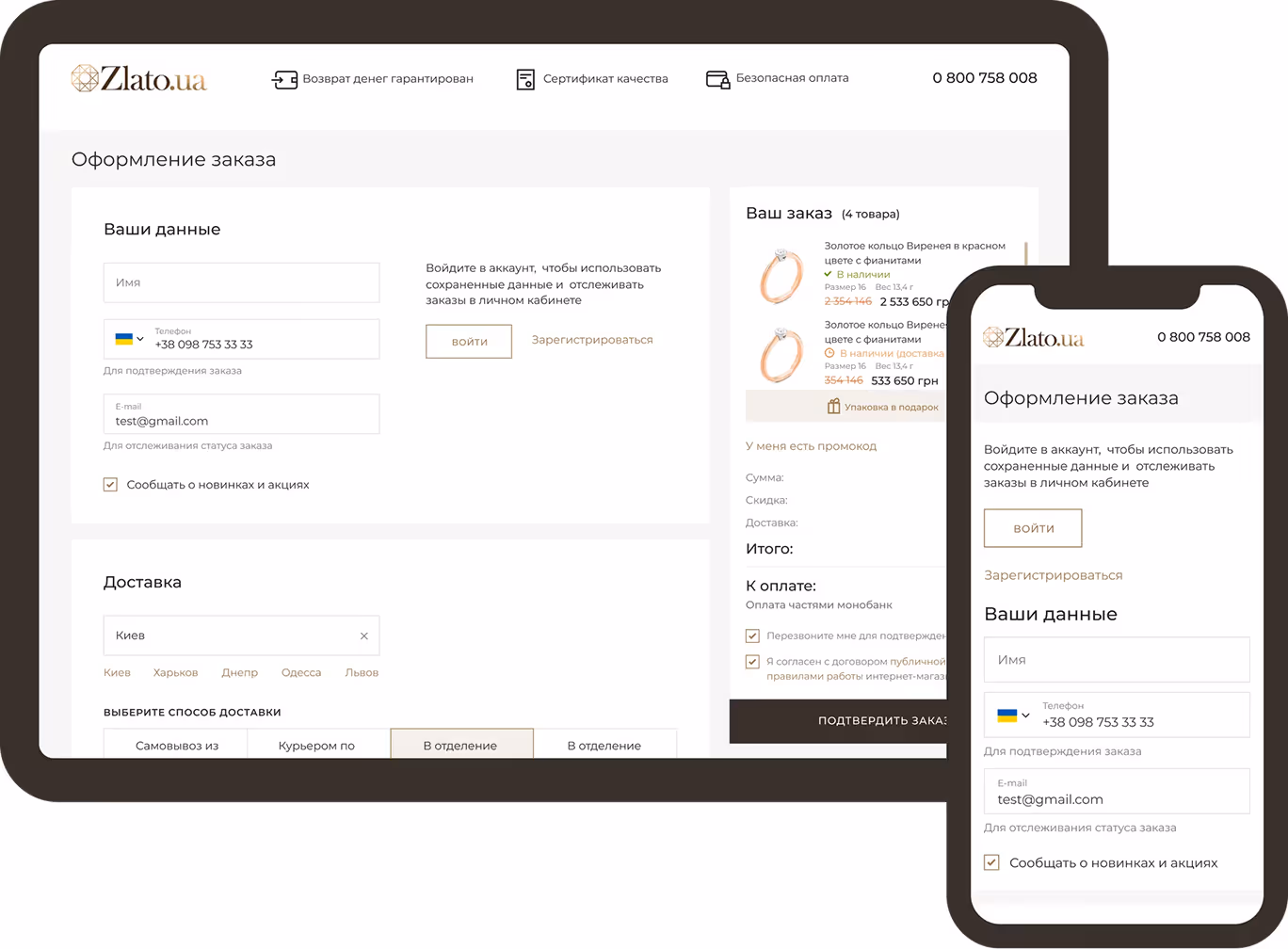
For example, while working on the Zlato.ua website redesign, we revealed that the checkout page was lengthy and complicated. So, we simplified it, restructured the order form, and split it into semantic blocks by means of visual accents.
As a result, the number of users who moved to the Checkout page and completed the checkout increased by 83.69%.
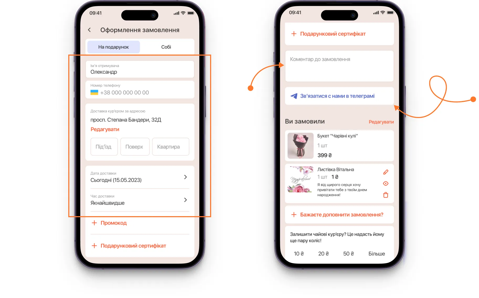
Don’t treat checkout as a formality. Create a smooth mobile experience by:
- using a one-column checkout layout optimized for mobile screens;
- minimizing the number of required fields and steps;
- enabling autofill, saved addresses, and mobile wallets;
- allowing cart edits without page reloads.
A well-designed checkout UX helps users complete routine grocery purchases without hesitation, thereby increasing website conversion rates.
What actually makes grocery UX work in real life: 5 universal rules
You can drive traffic to a website, but if the shopping experience is inconvenient and the website doesn’t convert, the business gains no real value from it.
A website is the place where the business meets the customer — and this is exactly where it must fulfill its key function — selling.
To achieve it, you need to think about online grocery UX/UI strategically:
1. Conduct reconnaissance:
Start with comprehensive website research and analyze the visitors' interactions with the interface to reveal any obstacles on their way to purchase — UX audit.
Then, based on the analytics, build a website prototype and work on user flows, taking into account the project’s specifics:
- Variety of products;
- Number of physical stores;
- Available services: pickup, scheduled, and express delivery.
2. Highlight the store’s competitive advantages:
People like saving money, especially when it comes to such regular expenses as groceries. To win the hearts of the customers, you need to highlight the reasons why they should choose you.
How can it all be done?
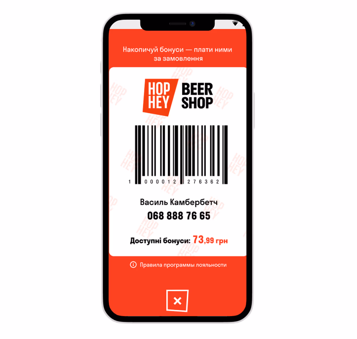
- Implement a loyalty program — 84% of customers prefer brands that do this. Since many people believe that money saved is money earned, the system of accruing bonuses from purchases increases their trust in the brand and motivates them to make repeat purchases.
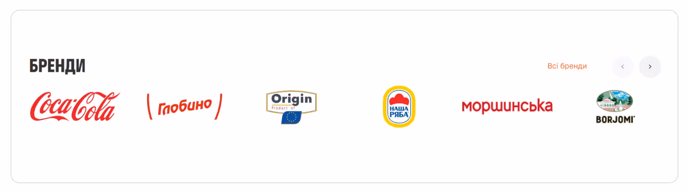
- Demonstrate the company's expertise — add information about the number of physical stores, reputable partners, employees, and its main advantages over other stores.

{{block}}
3. Guide customers to purchase
Help users find and select the right product quickly and without barriers. For grocery web design, it is important to prioritize predictable and understandable interaction over “creative” and “unexpected” elements.
Therefore, we recommend you to:
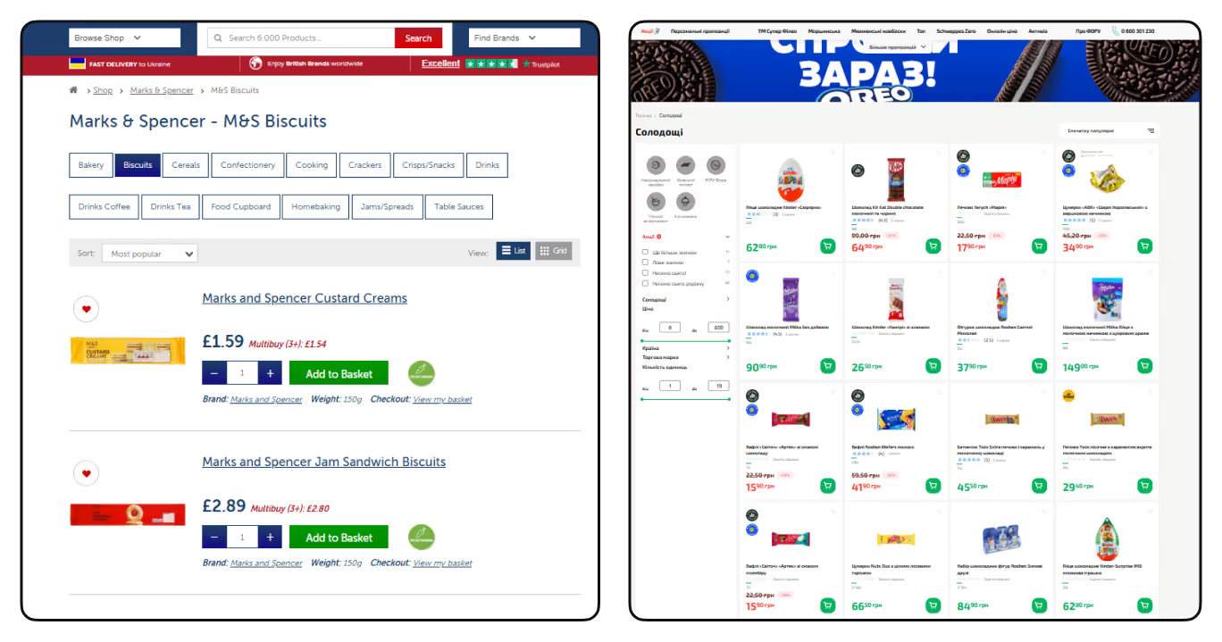
- Follow familiar UX patterns
It’s better to place website elements in places where users expect them to be: shopping cart in the upper right corner, search bar at the top of the page, clearly structured menus, etc.
- minimize visual noise
Let products be the main website’s focus: don't use animations without functional value, be careful with bright elements, and highlight such information as product’s price, weight, and description.
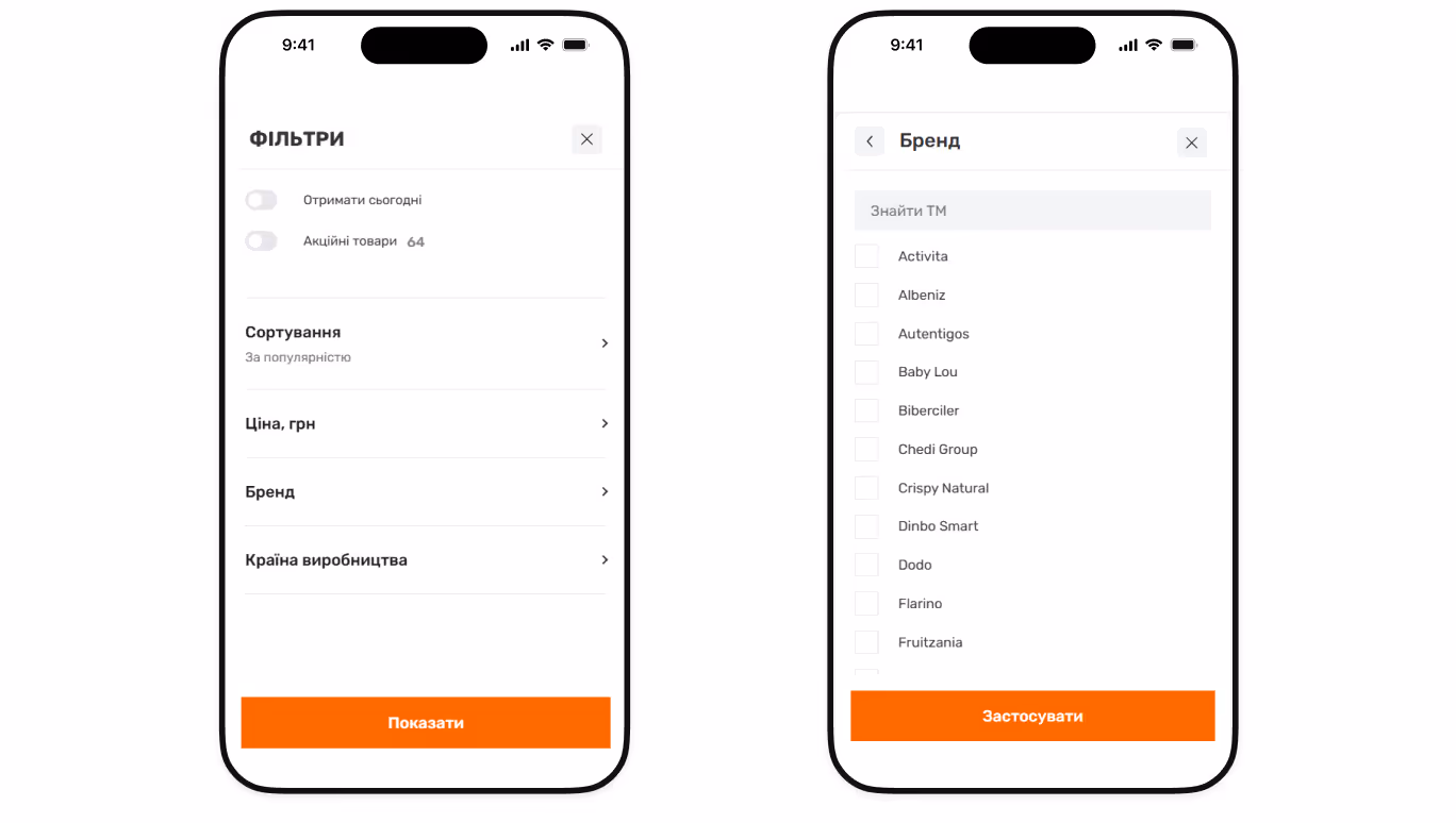
- Work on the product filtering option
By adding a block with filtering options, you will help users avoid getting lost in the variety of products and quickly find relevant ones. Place the most popular filters like product type, price, brand, etc, at the top of the list and hide less important ones under the ‘More filters’ drop-down button.
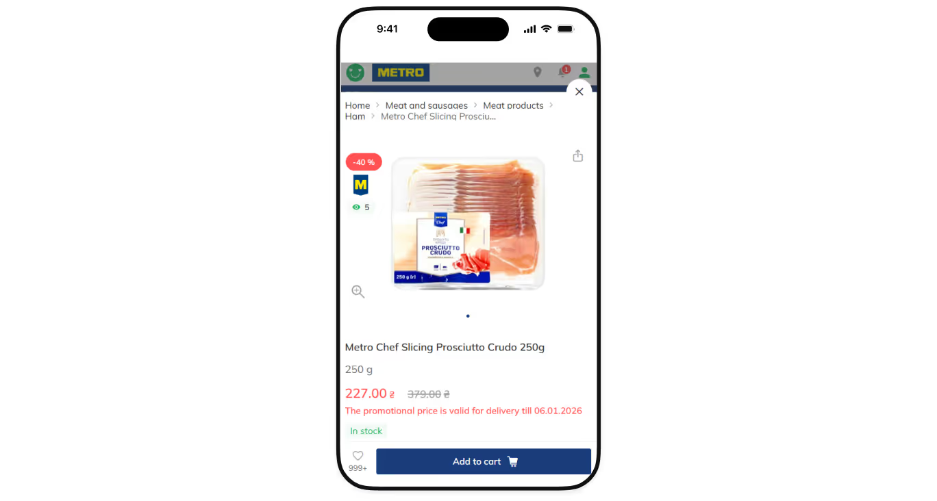
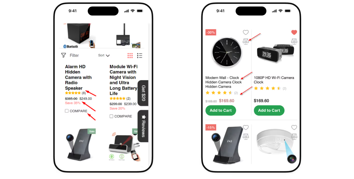
- Implement informative product previews
The fewer actions it takes to complete a purchase from the listing page, the higher the chance the user will actually finish the order. Therefore, it is essential to allow users to add products to the cart, adjust quantities, save items for later, and understand key product details directly from the product previews without the need to navigate the product page.
4. Offer an AI-personalized experience
87% of users worldwide are more loyal to brands that understand their preferences and needs. Luckily, nowadays, there are many AI personalization tools that can help you analyze customer behavior and adjust website content to it by:
- Offering recommendations based on the items customers purchase most frequently;
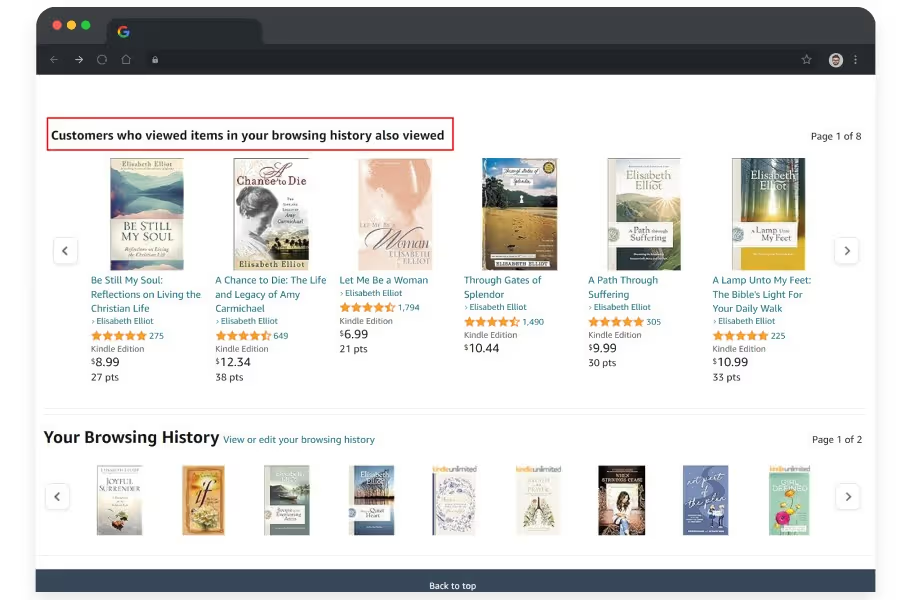
- Adapting product listings and promotions in real time based on browsing history, location, and time of day.
5. Focus on returning customers
Grocery stores should focus on building long-term relationships with their users to foster repeat behavior. To build a successful online grocery, you need to give customers the ability to make repeated purchases faster than leaving for competitors.
This can be achieved by:
- Saving carts and shopping history — 43% of customers abandon shopping carts because they are simply not ready to buy at that point, and want to browse. That’s why saved carts and order history should be accessible with one tap from the account or homepage in case they come back.
- Developing ‘Buy again’ flows for mobile users — returning customers should be able to reorder products with just a few taps. Clearly visible “Buy again” buttons and access to previous orders significantly speed up the shopping process.
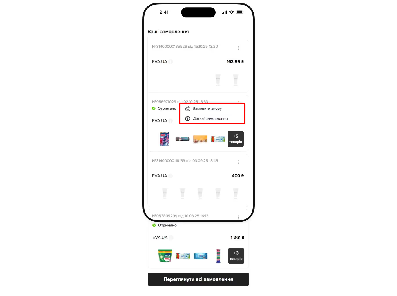
- Enabling autosave for key preferences — automatically save favorite products, delivery addresses, preferred time slots, and payment methods to remove repetitive steps and reduce exit rates.
By implementing these UX solutions, you will make the customers’ lives easier and that’s exactly what they strive for.
{{block}}
Final thoughts or why grocery websites need a UX-first approach?
Grocery web design is not about impressing users once. It’s about making them feel confident, fast, and understood, regardless of whether it's their 25th or 1st website visit.
And since users’ requirements and expectations are constantly evolving over time, your website must also update regularly to keep pace with them.
Therefore, if you want your online grocery store to truly succeed, you need to approach it strategically, from website analytics to the implementation of practical UX/UI solutions.
Remember: in grocery e-commerce, consistency, clarity, and usability aren’t optional — they’re what turn casual visitors into loyal and repeat customers.
FAQ
Question reference
Answer reference


.png)


.png)


.png)
More real-world Turum-burum cases?
Review our vast portfolio of cases in a variety of business fields to make sure of our expertise.
Go to Portfolio
