About the project:
Lenovo is a global technology company, ranked 217th in the Fortune Global 500, with revenues of $62 billion. It has 77,000 employees worldwide who are focused on delivering “smarter technology for everyone.”
Task: Finalize the website so it not only serves a branding purpose but also starts selling.

Website usability audit
We conducted an in-depth UX audit of the site, after which the client received:
- 50 hypotheses in 3 weeks
- A detailed roadmap for site optimization
- Expert supervision over the implementation of the recommendations.

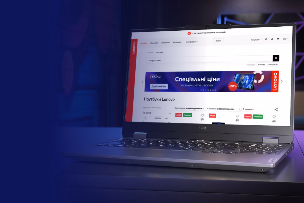
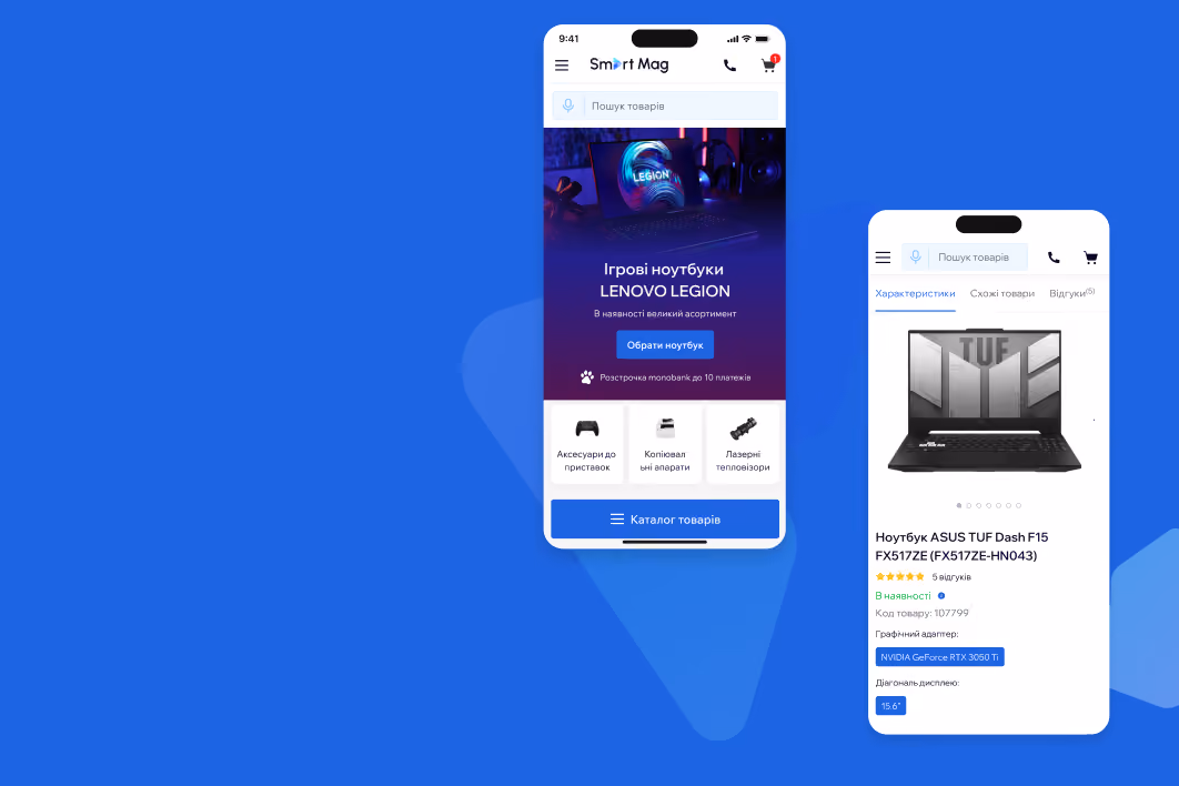
1. Clean and clear Call-to-Actions (CTAs)
Problem: On the product page, users do not notice the “Go to store” button because it does not point to a purchase, but is associated with the transition to the store map. In addition, the button is located only in the page navigation, where it may be overlooked.

Recommendation: Change the text of the button to "Buy", "Go to purchase", "Purchase", etc. and place several such buttons on the page, as it will affect the number of views of the product list on shop.lenovo.ua and the number of purchases.

2. Thoughtful catalog = shorter journey to purchase
Problem: The user can't go directly to a subcategory, product line, or model in the navigation, which makes the user's path to purchase longer and more complicated, reducing the likelihood of a purchase.

Recommendation: Add a drop-down list with subcategories, popular and new models. This will reduce the number of unnecessary steps, simplify product search, and increase the number of click-throughs and purchases.

Problem: The buy button is located at the top of the screen, which is inconvenient for users — they have to reach up with their big finger. It can also be overlooked because it's not commonplace, reducing the conversion rate of adding to a shopping cart.

Recommendation: Fix the buy button and price at the bottom of the screen so that users see and access it quickly. This will increase its visibility, increasing the number of additions to the cart and the total number of purchases.

4. Transparent terms and conditions: facilitate decision-making
Problem: Users don't notice the installment/credit icons, which can lead to purchase abandonment. Not displaying the monthly payment makes it difficult to decide and can reduce conversion.

Recommendation: Display the cost of goods in installments/credits per month. This makes large amounts more affordable, simplifies the selection, and increases the conversion of adding to the cart.


Results
Thanks to the UX audit and the implementation of Turum-burum's interface optimization recommendations, the conversion rate (CR) of Lenovo's website increased fourfold, the bounce rate decreased by 46%, and the exit rate decreased by 34%. We also configured the analytics and tagged events in more detail to give the company an up-to-the-minute picture of its performance.