About project
LAMOUR BEAUTY COMPANY (Lamour.ua) is an importer of professional Italian hair cosmetics. We exclusively represent TM Compagnia del Colore, Organethic, Bubblekid, Alfaparf Milano, and Endoten in Ukraine. The company is also an official supplier of Yellow in the Kyiv, Chernivtsi, Zhytomyr, and Vinnytsia regions.
Task:
Update the existing design of the project in order to improve user interaction with the site, both for the B2B segment and for B2C.

UX audit
The usability analysis process included the following:
- Set up tools and track user behavior using click maps, scroll maps, heat maps, etc.
- Analyze analytical data to generate hypotheses on interface improvement and increase conversion.
- Provide a detailed report with hypotheses and descriptions of problems, accompanied by screenshots and recommendations for best practices.
- Determine the priority of identified problems and propose solutions to address them based on their level of criticality.


ESR stage
After the usability analysis, we developed a plan for gradual improvement of the site, proposing to implement all changes using the ESR methodology: first, to fix the most critical errors, the elimination of which has the highest impact on the efficiency of the website, and then to address the issues of lower priority (and additional owner's requests).
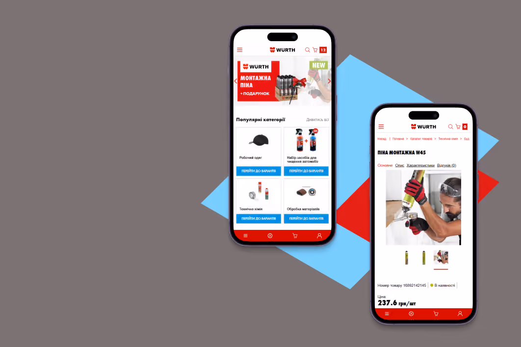
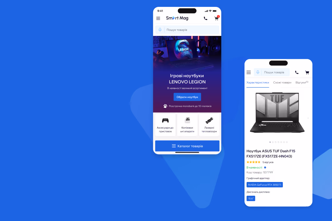
Homepage
- Placed accents and highlighted clickable elements.
- Demonstrated the company's advantages and added more attractive banners adapted to mobile devices.
- Added blocks of top-selling products, promotions, discounts, new products, and brand offers to increase the number of entry points.


Site navigation
- The navigation menu was fixed at the top of the page and is displayed when scrolling up.
- Worked on the hierarchical structure of the catalog.
- Arranged the catalog in horizontal order, structuring subcategories by mutual purpose and type.
- Configured Google Analytics search to better understand if users are using the search function and what they are looking for.
- Made the burger menu icon familiar to the user.

Product page
- Prioritized and structured information.
- Placed the right accents: highlighted the product name, buy button, section headings and descriptions.
- Clarified what the "Pro only" button means.


Results of the 1st sprint
- The bounce rate for the desktop version of the site decreased by 24%.
- The number of products per order increased by +43%.
- The average check increased by 1.7 times.
- User engagement metrics increased by almost +92% for pages per session and +79% of time spent on the site for the desktop version.