About the project
Domino's Pizza is a global fast-food leader in pizza delivery and carryout, operating in over 90 countries with more than 20,000 stores worldwide.
In Ukraine, the brand is the market leader for delivery, boasting 65+ stores across key cities such as Kyiv, Lviv, and Odesa.
Challenge: Most of the users come from mobile, while conversion rates on mobile and desktop are almost identical, meaning a mobile-first redesign was needed to align the digital experience with the brand's operational speed.
Tasks and Goals
- Conduct a UX audit, and based on analytics, Looker Studio data, and heatmaps, provide a new website design.
- Improve the mobile ordering experience without breaking familiar patterns (mobile-first).
- Simplify navigation and shorten the path from “Landing” to “Cart.”
- Make promotions, pricing, and delivery conditions clearer.
- Speed up repeat orders for returning users.
- Optimize the Checkout funnel to reduce bounce and exit rates.
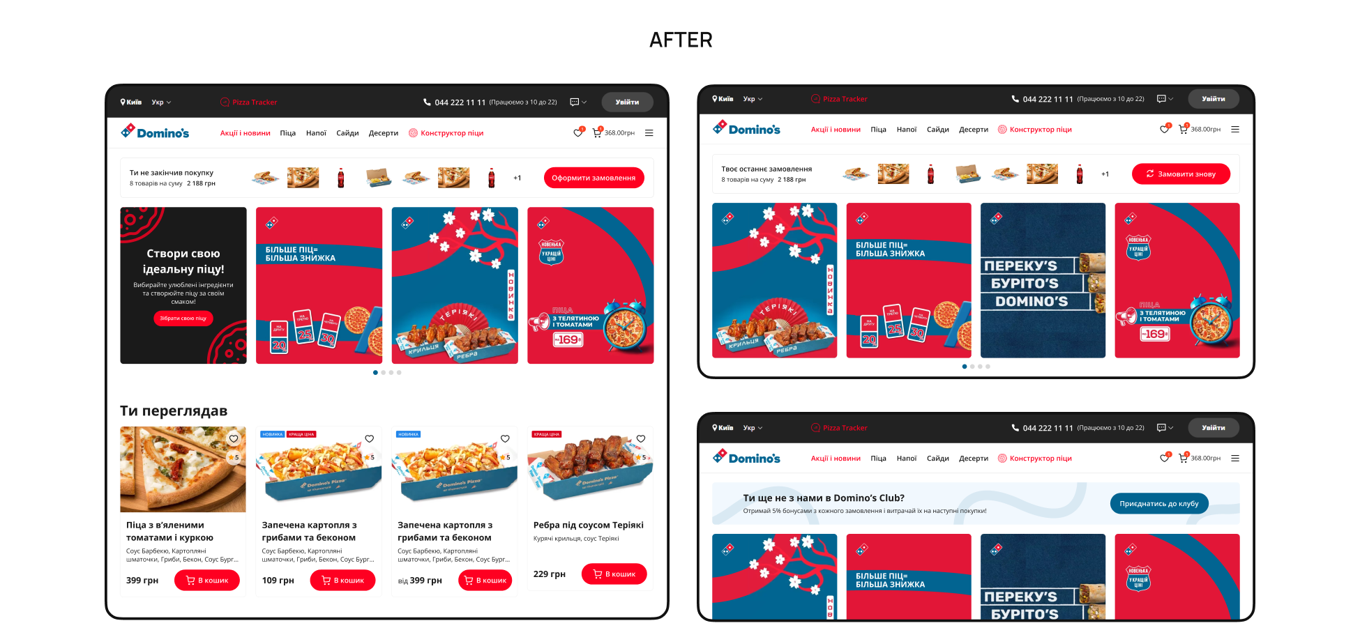
Homepage
Before: Clicking the banners led to text descriptions rather than products, causing a high bounce rate. Additionally, about one-third of returning users started on the homepage but had no quick way to repeat previous orders or resume abandoned carts, forcing them to browse the catalog from scratch.
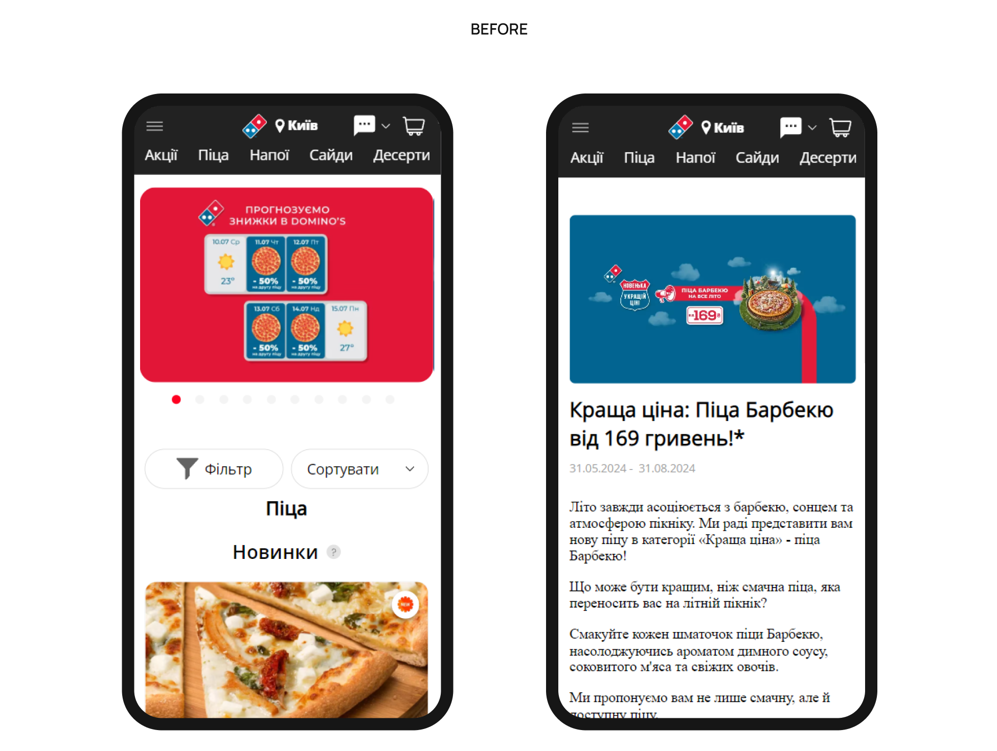
After: Shortened the user journey by linking banners directly to filtered product lists. For authorized users, introduce a “Repeat Order” or abandoned cart block, allowing loyal customers to re-order their favorites or complete the order in one click immediately after landing.
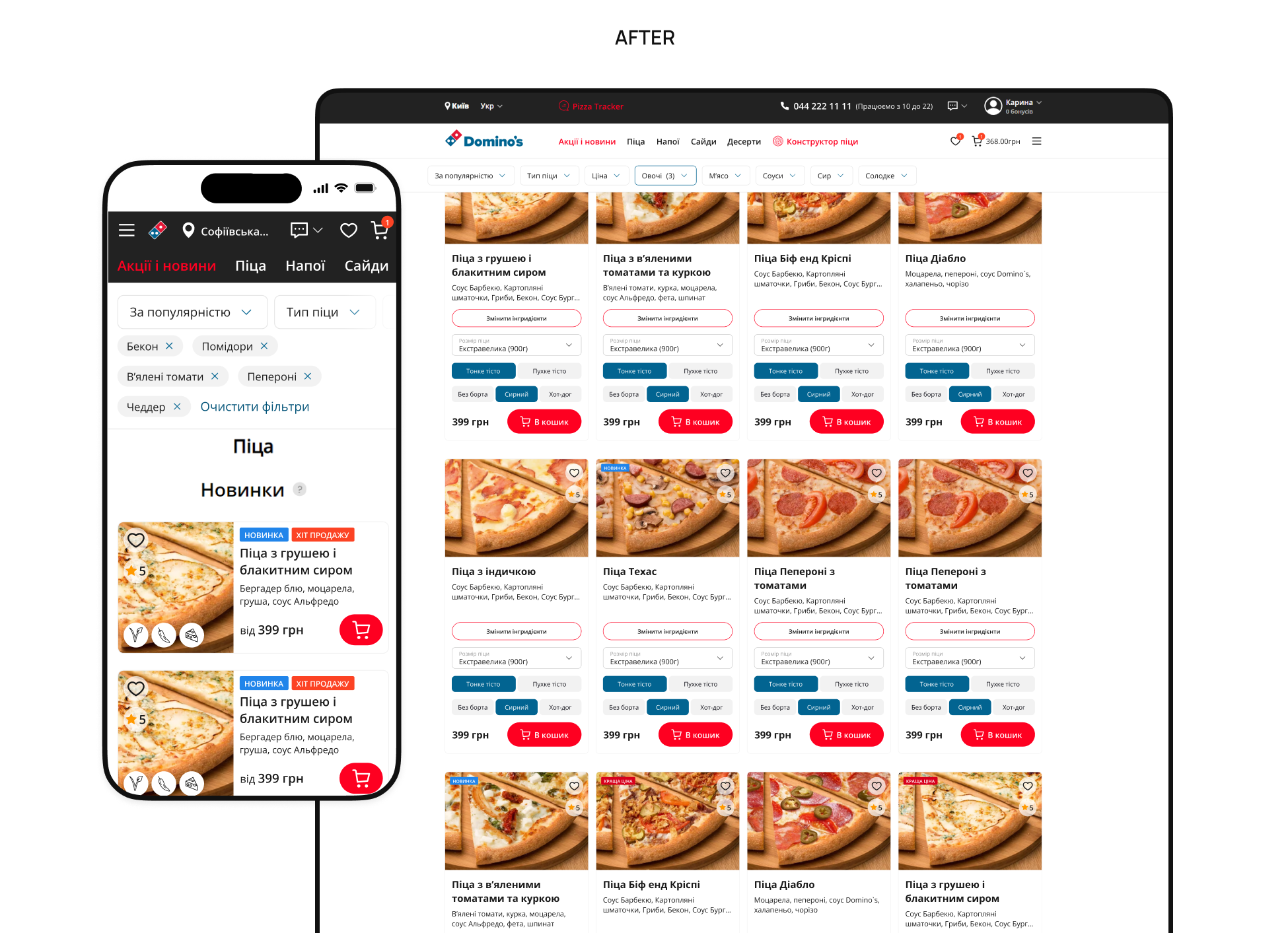
Product Listing Page
Before: UX analysis revealed the need to optimize navigation. Non-fixed filters were lost when scrolling, and large product cards lengthened the page and made comparison difficult; at the same time, users rarely navigated to secondary categories such as “Sides” or “Beverages.”
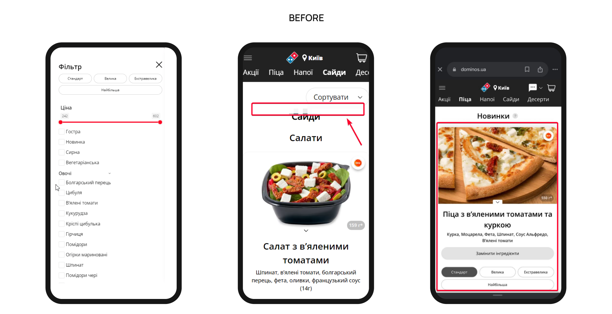
After: We made product cards more compact, keeping key information about ingredients and size. We fixed the filters and added navigation tags for subcategories (e.g., “Salads,” “Sauces”) to make it easier for users to find what they need.
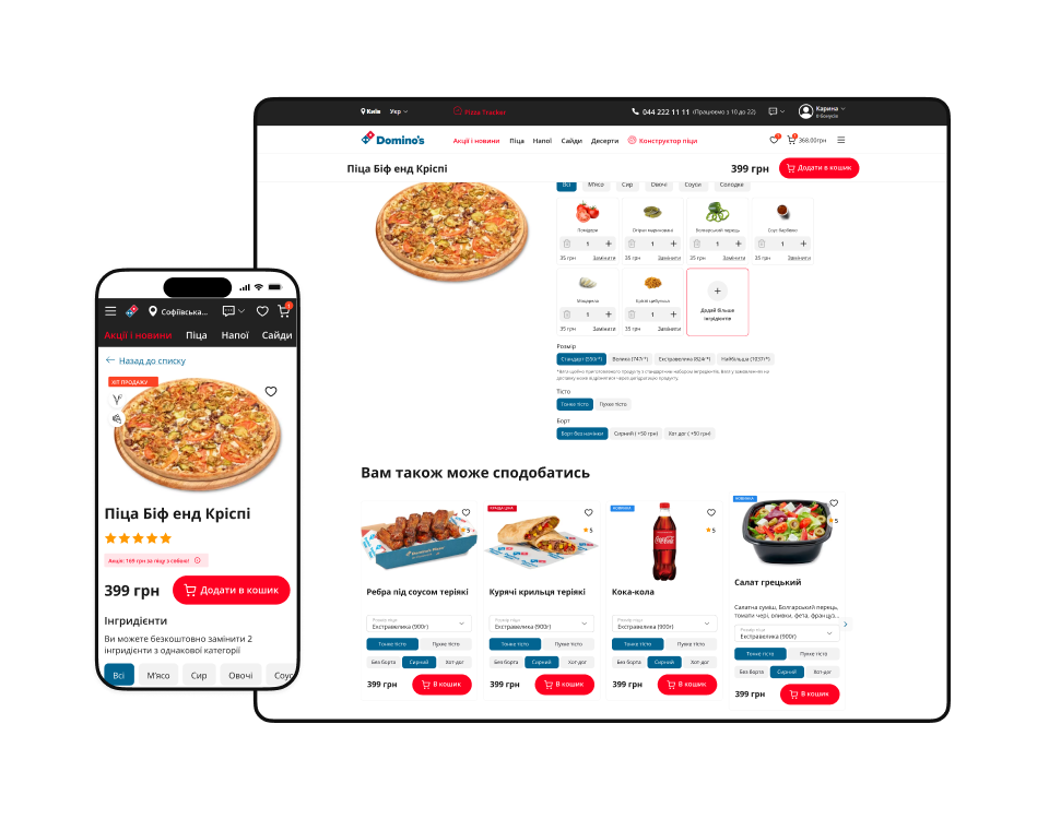
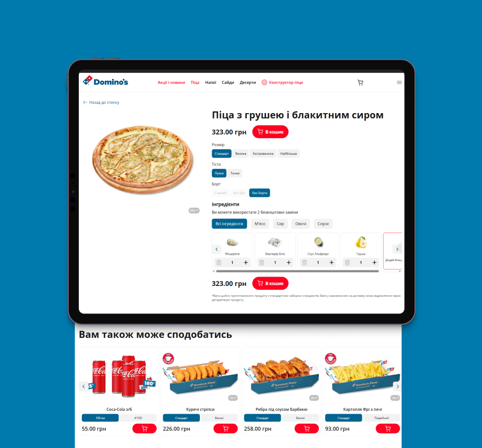
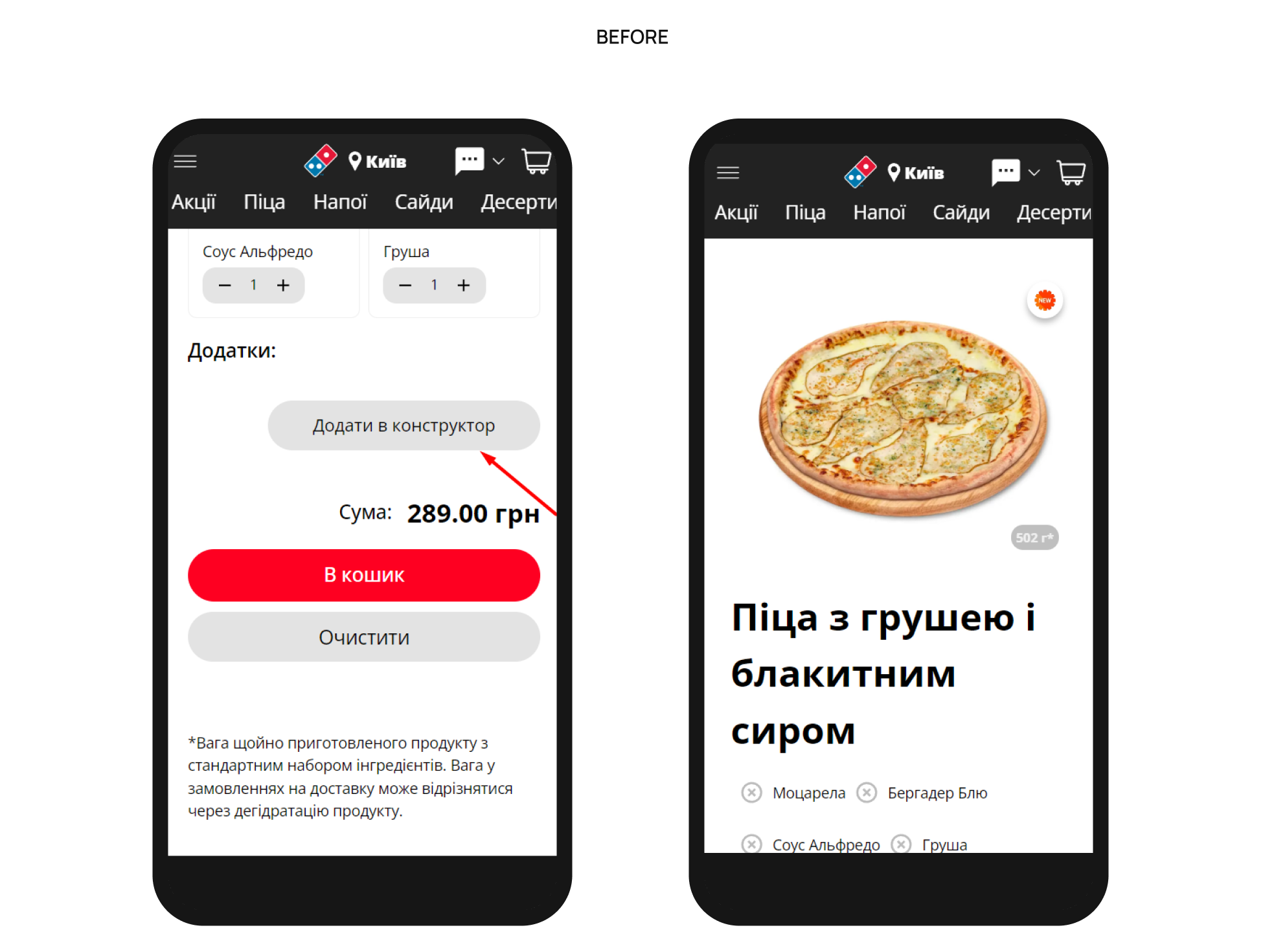
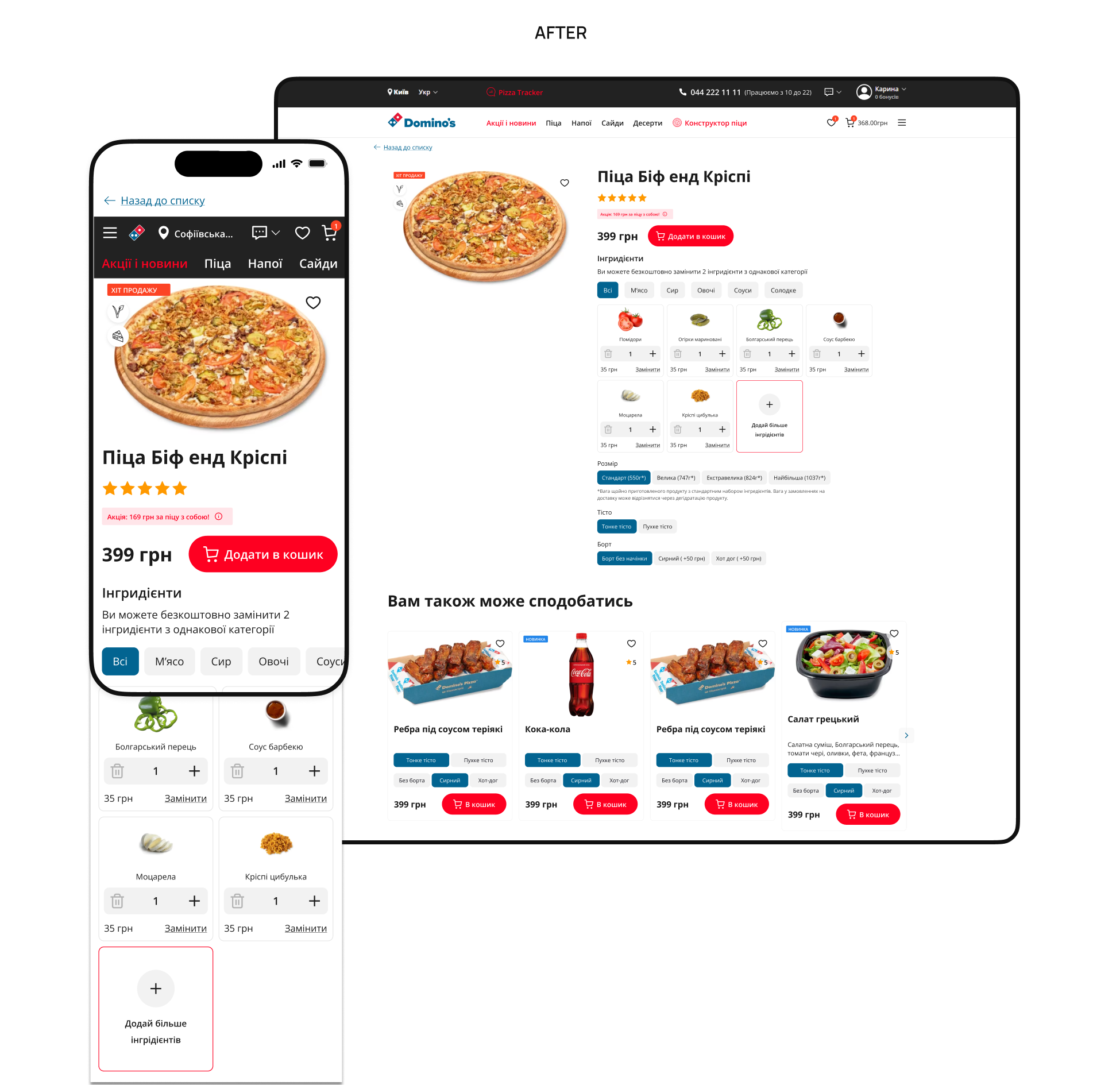
Product Page
Before: Only about a third of users added items to their cart from the product page. The price and the “Add to cart” button were not fixed; the “Pizza Builder” was hidden in the menu; there was no cross-sell block for drinks or sides, and the priority was to remove ingredients rather than add extras.
After: Separated the editing of the ingredients and pizza creation from scratch, and made extras more visible with a clear price. Also fixed the “Add to cart” button and added a cross-sell block for drinks and sides
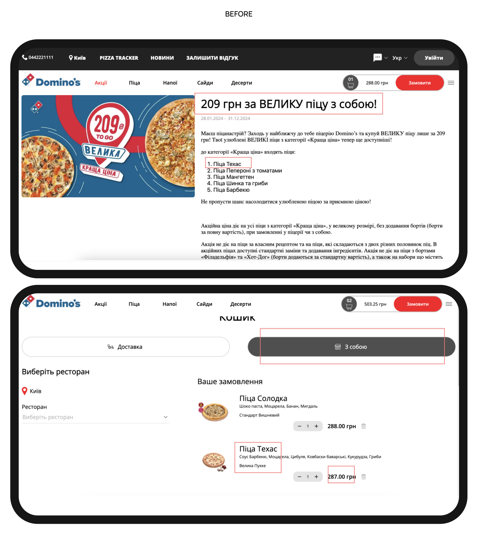
Shopping Cart
Before: The shopping cart and checkout were combined into a single process, so users saw the delivery options before reviewing their order. There was also no section for related products, and the promotion and discount calculations were not transparent enough.
After: Separated the shopping cart into a separate stage for review. We added a dynamic cross-sell block ("Don't forget a drink!") to increase the average check and pre-select the delivery method to display the correct price.
.png)
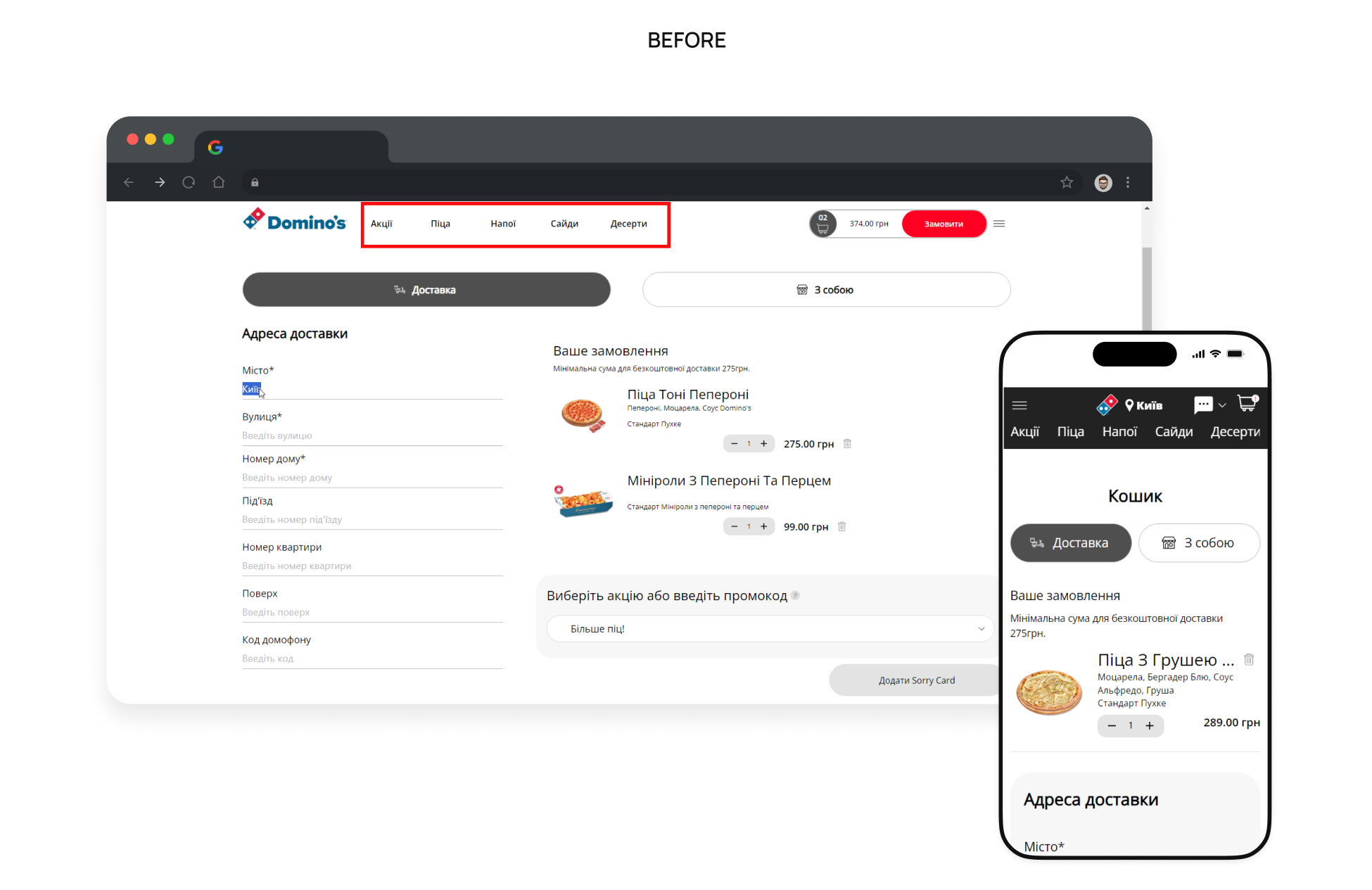
Checkout
Before: There wasn't clear information about delivery time, working hours, or payment methods. Besides, there was a full navigation menu that distracted users and pulled them back into browsing. Validation errors weren’t always obvious, and users couldn't easily spot where they made an error.
After: Optimized the Checkout page by adding clear delivery timing, working hours, and payment info; minimized navigation to reduce distractions; auto-scroll to error fields to help users fix typos quickly.
.png)

Results
CRO efforts, as well as the GA4 audit and configuration, provided Domino's Pizza with a foundation for further optimization of the digital experience. The proposed solutions became the starting point for subsequent UX/UI improvements to the website.
In particular, the following were implemented:
- Mobile-first optimization: simplified interface for the major mobile audience.
- Faster product search: fixed navigation and compact menu cards.
- Increased average check: “Add ingredients” and cross-sell blocks.
- Better customer retention: “Repeat order” and “Abandoned cart” blocks.
- Simpler checkout: shopping cart as a separate step and a clear checkout process.