WÜRTH: About The Project
Würth-Ukraine LLC is a subsidiary of Adolf Würth GmbH & Co. KG (Germany), a global leader in professional tools, installation materials, and technical chemicals.
The company has been operating in Ukraine since 1993, supplying more than 10,000 enterprises across the country with certified European-quality products and a wide range of over 125,000 items.

Tasks
Conduct an in-depth UX audit and identify barriers that prevent users from buying quickly and easily.
During the analysis, analytics showed that:
- 63.8% of visitors come from mobile devices, but the conversion rate there is 1.9 times lower than on desktop.
- Users stop at the catalog or product pages without completing a purchase.
- B2B customers lack features for quick checkout and repeat orders.

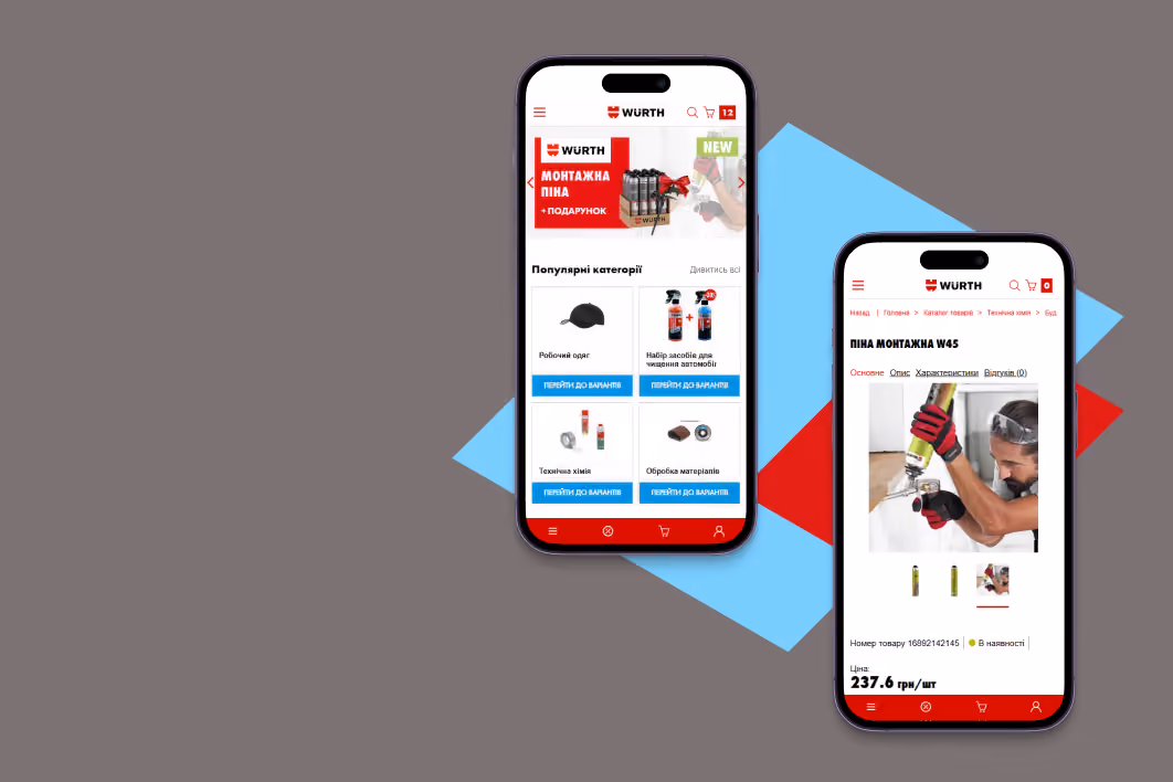
Navigation: from search to action in no time
Problem: Only 45.5% of mobile users reached the product catalog, and 59.4% left the site before viewing the product pages. Some of the reasons were:
- The “Catalog” item was not visually highlighted in the burger menu and on the desktop, so most users had to scroll through the entire list to find the section they needed;
- Categories were displayed only as text without icons, making them difficult to understand.
- The pop-up catalog lacked second- and third-level subcategories, so users opened pages one by one, wasting time.
.png)
Solution: We suggested improvements that could increase the number of transitions to subcategories and product pages by 8-12% and reduce the bounce rate by 15-20%:
- Highlight the “Catalog” in color in the menu to immediately attract attention;
- Add icons or thumbnails for categories to speed up selection;
- Add 2-3 levels of subcategories in the pop-up;
- In the desktop version, make the catalog fixed and visually highlighted so that the user does not lose it while scrolling.
.png)
Homepage: first impressions matter
Problem:
- The banner in the mobile version was too small, the text was difficult to read, and the CTA button was hard to tap. As a result, the CTR was only 0.41% (5 clicks) compared to 11.88% (138 clicks) on desktop, which is more than 27 times higher.
- There was no block for popular categories on either mobile or desktop, so users had to use the burger menu (18.68% of clicks) or search (7.6% of clicks) to find what they wanted, wasting time and attention.
.png)
Solution: To increase the banner's CTR by 10–15% and viewing depth by 5–7%, we recommended:
- Increase the size of the banner in the mobile version;
- Make the text more contrasting and the CTA more noticeable;
- Place popular categories in a separate block on the main page for faster navigation without unnecessary steps.
Problem:
- In the mobile version of the site, the filters were located in an unusual place, and users often did not notice them and spent more time choosing.
- There was no tool for sorting by price, new arrivals, or popularity.
- The “Pre-order” button looked the same as “Buy,” which misled users about delivery times.
.png)
Solution:
To shorten the path to purchase and increase trust, we suggested placing filters at the top of the page, adding sorting by parameters, and making the “Pre-order” button visually distinct.
This was expected to reduce the bounce rate by 10-15%, increase page depth by 15-20%, and increase the number of items added to the cart by 2-4%.

Shopping cart: a simple and confusion-free process
Problem: Users couldn't save or share their shopping cart, making the purchasing process difficult for B2B customers. In addition, three different shopping cart icons led to three different scenarios: no editing, immediate checkout, or simply duplicating the action. This confused users and often prevented them from completing their purchases.
.png)
Solution:
- Add an option to export the shopping cart to PDF or Excel for B2B customers, as well as a “share shopping cart” feature.
- Unify functionality — when clicking on any icon, open a single pop-up window with full control: view, edit, delete items, and a “Place order” button.
.png)
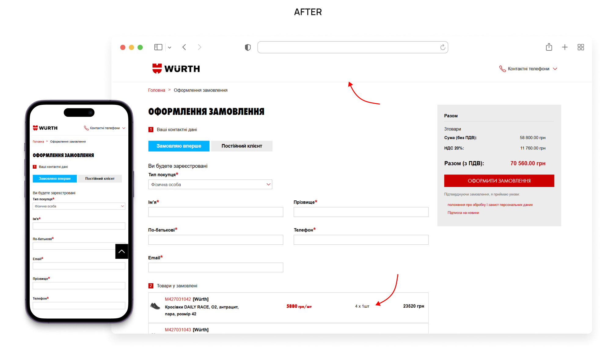
Checkout without hassle
Problem:
- The checkout page retained the full header, bottom navigation, and footer, which distracted users with active elements (catalog, promotions, search). Clicks on these elements often led to users leaving the checkout process, and upon returning, the data they had entered was not saved.
- At the checkout stage, the “delete” and “change quantity” elements attracted too much attention. This prompted users to review or reduce their orders, which lowered the average check.
.png)
Solution:
- Minimize the page design: leave only the logo and feedback button, removing unnecessary navigation and footer.
- Add auto-save to the form so that the user does not lose data when returning.
- Remove the option to delete/change the number of items directly at checkout and replace it with a link to edit the cart via a pop-up.
Problem:
- Breadcrumbs took up a third of the screen, forcing users to scroll to see the photo, price, or “Buy” button.
- The price block was unstructured: the old price, new price, and discount were all listed in a row without the necessary emphasis.
- No block with recommendations or recently viewed items, so users got lost among the options and often didn't purchase.
.png)
Solution:
- Optimize breadcrumbs: collapse or move them to a horizontal scroll to free up space for the main content;
- Structure the price block: old price — smaller and gray, discount — red, new price — contrasting and expressive;
- Add “Related products” and “Recently viewed” blocks so that the user can quickly select a set and return to the selected items.
.png)

Results
After the usability audit, we handed over all the materials to the Würth team to implement the changes on their own, and in just two months, we got results that exceeded expectations:
- +117% total revenue
- +85% CR from desktop
- +36% CR from mobile
- +71% “key events,” such as adding to cart, placing an order, clicks on CTA, etc.
Collaboration and the combination of analytics and UX solutions showed that even minor changes can significantly impact business performance.