About the Project
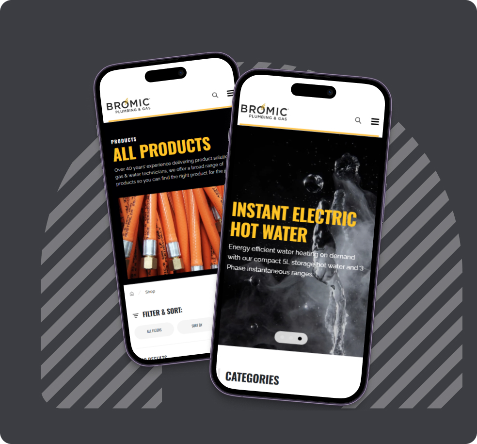
Bromic Plumbing & Gas is a trusted Australian and New Zealand supplier of gas and plumbing solutions with 1,000+ items across multiple categories. Its site serves both users who are researching products and trade professionals who need quick access to technical information and documentation.
In 2024, Turum-burum performed a UX audit based on analytics and behavioral data to find friction points across key user journeys. The client started putting the recommendations in production and here are some of the fixes.

UX Audit Findings
All our recommendations were based on the patterns revealed in the audit and behavioral data:
- Most visitors were new, but they viewed half as many pages, and their sessions were half as long as those of returning users.
- Overall, desktop users were more engaged, but mobile visitors were faster at key actions.
- Product pages were often the end of the line: users landing there rarely kept on browsing.
- One user desire was technical documentation, but getting the right files often required extra steps.
- Navigation wasn't effective enough, especially when moving between products, categories, and subcategories.

Navigation Without Hidden Subcategories
Before: Hovering over lower categories in the mega-menu could push its second-level subcategories off-screen. Seeing them meant moving the cursor into empty space and scrolling back up, an action most users wouldn't think to try. Without it, the subcategories looked like they didn't exist.
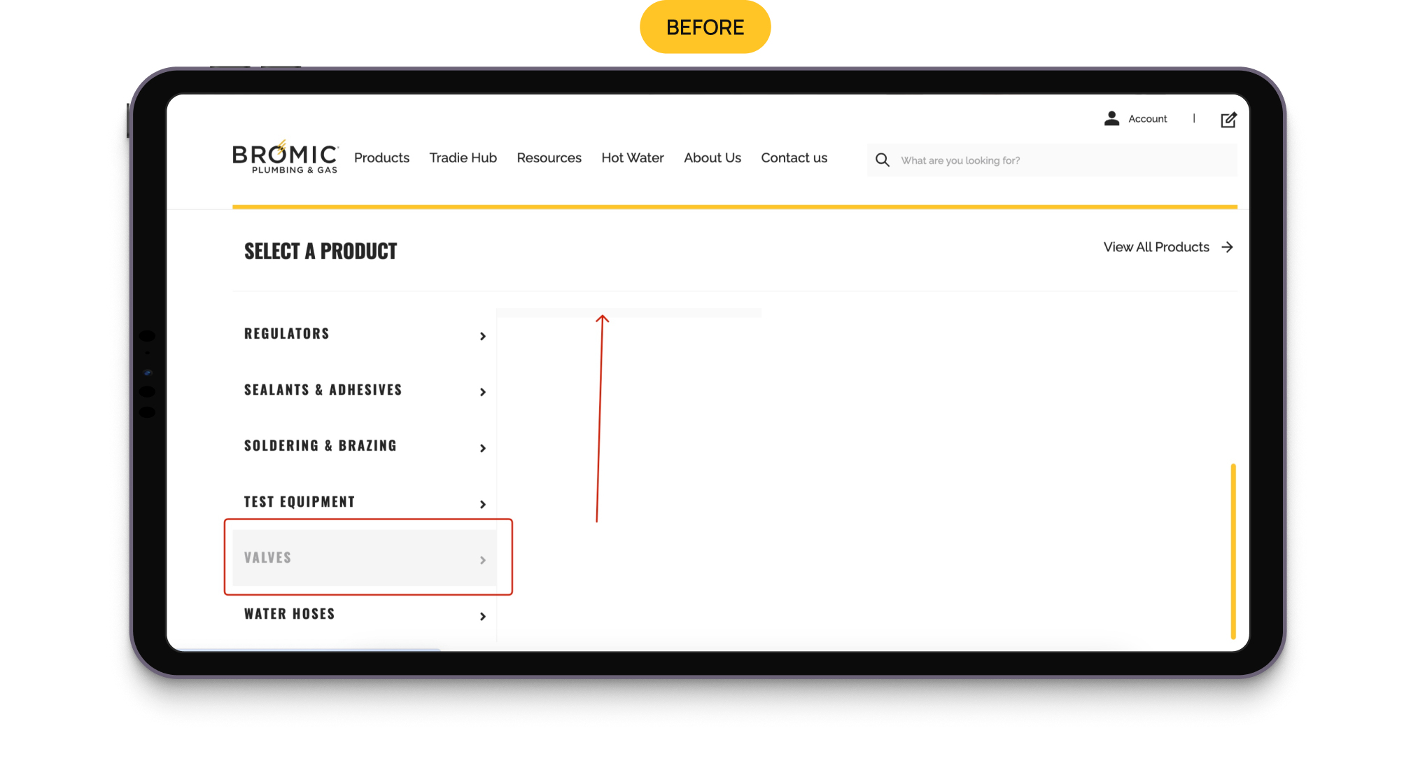
After: The navigation was updated so users can access second-level categories without the extra scrolling step, reducing the risk of users missing available product categories.
Documentation Came Out Earlier
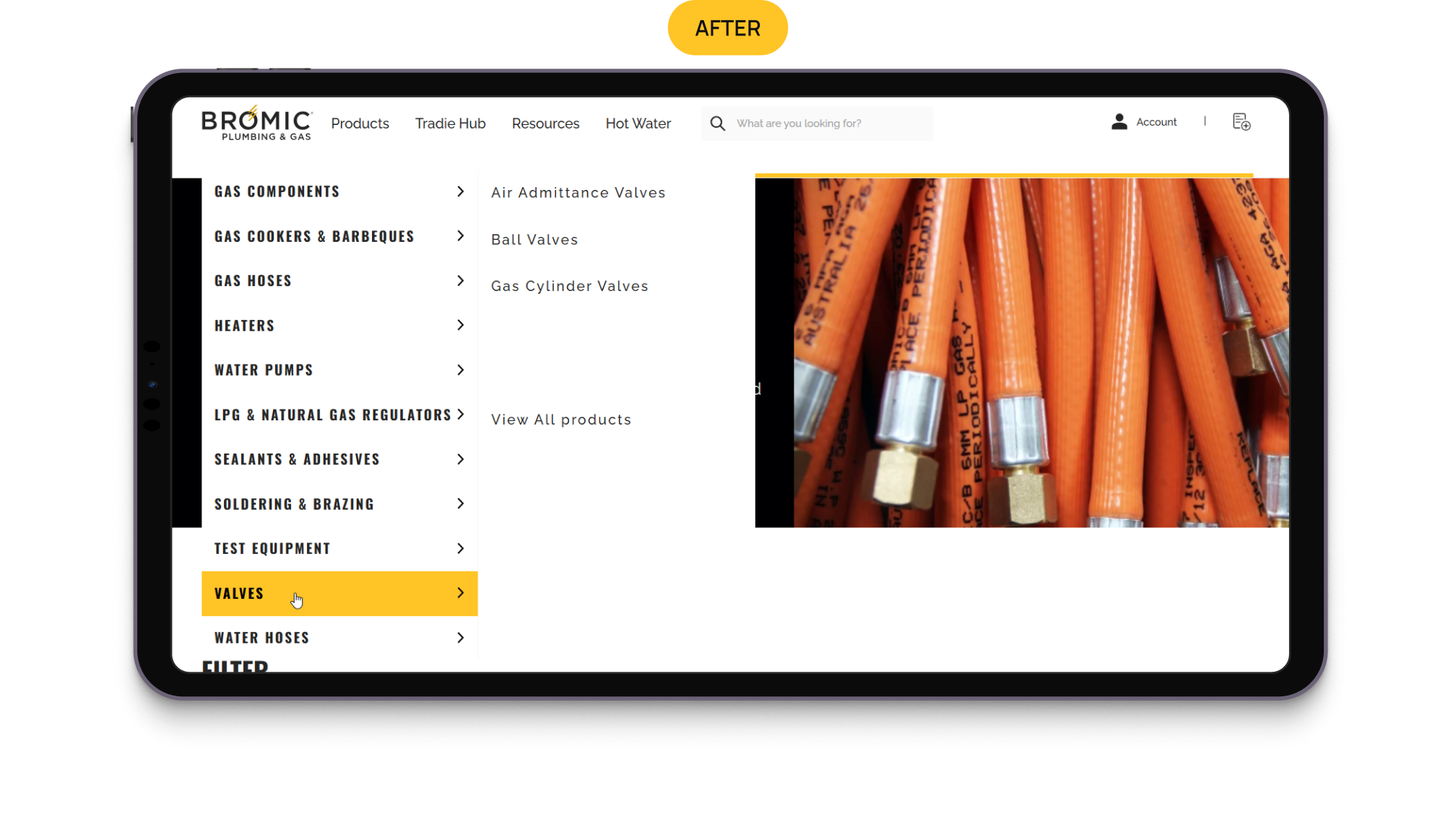
Before: Over half of visitors were looking for instruction manuals, but the product cards on the listing page didn’t indicate whether documentation existed, so users had to open each product to check. From there, downloads were found lower down the page, easily missed, with more than half of visitors leaving before finding them and without going further.
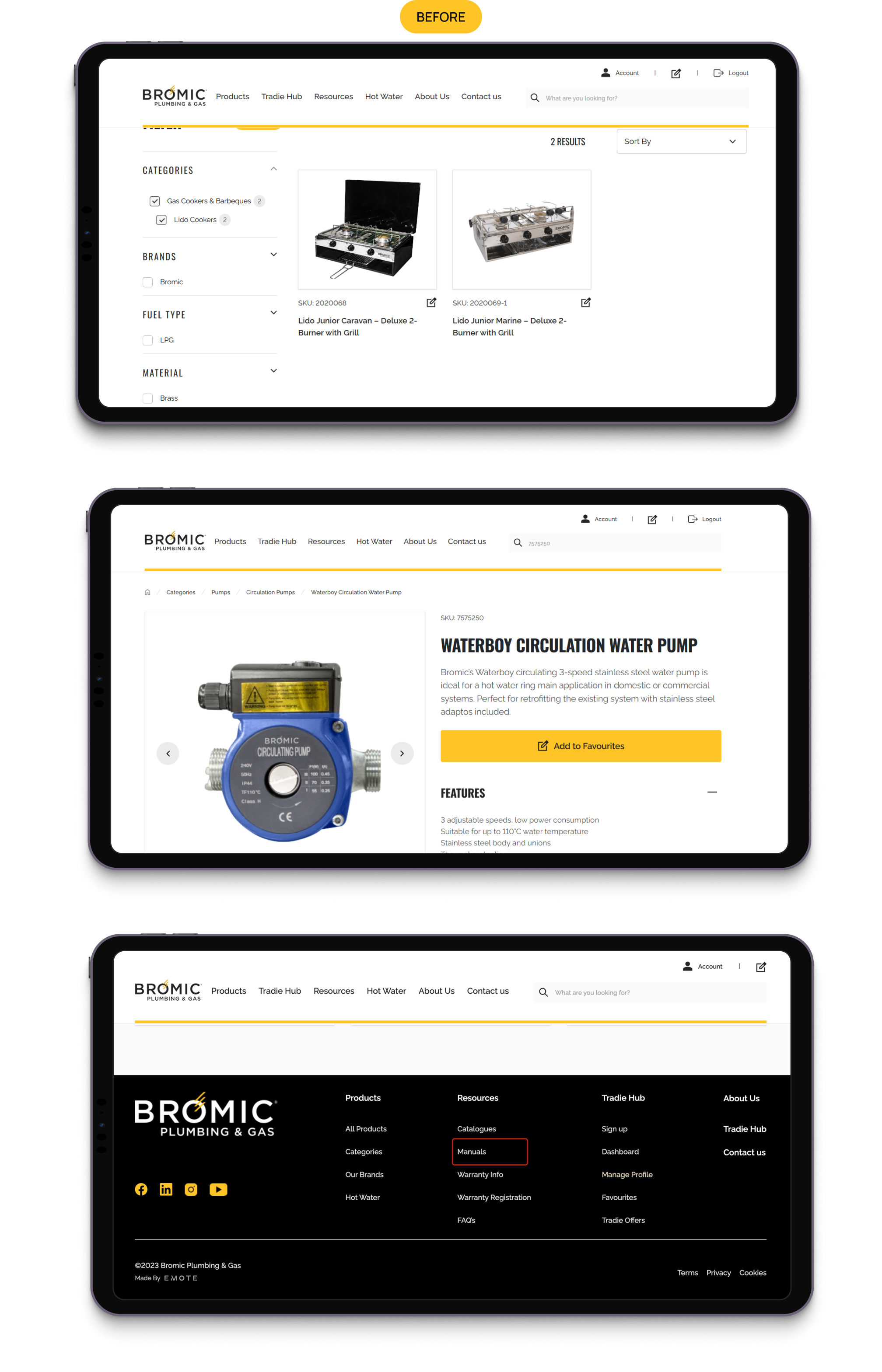
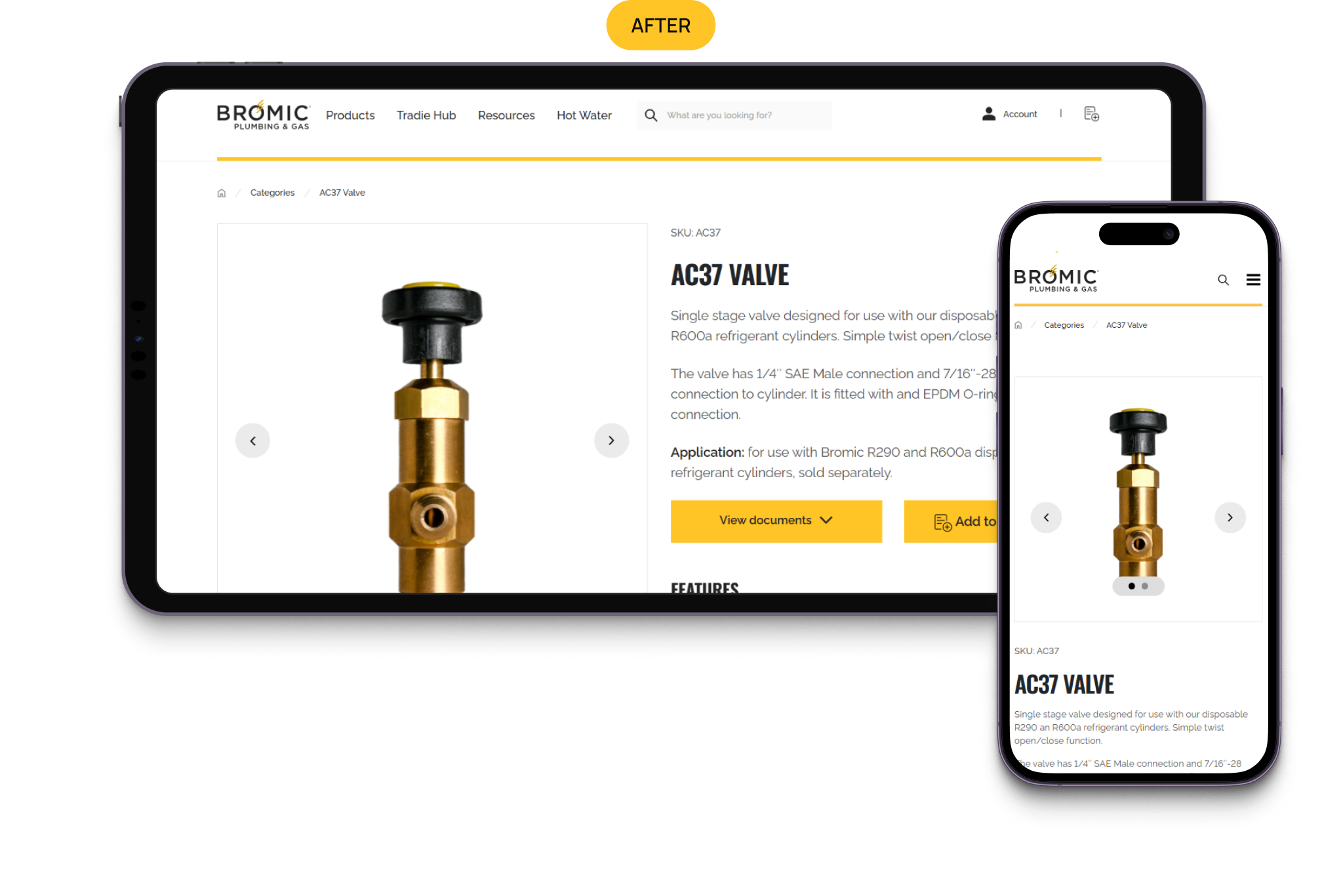
After: Listing cards now have a “View documents” button that links directly to the PDF, reducing the steps to get to documentation. On the product page, there is a “View documents” button right under the title that leads directly to the downloads section.
Related Products, Not Dead Ends
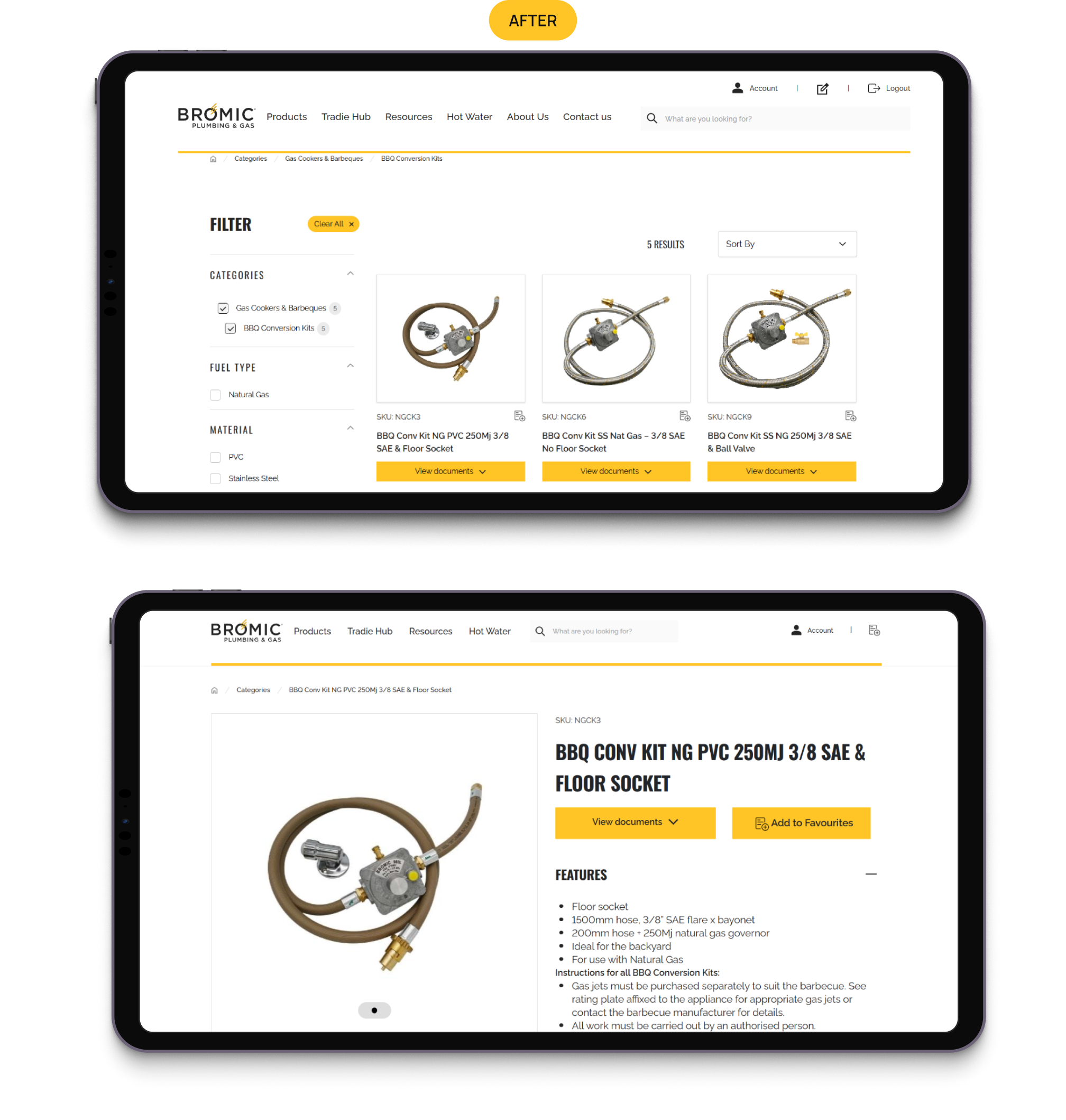
Before: When users landed on a product page, they tended to only look at one or two pages. They looked at the product details, perhaps downloaded some documentation, but usually didn’t go beyond that. If the product was wrong, there was no obvious way to explore other options without starting the search or browse again.

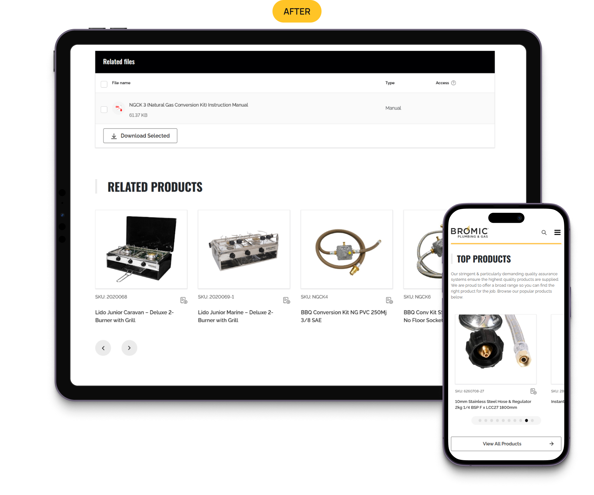
After: A Related Products section now appears on every product page, right below specs and downloads, giving users a next step instead of a dead end.
Smaller Breadcrumbs
Before: Breadcrumbs on the product page showed Home, a general category, and the product itself, with no quick way to jump to the actual category or subcategory list to browse alternatives. Heatmaps showed desktop users actively navigating this way, and the pattern mattered even more for the sizable share of visitors on mobile.
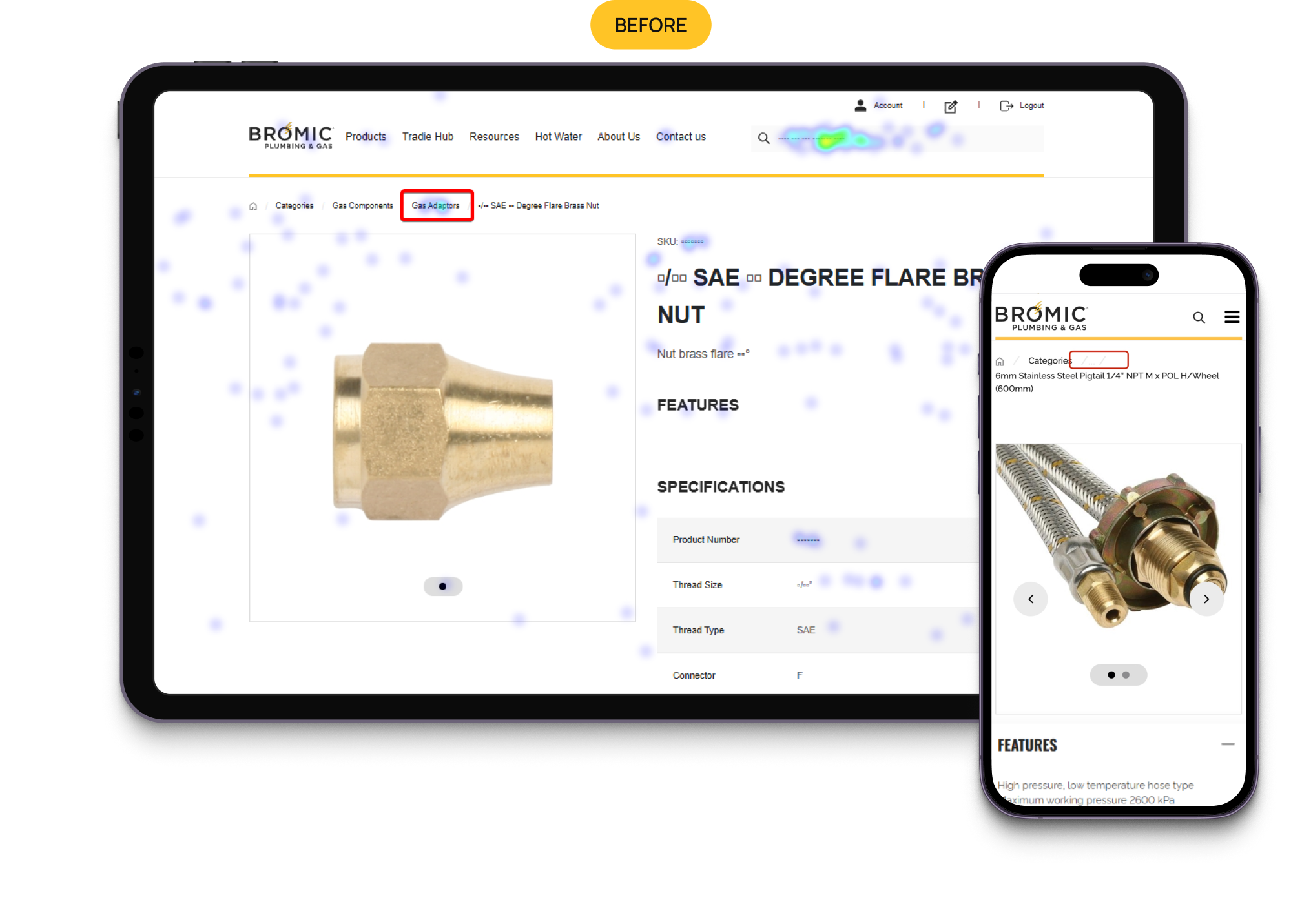
After: The breadcrumb is shorter now: a home icon, a "Categories" link, and the product name.
A Way Back to Login
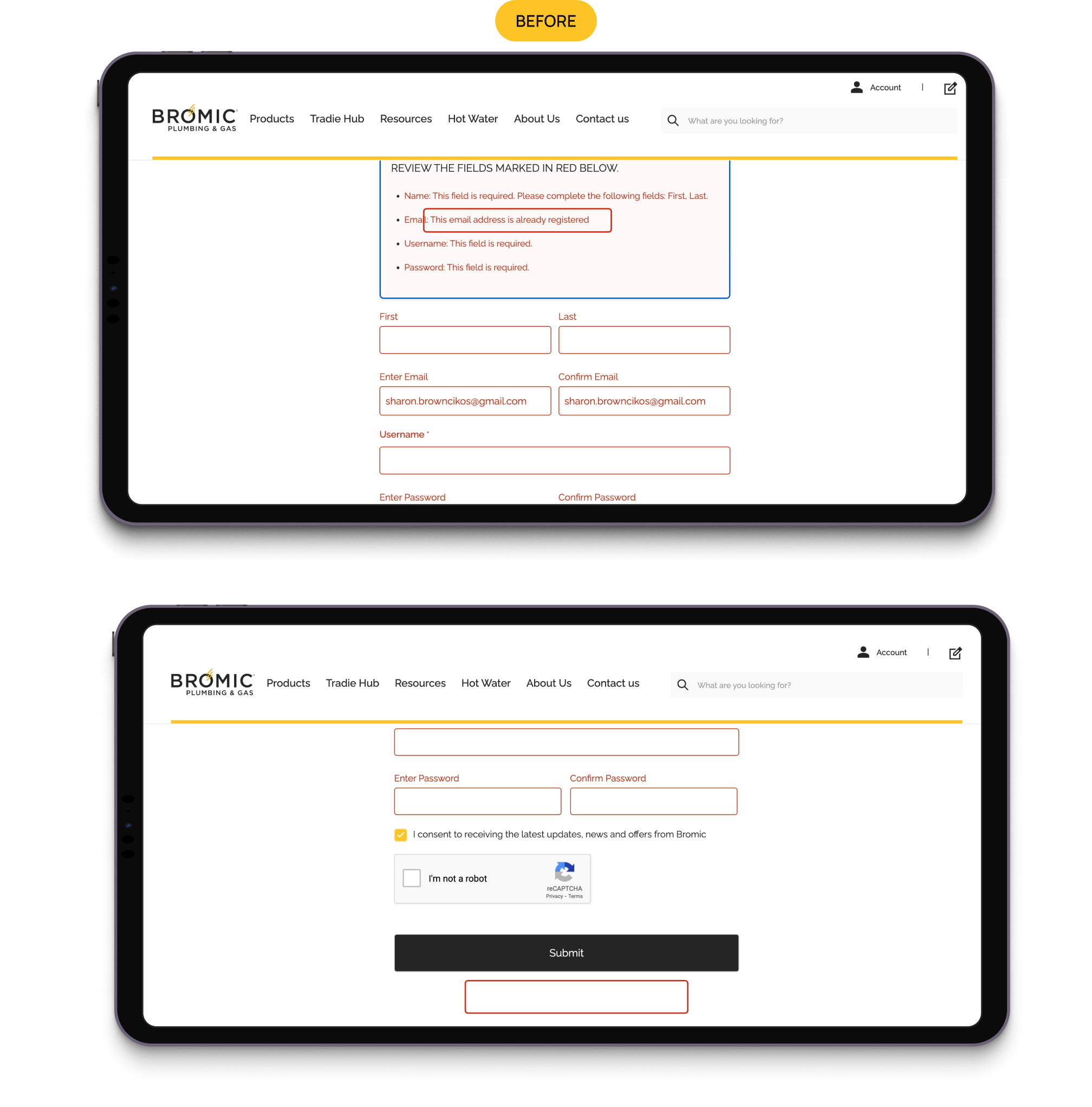
Before: If users attempted to sign up with an email address already associated with an account, they received an error message but no direct link to log in. They had to locate their own login page, or leave.
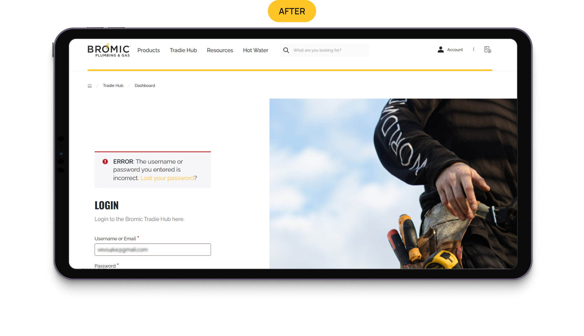
After: The registration flow now provides a direct Login link in this state, allowing returning users to switch from registration to login without searching for the right page.
Results
It’s just a part of the recommendations implemented by Bromic Plumbing & Gas. Yet, even the partial fixes gave the results, including:
- Faster access to product documentation, both on listings and product pages;
- Related Products section on product pages, giving the next step instead of the dead end;
- More direct path back to login after a failed registration without a need for a user to search for the solution by themselves;
- Fixes to subcategory visibility and breadcrumb navigation improved category discovery.