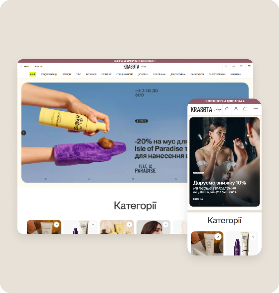
About the project
For 18 years, Krasota Shop has been selling professional skincare and makeup: 300+ brands, a store and a clinic in Kyiv, express delivery across the city in 3–8 hours, and consultations with cosmetologists.
The main challenge: most visitors came from mobile and for the first time, while the website worked best for returning customers. New shoppers got lost in the navigation, didn't see the store's advantages and reached checkout less often.
Tasks
- Find the steps where the store loses new customers.
- Check whether GA4 collects ecommerce events correctly.
- Build a prioritized plan of changes for the home page, catalog, product page, cart and checkout.
- Help shoppers choose products without a consultant.

How we worked
We analyzed GA4, heatmaps and session recordings in Microsoft Clarity, and went through every purchase scenario on mobile and desktop. We found duplicated ecommerce events in GA4 and events that didn't fire when the quantity changed in the cart. The outcome: a plan of 47 hypotheses scored with PIE.
Home page and navigation
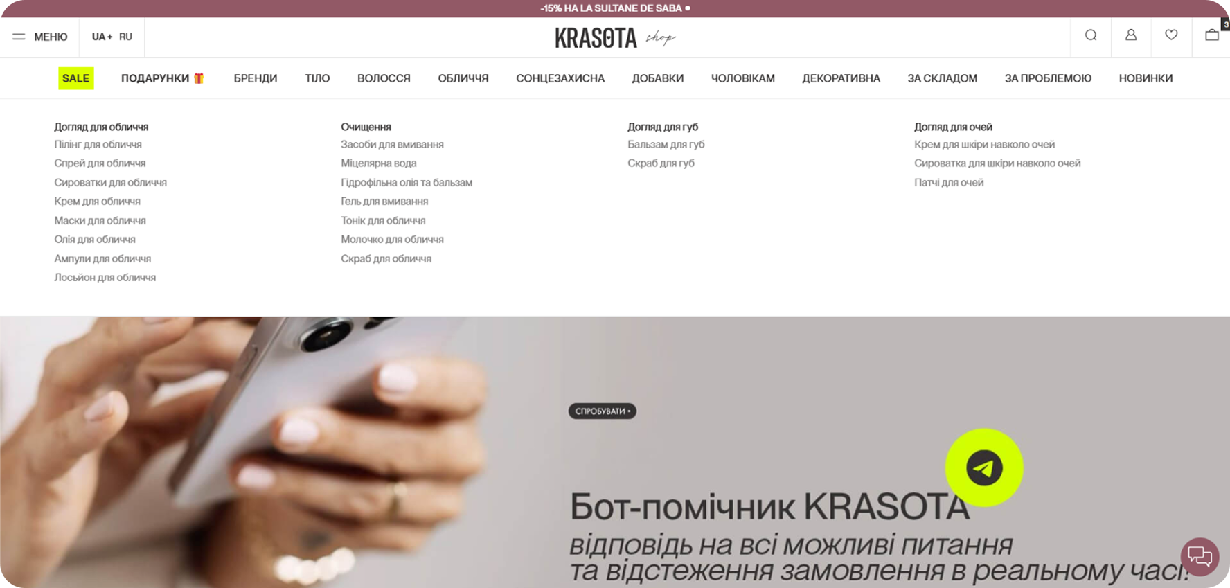
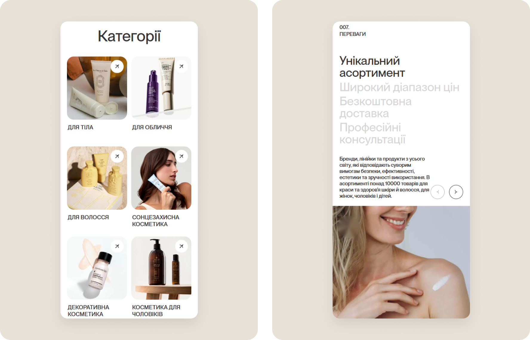
The home page got a "Categories" block with photos for a quick path to the catalog and an "Advantages" block: assortment, prices, free delivery, consultations. Mega-menu subcategories were grouped into compact sets, so the catalog is easier to scan.
Search and catalog
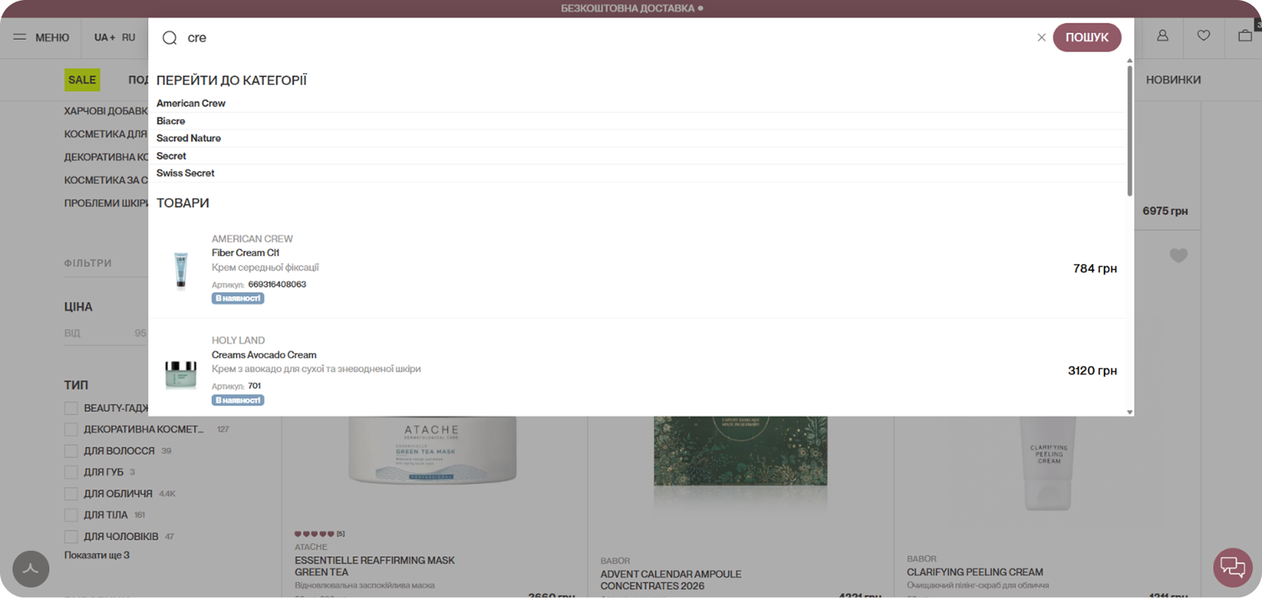
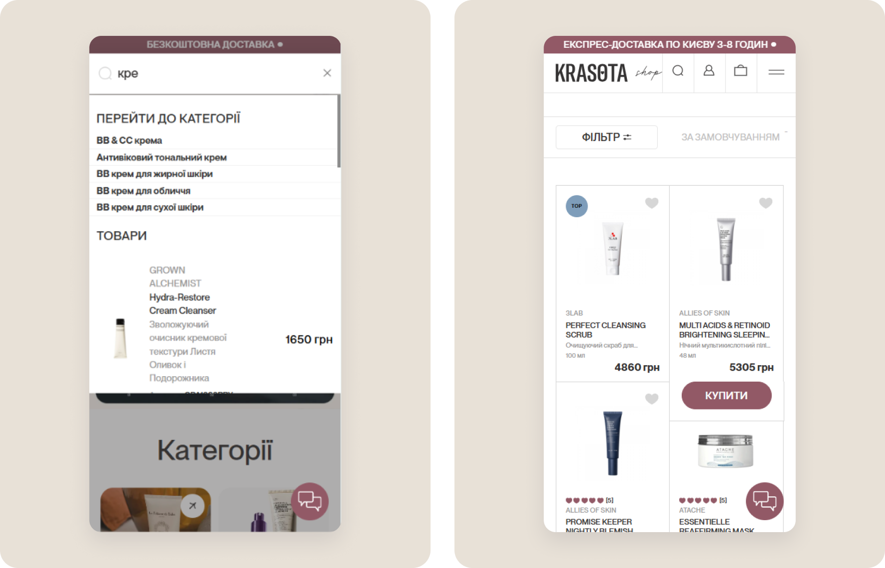
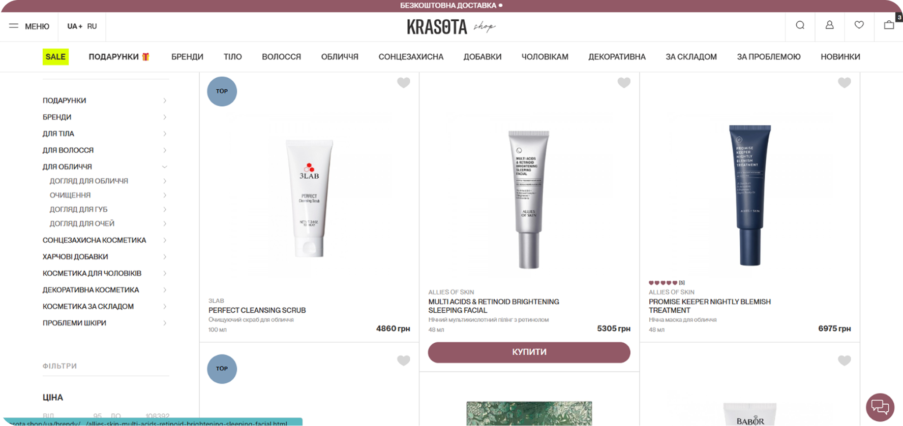
As you type, search suggests categories and products with price and availability. The catalog card shows the product volume and a "Buy" button. At the end of the list, the "Personally for you" block leads to other products if the first ones didn't fit.
Product page
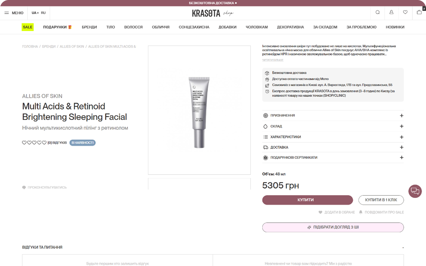
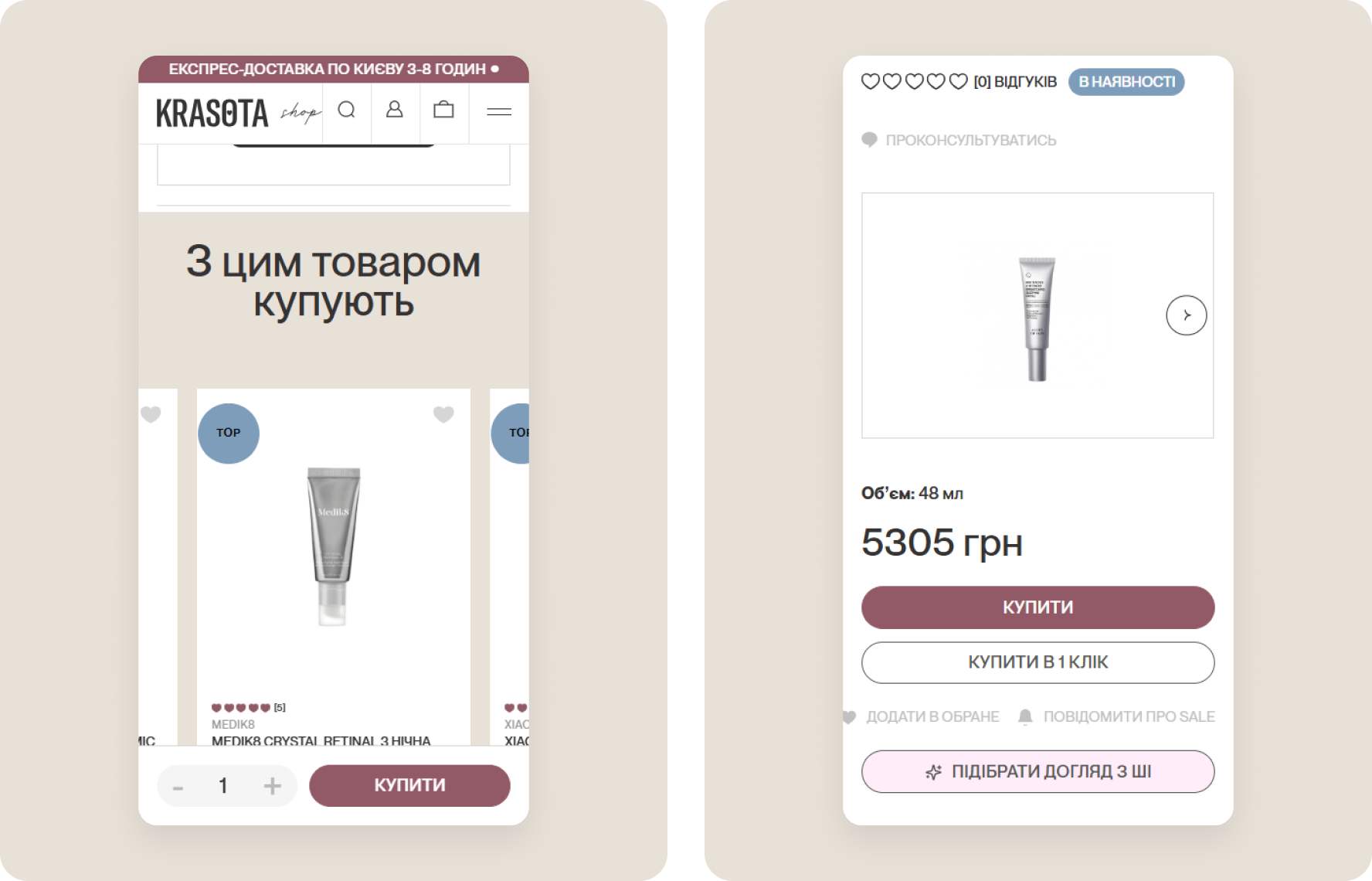
On mobile, a panel with quantity and the "Buy" button stays fixed at the bottom of the screen. The "Pick skincare with AI" button helps shoppers choose without a consultant. Below are the "Frequently bought together" and "Recently viewed" blocks, so shoppers can keep browsing without going back to the catalog.
Cart and checkout
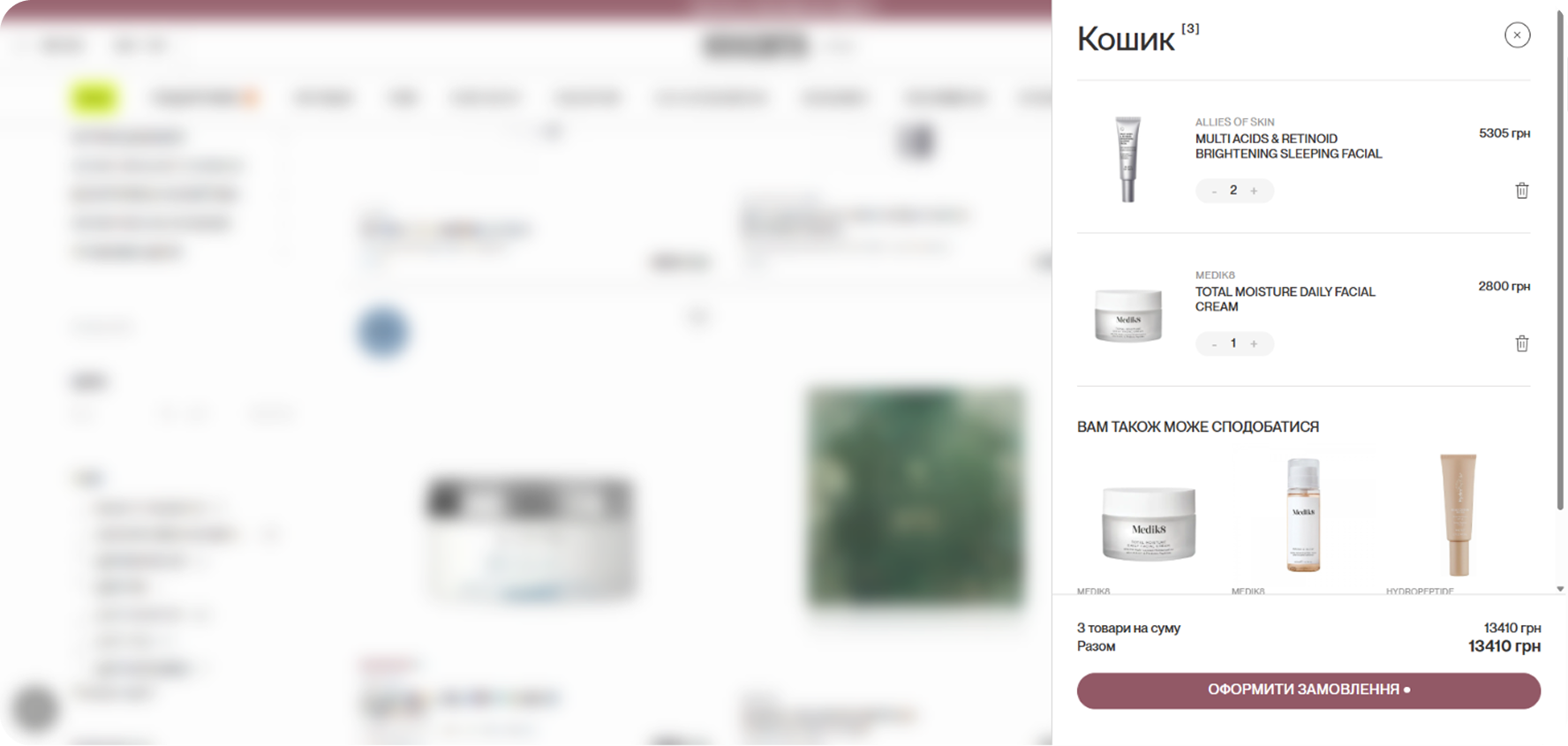
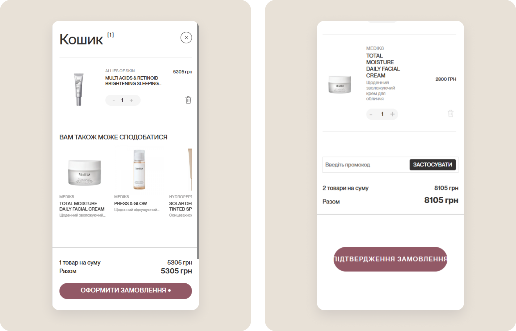
In the cart, products take the main space, recommendations go below, and the summary shows the number of items and the total. In the mobile checkout, the order items, promo code and total sit right before the confirmation button, so there's no need to scroll back to the top.

Results
- Ran a UX audit of the whole funnel and built a prioritized plan of 47 hypotheses.
- Found errors in GA4 ecommerce event tracking, so the store can trust its reports.
- Showed new shoppers the store's advantages and categories right on the home page.
- Made products easier to find: search suggestions, a compact menu, volume and "Buy" in the catalog card.
- Kept the buy button within reach across the whole mobile product page.
- Shortened the path from the cart to order confirmation.