


Website Navigation: How to Guide Users to a Purchase
Users may overlook minor design flaws. But if they can't quickly find the product they're looking for, they'll most likely leave and buy from a competitor instead.
In this article, we'll walk through 20 practical tips to optimize website navigation, shorten the customer journey, and increase your revenue.
Key Takeaways
- Website navigation directly impacts conversion rates and how quickly users can find products. It's part of your website's functionality — not just its design.
- Mobile-first is no longer a recommendation — it's the standard. Most eCommerce traffic now comes from mobile devices.
- Sticky navigation can increase the number of page views by 15-20% while reducing bounce rates by around 15%.
- Good navigation is about minimizing uncertainty — not minimizing clicks.
- A mega menu only works when it's built on a solid information architecture. Categories should be logically grouped, clearly labeled, and fully clickable.
- Search, the product catalog, filters, and recommendations should work as one unified system. AI-powered search enhances this system — it doesn't replace it.
- Breadcrumbs can reduce bounce rates by 10-15% while helping search engines and AI crawlers better understand your catalog structure.
- Navigation decisions should be validated through analytics and testing — not assumptions or off-the-shelf best practices.
Website Navigation: Types and Why They Matter for eCommerce
Well-designed navigation answers users' questions before they even have to ask them: What does this store sell? Where am I? How can I quickly jump to the desired category or product? How do I go back? Where can I find important information? What should I do next?
That's why modern website navigation is much more than just a main menu. It brings together your product catalog, predictive search, filters, sorting, subcategories, breadcrumbs, product recommendations, service pages, the footer, and even AI assistants. Each of these elements serves a different purpose, but they should all work together as one unified system.
Depending on its purpose, website navigation can be:
- Global: available from any page on the website, allowing users to move between its main sections.
- Local: helps users navigate within a specific category or section.
- Contextual: suggests related products, categories, or helpful content.
- Utility: provides access to delivery, payment, contact details, warranty information, and other service pages.
- Language: lets users switch between different language versions of the website.
- Promotional: banners and curated collections that lead users to sales, promotions, or special offers.
In terms of layout, the most frequently used types are the horizontal menu, sidebar (vertical), mega-menu, and multi-level hamburger menu. Any of these can be implemented using text labels, icons, or a combination of both.
But whatever format you choose, the core rule doesn't change: users should focus on choosing a product, not on figuring out how to navigate your website.
20 Tips for Optimizing Website Navigation
How do you make site navigation user-friendly? We have compiled 20 practical tips on optimizing website navigation to make it easier for users to find and purchase relevant products.
1. Think about the structure
Navigation starts with information architecture, not menu design. Before deciding where buttons should go or how categories should look, you first need to understand how users group products and the logic they follow when searching for them.
Build your website structure and data hierarchy so that even first-time visitors can easily find the information or product they're looking for. Don't mix different kinds of entities on the same menu level without a clear system behind it.
Based on what we've seen, 24% of fashion and footwear sites have issues with their navigation hierarchy.
.png)
Screen 1. The navigation menu mixes a lot of categories together: some read like special collections (NEW, CRUISE, EVENTS), others like standard product sections. This creates information overload. Arrows next to the labels point to nested items, but their design isn't obvious.The list is also too long, forcing users to scroll to find what they need, making navigation more difficult and frustrating.
Screen 2. The pop-up menu opens in a compact view (not full-screen) with no nesting at all. Instead, it presents a flat list with no clear hierarchy. Users have to scan the entire list to find the section they need, which doesn't scale well for a large catalog.
Screen 3. The navigation shows three category levels at once ("Him," "All Clothing," subcategories), creating visual clutter. A three-column layout like this is too heavy for a mobile screen, breaks the flow of the interaction, and makes choosing harder.
Don't force the path to a product into three clicks at any cost. That rule stopped being universal a long time ago. In 80% of cases users need up to 15 clicks to complete their task.
More importantly, users are willing to make more clicks if they understand where they are and what happens next. Frustration doesn't come from the number of clicks but from struggling to find the right product or information.
.webp)
- Clear positioning: the page title (say, "Women's Clothing" or "Dresses") clearly shows where users are within the website structure.
- Visual cues: each subcategory (like "Pants" or "Women's Leggings") is accompanied by an icon or image. This makes navigation easier to scan and helps users find what they need faster without relying on text alone.
- Well-organized structure: subcategories are displayed as a simple, easy-to-read list. Each item naturally leads to the next level, following a familiar mobile navigation pattern.
- A "Back" function: the Back button ("<") lets users quickly return to the previous menu level without reloading the page.
Based on our experience, optimizing your website structure can increase conversion rates by 10-15%, as users can navigate the site more efficiently and reach their goals faster.
2. Place Key Navigation Elements Where Users Expect Them
Don't move your main navigation elements (the store menu, catalog, cart, and so on) away from where users expect them. Keep them in predictable spots so people can find them fast.
The store menu, for instance, is usually placed on the left side of the header or just below it, with a visual accent to draw attention, while the cart and account icon go in the top-right corner.
We've also found that 30-40% of pageviews land on product listing pages, which makes fast access to the catalog critical. On mobile, the most effective approach is to include the full product catalog inside the hamburger menu while also adding a dedicated “Catalog” button to the homepage for faster access.
On desktop, keep the main navigation visible by making it sticky or revealing it when users scroll up. This allows shoppers to jump to other sections without having to scroll back to the top of the page.


Use familiar, descriptive labels for navigation elements so users immediately understand what will happen when they click. Avoid overly long labels or abstract wording — navigation should be clear, concise, and informative.
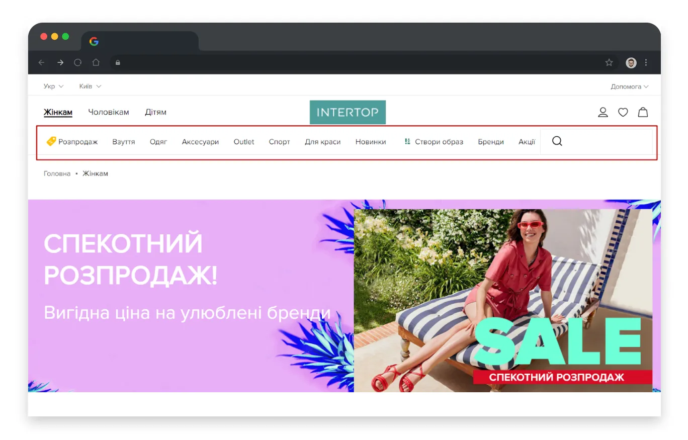
3. Optimize Navigation Around User Search Queries
Users should be able to find products using the words they naturally search for. That's why your website search needs to support different languages, spelling variations, and relevant product categories.
For example, if someone searches for the toy "Hot Wheels," they should also be able to find it by searching a transliterated version of the name. Offer autocomplete suggestions and correct misspellings whenever possible. This makes finding the right product faster and easier.

An SEO smart filter module can help generate product listings based on popular search queries. It allows you to create custom landing pages with unique titles and content that match what users search for in Google.

This approach creates new opportunities to rank for long-tail search queries, drive additional organic traffic, and make better use of your marketing budget.
It's also worth implementing modern technologies such as AI-powered search and AI assistants. These tools can understand user intent, evaluate multiple parameters simultaneously, and recommend the most relevant categories or product collections.
However, AI doesn't replace traditional search — it enhances it. To make AI truly effective, you still need a well-structured information architecture, complete product attributes, detailed descriptions, and accurate specifications. AI should shorten the customer journey, not simply exist as another feature on your website.
So modern on-site search should:
- Correct spelling mistakes and typos;
- Understand synonyms and natural language, not just exact matches;
- Find products by description, not only by name;
- Offer AI-powered suggestions when search results are too broad or too limited.
4. Prioritize Usability in Responsive Design
Responsive design is no longer optional but a fundamental part of modern web design. It ensures a seamless user experience across every device, from desktops to smartphones.
When designing a responsive website, navigation should remain intuitive and easy to use regardless of screen size. High-quality responsive navigation includes:
- Compact menus. Use collapsible or expandable menus that save screen space while still providing access to every section of the website.
- Familiar, easy-to-recognize icons. Choose standard navigation icons that users instantly understand, making it easier to move around your website.
- A clear hierarchy. Organize navigation into logical groups and subgroups so users can quickly understand even complex website structures.
- A focused menu. Keep the mobile menu concise by removing secondary or less important sections. Smaller screens require stronger prioritization.
- Enough spacing between interactive elements. Make sure buttons and links are large enough and spaced far enough apart to prevent accidental taps.
The average fingertip is about 1.6-2 cm wide, and a thumb's contact area is roughly 2.5 cm. That's why research shows the minimum physical size for a touch target should be 1 cm × 1 cm.
- Sticky navigation. Keep the main menu fixed at the top or bottom of the screen, or make it appear when users scroll upward. This allows users to quickly access key sections of the website, even when they're near the bottom of a page, making mobile navigation significantly more convenient.
{{block}}
5. Design Navigation With Your Business Scaling In Mind
As your business grows, so does your product catalog, the amount of data, and the complexity of your website. That's why it's important to design navigation that can evolve with your business, allowing you to add new categories and sections without compromising usability or visual consistency.
.webp)
For mobile devices, collapsible and expandable menus are equally important. They take up minimal screen space while still providing quick access to the entire catalog.
.webp)
On SmartMag's mobile website:
- The primary navigation opens as a slide-out panel with the main product categories and recognizable icons, such as Smartphones & Accessories, Headphones & Audio, and Kids' Products. This helps users quickly understand the catalog structure.
- Selecting a main category opens the second navigation level. For example, under Headphones & Audio, users can browse both general subcategories (such as Headphones and Audio Equipment) and brand-specific collections (including Marshall, Apple, Razer, and more).
- The interface includes thoughtful navigation elements, such as an All Categories button for returning to the previous level and a close icon for exiting the menu. The interaction feels smooth and allows users to explore the catalog without losing context.
This approach keeps the logical hierarchy intact while still feeling intuitive, even to a first-time visitor.
6. Make Navigation Load Fast
70% of consumers say page load speed affects whether they'll buy from a brand. That's especially worth remembering when designing for mobile.
So keep unnecessary scripts and plugins to a minimum, and avoid oversized images and heavy media files. Compress and optimize images with tools like Adobe Photoshop or online optimization services. You should also consider implementing lazy loading, so images and other media are loaded only when users scroll to them.
7. Experiment, But Without Sacrificing Usability
You don't have to limit yourself to conventional navigation patterns. Thoughtful experimentation can make browsing more intuitive and enjoyable.
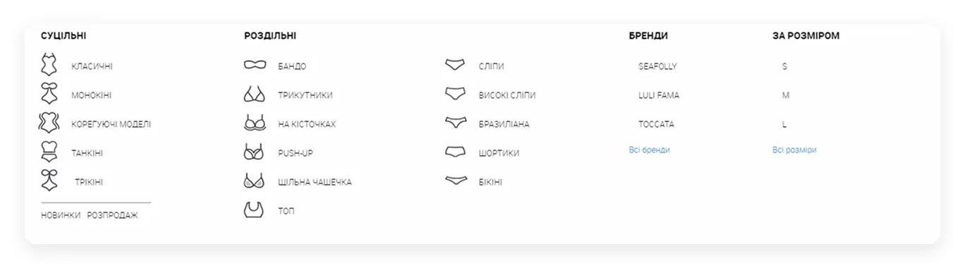
For example, when designing the Juliette lingerie store, we introduced custom illustrated category icons along with filters for sizes and brands.
This visual approach made product discovery faster and easier, even for shoppers unfamiliar with fashion terminology or current trends. That said, creativity should always support usability. Navigation that is too unconventional can confuse users and make it harder for them to find what they're looking for.
.webp)
8. Prioritize Your Accents and Highlight the Main CTA
Highlight only one primary action at a time to avoid overwhelming users with competing choices.
Create a clear hierarchy of actions and make the most important CTA stand out visually. This helps users understand what to do next and move through the buying journey with confidence.

9. Ensure Sufficient Contrast Between Text and Background
Good contrast isn't just about aesthetics. It directly affects usability.
Clear contrast between text, buttons, and background elements makes navigation easier for everyone, especially users browsing on mobile devices or people with visual impairments.
By following accessibility best practices, you improve readability, reduce user effort, and create a more inclusive shopping experience.

10. Use Full Navigation on Desktop
A hamburger menu is the right choice for mobile navigation, but it shouldn't replace your primary navigation on desktop. According to research, only 27% of users interact with a collapsible desktop menu, while full or combined navigation gets used nearly twice as often — 48% and 50% of the time, respectively.
If you run a marketplace or an online store with a large product catalog, make your Product Catalog easy to find. A dedicated, visually prominent Catalog button helps users quickly understand where to start browsing.


11. Feature Popular Categories in Your Main Navigation
Displaying your most popular product categories in the primary navigation does more than help users understand what you sell but also shortens their path to the products they're looking for. It also matters when someone lands on your site via a long-tail search query, since it shows them what else they could buy from your store.

On mobile, it's also worth adding a dedicated Catalog button to the homepage, giving users instant access to your product catalog.
.png)
12. Use a Mega Menu
A mega menu is a fast, convenient way to showcase the full assortment of a large online store. Use it to simplify how customers interact with your catalog. Make category names clickable across their full width, not just the arrow beside them. According to Baymard's research, users often click past the category name itself, expecting a listing page with subcategories.


{{block}}
13. Make Promotions and Sales Easy to Find
There are two effective ways to promote discounts and special offers on your homepage:
1. Create a dedicated Sale or Special Offers category featuring all discounted products.
2. Direct users to a category page with the Sale filter already applied. This allows them to browse all discounted products within that category while giving them the option to remove the filter if needed.

.webp)
14. Use Subcategories to Simplify Product Discovery
Subcategories help users narrow down their search and reach relevant products faster. At the same time, avoid creating overly complex navigation structures. Too many levels make browsing more difficult and increase the effort required to find products.
Whenever possible, display related categories alongside the current one to help users continue exploring without starting their search over.

15. Add Popular Filters to Key Pages
Shorten the user's journey and make it easier to find relevant products by placing popular filter options in the main menu, above the product listing, and on intermediate category pages.
.webp)
16. Get Breadcrumbs Right
Breadcrumbs remain one of the most valuable navigation elements on an eCommerce website.
According to our heatmap analysis, users actively rely on breadcrumbs, and a well-designed implementation can reduce bounce rates by 10-15%. They also make it easier to highlight the current page and reinforce users' sense of location within the catalog.
Below is an example of poorly implemented breadcrumbs: the navigation path is too long and wraps onto two lines. Returning several levels becomes difficult because users have to stop and read each item carefully, defeating the primary purpose of breadcrumbs, providing quick, intuitive navigation.
.webp)
That said, the role of breadcrumbs on mobile has shifted:
- Keep them compact. Instead of displaying the full hierarchy, show only one or two levels (for example, Catalog → Category) with horizontal scrolling if needed. This saves valuable screen space.
- Consider alternatives. Many mobile websites replace traditional breadcrumbs with a Back to... button or a dropdown in the page header, since mobile users are usually more interested in moving one level up than viewing the complete navigation path.
- Don't ignore SEO. Google continues to use breadcrumbs to understand your website's structure. Even if they aren't fully visible in the interface, they should remain in your HTML markup.
- Use a Home icon to provide quick access to the homepage.
Common mistakes in breadcrumb design:
- Font too small and tap targets too tight.
- Displaying an overly long path, especially one that ends with the product name.
- Showing only the first level (category) on mobile. A/B tests show this reduces how often users go back to search.
- Treating breadcrumbs as unnecessary on mobile. Instead of removing them, adapt them to smaller screens by displaying one or two levels, supporting horizontal scrolling or a compact dropdown, while keeping the full hierarchy available for desktop users and search engines.
.webp)
17. Show Recently Viewed Products
Give users a way back to products they've already looked at by adding a Recently Viewed section on the product page. This helps users compare options and continue their buying journey without having to search for the same products again if the current one isn't the right fit.
.webp)
18. Recommend Similar Products on Product Pages
Always offer users an alternative.
If a shopper isn't interested in the product they're currently viewing, recommend similar or related items instead. This keeps them engaged, encourages further browsing, and reduces the likelihood of them leaving your website to continue their search elsewhere.
A well-designed Similar Products section makes product discovery easier while increasing the chances of conversion.
.webp)
19. Use Your Footer as a Navigation Hub
Your footer isn't just the end of the page but another opportunity to help users find what they need. Add links to key sections, social media, messengers, and service pages in the footer, organized into columns by logic. This makes navigation easier on a site with extensive catalogs or large numbers of informational pages.
.webp)
20. Learn from User Feedback
Your users are one of the most valuable sources of UX insights.
Customer feedback often reveals usability issues that analytics alone may not uncover. Surveys, feedback forms, usability testing, and customer interviews can help you identify friction points, understand user expectations, and prioritize improvements that have the greatest impact on the shopping experience.
The best navigation isn't built on assumptions. It's refined through continuous testing and real user feedback.
So, What Makes Website Navigation Effective and User-Friendly?
Good navigation isn't about having a beautiful menu or reducing every journey to three clicks.
It's about creating a system that helps users quickly understand your product assortment, narrow down their choice, and reach the right product with minimal effort. Whether someone lands on your homepage, arrives from Google Search, clicks on an ad, uses AI-powered search, or opens a product page directly, the experience should feel seamless and intuitive.
The core traits of user-friendly navigation for an online store:
- Clarity.
Every navigation element should be intuitively clear from the first interaction. Users shouldn't have to guess where a link leads or how to find the products or information they need.
- Accessibility.
Users should be able to move around your website effortlessly, regardless of where they are in their journey. Well-designed navigation extends beyond the homepage and remains consistent across every page of your website.
- Thoughtful design.
Navigation elements should be easy to identify, highly readable, and placed where users naturally expect to find them. Avoid overly creative navigation patterns that require users to stop and figure out how your interface works.
Navigation isn't something you optimize once and forget about.
As your product catalog grows, user behavior evolves, devices change, and new search methods emerge, your navigation should evolve too. Regular data analysis, UX audits, and usability testing help you identify friction early, before they start costing you sales.
FAQ
1. How can I tell if my website navigation needs improvement?
The most common warning signs include high bounce rates on category pages, short sessions with little or no navigation deeper into the site, and users returning to search immediately after visiting the catalog.
Behavioral analytics tools, such as heatmaps, session recordings, and customer support inquiries, provide far more reliable insights than assumptions alone.
2. Are breadcrumbs still relevant in 2026?
Absolutely. Based on our experience, well-designed breadcrumbs can reduce bounce rates by 10-15%, help users navigate deep catalog structures, and improve how search engines and AI crawlers understand your website's hierarchy.
3. Can AI assistants replace traditional website navigation?
No. AI-powered search can understand natural language, correct misspellings, and recommend categories based on user intent. However, it doesn't replace your catalog, filters, or information architecture—it depends on them.
Even the most advanced AI assistant can't compensate for a poorly organized catalog or incomplete product data.
4. How can I optimize website navigation for mobile users?
Take a mobile-first approach.
Use hamburger navigation, sticky CTA buttons, large tap targets, and full-screen filters. These patterns make navigation easier, reduce bounce rates, and help increase conversions on mobile devices.
5. How does website navigation affect conversion rates and SEO?
Well-designed navigation improves the user experience by making products easier to find, increasing session duration, and reducing bounce rates.
From an SEO perspective, it creates a clear website structure that is easier for search engines to crawl and index, helping improve your visibility in Google search results.
6. What's the best way to test and improve website navigation?
Run A/B tests on different navigation patterns, and monitor metrics such as click-through rates, time to first interaction, and bounce rates.
Tools like Hotjar, Microsoft Clarity, and Google Analytics 4 help you identify friction points, validate design decisions, and continuously improve the user experience.
Question reference
Answer reference




.png)




.png)


.png)
More real-world Turum-burum cases?
Review our vast portfolio of cases in a variety of business fields to make sure of our expertise.
Go to Portfolio
