

8 E-commerce Checkout Best Practices to Optimize The Process and Boost Conversion
One of the biggest red flags in eCommerce? Users drop off at checkout.
Sure, a high bounce rate at any stage of the sales funnel is never good. But when potential customers leave during checkout, that becomes really critical as you're losing revenue.
The good news? It's a problem you can fix with better checkout UX.
And that's exactly what we'll cover in this article.
8 Checkout UX Best Practices To Boost Conversion Rate
We asked Maksym Chuvurin, UX/BA Team Lead and Head of the UX/UI Department at Turum-burum, which UX solutions truly help customers complete purchases and help businesses retain more revenue.
Below, you'll find 8 e-commerce checkout best practices and practical checkout UX tips to ensure users don't stumble over the interface and you don't lose orders because of it.
And, as always, we'll back them up with real case studies from our portfolio.
1. Follow Familiar Patterns and Minimize Form Fields
Users expect the checkout process to follow a familiar and predictable flow:
Personal Information → Shipping → Payment → Confirmation
Problems start when this logic is broken. That's when customers get confused, make mistakes while entering information, and… leave without completing their purchase.
In addition, every extra field delays the purchase and increases the chances of an “abandoned checkout.”
So, keep things simple. Follow established checkout patterns and ask only for the information that's truly necessary to process the order, arrange delivery, and communicate with the customer.
"Checkout is already a large form. If its structure doesn't match users' expectations, you're creating a barrier. And if you don't need a customer's date of birth or middle name to fulfill the order, simply don't ask for it. The goal is to remove everything unnecessary and make the process as simple as possible." — Maksym Chuvurin
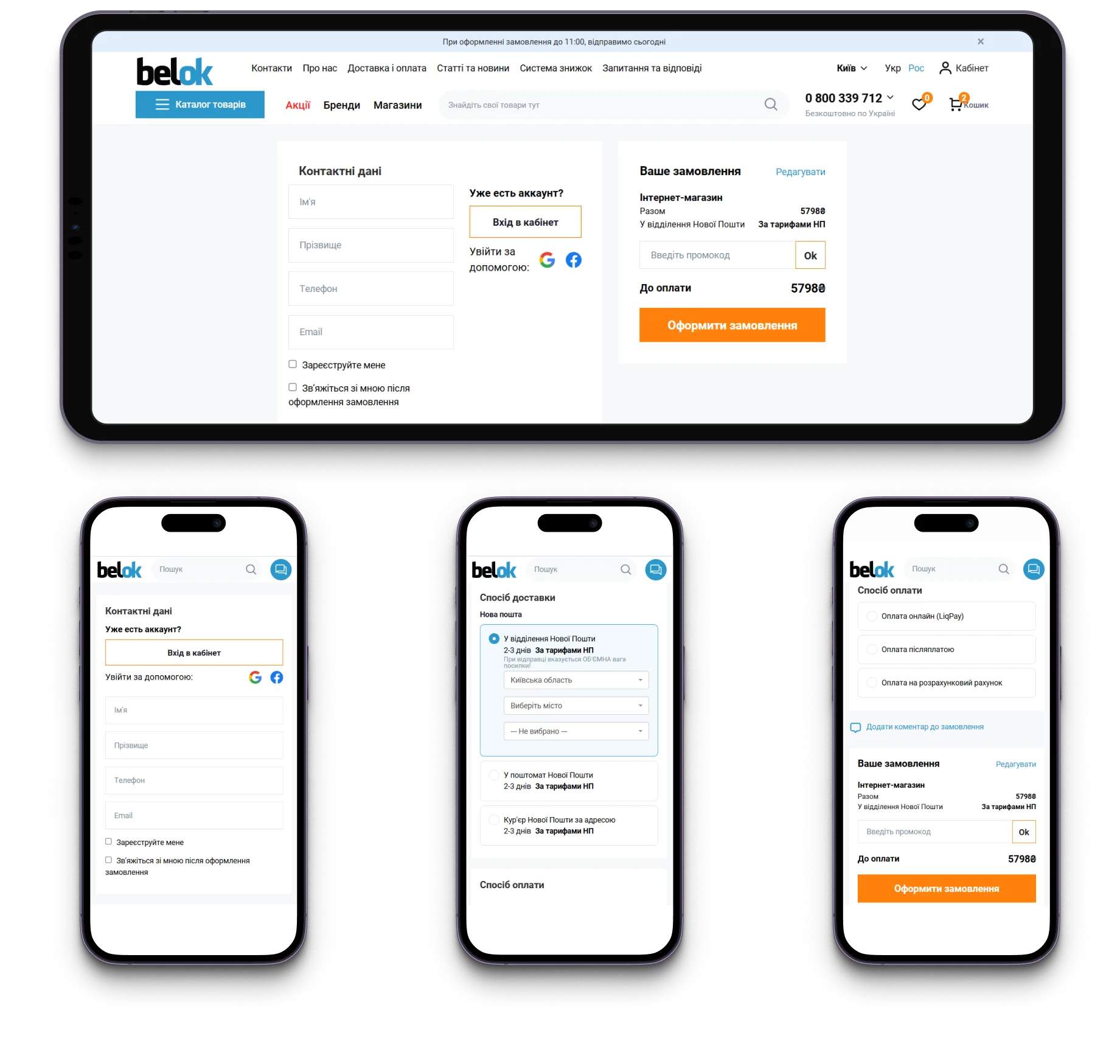
For example, during a UX audit of the Belok website, we discovered that the checkout process was too long, confusing, and cluttered with unnecessary elements, especially on mobile devices.
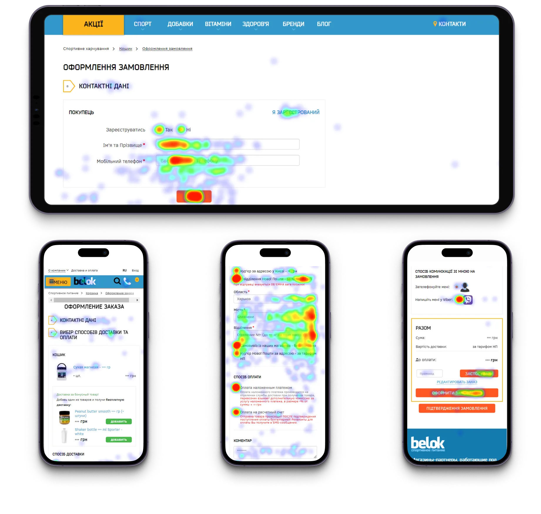
To simplify the checkout process, we’ve reduced the number of steps, removed secondary elements, added key order details, and optimized the flow to ensure a seamless experience across both desktop and mobile devices.
{{block}}
2. Reuse Customer Data: Make Returning Customers Feel Welcome
Returning customers shouldn't have to start from scratch every time they place an order. If the system recognizes an authenticated user, make the experience as seamless as possible by automatically filling in the information you already have.
Use saved addresses, contact details, preferred shipping methods, and payment information whenever possible. At the same time, always give customers an easy way to review and edit these details before placing their order.
"Customers shouldn't have to manually enter information that the business already knows." — Maksym Chuvurin
The same principle applies to new users. Make registration as quick and effortless as possible, then reuse the collected information throughout the checkout process. For example, when working on the FlowerPot mobile app, we designed a streamlined registration flow that takes just four screens and around two minutes to complete.
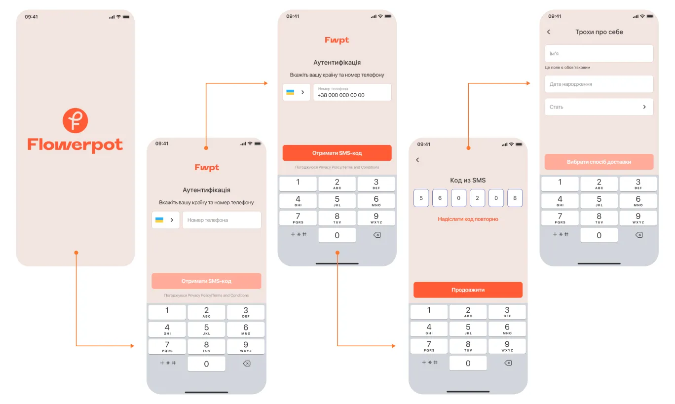
And during the checkout process, the form is automatically filled out, helping users complete purchases faster.
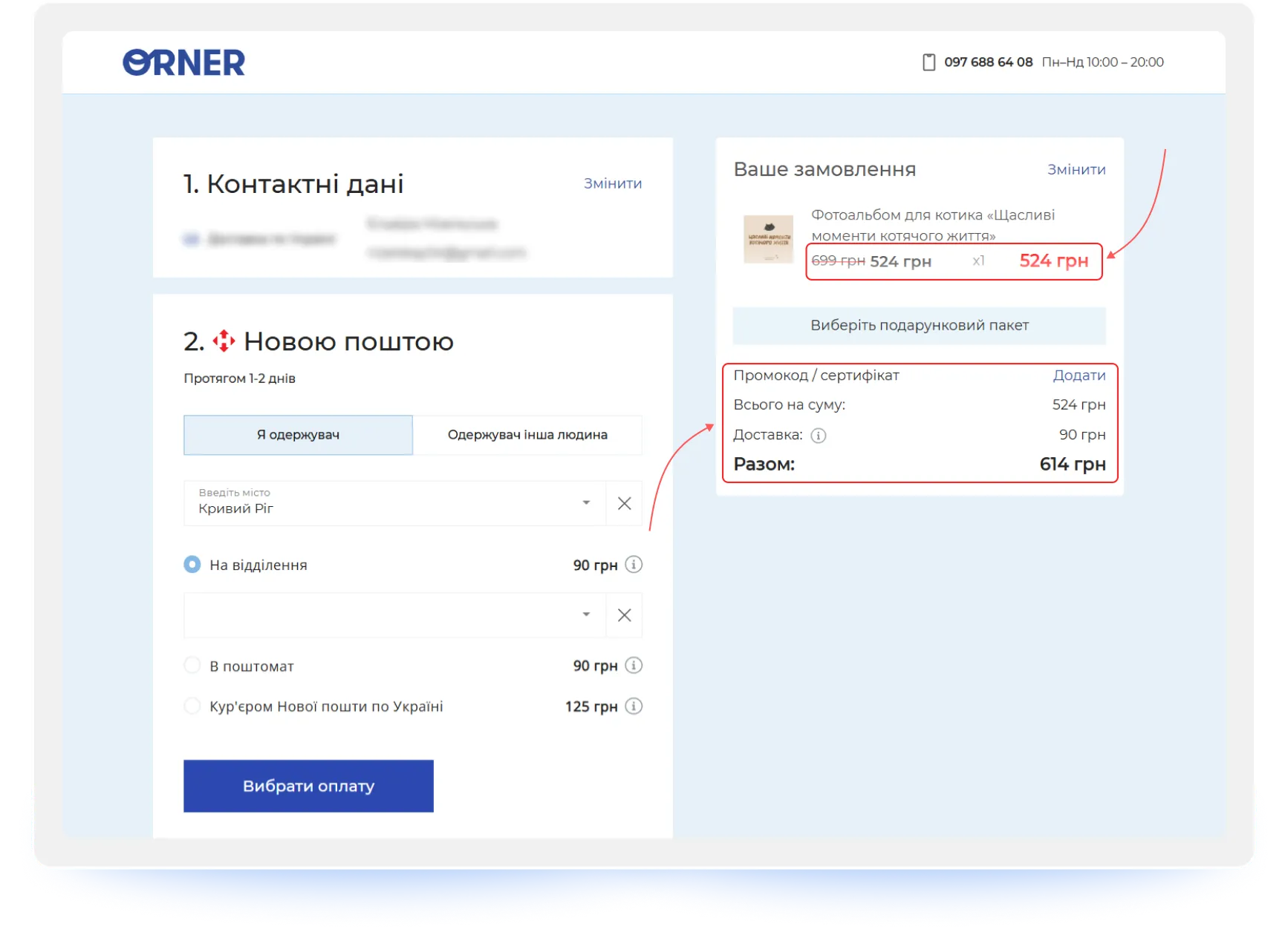
3. Pricing Transparency: Make Discounts, Rewards, and Final Costs Clear
Customers should never have to wonder whether their promo code worked, where their loyalty points went, or why the total order value suddenly changed.
Make the cost breakdown crystal clear by displaying the order subtotal, applied discounts, redeemed loyalty rewards, shipping costs, and the final amount due.
"At the checkout stage, people need certainty. Customers should clearly understand what they're paying for and exactly how much they're saving." — Maksym Chuvurin
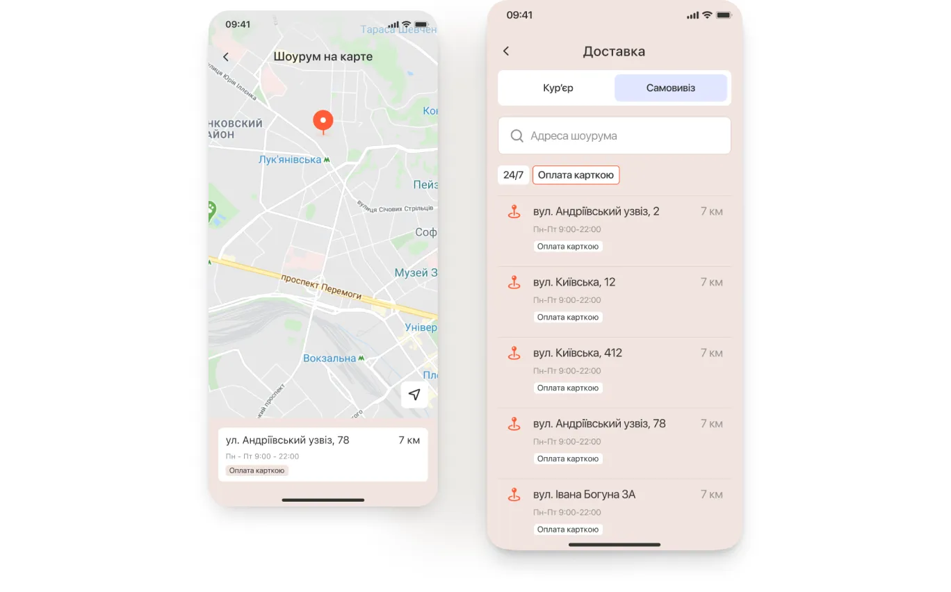
4. Delivery Options: Offer Choice and Show the Real Cost
Delivery is no longer just a logistics process — it's a conversion factor. Today, customers are looking for the right balance between cost, speed, and convenience.
Give users a choice between multiple delivery providers as well as home delivery options. Most importantly, always display accurate shipping costs and estimated delivery times before users proceed to payment. Hidden shipping fees have long been one of the leading causes of cart abandonment.
"Customers value having options. The more relevant delivery methods you offer, the higher the chances of a successful purchase." — Maksym Chuvurin
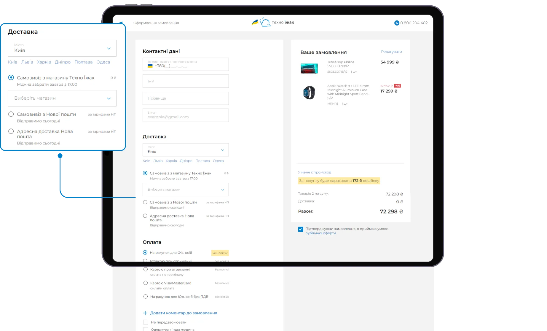
It's also important to let users select a pickup point, post office, or delivery address directly on a map instead of relying solely on dropdown menus.
If you're selling complex or bulky products, your checkout design should reflect that.
For example, when working on the KT-Stal project, an online store for rolled metal and construction materials, we faced a scenario far from typical in e-commerce.
Large-sized products, complex logistics, and the different needs of B2B and B2C customers required a unique approach to the ordering process.
To address this, we broke the checkout process into simple, easy-to-follow steps that adapt to the customer type (individual or business).
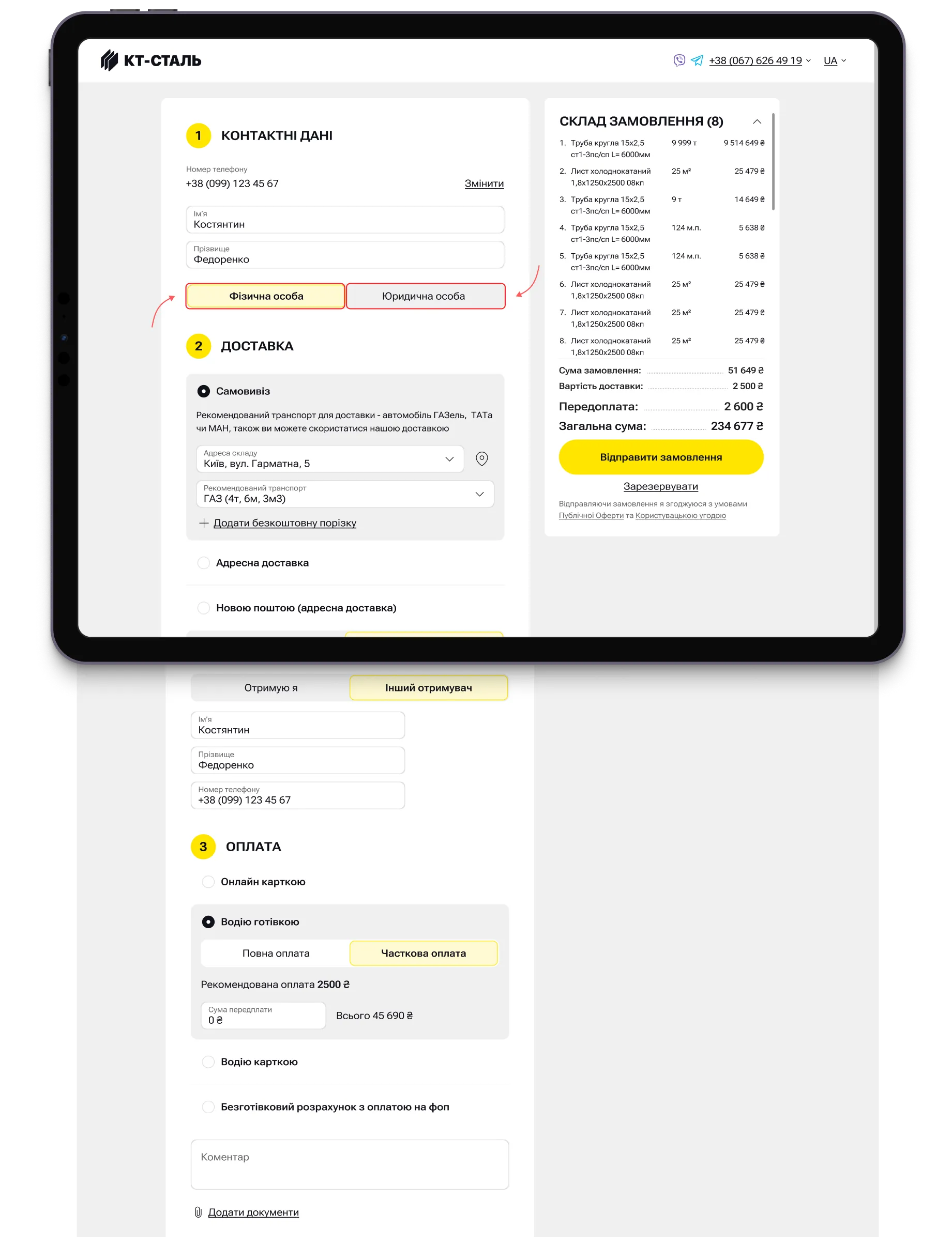
We also implemented a feature that automatically analyzes the weight and volume of the order, selects the most suitable vehicle, and shows the vehicle load percentage.
Users can also choose a convenient delivery time slot (morning, afternoon, or evening).

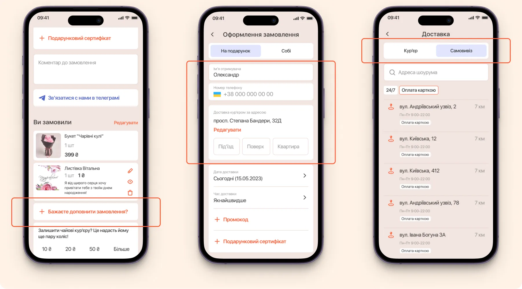
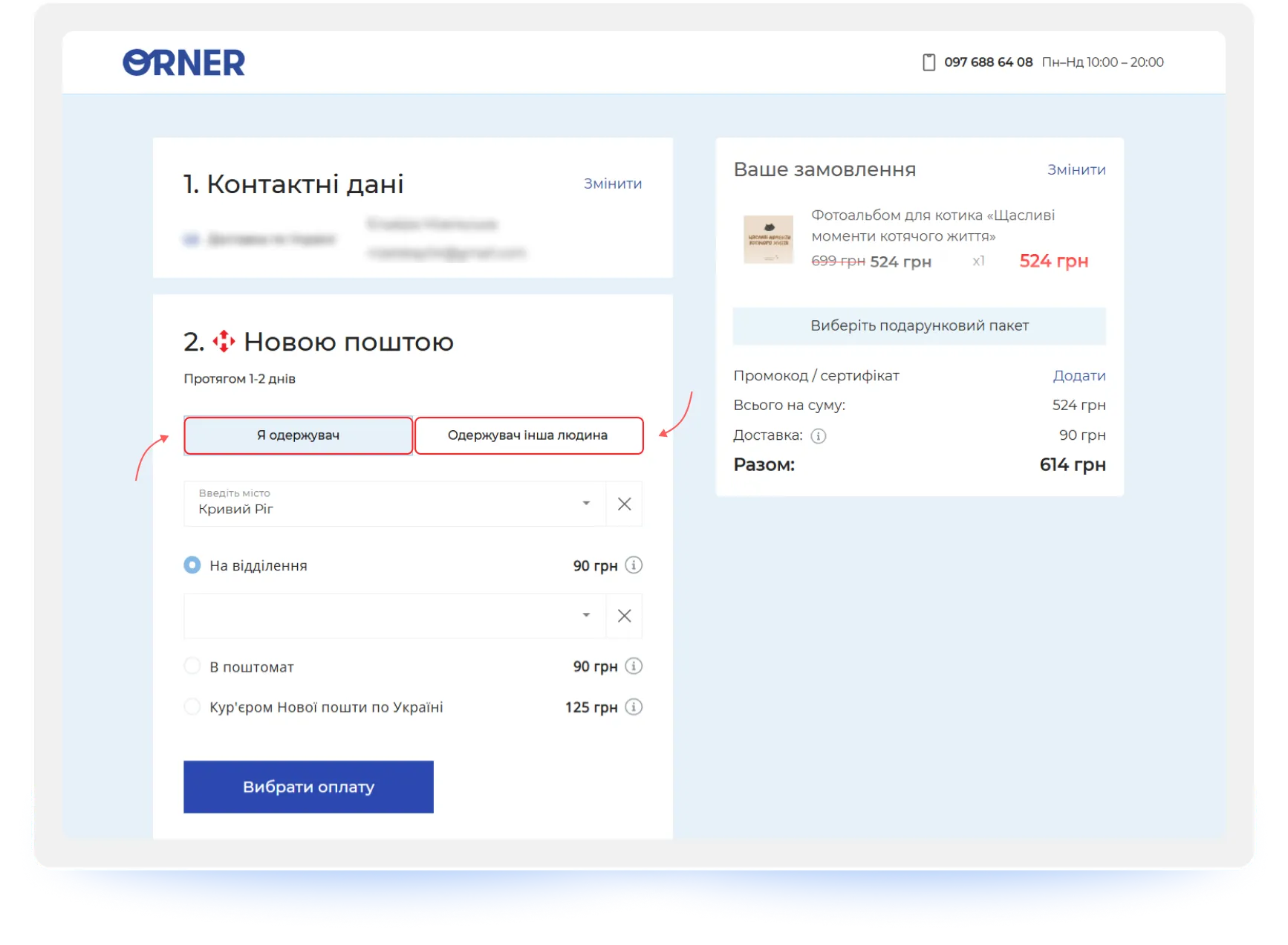
5. Buyer ≠ Recipient: Account for Cases Where One Person Orders and Another Receives
The person placing and paying for an order isn't always the one receiving it. This is a common scenario for gifts, corporate purchases, children's products, and family shopping.
Your checkout UX should account for this. Add a simple checkbox (for example, "Recipient is a different person") that reveals separate fields for the recipient's name and contact information.
"At the checkout stage, these roles should be separated: the personal details of the person placing the order and the details of the person receiving it. This allows one person to track the order while another can receive it without any issues." — Maksym Chuvurin
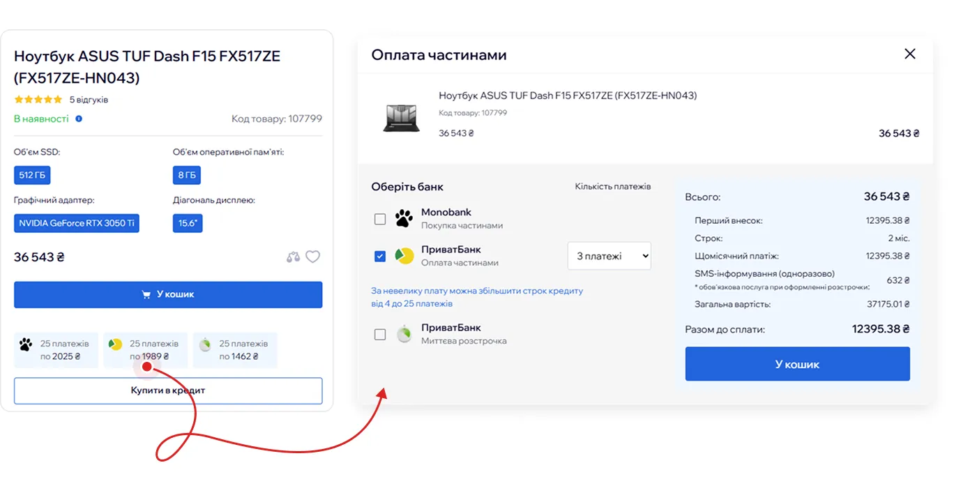
6. Flexible Payment Options: Offer Modern Methods and Buy Now, Pay Later
Offering multiple payment options without hidden fees is a critical feature.
Customers want to pay using the method they're most comfortable with. A modern checkout should accommodate different financial preferences by offering digital wallets (Apple Pay, Google Pay), credit and debit cards, cash on delivery, and bank transfers for B2B customers.
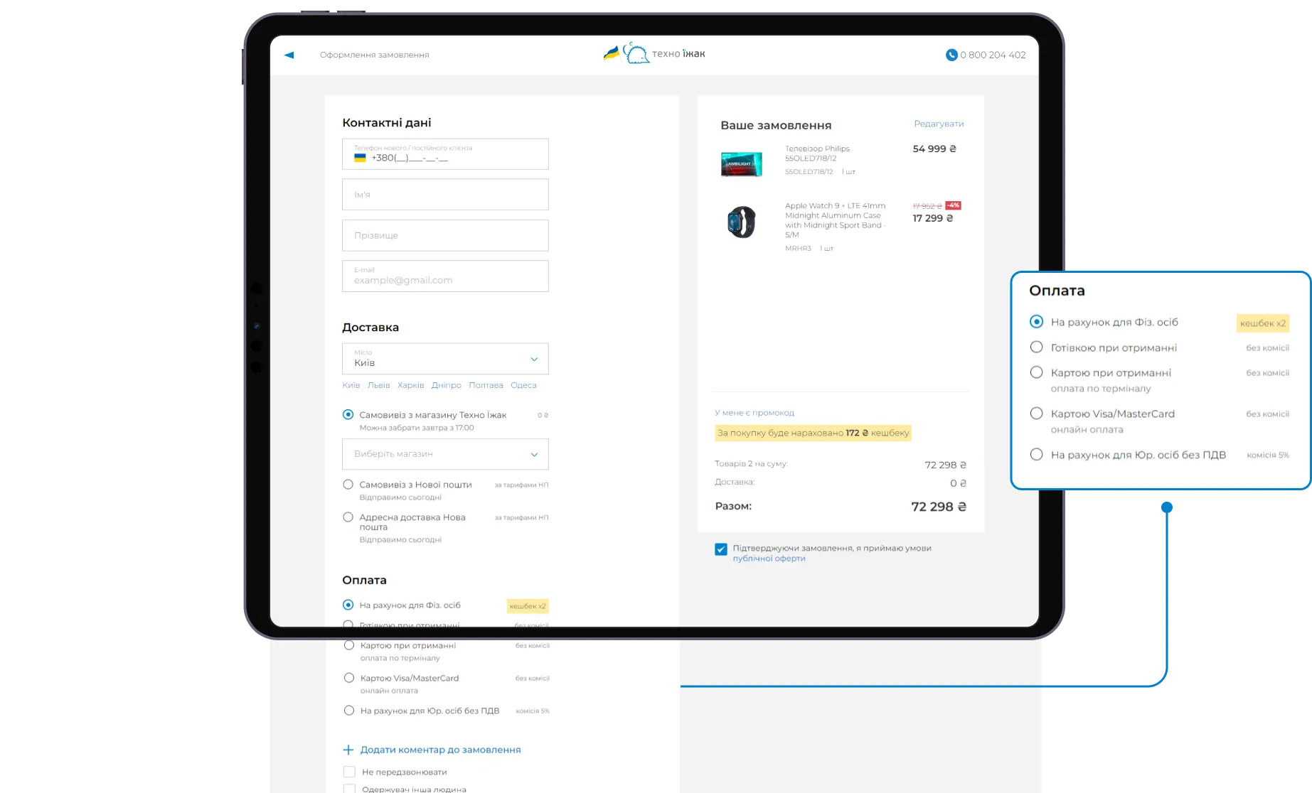
In addition, installment payment services such as BNPL (Buy Now, Pay Later) can significantly influence purchasing decisions, especially when it comes to electronics, appliances, and other high-ticket products.
"Products aren't getting any cheaper. Installment payments help break psychologically uncomfortable amounts into smaller, more manageable payments spread over time." — Maksym Chuvurin
At the same time, information about available payment options shouldn't be limited to the checkout page. Customers often make their purchase decision while browsing a product details page, so installment plans and BNPL options should be clearly visible long before they reach checkout.
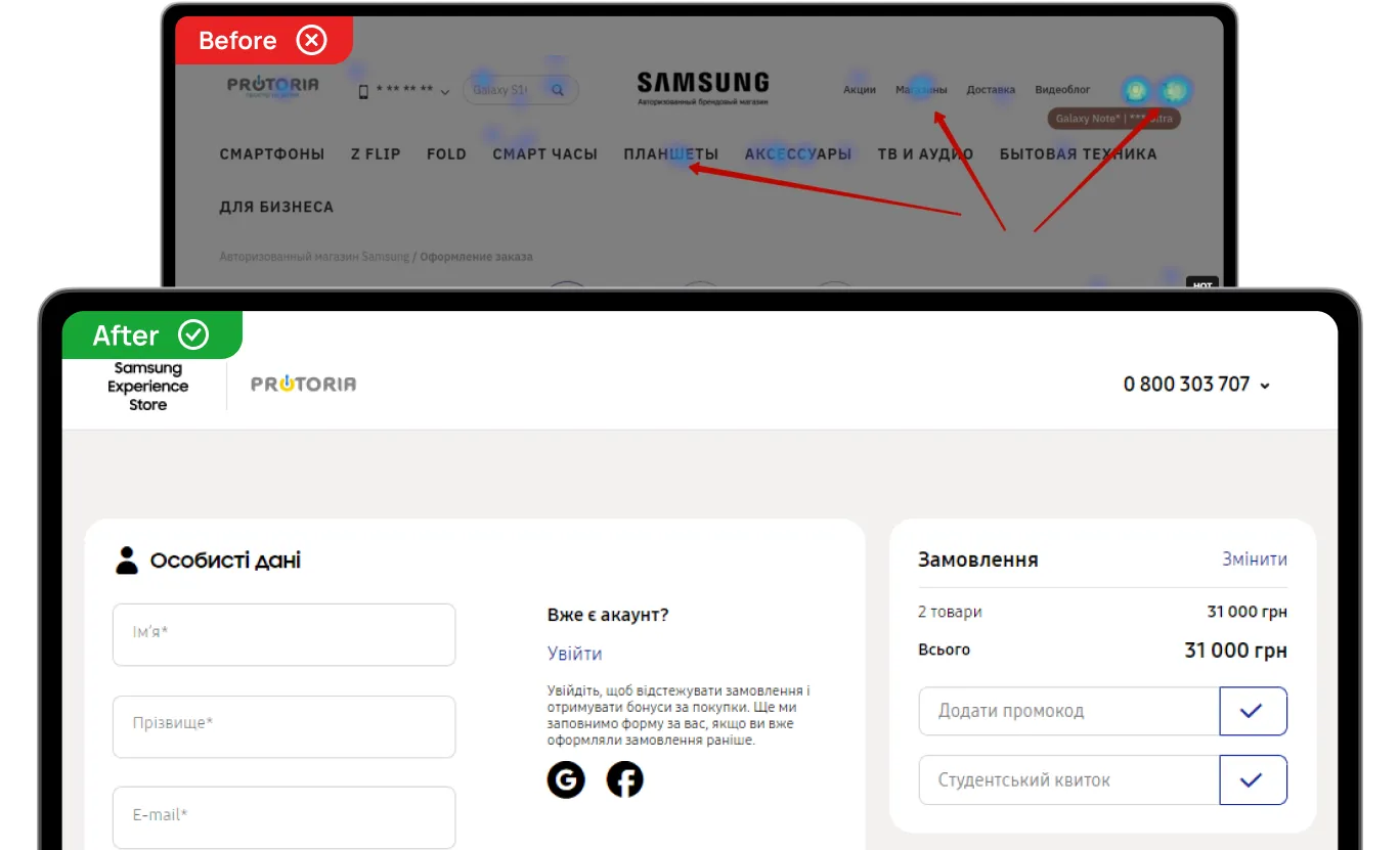
7. Focused Checkout: Remove Distractions and Keep Users on Track
Nothing on the checkout page should distract users from completing their purchase.
Follow the principle of a focused checkout: remove the main navigation menu, minimize the header and footer, and eliminate promotional banners. Instead, keep customer support contacts (live chat or phone number) and payment security badges visible so users can quickly resolve any concerns without leaving the page.
"At the checkout stage, users should be focused on one thing only — successfully completing their purchase. At the same time, payment security information and support contacts should remain accessible so customers can get help when needed without leaving the funnel." — Maksym Chuvurin
For example, while analyzing click maps for Samsung Experience Store, we found that users were regularly distracted by additional navigation elements and leaving the checkout page. However, that was precisely what helped resolve the issue: minimizing the header and footer.
8. Error Handling: Be Prepared for Technical Issues and Human Mistakes
We're all human. And we all make mistakes. That's why your checkout should make those mistakes as painless as possible:
- Help users instantly identify validation errors.
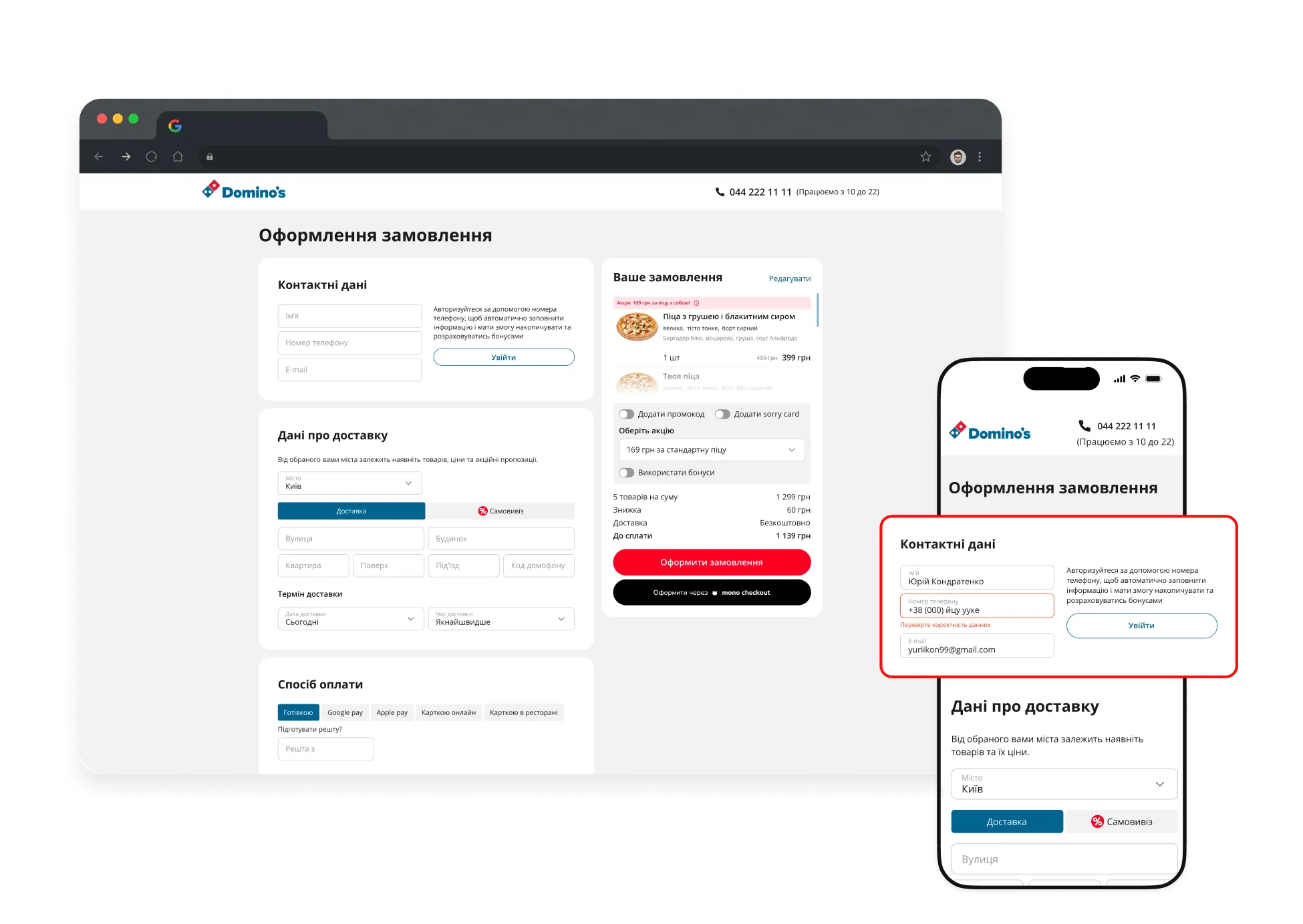
Sometimes customers can't complete their order because of a small issue in a form field (for example, incorrect autofill data), but they have no idea where the problem is. For Domino’s Pizza, we implemented automatic correction of hidden errors and auto-scroll functionality that takes users directly to the field that needs attention.
- Protect user progress with autosave.
A technical issue or an accidental click on a navigation element shouldn't erase everything a customer has already done. In the previous version of the WÜRTH checkout, users would often get distracted by promotions or the product catalog and, upon returning, find an empty form. The solution was autosaving entered information. Now, if the checkout process is interrupted, customers don't have to start over.
"A failed payment shouldn't force customers to go through the entire checkout process from the beginning." — Maksym Chuvurin
- Let users fix mistakes without leaving the page.
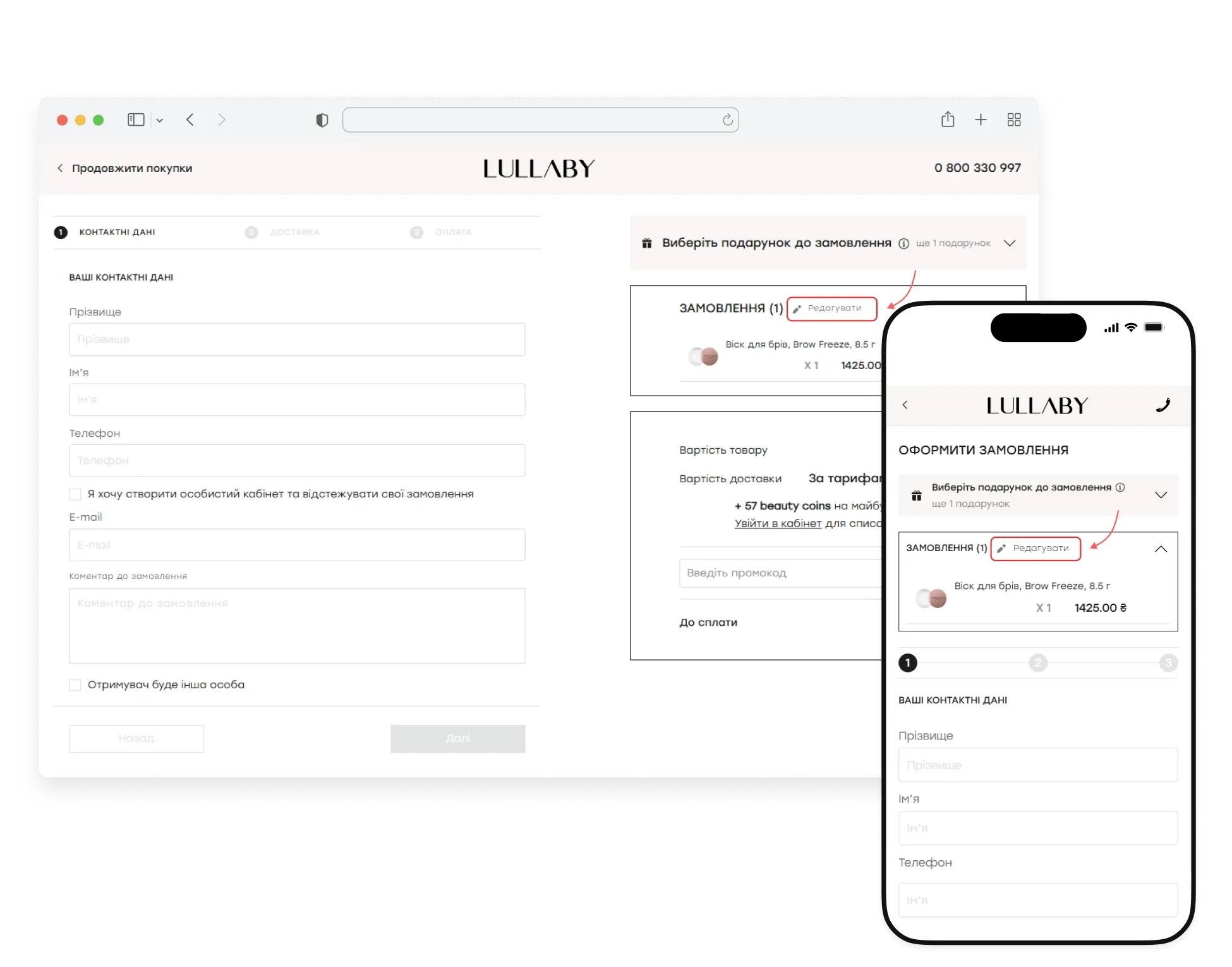
Sometimes issues are caused not by technical errors, but by hesitation or a simple change of mind. During the Lullaby redesign, we moved order editing into a pop-up window so users wouldn't have to return to a previous step if they suddenly wanted to change something in their order.
{{block}}
Checkout Process UX Optimization: Don't Get In The Customer's Purchase Way
Checkout is the final — and most critical — stage of the sales funnel. By the time users reach it, they've already made up their minds about buying. That's why even small UX issues at this stage can have a direct impact on revenue.
The task of checkout is not to persuade, but not to get in the way.
A logical and predictable flow, fewer steps, transparent pricing and shipping costs, autofill and saved customer data, effective error handling, and a distraction-free interface all influence whether a user becomes a buyer.
That's why investing in checkout UX matters. The fewer doubts, unnecessary actions, and obstacles users encounter on their way to purchase, the more likely they are to complete their order.
After all, sometimes, the difference between a completed purchase and a lost one is just a single extra click.
FAQ
What is a checkout UX audit?
A checkout UX audit is a part of a comprehensive interface analysis and is a review of the checkout process aimed at identifying usability issues, friction points, and technical barriers that prevent customers from completing purchases. A checkout UX audit typically evaluates form fields, navigation, payment methods, delivery options, error handling, and mobile usability to reveal opportunities for increasing conversions.
Can checkout UX best practices increase conversion rates?
Some checkout UX best practices can help you, but only when they're based on real user behavior and data, not assumptions. While checkout UX best practices provide a solid foundation, every website has its own challenges. That's why it's important to conduct a checkout UX audit before making changes, so you can identify the issues that have the biggest impact on your conversions.
Why are e-commerce checkout best practices important?
The checkout stage is where users either become buyers or leave. If users abandon the process, businesses lose potential revenue. E-commerce checkout best practices can help resolve common issues in the process.
Question reference
Answer reference


%20(1).png)


More real-world Turum-burum cases?
Review our vast portfolio of cases in a variety of business fields to make sure of our expertise.
Go to Portfolio
