


Website Rebranding: How to Refresh Your Brand Without Losing Sales
A company often grows faster than its website. It enters new markets, wins bigger clients and earns a reputation offline, while the site still shows the brand it launched with.
We've seen this gap in businesses that have little else in common. A top-three loan broker in the Nordics whose website looked more like an affiliate landing page than a trusted financial platform. A professional cosmetics store with 10,000+ products and no brand book, getting ready to enter the EU market. A Swedish emergency-supplies store whose detailed logo fell apart in the mobile header.
Different industries, same problem: the website no longer looks like the company behind it. That's when it needs a rebrand. The hard part is changing it without losing what already works, from the regulars who know their way around to the checkout that converts. This guide covers how to pick the scope, carry a new identity into the interface and launch it safely, with examples from e-commerce and SaaS projects we've worked on.
If you're short on time, here's the gist:
- Website rebranding is a UX project. Your logo, colors and type live in the header, the buttons and the checkout, not in a PDF.
- Choose the scope by what's broken: a logo refresh, a new visual identity or a full rebrand.
- Rebranding together with a redesign or a platform migration saves you a second launch.
- A brand identity starts working when it becomes a design system with components and states.
- Keep the motif customers already know, so regulars still recognize you after the change.
What is website rebranding?
Website rebranding means changing how your site looks, sounds and behaves at every step toward a purchase or a sign-up. A new logo is only one part of it: the brand covers everything a visitor sees, reads and does on the site.
On a website, a brand has three layers:
- The look: logo, colors, typefaces, photos and illustrations.
- The voice: headlines, button labels, error messages, emails.
- The behavior: what happens when someone searches, filters, adds to cart or makes a mistake in a form.
Most rebrands stop at the first layer. Visitors, though, judge all three, and they judge them at the moment they're about to pay. In Baymard Institute's checkout research, 19% of US shoppers who abandoned an order said they didn't trust the site with their credit card information. A logo that changes between pages, buttons in three different styles or a checkout that looks like another company makes that doubt easier.
Rebrand, redesign or refresh: which one do you need?
A redesign changes how your site works. A rebrand changes who people think you are. A refresh updates a few elements and leaves the foundation alone. Most projects land somewhere in between, so pick the scope by what's actually broken.
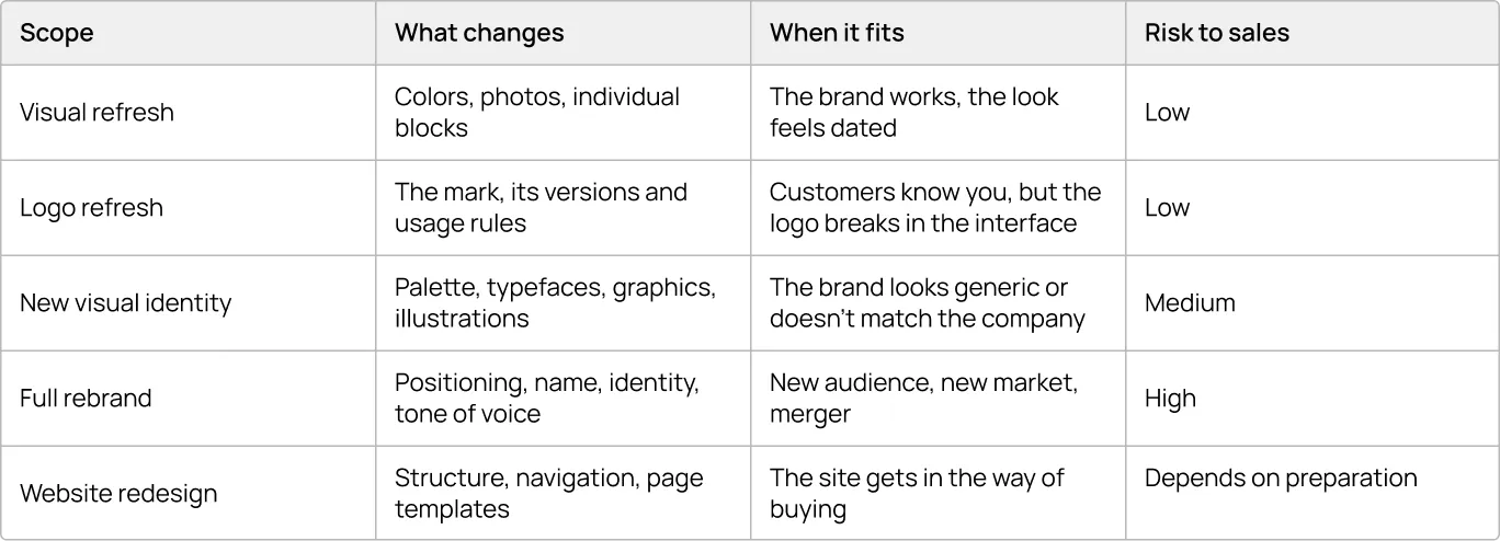
If customers recognize and trust you, start at the top of the table and move down only when the brand itself is the problem.
{{block}}
When does a website need a rebrand, and when doesn't it?
A website needs a rebrand when the brand itself gets in the way of selling. The site looks less credible than the business, there are no rules to keep it consistent, or the business is moving into a new market. If people get lost in the menu or give up at checkout, that's a redesign problem, and a new identity won't solve it. For that case, our website revamp checklist is a better place to start.
Four signs that it's the brand:
- The site looks smaller or less trustworthy than the company really is.
- There's no brand book, so every new page looks slightly different.
- You're entering a new market or speaking to a new audience.
- The logo falls apart at small sizes: in the mobile header, the favicon, the app icon.
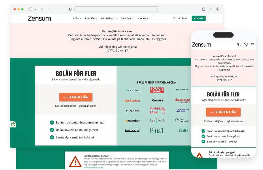
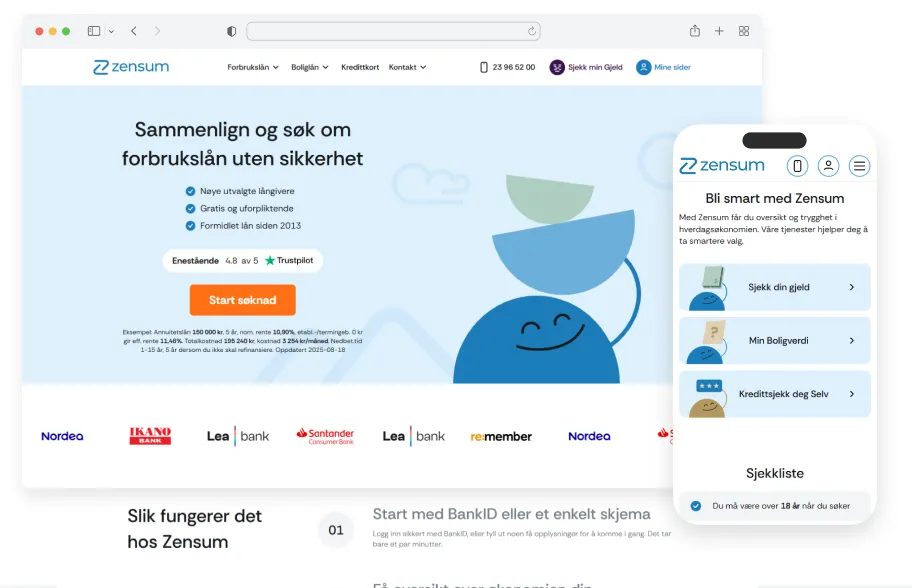
Zensum, one of the top three loan brokers in the Nordics, had the first sign. The old site converted, but a plain wordmark and a text-heavy homepage made it look more like an affiliate landing page than a company competing with banks for the same customers. So the project included a new identity alongside the redesign.
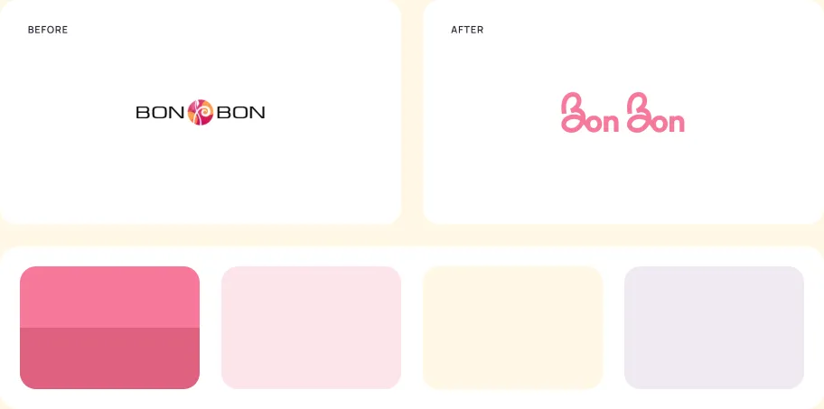
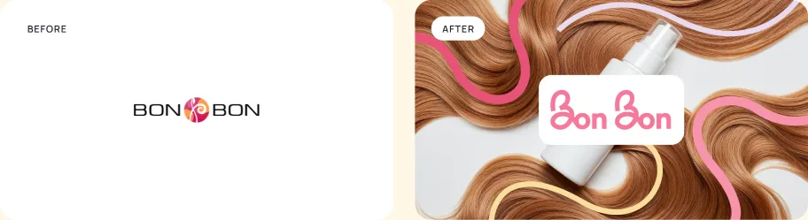
Bon-bon, a professional cosmetics store, had the second and third signs at once. It had no brand book, which held back its growth, and it was getting ready to enter the EU market. The new logo, palette and UI design system gave the team one set of rules for every page they add next.
As Denys Studennikov, COO at Turum-burum, puts it in our homepage guide, "if the website doesn't match how the company presents itself offline, it damages trust from the very first second."
How do you change a logo without losing recognition?
Keep the motif customers already know and rebuild the mark around it. The new logo has to work at small sizes in the interface, while regulars still recognize it at a glance.
Cracker Barrel shows the cost of getting this wrong. On August 19, 2025, the US restaurant chain replaced its familiar logo, a man leaning against a barrel, with a text-only version. After customer backlash, it announced a return to the old logo about a week later, and by its September earnings call the CEO said restaurant traffic had fallen about 8% since the change. The new logo removed the one thing loyal customers recognized.
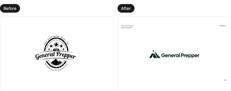
General Prepper, a Swedish online store for emergency supplies and outdoor gear, had an emblem full of small details. It held up at large sizes, but it broke down in digital interfaces, especially in the mobile header. We kept the original mountain motif and rebuilt the mark around three symbols: a tent for shelter, the mountains, and the Polar star as a guide.
The star then moved into the site itself: it now marks every section heading, so the brand is present on every screen, beyond the logo in the header.
For General Prepper, though, the new logo was only part of the job. The store also had a checkout problem and a platform move ahead, which brings us to the next question.
Should you rebrand and redesign at the same time?
Yes, if the site is being rebuilt anyway. One launch costs less than two, and customers get used to one change instead of two.
A logo or visual refresh can roll out gradually, page by page. A full rebrand usually launches with the whole site at once, because a new logo can't live on half the pages. The same goes for a platform migration: when the whole site is rebuilt anyway, it's the natural moment to launch the new brand with it, as part of a website redesign.
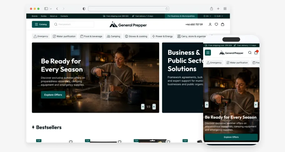
That's how it went with General Prepper. The store came to us about abandoned carts while preparing to move to the Wikinggruppen platform. Instead of patching a checkout that was about to be replaced, we designed a new identity and 23 page templates for desktop and mobile. Everything went live at once on the new platform.
How do you carry a new identity across the website?
Bring every element of the identity into the interface, beyond the homepage mockup. Check the logo in the mobile header, the brand color on buttons and in every state, the typeface in prices and filters, and the illustrations in empty states and error messages. If an element only works on a moodboard, it isn't ready.
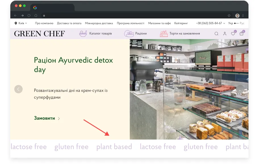
Green Chef, a Ukrainian plant-based food brand, had an identity before it had a proper website: the brand started on Instagram. We built the new homepage around the brand's values and the Instagram look its customers already knew.
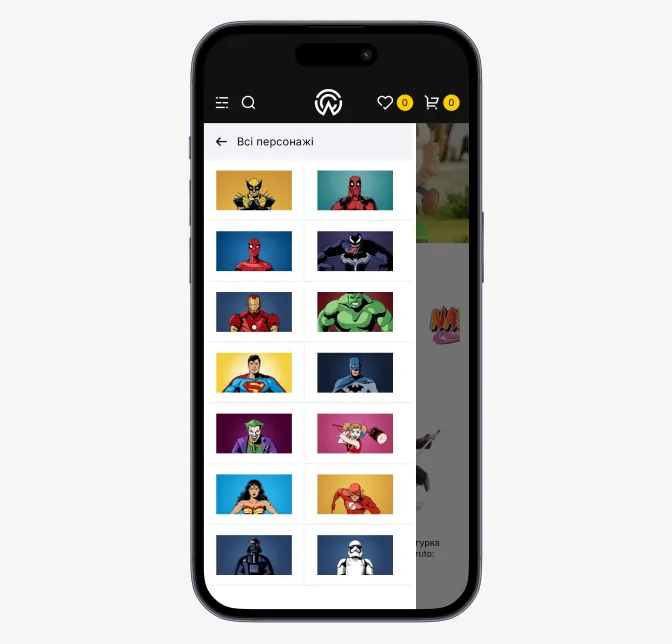
World of Comics, a Ukrainian chain of geek culture stores, we carried its brand into navigation. The menu uses comic book characters instead of plain category labels, so the brand shows up exactly where people choose what to buy.
Denys's rule for homepages applies to the whole site: "make the visitor feel the brand before they read a single product description."
What changes when the product is SaaS?
In SaaS, the brand lives inside the product as well as on the marketing site: in dashboards, pricing tables and documentation. That's why a SaaS brand needs UI guidelines along with the logo.
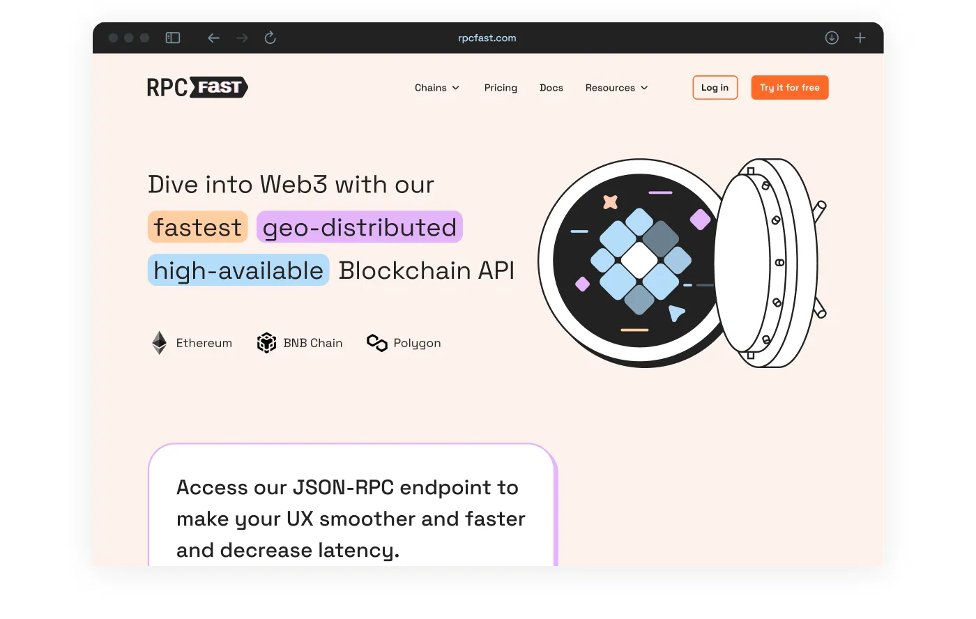
RPC Fast is a blockchain API. Its brand had to stand out in a category full of the same blockchain metaphors, so we drew custom illustrations instead. The same style then went into the parts of the product where buyers decide: the packages comparison table and the cost calculator.
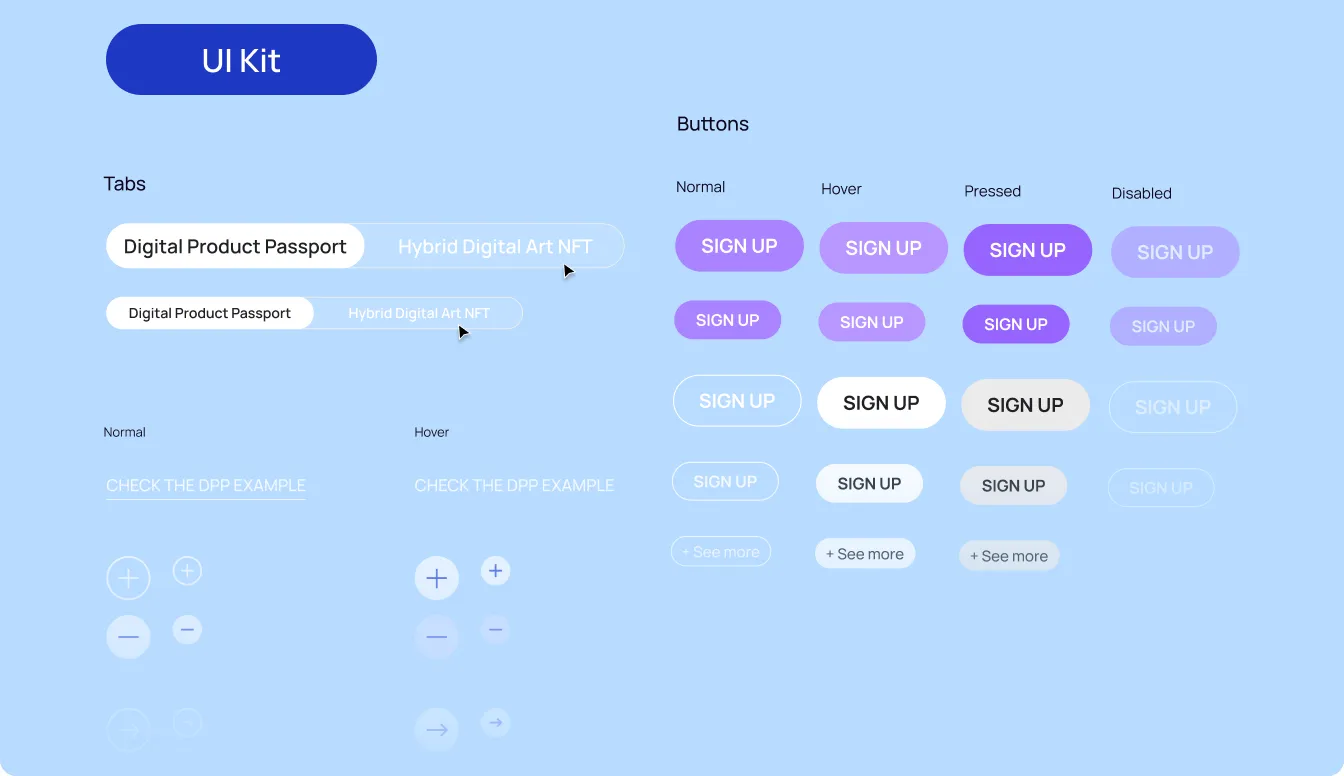
NFTrends needed one palette for two very different audiences, luxury brands and digital art buyers. We documented it as UI guidelines, so the client's team can add new elements without breaking the style.
Why isn't a brandbook enough?
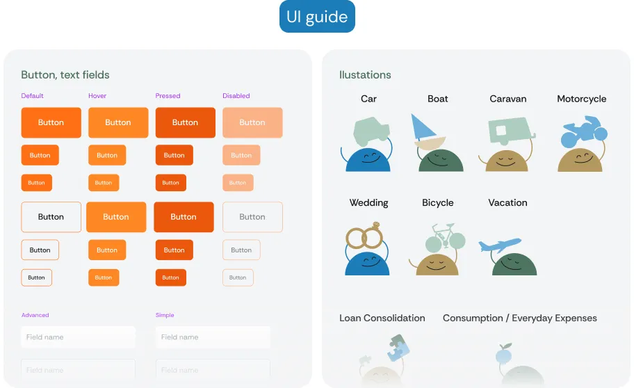
A PDF brandbook tells you what the logo and colors are. It doesn't tell a developer how a button looks when it's disabled, how an error message reads or how a product card behaves on mobile. A design system does, and that's what keeps the brand intact as the site grows.
Nielsen Norman Group draws the same line: a style guide is a piece of documentation, while a design system is a living set of standards with reusable components, and the style guide is only one part of it.
The difference matters most at scale. Zensum needed its new brand to work on far more than one homepage. The design system we built covers 100+ landing pages, so every new page follows the same rules without being designed from scratch.
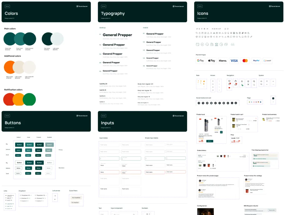
For an online store, the system covers more than buttons. General Prepper's includes colors, typography, icons, inputs and product components, each in all its states. It gave the Wikinggruppen developers clear rules for implementation, and one of them put it this way: "The Figma file was top-notch… the designs were so clear that I didn't even need to bother them!" If you're building one for the first time, start with our guide to UI kits.
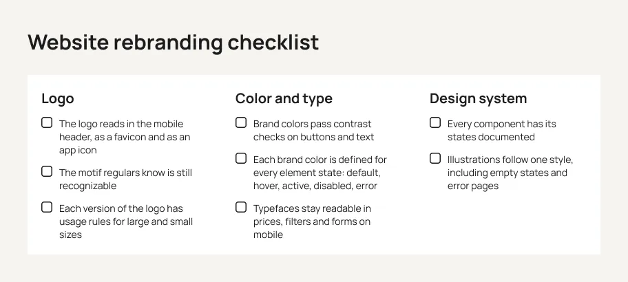
Website rebranding checklist
Run through this list before you switch the new brand on.
Logo
- The logo reads in the mobile header, as a favicon and as an app icon.
- The motif regulars know is still recognizable.
- Each version of the logo has usage rules for large and small sizes.
Color and type
- Brand colors pass contrast checks on buttons and text.
- Each brand color is defined for every element state: default, hover, active, disabled, error.
- Typefaces stay readable in prices, filters and forms on mobile.
Design system
- Every component has its states documented.
- Illustrations follow one style, including empty states and error pages.
{{block}}
Conclusion
A rebrand changes how people see you. On a website, that impression forms in the header, on the buttons, in error messages and in every state of the interface, not in the brand book. Pick the scope by what's actually broken, keep the motif customers already recognize, and turn the new identity into a design system so it holds as the site grows.
A new logo is the easy part. A brand that holds together on every screen is the rebrand.
FAQ
How much does it cost to rebrand a website?
It depends on the scope. A logo refresh, a new visual identity and a full rebrand with a redesign are very different projects. At Turum-burum, brand identity projects start from $3,000, and we give a clear estimate after discovery, once the scope is defined. A design system and UI kit are planned as part of the website project.
How long does a website rebrand take?
It depends on how much changes. A logo refresh is the shortest project: a new logo usually gets three concepts and two or three rounds of feedback. A full rebrand combined with a redesign or a platform migration takes longest, because the identity, page templates and development all need to be ready for one launch.
How often should you rebrand?
There's no fixed cycle. Rebrand when the brand starts getting in the way of growth: the site looks less credible than the company, you're entering a new market, or the identity no longer works in the interface. Between rebrands, small visual refreshes keep the site current without the risk of a full change.
Is a logo refresh enough, or do we need a full rebrand?
A logo refresh is enough when customers already recognize and trust your brand, and the problem is how the logo works in the interface: in the mobile header, the favicon, small sizes. A full rebrand is for bigger shifts, such as a new market, a new audience or new positioning. The comparison table above shows the options side by side.
Question reference
Answer reference





More real-world Turum-burum cases?
Review our vast portfolio of cases in a variety of business fields to make sure of our expertise.
Go to Portfolio
