


UX + SEO = Increased Organic Traffic With More Sales
Online business always meant SEO efforts so it’s visible on Google.
But today Google changed. And SEO changed with it.
Search is no longer about keywords alone. It’s about experience. User experience. That’s why modern SEO and UX are totally joined at the hip now.
And in this article, which is based on the webinar, we will break down how Google measures satisfaction through behavior and what businesses need to focus on if they want organic traffic to turn into real results (not just rankings).
Our insights come from two awesome experts:
- Christian Rudolf: Founder of TopDog. He’s a strategist who’s been crushing the SEO game for over 20 years, successfully guiding 300+ projects by focusing on search's economic impact and hitting specific business goals.
- Denys Studennikov: COO of Turum-burum. He’s a UX/CRO expert with a decade of experience and specializes in data-driven design that’s brilliant at turning web traffic into actual, measurable revenue.
UX Is Part Of SEO Now: Google Ranks Satisfaction, Not Just Keywords
SEO didn’t lose its role. It evolved.
Google still uses keywords to understand relevance, but rankings are increasingly shaped by what happens after the click.
Here are three key ideas that keep repeating across Google’s documentation:
- The experience should be holistic, not a single fix;
- The page should meet the user’s need, not just answer a question;
- The searcher shouldn’t feel the need to go back and try again.
That last one is critical.
If users click, hesitate, scroll aimlessly, or bounce back to Google, the page didn’t satisfy the intent and/or need, no matter how well it was optimized for keywords. This is why modern SEO can’t exist without UX.
“The searcher does not want to go back and do another query or revisit pages on the same query. This is a UX problem.” — Christian Rudolf, TopDog Founder
Every Search Is a Mini User Journey: Need → Query → Decision
A keyword is not the starting point. It’s the middle.
Every search follows a simple loop: a Need forms → it becomes a Query → the user looks for a way to Act or Decide.
In 2026, you have to look past the wording to understand what the user is truly trying to solve.
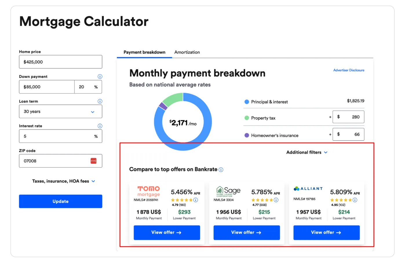
Take the loan broker as an example.
When someone searches “How much can I borrow?” (“Hur mycket får jag låna?”), they’re not looking for lending rules or definitions.
The real intent is practical and emotional: Can I afford this apartment? What are my options? What should I do next?
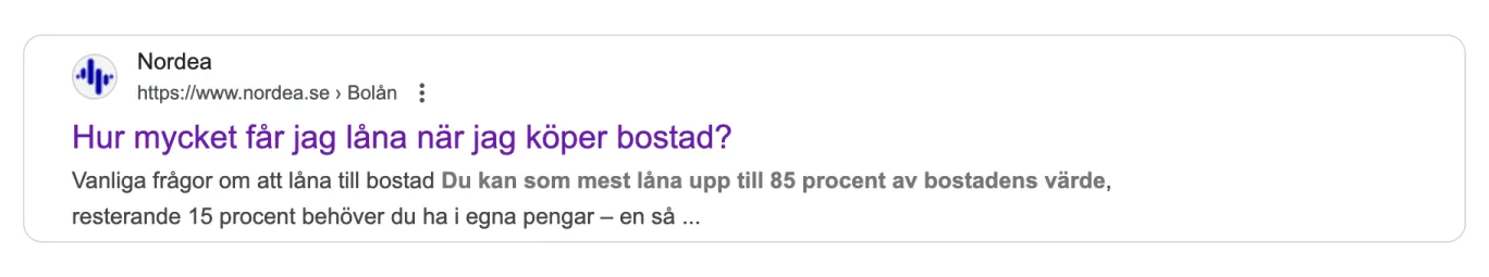
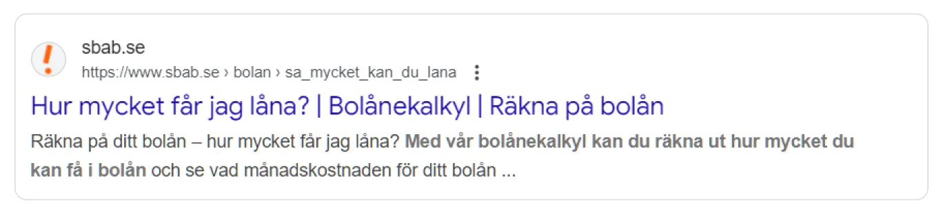
A page that only explains lending conditions technically answers the question, but it fails the need. But a page with a calculator, clear context, and an obvious next step completes the journey.
This is where UX directly influences SEO outcomes.
Pages that guide users from question to decision consistently generate stronger behavioral signals, and that performance feeds back into rankings, traffic quality, and revenue.
{{ block }}
Trust Is the New Conversion Factor (And It Impacts SEO Too)
Before users decide whether your content is useful, they decide whether it’s trustworthy.
Even when the information is relevant, users hesitate: “Do I trust this source?” (0.5 seconds). And only then they go to “Does this answer my question?” (2-5 seconds)
If you fail step 1, step 2 never happens.
That insight became obvious when Google studied how people interact with AI Overviews (the same applies to websites, though).
So, trust today is not built at the bottom of the page. It has to be visible immediately. Your on-page trust checklist to prevent the “back-button” bounce, you need to front-load these signals:
- Social Proof: Ratings and reviews must be visible in the first two scrolls. Most users only skim the top section of a page. If trust signals aren't visible instantly, they assume you aren't credible.
- Transparency: Clear delivery times, return policies, and payment methods.
- Authority: Credentials, awards, or “As Seen In” logos. In a sea of AI content, a familiar brand or a professional design acts as an instant “safe zone.”
- Consistency: Immediate visual cues that confirm “this is the right place.” Sensitive topics (like money or health) raise the bar. Users will look for a reason to leave. Don't give them one.

When users feel confident early, they stay longer, engage more, and move forward instead of back to Google.
And those behaviors are exactly what modern SEO rewards.
In other words, trust isn’t just about conversion anymore — it’s part of ranking. And central to Google’s E-E-A-T (Experience, Expertise, Authoritativeness, Trustworthiness) guidelines.
“More Text” Is Not a SEO Strategy. Structured Content Is.
Adding a “wall of text” just to “help SEO” is a 2015 tactic.
Today, long unstructured content often hurts rankings because users don’t read it and leave. And Google notices that.
Google rewards pages that are easy to understand, trust, and act on, not pages with more words. And this is where UX and SEO work together.
Modern SEO content strategy is about answering fast and then letting users go deeper (if they need to). Meanwhile, a good UX doesn’t remove text but structures and packages it. All that means:
- Clear headings that help users scan;
- Content blocks instead of long paragraphs (jump links and H2 anchors used so users can teleport to the answer);
- Depth that’s available, not forced.
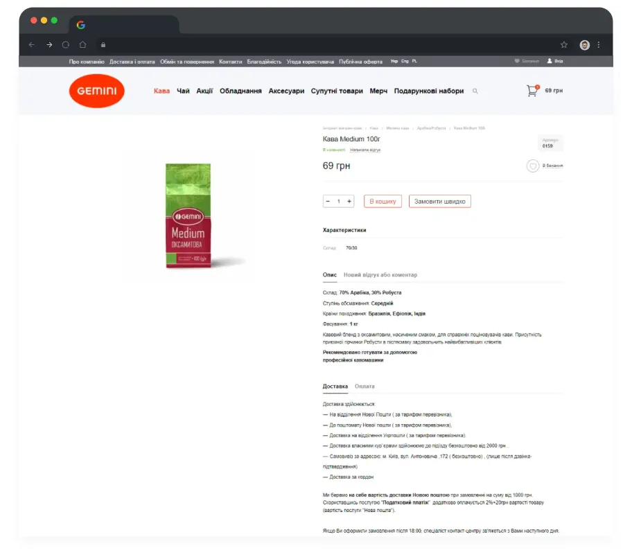
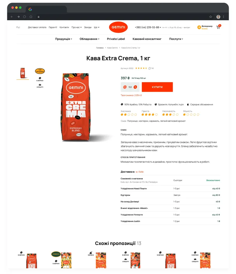
Thus, for instance, in the Gemini redesign case, a complex product, a lot of text, and a value proposition are to be explained without boring the user. The fix? Structure and visuals. We broke paragraphs into a grid of icons and short headlines and descriptions. Same word count and meaning, but now users see “product value,” not “homework.”
UX SEO + Google Ads (or Every Other Channel) = A Perfect Match
Improving UX is the only investment in digital marketing that pays you back twice.
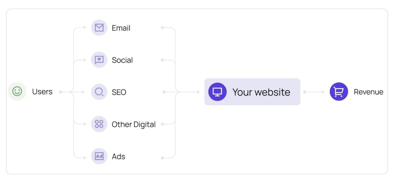
Most companies treat SEO and Paid Search as separate budgets, but they usually send traffic to the same pages. Be it Google Ads, email campaigns, social traffic, or referrals, all the channels lead to your website pages.
When you improve UX for SEO, you’re not just improving rankings — you’re improving the performance of every channel that sends users to those pages, automatically lowering your Cost Per Acquisition (CPA) for Google Ads and more.
So, you don’t need more traffic to make more money. You just need to stop wasting the traffic you already have.
Even if traffic stays exactly the same, better UX can lift revenue simply by improving two things:
- Conversion rate (more users complete the journey);
- Order value (users buy with more confidence).
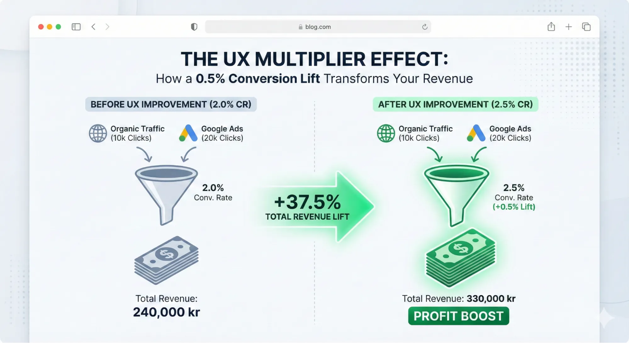
Let’s look at the math behind a conservative 0.5% lift in conversion rate.
Imagine a store with 10,000 organic clicks and 20,000 ad clicks per month. That without UX brings a 2.0% conversion rate and an average order value of 400 SEK, the total revenue is 240,000 SEK.
But after improving the UX, the conversion rate lifts by just 0.5%, from 2% to 2.5%, and trust signals bump the order value to 440 SEK.
The traffic didn't change. But the revenue jumped to 330,000 SEK. That is a 37.5% increase in total value created without spending a single extra dollar on clicking.
That’s why UX is one of the highest-ROI investments in SEO.
And that model is still modest. It doesn’t even include the “bonus effects”: better ad performance over time, improvements across other channels, and a higher chance of users returning once the experience feels trustworthy and smooth.
UX Importance or 3 SEO Landing Pages That Make or Break Conversion
A beautiful website without SEO has one problem: no visibility.
But SEO traffic to a non-converting site has another: wasted budget.
SEO brings people in. UX helps them find what they came for and move forward. If the experience is confusing, users don’t “think about it.” They hit Back and choose the next result. That’s why your website can easily become the bottleneck between traffic and revenue.
Don’t let your website become the bottleneck. Here is how to fix the three most critical landing pages in e-commerce: product page, category listing, and homepage.
PDP: Turn Product Interest Into a Confident “Add to Cart”
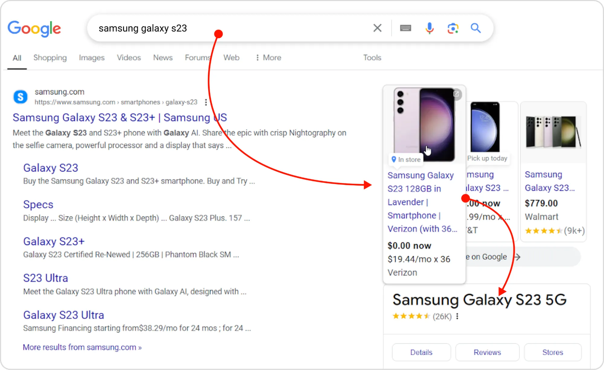
Product pages are common landing pages for specific queries. The user looks for a certain product and searches for it in Google, and Google provides the links directly to the product pages of online stores.
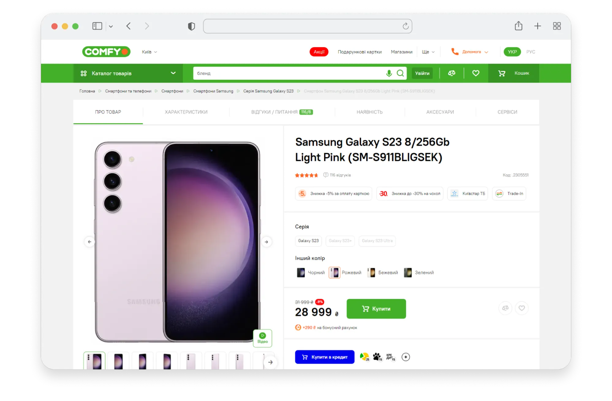
A product page is not a brochure. It’s a decision page.
That’s why the first 1-2 screens must answer the user’s core questions immediately:
- What is it? (clear visuals)
- Is it the right one? (options/variants, key features)
- How much, and how do I get it? (price + CTA, delivery, payment)
- Can I trust it? (reviews summary, proof)
In the Shiny&Diski case, heatmaps revealed that users were “rage-clicking” a text label “All Features.” Why? The critical technical specifications, which tire buyers need to see first, were buried on the 7th screen. And, not surprisingly, only 16% reached the features block, while 33% jumped to reviews placed above product details.
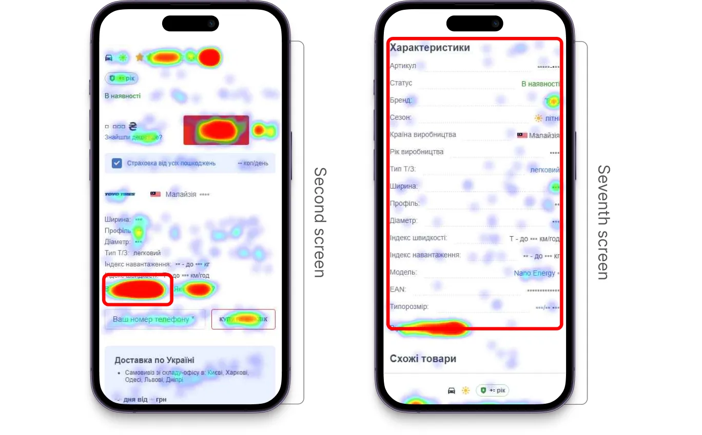
The solution? We moved the characteristics block right after the photo section and placed reviews after it, so product details became immediately accessible without extra clicks.
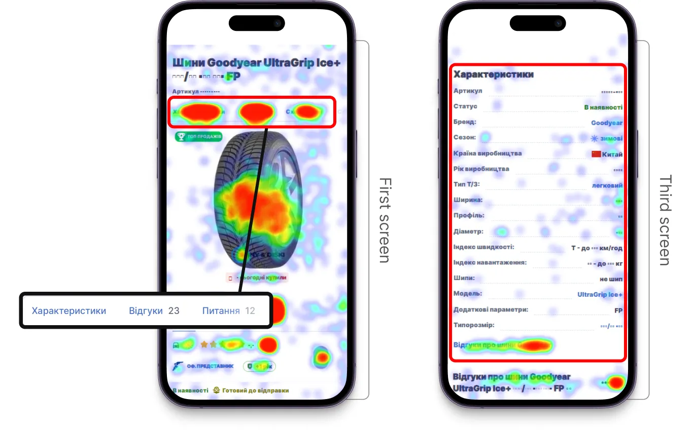
By simply aligning the layout with user intent, over 40% of users started viewing the features block, and conversion from product page to cart increased by 11%.
And what if we align SEO, usability, and branding in one consistent experience? The results can be even better. Let’s take the Fotoklok case study.
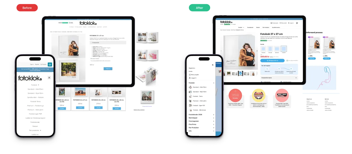
The product details page was redesigned around three core principles:
- Clarity of choice: large images in the carousel, formats shown as visual cards instead of text, and a thumbnail slider with a video option. A “Related Products” block keeps customers engaged and helps them discover the right fit.
- Process explained. The ordering process is illustrated by icons in three easy steps: upload photos, customize, and receive in 48h.
- Trust and conversion cues: customer photos and reviews for social proof, quality/award badges that emphasize reliability, benefit highlights, secure payment icons, and bold CTAs were placed at key points to reassure users and remove hesitation.
Together, we optimized PDP design, content, and structure so the site works equally well for users and for Google. Not only PDP but all the key pages were improved, and the results were visible. In figures, it looks as follows:
- +30% traffic from Google
- +25% boost in conversions
- Most successful revenue season in the company's history.
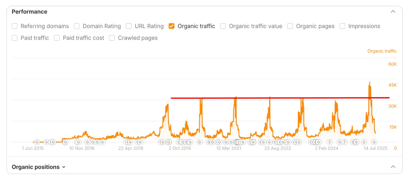
SEO performance of the Fotoklok website before and after the redesign
Category Pages: Help Users Find the Right Product Fast
Category pages (PLPs) often rank well for broad queries, but they suffer from high bounce rates. Why? Because users come here to choose.
If filters are slow, product cards are weak, the user has to reload the page every time they select a size or color, or navigation is unclear, the journey ends right here.
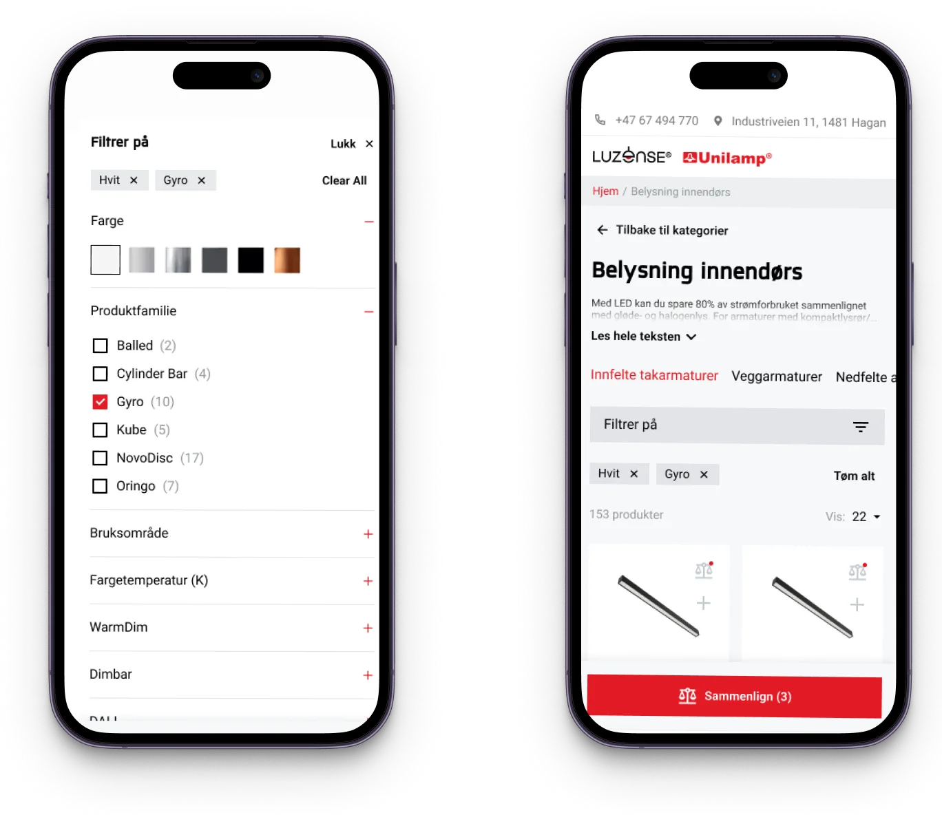
Let’s take a look at the Unilamp case. Unilamp is a Norwegian company, a global brand in architectural lighting. It’s a B2B segment. Thus, the category page plays a key role here. However, mobile users had to endure a page reload for every single filter selection. Plus, adding multiple items to a project list required opening every single product page…a nightmare for B2B buyers.
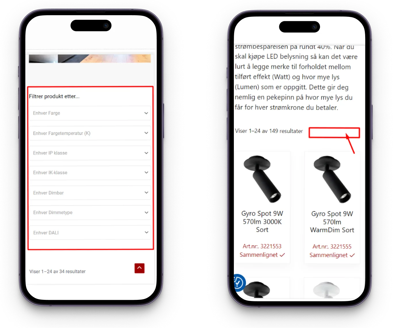
To fix it, we:
- Added a Filters button leading to a dedicated page with grouped parameters (price, size, color), where users could select multiple parameters at once.
- Added a “+” icon to every product card for forming an ordering list.
- Optimized filtering options and made them visually structured.
The results? Figures speak volumes:
- +30% user engagement.
- +41% conversion (requests left on the website).
- +16% average session duration.
Homepage and Core Pages: Structure That Google Can Index and Users Can Follow
While new SEO traffic often lands on specific products, your homepage is the anchor for returning visitors and direct traffic.
The key requirement here is structure.
Google indexes text, but humans scan structure. A homepage should act as a dispatch center, guiding users to their needs instantly while signaling authority.
Let’s take the GreenChef project. Seeing is believing. So, below are the homepage screenshots of the GreenChef site before and after the optimization.
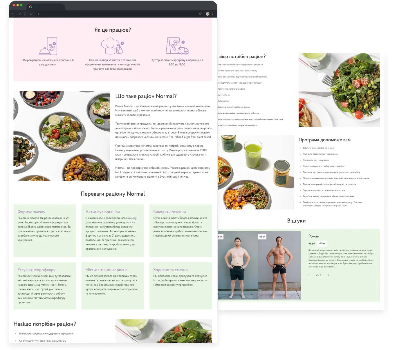
The content didn’t disappear. It became usable, and that changed behavior:
- +49.65% homepage engagement
- +23% micro-conversion from category listing to product page
- +13.17% increase in average time on site
Mobile-First Isn’t a Trend. It’s Where Most Conversion Leaks Hide.
And the last point, but definitely not the least, is the mobile-first concept. Here is a simple test for your mobile interface: Could a pug place an order?
It's a joke, but a serious one: if your calls-to-action demand surgical precision to click, you're definitely losing sales.
Jokes aside, 67% of users say that buttons and links that are too small make mobile shopping difficult.
A few key facts to remember:
- The average fingertip is about 1.6–2 cm wide, and a thumb has a touch area of around 2.5 cm.
- The minimum recommended size for a touch target is 1 cm × 1 cm (at least 28 × 28 px).
So, when designing a mobile app or responsive website, make sure there’s enough spacing between interactive elements — and that buttons and links are large enough to prevent accidental taps and frustration.
Let’s take a look at the SpyStore example.
Their mobile category page was a conversion killer: long text blocks, oversized titles, barely visible prices, and an unusual comparison button. Users had to scroll just to see products. Only 0.13% of mobile users reached the comparison page.

We shortened text blocks, resized elements by importance, increased spacing, displayed categories as tags, added a clear comparison button, and introduced collapsible menus with familiar icons.
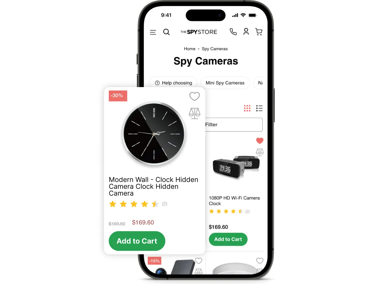
And results were immediate, massive, and seen one month after the release:
- The eCommerce conversion rate increased by 16%
- The share of mobile visitors grew
- The number of items added to the cart on mobile increased by 100%
{{ block }}
Conclusion: SEO Brings People In. UX Helps Them Finish the Journey.
A beautiful site without SEO means no visibility.
But traffic to a non-converting site is also wasted.
Real growth happens only when SEO and UX work together.
So how do SEO and UX actually fit together?
By treating SEO not as a goal but as a shared process — with one plan and clear ownership across teams.
A simple integration model:
- Discovery: SEO defines intent and demand; UX validates this with user research and the Jobs-to-Be-Done framework.
- Structure: UX designs flows and visual hierarchy; SEO ensures crawlability, internal linking logic, and a taxonomy that aligns with keywords.
- Content & design: SEO guides the semantic structure (H1s, schema, entity depth); UX ensures readability, scannability, and accessibility.
- Testing: UX and CRO test behavior; SEO tracks organic performance.
- Post-launch: One review — technical health + user behavior.
This is why the strategy survives every Google update: it’s not built on tricks but on satisfying real user needs. Rankings improve because behavior improves.
If organic traffic isn’t converting, the bottleneck isn’t Google. It’s the experience.
Don’t let your site become a bottleneck.
FAQ
Question reference
Answer reference


.png)
.png)


More real-world Turum-burum cases?
Review our vast portfolio of cases in a variety of business fields to make sure of our expertise.
Go to Portfolio
