


AI Overviews: How To Survive and Why UX Your Most Underrated SEO Signal
How AI search changed the rules for SEO and why the fundamentals never did
There is an elephant in the room, and it’s generating zero-click summaries at the top of our search results.
With the rollout of AI Overviews (formerly SGE), the SEO community (and, honestly, businesses too) has been in a state of low-level panic. Google’s algorithm feels more mysterious than ever, organic traffic is shifting in ways that defy old logic, and the “publish 2,000 words and build links” playbook is showing serious cracks.
To find the answer to “what to do,” I, Denys Studennikov (COO at Turum-burum), sat down with Christian Rudolf, founder of TopDog, who has the answers, as for over 20 years, he has led 300+ SEO projects by focusing on search’s economic impact and business goals.
The thoughts, ideas, and insights are all here.
AI Overviews Are Not a Death Sentence (For Everyone) Or 6 Things To Mind To Survive
So below is a breakdown of how modern search actually works today and why UX is the only algorithm-proof strategy you have left.
The AI Overview Panic: Quality vs. Quantity of Traffic
The biggest fear surrounding AI in search is the massive drop in organic traffic. Recent data, including studies on the rise of zero-click searches and debates on AI search optimization, found that 68% of all US Google searches now end without a click, and when an AI Overview is present, click-through rates drop by nearly 60%.
But here is the thing to mind: not all traffic is created equal.
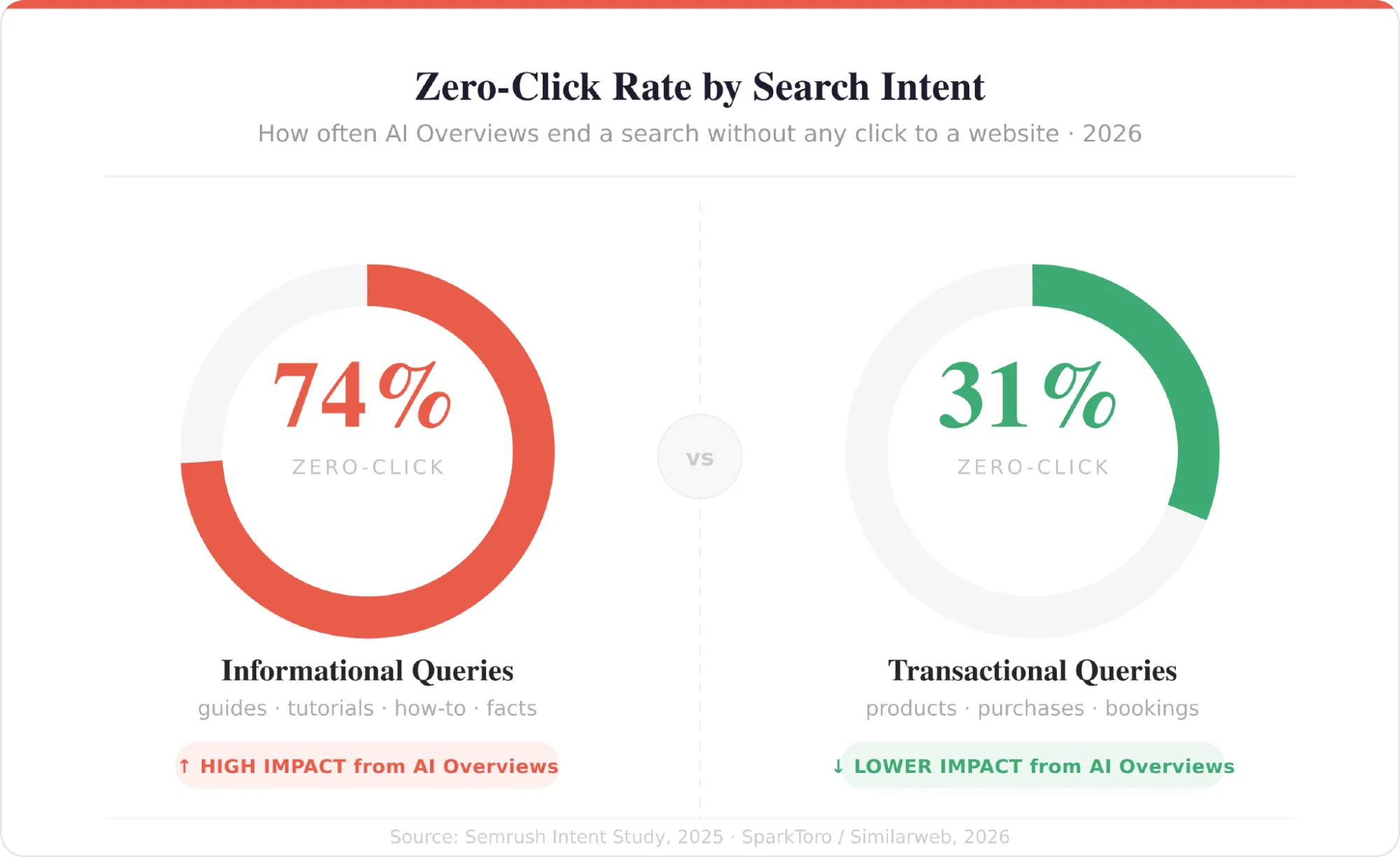
E-commerce queries trigger an AI overview only 3.2% of the time, compared to near-universal coverage for informational how-to content. Google even has a term for content the AI can now fully synthesize on the spot: commodity content. If your top-of-funnel strategy is built on answering “what is” and “how does,” the machine has already replaced you.
“If you have informational queries like ‘why,’ ‘when,’ or ‘who,’ you might see a huge drop. Media sites, affiliates, and top-of-funnel B2B content are hit hard. But if you look at commercial and transactional queries, the impact is way less. For example, Swedish Amazon ranks for over 300,000 keywords and combinations, but only about 24,000 of those trigger Google AI Overviews. If we did the same for a media site, 80% would have an AI overview.” — Christian Rudolf
The era of equating “more eyeballs” with “better SEO” is over. Instead of panicking over lost informational traffic, the goal is to capture the user when they are ready to act. If your site’s goal is stronger leads and acquisition, a smaller pool of highly targeted, high-intent traffic converting on a frictionless interface is infinitely more valuable than a million users who bounce after reading a line.
The Algorithm Is Mysterious, but the “Back Button” Is Not
We often hear that the algorithm is too complex to understand. But at its core, Google is still measuring something very simple: did the user get what they came for?
That’s about task fulfillment. And it applies no matter what the task is. Whether the user wants to buy tires, download a report, or book a demo, our job is to move them further down their journey.
That step looks different depending on the context: in e-commerce, the journey is usually quick — arrive, find, buy. In B2B, it’s far longer, spanning research, comparison, and multiple visits before any decision. But in both cases, the principle is the same.
So if they arrive at your website and take one more step closer to their final goal, that is goal fulfillment. And whatever that goal is, it is truly important to Google.
Here’s a simple example that makes this concrete. A user searches “buy summer tires.” What they do not want is a 1,800-word article on the history of vulcanized rubber. But they expect a trustworthy interface where they can find options and hit a clear “Book a Fitting” button. And that’s a matter of good UX/UI. Nothing revolutionary here, and yet plenty of businesses still get it wrong.
“If the UX is terrible, the user will punish you by hitting the back button. This is super toxic. It is a vote against the website, a vote against the content, and a vote against the brand. Google collects, saves, and analyzes this information. It is not just bad for your business; it is actively bad for your SEO.” — Christian warns
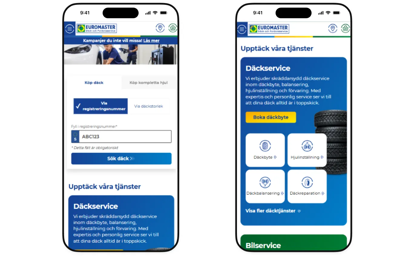
Let’s take the EuroMaster website as an example. If you visit it once (especially on mobile), you’ll understand why many people are not good at it. The search form users came for competes with a promotional banner, cramped header icons make misclicks likely, and the “Sök däck >>” CTA gets lost in the interface entirely.
In Google’s latest core update, it dropped from page one to page three.
And visit Shiny&Diski website on mobile to see the difference. Structure, accents, navigation, and entry points are made to help users find the needed product as fast as possible.
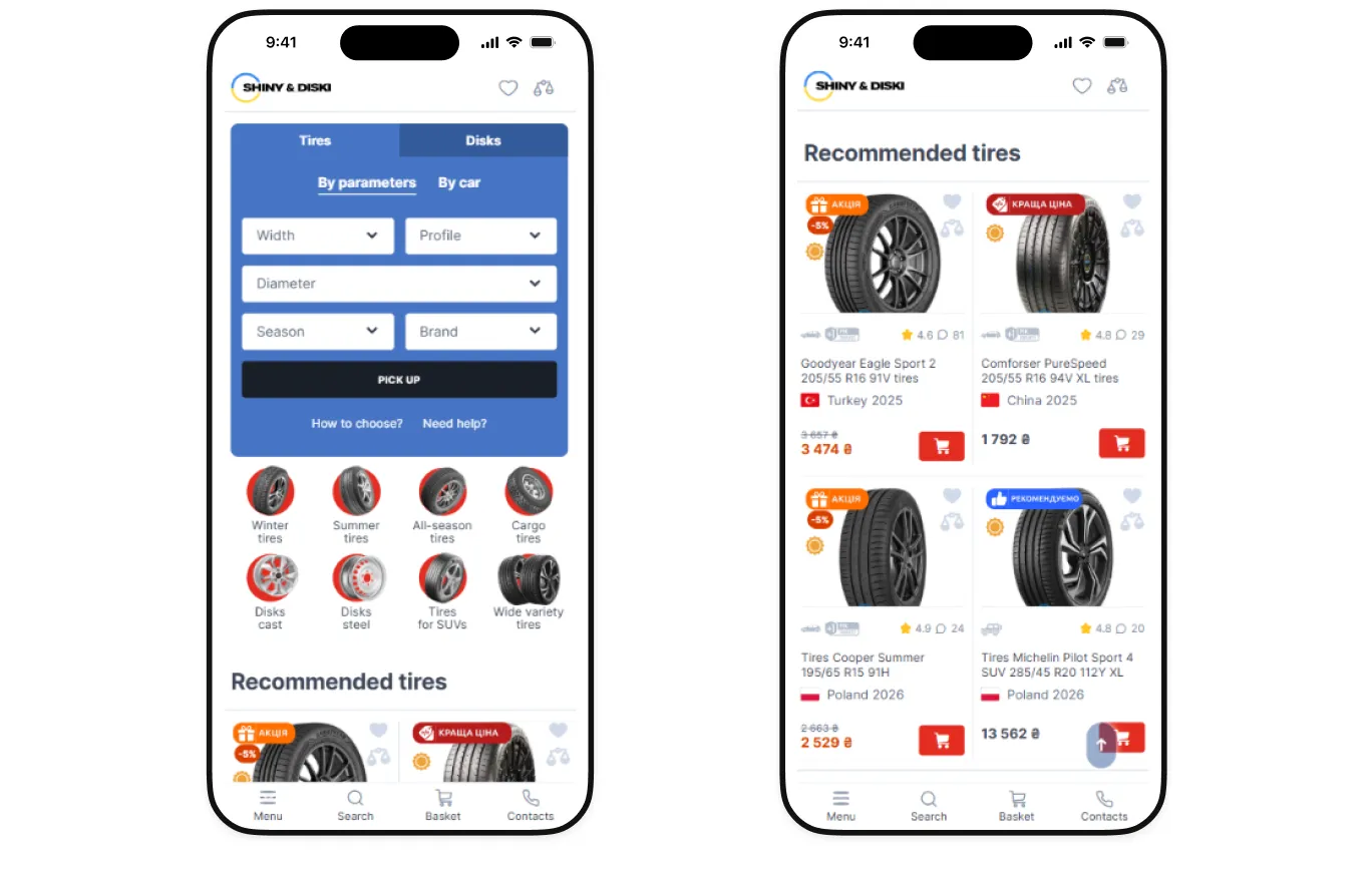
If your interface creates friction, you are signaling to the algorithm that your page does not fulfill the user’s intent. This is also what Google’s E-E-A-T framework (Experience, Expertise, Authoritativeness, Trustworthiness) actually describes in practice. Good UX is how you prove your relevance to the machine.
Core Web Vitals: The “Hygiene Factor”
You can’t discuss UX and SEO without addressing Core Web Vitals (CWV) and site performance. Yes, they matter.
“Core Web Vitals aren’t optional — skip them, and you face severe SEO problems immediately. But they’re the floor, not the ceiling.” — Christian claims
But the industry has developed a habit of treating technical performance as the main event when it is “a hygiene factor.”
Fast load times and stable layouts support the experience. They do not create it. A blazing-fast website with confusing navigation and a buried CTA will still bleed conversions, and rankings will follow.
You’ve already met Euromaster.se. Their problem was never backend performance — it was a disjointed interface that sent frustrated users straight back to Google with their question still open, taking the rankings down with them.
“It’s like brushing your teeth before you leave your home. You can get away with skipping it once, but not twice.” — Christian says
Fix your CWV according to Google’s technical documentation, absolutely, but don’t pretend a fast server will save a broken interface or user flow.
How AI Bots Actually Crawl (Hint: They Need HTML)
We tend to think of AI bots as hyper-advanced, but from a purely technical crawling perspective, they are surprisingly primitive.
While Google’s crawler has spent 20 years learning how to execute and render complex JavaScript frameworks (as outlined in their Crawling and Indexing documentation), AI crawlers feeding LLMs do not have that luxury.
ChatGPT runs on Bing’s index. Gemini uses Google’s. Tools relying on Common Crawl (the open-source archive that feeds most LLM training data) only know your content if that archive actually captured it. If you’re not in there, your AI search visibility suffers regardless of your Google rankings.
“These new tools have a problem with retrieval. Their capability of reading front-end frameworks compared to the Google crawler is way less. In many cases, it’s zero. Your content needs to be in raw HTML to be reliably digested by databases like Common Crawl.” — Christian explains
Furthermore, the way these bots index context has evolved. Instead of fetching one answer for one query, AI relies on “fan-out” or “grounded” queries.
As SEO expert Malte Landwehr highlighted recently, AI tools break down a single prompt (“I need a waterproof kids’ backpack for a mountain hike”) into multiple sub-intents. The bots then rapidly fetch information for each sub-intent to synthesize an answer, dramatically altering traditional crawl behavior.
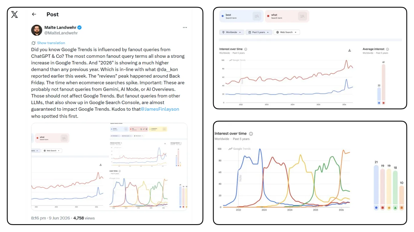
If your content is buried in un-renderable JavaScript, or if your site architecture doesn’t clearly structure these specific solutions, you are invisible to the AI. Clean, semantic HTML isn’t just an old-school SEO best practice; it is the prerequisite for AI discovery.
A Quick Note on Mobile-First: It’s Mindset, Not Checkbox
Mobile-first has been the standard for years. However, the disconnect happens when companies treat mobile-first solely as a technical checklist (e.g., passing the viewport test) rather than a usability requirement.
A page can pass every mobile-friendly test while still being a nightmare: tiny touch targets, navigation that requires four taps to reach anything useful, pop-ups that swallow the entire screen.
Mobile-first means a user can comfortably achieve their goal on a small screen. If thumbs can’t navigate it, the algorithm won’t reward it. And, just for your information, 76% of sites obtained “mediocre” or worse performance scores for touch interfaces, with 48% receiving “very poor” ratings.
And keep a few key facts in mind when designing to ensure enough size of interactive elements and spacing between them:
- The average fingertip is about 1.6–2 cm wide, and a thumb has a touch area of around 2.5 cm.
- The minimum recommended size for a touch target is 1 cm × 1 cm (at least 28 × 28 px).
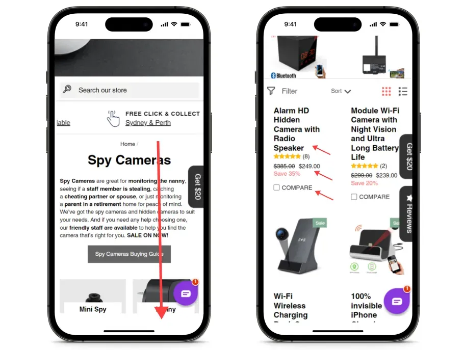
Our The SpyStore case makes the principle tangible. Their mobile category page was responsive but far from mobile-friendly and, to put it diplomatically, a conversion killer: long text blocks, oversized titles, barely visible prices, and a comparison button that confused more than it converted.
Users had to scroll past everything just to see actual products. Only 0.13% of mobile visitors ever reached the comparison page.
We shortened text blocks, resized elements by hierarchy, increased spacing between the interactive elements, displayed categories as tags, added a clear comparison button, and introduced collapsible menus with familiar icons.
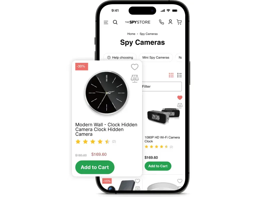
One month after launch: eCommerce conversion rate up 16% and items added to cart on mobile up 100%.
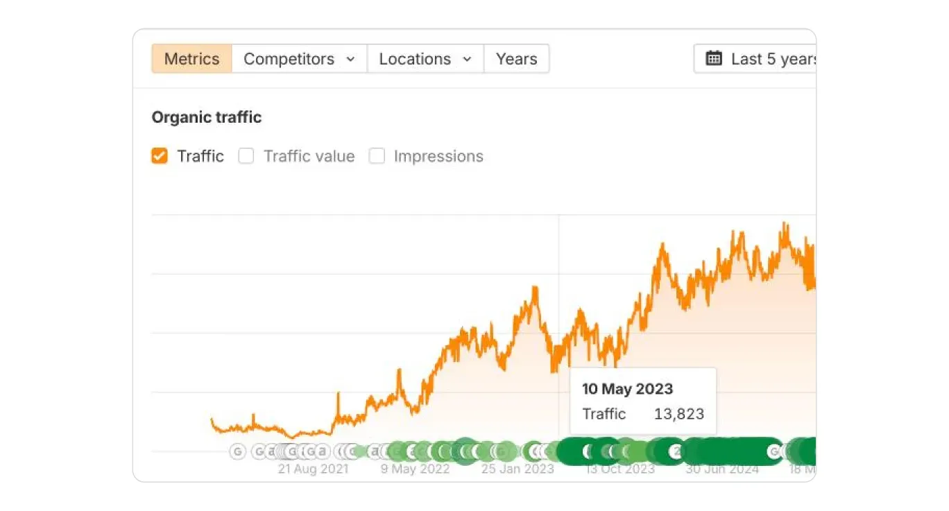
And here’s where the SEO loop closes: the website redesign had a direct, measurable impact on organic traffic. Not because anything changed in the content or the links. Because users stopped bouncing.
B2B and Media Companies: It’s Where Everything Has Changed
What should a media company do when their informational traffic evaporates overnight?
“Close business and go home. Or you can go all-in on Google Discover — there’s traffic there. B2B needs to get serious about the full funnel: ICP, user journey stages, and a conversion hypothesis at each step. Affiliate businesses face the hardest road.” — Christian
In each case, the path is the same: know who you’re for; map what they need at every stage; and build UX and content that serve each step, not as separate workstreams but as one integrated answer to the same question: where is this person in their journey, and what do they need to take one step further?
Conclusion: Stop Treating Your Strategy Like a Silo
“The tactic phase is over,” Christian Rudolf says. He’s serious.
The panic over AI in search stems from a fundamental disconnect: treating SEO and UX/UI as separate tactics when they should be part of business strategy.
Your UX/UI design, your content strategy, and your technical SEO must merge into a single, cohesive effort focused on moving the user down the funnel and answering a single question: What does this person need, and are we giving it to them?
Stop optimizing for bots. Start removing friction for the human on the other side of the screen, and you stop having to guess what the next algorithm update will require, because what’s best for that person is exactly what every version of the algorithm has been rewarding all along.
Everything else is hygiene.
FAQ
Question reference
Answer reference

.png)








.png)

.png)

More real-world Turum-burum cases?
Review our vast portfolio of cases in a variety of business fields to make sure of our expertise.
Go to Portfolio
