


Logo design for business: What matters and when to refresh it
Most logos are approved on a large screen in a meeting room. Customers meet them somewhere else: in a mobile header, a round social avatar, a browser tab among a dozen others, a label on a parcel.
That gap causes quiet brand problems. A logo that looked convincing in the presentation proves awkward in daily use, so teams improvise: someone stretches the file for a banner, someone redraws a simpler version for Instagram, a printer picks a colour that looks close enough. A year later, several versions are in circulation, and none is quite the one that was approved.
This article is for founders, CEOs, CMOs and marketing leaders who commission or approve a logo. It explains what logo design for business actually involves, which qualities matter, how to judge proposals, when a refresh beats a replacement, and what an agency should leave you with.
The Essentials: A good business logo helps customers recognize your brand, reflects its positioning, and works consistently across your website, social media, and other channels. Before approving a design, check how it performs in real applications. If your current logo is already recognizable, a refresh may be enough without starting from scratch.
Why logo design matters for a business
A logo is the mark that tells customers they are dealing with the same business, wherever they see it. Its main job is recognition: helping people notice the brand and remember it next time.
That job depends on consistency. A shopper might see your ad on Monday, find you in search results on Wednesday and receive an order confirmation on Friday. When all three carry the same mark, the encounters build on each other; when each carries a slightly different version, the customer has to do the linking.
So a logo problem is rarely just a matter of looks. An outdated mark can make an established company look less current than its products.
Three terms often get mixed up. A logo is one recognizable element of a brand. Brand identity is the wider visual language around it, including colours, typography and imagery, plus the rules for using them. Branding can also include positioning, naming and messaging.
Recognition is harder to build than an attractive design might suggest. According to Ipsos’s 2026 research, only 15% of more than 12,000 distinctive brand assets analyzed across 900+ brands reached its highest recognition category: assets instantly and uniquely associated with the correct brand. The research covers logos, colours, packaging, and other brand elements, not logos alone. For businesses, the lesson is clear: a distinctive identity needs more than a strong initial design. It needs consistent use over time.
What makes a good logo for a business?
A good business logo is recognizable, distinct from competitors, relevant to the brand’s positioning, readable at the sizes customers see it, and flexible enough for the formats the business uses.
- Recognition that survives a glance. People rarely study a logo; they see it for a moment in a feed or on a delivery box. A recognizable logo has something that holds up in that moment, such as a distinctive shape, letterform or colour relationship. The more a mark relies on fine detail, the less of it remains.
- Differentiation from the category. Most markets have visual defaults: leaves for natural products, shields for security, shopping bags for online stores. A logo built on the default symbol says which category you belong to, but not which company you are. That is why competitor research comes before any sketching: putting rivals’ logos side by side shows which category signals help customers understand what you sell, and which would make you look like everyone else.
- Relevance to the positioning. A professional supplier, a premium retailer and a discount marketplace need different visual characters, even when they sell similar products. Trends are an unreliable guide, because a mark built on this year’s style can age with it. Relevance also looks ahead: a logo tied closely to one product can become a constraint as the business adds categories or markets, so ask whether it can stretch to where the company is heading.
- Readability where customers actually see it. If the name or symbol is hard to make out at the sizes your channels use, the logo is weakest exactly where it appears most. Long names, thin strokes and ornate scripts are typical causes.
- Flexibility across formats. Many businesses need more than one file, perhaps a horizontal and a compact layout, a symbol, and single-colour and dark-background versions; what matters is that the necessary versions exist and are approved, because otherwise people make their own.
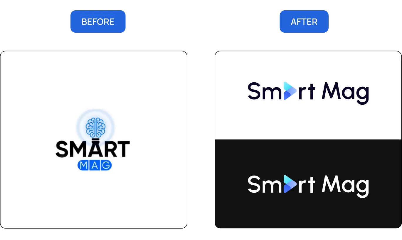
How a logo has to work across your website and other channels
A logo has to fit the places where customers meet the brand, from the website header to social profiles, ads and print. Digital placements are usually the most demanding: small, fixed in shape and seen constantly. At Turum-burum, we check logo concepts in their intended applications before final approval. That way, we catch practical problems while the design can still change, instead of leaving your team to work around them after launch.
- Mobile header. Space is tight and fine detail disappears; a long wordmark that looks elegant on desktop may need a compact or symbol version.
- Browser tabs and search results. Google requires a square favicon of at least 8×8 px, recommends going larger than 48×48 px, and asks that it represent the site’s brand. A wide wordmark can’t be shrunk into a square; a symbol or monogram can.
- Social profiles. Many platforms show profile images as circles, cropping the corners of wide marks.
- Ads, marketplaces and email. The logo appears small, on backgrounds you don’t control.
Check accessibility at the same time. W3C contrast guidance exempts logo text from minimum contrast requirements, but not the interface around it, and suggests considering a higher-contrast variant where the logo works as a link. A pale brand colour that suits the logo may not work for buttons or body text.
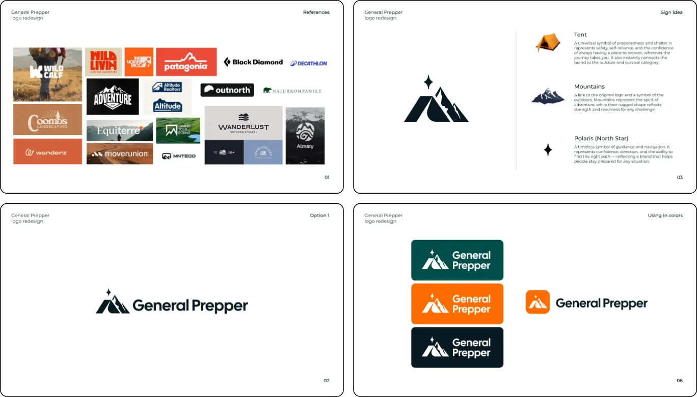
General Prepper, a Swedish online store for emergency-preparedness gear, shows the point. Its badge-style logo had many small details and was hard to use in digital interfaces, especially in the mobile header. Our team refreshed it while keeping the original mountain motif: the new sign combines a tent, mountains and the Polaris star. The star also became a recognizable element across the site, where it marks every section title.
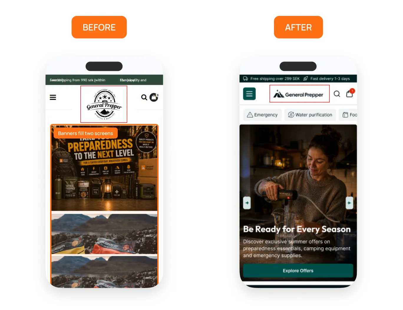
The logo should also belong to the same visual identity as the site’s typography, colours and imagery, though it needn’t resemble the buttons. A new or refreshed logo does not automatically mean a new website: a refresh with similar proportions and colours can usually replace the old version in the existing header. A new palette or typeface reaches further, into buttons, links, banners and email templates, but a refresh still does not automatically require a new design system. How much else changes depends on how far the refresh goes and on the agreed scope. When a design system is needed, we build it as part of a website or product design project. Our UI kit guide explains that layer.
How to evaluate logo concepts before you approve them
Judge concepts against criteria you agreed before design started, and look at them where they will actually be used, not just on a presentation board.
The criteria cover positioning, audience, competitors, placements and anything that must be preserved. At Turum-burum, a UX/UI design and CRO agency, we set these criteria during discovery and agree on a creative direction before we develop detailed concepts. That way, the client and our designers judge each proposal by the same standard, not just personal taste. With the criteria in writing, a comment like “it feels too playful for our trade customers” becomes something the team can check.
How well can marketers predict what customers recognize? A study published in the Journal of Brand Management compared marketers’ predictions with consumer responses for 405 existing brand elements from 50 brands. Only 44% of the predictions put an element in the same recognition-and-uniqueness category as the consumer data. The study examined existing brand assets, not new logo concepts. Still, it is a useful reminder that internal opinions may differ from customer perceptions. Agreed criteria and feedback from the right customers help fill in the gaps. The settings below show how a concept behaves outside the presentation:
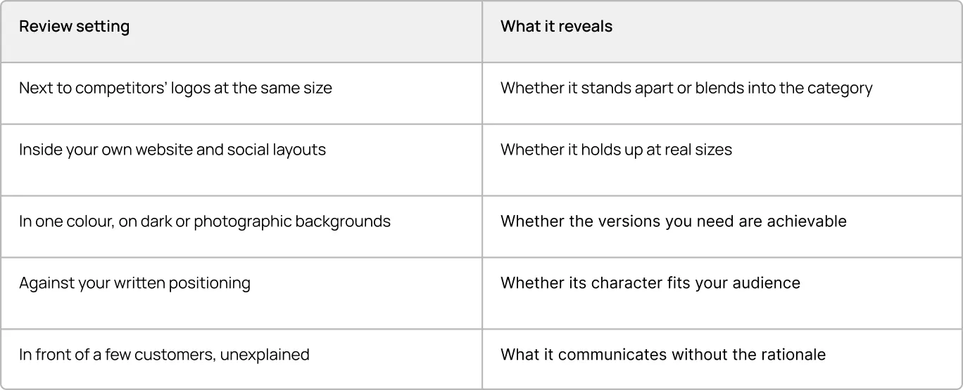
Suppose one concept looks impressive in a full-screen presentation, while another is easier to recognize in a crowded product listing and works better in your mobile header. The second may be the stronger business choice, even if the first gets more votes in the meeting room.
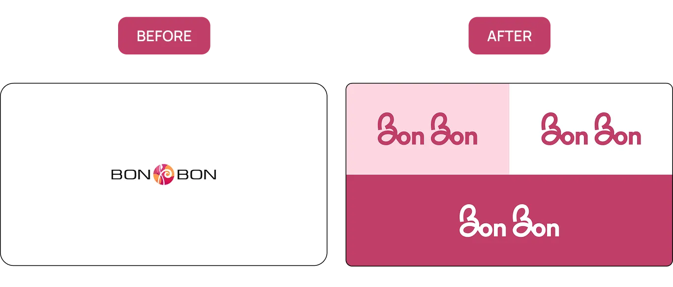
Ask what idea each concept is built on. If the designer can explain it, you have something more useful to judge than taste: does the idea fit what the business sells, and to whom? For Bon Bon, an online store that has sold professional hair, face and body cosmetics for more than 13 years, our designers developed a new logo with a wordmark and an emblem built from the letters of the brand name. Their inspiration came from waves of hair and the ribbons used to tie them. For the palette, the team considered five colour variants before settling on pink with powder, cream and lavender.
Feedback works best when it is collected in one place, tied to the criteria and owned by one decision-maker. Scattered comments from a large group tend to pull a concept toward a compromise nobody chose. If none of the first concepts works, go back to the agreed direction, work out what missed, and refine from there rather than asking for a batch of unrelated new options.
When to keep, refresh or replace an existing logo
Keep a logo that customers recognize and that works. Refresh it when the recognizable core is sound but details, proportions or colours have aged or cause problems in use. Redesign or replace it when the business has changed enough that the mark sends the wrong signal.
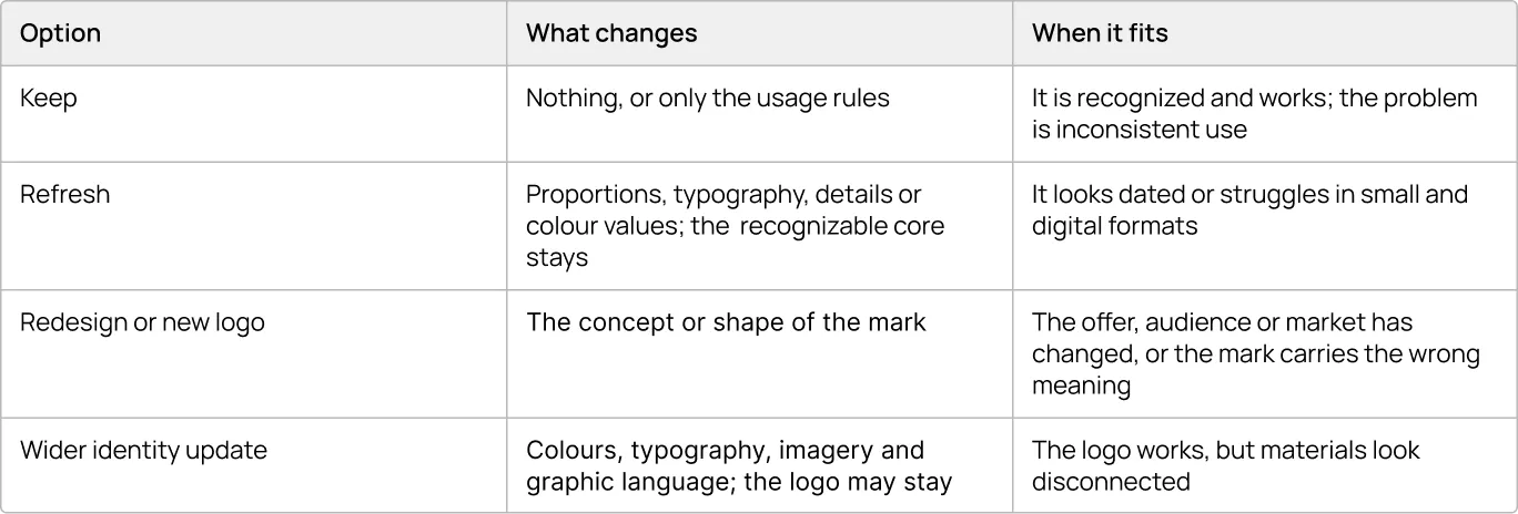
Whatever the option, first list what customers already associate with the brand, such as a shape, motif, colour relationship or letterform. Being tired of the logo is a poor reason to drop it: your team sees it every day, while some customers may only now be starting to recognize it.
Before commissioning a redesign, check whether the logo itself is the problem. Sometimes the business simply needs better files and clearer rules for using them. If a change goes ahead, update the digital channels together, replace printed materials as stock runs out, and remove old files from shared drives.
{{block}}
What to Expect From a Professional Logo Design Agency
A professional logo process should leave you with a decision you can defend and a logo your teams can use. Whichever agency you talk to, its answers to a few questions will tell you more than its portfolio:
- How do you establish what the logo needs to do before designing?
- How many concepts will we see, and how will each be explained?
- How will the logo be tested in our real formats before it is final?
- What exactly will we receive, and how are rights to the final artwork transferred?
Our own brand identity process starts with the business, not the sketches: discovery and competitor research, an agreed creative direction, then typically three distinct concepts for a new logo (for a refresh, the number of directions depends on how much is preserved). We then refine the chosen concept over two or three rounds of consolidated feedback, check it across sizes and formats, and document the usage rules.
What to bring to the first meeting. You will get better proposals sooner if you can share your positioning and audiences in writing, current logo files and where the logo appears, the competitors you are compared with, plans for new products or markets, and who will make the final decision.
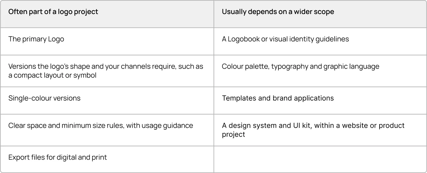
What to agree at handover. Scope varies, so the proposal should list what you will receive. As a guide:
Why Your Business Needs a Logobook
A Logobook is a guide that documents how the logo may be used. Its value is practical: the more people use a logo, the more ways it can go wrong. At Turum-burum, we document the usage rules so marketing teams, developers, and external partners all work from the same reference instead of each making their own design calls.
General Prepper’s Logobook shows what that reference contains and which question each part answers:
- Sign concept: what does the logo stand for? The tent stands for shelter and safety, the Polaris star for guidance, and the mountains link back to the original logo. People who understand the idea are less likely to “improve” it.
- Configurations: which version goes where? Each of the five versions shown earlier has an assigned use, so nobody has to squeeze the horizontal logo into a round avatar.
- Clear space: how much room does the logo need? At least the height of the capital “G”, and twice that next to partner logos.
- Incorrect use: what should never happen to it? Six examples, including distorted proportions, drop shadows and changed colours, show what to avoid at a glance
With these answers in writing, the marketing team points people to the rules instead of approving every use of the logo.
A Logobook focuses on the logo; a brand book covers the wider visual identity. Which one a project includes depends on the agreed scope.
Change the Logo Only as Much as the Problem Requires
If your logo is recognized and works, invest in approved files and clear rules. If it is recognized but dated or awkward in digital formats, refresh it and keep the recognizable core. Replace it only when the business has moved on from what it communicates.
A logo is judged where customers meet it, not where it was approved.
FAQ
How long should a business logo last before it needs a refresh?
There is no fixed cycle. Some logos work for decades with small adjustments; others date within years. Refresh when there is a functional or strategic reason, such as poor digital legibility or a shift in positioning.
Can we keep our logo and update only the visual identity around it?
Yes. If the logo is recognizable and works well, a new one is not always necessary: colours, typography, graphic elements and imagery can be refreshed around it.
Can a logo refresh change the colours?
Yes. A refresh can adjust colour values, for example to modernize them or to make them reproduce more reliably on screen and in print, while keeping the colour relationships customers already recognize.
What file formats should a logo be delivered in?
Ask for vector files (SVG, EPS or PDF) for scaling and print, and raster files such as PNG for everyday digital use, for every approved version of the logo.
Who should approve a new logo?
A small group with one decision owner: the marketing lead, someone close to customers and whoever manages the website, so practical problems come up before approval, not after launch.
Question reference
Answer reference



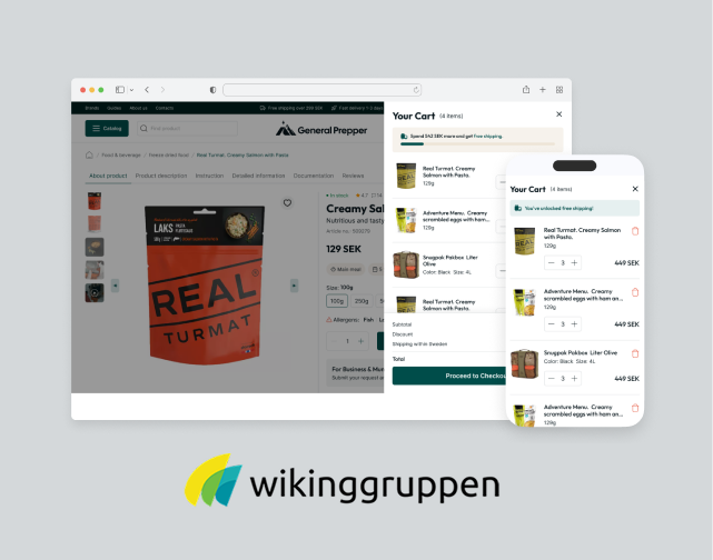






More real-world Turum-burum cases?
Review our vast portfolio of cases in a variety of business fields to make sure of our expertise.
Go to Portfolio
