

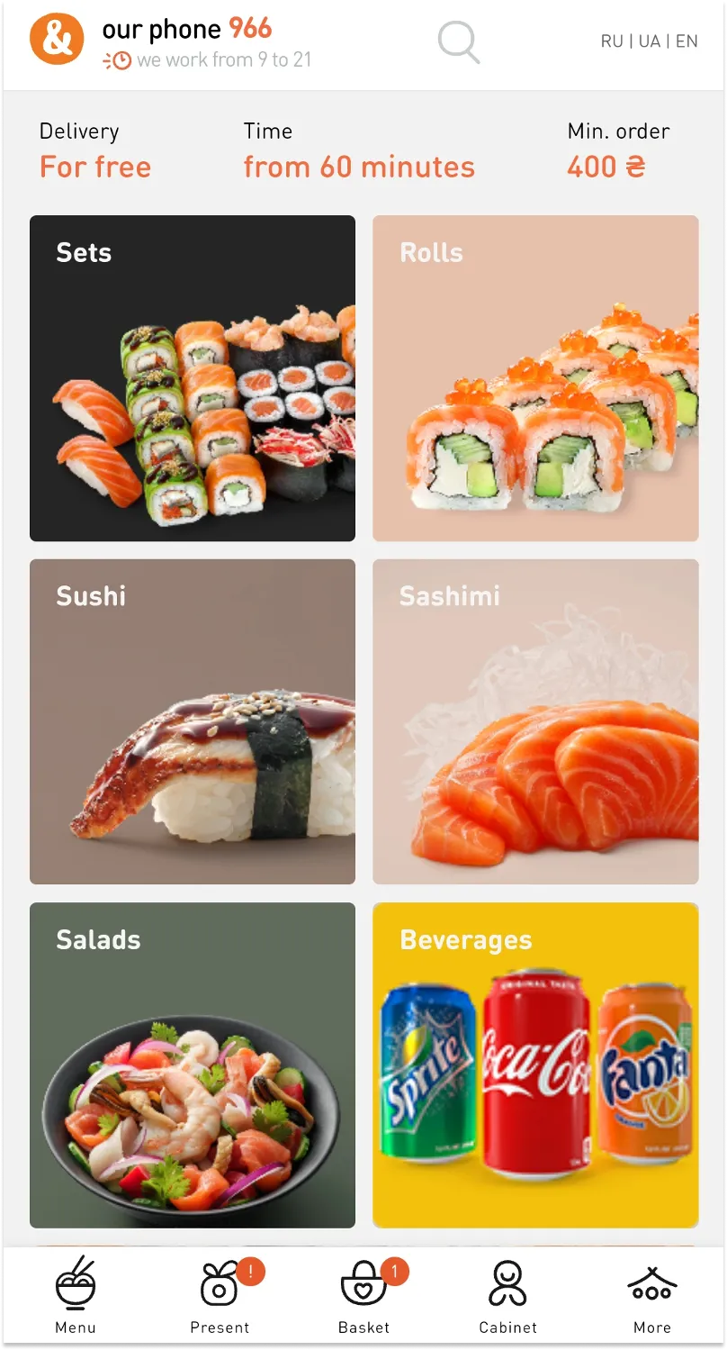
UX audit checklist for an e-commerce website: 170+ points to evaluate the interface
How to conduct a usability audit of an online store on your own? In this article you will find a detailed UX audit checklist with examples that will help you identify issues and understand what should be done to improve user experience. Just go ahead and use it.
In addition, you can read the tips from experts how to design motion effects that enhance e-commerce UX and increase conversions.
Key elements for a website usability audit
- The home page should be designed in such a way that it communicates the website content –– the user should understand what the site is about (online store of electronics, jewelry, children’s products, etc.), as well as present the unique selling proposition.
- You have 1-3 seconds to get the user interested and engaged on your site.
- The design of your online store should be unique and catchy.
- The most important information should be presented on the first screen.
- The user should be able to try all the basic features without registration.

- There are prompts and help for new users.
- There are no distractions and unnecessary information; you can close online chats, pop-up windows, etc. at any moment.
- There is no need to enter the same data twice.
- The website content is well structured and does not create visual noise.
- The headings are clear, easy-to-understand and laconically designed.
- All the website content is divided into main and secondary.
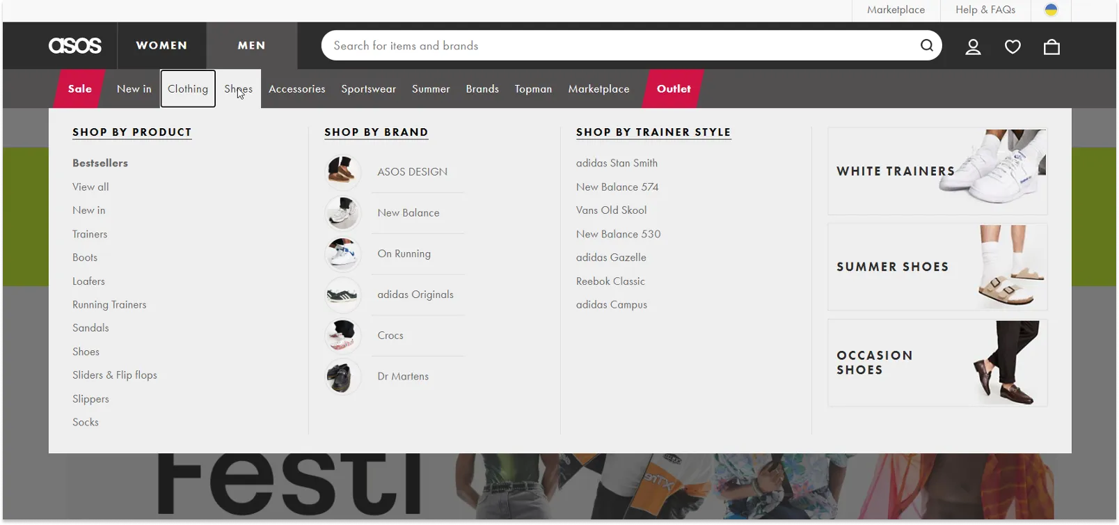
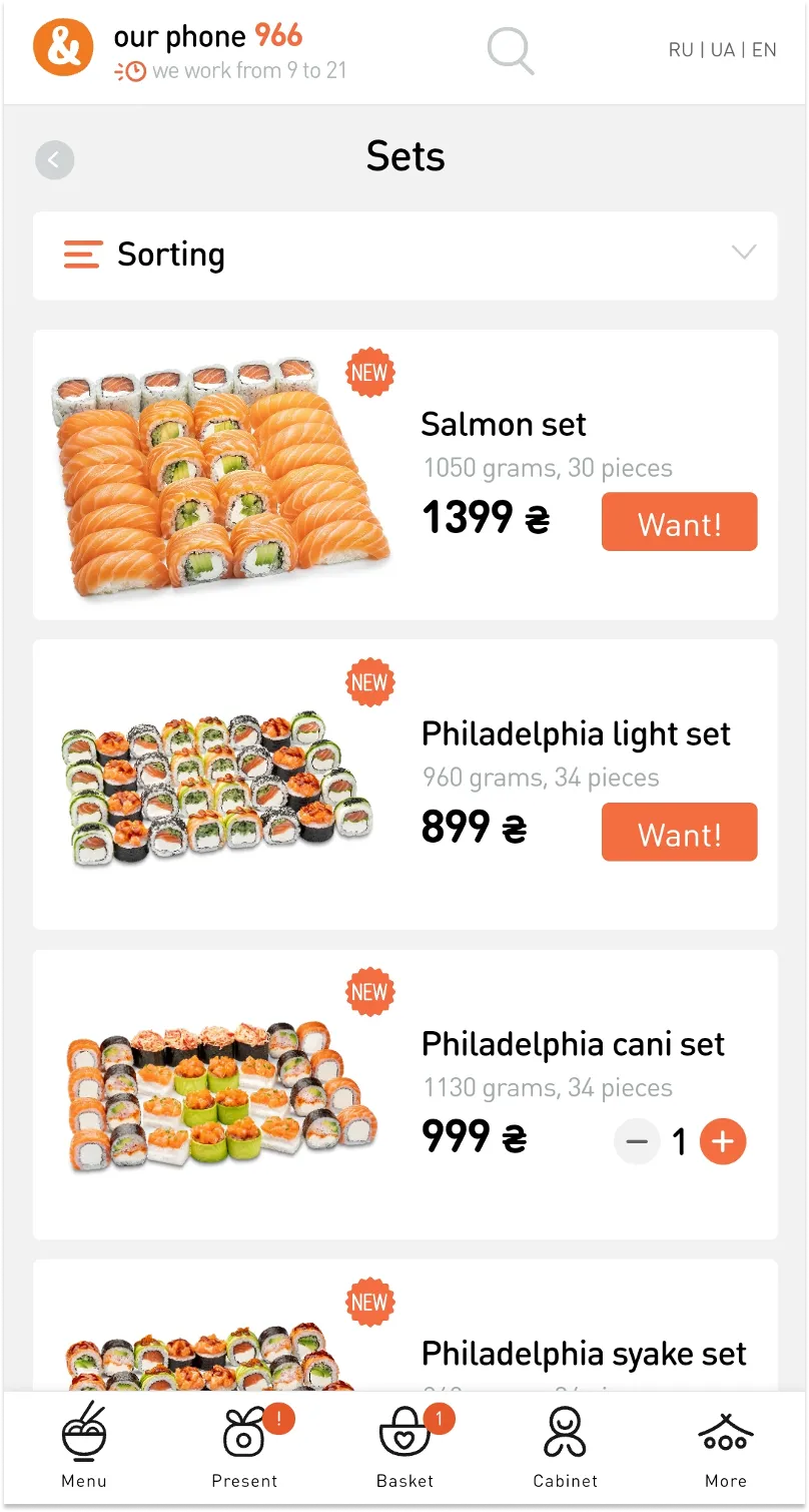
- The product catalog is well structured and intuitive so that the user can easily find the product he/she needs.
- At the bottom right of the long pages there is a back-to-top button and a sticky menu so that the user does not have to scroll long.
Website navigation
- The user always knows which section of your online store he/she is in.
- The structure of the catalog categories is well thought out.
- Key points of website navigation (catalog, shopping cart, etc.) are available to the user at any moment, on any page of the online store.
- The design of the key points of the user path (registration, purchase, subscription, etc.) is clear and simple.
- The user has access to important information from any page of the online store.
- There are no dead-end pages on the site.
- That is, on any page the user can follow the link to another page. For example, all the articles in the blog are counter-linked, in the descriptions of services and products there is a CTA for placing an order, the 404 page contains links to the main website sections or search, etc.
- The “Back” button of the browser is not blocked by the site.
Main menu (the next step of our UX audit checklist)
- The main menu of the online store should be all in one place (except for checkout) and the user should have access to it from any page of the site.
- All the menu items are sorted by priority and significance, from most to least important (left to right, up and down).
- The main menu should not contain more than two subcategories, and the subcategories should differ from the rest of the menu items.
Structure of the website pages
- The online store header should be concise and contain important information and links (logo, name, contacts, menu).
- The eye should be able to embrace every block on the page.
- If the element is clickable, it should be visually clear and obvious. Once the mouse cursor is pointed at it, it should change.
- The design of the icons and graphic elements should communicate their meaning and purpose and be intuitive.
Site search and product list page
- The search bar, its size and design should be in line with the business objectives.
- The search bar should be visible and available on any screen.
- There should be only one search bar on the page.
- There should be autofill and relevant prompts.
- Prompts should be displayed in the search box according to the priorities and selection parameters (category-subcategory-products/content).
- Search should minimize errors and false queries, look for synonyms.
- If the query is entered from a wrong layout, the search box should automatically replace the search query.
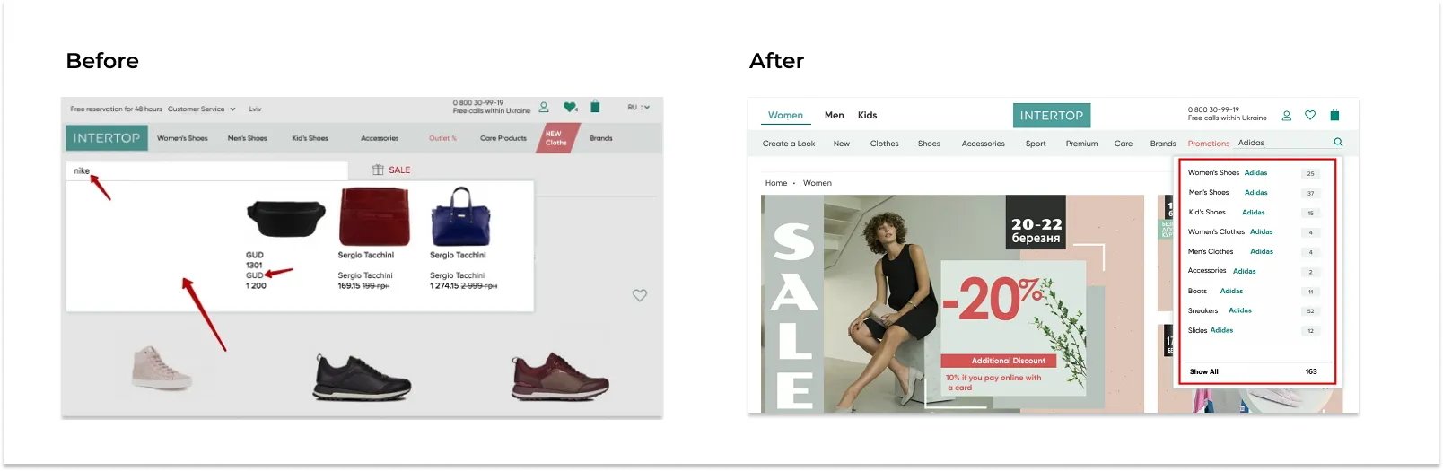
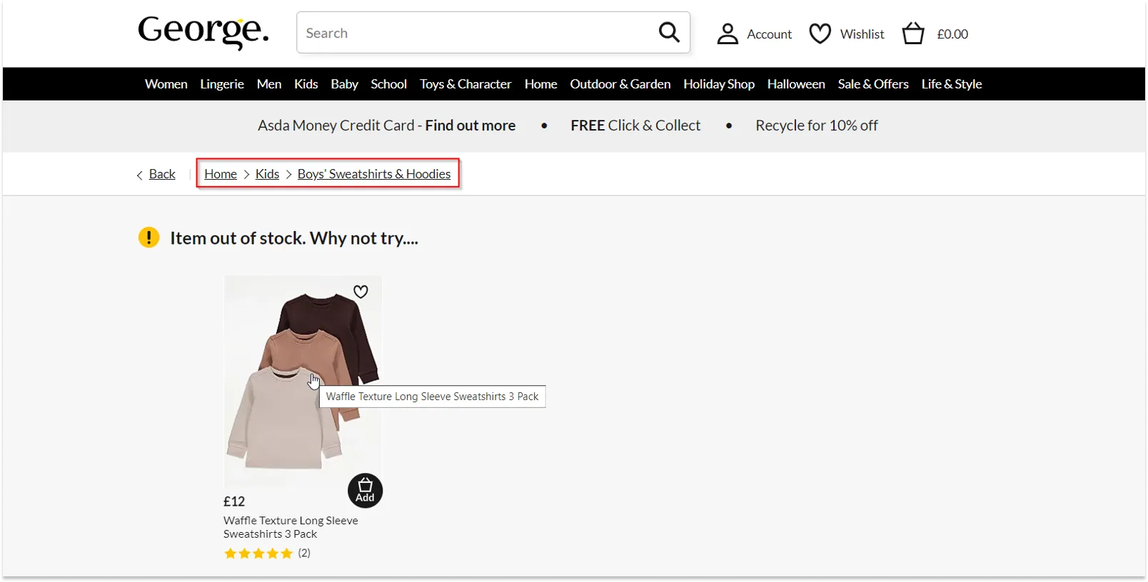
UX analysis of the Intertop online store conducted by experts before the redesign identified search issues.
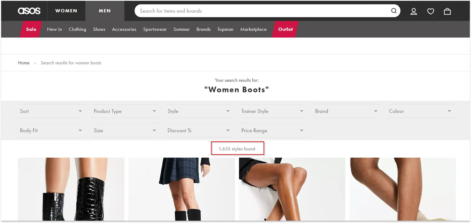
Search results page
- The search result matches the search query.
- There is a possibility to filter the products.
- In case no results have been found for the search query, a prompt appears as to how the search query can be edited or an alternative product is offered.
- The quantity of the products found for the search query is displayed.
- In case there is no possibility to search for the product by categories, the search throughout the whole site is conducted.
Text and its design on the website
- Text should only provide the information that is useful for the user, without the fluff. First comes the most important information, then the rest.
- The text is well structured –– headings, subheadings, paragraphs, quotations, different types of lists are used.
- Texts are readable and easy-to-understand, not more than 75 characters in length.
Paragraphs
- Ideally, the font size of the main text should be 16 px.
- The text should be left-aligned.
- The line length should not exceed 80 characters. If the lines are too short or too long, it negatively affects the perception of the text.
Headings
- Headings give the user an idea of “what will follow”, or, which is even better, “what the text is about”.
- The design of the headings should resemble the design of “their” paragraphs.
- The size of the font for headings should be 1.5 times bigger than that for subheadings, and the size of the font for subheadings should be, in its turn, 1.5 bigger than that of the text.
Style, size and color of the font
- The use of the uppercase should be justified and kept to a minimum, as it makes it difficult to read and perceive the text.
- Fonts should be the same for all the website pages. They should be readable and contrasting against the background.
- The color of the main text and that of the links should be different and contrast with each other.
- The use of different text colors should be justified.
- All long numbers should be separated by spaces for ease of reading (for example, 1 524 733).
Design of links and buttons
- The text of the link should tell the user where it will take him/her.
- The color and style of the links should be visually different from the rest of the text (underlined or highlighted).
- If the user clicks on a link, it changes its color.
- All the links that do not lead the user to another page have a dotted line underneath them.
- The link text is long enough for the user to be able to comfortably click on it.
- The links for downloading files should be visually different from those that take users to other pages of the site.
CTA buttons and links
- Buttons are used to perform certain actions.
- The website buttons should actually look like ones: by their shape, reaction to cursor and hover.
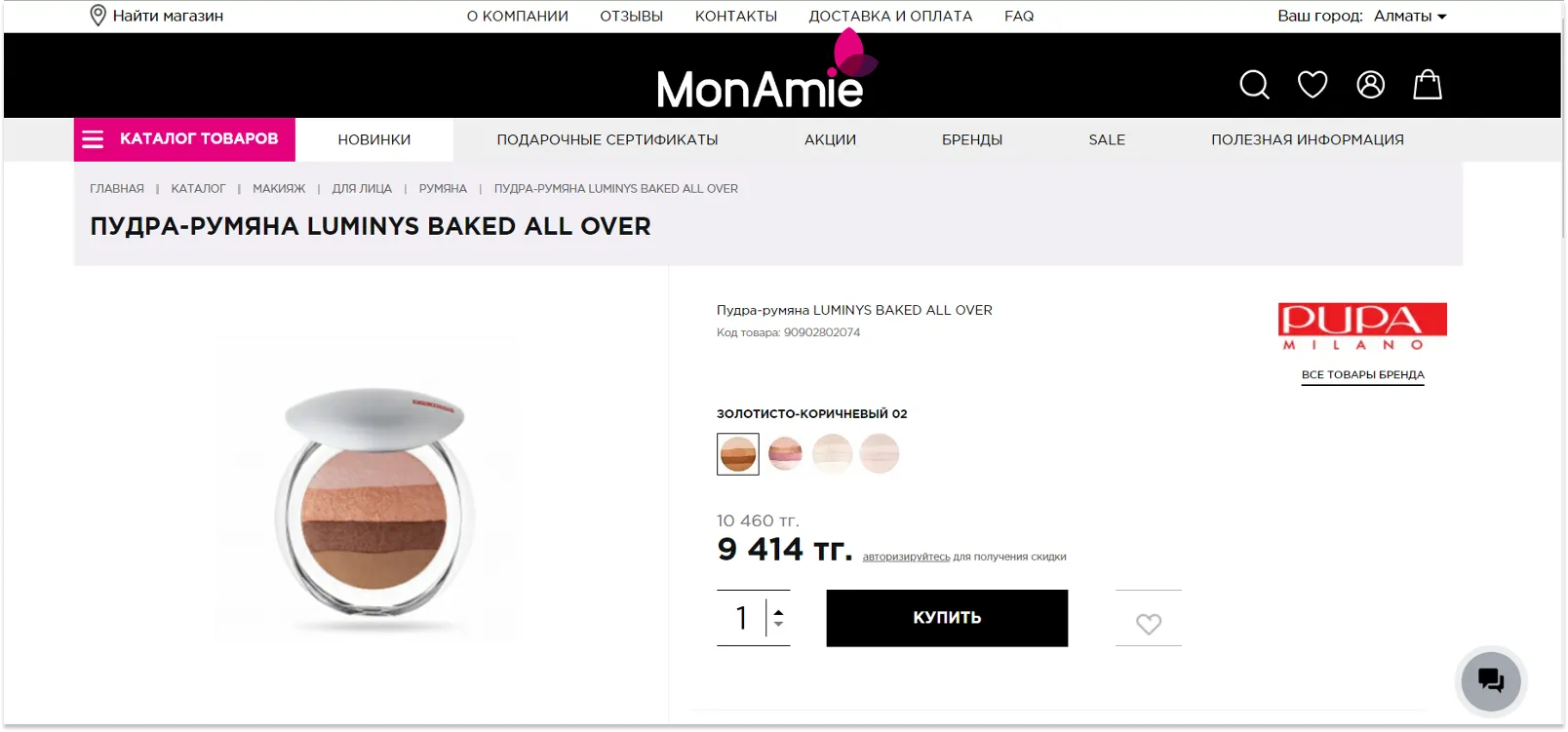
- There is only one CTA button on the page, and it visually stands out among other buttons.
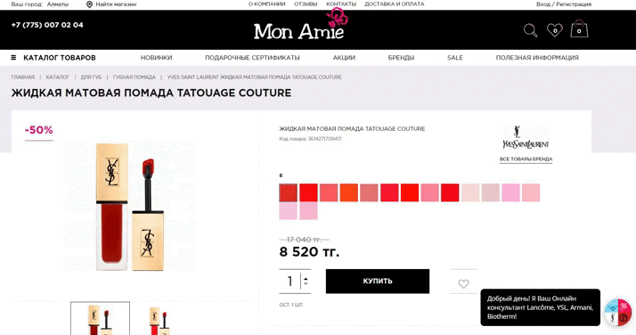
Anti-example:
In the Mon Amie online makeup store there are also several CTA buttons, but they are designed in such a way that there is only one visual accent –– BUY NOW.
- The call to action or the text on the button is an imperative verb: Find, Buy Now, Subscribe, etc.
- The button reacts to the cursor –– for example, changes the color to encourage the user to make a click.
- In case some action is unavailable, buttons and links do not disappear from the screen, but are deactivated and blocked.
Forms to fill in (the next step of our UX audit checklist)
How to design forms in general
- Forms should be as simple and concise as possible. If it is checkout, registration, or any target form, it should contain only the mandatory fields.
- If the field is optional, it should be reasoned and justified.
- If it is a big form with many fields, it should be well-structured, the fields being grouped by their meaning, with subheadings for each group.
- When you open the form, the cursor automatically moves to the first field.
- The active field is visually highlighted.
- The prompt stays in place when the focus is moved to the field.
- If the form consists of several steps, there should be a step-by-step instruction and a progress bar. The user should be informed of the step he/she is in, and how many more steps there are left.
- All the filled-in fields are saved until the process is completed so that the user does not have to re-enter the data in case he/she accidentally leaves the form page.
- The user can move the cursor from field to field using the tab key.
Form elements – fields and their meanings
- The name of the “Submit” button should correspond to the purpose of filling in the form (e.g. “Register” or “Proceed to payment”, etc.).
- There are prompts, examples, or clarifications for the fields that the user might have questions about.
- All the required fields are marked or highlighted and are visually different from the optional ones.
- The names of the fields should correspond to their meaning and purpose.
- Some fields are filled in by default with the most likely values. For example, for booking there are usually 2 adults entered in the search box by default.
- Field labels should be performed in the same style.
Validation, mistakes, and prompts
- There should be a possibility to take one step back so that the user could edit the already entered data.
- Validation of the information should be carried out immediately after the focus switch and without the form page reloading.
- If the user has made a mistake, the error message should appear near the field where the mistake was made. This message should be as informative as possible, indicating what exactly the problem is.
- If the filled-in form has not been validated, the fields should still stay filled in.
Catalog and its features
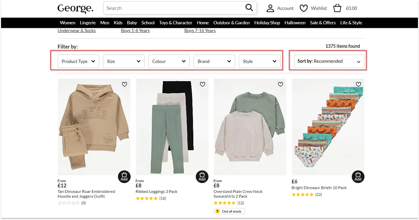
Filters on the product list page
- The user can deselect the selected values for lists and radio buttons.
- Dependent fields should be updated synchronously.
- It should be obvious, in what order, by what field and parameter sorting has been applied in this case.
- It is intuitively understandable how one can change the sorting order or field.
- The filter button is always visible to the user.
- There are breadcrumbs by which the user can return to the filtered product list after opening the product card.
- All the parameters are displayed in the filter as a list, and the user can reset any parameter.
- If the filter has complex parameters, there must be a prompt explaining them so that the user could understand how and what they can be used for.
Sending a filtered list
The user can send a link to the filtered catalog to another user, the latter being able to see the filtered items once he/she clicks on the link.
Therefore, when conducting a usability audit of the site, it is important to pay attention to the following requirements:
- When filtering parameters are applied, the URL should dynamically change.
- The filtered product list should open without redirects, filter flashes, or additional transitions, even when you open the link in incognito mode.
- All the changes of each filter field are saved.
- All the filter fields affect the filtered list correctly, both when it comes to each particular field, and to field combinations.
- After the filter is reset, the product list is rebuilt, and both the filter parameters and the URL are reset.
Adding a product to the cart from the catalog
- The user can add any product to the cart.
- Once the item is added from the catalog to the shopping cart, there is a visual confirmation thereof.
Number of items
- When the customer adds a product to the cart from the catalog page, the selected number of items should be taken into account.
- It is better if the information about the available quantity of goods in stock is displayed in the field.
- When the user adds items to the shopping cart or removes them from there, the number of items is automatically updated.
Mini-cart
- When the items are deleted, new items are added, or the number of the already added items is changed, recalculation of the total amount and number of items takes place in the shopping cart block automatically, without page reload.
Product card
- The heading contains the name of the product.
- All the information about the product is up to date and displayed correctly.
- There is a link to go back to the catalog, or breadcrumbs.
Adding a product to the cart
- The user can add the necessary quantity of the product to the shopping cart.
- There is a visual confirmation of the addition of the product to the cart.
Displaying additional blocks
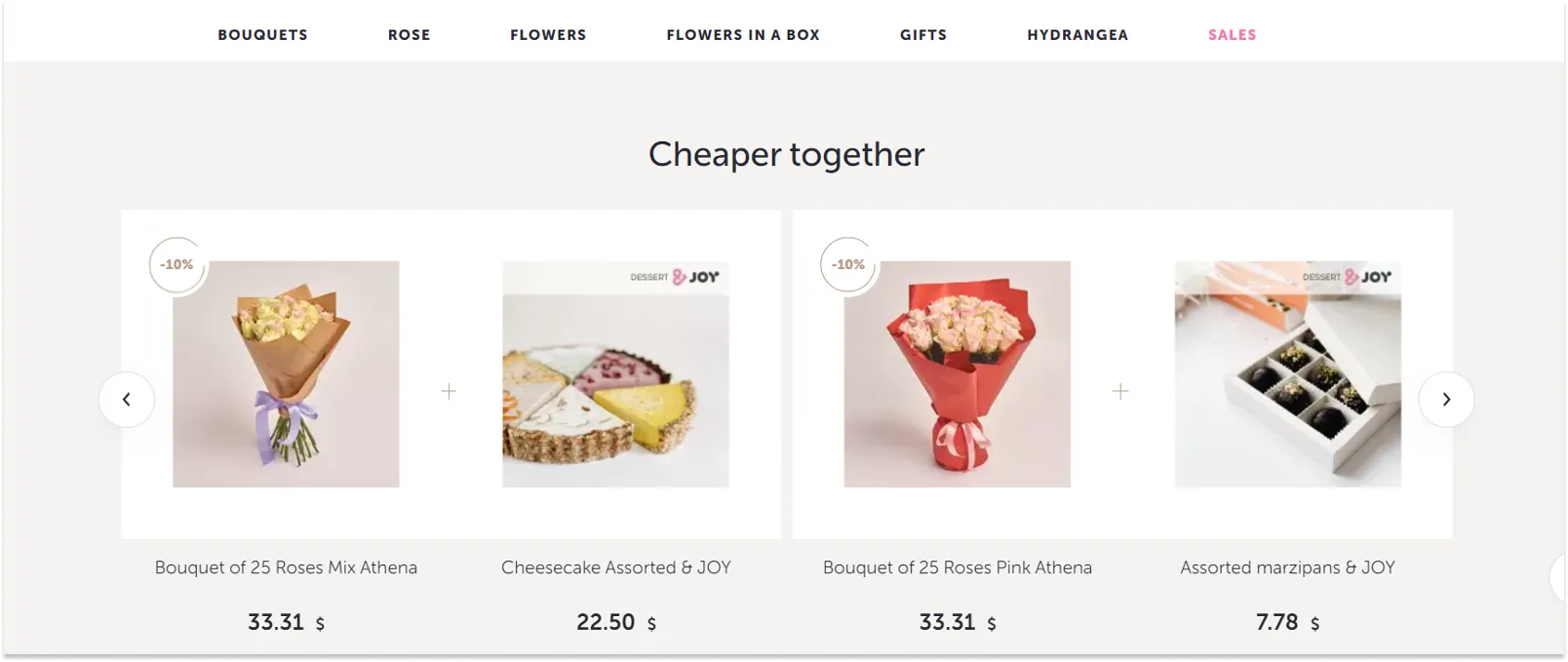
- If there are such upsell and cross-sell blocks as “Customers who bought this item also bought”, “Recommended products”, “You also viewed”, relevant products are displayed there.
For example, in the Dicentra.ua online flower store the cross-sell block is presented on the home page and offers promotional bundles: flowers plus a gift (“Cheaper together”).
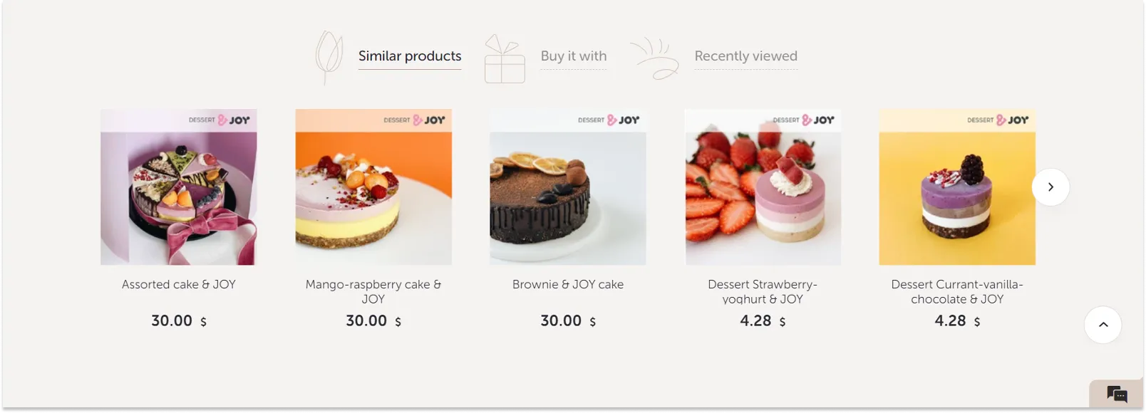
In the product card there are various options of cross-sell and upsell tools, from sweets and cakes to similar and viewed products.
- All the information about the product is provided (characteristics, reviews, configuration, etc.), links to it are displayed on the current page, but they do not take the user away from the purchase.
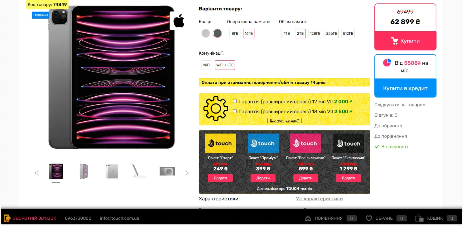
- There are several high-quality product photos with a zoom option, so that the user could have a close look at the product before making a purchase.
- If the product has additional parameters, the user can choose one of them right in the product card.
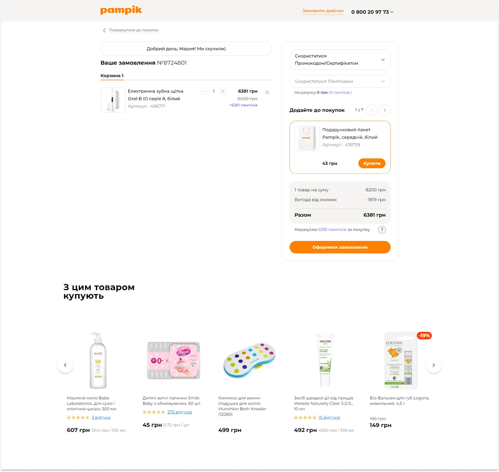
Shopping cart (the next step of our UX audit checklist)
- The total order amount shown in the shopping cart should be calculated automatically, taking into account all the discounts, promotions, coupons, shipping costs, or any other fees involved.
- If incorrect data is entered, a warning/error message appears and the values are reset.
- If the user enters a number or changes the value in the «Quantity» field, the total order amount is immediately recalculated. If a zero has been entered, the entry is removed. In this case, confirmation of the action is desirable to avoid random input.
- There is a button or a link to go back to the catalog.
- When the CTA button is clicked upon, the user is taken to checkout or the next step of the order placement procedure.
- If there is a mini-cart, all the data is synchronized with the main cart.
Checkout
- The checkout page design should be laconic and contain the following elements: a logo leading to the home page, simple header and footer. This is to ensure that the user has fewer exit points from the checkout page.
- At the checkout the user sees separate lines with the product price, the shipping cost, etc.
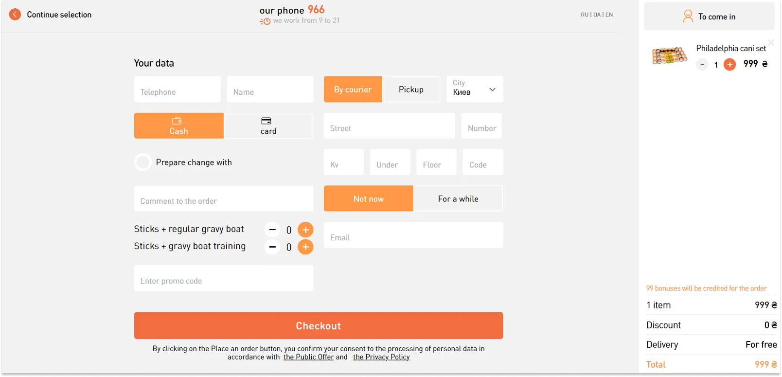
- The shipping costs are calculated automatically depending on the shipping method chosen, and the total order amount changes accordingly.
- If delivery addresses are saved for registered users, they should be able to select the saved address or add a new one. If the user chooses to add a new address, the address fields should be automatically cleared.
- The user is provided with up-to-date information about delivery methods and payment options.
- For registered users all the checkout data is automatically saved and autofilled.
- After the order is placed, an email with the order information and a link to the order history is automatically sent to the indicated address.
- New users are automatically registered once the order is placed.
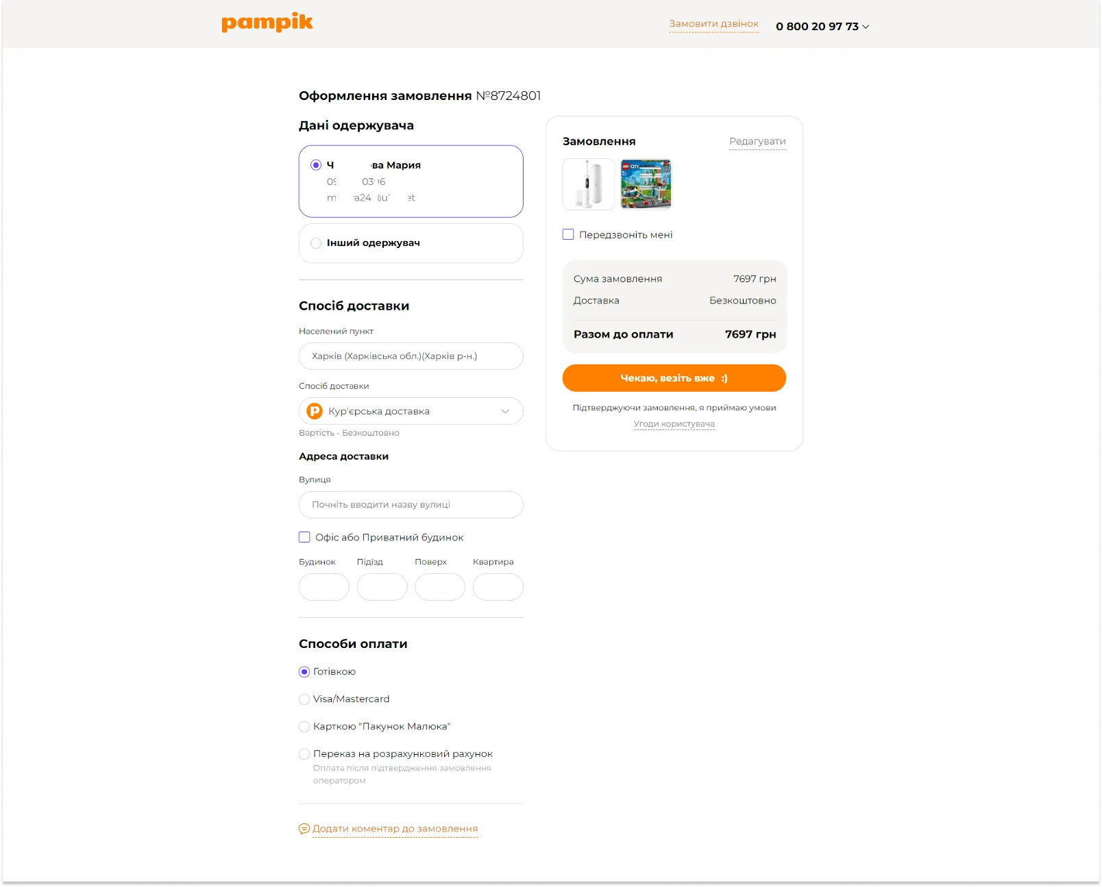
- If the user leaves checkout without completing the order, the items remain in the shopping cart.
- After the order has been paid for, the user gets to the page with the order information and further instructions.
- If a payment error occurs, the user is prompted how to make another try.
- The user can return to editing the order.
- Once the order is placed, the shopping cart is cleared automatically.
“Thank You for Your Order” page
- When the order is placed, the user gets to the page with the order information, further instructions, information as to how the order will be confirmed, etc.
- If there is an option of receiving and printing out a receipt, there should be a link to it here.
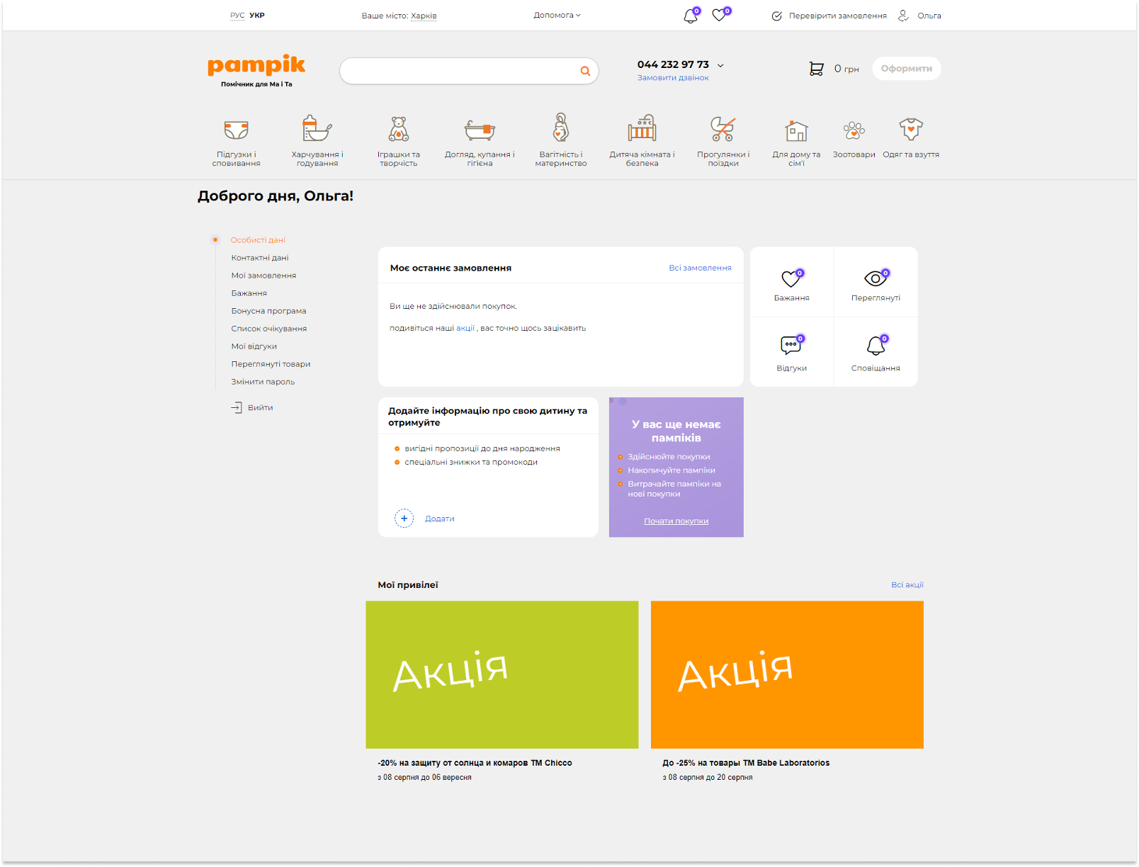
Personal account
- During the registration all the user data is saved and used for subsequent orders (name, preferred shipment and payment methods, etc.)
- There is real-time order tracking.
- Orders can be paid for from the personal account.
- The user can duplicate a previous order.
- In their personal accounts users can change their passwords, unsubscribe from the newsletter, create “Favorites” lists, leave the personal account, etc.
Website usability audit is the first step to be taken when users experience problems during the interaction with the online store, or when the conversion rate is low. In the article “Effective Ways of Testing Your Website Usability”, we share web-tools to identify interface shortcomings.
Adaptive version of the online store
When it comes to online store optimization, there is a list of requirements: Google page speed insight. If you follow them, your site should be in the green zone. Thus, UX audit of your site helps to find and eliminate errors in the interface, optimize the site performance, improve the key KPIs, i.e. it is the first step to the income increase.
Home page of the online store
- For the mobile version of the site, remove all the extra blocks to optimize the page download speed.
- All the marketing banners should be optimized for mobile devices, and the text should be readable. For this, banners of different sizes should be made (366-1920 and 320).
- For the projects mostly meant for mobile device users, the mobile-first principle should be dominating in the design (320-768-1024-1280-1366-1920).
Website navigation
- Navigation is all about consistent design elements that are always in the same spots, easy for the user to find.
- Navigation in the catalog should be the same as in the desktop version.
- The user should intuitively understand how to get to other pages and to his/her personal account.
- Catalog levels should be displayed on separate menu pages, and not unfold as a list.
Search bar
- The search bar is big enough and prioritized to meet the business objectives.
- Search should be available on any screen if it is an important tool for this particular online store.
- There are advanced prompts in the search field that are displayed according to priorities (category-subcategory-products/content).
- The search engine takes into account potential errors, transliteration, looks for synonyms, etc.
Keyboard
- The height of the keyboard panel is taken into account for all inputs and filling-in of the fields.
- The keyboard must not cover the input field.
Product catalog
- The user can get all the necessary information about the product in the product card.
- Hover effect is disabled.
- Filter is a consistent element and is highlighted among other elements, or there is a back-to-top button.
- The user can select several filters simultaneously without reloading the page.
Product card
- There is a photo gallery for each product, and every photo can be zoomed.
- The user has quick access to the key target action.
- All the blocks and information are the same as in the desktop version.
Shopping cart
- The “Place Order” button should be available from the first screen.
- It is intuitively clear where and how to add a promotional code.
- All the information and blocks are available in the adaptive version of the shopping cart, just like in the desktop version.
Use this ux audit checklist to conduct a usability of your website. If you follow the user path, identify and address the issues on the key site pages, not only will you be able to optimize your conversions and sales, but you will also make a qualitative leap and take your business to the next level.

.png)


More real-world Turum-burum cases?
Review our vast portfolio of cases in a variety of business fields to make sure of our expertise.
Go to Portfolio
