
Getting Acquainted with Dashboard UI Design Basics
We've probably all seen those frightening giant monitors full of figures and data in movies about global catastrophes or special forces operations.
In fact, such monitors with loads of data can be found not just in films and are usually analized not by superheroes. Space flight control centers, military bases, brokerage firms, business owners – this is just a small list of areas where dashboards are used.
But let's take things in order!
Definition:
A dashboard is a visual tool that displays all pivotal data in one place. The collected information may be presented in the form of charts, graphs, tables, and other visualization elements. The main objective of dashboards is to help people deal effectively with vast amounts of data and make appropriate decisions depending on their purposes.
You may think that information panels are challenging to read, but it mainly depends on the dashboard UI design. It is a mistake to think that such tools can only be used by the company’s CEOs, top managers, and chief accountants. A good dashboard can be used even by people with minimal technical or special skills.
The main features of a high-quality dashboard UI design
A high-quality dashboard is characterized by several key signs that make it client-oriented, convenient, and effective in delivering business-related numbers and insights, including.
- Transparency: The dashboard data is presented straightforwardly, visual interface elements are not distracting and misleading: fonts and icons are predictable and usual across the dashboard.
- Intuitive Navigation: All types of website users reach the relevant information without facing serious obstacles, even when interacting with the platform for the first time.
- Current insights: The dashboard showcases essential data and metrics aligned with the user's objectives. It reduces or removes less relevant or outdated information.
- Customized options: Users can personalize the dashboard layout, data views, and settings according to their preferences and needs.
- Responsive interface: The dashboard works seamlessly across various devices and screen sizes, providing a consistent experience for all users.
- Speed and performance: The dashboard offers fast loading times and prompt responses to user interactions.
- Notifications and alerts: The dashboard supplies clear notifications and alerts when needed, such as updates on new data or changes.
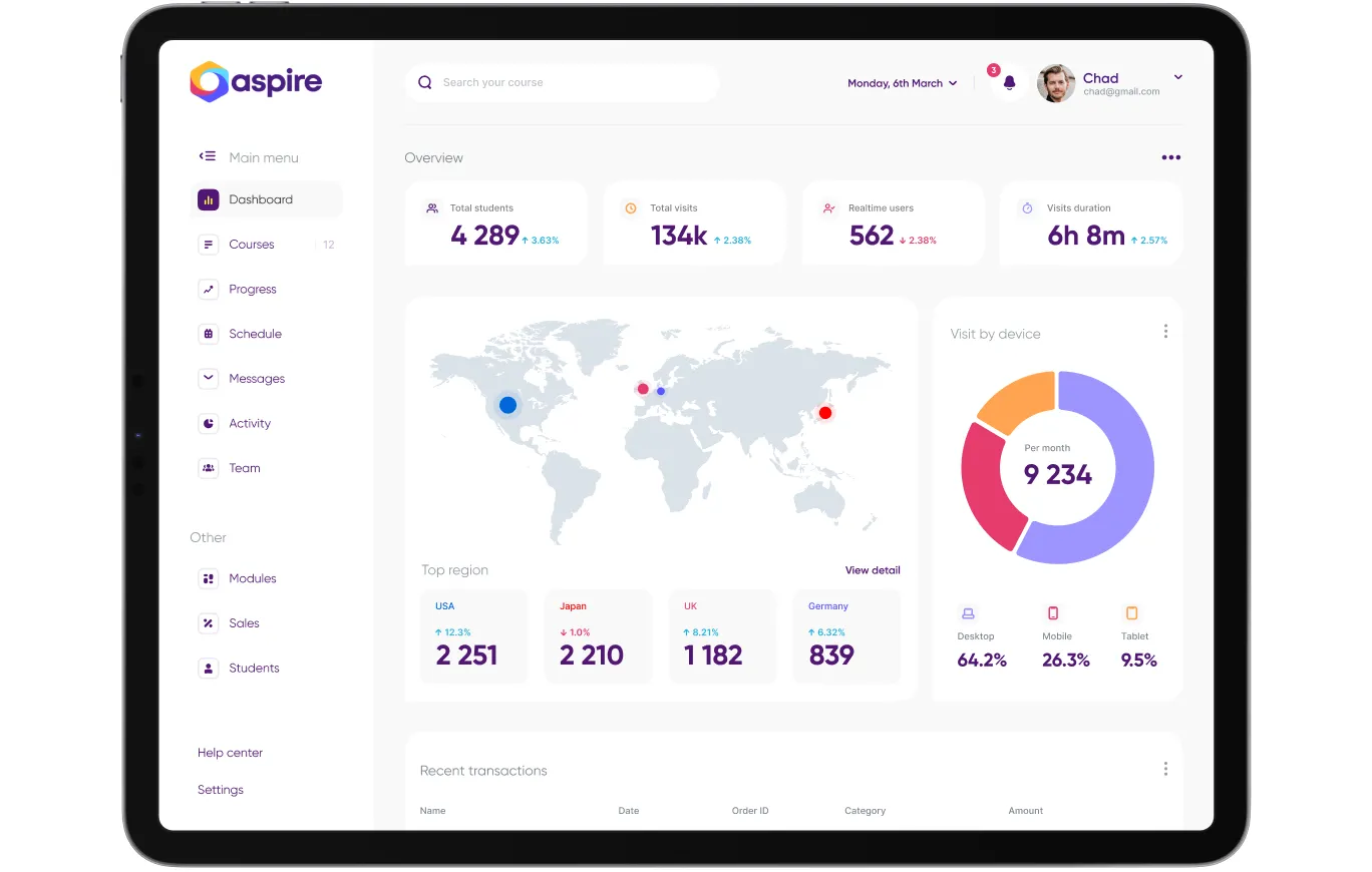
In conclusion, an effective UI dashboard design makes data accessible, understandable, and actionable, enabling users to make informed decisions and achieve their goals efficiently. For example, for the international education platform Aspire Turum-burum created a unique mobile app dashboard UI design catering to different types of users, including teacher, student and admin dashboard UI design.
The team implemented a modern design with intuitive layout, clear categorization, and efficient search capabilities. These improvements led to increased user engagement, a higher conversion rate, and an overall more satisfying shopping experience.
Dashboard types
Dashboards can be divided into small groups, depending on the number of databases used, the way they are visualized, and, say, the number of people who have access. Globally, dashboards are divided into two types: tactical and strategic.
- Tactical dashboards are needed to manage specific processes. For example, the main screen of Google Analytics displays the number of visitors over the past week and at the time of viewing the dashboard. It also contains information about traffic sources, the most popular viewing hours, and cohorts — in general, it contains the site's main indicators that are necessary for its development.
- Strategic dashboards are used to gain a global perspective on the company's and market's situation. They reconcile indicators from different sources using specified formulas, allowing users to see current income and understand the company's financial health.
Flutter dashboard UI design: definition and benefits
Flutter is a UI toolkit developed by Google that enables developers to build cross-platform applications from a single codebase, targeting mobile, web, and desktop platforms. Flutter dashboard UI design leverages the framework's powerful features to create dynamic dashboards with customizable widgets and components.
Developers can use its expressive and flexible UI capabilities to design dashboards that display data in charts, graphs, tables, and other visual elements. This approach provides users with clear, organized information for analysis and decision-making.
Among the Flutter advantages are the following:
- Cross-Platform Compatibility: Flutter allows the deployment of dashboards across multiple platforms, providing a consistent experience for users on Android, iOS, web, and desktop.
- Customization: It offers a rich set of widgets and tools that enable developers to customize the design and functionality of dashboards to meet specific user needs.
- Quick Development: Flutter's hot reload feature accelerates the development process, allowing for quick changes and testing without rebuilding the entire application.
- Consistent Design: Flutter's widget-based structure ensures a seamless and harmonious design across various platforms, providing a cohesive user experience.
Leveraging Flutter dashboard UI design allows developers to produce practical and visually engaging dashboards. This method enhances data access, enabling users to make well-informed decisions and boost productivity.
Enhancing Data Clarity: The Essentials of Dashboard Table UI Design
Dashboard table UI design centers on displaying data in tables within a digital dashboard. The aim is to arrange and showcase complex data sets in a straightforward way, allowing users to quickly spot patterns and trends.
Key aspects of effective dashboard table UI design include:
- Readability: Apply clear labels, column headers, and consistent formatting to facilitate easy comprehension of data.
- Sorting and Filtering: Provide features that enable users to sort and filter data, aiding them in focusing on relevant information.
- Responsive Design: Design tables to adapt to various screen sizes and devices for seamless usability.
- Visual Cues: Implement colors, icons, and other visual aids to emphasize key data and enhance interpretation.
- Customization: Offer options for users to personalize views, expand rows, and drill down into details for a tailored experience.
Concentrating on these elements can help you design dashboard tables that effectively convey data, empowering users to make informed decisions and gain meaningful insights.
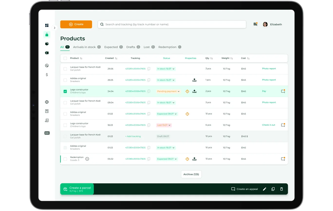
Despite its apparent simplicity, creating a high-quality dashboard table design demands extensive experience and in-depth expertise. As an example, we can consider Logistic case — the process of developing a dashboard design for managing the purchase of goods, including admin dashboard UI design.
The information panel had to satisfy various users' needs, including parcel management, real-time tracking, and convenient pickup and delivery scheduling. So, we presented many dashboard blocks in tables since they provide a clear overview of multiple data points simultaneously, allowing users to interpret and compare information quickly. Moreover, tables can display precise values, making them crucial for detailed analysis and decision-making.
But before the dashboard table UI design stage, the Turum-burum team had to do a lot of work. We conducted deep analytics to understand the business specifics. This process included collecting business requirements, interviewing users, and researching the target audience.
After this stage, we developed the optimal information structure, user flow, and prototypes. Only then were we able to develop a product design that allowed us to provide a successful and personalized user experience.
Optimizing Data Selection: Dashboard Filter UI Design
Dashboard filter UI design provides users with intuitive and effective ways to refine and control the data they view on a digital dashboard. A well-thought-out design allows users to narrow down data sets based on specific criteria, helping them find the information they need quickly and efficiently.
Key elements of dashboard filter UI design include:
- User-Friendly Design: Filters should be clear and easy to use, allowing users to apply and modify them without difficulty.
- Variety of Filter Types: Offer different filter styles, such as dropdowns, checkboxes, sliders, and date pickers, to suit various data types and user needs.
- Live Updates: The dashboard should refresh data in real-time when filters are applied, instantly showing the filtered information.
- Transparency: Clearly indicate which filters are active, so users know what's being filtered and can adjust settings accordingly.
- Hierarchical Filtering: For greater control, enable filtering at multiple levels, such as category, subcategory, or specific data points.
- Filter Presets and Saving: Allow users to save and reuse filter settings for quick and efficient personalization.
- Adaptive Design: Design filters to work smoothly across different devices and screen sizes for accessibility on mobile and desktop.
- Uniformity and Feedback: Keep filter design consistent throughout the dashboard and offer feedback, such as highlighting filtered data, to keep users informed.
Overall, an effective dashboard filter UI design enhances user experience by making it easy for users to focus on the most relevant data and gain valuable insights from the dashboard. By prioritizing usability and clarity, you can create a more engaging and productive dashboard experience.
Effective Use of Dashboard Card UI Design
Dashboard card UI design is a powerful approach to organizing and presenting information on digital dashboards. Users can quickly grasp key insights at a glance by breaking data into individual cards, each containing a specific data set or metric. Cards offer a modular and customizable experience, allowing users to rearrange and resize them according to their preferences.
The visual hierarchy within cards emphasizes important information, making it easy for users to identify critical data points. To ensure an intuitive dashboard card UI design, use consistent fonts and colors, add interactive features like drill-downs and clickable elements to ensure a cohesive look across the dashboard. These enable users to explore data further and gain deeper insights.
Apart from this, ensure the cards are organized and grouped by themes or categories and adapt seamlessly to different screen sizes and devices for a consistent user experience across platforms. A good dashboard card UI design streamlines the gathering of insights, allowing users to make informed decisions quickly and effectively.
Optimizing User Experience: Key Elements of Dashboard Mobile UI Design
Dashboard mobile UI design focuses on creating easy-to-use and navigate information panels on mobile devices. And since nowadays, people especially appreciate the ability to manage their business on the move, it is pivotal to ensure the same level of customer satisfaction when using different devices.
So, while developing a dashboard mobile UI design make sure the product:
- works well across various screen sizes and orientations;
- has intuitive navigation and concise visualizations that make it easy for users to access and interpret data quickly;
- has a correct visual hierarchy that emphasizes important information, guiding users to key insights;
- includes interactive elements like touch gestures and swipe actions to enhance user engagement;
- provide real-time data updates and fast loading times to keep users informed and satisfied, while optimizing performance.
By prioritizing these elements, mobile dashboard UI design can provide a smooth and productive experience for users on the go.
Note that some products may require a web product that works equally well on various devices, while others – a separate mobile app dashboard UI design. A good UI designer should know how to handle both tasks.
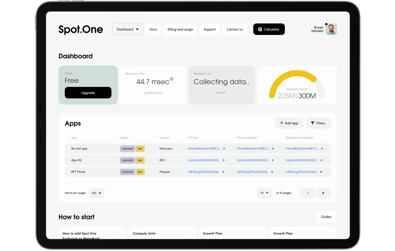
For example,Turum-burum team created a Flutter dashboard UI design for an API SaaS project called Spot.One. The goal was to enable users to access and manage Spot.One API data efficiently on the go. By adapting the dashboard design for mobile devices, the team provided users with a seamless experience across platforms.
The dashboard incorporated intuitive navigation, real-time data updates, and interactive elements like touch gestures and swipe actions. This approach enhanced user engagement and allowed users to analyze data and make informed decisions quickly.
Overall, the Flutter dashboard UI design delivered a streamlined, efficient, and user-friendly experience, demonstrating the potential of Flutter in creating high-quality dashboards for a variety of applications.
To sum up, effective dashboard UI design is essential for presenting complex data in an accessible and usable way. By prioritizing clarity, responsiveness, customization, and real-time data updates, designers can create the best dashboard UI design that empowers users to make informed decisions. However, you need to take many aspects into account to develop a good dashboard!
Share this post on:


More real-world Turum-burum cases?
Review our vast portfolio of cases in a variety of business fields to make sure of our expertise.
Go to Portfolio
